글자정렬
정렬 하는 법
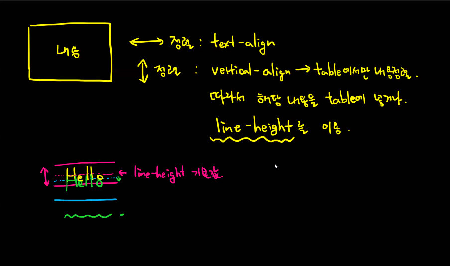
- text-align : 내용을 가로 방향 정렬 - left, center, right
- vertical- align: 테이블에서 내용을 세로방향 정렬, 또는 객체 정렬 기준
line-eight
- 줄간견
- Hello와 Hi가 같이 정렬 되는것이 아닌 그림처럼 정렬되서 두줄 이상 권유하지않는다.
- 한줄 일때만 사용
table과 table-cell

- display : table - 테이블
- display : table-cell 테이블의 칸
- 두줄 이상 세로 정렬 정석법
.b1{
	display: table;
	width: 100%;
	height: 100%;
}
.b2{
	display: table-cell;
	vertical-align: middle;
}- text-indent : 문단 들여쓰기
- letter-spacing : 자간
- word-spacing : 글자가 간격
/* 들여쓰기*/
	text-indent: 50px;
	/* 글자자간, 사용은 안한다. */
	letter-spacing: -2px;
	/* 단어간 띄어쓰기 그러나, 사용안한다. */
	word-spacing: -2px;
white-space - 공백, 넘침

- normal : 공백들을 스페이스 한칸으로, 크기보다 클 경우 자동 줄 바꿈
- nowrap : 공백들을 스페이스 한칸으로, 크기보다 클 경우 넘침<"br/"> 만나야 줄 바꿈
- pre : 공백 그대로 적용, 크기보다 클 경우 넘침, <"br/"> 또는 엔터를 만나야 줄 바꿈
- pre-line : 공백들은 스페이스 한칸 처리하되 엔터는 정상적용, 크기보다 클 경우 자동 줄 바꿈
- pre-wrap : 공백 그대로 적용, 크기보다 클 경우 자동 줄 바꿈.
overflow -넘쳤을 때을 옵션

- visible: 넘치는 것 보여줌
- hidden : 넘치는 것 감춤
- scroll : 스크롤바 존재
- auto : 넘치는 방향에만 스크롤 바 존재
- overflow-x
- overflow-y
- x,y 축 개별 지정시 사용, 주로 y축으로 auto 걸어서 사용
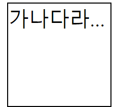
- text-overflow - 글자가 overflow 되었을 때
말줄임나오게 하는 한세트
	white-space: nowrap;
	overflow: hidden;
	/* ...좀 나오게 하는 것 다만, 한줄 그리고 텍스트가 넘쳤을 때 */
	text-overflow: ellipsis;
출력결과
text-shadow : 그림자
- 기본 값 0px 내가 줘야한다.
크기(가로축) 크기 (세로축) => 2px 2px Hello
크기 크기 색상
크기 크기 블러크기 색상
bow-shadow : 테두리 그림자
.e{
	font-size: 50px;
	text-shadow: 0px 0px 10px lime;
	color: white;
	height: 300px;
	background-image: url('moun.png');
					/*가로     세로  */
	background-size: 100px 100px;
	background-repeat: no-repeat;
	background-position: center;
    	/* 	가로,세로,블러,스프레드 색상 */
	box-shadow: 0px 0px 4px 10px lime;

}
background
background-repeat : 배경이미지 반복
linear-gradiant(방향,색상)
- 무지개 만드는 것
background-position : 배경 위치지정

-
% --> 배경 이미지의 중간지점 위치를 비율로 지정, 단 0%를 잡더라도 이미지는 붙게하여 제공
-
px,외 다른 수치들 --> 중간점 위치를 해당 수치에 맞추어 지정.
-
top, bottom,center,left,right : 해당 지정 방향에 위치시킴
포지션-relative
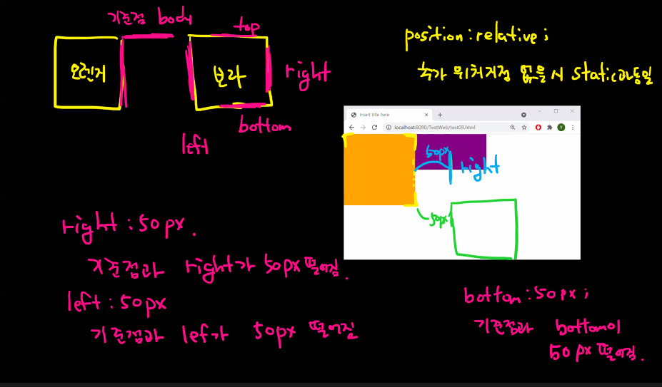
- 위치지정 시 기준대상(접촉 중 객체) 기준으로 이동
- 바로 앞에 꺼 기준으로 잡고 발동
- 추가 위치지정 없을 시 static과 동일
- test09 참고
포지션-fixed
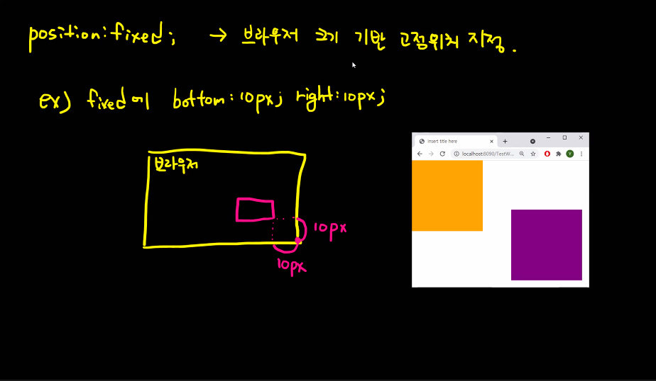
- 브라우저 기준 고정위치 지정
※안쓰는 거 권장 디자인을 가린다.
포지션-absolute - 절대적 위치 지정
-
위치지정 없는 경우 relative와 동일
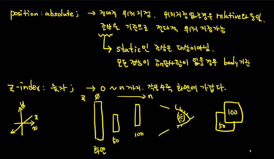
-
조상을 기준으로 절대적 위치 지정가능
- static인 조상은 대상이 아님, 모든 조상에 해당사항이 없을 경우 body기준
-
z- index : 숫자 ; --> 0 ~ n 까지. 작을 수록 화면에 가깝다.,우선순위부여
- 숫자가 높을 수록 위에 위치한다. 0이 화면 ,n이 내눈
- 팝업분야에서 사용
- test09 참고
-
cursor : 마우스 갖다대면 바뀌는 것
.e{
	font-size: 50px;
	text-shadow: 0px 0px 10px lime;
	color: white;
	height: 300px;
	background-image: url('moun.png');
					/*가로     세로  */
	background-size: 100px 100px;
	background-repeat: no-repeat;
	background-position: center;

}

.f{
	height: 100px;
	background-image: linear-gradient(to bottom right, green, blue, purple);
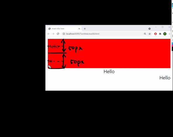
실습 test08
<!DOCTYPE html>
<html>
<head>
<meta charset="UTF-8">
<title>test08</title>
<style type="text/css">
.a {
	/* 인라인 블록도 설정 가능 */
	text-align: left;
	background-color:red;
	height: 100px;
	line-height: 50px;
	/* 들여쓰기*/
	text-indent: 50px;
	/* 글자자간, 사용은 안한다. */
	letter-spacing: -2px;
	/* 단어간 띄어쓰기 그러나, 사용안한다. */
	word-spacing: -2px;
}
.b{
	text-align: center;
	background-color: orange;
	height: 100px;

}

.b1{
	display: table;
	width: 100%;
	height: 100%;
}
.b2{
	display: table-cell;
	vertical-align: middle;
}
.c{
	text-align: right;
}
.d{
	display: inline-block;
	width: 80px;
	height: 80px;
	border: 1px solid #000000;
	/* white-space: 여백 */
	white-space: nowrap;
	overflow: hidden;
	/* ...좀 나오게 하는 것 다만, 한줄 그리고 텍스트가 넘쳤을 때 */
	text-overflow: ellipsis;
			/* 	가로,세로,블러,스프레드 색상 */
	box-shadow: 0px 0px 4px 10px lime;

}

.e{
	font-size: 50px;
	text-shadow: 0px 0px 10px lime;
	color: white;
	height: 300px;
	background-image: url('moun.png');
					/*가로     세로  */
	background-size: 100px 100px;
	background-repeat: no-repeat;
	background-position: center;

}

.f{
height: 100px;
background-image: linear-gradient(to bottom right, green, blue, purple);

}
</style>
</head>
<body>
<div class="a">Hello 안녕<br/>Hi</div>
<div class="b">
	<div class="b1">
		<div class="b2">
				Hello<br/>Hi
		</div>
	</div>
</div>
<div class="c">Hello</div>
<div class="d">가나다라마바사아자차카타파하</div>
<div class="e">Hungry!!</div>
<div class="f"></div>
</body>
</html>
출력결과

실습 test09
<!DOCTYPE html>
<html>
<head>
<meta charset="UTF-8">
<title>test09</title>
<style type="text/css">
	body{
		margin: 0px;
		font-size: 0pt;
	}
.a, .b, .c{
	display: inline-block;
	vertical-align: top;
	width: 100px;
	height: 100px;
	}
.a{
	background-color: orange;
	}
.b{
	background-color: purple;
	position: absolute;
	left: 50px;
	top: 50px;
	z-index: 100;
}

.c{
	background-color: aqua;
	position: absolute;
	left: 100px;
	top: 100px;
	z-index: 50;
}

.p{
	display: inline-block;
	vertical-align: top;
	width: 300px;
	height: 300px;
	background-color: red;
	position: relative;
	z-index: 300;
}
.popup{
	display: inline-block;
	width: 300px;
	height: 300px;
	background-color: #ffffff;
	box-shadow: 0px 0px 1px 1px #444444;
	position: absolute;
	top: calc(50% - 150px); /* 높이의 반만큼 뺌  */
	left: calc(50% - 150px); /* 너비의 반만큼 뺌  */
	z-index: 300;
	font-size: 16pt;
	cursor: pointer;
}
.bg{
	display: inline-block;
	width: 100%;
	height: 100%;
	position: absolute;
	top: 0px;
	left: 0px;
	background-color: #000000;
	z-index: 200;
	opacity: 0.6; /* 0.0(투명) ~ 1.0(불투명) */

}
</style>
</head>
<body>
<div class="a"></div>
<div class="p">
	<div class="b"></div>
	<div class="c"></div>
</div>
<div class="bg"></div>
<div class="popup">팝업이다.</div>
</body>
</html>
출력결과

사실 이틀만에 방대한 양을 배워서 ...기억이나 잘 활용할 자신은 없지만, 어쨋든 하다보면 방법을 알게될거다. 차근차근 하나 씩 해보면서 감을 찾아보자 다만, 포기만 하지말자 그리고 개발자도구 활용하자.
호텔리어 출신 비전공자