
Exploratory Data Analysis
데이터셋 출처
데이터 구성
- Pregnancies : 임신 횟수
- Glucose : 2시간 동안의 경구 포도당 내성 검사에서 혈장 포도당 농도
- BloodPressure : 이완기 혈압 (mm Hg)
- SkinThickness : 삼두근 피부 주름 두께 (mm), 체지방을 추정하는데 사용되는 값
- Insulin : 2시간 혈청 인슐린 (mu U / ml)
- BMI : 체질량 지수 (체중kg / 키(m)^2)
- DiabetesPedigreeFunction : 당뇨병 혈통 기능
- Age : 나이
- Outcome : 768개 중에 268개의 결과 클래스 변수(0 또는 1)는 1이고 나머지는 0입니다.
라이브러리
import numpy as np
import pandas as pd
import seaborn as sns
import matplotlib.pyplot as plt

%matplotlib inline
데이터 로드
df = pd.read_csv("data/diabetes.csv")
df.shape
(768,9)
# info로 데이터타입, 결측치, 메모리 사용량 등의 정보를 봅니다.
df.info()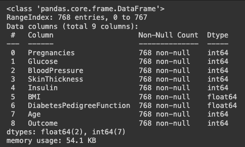
# 결측치를 봅니다.
df_null = df.isnull()
df_null.head()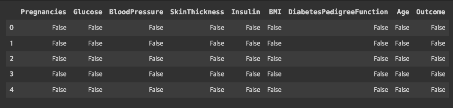
df_null.sum()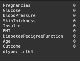
# 수치데이터에 대한 요약을 봅니다.
df.describe()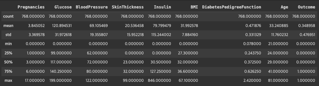
# 가장 마지막에 있는 Outcome 은 label 값이기 때문에 제외하고
# 학습과 예측에 사용할 칼럼을 만들어 줍니다.
# feature_columns 라는 변수에 담아줍니다.
feature_columns = df.columns[:-1].tolist()
feature_columns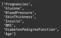
결측치 시각화
값을 요약해 보면 최솟값이 0으로 나오는 값들이 있습니다.
0이 나올 수 있는 값도 있지만 인슐린이나 혈압 등의 값은 0값이 결측치라고 볼 수 있을 것입니다.
따라서 0인 값을 결측치로 처리하고 시각화 해봅니다.
cols = feature_columns[1:]
cols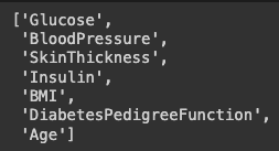
# 결측치 여부를 나타내는 데이터 프레임을 만듭니다.
# 0값을 결측치라 가정하고 정답(label, target) 값을 제외한 칼럼에 대해
# 결측치 여부를 구해서 df_null 이라는 데이터프레임에 담습니다.
df_null = df[cols].replace(0, np.nan)
df_null = df_null.isnull()
df_null.sum()
df_null.mean() * 100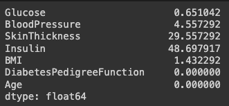
# 결측치의 갯수를 구해 막대 그래프로 시각화 합니다.
df_null.sum().plot.barh()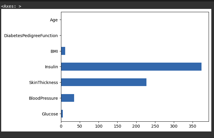
# 결측치를 heatmap으로 시각화 합니다.
plt.figure(figsize=(15,4))
sns.heatmap(df_null, cmap="Greys_r")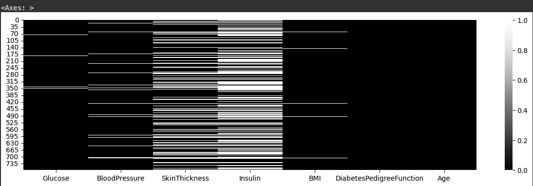
정답값
- target, label 이라고 부르기도 합니다.
# 정답값인 Outcome 의 갯수를 봅니다.
df["Outcome"].value_counts()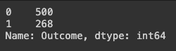
# 정답값인 Outcome 의 비율을 봅니다.
df["Outcome"].value_counts(normalize=True)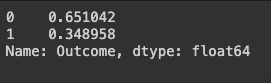
# 다른 변수와 함께 봅니다.
# 임신횟수와 정답값을 비교해 봅니다.
# "Pregnancies"를 groupby로 그룹화해서 Outcome 에 대한 비율을 구합니다.
# 결과를 df_po라는 변수에 저장합니다.
df_po = df.groupby(["Pregnancies"])["Outcome"].agg(["mean","count"].reset_index()
df_po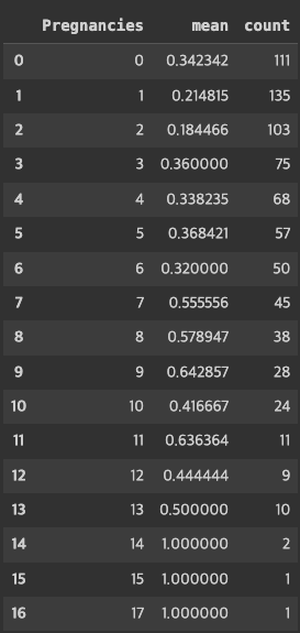
# 임신 횟수에 따른 당뇨병 발병 비율
df_po["mean"].plot.bar(rot=0)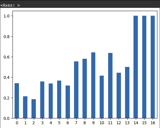
countplot
# 위에서 구했던 당뇨병 발병 비율을 구해봅니다.
# 당뇨병 발병 빈도수를 비교합니다.
sns.countplot(data=df, x="Outcome")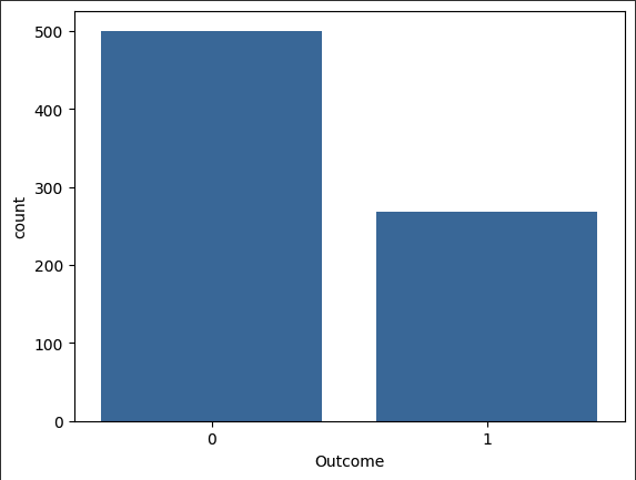
# 임신횟수에 따른 당뇨병 발병 빈도수를 비교합니다.
sns.countplot(data=df, x="Pregnancies", hue="Outcome")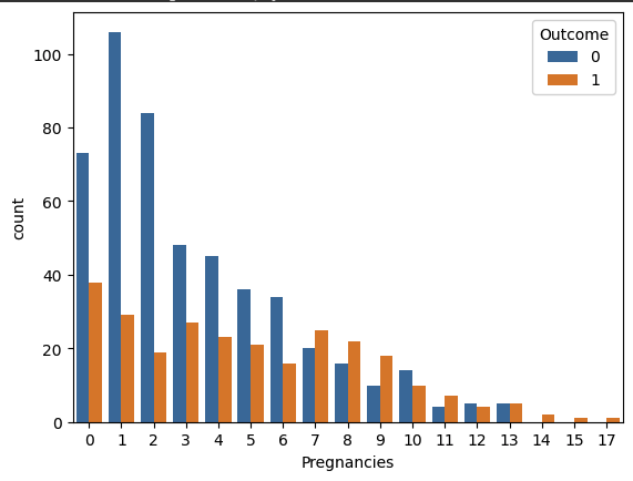
# 임신횟수의 많고 적음에 따라 Pregnancies_high 변수를 만듭니다.
df["Pregnancies_high"] = df["Pregnancies] > 6
df[["Pregnancies","Pregnancies_high"]].head()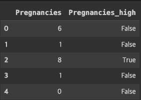
# Pregnancies_high 변수의 빈도수를 countplot 으로 그리고
# Outcome 값에 따라 다른 색상으로 표현합니다.
sns.countplot(data=df, x="Pregnancies_high", hue="Outcome")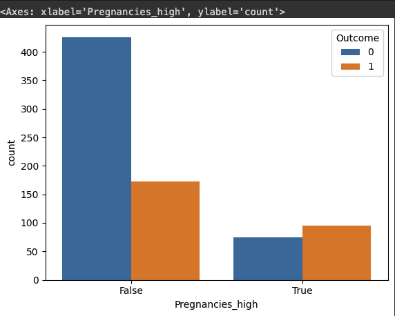
barplot
- 기본 설정으로 시각화 하면 y축에는 평균을 추정해서 그리게 됩니다.
# 당뇨병 발병에 따른 BMI 수치를 비교합니다.
sns.barplot(df, x="Outcome", y="BMI")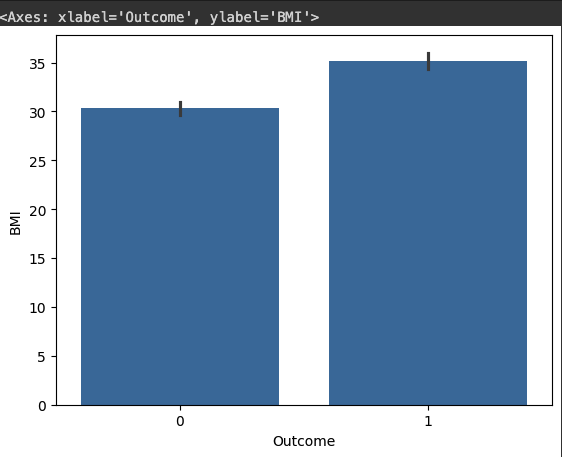
# 당뇨병 발병에 따른 포도당(Glucose)수치를 비교합니다.
sns.barplot(df, x="Outcome", y="Glucose")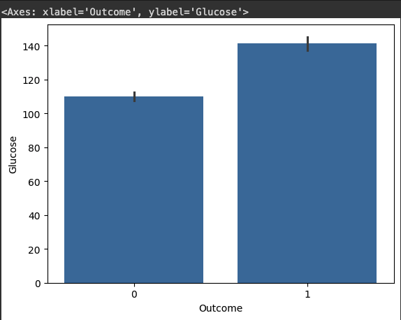
# Insulin 수치가 0 이상인 관측치에 대해서 당뇨병 발병을 비교합니다.
sns.barplot(df, x="Outcome", y="Insulin")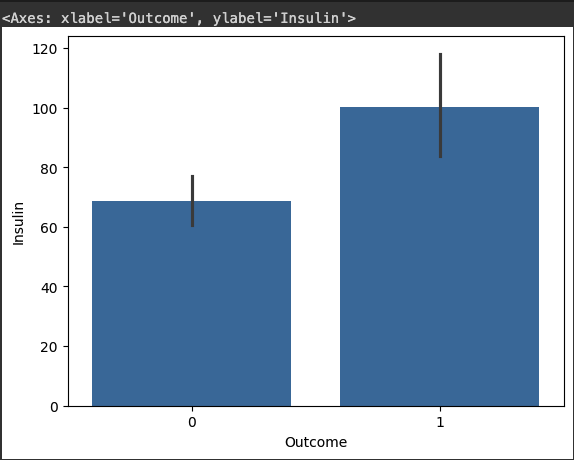
# 임신 횟수에 대해서 당뇨병 발병 비율을 비교합니다.
sns.barplot(df, x="Outcome", y="Pregnancies")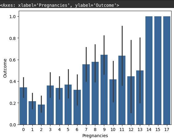
# 임신횟수(Pregnancies)에 따른 포도당(Glucose)수치를 당뇨별 발병여부(Outcome)에 따라 시각화 합니다.
sns.barplot(df, x="Pregnancies", y="Glucose", hue="Outcome)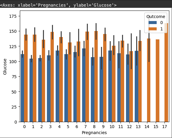
# 임신횟수(Pregnancies)에 따른 체질량지수(BMI)수치를 당뇨별 발병여부(Outcome)에 따라 시각화 합니다.
sns.barplot(df, x="Pregnancies", y="BMI", hue="Outcome)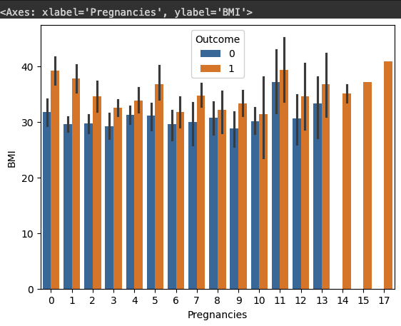
# 임신횟수(Pregnancies)에 따른 인슐린 수치(Insulin)를 당뇨병 발병여부(Outcome)에 따라 시각화합니다.
# 인슐린 수치에는 결측치가 많기 때문에 0보다 큰 값에 대해서만 그립니다.
sns.barplot(df[df["Insulin"] > 0], x="Pregnancies", y="Insulin", hue="Outcome"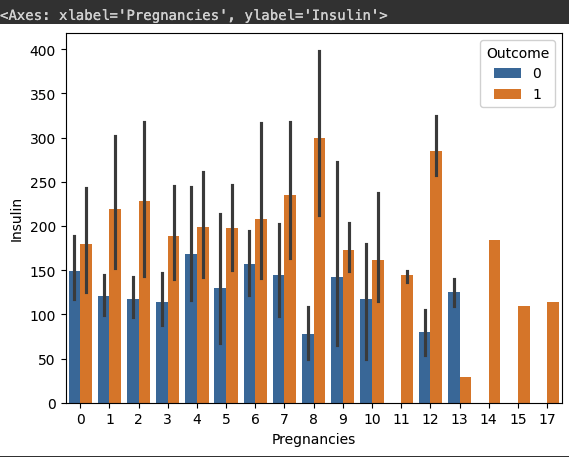
boxplot
# 임신횟수(Pregnancies)에 따른 인슐린 수치(Insulin)를 당뇨병 발병여부(Outcome)에 따라 시각화 합니다.
# 인슐린 수치에는 결측치가 많기 때문에 0보다 큰 값에 대해서만 그립니다.

sns.boxplot(df[df["Insulin"] > 0],
            x="Pregnancies", y="Insulin", hue="Outcome")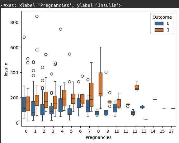
Violinplot
# 위의 그래프를 violinplot으로 시각화 합니다.
sns.violinplot(df[df["Insulin"] > 0],
            x="Pregnancies", y="Insulin", hue="Outcome")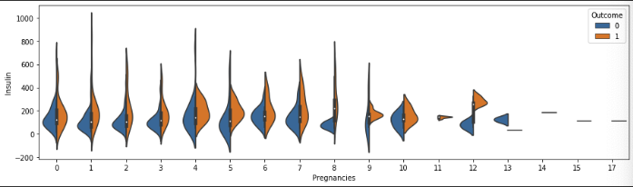
Swarmplot
# 위의 그래프를 swarmplot 시각화 합니다.
sns.swarmplot(df[df["Insulin"] > 0],
            x="Pregnancies", y="Insulin", hue="Outcome")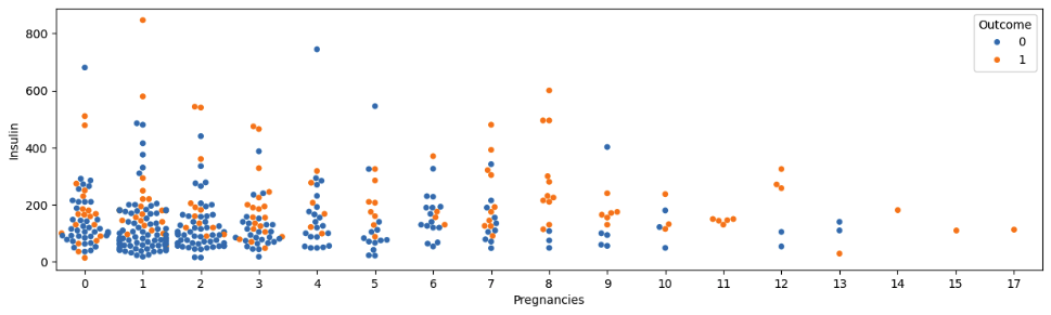
distplot
df_0 = df[df["Outcome"] == 0]
df_1 = df[df["Outcome"] == 1]
df_0.shape, df_1.shape
((500, 10), (268, 10))
# 임신횟수에 따른 당뇨병 발병 여부를 시각화 합니다.
sns.distplot(df_0["Pregnancies"])
sns.distplot(df_1["Pregnancies"])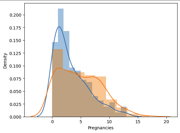
# 나이에 따른 당뇨병 발병 여부를 시각화 합니다.
g = sns.distplot(df_0["Age"], hist=False, rug=True)
g = sns.distplot(df_1["Age"], hist=False, rug=True)
g.legend(["0", "1"])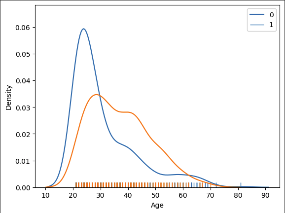
Subplots
Pandas를 통한 histplot 그리기
- pandas를 사용하면 모든 변수에 대한 서브플롯을 한 번에 그려줍니다.
df["Pregnancies_high"] = df["Pregnancies_high"].astype(int)
h = df.hist(figsize=(15, 15), bins=20)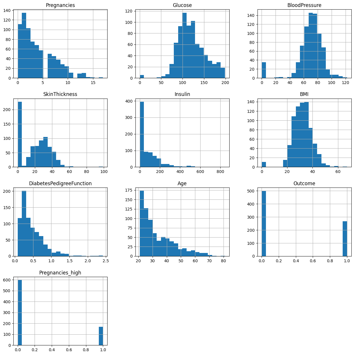
반복문을 통한 서브플롯 그리기
1. distplot
# 칼럼의 수 만큼 for 문을 만들어서 서브플롯으로 시각화를 합니다.
cols = df.columns[:-1].tolist()
cols
['Pregnancies',
'Glucose',
'BloodPressure',
'SkinThickness',
'Insulin',
'BMI',
'DiabetesPedigreeFunction',
'Age',
'Outcome']# distplot으로 서브플롯을 그립니다.
fig, axes = plt.subplots(nrows=3, ncols=3, figsize=(15,15))
for i, col_name in enumerate(cols):
row = i // 3
col = i % 3
sns.distplot(df[col_name], ax=axes[row][col])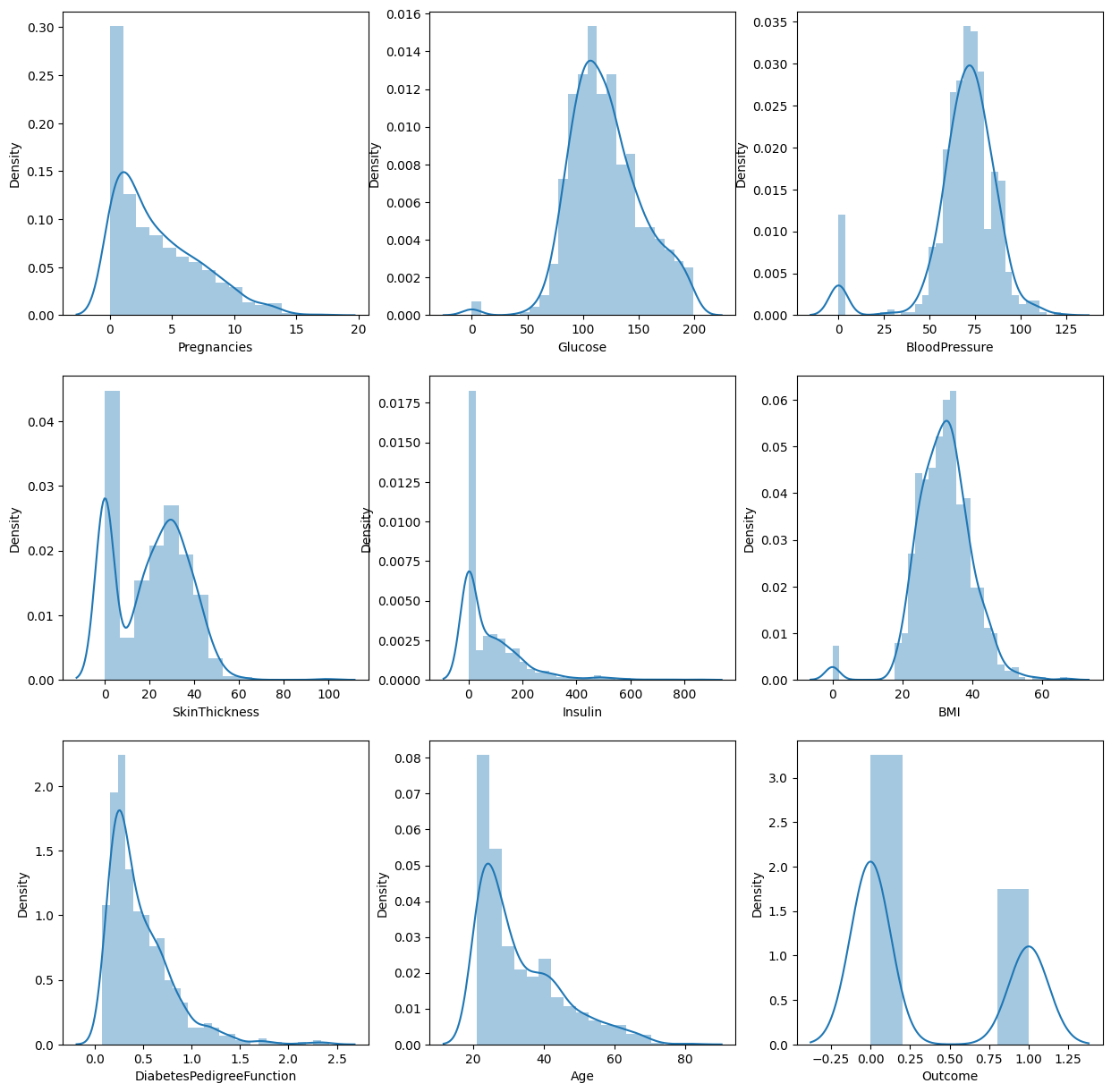
# 모든 변수에 대한 distplot을 그려 봅니다.
fig, axes = plt.subplots(nrows=4, ncols=2, figsize=(15, 15))

for i, col_name in enumerate(cols[:-1]):
    row = i // 2
    col = i % 2
    sns.distplot(df_0[col_name], ax=axes[row][col])
    sns.distplot(df_1[col_name], ax=axes[row][col])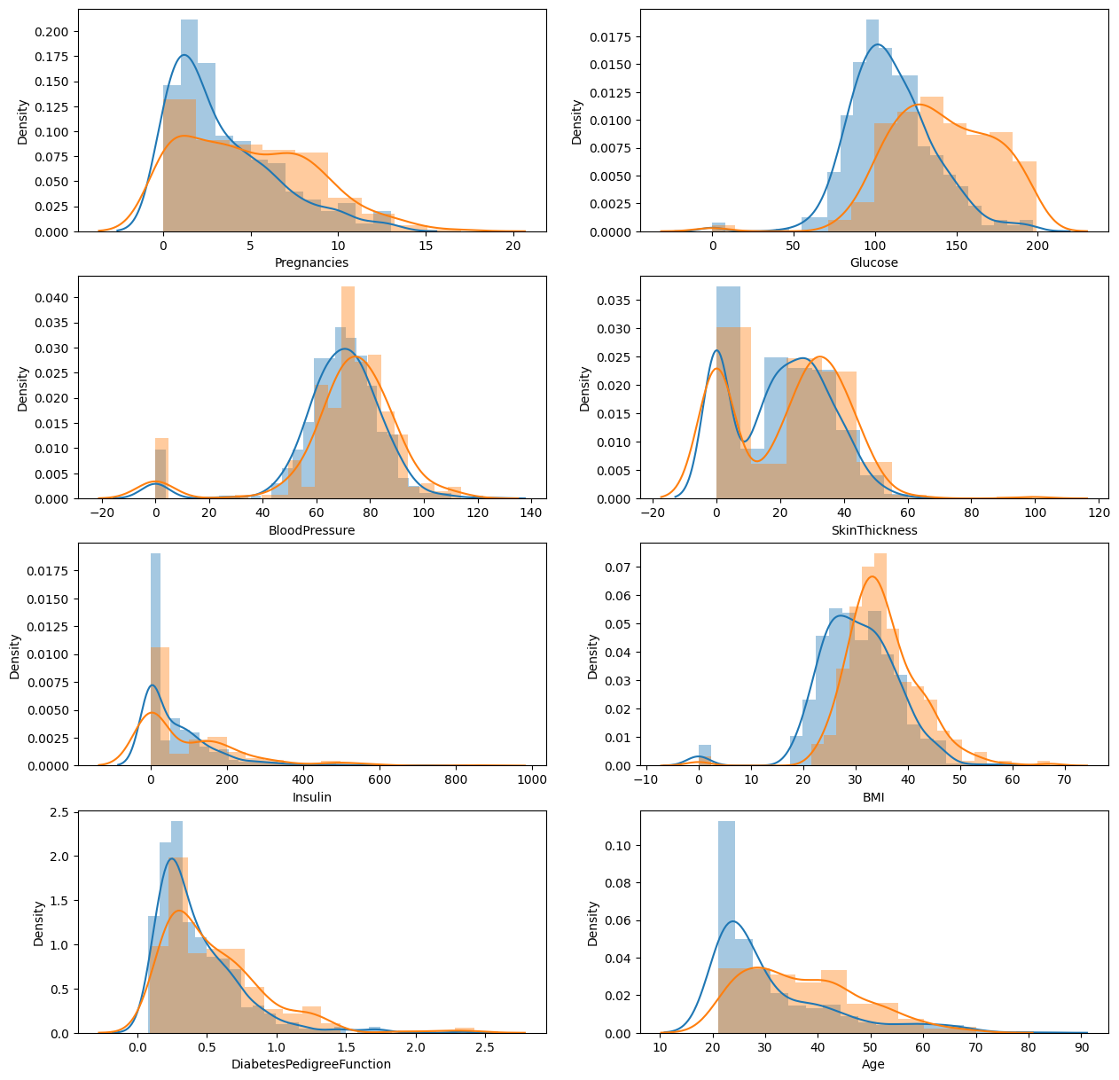
2. violinplot
# violinplot으로 서브플롯을 그려봅니다.
fig, axes = plt.subplots(nrows=4, ncols=2, figsize=(15, 15))

for i, col_name in enumerate(cols[:-1]):
    row = i // 2
    col = i % 2
    sns.violinplot(data=df, x="Outcome", y=col_name, ax=axes[row][col])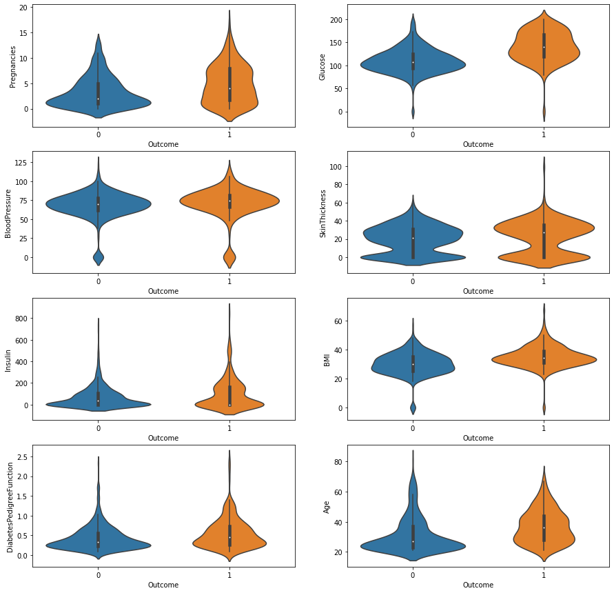
3. lmplot
- 상관계수가 높은 두 변수에 대해 시각화 합니다.
# Glucose와 Insulin을 Outcome 으로 구분해 봅니다.

sns.lmplot(data=df, x="Glucose", y="Insulin", hue="Outcome"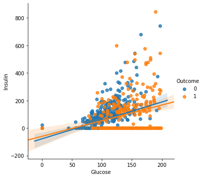
# Insulin 수치가 0 이상인 데이터로만 그려봅니다.
sns.lmplot(data=df[df["Insulin] > 0], x="Glucose", y="Insulin", hue="Outcome")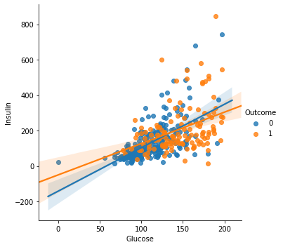
4. pairplot
# PairGrid를 통해 모든 변수에 대해 Outcome 에 따른 scatterplot을 그려봅니다.

g = sns.PairGrid(df, hue="Outcome")
g.map(plt.scatter)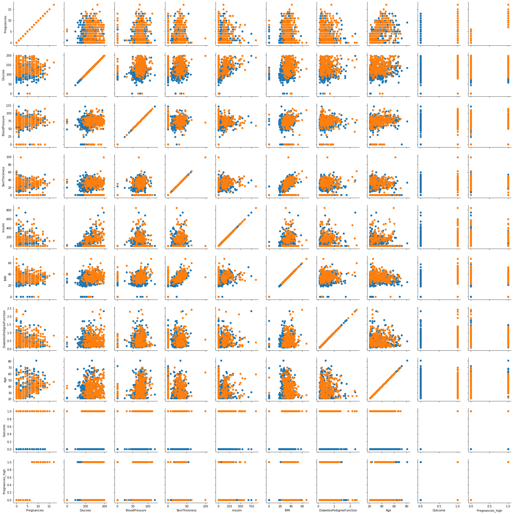
상관분석
r이 -1.0과 -0.7 사이이면, 강한 음적 선형관계,
r이 -0.7과 -0.3 사이이면, 뚜렷한 음적 선형관계,
r이 -0.3과 -0.1 사이이면, 약한 음적 선형관계,
r이 -0.1과 +0.1 사이이면, 거의 무시될 수 있는 선형관계,
r이 +0.1과 +0.3 사이이면, 약한 양적 선형관계,
r이 +0.3과 +0.7 사이이면, 뚜렷한 양적 선형관계,
r이 +0.7과 +1.0 사이이면, 강한 양적 선형관계
df_matrix = df.iloc[:, :-2].replace(0, np.nan)
df_matrix["Outcome"] = df["Outcome"]
df_matrix.head()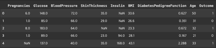
# 정답 값인 Outcome을 제외 하고 feature 로 사용할 컬럼들에 대해 0을 결측치로 만들어 줍니다.
# 상관계수를 구합니다.

df_corr = df_matrix.corr()
df_corr.style.background_gradient()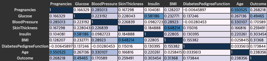
# 위에서 구한 상관계수를 heatmap으로 시각화 합니다.
plt.figure(figsize=(15, 8))
sns.heatmap(df_corr, annot=True, vmax=1, vmin=-1, cmap="coolwarm")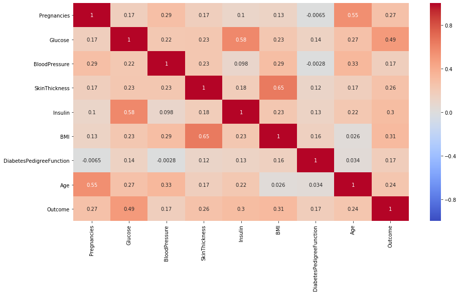
#  Outcome 수치에 대한 상관계수만 모아서 봅니다.

df_corr["Outcome"]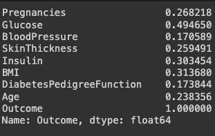
상관계수가 높은 변수끼리 보기
# Insulin 과 Glucose 로 regplot 그리기
sns.regplot(data=df, x="Insulin", y="Glucose")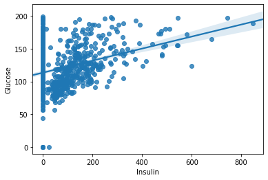
# df_0 으로 결측치 처리한 데이터프레임으로
# Insulin 과 Glucose 로 regplot 그리기

sns.regplot(data=df_matrix, x="Insulin", y="Glucose")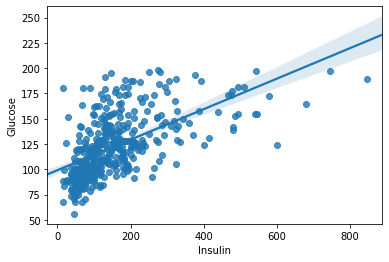
sns.lmplot(data=df_matrix, x="Insulin", y="Glucose", hue="Outcome")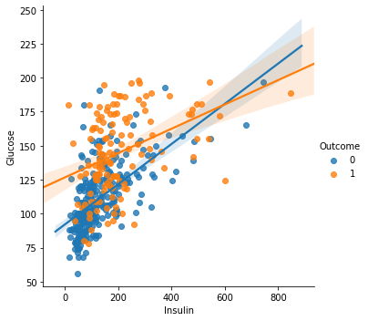
# Age 와 Pregnancies 로 regplot 그리기

sns.regplot(data=df, x="Age", y="Pregnancies")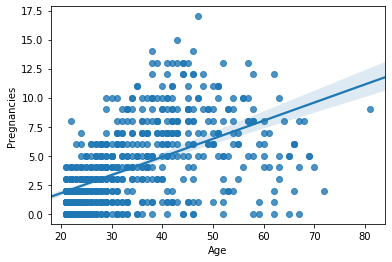
# Age 와 Pregnancies 로 lmplot 을 그리고 Outcome 에 따라 다른 색상으로 표현하기

sns.lmplot(data=df, x="Age", y="Pregnancies", hue="Outcome", col="Outcome")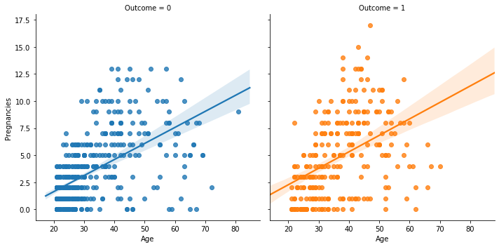

이기적이타주의자