matplotlib
< matplotlib 그래프 기본 형태 >
plt.figure(figsize=(10, 6))
plt.plot(x, y)
plt.show
> plt.figure(figsize=(10, 6))
plt.plot([0, 1, 2, 3, 4, 5, 6, 7, 8, 9], [1, 1, 2, 3, 4, 2, 3, 5, -1, 3])

> plt.show()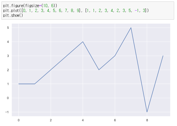
1. 삼각함수 그래프
- np.arange(a, b, s): a부터 b까지 s의 간격
- np.sin(value)
> import numpy as np

> t = np.arange(0, 12, 0.01)
> y = np.sin(t)

> plt.figure(figsize=(10, 6))
> plt.plot(t, np.sin(t))
> plt.plot(t, np.cos(t))
> plt.show()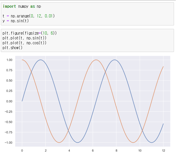
여기서 격자 무늬 추가 + 그래프 제목 추가 + x축,y축 제목 추가 + 범례 표시
> def drawGraph():

    plt.figure(figsize=(10, 6))
    plt.plot(t, np.sin(t), label="sin")
    plt.plot(t, np.cos(t), label="cos")
    plt.grid(True)
    plt.legend(loc=2) # 범례
    plt.title("Example of sinewave")
    plt.xlabel("time")
    plt.ylabel("Amplitude") # 진폭
    plt.show()


> drawGraph()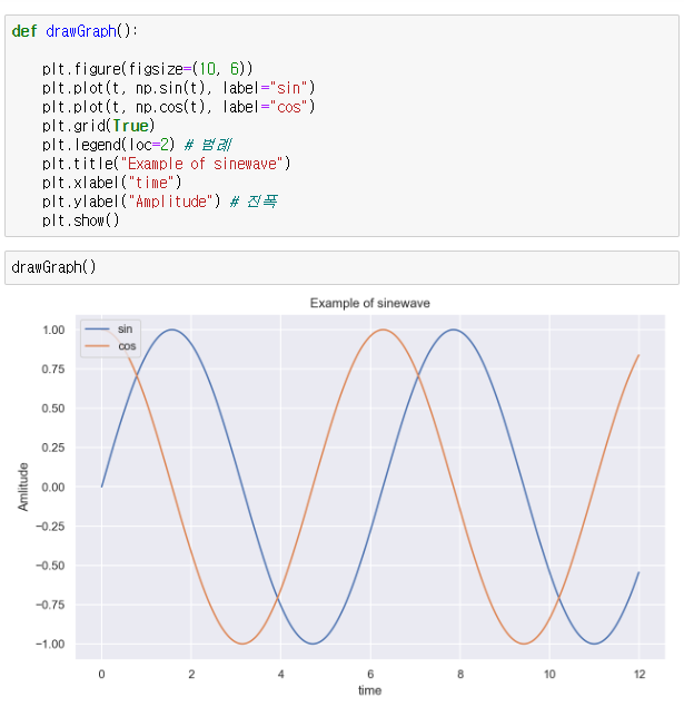
- 그래프 옵션 추가
> t = np.arange(0, 5, 0.5)
> t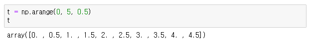
> plt.figure(figsize=(10, 6))
> plt.plot(t, t, "r--") # red ----
> plt.plot(t, t ** 2, "bs") # blue square
> plt.plot(t, t ** 3, "g>") # grean '>'
> plt.show()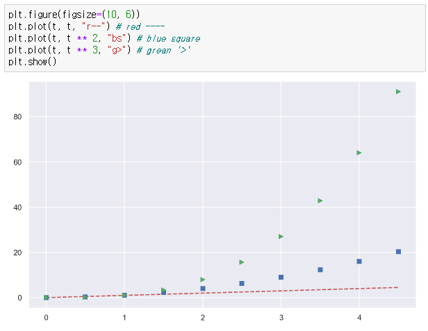
# t = [0, 1, 2, 3, 4, 5, 6]


> t = list(range(0, 7))
> y = [1, 4, 5, 8, 9, 5, 3]


> def drawGraph():

    plt.figure(figsize=(10, 6))
    plt.plot(
        t,
        y,
        color="red",
        linestyle="--",
        marker="o",
        markerfacecolor="blue",
        markersize=10,
    )

    plt.xlim([-0.5, 6.5])
    plt.ylim([0.5, 9.5])
    plt.show()

> drawGraph()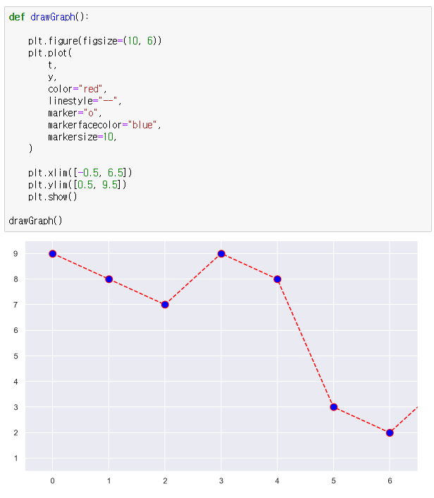
- scatter plot
> t = np.array(range(0, 10))
> y = np.array([9, 8, 7, 9, 8, 3, 2, 4, 3, 4])
> def drawGraph():
plt.figure(figsize=(10, 6))
plt.scatter(t, y)
plt.show()
> drawGraph()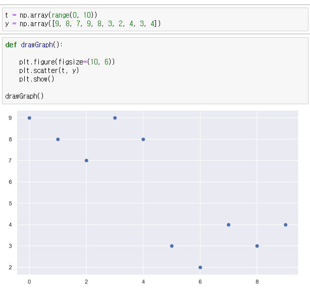
> colormap = t

> def drawGraph():

    plt.figure(figsize=(10, 6))
    plt.scatter(t, y, s=150, c=colormap, marker=">")
    plt.colorbar()
    plt.show()

> drawGraph()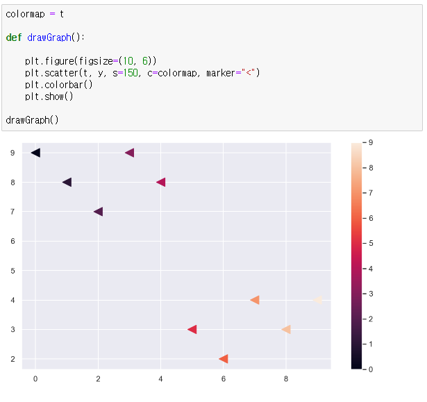
- bar plot
> data_result.head()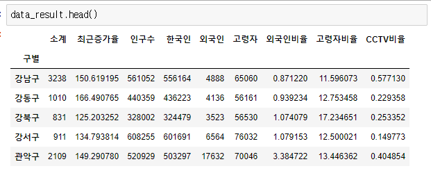
> data_result["인구수"].plot(kind="bar", figsize=(10,10))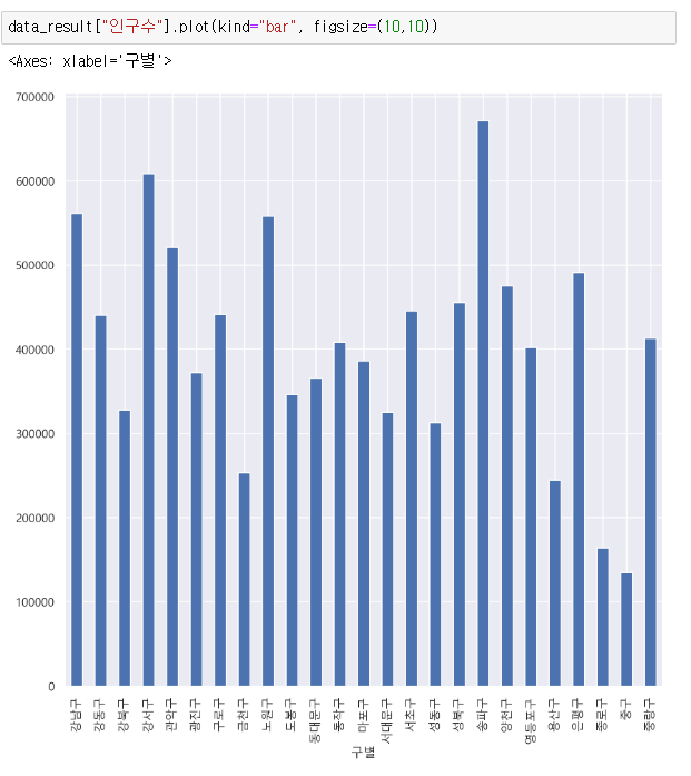
> data_result["인구수"].plot(kind="barh", figsize=(10,10))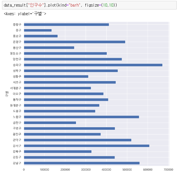

데이터 관련 학습 일지