군집화(Clustering)는 비지도 학습의 일종으로, 주어진 데이터 세트를 비슷한 특징을 가진 여러 그룹(클러스터)로 나누는 방법이다.
지도 학습과 달리 군집화는 레이블이 없는 데이터에서 자연스럽게 데이터의 구조나 패턴을 파악하여 한다.
타깃을 모르는 비지도 학습
1. 비지도 학습이란?
비지도 학습은 데이터에 레이블이 없을 때, 즉 결과나 타깃 변수가 알려지지 않은 상태에서 데이터의 구조를 이해하거나 패턴을 발견하는 방법을 말한다.
군집화 예시: 과일 데이터셋
import numpy as np
import matplotlib.pyplot as plt
# npy 파일 로드
fruits = np.load('fruits_300.npy')
print(fruits.shape)
#출력 (300, 100, 100) #샘플 개수, 이미지 높이, 이미지 너비
print(fruits[0, 0, :])
#[ 1 1 1 1 1 1 1 1 1 1 1 1 1 1 1 1 2 1
# 2 2 2 2 2 2 1 1 1 1 1 1 1 1 2 3 2 1
# 2 1 1 1 1 2 1 3 2 1 3 1 4 1 2 5 5 5
# 19 148 192 117 28 1 1 2 1 4 1 1 3 1 1 1 1 1
# 2 2 1 1 1 1 1 1 1 1 1 1 1 1 1 1 1 1
# 1 1 1 1 1 1 1 1 1 1]
#흑백 이미지
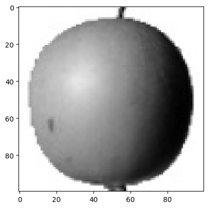
plt.imshow(fruits[0], cmap='gray')
plt.show()
#반전 이미지
plt.imshow(fruits[0], cmap='gray_r')
plt.show()
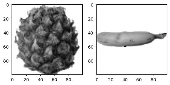
fig, axs = plt.subplots(1,2) # 여러개의 그래프를 배열로 쌓음
axs[0].imshow(fruits[100], cmap='gray_r')
axs[1].imshow(fruits[200], cmap='gray_r')
plt.show()위의 코드에서 과일 데이터셋을 활용하여 군집화를 수행할 수 있다. 주어진 데이터는 세가지 과일(사과, 파인애플, 바나나)로 구성되어 있으며, 각 이미지를 100x100크기의 흑백 이미지로 변환한 뒤, 픽셀 값을 기반으로 분석했다.
픽셀값 분석
# 1차원 배열로 만들기
apple = fruits[0:100].reshape(-1, 100*100)
pineapple = fruits[100:200].reshape(-1, 100*100)
banana= fruits[200:300].reshape(-1, 100*100)
print(apple.shape)
#출력 (100, 10000)
1. 샘플의 평균값
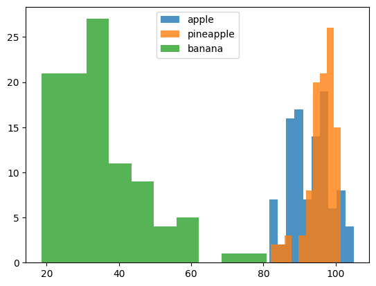
print(apple.mean(axis=1))
plt.hist(np.mean(apple, axis=1), alpha=0.8) #alpha 투명도
plt.hist(np.mean(pineapple, axis=1), alpha=0.8)
plt.hist(np.mean(banana, axis=1), alpha=0.8)
plt.legend(['apple', 'pineapple', 'banana']) #범례
plt.show()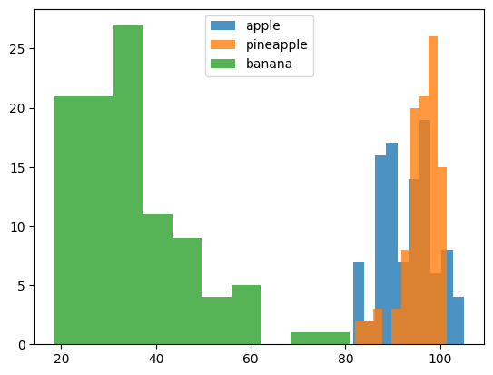
각 과일 샘플의 픽셀값 평균을 계산하여 히스토그램을 만들었다. 이를 통해 샘플 간의 분포를 시각적으로 파악할 수 있다
(사과와 파인애플이 공통적으로 겹쳐지는 부분이 많음)
2. 픽셀의 평균값
fig,axs = plt.subplots(1, 3, figsize=(20, 5))
axs[0].bar(range(10000), np.mean(apple, axis=0))
axs[1].bar(range(10000), np.mean(pineapple, axis=0))
axs[2].bar(range(10000), np.mean(banana, axis=0))
plt.show()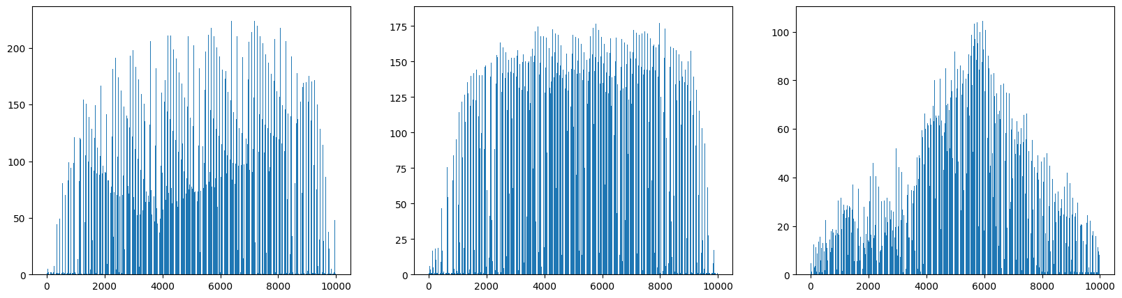
각 군집에서 일정한 형태를 띄고 있는 모습을 확인할 수 있다.
apple_mean = np.mean(apple, axis=0).reshape(100, 100)
pineapple_mean = np.mean(pineapple, axis=0).reshape(100, 100)
banana_mean = np.mean(banana, axis=0).reshape(100, 100)
fig, axs = plt.subplots(1, 3, figsize=(20, 5))
axs[0].imshow(apple_mean, cmap='gray_r')
axs[1].imshow(pineapple_mean, cmap='gray_r')
axs[2].imshow(banana_mean, cmap='gray_r')
plt.show()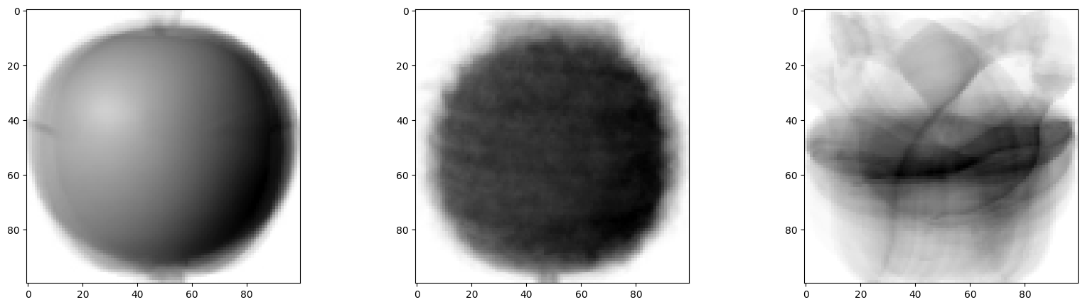
100x100 크기로 이미지처럼 출력
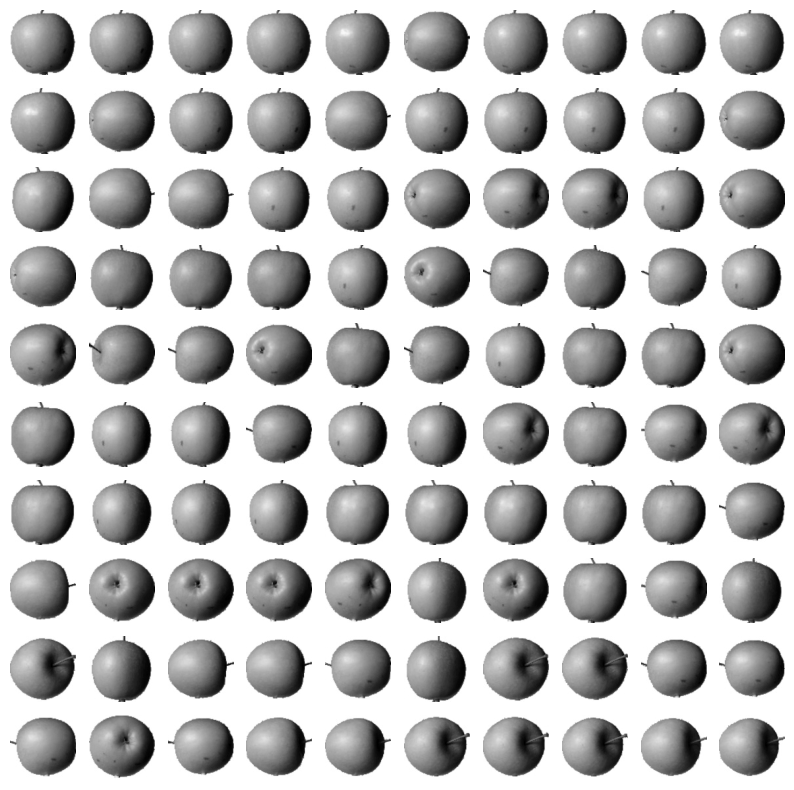
평균값과 가까운 사진 고르기
사과의 평균 이미지와 다른 샘플의 절대값 차이의 평균을 계산하여, 사과와 가장 유사한 샘플을 찾는다. 이를 통해 특정 클러스터에 속할 가능성이 높은 이미지를 찾을 수 있다.
# apple 평균을 값을 뺀 절대값의 평균
abs_diff = np.abs(fruits - apple_mean)
abs_mean = np.mean(abs_diff, axis=(1,2))
print(abs_mean.shape)

# 작은 순서대로 100개 고르기
apple_index = np.argsort(abs_mean)[:100] #작은 순서대로 나열
fig, axs = plt.subplots(10, 10, figsize=(10,10))
for i in range(10):
  for j in range(10):
    axs[i, j].imshow(fruits[apple_index[i*10 + j]], cmap='gray_r')
    axs[i, j].axis('off') #좌표축 그리지 않음
plt.show()