display
<!DOCTYPE html>
<html>
<head>
<meta charset="utf-8">
<meta name="viewport" content="width=device-width">
<title>JS Bin</title>
<style>
div, span {
width: 80px;
height: 80px;
margin: 20px;
}
div{
background: pink;
}
span {
background: skyblue;
}
</style>
</head>
<body>
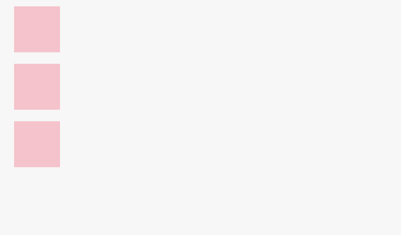
<!-- Block-level -->
<div></div>
<div></div>
<div></div>
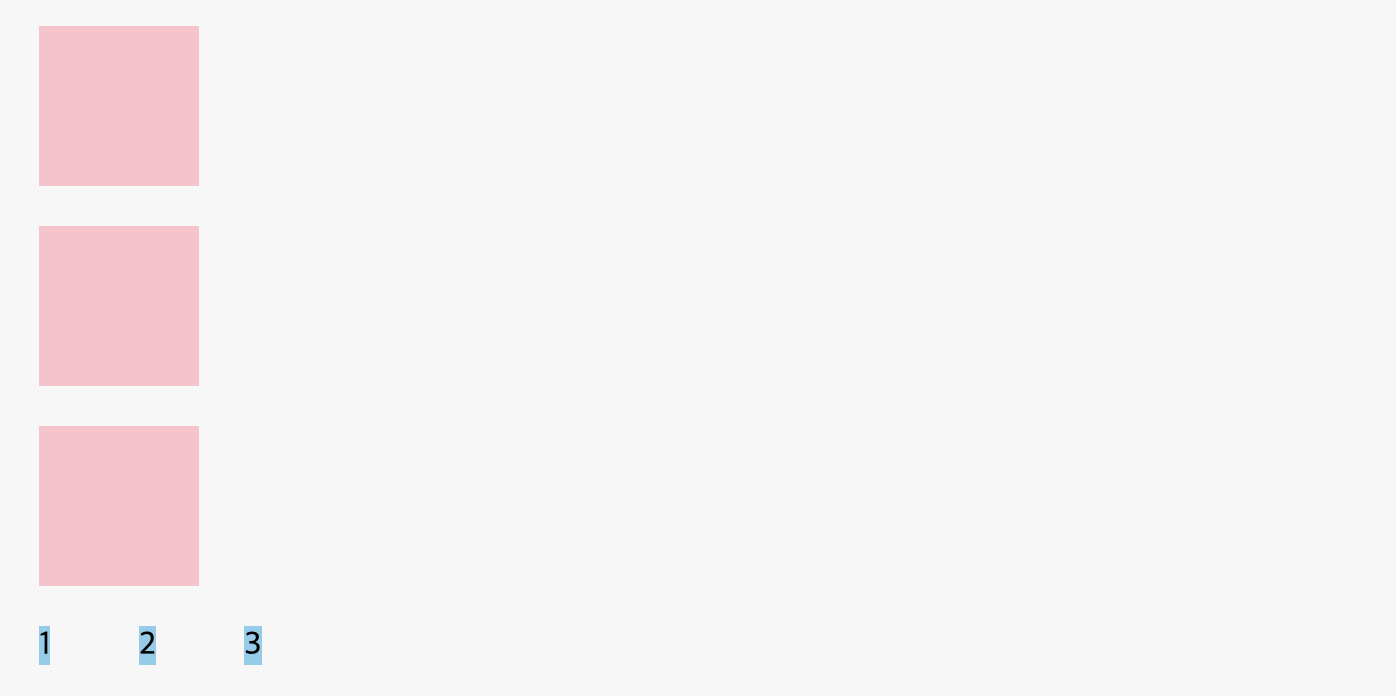
<!-- Inline-level -->
<span>1</span>
<span>2</span>
<span>3</span>
</body>
</html>div
div는 기본적으로 Block level이기 때문에 한 줄에 하나만 나온다.
span
span은 Inline level이기 때문에 공간이 많으면 한 줄에 여러개가 나온다.- 왜냐하면
span은 안에 내용이 있어야 출력이 된다.
→ 그러나 이 기본값(Block 또는 Inline)은 CSS를 통해 변경이 가능하다.
<!DOCTYPE html>
<html>
<head>
<meta charset="utf-8">
<meta name="viewport" content="width=device-width">
<title>JS Bin</title>
<style>
div, span {
width: 80px;
height: 80px;
margin: 20px;
}
div{
background: pink;
display: inline;
}
span {
background: skyblue;
display: block;
}
</style>
</head>
<body>
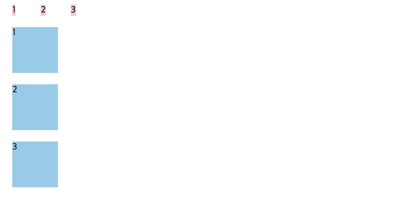
<!-- Block-level -->
<div>1</div>
<div>2</div>
<div>3</div>
<!-- Inline-level -->
<span>1</span>
<span>2</span>
<span>3</span>
</body>
</html>inline-block
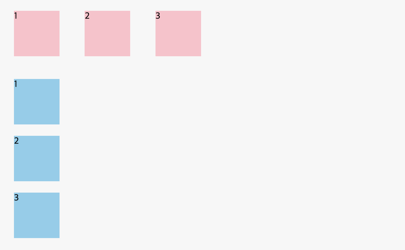
inline-block은 상자이긴 한데 한 줄에 여러개가 진열될 수 있는 특별한 상자이다.(block은 한 줄에 하나만 나온다.)
<!DOCTYPE html>
<html>
<head>
  <meta charset="utf-8">
  <meta name="viewport" content="width=device-width">
  <title>JS Bin</title>
  <style>
    div, span {
  width: 80px;
  height: 80px;
  margin: 20px;
}
    div{
      background: pink;
      display: inline-block;
    }
    span {
      background: skyblue;
      display: block;
    }
  </style>
</head>
<body>
<!-- Block-level -->
  <div>1</div>
  <div>2</div>
  <div>3</div>
<!-- Inline-level -->
  <span>1</span>
  <span>2</span>
  <span>3</span>
</body>
</html>
position
position: static;
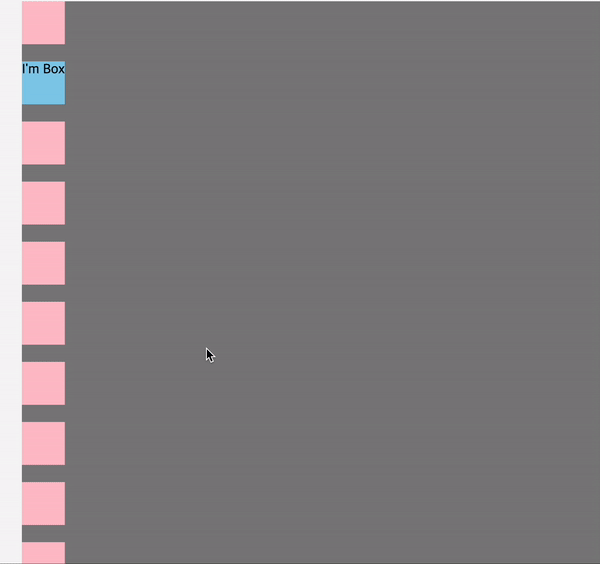
- container의 위치를 바꾸기 위해서는 position에 특정한 값을 입력해야 한다. left, top 등 위치만 입력하고 position에 아무런 값을 입력하지 않으면 container의 위치는 변경되지 않는다. position은 기본값으로 static를 가지고 있다. static은 HTML에 정의된 순서대로 브라우저에 자연스럽게 보여지는 것을 말한다.
<!DOCTYPE html>
<html>
<head>
<meta charset="utf-8">
<meta name="viewport" content="width=device-width">
<title>JS Bin</title>
<style>
div {
width: 50px;
height: 50px;
margin-bottom: 20px;
background: pink;
}
.container {
background: #D3D3D3
left: 20px;
top: 20px;
}
.box {
background: skyblue;
}
</style>
</head>
<body>
<article class="container">
<div></div>
<div class="box">I'm Box</div>
<div></div>
<div></div>
<div></div>
<div></div>
<div></div>
<div></div>
<div></div>
<div></div>
<div></div>
<div></div>
<div></div>
</body>
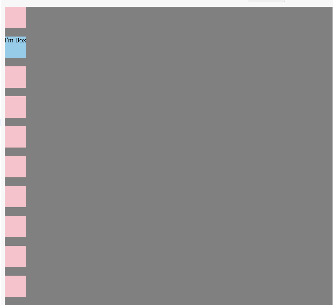
</html>position: relative;
.container,.box의 위치가 위쪽과 왼쪽에서 20px씩 이동했다. 이것을 통해 relative는 원래 있어야 할 위치에서 옮겨진다는 것을 알 수 있다.
<!DOCTYPE html>
<html>
<head>
<meta charset="utf-8">
<meta name="viewport" content="width=device-width">
<title>JS Bin</title>
<style>
div {
width: 50px;
height: 50px;
margin-bottom: 20px;
background: pink;
}
.container {
background: gray;
left: 20px;
top: 20px;
position: relative;
}
.box {
background: skyblue;
left: 20px;
top: 20px;
position: relative;
}
</style>
</head>
<body>
<article class="container">
<div></div>
<div class="box">I'm Box</div>
<div></div>
<div></div>
<div></div>
<div></div>
<div></div>
<div></div>
<div></div>
<div></div>
<div></div>
<div></div>
<div></div>
</body>
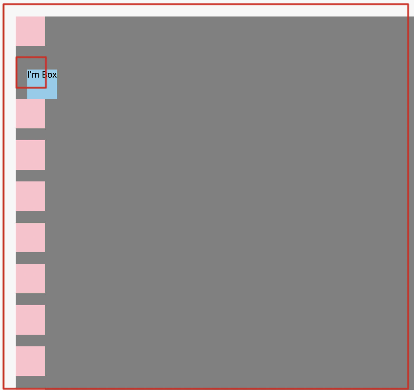
</html>position: absolute;
absolute의 경우 내 아이템이 담겨 있는 박스를 기준으로 위치가 변경되는 것을 말한다.(여기서는.container가 기준이다.)
<!DOCTYPE html>
<html>
<head>
<meta charset="utf-8">
<meta name="viewport" content="width=device-width">
<title>JS Bin</title>
<style>
div {
width: 50px;
height: 50px;
margin-bottom: 20px;
background: pink;
}
.container {
background: gray;
left: 20px;
top: 20px;
position: relative;
}
.box {
background: skyblue;
left: 20px;
top: 20px;
position: absolute;
}
</style>
</head>
<body>
<article class="container">
<div></div>
<div class="box">I'm Box</div>
<div></div>
<div></div>
<div></div>
<div></div>
<div></div>
<div></div>
<div></div>
<div></div>
<div></div>
<div></div>
<div></div>
</body>
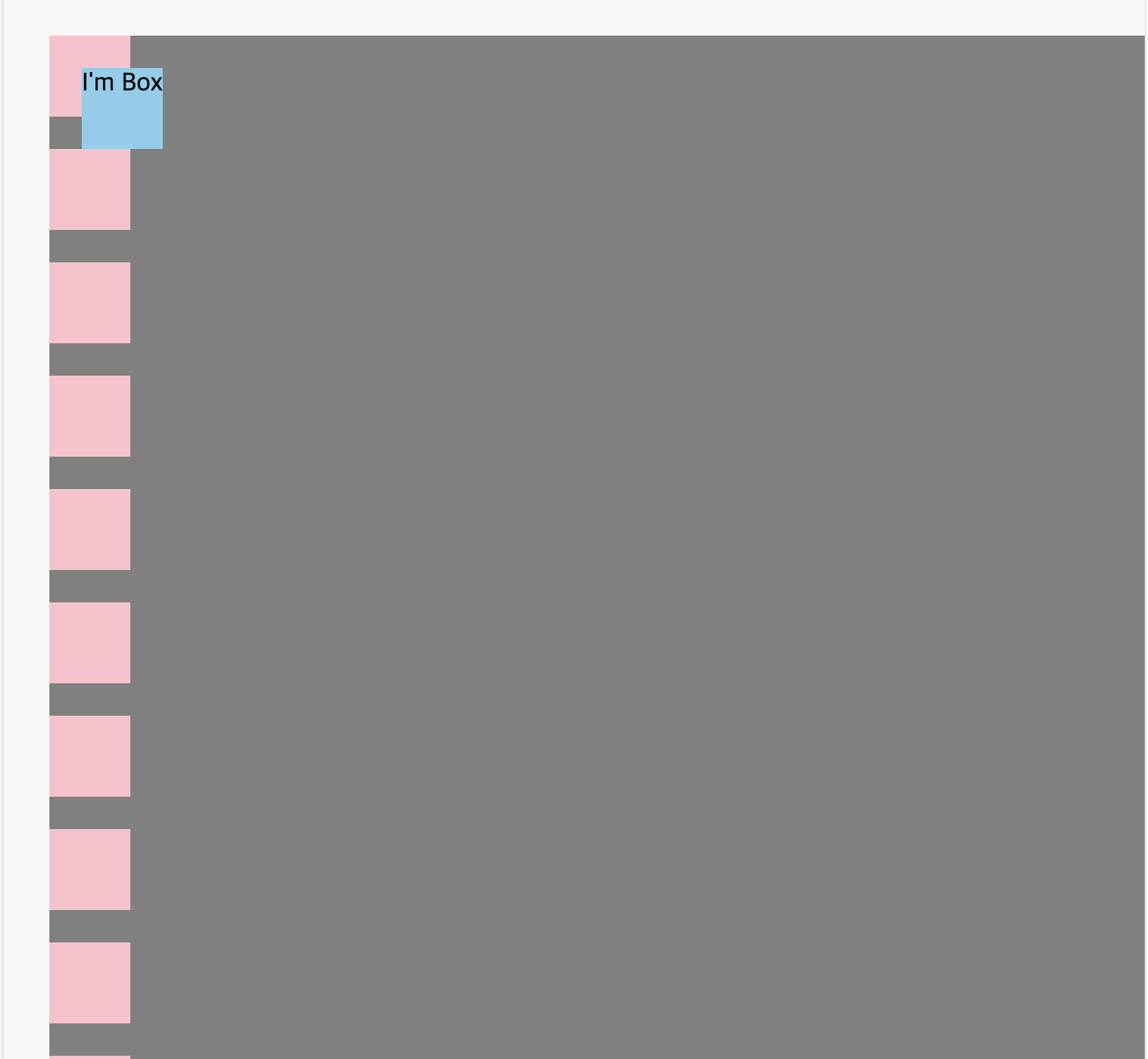
</html>position: fixed;
fixed는 상자에서 벗어나서 해당 웹 페이지를 기준으로 위치가 변경된다.
<!DOCTYPE html>
<html>
<head>
<meta charset="utf-8">
<meta name="viewport" content="width=device-width">
<title>JS Bin</title>
<style>
div {
width: 50px;
height: 50px;
margin-bottom: 20px;
background: pink;
}
.container {
background: gray;
left: 20px;
top: 20px;
position: relative;
}
.box {
background: skyblue;
left: 20px;
top: 20px;
position: fixed;
}
</style>
</head>
<body>
<article class="container">
<div></div>
<div class="box">I'm Box</div>
<div></div>
<div></div>
<div></div>
<div></div>
<div></div>
<div></div>
<div></div>
<div></div>
<div></div>
<div></div>
<div></div>
</body>
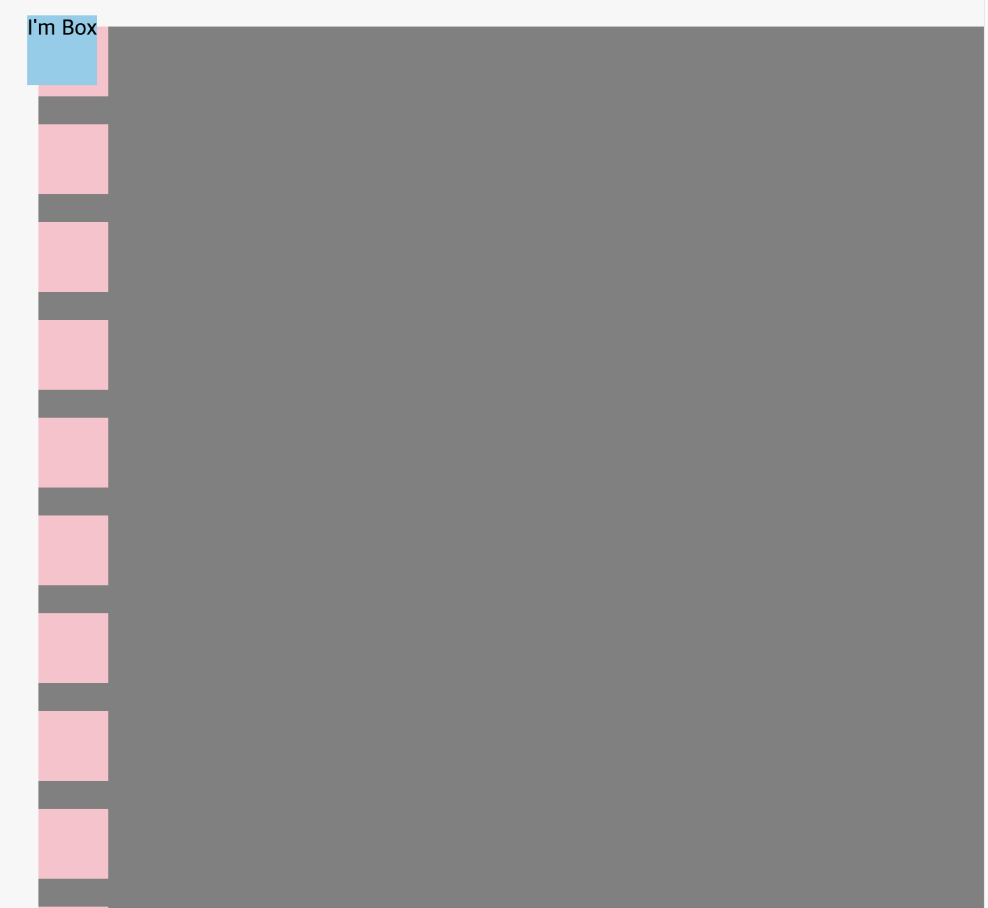
</html>position: sticky;
sticky는 원래 있어야 할 자리에 있으면서 스크롤을 해도 없어지지 않는다.
<!DOCTYPE html>
<html>
<head>
  <meta charset="utf-8">
  <meta name="viewport" content="width=device-width">
  <title>JS Bin</title>
  <style>
    div {
      width: 50px;
      height: 50px;
      margin-bottom: 20px;
      background: pink;
    }

    .container {
      background: gray;
      left: 20px;
      top: 20px;
      position: relative;
    }

    .box {
      background: skyblue;
      left: 20px;
      top: 20px;
      position: sticky;
    }

  </style>
</head>
<body>
  <article class="container">
  <div></div>
  <div class="box">I'm Box</div>
  <div></div>
  <div></div>
  <div></div>
  <div></div>
  <div></div>
  <div></div>
  <div></div>
  <div></div>
  <div></div>
  <div></div>
  <div></div>
  <div></div>
  <div></div>
  <div></div>
  <div></div>
  <div></div>
  <div></div>
  <div></div>
  <div></div>
  <div></div>
</body>
</html>