1 Seaborn
import seaborn as sns- matplotlib은 파이썬 핵심 시각화 도구. seaborn은 matplotlib 기반을 둔 통계 그래프 특화 라이브러리.
판다스, 넘파이 같이 데이터 분석에 자주 쓰는 라이브러리와 호환되어 쉽게 데이터 시각화. - https://seaborn.pydata.org/examples/index.html
sns.load_dataset('anscombe'): seaborn에서 제공하는 이미 만들어진 데이터셋 예제 들고오기. 데이터프레임으로 들고온다.
여기서 anscombe는 평균, 분산, 상관관계, 회귀선 모두 같지만 모양 다른, 통계학자가 일부러 이렇게 만들어놓은 데이터.
이 외에도 'tips' 등 다양한 데이터 있음.- https://velog.io/@imindude/%ED%8C%8C%EC%9D%B4%EC%8D%AC-seaborn-%EB%AA%A8%EB%93%88%EC%9D%98-color-palette 컬러 팔레트
- seaborn 데이터 https://seaborn.pydata.org/examples/index.html
2 일변량 그래프
2-1 히스토그램
hist, ax1 = plt.subplots()
sns.histplot(data=tips, x='total_bill', ax=ax1)
plt.show()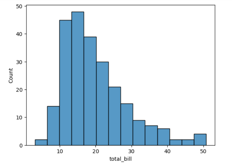
- hist는 figure, ax1는 subplot을 각각 할당.
- data는 사용하는 데이터프레임, x는 x축에 사용할 시리즈.
- ax= subplot을 뜻하고, ax=ax1는 기존의 subplot객체를 subplot으로 지정한 것. 지정 안하면 자체적으로 subplot 생성하려고 시도.
2-2 밀도 그래프
den, ax1 = plt.subplots()
sns.kdeplot(data=tips, x='total_bill', ax=ax1)
plt.show()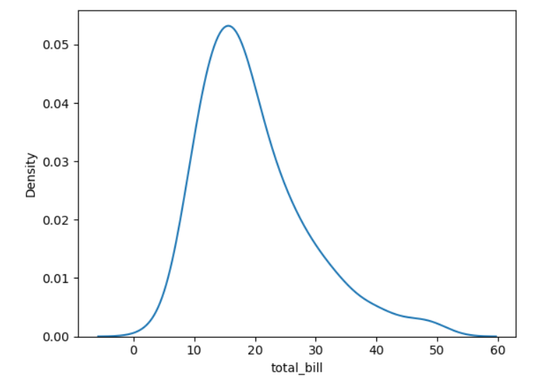
- 커널 밀도 추정(kernel density estimation, KDE) 그래프.
히스토그램과 같이 일변량 분포 시각화.
주어진 데이터셋의 확률 밀도 함수(PDF, Probability Density Function)을 추정하는 비모수적(non-parametric) 방법 중 하나.
각 데이터 포인트 주변에 커널함수(정규 분포) 적용해서, 데이터 포인트 주변의 확률 밀도 추정. 곡선 아래 넓이가 1이 되도록, 데이터를 부드럽게 근사.
=> 데이터 분포를 히스토그램보다 더 부드럽게 추정해 데이터가 어디 집중되어 있는지 시각화.
2-3 러그 그래프
fig, ax1 = plt.subplots()
sns.rugplot(data=tips, x='total_bill', ax=ax1)
sns.histplot(data=tips, x='total_bill', ax=ax1)
plt.show()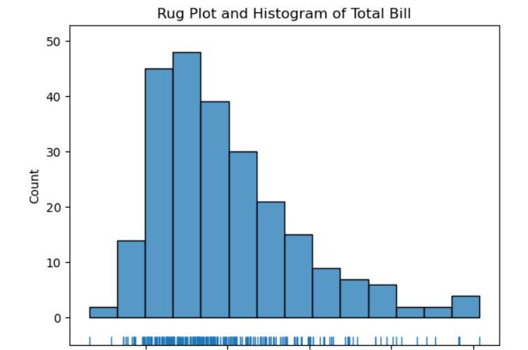
- 주어진 데이터를 축 위에 작은 직성 형태의 털(rug)로 나타낸다. 주로 밀도 그래프, 히스토그램과 함께 사용.
2-4 한거번에 그리기
fig = sns.displot(data=tips, x='total_bill', kde=True, rug=True)
fig.set_axis_labels(x_var='Total Bill', y_var='Count')
plt.show()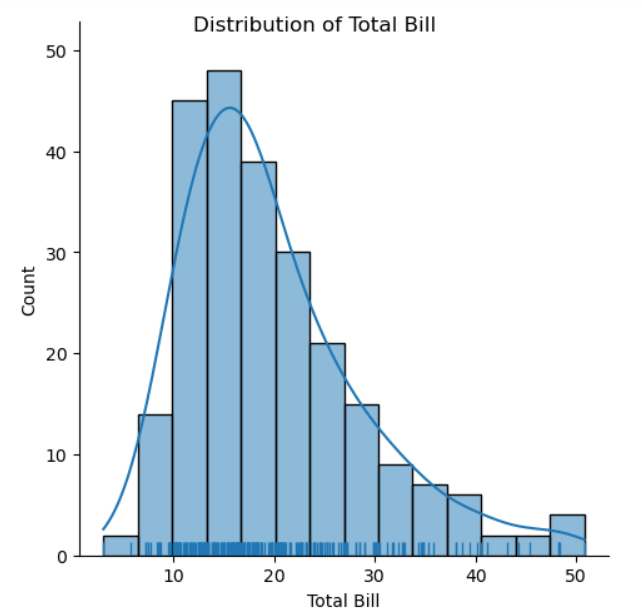
- kde=True, rug=True로 하면 같이 그려짐.
- set_axis_labels는 x, y를 각각 한거번에 설정.
2-5 막대그래프 그리기
count, ax1 = plt.subplots()
sns.countplot(data=tips, x='day', palette='viridis', ax=ax1)
plt.show()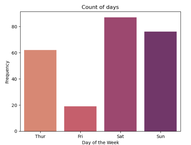
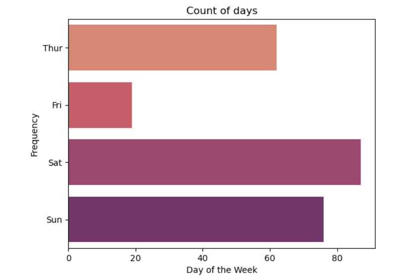
- palette는 지정 안하면 디폴트 종류로 나옴. 칼라표에서 집어넣는 것.
- https://seaborn.pydata.org/generated/seaborn.color_palette.html
- x말고 y로 하면 가로 그래프가 됨.
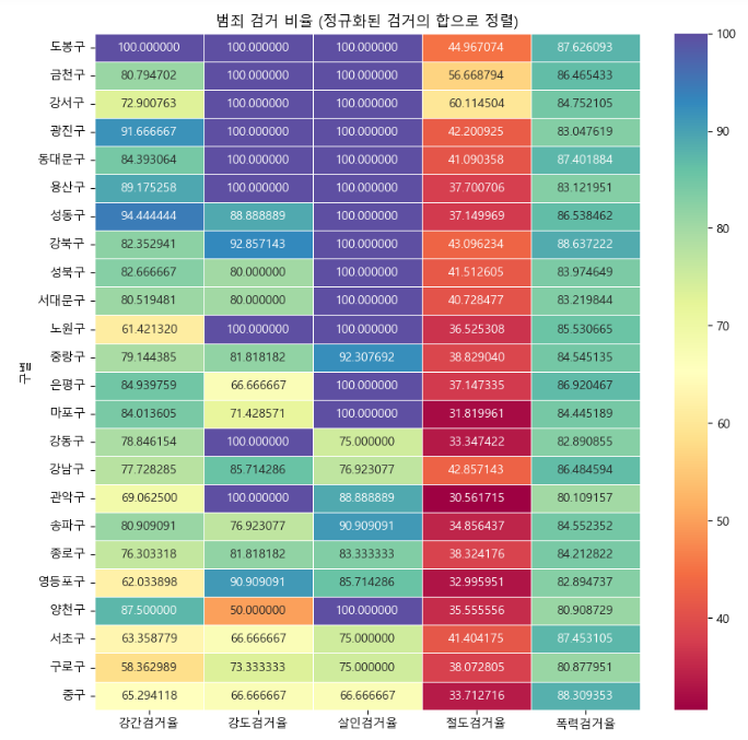
2-6 히트맵 그래프
crime_anal_norm_sort = crime_anal_norm.sort_values(by='검거', ascending=False)

plt.figure(figsize = (10,10))
sns.heatmap(crime_anal_norm_sort[target_col], annot=True, fmt='f',
                    linewidths=.5, cmap='Spectral') #색만 조금 다르게 설정
plt.title('범죄 검거 비율 (정규화된 검거의 합으로 정렬)')
plt.show()sns.heatmap(): 히트맵 형태로 시각화. 데이터의 값에 따라 색상의 강도를 다르게 해서 데이터 패턴이나 변화를 보여줌.
- 매개변수
-annot=True: 각 셀에 데이터값 표시.
-fmt=f: annot의 데이터값을 어떻게 표기할지. f는 고정 소수점 형식.
-linewidths=.5: 셀간 경계선 너비.
-cmap=: 히트맵에 사용할 컬러맵.
3 이변량 그래프
3-1 산점도 그래프
- 주요 차이점은 생성하는 객체. 1 Axes 객체, 2 FacetGrid 객체 생성하는 방법으로 나뉨.
(1) 방법 1: ax1의 데이터타입: axes.
scatter, ax1 = plt.subplots()
sns.scatterplot(data=tips, x='total_bill', y='tip', ax=ax1)
plt.show()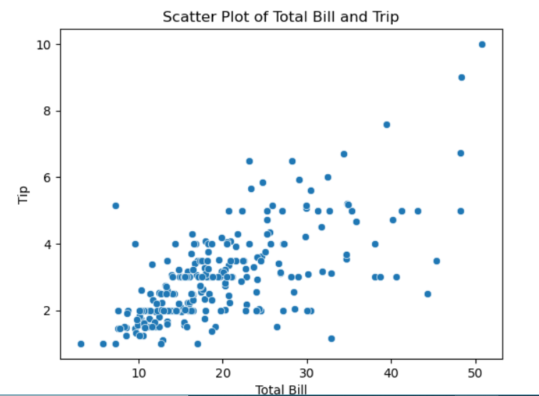
(2) 방법 2: regression(회귀선)이 같이 찍힘. 이게 더 포괄적인 그래프 그리기 함수. ax1의 데이터타입: axes.
fig, ax1 = plt.subplots()
sns.regplot(data=tips, x='total_bill', y='tip', ax=ax1)
plt.show()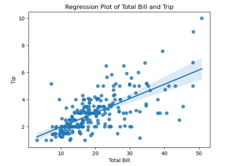
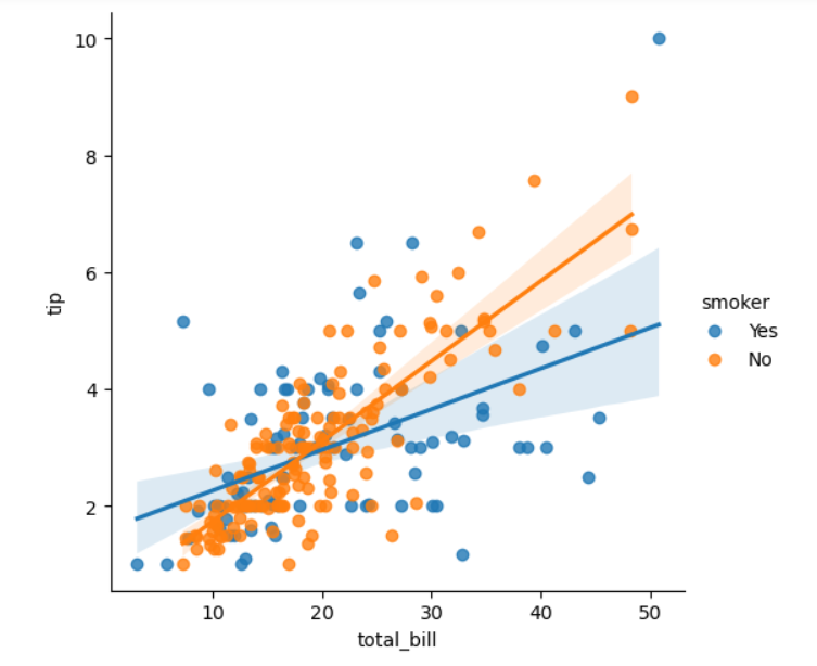
(3) 방법3: 이것도 회귀선 같이 찍힌다. 이 경우 col='sex'로 하면, 성별로 따로 그래프 찍힌다. hue='smoker'로 하면 흡연자 색깔로 구분해서 찍는다. 없으면 그냥 전체로. fig의 데이터타입: FacetGrid.
fig = sns.lmplot(data=tips, x='total_bill', y='tip', col='sex', hue='smoker')
plt.show()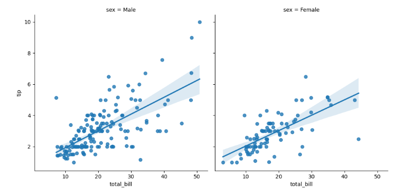
3-1-1 조인트 그래프
joint = sns.jointplot(data=tips, x='total_bill', y='tip')
joint.set_axis_labels(xlabel='Total Bill', ylabel='Tip')
joint.figure.suptitle('Joint Plot of Total Bill and Tip', y=1.03) # y는 타이틀 위치 y축
plt.show()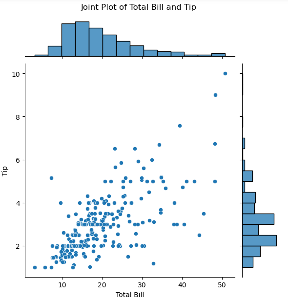
3-1-2 육각 그래프
hexbin = sns.jointplot(data=tips, x='total_bill', y='tip', kind='hex')
hexbin.set_axis_labels(xlabel='Total Bill', ylabel='Tip')
hexbin.figure.suptitle('Hexbin Plot of Total Bill and Tip', y=1.03)
plt.show()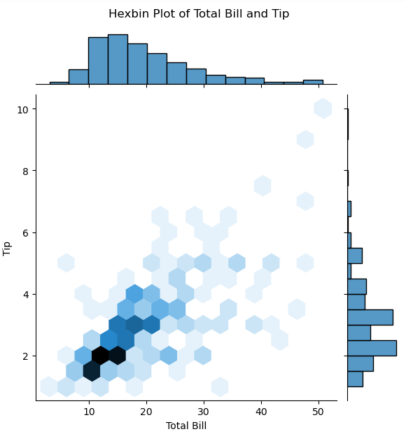
- 위에서 jointplot에 매개변수 kind='hex'만 지정
- 산점도 그래프는 2개 변수 비교할 떄 유용. 표시 데이터 너무 많으면 그래프 복잡해짐. => 육각 그래프는 두 변수의 값을 나타내는 점을 구간 별로 묶어서 표현.
3-2 밀도 그래프
kde, ax1 = plt.subplots()
sns.kdeplot(data=tips, x='total_bill', y='tip', fill=True, ax=ax1)
plt.show()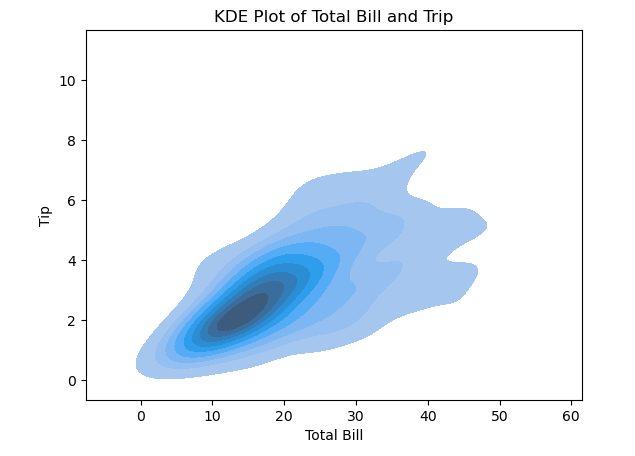
- fill=True로 음영 효과 넣는다.
- 일변량과 다른 건 2개의 변수 넣는다는 거
3-2-1 조인트 그래프
kde2d = sns.jointplot(data=tips, x='total_bill', y='tip', kind='kde')
kde2d.set_axis_labels(xlabel='Total Bill', ylabel='Tip')
kde2d.figure.suptitle('KDE Plot of Total Bill and Tip', y=1.03)
plt.show()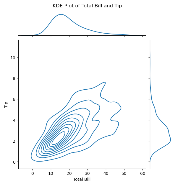
- 위의 조인트 그래프에서 kind='kde'로만 수정.
3-3 막대 그래프
fig, ax1 = plt.subplots()
sns.barplot(data=tips, x='time', y='total_bill', estimator=np.mean, ci=95, ax=ax1)
plt.show()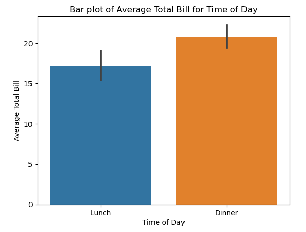
- estimator는 설정 안하면 그냥 평균으로. 여기서는 numpy의 평균 적용(연산 방법 조금씩 다를 수 있다)
- ci는 신뢰구간 설정.
- 막대 그래프 위에 있는 선은 신뢰구간 표현.
order=['young', 'middle', 'old']이렇게 매개변수로 값의 순서를 지정할 수도 있다.
3-4 박스 그래프
fig, ax1 = plt.subplots()
sns.boxplot(data=tips, x='time', y='total_bill', ax=ax1)
plt.show()- 박스 그래프는 최솟값, 1사분위수, 중앙값, 3사분위수, 최댓값, 이상값 등 다양한 통계량을 한 번에 표현.
- 매개변수 y는 생략 가능. => 일변량 그래프로 표현. 여기서 생략하려면, total_bill을 x에 넣고, time 없애고.
- 주요 매개변수(여기선 y)는 반드시 숫자형 변수를 지정해야 한다
- x, y를 바꾸면 가로로 됨.
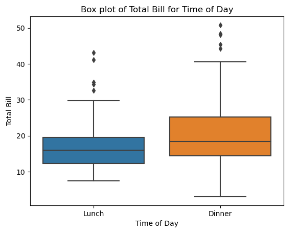
hue, col(?)
3-4-1 바이올린 그래프
fig, ax1 = plt.subplots()
sns.violinplot(data=tips, x='time', y='total_bill', ax=ax1)
plt.show()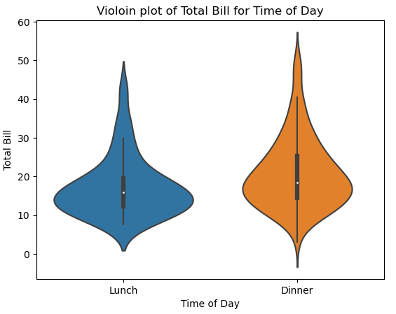
- 바이올린 모양으로 어디 분포가 몰려있는지 보여줌
4 한거번에 여러 그래프 그리기
4-1
box_violin, (ax1, ax2) = plt.subplots(nrows=1, ncols=2)
sns.boxplot(data=tips, x='time', y='total_bill', ax=ax1)
sns.violinplot(data=tips, x='time', y='total_bill', ax=ax2)

ax1.set_title('Box Plot')
ax1.set_xlabel('Time of Day')
ax1.set_ylabel('Total Bill')

ax2.set_title('Violoin plot')
ax2.set_xlabel('Time of Day')
ax2.set_ylabel('Total Bill')

box_violin.suptitle('Comparison of Box Plot with Violin Plot')
box_violin.set_tight_layout(True)

plt.show()- subplot을 여러 개로 그리기.
- #box_violin, ax => ax[0], ax[1]로 인덱싱으로 해도 가능.
- 3개 이상이어도 가능.
4-2 PairGrid
pair_grid = sns.PairGrid(tips, diag_sharey=False)
pair_grid = pair_grid.map_upper(sns.regplot)
pair_grid = pair_grid.map_lower(sns.kdeplot)
pair_grid = pair_grid.map_diag(sns.histplot)
plt.show()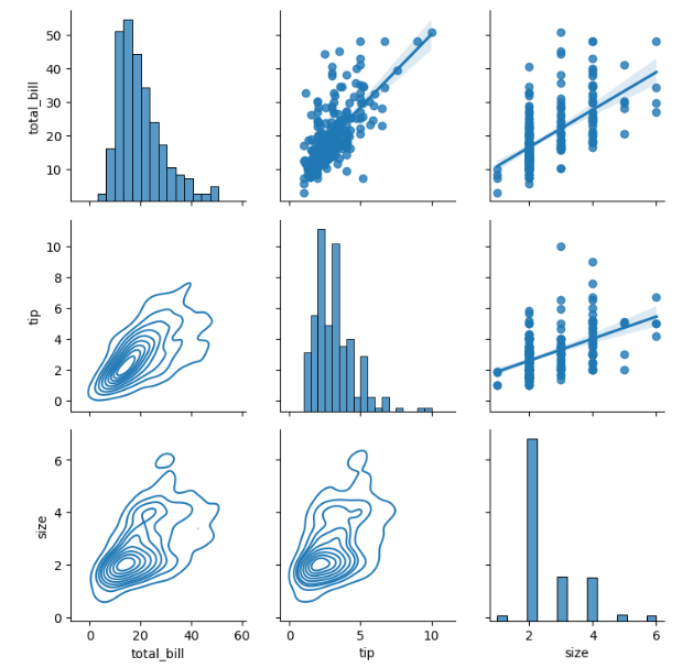
- 일단 tips에는 숫자로 된 컬럼이 총 3개 있다. total_bill, tip, size
- 이 3가지가 각각 x와 y에 생기면서 그 조합으로 나오는 9개의 그래프를 그린다
diag는 대각선 부분인데, 이 부분은 같은 변수끼리의 조합이다. 따라서 단변수 그래프인 히스토그램을 그린다.upper은 상삼각 부분이고, 여기는 산포도, 회귀선 그래프를 그린다lower은 하삼각 부분이고, 여기는 kde 그래프를 그린다.diag_sharey=False이건, 각각의 서브플롯 y축이 자체적인 범위를 가지도록 설정하는 것. 이걸 True로 하면 9개의 서브플롯 y축의 범위가 모두 같아진다.
4-2-1 Pairplot
fig = sns.pairplot(data=tips)
fig.figure.suptitle('Pairwise Relationships of the Tips Data', y=1.03)
plt.show()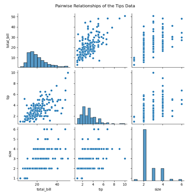
- 이건 pairgrid의 간단 버전
- 대각선 부분은 단변수로 히스토그램, 그 외의 부분은 산포도로 나온다. 상삼각과 하삼각은 똑같은 내용이지만 x, y축이 반전되어 있다.
kind=로 지정할 수 있다. reg(산점도, 선형회귀선 함께), scatter(산점도), kde(커널 밀도 추정), hist(히스토그램)- fig.figure.suptitle인 이유 =>
fig은 pairplot 객체로 suptitle없다
fig.figure 해야 figure 객체
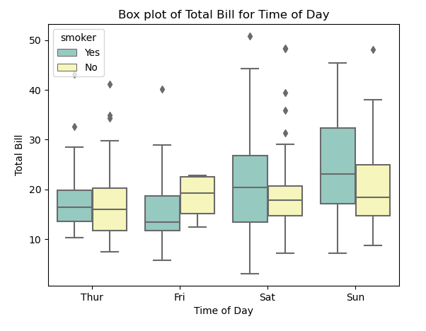
5 그래프 색상 입히기
fig, ax1 = plt.subplots()
sns.violinplot(data=tips,
              x='time',
              y='total_bill',
              hue='smoker',
              split=True,
              palette='viridis',
              ax=ax1)
plt.show()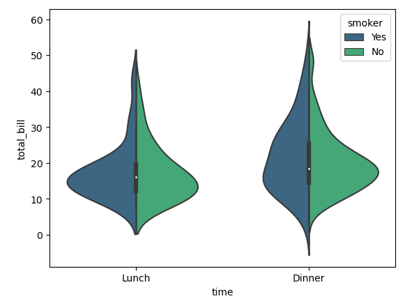
- 여기서 색상 부분은 palette로 지정색깔을 설정한 부분.
- 그리고 hue=smoker은 흡연 여부로 자료를 나누는 거고, split은 False면 2개로 각각 보여주고, True면 1개를 2개로 나눠서 보여준다.
fig = sns.pairplot(tips, hue='time', palette='viridis')
plt.show()- 이렇게 hue로 하면 time별로 색깔이 다르게 나오고, palette는 그 색깔 지정 가능.
6 관련 메서드
barplot().set(): seaborn, matplotlib에서 그래프의 여러 속성을 한 번에 설정하는 메서드.- xlim과 ylim: 이는 각각 x축과 y축의 한계를 설정합니다. 예를 들어, xlim=[0, 800]은 x축의 범위를 0부터 800까지로 설정합니다.
- xlabel과 ylabel: x축과 y축에 레이블(설명 텍스트)을 설정합니다.
- title: 그래프의 제목을 설정합니다.
- xticks와 yticks: x축과 y축에 표시될 눈금의 위치를 설정합니다.
- xticklabels와 yticklabels: x축과 y축 눈금에 사용할 레이블을 설정합니다. 이는 각 눈금의 이름을 변경할 때 유용합니다.
- fontsize 또는 size: 텍스트의 크기를 설정합니다.
- color: 텍스트의 색상을 설정합니다.
colors = sns.color_palette('Paired',len(data_result.index)): sns에 있는 컬러 팔레트를 생성하는 함수. Paired는 색상 이름, len()부분은 생성할 색깔 갯수. 여기서는 index개수만큼 생성한다는 뜻. 왜냐하면 plt에서 c 매개변수로 색상을 지정할 때, 색상의 리스트가 들어가면, 그건 데이터포인트수와 갯수가 동일해야 하기 때문.

일본에서 일하는 게임 기획자. 시시해서 죽어버리지 않게, 재밌고 의미 있는 컨텐츠에 관심 있습니다. 그 도구로 데이터, AI도 찝적댑니다.