
Display 란
Display란 본래 두 개 이상의 작품 등을 어떤 목적으로 진열하여 보여주는 것을 말하며, 전시라고도 불린다.
CSS에서의 Display에서도 마찬가지이다.
Display 속성
| 속성 | 설명 |
|---|---|
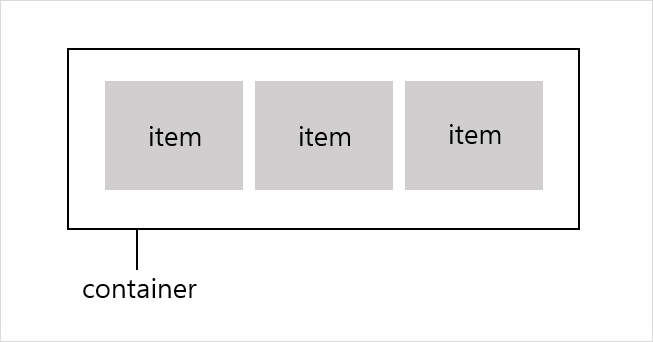
| flex | block 속성으로 container을 정의하며 flex를 적용해야만 flex, flex-direction, align-items, flex-wrap을 적용 가능 |
| flex-direction | 정렬의 방향을 결정 |
| justify-content | 수평방향으로 여백을 두는 방식 |
| align-items | 수직 방향으로 여백을 두는 방식 |
Display 적용
처음 Display를 작성하기 전 아래와 같이 작성해두었다.
<!DOCTYPE html>
<html lang="en">
<head>
    <meta charset="UTF-8">
    <meta name="viewport" content="width=device-width, initial-scale=1.0">
    <meta http-equiv="X-UA-Compatible" content="ie=edge">
    <title>display</title>

    <style>
        .box{}
        .first{
            background-color: red;
            width: 100px;
            height: 100px;
        }
        .second{
            background-color: orange;
            width: 100px;
            height: 100px;
        }
        .third{
            background-color: yellow;
            width: 100px;
            height: 100px;
        }
        .four{
            background-color: green;
            width: 100px;
            height: 100px;
        }
    </style>

</head>
<body>

    <div class="box">
        <div class="first"></div>
        <div class="second"></div>
        <div class="third"></div>
        <div class="four"></div>
    </div>

</body>
</html>
1. Display:flex
| 속성 | 설명 |
|---|---|
| flex | block과 같은 성향으로 container이 수직으로 쌓인다. |
| inline-flex | inline과 같은 성향으로 container이 수평으로 쌓인다. |
1) Display:flex
container이 수직으로 쌓이는 것을 볼 수 있다.
<!DOCTYPE html>
<html lang="en">
<head>
    <meta charset="UTF-8">
    <meta name="viewport" content="width=device-width, initial-scale=1.0">
    <meta http-equiv="X-UA-Compatible" content="ie=edge">
    <title>flex</title>

    <style>
        .box1{
            display: flex;
        }
        .box2{
            display: flex;
            margin-top: 10px;
        }
        .first{
            background-color: red;
            width: 100px;
            height: 100px;
        }
        .second{
            background-color: orange;
            width: 100px;
            height: 100px;
        }
        .third{
            background-color: yellow;
            width: 100px;
            height: 100px;
        }
        .four{
            background-color: green;
            width: 100px;
            height: 100px;
        }
    </style>

</head>
<body>

    <div class="box1">
        <div class="first"></div>
        <div class="second"></div>
        <div class="third"></div>
        <div class="four"></div>
    </div>
    <div class="box2">
        <div class="first"></div>
        <div class="second"></div>
        <div class="third"></div>
        <div class="four"></div>
    </div>

</body>
</html>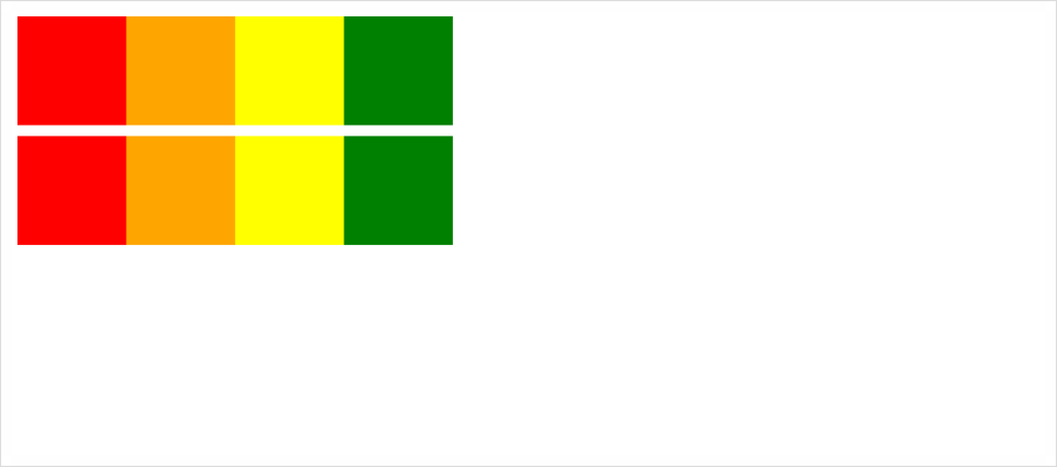
2) Display:inline-flex
container이 수평으로 쌓이는 것을 볼 수 있다.
<!DOCTYPE html>
<html lang="en">
<head>
    <meta charset="UTF-8">
    <meta name="viewport" content="width=device-width, initial-scale=1.0">
    <meta http-equiv="X-UA-Compatible" content="ie=edge">
    <title>inline_flex</title>

    <style>
        .box1{
            display: inline-flex;
        }
        .box2{
            display: inline-flex;
        }
        .first{
            background-color: red;
            width: 100px;
            height: 100px;
        }
        .second{
            background-color: orange;
            width: 100px;
            height: 100px;
        }
        .third{
            background-color: yellow;
            width: 100px;
            height: 100px;
        }
        .four{
            background-color: green;
            width: 100px;
            height: 100px;
        }
    </style>

</head>
<body>

    <div class="box1">
        <div class="first"></div>
        <div class="second"></div>
        <div class="third"></div>
        <div class="four"></div>
    </div>
    <div class="box2">
        <div class="first"></div>
        <div class="second"></div>
        <div class="third"></div>
        <div class="four"></div>
    </div>

</body>
</html>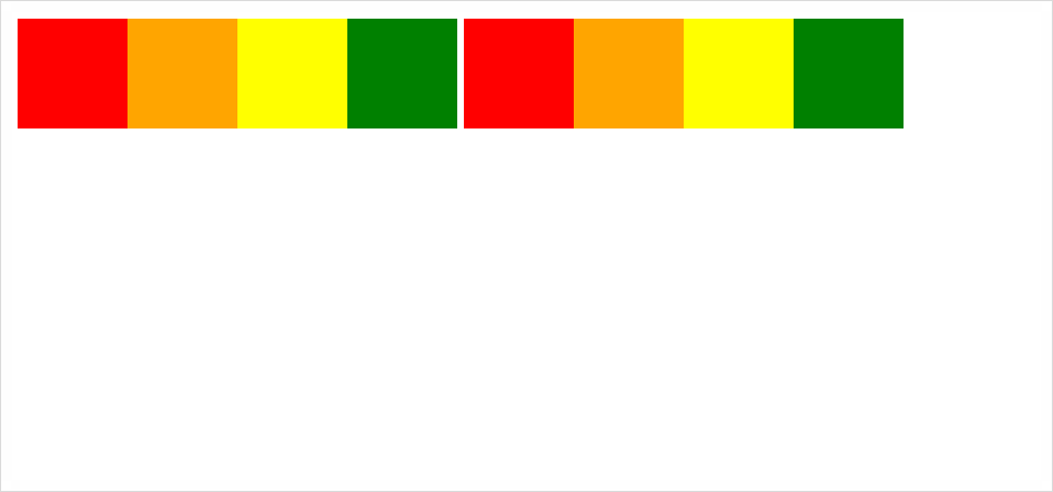
2. Display:flex-direction
| 속성 | 설명 |
|---|---|
| row | item들을 왼쪽에서 오른쪽 방향인 수평축으로 이동 |
| row-reverse | item들을 row의 반대편으로 이동 |
| column | item들을 위쪽에서 아래쪽 방향으로 수직축으로 이동 |
| column-reverse | item들을 column의 반대편으로 이동 |
1) flex-direction:row
item들이 수평축으로 이동한 것을 볼 수 있다.
<!DOCTYPE html>
<html lang="en">
<head>
    <meta charset="UTF-8">
    <meta name="viewport" content="width=device-width, initial-scale=1.0">
    <meta http-equiv="X-UA-Compatible" content="ie=edge">
    <title>flex_direction_row</title>

    <style>
        .box{
            display: block;
            flex-direction: row;
        }
        .first{
            background-color: red;
            width: 100px;
            height: 100px;
        }
        .second{
            background-color: orange;
            width: 100px;
            height: 100px;
        }
        .third{
            background-color: yellow;
            width: 100px;
            height: 100px;
        }
        .four{
            background-color: green;
            width: 100px;
            height: 100px;
        }
    </style>

</head>
<body>

    <div class="box">
        <div class="first"></div>
        <div class="second"></div>
        <div class="third"></div>
        <div class="four"></div>
    </div>

</body>
</html>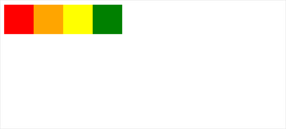
2) flex-direction:row-reverse
item들이 row의 반대편으로 간 것을 확인할 수 있다.
<!DOCTYPE html>
<html lang="en">
<head>
    <meta charset="UTF-8">
    <meta name="viewport" content="width=device-width, initial-scale=1.0">
    <meta http-equiv="X-UA-Compatible" content="ie=edge">
    <title>flex_direction_row_reverse</title>

    <style>
        .box{
            display: flex;
            flex-direction: row-reverse;
        }
        .first{
            background-color: red;
            width: 100px;
            height: 100px;
        }
        .second{
            background-color: orange;
            width: 100px;
            height: 100px;
        }
        .third{
            background-color: yellow;
            width: 100px;
            height: 100px;
        }
        .four{
            background-color: green;
            width: 100px;
            height: 100px;
        }
    </style>

</head>
<body>

    <div class="box">
        <div class="first"></div>
        <div class="second"></div>
        <div class="third"></div>
        <div class="four"></div>
    </div>

</body>
</html>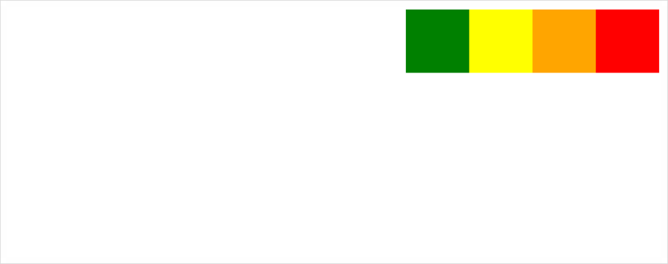
3) flex-direction:column
item들이 수직축으로 이동한 것을 볼 수 있다.
<!DOCTYPE html>
<html lang="en">
<head>
    <meta charset="UTF-8">
    <meta name="viewport" content="width=device-width, initial-scale=1.0">
    <meta http-equiv="X-UA-Compatible" content="ie=edge">
    <title>flex_direction_column</title>

    <style>
        .box{
            display: flex;
            flex-direction: column;
        }
        .first{
            background-color: red;
            width: 100px;
            height: 100px;
        }
        .second{
            background-color: orange;
            width: 100px;
            height: 100px;
        }
        .third{
            background-color: yellow;
            width: 100px;
            height: 100px;
        }
        .four{
            background-color: green;
            width: 100px;
            height: 100px;
        }
    </style>

</head>
<body>

    <div class="box">
        <div class="first"></div>
        <div class="second"></div>
        <div class="third"></div>
        <div class="four"></div>
    </div>

</body>
</html>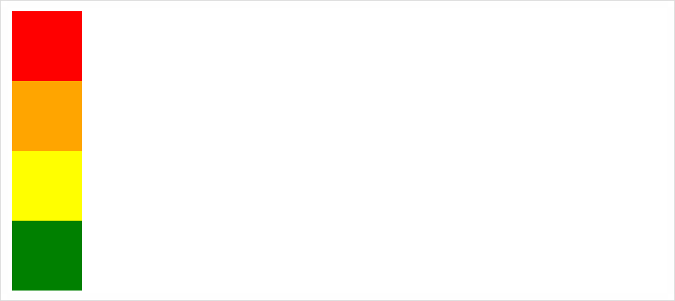
4) flex-direction:column-reverse
item들이 column의 반대편으로 간 것을 확인할 수 있다.
<!DOCTYPE html>
<html lang="en">
<head>
    <meta charset="UTF-8">
    <meta name="viewport" content="width=device-width, initial-scale=1.0">
    <meta http-equiv="X-UA-Compatible" content="ie=edge">
    <title>flex_direction_column_reverse</title>

    <style>
        .box{
            display: flex;
            flex-direction: column-reverse;
            height: 500px;
        }
        .first{
            background-color: red;
            width: 100px;
            height: 100px;
        }
        .second{
            background-color: orange;
            width: 100px;
            height: 100px;
        }
        .third{
            background-color: yellow;
            width: 100px;
            height: 100px;
        }
        .four{
            background-color: green;
            width: 100px;
            height: 100px;
        }
    </style>

</head>
<body>

    <div class="box">
        <div class="first"></div>
        <div class="second"></div>
        <div class="third"></div>
        <div class="four"></div>
    </div>

</body>
</html>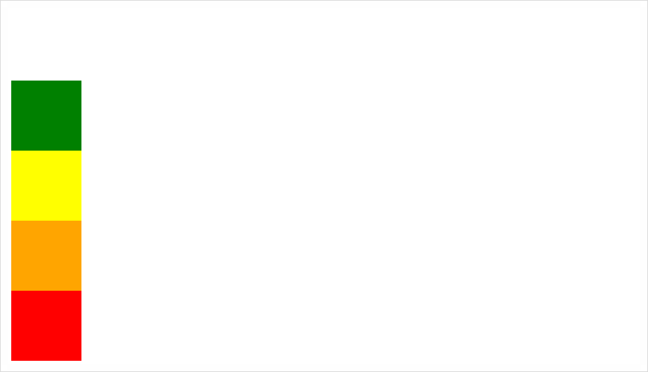
justify-content, align-items 속성들은 CSS Display Flex(2)에서 살펴보자.