
3. justify-content
justify-content는 수평방향으로 여백을 두는 방식이다.
| 속성 | 설명 |
|---|---|
| flex-start | item들을 시작점에서 정렬 |
| flex-end | item들을 끝점으로 정렬 |
| center | item들을 가운데로 정렬 |
| space-between | 맨 처음 item은 시작점에 마지막 item은 끝점에 정렬되며 나머지 item들은 이 사이에 고르게 분포 |
| space-around | item들을 균등한 여백을 포함하여 정렬 |
1) justify-content:flex-start
item들이 시작점에서부터 정렬된다.
<!DOCTYPE html>
<html lang="en">
<head>
   <meta charset="UTF-8">
   <meta name="viewport" content="width=device-width, initial-scale=1.0">
   <meta http-equiv="X-UA-Compatible" content="ie=edge">
   <title>justyfy_content_flex_start</title>

   <style>
       .box{
           display: flex;
           justify-content: flex-start;
       }
       .first{
           background-color: red;
           width: 100px;
           height: 100px;
       }
       .second{
           background-color: orange;
           width: 100px;
           height: 100px;
       }
       .third{
           background-color: yellow;
           width: 100px;
           height: 100px;
       }
       .four{
           background-color: green;
           width: 100px;
           height: 100px;
       }
   </style>

</head>
<body>

   <div class="box">
       <div class="first"></div>
       <div class="second"></div>
       <div class="third"></div>
       <div class="four"></div>
   </div>

</body>
</html>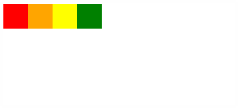
2) justify-content:flex-end
item들이 끝점에서부터 정렬된다.
<!DOCTYPE html>
<html lang="en">
<head>
    <meta charset="UTF-8">
    <meta name="viewport" content="width=device-width, initial-scale=1.0">
    <meta http-equiv="X-UA-Compatible" content="ie=edge">
    <title>justyfy_content_flex_end</title>

    <style>
        .box{
            display: flex;
            justify-content: flex-end;
        }
        .first{
            background-color: red;
            width: 100px;
            height: 100px;
        }
        .second{
            background-color: orange;
            width: 100px;
            height: 100px;
        }
        .third{
            background-color: yellow;
            width: 100px;
            height: 100px;
        }
        .four{
            background-color: green;
            width: 100px;
            height: 100px;
        }
    </style>

</head>
<body>

    <div class="box">
        <div class="first"></div>
        <div class="second"></div>
        <div class="third"></div>
        <div class="four"></div>
    </div>

</body>
</html>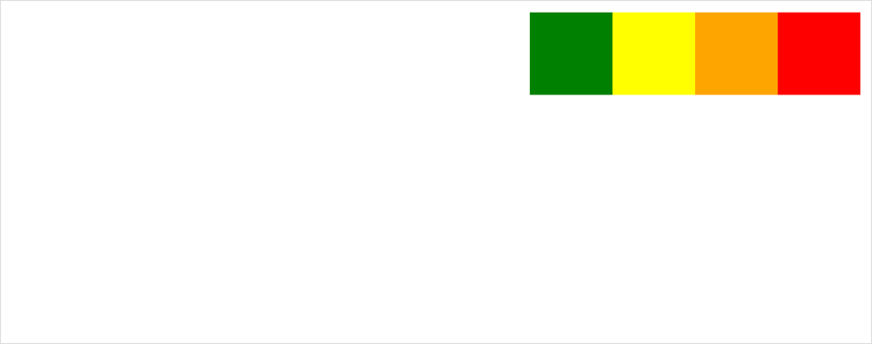
3) justify-content:center
item들이 가운데로 정렬된다.
<!DOCTYPE html>
<html lang="en">
<head>
    <meta charset="UTF-8">
    <meta name="viewport" content="width=device-width, initial-scale=1.0">
    <meta http-equiv="X-UA-Compatible" content="ie=edge">
    <title>justyfy_content_center</title>

    <style>
        .box{
            display: flex;
            justify-content: center;
        }
        .first{
            background-color: red;
            width: 100px;
            height: 100px;
        }
        .second{
            background-color: orange;
            width: 100px;
            height: 100px;
        }
        .third{
            background-color: yellow;
            width: 100px;
            height: 100px;
        }
        .four{
            background-color: green;
            width: 100px;
            height: 100px;
        }
    </style>

</head>
<body>

    <div class="box">
        <div class="first"></div>
        <div class="second"></div>
        <div class="third"></div>
        <div class="four"></div>
    </div>

</body>
</html>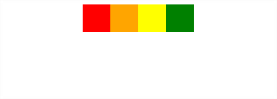
4) justify-content:space-between
맨 처음 item은 시작점에 맨 마지막 item은 끝점에 있으며 나머지 item들은 균등한 배치로 정렬되어있다.
<!DOCTYPE html>
<html lang="en">
<head>
    <meta charset="UTF-8">
    <meta name="viewport" content="width=device-width, initial-scale=1.0">
    <meta http-equiv="X-UA-Compatible" content="ie=edge">
    <title>justyfy_content_space_between</title>

    <style>
        .box{
            display: flex;
            justify-content: space-between;
        }
        .first{
            background-color: red;
            width: 100px;
            height: 100px;
        }
        .second{
            background-color: orange;
            width: 100px;
            height: 100px;
        }
        .third{
            background-color: yellow;
            width: 100px;
            height: 100px;
        }
        .four{
            background-color: green;
            width: 100px;
            height: 100px;
        }
    </style>

</head>
<body>

    <div class="box">
        <div class="first"></div>
        <div class="second"></div>
        <div class="third"></div>
        <div class="four"></div>
    </div>

</body>
</html>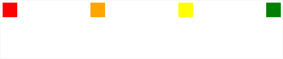
5) justify-content:space-around
item들을 균등한 여백을 포함하여 정리하였다.
<!DOCTYPE html>
<html lang="en">
<head>
    <meta charset="UTF-8">
    <meta name="viewport" content="width=device-width, initial-scale=1.0">
    <meta http-equiv="X-UA-Compatible" content="ie=edge">
    <title>justyfy_content_space_between</title>

    <style>
        .box{
            display: flex;
            justify-content: space-between;
        }
        .first{
            background-color: red;
            width: 100px;
            height: 100px;
        }
        .second{
            background-color: orange;
            width: 100px;
            height: 100px;
        }
        .third{
            background-color: yellow;
            width: 100px;
            height: 100px;
        }
        .four{
            background-color: green;
            width: 100px;
            height: 100px;
        }
    </style>

</head>
<body>

    <div class="box">
        <div class="first"></div>
        <div class="second"></div>
        <div class="third"></div>
        <div class="four"></div>
    </div>

</body>
</html>
4. align-item
align-item은 수직 방향으로 여백을 두는 방식이다.
| 속성 | 설명 |
|---|---|
| flex-start | item들을 각 줄의 시작점으로 정렬 |
| center | item들을 가운데로 정렬 |
| flex-end | item들을 각 줄의 끝점으로 정렬 |
1) align-item:flex-start
item들이 각 줄의 시작점에서부터 정렬되어있다.
<!DOCTYPE html>
<html lang="en">
<head>
    <meta charset="UTF-8">
    <meta name="viewport" content="width=device-width, initial-scale=1.0">
    <meta http-equiv="X-UA-Compatible" content="ie=edge">
    <title>align_item_flex_start</title>

    <style>
        .box{
            display: flex;
            align-items:flex-start;
            height: 400px;
        }
        .first{
            background-color: red;
            width: 100px;
            height: 400px;
        }
        .second{
            background-color: orange;
            width: 300px;
            height: 200px;
        }
        .third{
            background-color: yellow;
            width: 200px;
            height: 300px;
        }
        .four{
            background-color: green;
            width: 400px;
            height: 100px;
        }
    </style>

</head>
<body>

    <div class="box">
        <div class="first"></div>
        <div class="second"></div>
        <div class="third"></div>
        <div class="four"></div>
    </div>

</body>
</html>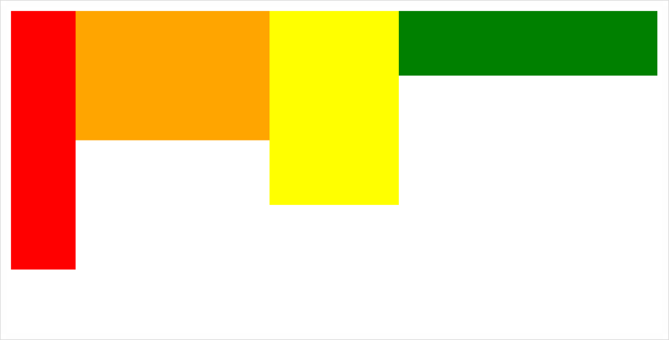
2) align-item:center
수직 방향에서 item들이 가운데를 기준으로 정렬되어있다.
<!DOCTYPE html>
<html lang="en">
<head>
    <meta charset="UTF-8">
    <meta name="viewport" content="width=device-width, initial-scale=1.0">
    <meta http-equiv="X-UA-Compatible" content="ie=edge">
    <title>align_item_flex_center</title>

    <style>
        .box{
            display: flex;
            align-items:center;
            height: 400px;
        }
        .first{
            background-color: red;
            width: 100px;
            height: 400px;
        }
        .second{
            background-color: orange;
            width: 300px;
            height: 200px;
        }
        .third{
            background-color: yellow;
            width: 200px;
            height: 300px;
        }
        .four{
            background-color: green;
            width: 400px;
            height: 100px;
        }
    </style>

</head>
<body>

    <div class="box">
        <div class="first"></div>
        <div class="second"></div>
        <div class="third"></div>
        <div class="four"></div>
    </div>

</body>
</html>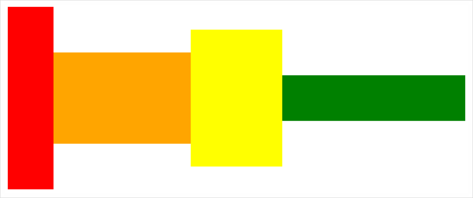
3) align-item:flex-end
아래의 그림과 같이 수직 방향에서 item들이 아래점에서부터 정렬되어있다.
<!DOCTYPE html>
<html lang="en">
<head>
    <meta charset="UTF-8">
    <meta name="viewport" content="width=device-width, initial-scale=1.0">
    <meta http-equiv="X-UA-Compatible" content="ie=edge">
    <title>align_item_flex_end</title>

    <style>
        .box{
            display: flex;
            align-items:flex-end;
            height: 400px;
        }
        .first{
            background-color: red;
            width: 100px;
            height: 400px;
        }
        .second{
            background-color: orange;
            width: 300px;
            height: 200px;
        }
        .third{
            background-color: yellow;
            width: 200px;
            height: 300px;
        }
        .four{
            background-color: green;
            width: 400px;
            height: 100px;
        }
    </style>

</head>
<body>

    <div class="box">
        <div class="first"></div>
        <div class="second"></div>
        <div class="third"></div>
        <div class="four"></div>
    </div>

</body>
</html>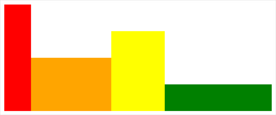
참고
https://heropy.blog/2018/11/24/css-flexible-box/
https://blog.naver.com/nsoft21/221558782515