1. Matplotlib 심화
1.1 막대 차트 (Bar Chart)
# Set different color
color = ['blue' if value > 30 else 'orange' for value in values]

plt.bar(categories, values, color=color)
plt.xlabel('Categories')
plt.ylabel('Values')
plt.title('Bar Chart')
plt.show()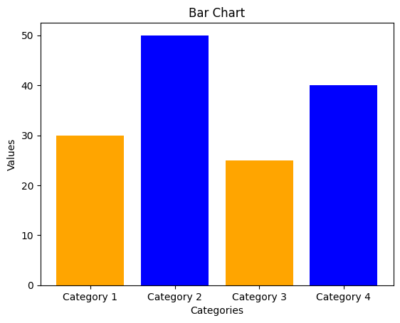
1.2 스택 바 차트 (Stacked Bar Chart)
# Sample data for stacked bar chart
categories_stacked = ['Category 1', 'Category 2', 'Category 3', 'Category 4']
values1_stacked = [15, 30, 25, 10]
values2_stacked = [10, 20, 30, 25]

# Create a stacked bar chart
plt.bar(categories_stacked, values1_stacked, label='Value 1', color='blue')
plt.bar(categories_stacked, values2_stacked, bottom=values1_stacked, label='Value 2', color='orange')
plt.xlabel('Categories')
plt.ylabel('Values')
plt.title('Stacked Bar Chart')
plt.legend()
plt.show()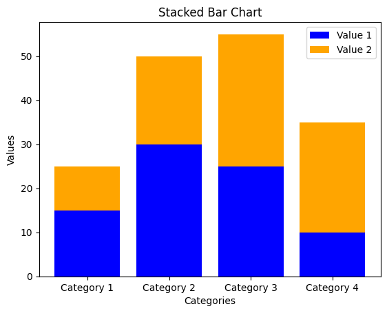
1.3 그룹 바 차트 (Grouped Bar Chart)
# Sample data for grouped bar chart
x_grouped = np.arange(len(categories_stacked))
width = 0.3	# 막대그래프의 너비

# Create a grouped bar chart
plt.bar(x_grouped - width/2, values1_stacked, width=width, label='Value 1', color='blue')
plt.bar(x_grouped + width/2, values2_stacked, width=width, label='Value 2', color='orange')
plt.xlabel('Categories')
plt.ylabel('Values')
plt.title('Grouped Bar Chart')
plt.xticks(x_grouped, categories_stacked)
plt.legend()
plt.show()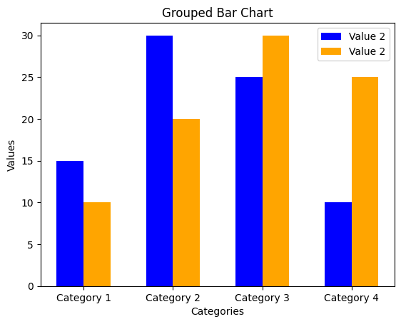
1.4 서브 플롯 (Subplot)
# Create a subplot with multiple charts
plt.figure(figsize=(10, 5))

# Subplot 1 - Bar Chart
plt.subplot(1, 2, 1)	# subplot(행의 개수, 열의 개수, subplot 위치)
plt.bar(categories, values)
plt.xlabel('Categories')
plt.ylabel('Values')
plt.title('Bar Chart')

# Subplot 2 - Line Chart
plt.subplot(1, 2, 2)
plt.plot(x_values, y_values, marker='o', linestyle='-')
plt.xlabel('X Values')
plt.ylabel('Y Values')
plt.title('Line Chart')
plt.grid(True)	# Add grid lines

plt.tight_layout()	# Adjust the layout to avoid overlapping
plt.show()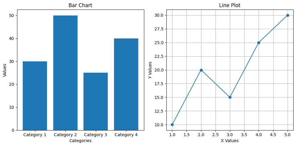
1.5 Customized 라인 차트
# Customize plot appearance
plt.plot(x_values, y_values, marker='o', linestyle='-', color='blue', label='customized label')
plt.xlabel('X Values')
plt.ylabel('Y Values')
plt.title('Customized Line Chart')
plt.legend(loc='upper left')	# Show legend
plt.grid(True)	# Add grid lines
plt.xlim(0, 6)	# Set x-axis limits
plt.ylim(0, 35)	# Set y-axis limits
plt.xticks(np.arange(1, 6, step=1))	# Customize x-axis ticks
plt.yticks(np.arange(0, 36, step=5))	# Customize y-axis ticks
plt.axhline(y=20, color='red', linestyle='--', linewidth=2, label='Threshold')	# Add horizontal line
plt.text(3.5, 22, 'Threshold', color='red', fontsize=12)	# Add text annotation
plt.show()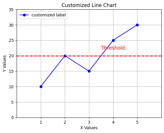
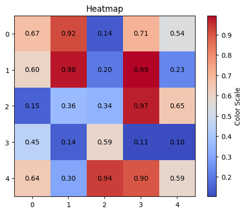
1.6 히스맵 (Heatmap)
# Create a heatmap
plt.imshow(data_heatmap, cmap='coolwarm', interpolation='nearest')

# Add annotation (text) to the heatmap
for i in range(data_heatmap.shape[0]):
	for j in range(data_heatmap.shape[1]):
    	plt.text(j, i, f'{data_heatmap[i, j]:.2f}', ha='center', va='center')

plt.colorbar(label='Color Scale')
plt.title('Heatmap with Annotation')
plt.show()data_heatmap.shape
# 결과값:
# (5, 5)참고:
imshow()의interpolation매개변수: 이미잔 플롯과 같은 데이터를 시각화할 때 사용되는 보간(interpolation) 방법을 설정한다. 이것은 픽셀 간의 값이 주어지지 않은 경우에 그 사이의 값을 추정하는 방법을 결정한다.
- 일반적으로 이미지나 플롯을 확대하거나 축소할 때, 보간은 이웃한 픽셀의 값을 사용하여 보간한다. 이것은 이미지나 플롯이 부드럽고 연속성이 있게 보이도록 한다.
'nearest': 가장 가까운 이웃의 값을 사용하여 보간한다. 이 방법은 보간에 있어 가장 간단한 방법으로, 주로 카테고리 데이터나 이미지 픽셀의 이진화된 데이터에 사용된다.

거북선통통통통