1. Matplotlib 소개
Matplotlib은 파이썬에서 데이터 시각화를 위해서 가장 많이 쓰이는 라이브러리이다. 다양한 유형의 그래프와 plot을 생성해서 데이터를 시각화할 수 있고 데이터 분석 결과를 보여줄 때 매우 유용한 도구이다.
import matplotlib.pyplot as plt# sample data for bar chart
categories = ['Category 1', 'Category 2', 'Category 3', Category 4']
values = [30, 50, 25, 40]
# sample data for line chart
x_values = [1, 2, 3, 4, 5]
y_values = [10, 20, 15, 25, 30]# create a bar chart
plt.bar(categories, values)
plt.xlabel('Categories')
plt.ylabel('Values')
plt.title('Bar Chart')
plt.show()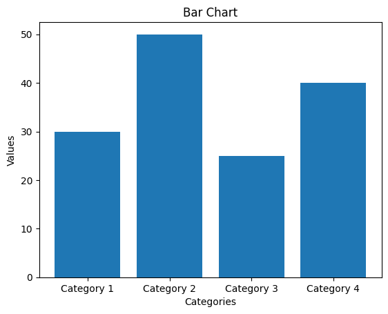
plt.plot(x_values, y_values, marker='o', linestyle='-')
plt.xlabel('X Values')
plt.ylabel('Y Values')
plt.title('Line Chart')
plt.grid(True)	# add grid lines
plt.show()
# linestyle은 ls로 줄여서 쓸 수 있음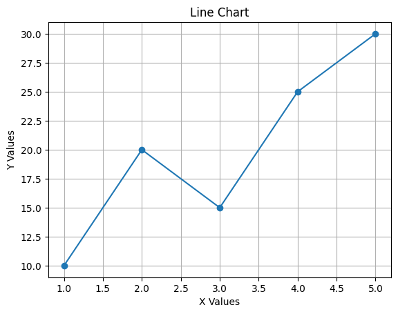
import numpy as np

# sample data for scatter plot(산점도)
x_scatter = np.random.rand(50)
y_scatter = np.random.rand(50)
colors_scatter = np.random.rand(50)
sizes_scatter = np.random.randint(10, 100, 50)	# 10부터 100까지 숫자 중 무작위로 50개 뽑기

# sample data for pie chart
labels_pie = ['Category A', 'Category B', 'Category C', 'Category D']
sizes_pie = [30, 15, 25, 30]
참고:
np.random.rand(10)
/* array([0.19664095, 0.35702134, 0.18094854, 0.42053037, 0.84460685,
       0.01855177, 0.07529934, 0.69098415, 0.97925693, 0.49299544]) */
plt.scatter(x_scatter, y_scatter, c=colors_scatter, s=sizes_scatter, alpha=0.7)
plt.xlabel('X Values')
plt.ylabel('Y Values')
plt.title('Scatter Plot')
plt.colorbar(label='Color Scale')
plt.show()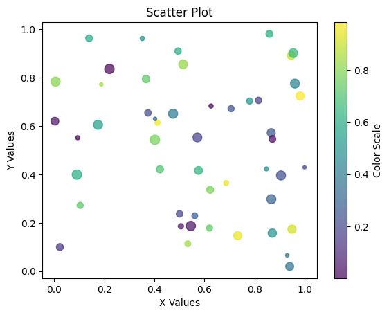
# create a pie chart
plt.pie(sizes_pie, labels=labels_pie, autopct='%1.1f%%', startangle=90)
plt.axis('equal')
plt.title('Pie Chart')
plt.show()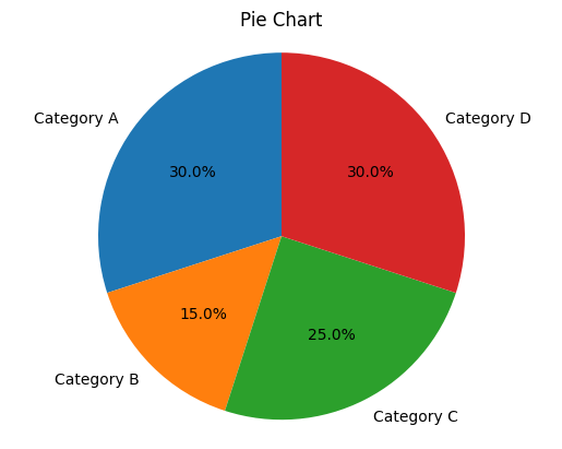
# sample data for histogram
data_histogram = np.random.randn(1000)

# sample data for box plot
data_boxplot = [np.random.normal(0, std, 100) for std in range(1, 5)]

# sample data for violin plot
data_violin = [np.random.normal(0, std, 100) for std in range(1, 5)]

# sample data for heatmap
data_heatmap = np.random.rand(5, 5)
참고:
list = []
for num in range(1, 5):
    list.append(num)
    print(list)
위의 코드 결과값은 아래와 같다.
[num for num in range(1,5)]
# 결과값:
# [1, 2, 3, 4]
참고:
5열과 5행의 난수값 생성하기np.random.rand(5, 5) /* array([[0.57844964, 0.05244181, 0.79865724, 0.9687172 , 0.14446408], [0.06319491, 0.97228126, 0.52256485, 0.15789751, 0.00443889], [0.1329653 , 0.41656348, 0.02140328, 0.73698363, 0.47251244], [0.24297942, 0.57664035, 0.52962035, 0.01780422, 0.37691861], [0.23160692, 0.41192037, 0.59039724, 0.4206527 , 0.3127653 ]]) */
# create a histogram
plt.hist(data_histogram, bins=20, edgecolor='black')
plt.xlabel('Value')
plt.ylabel('Frequency')
plt.title('Histogram')
plt.show()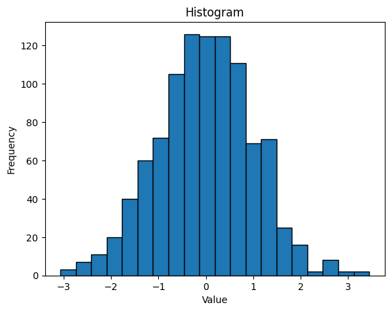
# create a box plot
plt.boxplot(data_boxplot, labels=['Box 1, 'Box 2', 'Box 3', 'Box 4'])
plt.xlabel('Box Number')
plt.ylabel('Values')
plt.title('Box Plot')
plt.show()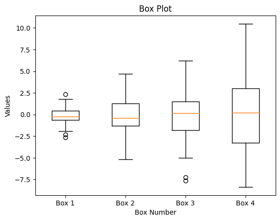
# create a violin plot
plt.violineplot(data_violin, showmedians=True)
plt.xlabel('Data Series')
plt.ylabel('Values')
plt.title('Violine Plot')
plt.xticks(np.arange(1, 5), ['Series 1', 'Series 2', 'Series 3', 'Series 4']
plt.show()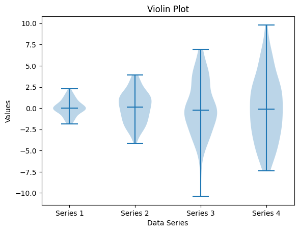
# create a heatmap
plt.imshow(data_heatmap, cmap='coolwarm', interpolation='nearest')
plt.colorbar(label='Color Scale')
plt.title('Heatmap')
plt.show()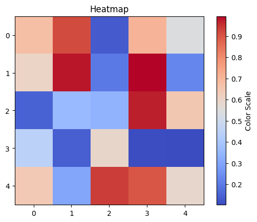

거북선통통통통