1. 컬럼 간의 관계를 눈으로 확인하기
1.1 seaborn.heatmap
seaborn.heatmap(data, vmin=None, vmax=None, cmap=None, annot=None, fmt='.2g')- data: heatmap을 그릴 데이터
- vmin: 최소값
- vmax: 최댓값
- camp: 그림을 그릴 색조합
- annot: 데이터 표기 (bool)
- fmt: 표기 데이터의 형식
numeric_df = df.select_dtypes(include=[float, int])

corr_df = numeric_df.corr()
corr_df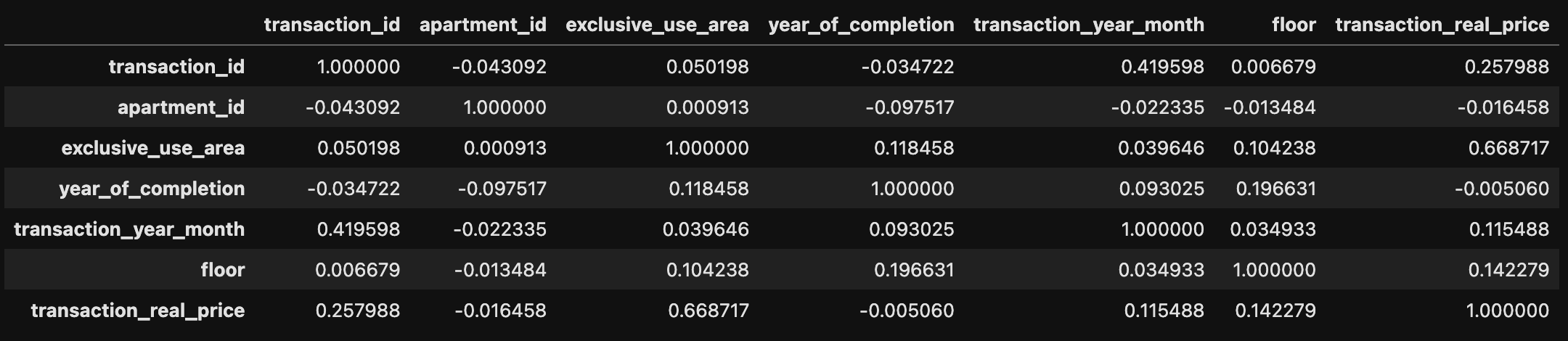
sns.heatmap(corr_df, annot=True, vmin=-1, vmax=1, cmap='RdYlBu_r')
plt.show()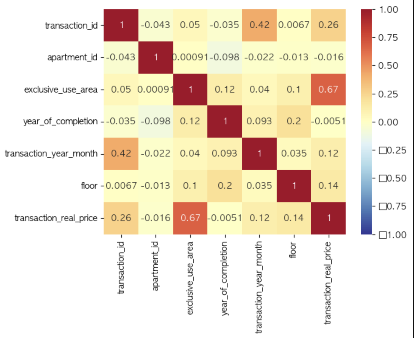
!pip install scipysns.clustermap(corr_df, annot=True, cmap='RdYlBu_r', vmin=-1, vmax=1)
plt.show()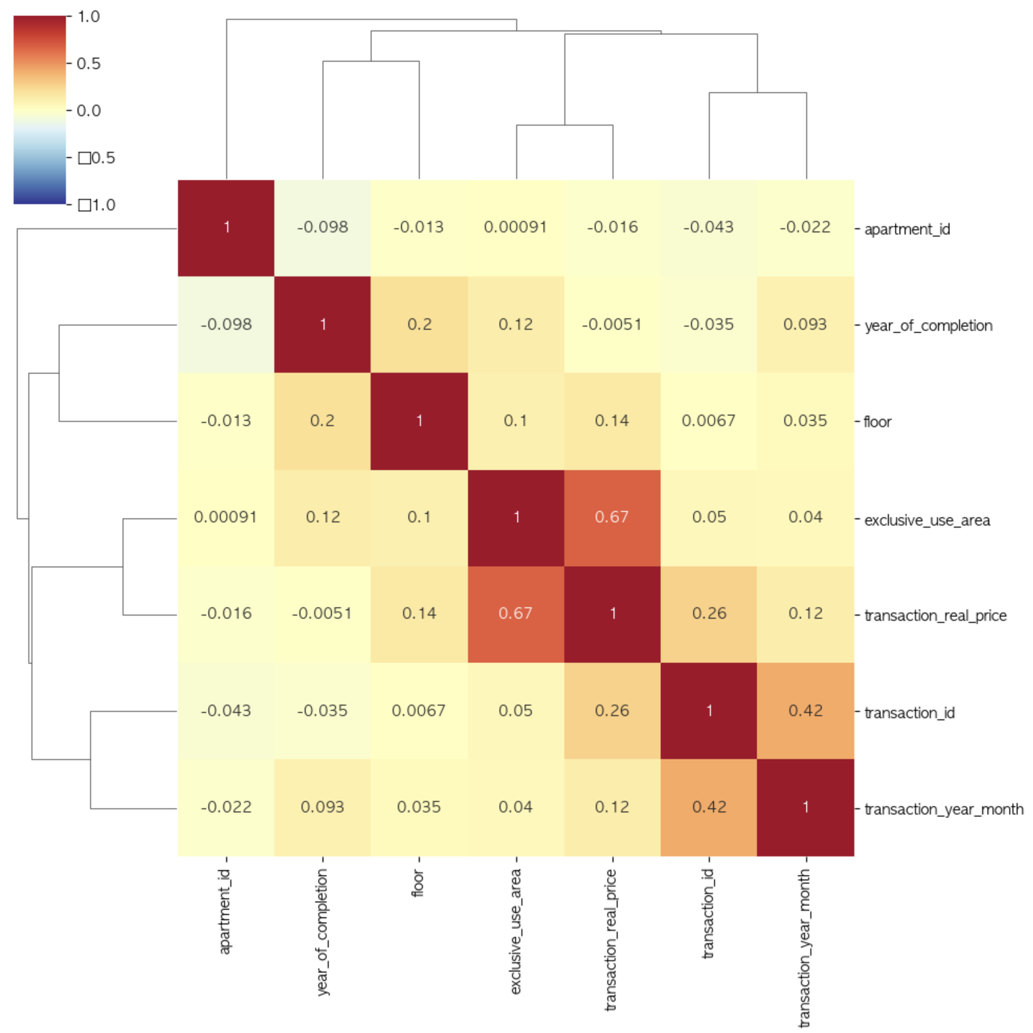
1.2 confusion matrix (혼동 행렬)
pip install scikit-learnfrom sklearn.metrics import confusion_matrix
sample = 100
true_labels = [0] * 80 + [1] * 20
predicted_labels = np.random.randint(2, size=sample)
conf_mtx = confusion_matrix(true_labels, predicted_labels)
conf_mtx
# 결과값:
# array([[32, 48],
# [ 8, 12]])
sns.heatmap(conf_mtx, annot=True, cmap='RdYlBu')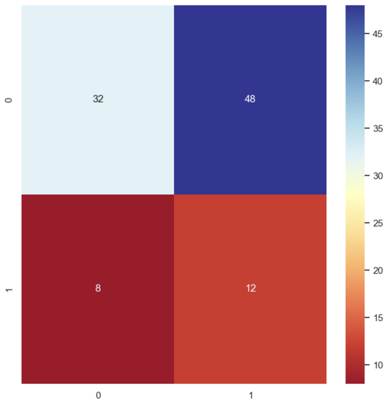
1.3 시계열 데이터
시계열 데이터는 시간 순서에 따른 데이터 포인트의 연속으로 구성된 데이터이다. 각 데이터 포인트는 특정 시간 또는 시간 간격에 연결되어 있다.
예: 주식/코인 데이터, 기상 데이터, 웹사이트 트래픽 데이터 등

거북선통통통통