import styled from 'styled-components';

const Father = styled.div`
  display: flex;
`;

const Box = styled.div<{ boxColor: string }>`
  background-color: ${(props) => props.boxColor};
  width: 100px;
  height: 100px;
`;

<Father>
  <Box boxColor="blue" />
  <Box boxColor="red"/>
</Father>
props로 전달하여 배경색을 변경해 보았니다. 이제는 Box라는 컴포넌트 안에 있는 속성 전부를 받아온 원 모양 디자인을 하고 싶다면 어떻게 해야 할까 알보겠습니다.
import styled from 'styled-components';

const Father = styled.div`
  display: flex;
`;

const Box = styled.div<{ boxColor: string }>`
  background-color: ${(props) => props.boxColor};
  width: 100px;
  height: 100px;
`;

const Circle = styled(Box)`
  border-radius: 50px;
`;

<Father>
  <Box boxColor="blue" />
  <Circle boxColor="pink" />
</Father>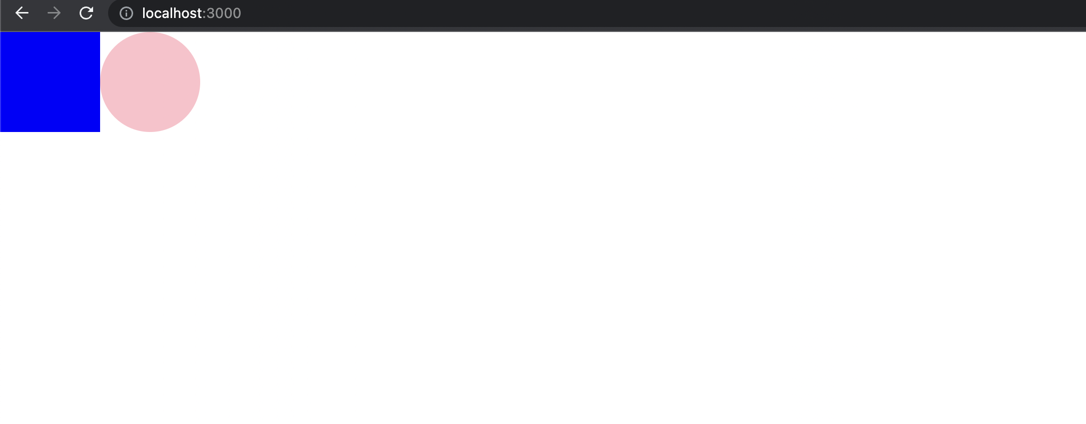
변수로 할당 된 Box를 styled(Box)로 넣어주면 Box 컴포넌트 안에 있는 속성 까지 전부 쓸수 있습니다. 컴포넌트를 확장하고 재사용할 수 있는 편리함 너무나 멋진 장점인 것 같습니다.
필요할 때 남기는 날것의 기록 공간