- 히스토그램은 데이터를 간편하게 시각화할 수 있어 많이 사용되지만, 연속형 데이터를 단순화하여 분석하는 제한이 있다.
- 확률 밀도 함수(PDF)는 각 구간이 전체에서 차지하는 비중을 통해 연속형 데이터의 분포를 살펴볼 수 있다.
- 연속형 데이터에서 특정 값의 확률은 0이지만, 특정 구간에 대한 확률을 계산할 수 있다는 점이 중요하다.
- 확률 밀도 함수는 이론적 개념으로, 실제로는 히스토그램을 기반으로 한 추정을 통해 KDE Plot 등을 활용하여 데이터를 부드럽게 표현할 수 있다.
- KDE Plot은 히스토그램의 한계를 보완하여 연속형 데이터의 대략적 분포를 세밀하게 추정하고, 파라미터 조정을 통해 분포의 세부 표현 정도를 조절할 수 있다.
import pandas as pd
import matplotlib.pyplot as plt
df = pd.read_csv('data/body.csv')
df
df['height'].plot(kind='kde')
plt.show()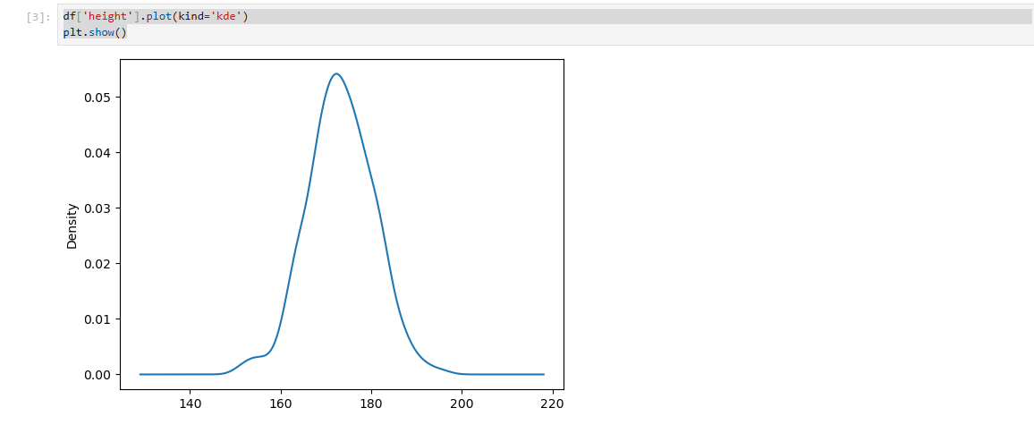
df['height'].plot(kind='kde', bw_method=0.1 )
plt.show()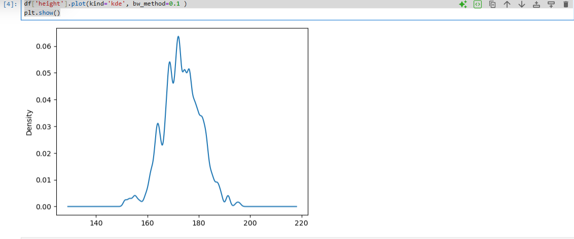
df['height'].plot(kind='kde', bw_method=2)
plt.show()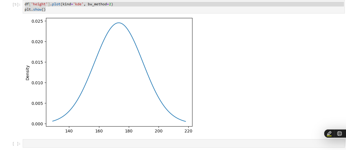
import numpy as np
import pandas as pd
import matplotlib.pyplot as plt

car_df = pd.read_csv('data/car.csv')

#제조사별 평균 가격 구하기

mean_price = car_df.groupby('manufacturer')['price'].mean()


#bar plot 그리기

#mean_price.plot(kind='bar')
#plt.title('제조사별 중고차 평균 가격')
#plt.ylabel('평균 가격')
#plt.show()

bmw_df = car_df[car_df['manufacturer'] == 'BMW']
bmw_df['price'].plot(kind='hist')
plt.title('BMW 중고차 가격 분포')
plt.xlabel('가격')
plt.ylabel('빈도수')
plt.show()

hyundai_df = car_df[car_df['manufacturer'] == 'HYUNDAI']
hyundai_df['price'].plot(kind='hist')
plt.title('hyundai 중고차 가격 분포')
plt.xlabel('가격')
plt.ylabel('빈도수')
plt.show()

lexus_df = car_df[car_df['manufacturer'] == 'LEXUS']
lexus_df['price'].plot(kind='hist')
plt.title('LEXUS 중고차 가격 분포')
plt.xlabel('가격')
plt.ylabel('빈도수')
plt.show()

volkswagen_df = car_df[car_df['manufacturer'] == 'VOLKSWAGEN']
volkswagen_df['price'].plot(kind='hist')
plt.title('VOLKSWAGEN 중고차 가격 분포')
plt.xlabel('가격')
plt.ylabel('빈도수')
plt.show()


#박스플롯으로 이상점 확인
bmw_df = car_df[car_df['manufacturer'] == 'AUDI']
bmw_df['price'].plot(kind='box')
plt.show()

#중고차의 주행 거리(mileage)의 박스플롯
car_df['mileage'].plot(kind='box')
plt.show()

#중고차의 주행 거리(mileage)의 1사분위수와 3사분위수 값
#describe() 함수를 통해 확인하거나, quantile() 함수
car_df.describe()

개발자