1. 데이터 읽기 (with jupyter notebook)
필요한 모듈 및 데이터 호출
	import pandas as pd

	CCTV_Seoul = pd.read_csv("../data/01. Seoul_CCTV.csv")
	CCTV_Seoul.head()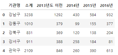
CCTV_Seoul.columns
CCTV_Seoul.columns[0]
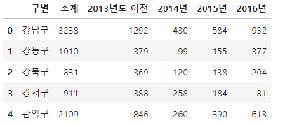
	CCTV_Seoul.rename(columns={CCTV_Seoul.columns[0]: "구별"}, inplace=True)
	CCTV_Seoul.head()
pop_Seoul = pd.read_excel("../data/01. Seoul_Population.xls")
pop_Seoul.head()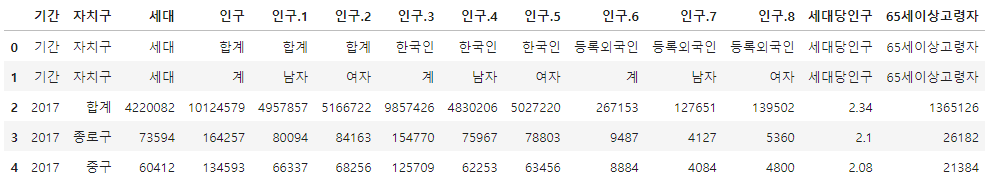
가져올 data의 필요한 부분의 index와 column 옵션주기
pop_Seoul = pd.read_excel("../data/01. Seoul_Population.xls", header=2, usecols="B, D, G, J, N")
pop_Seoul.head()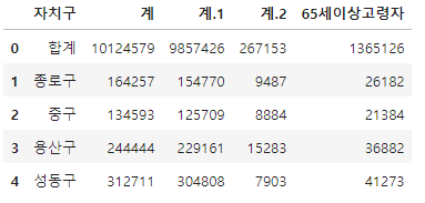
pop_Seoul.rename(
columns={
    pop_Seoul.columns[0]: "구별",
    pop_Seoul.columns[1]: "인구수",
    pop_Seoul.columns[2]: "한국인",
    pop_Seoul.columns[3]: "외국인",
    pop_Seoul.columns[4]: "고령자",
	},
	inplace=True
)
pop_Seoul.head()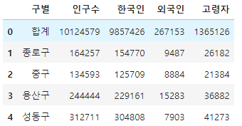
2. CCTV 데이터 훑어보기
CCTV_Seoul.head()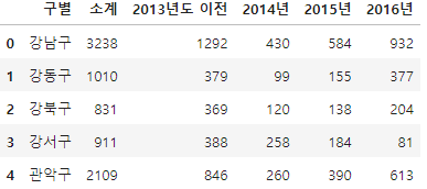
CCTV_Seoul.sort_values(by="소계", ascending=True).head(5)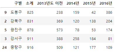
CCTV_Seoul.sort_values(by="소계", ascending=False).head(5)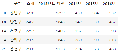
기존 컬럼이 없으면 추가, 있으면 수정
CCTV_Seoul["최근증가율"] = (
    (CCTV_Seoul["2016년"] + CCTV_Seoul["2015년"] + CCTV_Seoul["2014년"]) / CCTV_Seoul["2013년도 이전"] * 100)

CCTV_Seoul.sort_values(by="최근증가율", ascending=False).head(5)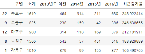
3. 인구현황 데이터 훑어보기
pop_Seoul.head()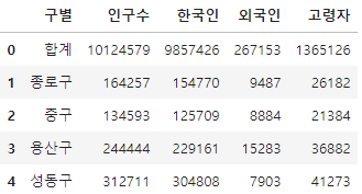
0번재 index 제거
pop_Seoul.drop([0], axis=0, inplace=True)
pop_Seoul.head()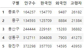
중복되지 않게 하나의 값들만 표시
pop_Seoul["구별"].unique() 
중복되지 않은 값들의 총 계
len(pop_Seoul["구별"].unique())
외국인비율, 고령자비율 column 생성
pop_Seoul["외국인비율"] = pop_Seoul["외국인"] / pop_Seoul["인구수"] * 100
pop_Seoul["고령자비율"] = pop_Seoul["고령자"] / pop_Seoul["인구수"] * 100
pop_Seoul.head()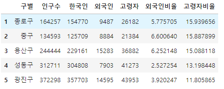
인구수 기준 내림차순 정렬
pop_Seoul.sort_values(["인구수"], ascending=False).head(5)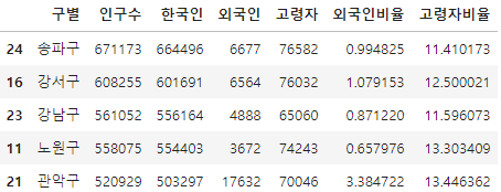
외국인 기준 내림차순 정렬
pop_Seoul.sort_values(["외국인"], ascending=False).head(5)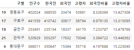
외국인비율 기준 내림차순 정렬
pop_Seoul.sort_values(["외국인비율"], ascending=False).head()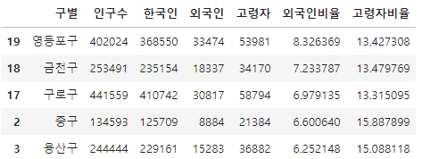
고령자 기준 내림차순 정렬
pop_Seoul.sort_values(by="고령자", ascending=False).head()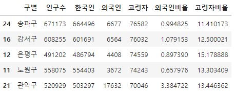
고령자비율 기준 내림차순 정렬
pop_Seoul.sort_values(by="고령자비율", ascending=False).head()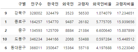
4. 두 데이터 합치기
CCTV_Seoul.head(1)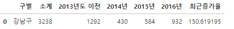
pop_Seoul.head(1)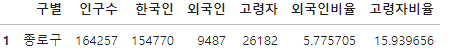
data_result = pd.merge(CCTV_Seoul, pop_Seoul, on="구별")
data_result.head()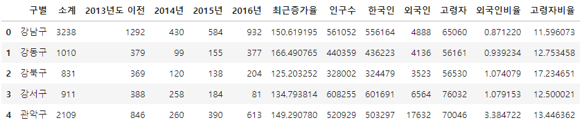
년도별 데이터 컬럼 삭제 (del, drop())
del data_result["2013년도 이전"]
del data_result["2014년"]
data_result.head(3)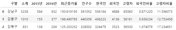
data_result.drop(["2015년", "2016년"], axis=1, inplace=True)
data_result.head()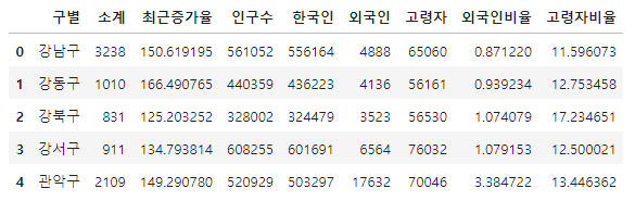
인덱스 변경 (set_index()) - 선택한 column을 dataframe의 index로 지정
data_result.set_index("구별", inplace=True)
data_result.head()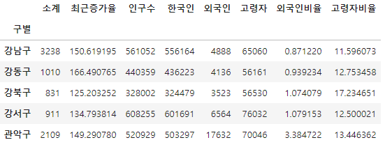
상관계수 (corr())
- correlation의 약자, 상관계수가 0.2 이상인 데이터 비교
data_result.corr()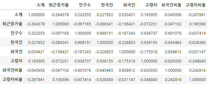
데이터의 기본적인 정보 확인
data_result.info()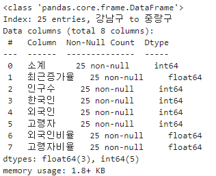
새 column CCTV비율 추가
data_result["CCTV비율"] = (data_result["소계"] / data_result["인구수"]) * 100
data_result.head()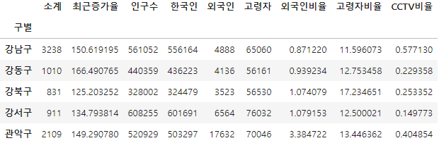
CCTV비율 기준 내림차순 정렬
data_result.sort_values(by="CCTV비율", ascending=False).head()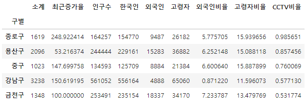
CCTV비율 기준 오름차순 정렬
data_result.sort_values(by="CCTV비율", ascending=True).head()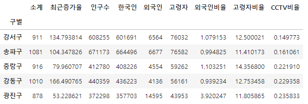
5. 데이터 시각화
한글 깨짐 방지를 위한 setting (Windows용)
import matplotlib.pyplot as plt
%matplotlib inline
from matplotlib import rc
rc("font", family="Malgun Gothic")


data_result.head()
소계 column 시각화
data_result["소계"].plot(kind="barh", grid=True, figsize=(10, 10));
보기 좋게 다시 정렬
def drawGraph():
    data_result["소계"].sort_values().plot(
        kind="barh", grid=True, title="가장 CCTV가 많은 구", figsize=(10, 10));
drawGraph()
CCTV비율 column 시각화
def drawGraph():
    data_result["CCTV비율"].sort_values().plot(
        kind="barh", grid=True, title="가장 CCTV가 많은 구", figsize=(10, 10));
drawGraph()
6. 데이터의 경향 표시
데이터 확인
data_result.head()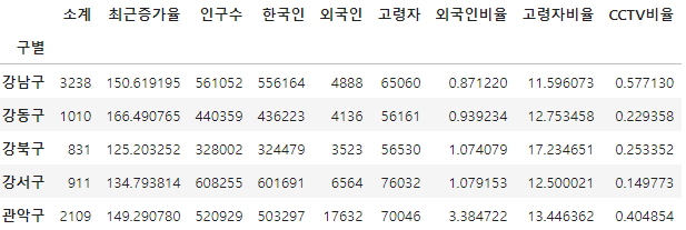
인구수와 소계 column으로 scatter plot 그리기
def drawGraph():

    plt.figure(figsize=(14, 10))
    plt.scatter(data_result["인구수"], data_result["소계"], s=50)
    plt.xlabel("인구수")
    plt.ylabel("CCTV")
    plt.grid(True)
    plt.show()
drawGraph()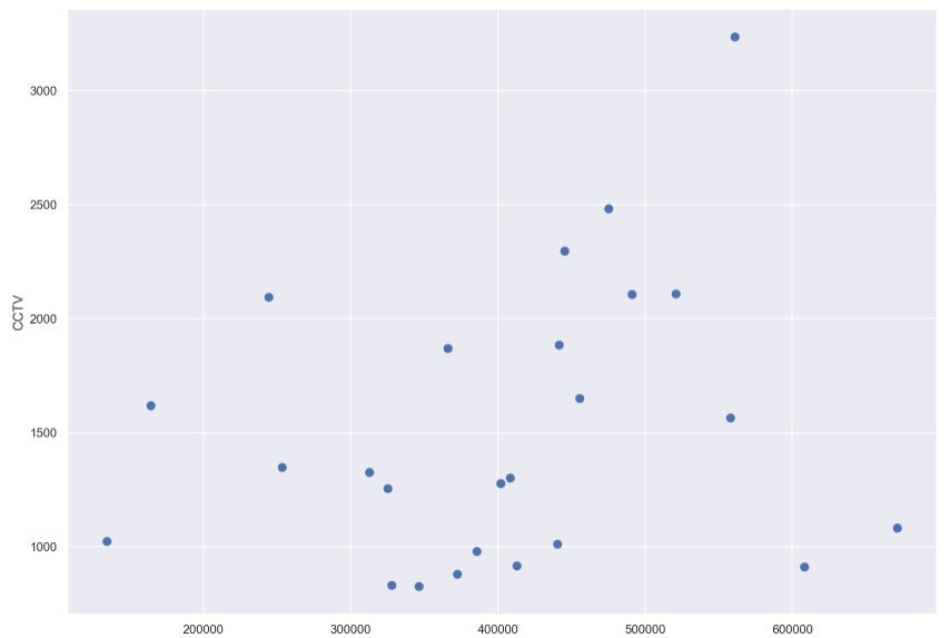
1차 직선 만들기 (경향선) with Numpy
- np.polyfit(): 직선을 구성하기 위한 계수를 계산
- np.poly1d(): polyfit 으로 찾은 계수로 파이썬에서 사용할 수 있는 함수로 만들어줌
import numpy as np

fp1 = np.polyfit(data_result["인구수"], data_result["소계"], 1)
fp1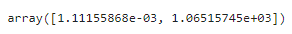
f1 = np.poly1d(fp1)
f1
인구가 40만인 구에서 서울시의 전체 경향에 맞는 적당한 CCTV 수 계산
f1(400000)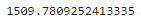
경향선을 그리기 위한 X 데이터 생성
- np.linspace(a, b, n): a부터 b까지 n개의 등간격 데이터 생성
fx = np.linspace(100000, 700000, 100) 경향선 추가
def drawGraph():

    plt.figure(figsize=(14, 10))
    plt.scatter(data_result["인구수"], data_result["소계"], s=50)
    plt.plot(fx, f1(fx), ls="dashed", lw=3, color="g")
    plt.xlabel("인구수")
    plt.ylabel("CCTV")
    plt.grid(True)
    plt.show()
drawGraph()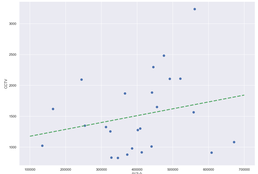
7. 강조하고 싶은 데이터를 시각화해보자
그래프 다듬기
- 경향(trend)과의 오차를 만들자
- 경향은 f1 함수에 해당 인구를 입력
- f1(data_result["인구수"])
fp1 = np.polyfit(data_result["인구수"], data_result["소계"], 1)
f1 = np.poly1d(fp1)
fx = np.linspace(100000, 700000, 100)
기존 데이터 확인
data_result.head(3)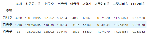
오차 데이터 추가
data_result["오차"] = data_result["소계"] - f1(data_result["인구수"])
data_result.head(1)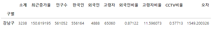
경향과 비교해서 오차가 많이 나는 데이터를 계산 (경향 대비 CCTV 많은 구 - 내림차순)
df_sort_f = data_result.sort_values(by="오차", ascending=False)
df_sort_f.head()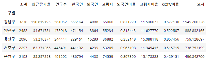
경향과 비교해서 오차가 많이 나는 데이터를 계산 (경향 대비 CCTV 적은 구 - 오름차순)
df_sort_t = data_result.sort_values(by="오차", ascending=True)
df_sort_t.head()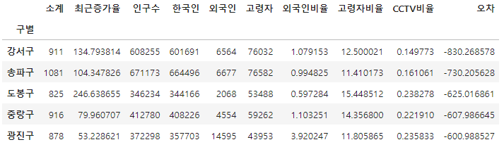
최종 그래프 생성 전 시각화 모듈 세부 설정
from matplotlib.colors import ListedColormap

# colormap 을 사용자 정의(user define)로 세팅
color_step = ["#e74c3c", "#2ecc71", "#95a9a6", "#2ecc71", "#3498db", "#3498db"]
my_cmap = ListedColormap(color_step)
정리된 데이터를 가지고 최종 시각화
def drawGraph():

    plt.figure(figsize=(14, 10))
    plt.scatter(data_result["인구수"], data_result["소계"], s=50, c=data_result["오차"], cmap=my_cmap)
    plt.plot(fx, f1(fx), ls="dashed", lw=3, color="g")

    for n in range(5):
        # 상위 5개
        plt.text(
            df_sort_f["인구수"][n] * 1.02, # x 좌표
            df_sort_f["소계"][n] * 0.98,  # y 좌표
            df_sort_f.index[n], # title
            fontsize=15,
        )

        # 하위 5개
        plt.text(
            df_sort_t["인구수"][n] * 1.02,
            df_sort_t["소계"][n] * 0.98,
            df_sort_t.index[n],
            fontsize=15
        )

    plt.xlabel("인구수")
    plt.ylabel("CCTV")
    plt.colorbar()
    plt.grid(True)
    plt.show()
drawGraph()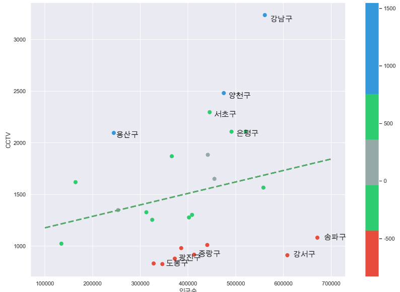
마무리는 항상 데이터 저장
data_result.to_csv("../data/01. CCTV_result.csv", sep=",", encoding="utf-8")