
Framer Motion 라이브러리
: animation을 쉽게 구현할 수 있음.
﹒ 설치
📎 설치
npm i framer-motion
📎 import
import {motion} from 'framer-motion'
📎 규칙
animate 적용할 요소를 <motion.div>로 작성
📎 animate된 스타일드컴포넌트
const Box = styled(motion.div)``;
﹒ props
https://www.framer.com/developers/ > API Documentation
☁️ animate
- animation할 속성 설정
☁️ transition
- animation을 특정시킬 수 있음.
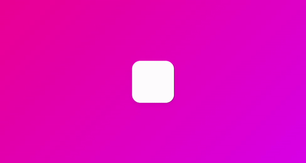
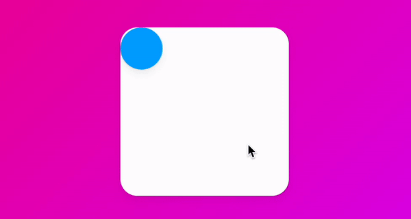
👾 #01
const Box = styled(motion.div)`...border-radius: 10px;`;
...
<Box
  transition={{ duration: 3, delay:2 }}
  animate={{ borderRadius: "100px" }}>
</Box>
...
👉🏻 2초 지나고 3초동안 사각형에서 원이됨.
☁️ initial
- element의 초기 상태를 지정.
👾 #02
const Box = styled(motion.div)`...border-radius: 10px;`;
...
<Box
  initial={{ scale:0 }}
  animate={{ scale:1, rotateZ:360 }}
  transition={{type:"spring" stiffness:1, damping:1, bounce: 0.5}}>
</Box>
...
👉🏻 처음에 el이 없다가 360도 회전하면서 나타남.
👉🏻 spring(기본값)은 현실세계의 물리법칙을 시뮬레이트함.
👉🏻 stiffness: 물리현상을 시뮬레이트함.
👉🏻 damping: 반동력, 0으로 하면 무기한으로 진동함.
👉🏻 bounce: 튐김의 수치를 정함. 기본값 0.25
👉🏻 모든 animation에는 기본적으로 spring(=Ease)이 기본적으로 적용되기 때문에 type:"tween"으로 선형적 타입으로 바꾸면 튕기는 효과가 사라짐.
☁️ variants
- 많은 animation을 하나로 연결시켜 코드를 깔끔하게 만듬.
- animation의 무대
- 원하면 마지막 stage에 transition을 설정할 수 있음.
- start,end 네이밍은 사용자가 지정가능
- variants객체 생성.
- initial, animate 프롭에 varianst프롭에 설정한 variants객체의 프로퍼티 지정.
👾 #03
const myVars = {
  start: { scale: 0 }, // initial stage
  end: {
    scale: 1,
    rotateZ: 360,
    transition:{ type: "spring", delay: 0.5 }
  } // finishing stage
};
...
<Box
  variants={myVars}
  initial="start"
  animate="end"
/>
...
👾 #04_자식들이 있는 경우
const boxVariants = {
  start: { opsity:0, scale: 0.5 },
  end: {
    opsity:1, scale: 1,
    transition:{
      type:"spring",
      duration:0.5,
      bounce:0.5,
      delayChildren: 0.5 // 자식요소들에게 delay적용
      staggerChildren: 0.5 // 자식요소들에게 순서대로 증감하는 delay적용
    }   },
}

const circleVariants = {
  start: { opsity: 0, y:10 },
  end: { opsity: 1, y:0 },
  }

...
<Box
  variants={boxVariants}
  initial="start"
  animate="end"
>
  <Circle variants={circleVariants}/>
  <Circle variants={circleVariants}/>
  <Circle variants={circleVariants}/>
  <Circle variants={circleVariants}/>
</Box>
...
👉🏻 자식 요소 motion객체의 start,end네이밍을 부모요소와 같에 지어야함.
👉🏻 기본적으로 motion은 initial="start", animate="end"을 자식 요소에 각각 붙여넣기 하기때문에 variants만 설정하면 됨.
﹒ Gestures
- 요소위에 마우스를 hover, click등을 했을때 animation지정
☁️ whileHover, whileTap
👾 #05
const Box = styled(motion.div)`
  width: 200px;
  height: 200px;
  background-color: rgba(255, 255, 255, 1);
  border-radius: 40px;
  box-shadow: 0 2px 3px rgba(0, 0, 0, 0.1)
`;
...
<Box
  whileHover={{ scale: 1.5, rotateZ:90 }}
  whileTap={{ scale:1, borderRadius: "100px" }}
/>
...
👾 #06_variants 적용
const boxVariants = {
  hover: {scale: 1.5, rotateZ:90},
  click: {scale:1, borderRadius: "100px"}
}
...
<Box
  variants={boxVariants}
  whileHover="hover"
  whileTap="click"
/>
﹒ Dragging
- 어떤 방향이든 드래그하고, 특정 범위 내에서 드래그할 때의 animation지정
☁️ drag, whileDrag
👾 #07_떤 방향이든 드래그
<Box
  drag // 속박없이 움직일 수 있음.
  whileDrag={{backgroundColor:"rgb(255, 234, 167)"}} // 드래그 동안 스타일 지정
  variants={boxVariants}
  whileHover="hover"
  whileTap="click"
/>
👉🏻 드래그 하는 동안 요소의 배경색이 노란색으로 바뀜
👉🏻 색변경 시 animation적용하기 위해서는 색상을 정수로 표현된걸로 지정해야함.
👉🏻 drag="x"로 지정하면 x축으로만 드래그 할 수 있음.
☁️ dragConstraints, dragSnapToOrigin, dragElastic
- dragConstraints: 드래깅이 허용될 수 있는 영역 지정.
- useRef를 사용하여 범위를 지정할 수 있음.
- dragSnapToOrigin : 원래 위치로 돌아오게 함.
- dragElastic: 당기는 힘. 0~1사이의 값(기본값 0.5), 수치가 클 수록 마우스포인터에 맞게 드래그가 실행 됨. 0으로 지정하면 범위 안에서만 움직임(overflow하지 않음).
👾 #07_특정 범위 내에서 드래그
...
const BiggerBox = styled.div`
  width: 600px;
  height: 600px;
  background-color: rgba(255, 255, 255, 0.4);
  border-radius: 40px;
  display: flex;
  justify-content: center;
  align-items: center;
`;
...
const biggerBoxRef = useRef(null);
...
<BiggerBox ref={biggerBoxRef}>
  <Box
    drag // 드래그 활성화
    dragSnapToOrigin // 드롭 시 중앙으로 돌아오는 프롭(원래 위치로 돌아옴.)
    dragElastic={1} // 드래그 시 당기는 힘, 0으로 지정하면 벽안에서만 움직임.
    dragConstraints={biggerBoxRef} // 제약 설정
    variants={boxVariants}
    whileHover="hover"
    whileTap="click"
  />
</BiggerBox>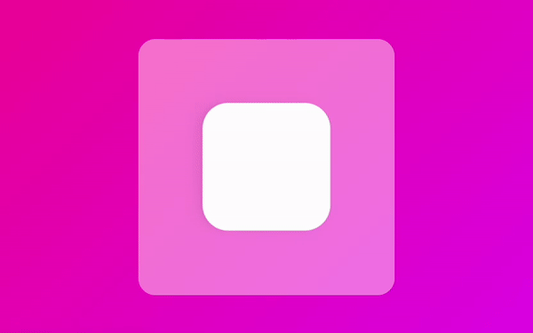
﹒ MotionValue
- 애니매이션 내의 수치를 트래킹할 때 필요
- 드래깅하는 요소를 추적할 때 필요
- MotionValue값은 set메서드로 업데이트할 수 있으며, React 재 렌더링을 트리거 하지 않음.
- get메서드로 값을 불러올 수 있음.
☁️ useMotionValue
- import {useMotionValue} from 'framer-motion';
- useMotionValue(기본값) 설정.
👾 #08_MotionValue값 확인
const x = useMotionValue(0); // 기본값 0으로 설정.
  console.log(x);
  // x는 set메서드로 업데이트할 수 있으며, React 재 렌더링을 트리거 하지 않음.
  // 업데이트 되는 x값을 확인하려면 useEffect(), get()을 사용해야함.
  useEffect(()=>{x.onChange(()=>{console.log(x.get())})},[x]);
return (
  <Wrapper>
    <Box
      drag="x"
  	  style={{x}}
  	  dragSnapToOrigin
    />
  </Wrapper>
);
👾 #09_버튼 클릭 시 MotionValue값 설정
const x = useMotionValue(0); // 기본값 0으로 설정.
return (
  <Wrapper>
  	<button onClick={()=>{x.set(200)}}>click me</button>
    <Box
      drag="x"
  	  style={{x}}
  	  dragSnapToOrigin
    />
  </Wrapper>
);
👉🏻 버튼 클릭 시 x축으로 200이동
👉🏻 style={{x}}: 스타일에 x값을 연결 시킴!!
☁️ useTransform
- import {useTransform} from 'framer-motion';
- useTransform(MotionValue값, [input값 배열], [output값 배열]) 설정 -> input값(제한값)과 output값의 개수가 같아야함!!
👾 #10_x축으로 -800이동하면 scale이 2(2배 크기), 0이면 scale이 1(원래크기), +800이면 scale이 0이 됨(사라짐).
// -800 -> scale 2, 0 -> scale 0, 800-> scale 0.5
const x = useMotionValue(0); // 기본값 0으로 설정.
const scaleValue = useTransform(x,[-800,0,800],[2,1,0]);
useEffect(()=>{scaleValue.onChange(()=>{console.log(scaleValue.get());})},[scaleValue]); // get()으로 useTransform 인자의 3번째 값이 반환됨.(ex) 0.5690등..)
return (
  <Wrapper>
    <Box
      drag="x"
  	  style={{x, scale: scaleValue}} // useTransform의 변수가 scale일 때 style={{x, scale}}
  	  dragSnapToOrigin
    />
  </Wrapper>
);
👾 #11
const x = useMotionValue(0);
const gradient = useTransform(x, [-800, 0, 800],
    [
      "linear-gradient(135deg,rgb(0,210,238),rgb(0,83,238))",
      "linear-gradient(135deg,rgb(238,0,153),rgb(221,0,238))",
      "linear-gradient(135deg,rgb(0,238,155),rgb(238,238,0))"
    ]
  );
return (
    <Wrapper style={{ background: gradient}}>
      <Box
        drag="x"
        style={{ x, rotateZ }}
        dragSnapToOrigin
        dragElastic={1}
      />
    </Wrapper>
  );
👉🏻 x축으로 드래그 시 배경색 변경됨.
☁️ useViewportScroll
- 뷰포트가 스크롤될 때 업데이트되는 MotionValues를 반환
scrollX— 수평 스크롤 거리(픽셀).
scrollY— 세로 스크롤 거리(픽셀).
scrollXProgress0— 및 사이의 수평 스크롤 진행률 1.
scrollYProgress0— 및 사이의 수직 스크롤 진행률 1.
👾 #12
const Wrapper = styled(motion.div)`
  height: 200vh;
  width: 100vw;
`;
const Box = styled(motion.div)`
  width: 200px;
  height: 200px;
`;
...
const {scrollY, scrollYProgress} = useViewportScroll();
const scale = useTransform(scrollYProgress,[0,1],[1,5]);
useEffect(() => {
    scrollY.onChange(() => {
      console.log(scrollY.get());
      console.log(scrollYProgress.get());
    })
  }, [scrollY, scrollYProgress]);
...
<Wrapper>
  <Box style={{ scale }}/>
</Wrapper>
...
👉🏻 y축으로 스크롤을 내리면 Box의 크기가 3배로 커짐
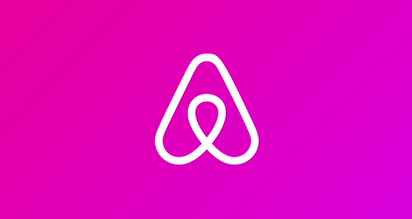
﹒ Path
path의 속성을 사용하여 animation 적용
☁️ 애어비앤비 로고 animation적용
👾 #13_stroke의 length와 fill의 opacity로 animation을 이용
const Svg = styled.svg`
  width: 300px;
  height: 300px;
    path {
      stroke: white;
      stroke-width: 2;
    }
`;
/* const svg = {
  start: { pathLength: 0, fill: "rgba(255, 255, 255, 0)" },
  end: {
    fill: "rgba(255, 255, 255, 1)",
    pathLength: 1,
    transition: {duration: 3}
  },
}; */
...
return (
    <Wrapper>
      <Svg xmlns="http://www.w3.org/2000/svg" viewBox="0 0 448 512">
        <motion.path
          initial={{ pathLength: 0, fill: "rgba(255, 255, 255, 0)" }}
          animate={{ pathLength: 1, fill: "rgba(255, 255, 255, 1)" }}
          transition = {{
            default:{duration: 5}, // 모든 속성에 적용 됨.
            fill: {duration:2, delay:3} // 특정 속성에 지정할 수 있음.
          }}
          /* variants={svg}
          initial="start"
          animate="end" */
          d="M224 373.12c-25.24-31.67-40.08-59.43-45-83.18-22.55-88 112.61-88 90.06 0-5.45 24.25-20.29 52-45 83.18zm138.15 73.23c-42.06 18.31-83.67-10.88-119.3-50.47 103.9-130.07 46.11-200-18.85-200-54.92 0-85.16 46.51-73.28 100.5 6.93 29.19 25.23 62.39 54.43 99.5-32.53 36.05-60.55 52.69-85.15 54.92-50 7.43-89.11-41.06-71.3-91.09 15.1-39.16 111.72-231.18 115.87-241.56 15.75-30.07 25.56-57.4 59.38-57.4 32.34 0 43.4 25.94 60.37 59.87 36 70.62 89.35 177.48 114.84 239.09 13.17 33.07-1.37 71.29-37.01 86.64zm47-136.12C280.27 35.93 273.13 32 224 32c-45.52 0-64.87 31.67-84.66 72.79C33.18 317.1 22.89 347.19 22 349.81-3.22 419.14 48.74 480 111.63 480c21.71 0 60.61-6.06 112.37-62.4 58.68 63.78 101.26 62.4 112.37 62.4 62.89.05 114.85-60.86 89.61-130.19.02-3.89-16.82-38.9-16.82-39.58z" /></Svg>
    </Wrapper>
  );
👉🏻 pathLength: 현재 위치까지의 path의 길이를 나타냄.
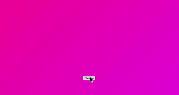
﹒ Animate Presence
- React js app에서 사라지는 compoenet를 animate함.
- component의 상태가 visible상태여야 함.
<AnimatePresence>조건문</AnimatePresence>- 3가지 state를 가짐 -> initial, animate, exit
- 컴포넌트가 render되거나 destroy될 때 효과를 줄 수 있음.
👾 #14
const Wrapper = styled(motion.div)`
  height: 100vh;
  width: 100vw;
  display: flex;
  justify-content: center;
  align-items: center;
`;

const Box = styled(motion.div)`
  width: 400px;
  height: 200px;
  background-color: rgba(255, 255, 255, 1);
  border-radius: 40px;
  position: absolute;
  top: 100px;
  box-shadow: 0 2px 3px rgba(0, 0, 0, 0.1), 0 10px 20px rgba(0, 0, 0, 0.06);
`;

const boxVariants = {
  initial: { opacity: 0, scale: 0 },
  visible: { opacity: 1, scale: 1, rotateZ: 360 },
  leaving: { opacity: 0, scale: 0, y: 50 }
}

function App() {
  const [showing, setShwoing] = useState(false);
  const toggleHandler = () => { setShwoing(prev => !prev) }

  return (
    <Wrapper>
      <button onClick={toggleHandler}>Click me</button>
      <AnimatePresence>
        {showing ? (
          <Box
            variants={boxVariants}
            initial="initial"
            animate="visible"
            exit="leaving"
          />
        ) : null}
      </AnimatePresence>
    </Wrapper>
  );
}
☁️ custom
- custom={0}처럼 사용
- variants를 변경할 수 있음.
- custom프롭을 사용하게 되면 variants는 object를 반환하는 FN으로 변경해야 함.
☁️ exitBeforeEnter
- 전 요소의 animation이 완전히 끝난 후 다음 animation이 작동 함.
- ex)
<AnimatePresence exitBeforeEnter custom={back}>
☁️ onExitComplete
- exit가 끝날 때 실행.
- ex)
<AnimatePresence onExitComplete={toggleLeaving}>// toggleLeaving함수
☁️ initial={false}
- 컴포넌트가 처음 mount될 때 initial에 해당하는 animation이 적용되지 않음!!
- ex) `'
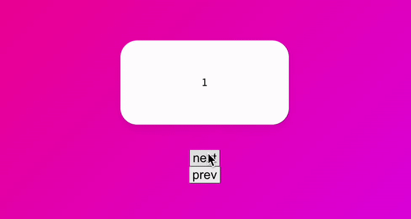
👾 #15_slider만들기
const Wrapper = styled(motion.div)`
  height: 100vh;
  width: 100vw;
  display: flex;
  justify-content: center;
  align-items: center;
  flex-direction: column;
`;

const Box = styled(motion.div)`
  width: 400px;
  height: 200px;
  background-color: rgba(255, 255, 255, 1);
  border-radius: 40px;
  position: absolute;
  top: 150px;
  display: flex;
  justify-content: center;
  align-items: center;
  font-size: 28px;
  box-shadow: 0 2px 3px rgba(0, 0, 0, 0.1), 0 10px 20px rgba(0, 0, 0, 0.06);
`;


function App() {
  const [visible, setVisible] = useState(1);
  const [back, setBack] = useState(false); // 슬라이드가 뒤로가는지 확인하는 state
  const nextPlease = () => {
    setBack(false);
    setVisible(prev => prev === 10 ? 10 : prev + 1)
  }
  const prevPlease = () => {
    setBack(true);
    setVisible(prev => prev === 1 ? 1 : prev - 1)
  }

  const boxVariants = {
    // 인수인 isBack은 Box의 custom={back}으로 받은 값임.
    entry: (isBack: boolean) => { return { opacity: 0, scale: 0, x: isBack?-500: 500 } },
    visible: { opacity: 1, scale: 1, x: 0, transition: { duration: .3 } },
    exit: (isBack: boolean) => { return { opacity: 0, scale: 0, x: isBack?500: -500, transition: { duration: .3 } } },
  }
  return (
    <Wrapper>
      {/*
        AnimatePresence에도 custom 작성,
        exitBeforeEnter : 전 요소의 animation이 완전히 끝난 후 다음 animation이 작동 함. ex) <AnimatePresence exitBeforeEnter custom={back},
        onExitComplete: exit가 끝날 때 실행. >
      */}
      <AnimatePresence custom={back}>
        <Box
          custom={back} // back에 따라 boxVariants가 달라짐.
          key={visible} // React js의 children은 각 고유의 key가 필요하기 때문에 key값이 변하면 다른 요소로 변함.
          variants={boxVariants}
          initial="entry"
          animate="visible"
          exit="exit"
        >
          {visible}
        </Box>
      </AnimatePresence>
      <button onClick={nextPlease} style={{ fontSize: "30px" }}>next</button>
      <button onClick={prevPlease} style={{ fontSize: "30px" }}>prev</button>
    </Wrapper>
  );
}
📍 transition={{type:"tween"}} : linear과 같은 효과로, 슬라이드 될 때 통통튀기는 효과를 없애 줌.
﹒shared layout animation
☁️ layout
- 이 prop을 element에게 주면 layout이 바뀔 때 알아서 animate됨.
👾 #16
const Box = styled(motion.div)`
  width: 400px;
  height: 400px;
  background-color: rgba(255, 255, 255, 1);
  border-radius: 40px;
  display: flex;
  justify-content: flex-start;
  align-items: flex-start;
  box-shadow: 0 2px 3px rgba(0, 0, 0, 0.1), 0 10px 20px rgba(0, 0, 0, 0.06);
`;

const Circle = styled(motion.div)`
  background-color: #00a5ff;
  height: 100px;
  width: 100px;
  border-radius: 50px;
  box-shadow: 0 2px 3px rgba(0, 0, 0, 0.1), 0 10px 20px rgba(0, 0, 0, 0.06);
`;

function App() {
  const [clicked, setClicked] = useState(false);
  const toggleClicked = ()=>{
    setClicked((prev)=> !prev);
  }

  return (
    <Wrapper onClick={toggleClicked}>
      <Box style={{justifyContent: clicked ? "center" : "flex-start",alignItems: clicked ? "center" : "flex-start"}}>
        <Circle layout /> // layout프롭을 주는것 만으로 알아서 animation을 작동하게 함!!
      </Box>
    </Wrapper>
  );
}
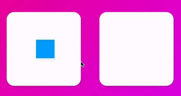
☁️ layoutId
- layoutId=""
- 이 프롭은 Framer에게 여러 요소(UI 컴포넌트)를 하나로 생각하게 만들어 줌.
👾 #17_두 Circle을 연결하기
function App() {
  const [clicked, setClicked] = useState(false);
  const toggleClicked = ()=>{
    setClicked((prev)=> !prev);
  }

  return (
    <Wrapper onClick={toggleClicked}>
      <Box>
        {clicked ? <Circle layoutId='circle' style={{borderRadius:0}}/> : null}
      </Box>
      <Box>
        {!clicked ? <Circle layoutId='circle' style={{borderRadius:50}}/> : null}
      </Box>
    </Wrapper>
  );
}
👉🏻 layoutId로 두 Circle을 같은 Circle로 연결해 한개가 일직선으로 움직이는 animation효과를 발생 함.
☁️ overlay효과 예제
👾 #18_ 클릭한 박스가 overlay위 정가운데로 이동하는 animation
const Wrapper = styled.div`
height: 100vh;
width: 100vw;
display: flex;
justify-content: space-around;
align-items: center;
`;
const Grid = styled.div`
display: grid;
grid-template-columns: repeat(3, 1fr);
width: 70vw;
gap: 10px;
div:first-child,
div:last-child {
grid-column: span 2;
}
`;
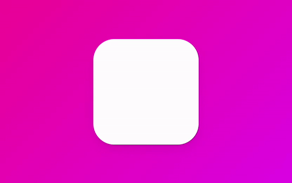
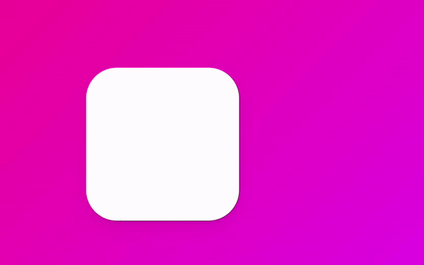
const Box = styled(motion.div)`
background-color: rgba(255, 255, 255, 1);
border-radius: 40px;
height: 200px;
box-shadow: 0 2px 3px rgba(0, 0, 0, 0.1), 0 10px 20px rgba(0, 0, 0, 0.06);
`;
const Overlay = styled(motion.div)`
width: 100%;
height: 100%;
position: absolute;
display: flex;
justify-content: center;
align-items: center;
`;
function App() {
const [clickedId, setClickedId] = useState<string | null>(null);
return (
<Wrapper>
<Grid>
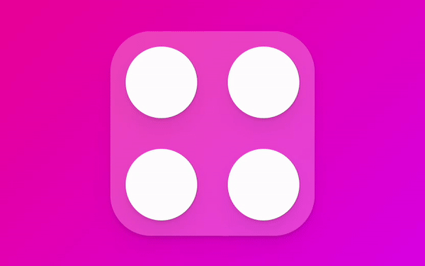
{["1", "2", "3", "4"].map((n) => (
<Box key={n} layoutId={n} onClick={() => setClickedId(n)} />
))}
</Grid>
<AnimatePresence>
{clickedId ? (
<Overlay
onClick={() => { setClickedId(null) }}
initial={{ backgroundColor: "rgba(0, 0, 0, 0)" }}
animate={{ backgroundColor: "rgba(0, 0, 0, .5)" }}
exit={{ backgroundColor: "rgba(0, 0, 0, 0)" }}>
<Box layoutId={clickedId} style={{ width: 400, height: 200 ,backgroundColor:"rgb(0, 208 , 162)"}} />
</Overlay>
) : null}
</AnimatePresence>
</Wrapper>
);
}

마침 공부중인데 덕분에 감사히 잘 보았습니다.