flex
flex(flexible) : 잘 구부러지는, 유연한
급격한 지름 아님
flexbox로 레이아웃을 구성
= 박스를 유연하게 늘리거나 줄여서 구성함
display: flex
부모 박스요소에
display: flex적용
자식 박스의 방향과 크기를 결정한다
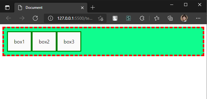
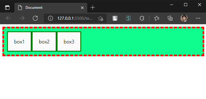
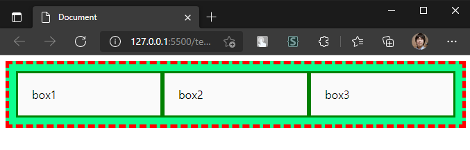
기본적인 적용
display: flex 가 적용된 부모 박스의 자식 요소
= 왼쪽부터 차례대로 이어 배치
test.html
<!DOCTYPE html>
<html lang="en">
<head>
  <title>test</title>
  <link rel="stylesheet" href=".\test.css">
</head>
<body>
  <div id="outer">
    <div class="box">box1</div>
    <div class="box">box2</div>
    <div class="box">box3</div>
  </div>
</body>
</html>
test.css
#outer {
  display: flex;
  border: 5px dashed red;
  background-color: rgb(15, 253, 142);
  padding: 10px;
}

.box {
  border: 3px solid green;
  background-color: rgb(250, 250, 250);
  padding: 20px;
}
적용된 모습
- 주의 사항
- 부모 요소 :display: flex
- 자식 요소 : 부모가display: flex일 때flex라는 속성을 가짐
flex 요소 방향 설정 (flex-direction)
수직 분할이 기본값이지만 수평으로도 분할 가능
= 부모 요소에 flex-direction 부여
flex-direction: row;	# 수직 분할 (기본값)
flex-direction: column;	# 수평 분할
grow, shrink, basis
자식 요소에 아무런 속성이 없을 경우의 flex 속성
flex: 0 1 auto;	# 기본값

flex: <grow> <shrink> <basis>
flex-grow: 0;
flex-shrink: 1;
flex-basis; auto;
grow: 늘어날 비율
- 자식 요소 하나만 grow: 1
test.html 수정
  ...
  <div id="outer">
    <div class="box target">box1</div>
    <div class="box">box2</div>
    <div class="box">box3</div>
  </div>
  ...
test.css 수정
...
.target {
  flex: 1 1 auto;
}
적용된 모습
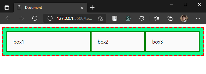
- 모든 자식의 grow: 1
test.css 수정
...
.box {
  flex: 1 1 auto;
}
적용된 모습
-
모든 자식 요소의
flex-grow가 같다
= 각 자식의 가로 길이는 동일한 비율이다 -
자식들의
flex-grow가 서로 다를 때
test.css 수정
...
.box {
  flex: 1 1 auto;
}
.target {
  flex: 2 1 auto;
}
자식 박스는 총 3개 target flex-grow: 2 나머지 box flex-grow: 1 전체 flex-grow : 2 + 1 + 1 = 4 target의 flex-grow 비율 : 2/4 # 50%
적용된 모습
shrink: 줄어들 비율
grow와 반대 개념, flex-grow 와 되도록 같이 쓰지 않기
ex. flex: <grow> 1 auto
= width, flex-basis 영향으로 바뀔 크기를 예측하기 어렵다
flex-grow로 비율을 변경할 경우1 (기본값)로 두어도 괜찮다
basis: 기본 크기
grow, shrink 되기 전의 요소 크기
= flex-grow: 0 이라면 지정된 basis 크기가 유지됨
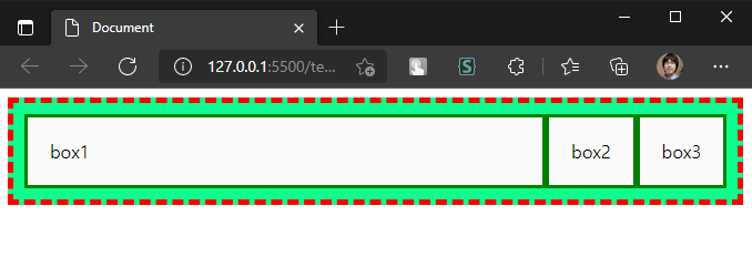
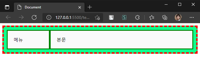
test.html 수정
...
  <div id="outer">
    <div class="box left">메뉴</div>
    <div class="box right">본문</div>
  </div>
...
test.css 수정
...
/* grow: 0 (100px 이상으로 늘어나지 않음) */
.left {
  flex: 0 1 100px;
}

/* grow: 1 (나머지 공간을 채움) */
.right {
  flex: 1 1 auto;
}
적용된 모습
flex-grow: 0일 때만flex-basis속성 값이 유지됩니다
width,flex-basis둘 다 있다면flex-basis가 우선- 자식 박스의 내용이 넘친다면,
width가 정확한 크기를 보장하지 않는다
- 이 때width대신max-width를 쓸 수 있음
콘텐츠 정렬 방법
정렬할 기준 : 축(axix)
= main axis는 flex-direction 속성으로 결정됨
= cross axis는 main axis와 수직을 이루는 방향
flex-direction : row (기본값)일 때
main axis = 가로축, cross axis = 세로축
콘텐츠 수평 정렬 (justify-content)
부모 박스에 justify-content 속성 적용
= 자식 박스를 수평으로 정렬 (main axis 방향으로)
justify-content: flex-start; # 기본값
justify-content: flex-end;
justify-content: center;
justify-content: space-between;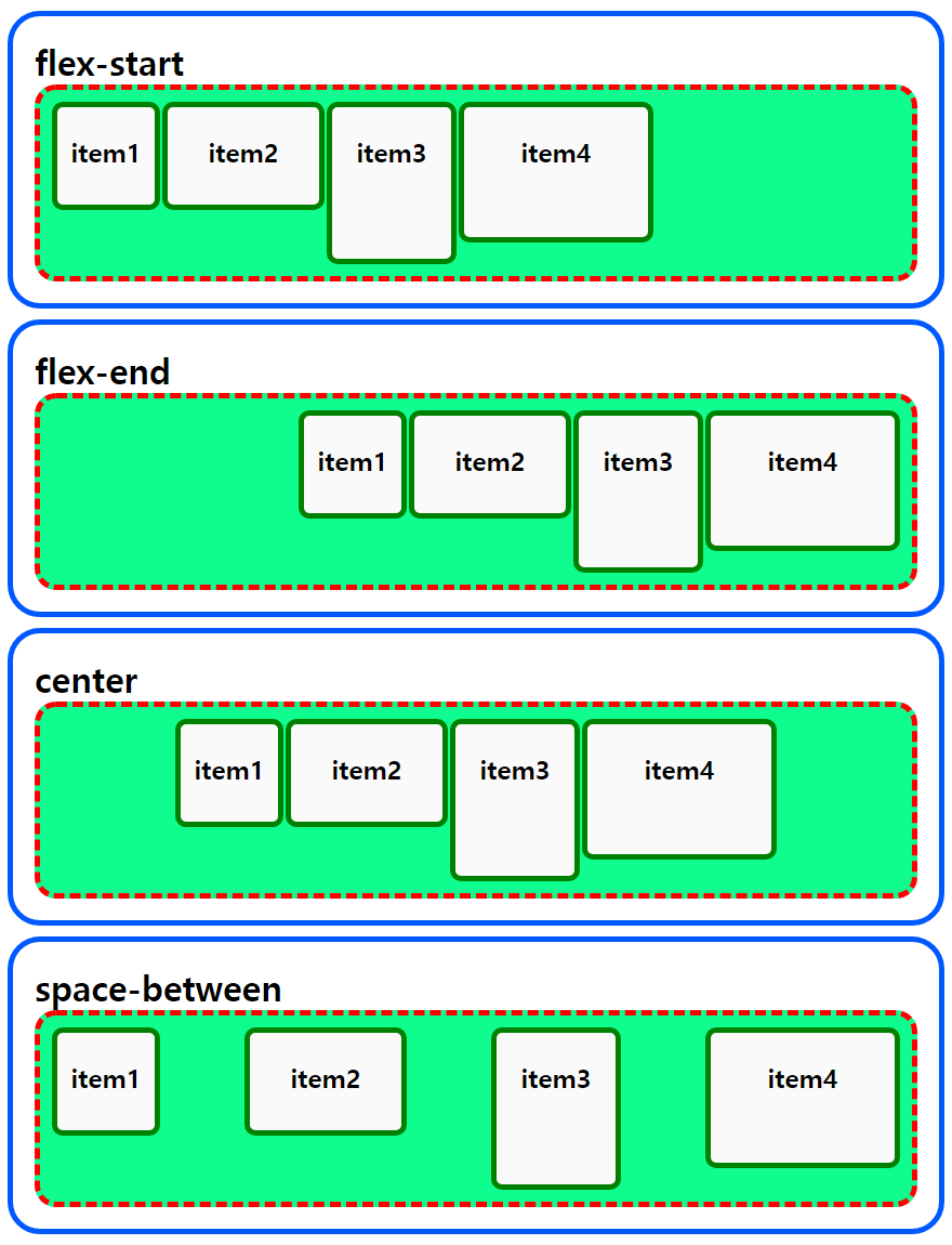
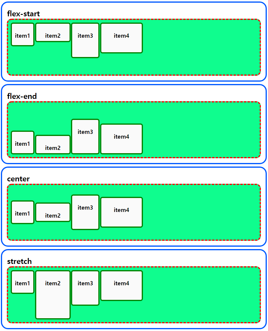
콘텐츠 수직 정렬 (align-items)
부모 박스에 align-items 속성 적용
= 자식 박스를 수직으로 정렬 (cross axis 방향으로)
align-items: flex-start; # 기본값
align-items: flex-end;
align-items: center;
align-items: stretch;
# stretch: height 값이 없는 자식을 부모 height 까지 잡아 늘임