Seaborn
Seaborn은 파이썬 데이터 시각화 라이브러리 중 하나로, Matplotlib을 기반으로 하여 만들어졌다. Matplotlib보다 더욱 간단하게 그래프를 그릴 수 있도록 많은 기능들을 제공한다.
Seaborn은 다양한 색상 테마와 그래프 스타일을 제공하여 시각화 작업에서 훨씬 더 직관적이고 아름다운 그래프를 그릴 수 있다. 또한, 데이터를 쉽게 정리하고 분석할 수 있도록 몇 가지 편리한 기능을 제공한다.
Seaborn이 제공하는 주요 기능
-
데이터셋 로딩: Seaborn은 예제 데이터셋을 포함하고 있어, 이를 불러와 쉽게 시각화할 수 있다.
-
그래프 스타일 설정: Seaborn은 Matplotlib의 기본 스타일을 보다 개선하고, 그래프 색상, 선 스타일 등을 설정할 수 있다.
-
범주형 데이터 시각화: countplot(), barplot(), boxplot(), violinplot() 등
-
수치형 데이터 시각화: scatterplot(), lineplot(), distplot(), kdeplot() 등
-
히트맵: heatmap() 함수를 제공. 이 함수를 이용하면, 2차원 데이터의 색상을 이용하여 시각화할 수 있다.
-
회귀 분석: lmplot(), regplot() 등
-
분포 분석: distplot(), kdeplot() 등
-
다중 플롯: subplotgrid(), FacetGrid() 등
# sns.set_style()
# "white", "whitegrid", "dark", "darkgrid"

sns.set_style("white")
plt.figure(figsize=(10, 6))
plt.plot(x, y1, x, y2, x, y3, x, y4)
plt.show()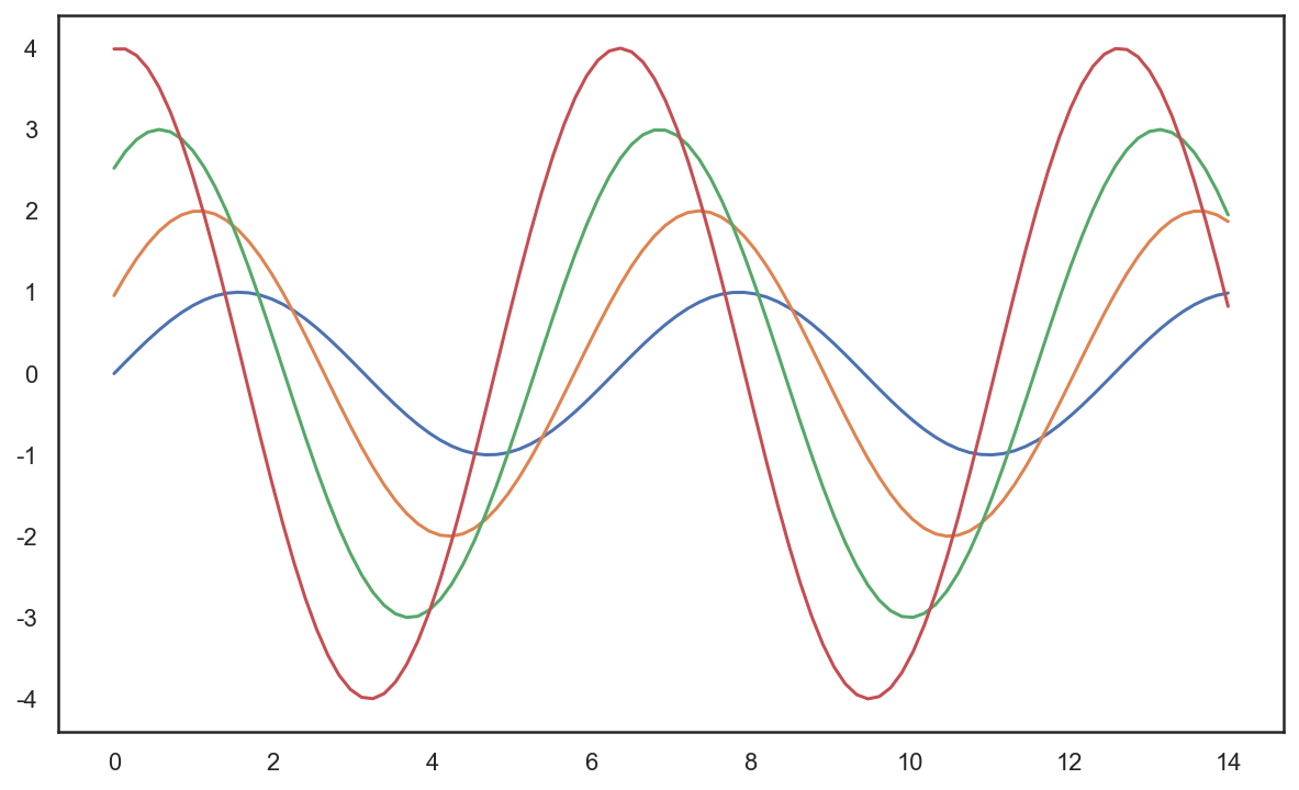
# sns.set_style()

sns.set_style("dark")
plt.figure(figsize=(10, 6))
plt.plot(x, y1, x, y2, x, y3, x, y4)
plt.show()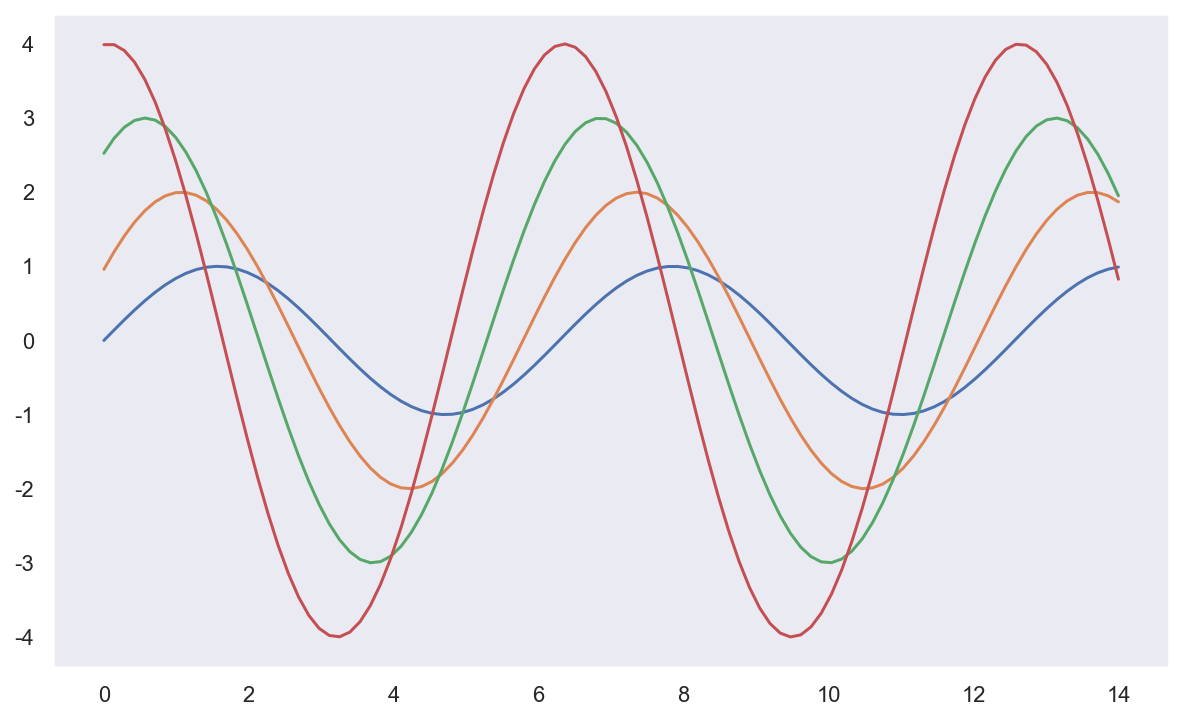
예시 - tips data
- boxplot
- swarmplot
- lmplot
tips = sns.load_dataset("tips")

# boxplot
plt.figure(figsize=(8, 6))
sns.boxplot(x=tips["total_bill"])
plt.show()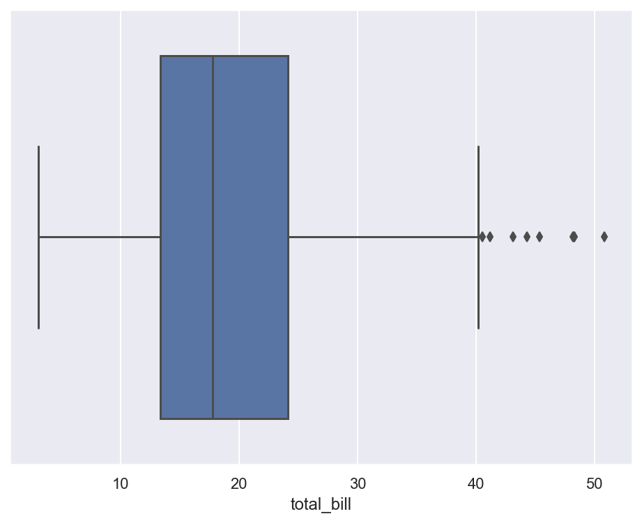
# boxplot
plt.figure(figsize=(8, 6))
sns.boxplot(x="day", y="total_bill", data=tips)
plt.show()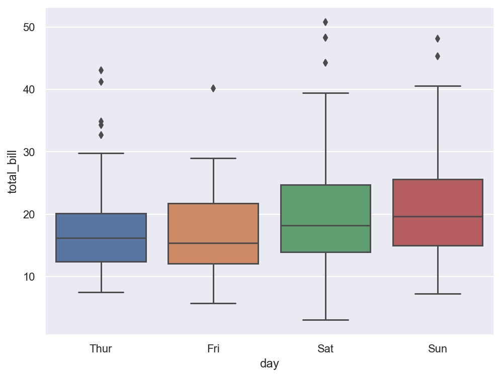
# boxplot hue, palette option
# hue: 카테고리 데이터 표현

plt.figure(figsize=(8, 6))
sns.boxplot(x="day", y="total_bill", data=tips, hue="smoker", palette="Set1") # Set 1 ~ 3
plt.show()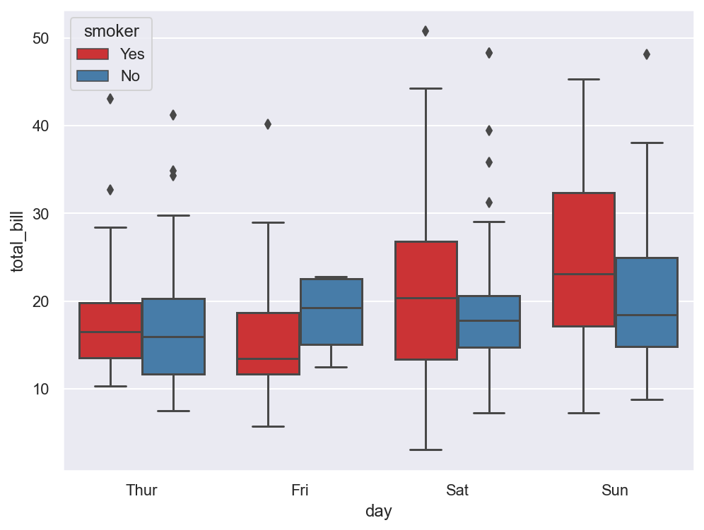
# swarmplot
# color: 0~1 사이 검은색부터 흰색 사이 값을 조절

plt.figure(figsize=(8, 6))
sns.swarmplot(x="day", y="total_bill", data=tips, color="0.5")
plt.show()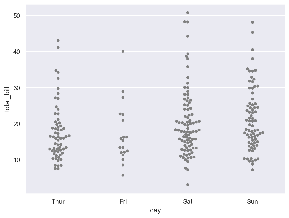
# boxplot with swarmplot

plt.figure(figsize=(8, 6))
sns.boxplot(x="day", y="total_bill", data=tips)
sns.swarmplot(x="day", y="total_bill", data=tips, color="0.25")
plt.show()
# lmplot: total_bil과 tip 사이 관계 파악

sns.set_style("darkgrid")
sns.lmplot(x="total_bill", y="tip", data=tips, height=7) # size => height
plt.show()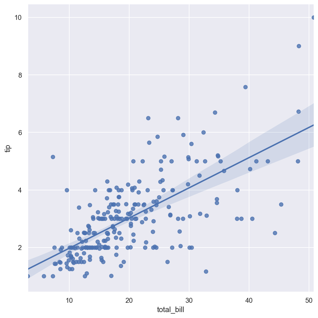
# hue option

sns.set_style("darkgrid")
sns.lmplot(x="total_bill", y="tip", data=tips, height=7, hue="smoker")
plt.show()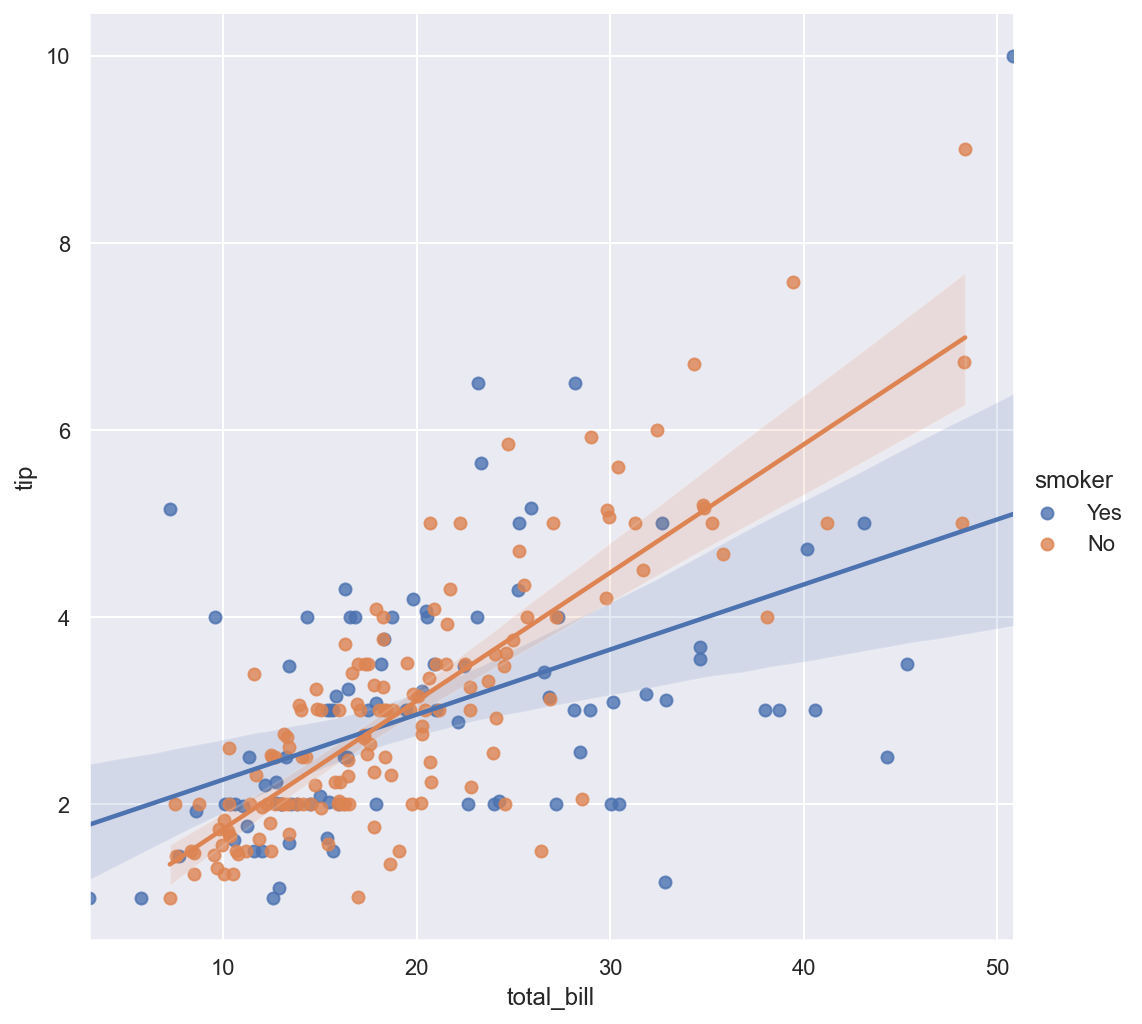
예시 - flights data
- heatmap
flights = sns.load_dataset("flights")

# pivot
# index, columns, values
flights = flights.pivot(index="month", columns="year", values="passengers")

# heatmap

plt.figure(figsize=(10, 8))
sns.heatmap(data=flights, annot=True, fmt="d") # annot=True 데이터 값 표시, fmt="d" 정수형 표현
plt.show()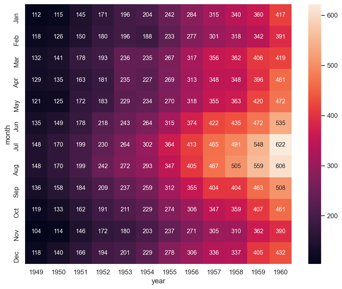
# colormap

plt.figure(figsize=(10, 8))
sns.heatmap(flights, annot=True, fmt="d", cmap="YlGnBu")
plt.show()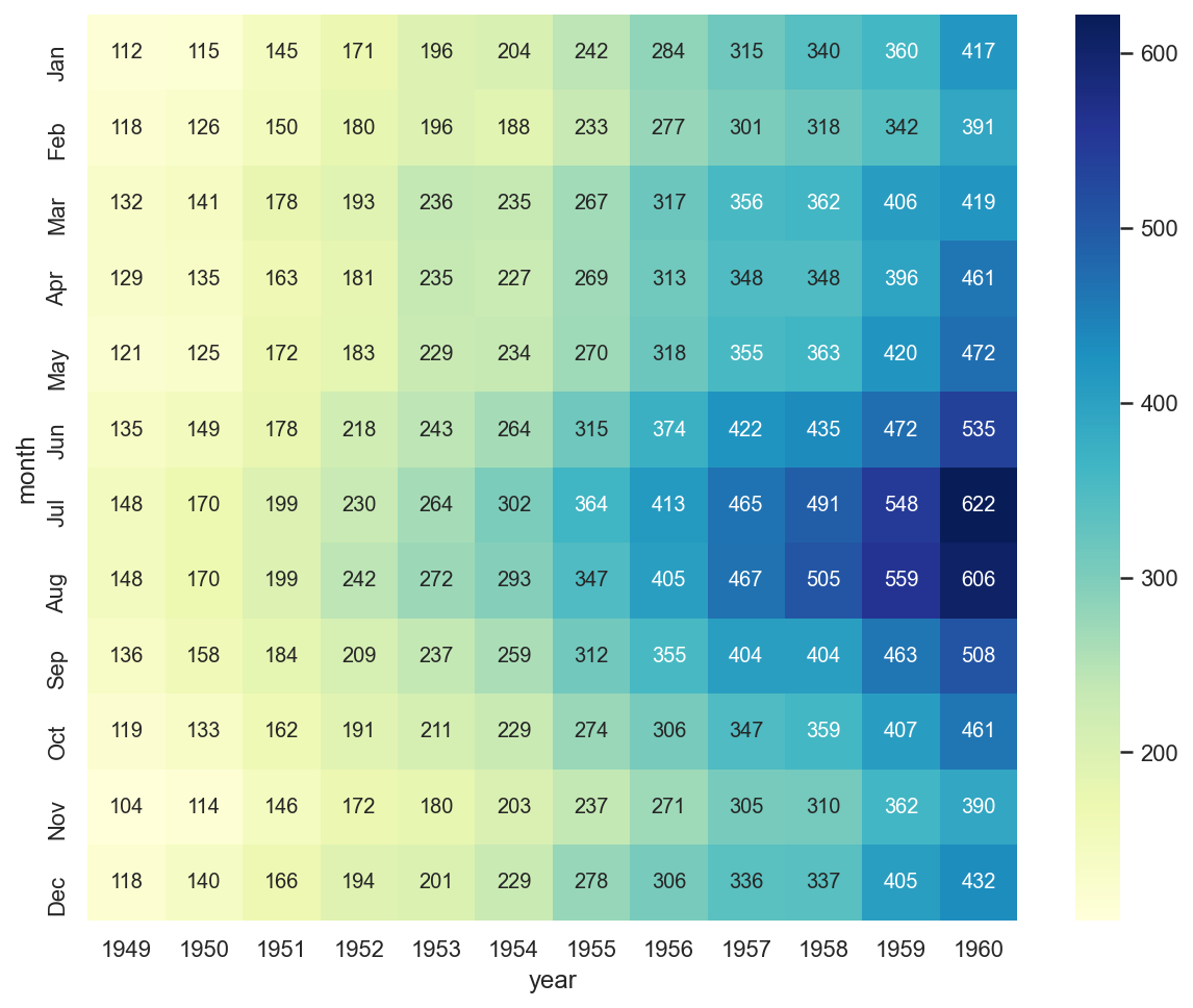
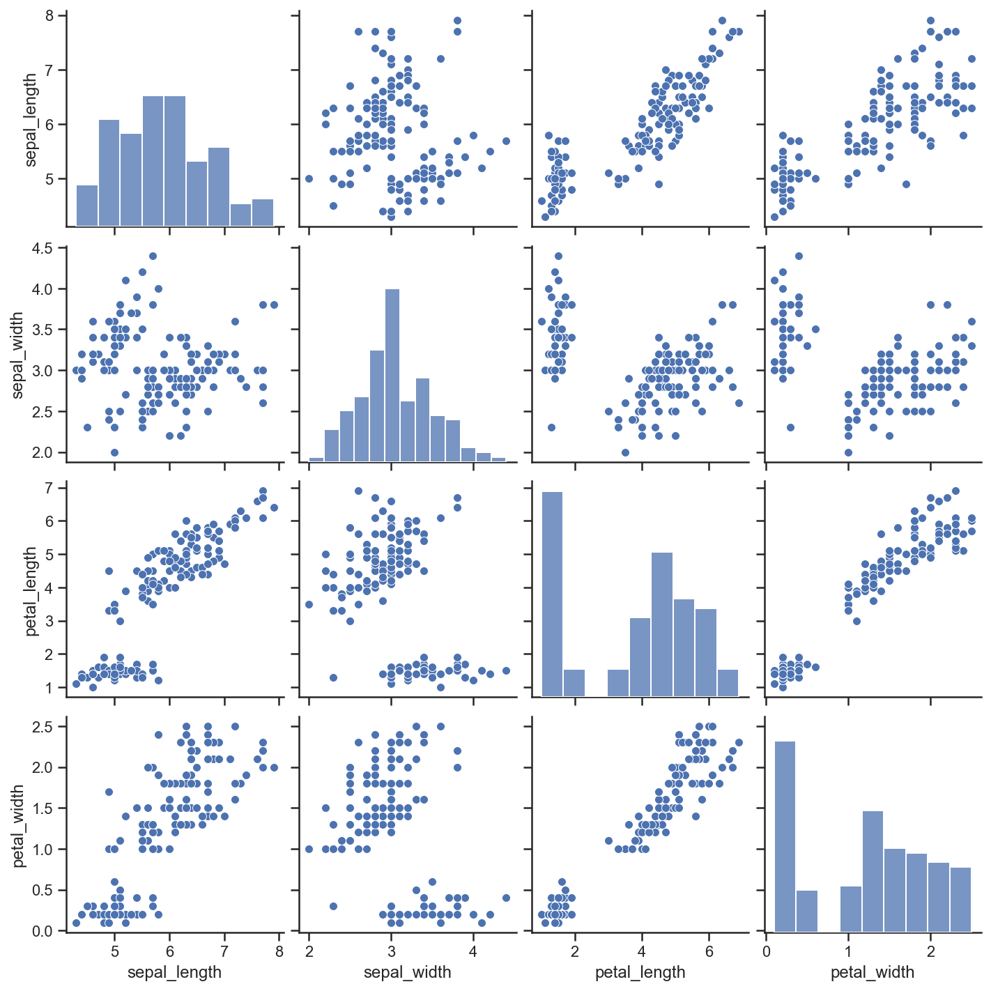
예시 - iris
- pairplot
iris = sns.load_dataset("iris")
# pairplot

sns.set_style("ticks")
sns.pairplot(iris)
plt.show()
# hue option

sns.pairplot(iris, hue="species")
plt.show()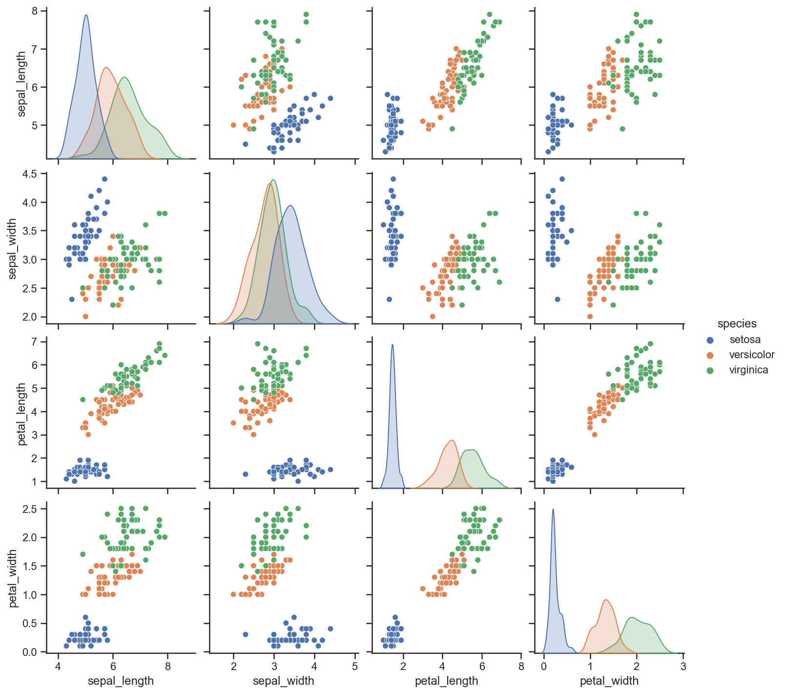
# 원하는 컬럼만 pairplot

sns.pairplot(iris,
             x_vars=["sepal_width", "sepal_length"],
             y_vars=["petal_width", "petal_length"])
plt.show()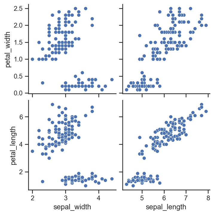
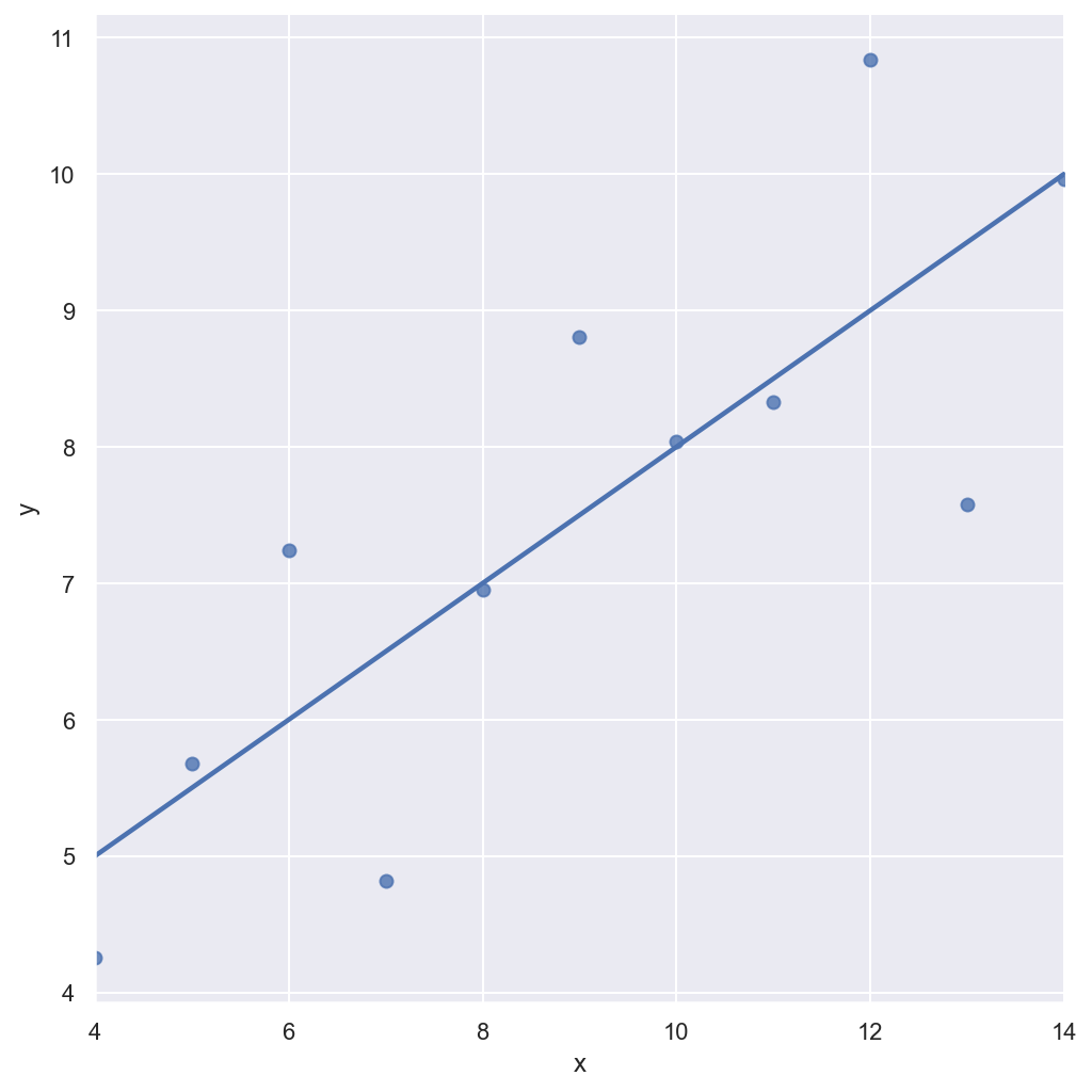
예시 - anscomebe data
- lmplot
anscombe = sns.load_dataset("anscombe")
sns.set_style("darkgrid")
sns.lmplot(x="x", y="y", data=anscombe.query("dataset == 'I'"), ci=None, height=7) # ci 신뢰구간 선택, None 옵션은 신뢰구간 영역 보이는 옵션을 끄는 것
plt.show()
sns.set_style("darkgrid")
sns.lmplot(x="x", y="y", data=anscombe.query("dataset == 'I'"), ci=None, height=7, scatter_kws={"s": 80}) # 마커사이즈 변경 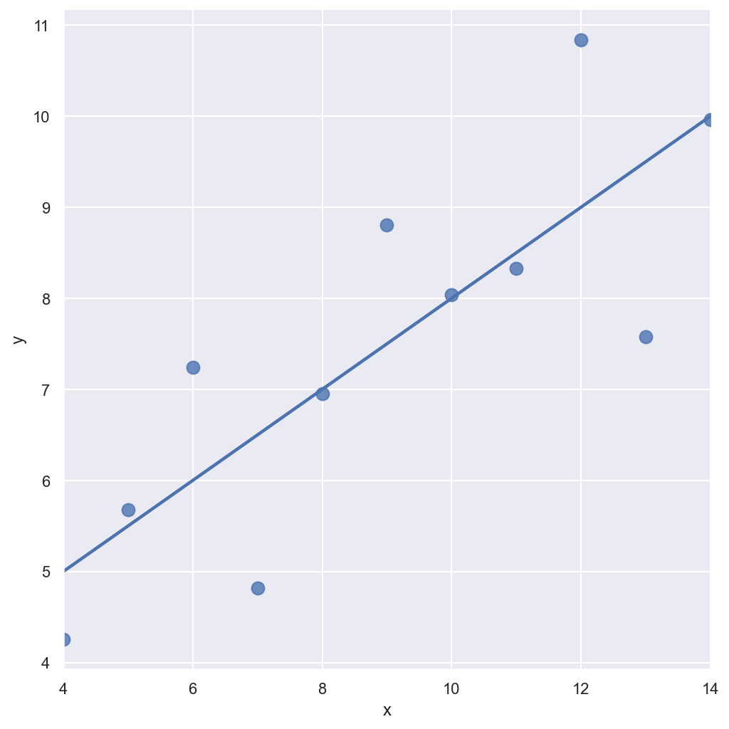
# order option
sns.set_style("darkgrid")
sns.lmplot(
    x="x",
    y="y",
    data=anscombe.query("dataset == 'II'"), # 2차식
    order=1, # 차수에 따라 옵션 변경
    ci=None,
    height=7,
    scatter_kws={"s": 80}) # ci 신뢰구간 선택
plt.show()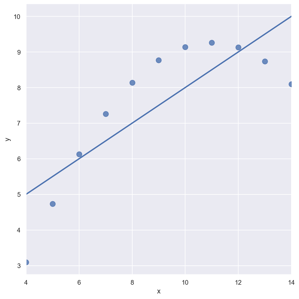
# order option
sns.set_style("darkgrid")
sns.lmplot(
    x="x",
    y="y",
    data=anscombe.query("dataset == 'II'"),
    order=2, # 차수에 따라 옵션 변경
    ci=None,
    height=7,
    scatter_kws={"s": 80}) # ci 신뢰구간 선택
plt.show()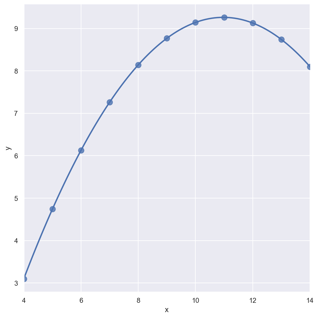
# outlier
sns.set_style("darkgrid")
sns.lmplot(
    x="x",
    y="y",
    data=anscombe.query("dataset == 'III'"), # 아웃라이어 있는 데이터
    ci=None,
    height=7,
    scatter_kws={"s": 80}) # ci 신뢰구간 선택
plt.show()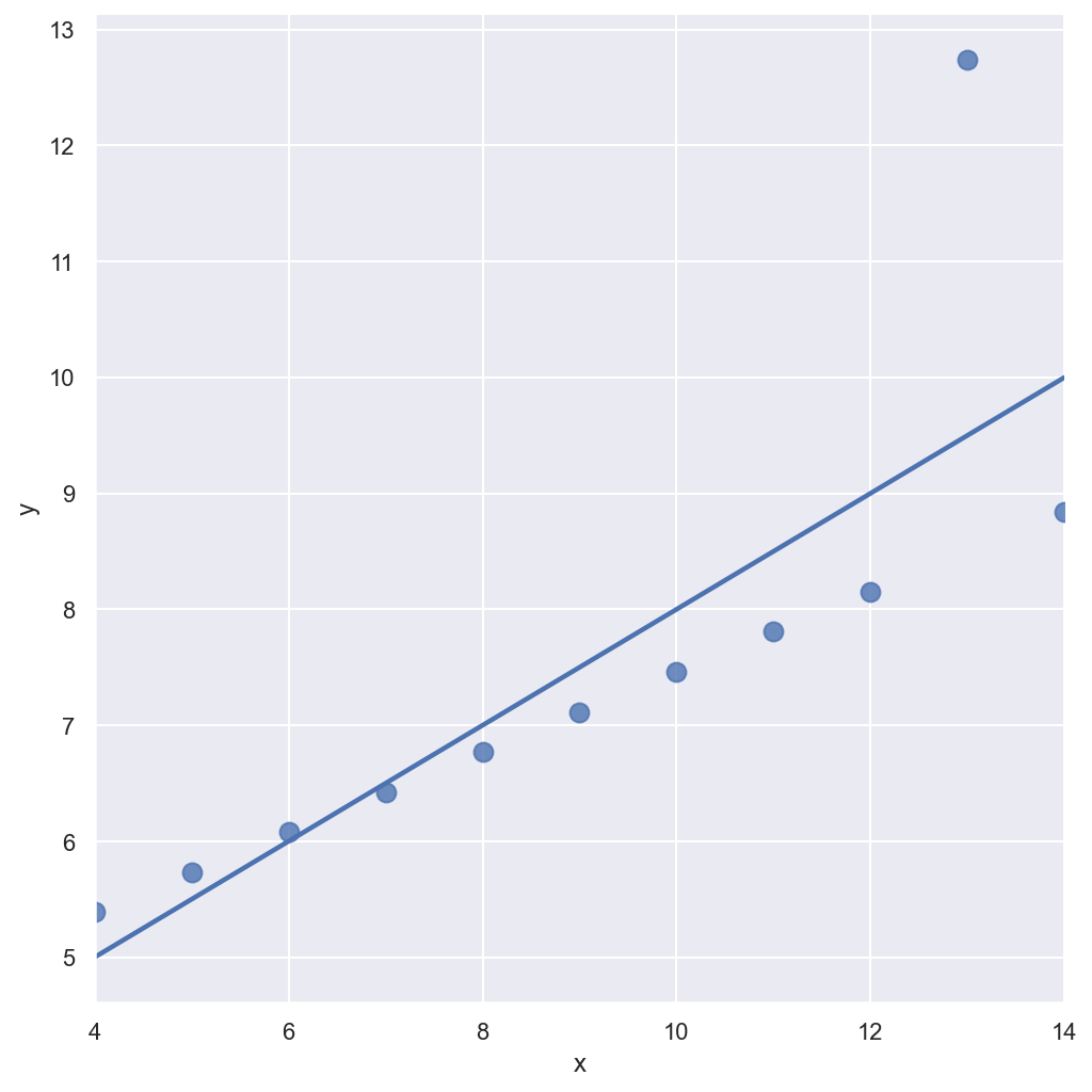
# outlier
sns.set_style("darkgrid")
sns.lmplot(
    x="x",
    y="y",
    data=anscombe.query("dataset == 'III'"),
    robust=True, # 원본에서 많이 떨어진 데이터는 없는 셈 친다
    ci=None,
    height=7,
    scatter_kws={"s": 80}) # ci 신뢰구간 선택
plt.show()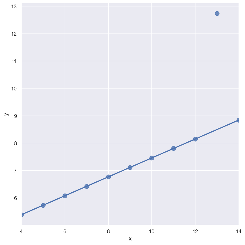

씨앗 데이터 분석가.