1) 유용한 CSS 속성들
1) 불투명도와 알파 채널
1-1 ) alpha
- rgba(red, green, blue ,alpha)
0 < alpha < 1
'1' 은 전혀 투명하지 X
'0' 은 완전히 투명 O
<html code>
<section>
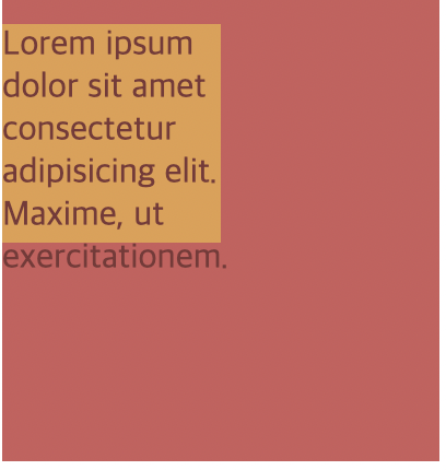
<div id="rgba">
Lorem ipsum dolor sit amet consectetur adipisicing elit. Maxime, ut
exercitationem.
</div>
</section>
<css code>
section {
width: 200px;
height: 200px;
background-color: indianred;
}
#rgba {
width: 50%;
height: 50%;
background-color: rgba(255, 255, 255, 0.6);
}- alpha는 배경의 투명도만 설정할 뿐이고 해당 태그안에 들어있는 컨텐츠에 대해서는 투명도를 적용시키지 않는다.

1-2) opacity
'1' 은 전혀 투명하지 X
'0' 은 완전히 투명 O
<html code>
<section>
      <div id="opacity">
        Lorem ipsum dolor sit amet consectetur adipisicing elit. Maxime, ut
        exercitationem.
      </div>
</section>

<css code>
#opacity {
  width: 50%;
  height: 50%;
  background-color: yellow;
  opacity: 0.4;
}- div태그 안의 글자까지 투명해짐을 알 수 있음.
2) 위치 속성
 <body>
    <h1>Position Property</h1>
    <section id="static">
      <h2>Static</h2>
      <div></div>
      <div id="middle"></div>
      <div></div>
    </section>
    <section id="relative">
      <h2>Relative</h2>
      <div></div>
      <div id="middle"></div>
      <div></div>
    </section>
    <section id="absolute">
      <h2>Absolute</h2>
      <div></div>
      <div id="middle"></div>
      <div></div>
    </section>
  </body>
1) static
- 디폴트값 : static
상하좌우 px 줘도 불변. 고정되있음.
div {
  width: 100px;
  height: 100px;
  background-color: cornflowerblue;
  margin: 10px;
  border: 2px solid black;
  display: inline-block;
}

#middle {
  background-color: skyblue;
}

#static #middle {
  position: static;
  top: 100px;
}
2) relative
- 상하좌우 값 변경가능.
#relative #middle {
  position: relative;
  top: 100px;
  right: 30px;
  left: 30px;
}
3) absolute
- 문서의 일반적인 흐름에서 요소가 제거되고 공간도 배정 X
#absolute {
  position: relative;
}
#aboslute #middle {
  position: absolute;
  top: 50px;
  left: 50px;
}
abosolute 같은경우에는 부모클래스가 'relative'라고 설정을 해줘야 부모클래스 구역 안에서 컨트롤이 가능하다.

4) fixed
- absolute와 비슷하나 부모클래스와는 관련이 없다는 점에서 다르다.
- 초기 컨테이닝 블럭의 상대적 위치에 존재한다.
2) CSS 전환
1) hover + transition
<html code>
<body>
    <h1>Transitions</h1>
    <div class="circle"></div>


</body>

<css code>
.circle {
  width: 300px;
  height: 300px;
  background-color: magenta;
  transition: 2s;
}

.circle:hover {
  background-color: cyan;
  border-radius: 50%;
}- 마우스를 div(300 X 300)네모박스에 올려놓으면 2초동안 원의 형태로 변화함.
<여러가지 조건들>

transition: background-color 0.5s 0.5s;

  -> 처음 0.5s : 0.5초동안 변함
     두번째 0.5 : hover 하고 0.5초 뒤에 transition 시작 (dealy 시간)

transition: all 0.5s 0.5

  -> 모든 특성이 0.5초동안 아무일없다가 0.5초동안 변함.


transition: background-color 0.5s, border-radius 2s;

-> 배경색은 0.5초내로 변하지만 네모에서 원의 형태는 2s에걸쳐 변함.
2) timing
<html code>
<body>
    <h1>Transitions</h1>
    <div class="circle"></div>
    <section>
      <div></div>
      <div></div>
      <div></div>
      <div></div>
    </section>
  </body>


<css code>
section div {
  height: 100px;
  width: 100px;
  background-color: turquoise;
  margin: 20px 0;
  transition: margin-left 3s;
}

section:hover div {
  margin-left: 500px;
}

div:nth-of-type(1) {
  transition-timing-function: ease-in;
}

div:nth-of-type(2) {
  transition-timing-function: ease-in-out;
}

div:nth-of-type(3) {
  transition-timing-function: cubic-bezier(0.7, 0, 0.84, 0);
}

div:nth-of-type(4) {
  transition-timing-function: cubic-bezier(0.85, 0, 0.15, 1);
}

-> 모든 사각형에 3초의 전환을 margin-left로 주되 타이밍 기능을 '개별적'으로 지정.
<정리>
1) 애니메이션 효과를 줄 특성지정
2) 지속시간 지정
3) 타이밍기능 지정 (ex) ease-in-out , ease-in)
4) 주로 hover와 함께 쓰임.
3) CSS 변환이 가진 능력
transform
<html code>

<body>
    <section>
      <h1>Transform me !</h1>
      <h1>Transform me !</h1>
      <h1>Transform me !</h1>
      <h1>Transform me !</h1>
    </section>
    <section>
      <h1>Transform me !</h1>
      <h1>Transform me !</h1>
      <h1>Transform me !</h1>
      <h1>Transform me !</h1>
    </section>
</body>

<css code>

h1 {
  background-color: #2a9d8f;
  border: 5px solid black;
  color: bisque;
  padding: 0.4em;
  width: 300px;
  font-size: 1.8em;
  text-align: center;
  margin: 20px auto;
  font-family: "Courier New", Courier, monospace;
  font-weight: lighter;
}

h1:nth-of-type(2n) {
  background-color: #e9c46a;
}

h1:nth-of-type(3n) {
  background-color: #f4a261;
}

h1:nth-of-type(4n) {
  background-color: blueviolet;
}

section:first-of-type h1:nth-of-type(1) {
  /* transform-origin: bottom top ;*/
  transform: rotate(45deg);
}

section:first-of-type h1:nth-of-type(2) {
  transform: scale(0.8);
}

section:first-of-type h1:nth-of-type(3) {
  transform: translateX(200px);
}

section:first-of-type h1:nth-of-type(4) {
  transform: translate(-100px, 50px);
}
section:nth-of-type(2) h1:nth-of-type(1) {
  transform: skew(30deg);
}

section:nth-of-type(2) h1:nth-of-type(2) {
  transform: skew(10deg, 5deg);
}

section:nth-of-type(2) h1:nth-of-type(3) {
  transform: rotate(30deg) scale(0.7);
}

section:nth-of-type(2) h1:nth-of-type(4) {
  transform: translateX(-500px) rotate(180deg) scaleY(1.5);
}

section:nth-of-type(2) {
  transform: scale(0.7);
}
4) Hover 효과 주기
- box-shadow: (offset-x | offset-y | blur-radius | spread-radius | color )
body {
  height: 100vh;
  display: flex;
  align-items: center;
  justify-content: center;
  background-color: #151b29;
}

button {
  background: none;
  color: #ffa260;
  border: 2px solid;
  padding: 1em 2em;
  font-size: 1em;
  transition: color 0.2s, border-color 0.2s, box-shadow 0.2s, transform 0.2s;
}

button:hover {
  border-color: #f1ff5c;
  color: white;
  box-shadow: (0 0.5em 0.5em -0.4em);
  transform: translateY(-0.25em);
  cursor: pointer;
}
5) 배경에 관한 진실
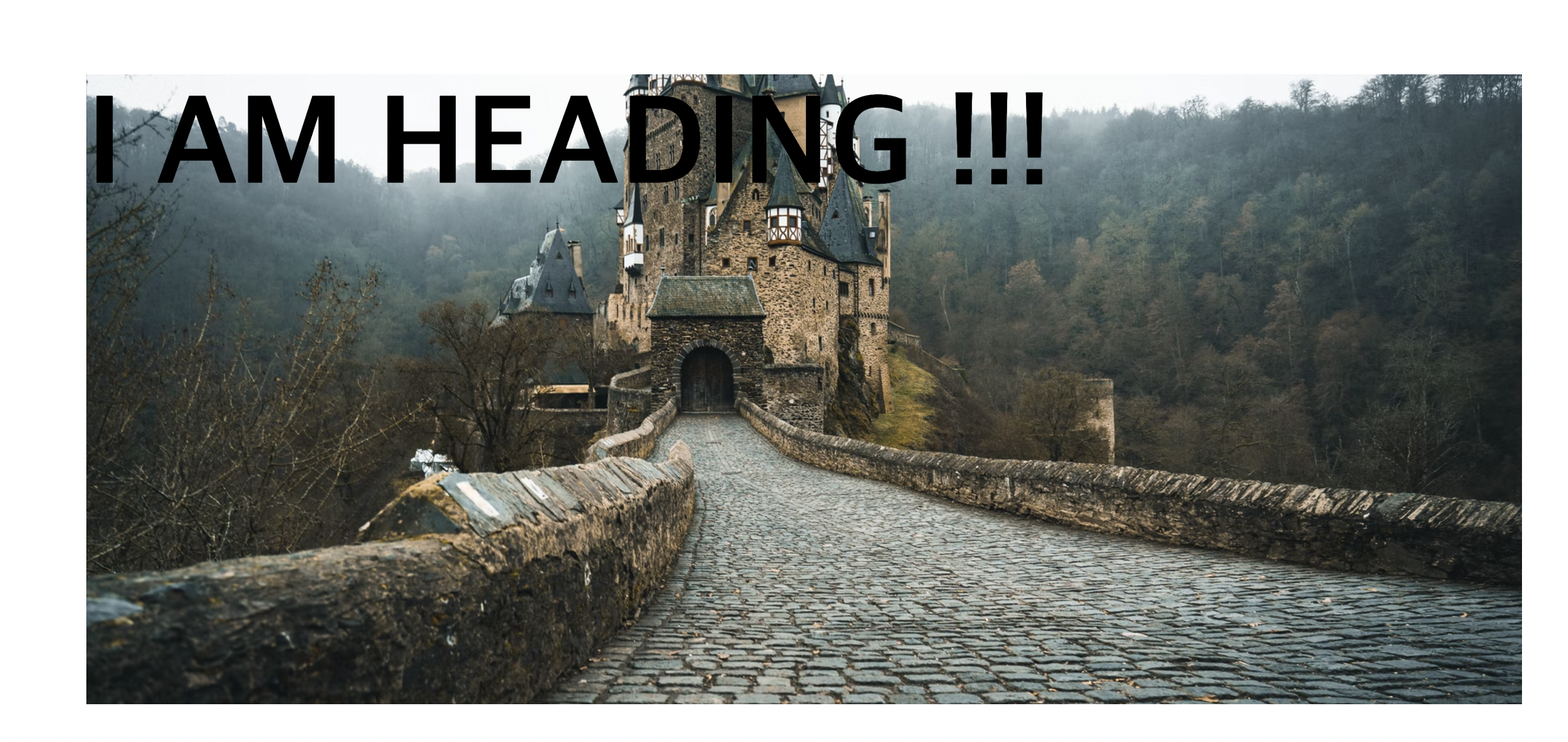
section {
  width: 80%;
  height: 500px;
  margin: 0 auto;
  background-image: url("https://images.unsplash.com/photo-1657002774608-5f1914825a5c?ixlib=rb-1.2.1&ixid=MnwxMjA3fDB8MHxwaG90by1wYWdlfHx8fGVufDB8fHx8&auto=format&fit=crop&w=1740&q=80");
  background-size: cover;
  background-position: bottom;


 * background 속기법
 background: center/cover (사진의 중앙부분을 쓰고싶으면서 반복되는게 싫어서 cover속성을 주고싶으면 '/' 로 연결해야함)
    url("https://images.unsplash.com/photo-1657002774608-5f1914825a5c?ixlib=rb-1.2.1&ixid=MnwxMjA3fDB8MHxwaG90by1wYWdlfHx8fGVufDB8fHx8&auto=format&fit=crop&w=1740&q=80");

}

h1 {
  font-size: 100px;
  color: black;
}
6) 놀라운 구글의 글꼴
--->  head태그에 자손으로서 글꼴 링크 추가

   <link
      href="https://fonts.googleapis.com/css2?family=Montserrat&display=swap"
      rel="stylesheet"
    />

    --------------------------------------------------------------------
  <body>
    <main>
      <h1>Google Fonts</h1>
      <h2>Subheading Goes Here</h2>

      <h3>Chicken Nugget Smoothies</h3>
      <p>
        Lorem ipsum dolor sit amet, consectetur adipisicing elit. Commodi
        deleniti dolorem impedit facere magni recusandae sint similique minima
        non, et, iste dolorum iusto voluptatum? Reprehenderit tempora enim saepe
        ipsam dolorum. Fugiat dolorum est accusamus voluptate nam? Ut asperiores
        beatae vel quod id. Repudiandae, cupiditate ad. Recusandae sit corporis,
        ipsum vero magnam quisquam. Nulla, obcaecati. Quaerat iste dignissimos
        id libero quae! Pariatur recusandae laborum animi quas hic error est
        nostrum autem ab, in quidem cumque corrupti quos illum maiores sint
        provident, sed quia. Quos rerum fugit esse accusantium sapiente
        voluptatibus fugiat? Maiores, deserunt praesentium. Dolorem vel
        temporibus amet eligendi nisi! Laboriosam nesciunt beatae at nisi
        impedit, corporis doloribus hic ex blanditiis et delectus veritatis,
        asperiores nobis enim mollitia earum atque. Odit? In aperiam iste beatae
        maxime tempore rem accusantium ex corporis. Illo a nobis quis architecto
        reprehenderit voluptate ipsum enim beatae saepe consequatur. Rem ex
        dolorem ratione quaerat, numquam eligendi itaque. Temporibus placeat
        quidem excepturi magni, nostrum quis vel pariatur odio fugit beatae
        repellat iure impedit deleniti cumque maxime totam ratione reprehenderit
        animi necessitatibus ut illo amet alias! Sapiente, nobis placeat!
      </p>
    </main>
</body>

<css code>
body {
  font-family: "Montserrat", sans-serif;
}

main {
  width: 60%;
  margin: 0 auto;
}

h1 {
  font-size: 3rem;
  margin-bottom: 0;
}

h1 + h2 {
  margin-top: 10px;
}

h1,
h2,
h3 {
  font-family: Roboto, sans-serif;
  font-weight: 100;
}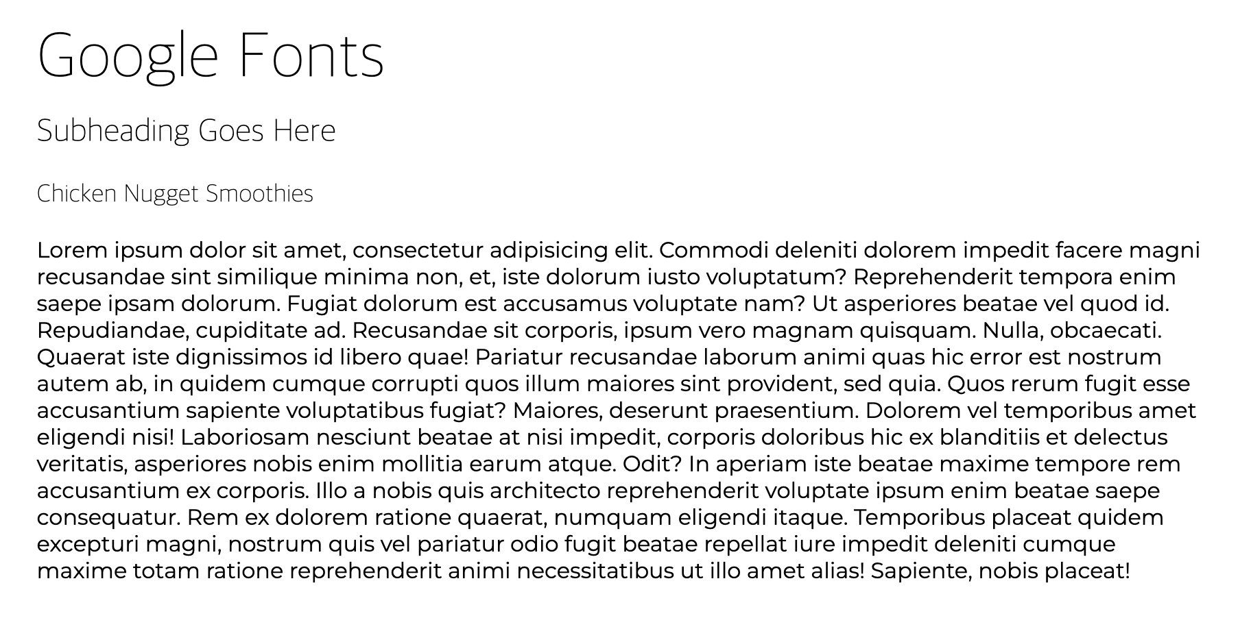
- 문단은 Montserrat 글꼴 , h태그들은 Roboto 글꼴 적용.
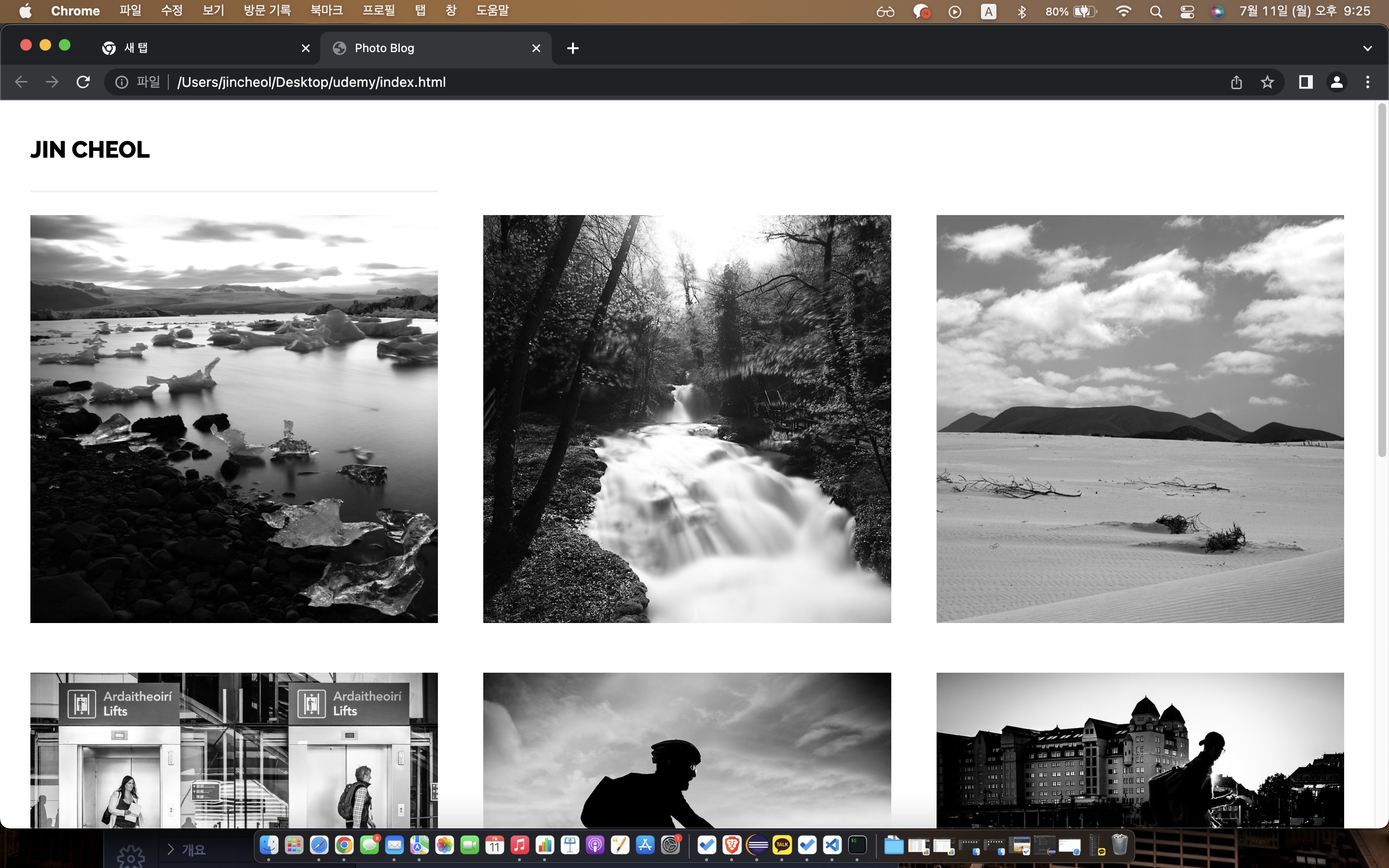
7) 사진 블로그 코딩하기
<html code>
<!DOCTYPE html>
<html>
  <head>
    <title>Photo Blog</title>
    <link rel="stylesheet" href="style2.css" />
    <link rel="preconnect" href="https://fonts.googleapis.com" />
    <link rel="preconnect" href="https://fonts.gstatic.com" crossorigin />
    <link
      href="https://fonts.googleapis.com/css2?family=Montserrat&family=Raleway:wght@800&display=swap"
      rel="stylesheet"
    />
  </head>
  <body>
    <!-- PUT YOUR NAME HERE! -->
    <nav>Jin Cheol</nav>

    <!-- Massimo Margagnoni -->
    <img
      src="http://c1.staticflickr.com/9/8450/8026519634_f33f3724ea_b.jpg"
    /><img
      src="http://c2.staticflickr.com/8/7218/7209301894_c99d3a33c2_h.jpg"
    /><img
      src="http://c2.staticflickr.com/8/7231/6947093326_df216540ff_b.jpg"
    />

    <!-- Giuseppe Milo -->
    <img
      src="http://c1.staticflickr.com/9/8788/17367410309_78abb9e5b6_b.jpg"
    /><img
      src="http://c2.staticflickr.com/6/5814/20700286354_762c19bd3b_b.jpg"
    /><img
      src="http://c2.staticflickr.com/6/5647/21137202535_404bf25729_b.jpg"
    />

    <!-- GörlitzPhotography -->
    <img
      src="http://c2.staticflickr.com/6/5588/14991687545_5c8e1a2e86_b.jpg"
    /><img
      src="http://c2.staticflickr.com/4/3888/14878097108_5997041006_b.jpg"
    /><img
      src="http://c2.staticflickr.com/8/7579/15482110477_0b0e9e5421_b.jpg"
    />

    <!-- All Photos Licensed Under Creative Commons 2.0 -->
    <!-- https://creativecommons.org/licenses/by/2.0/legalcode  -->
  </body>
</html>

<css code>

img {
  width: 30%;
  margin: calc(10% / 6);
  /* margin: 1.6666%: 이미지 너비가 30씩 차지했으므로 나머지 10프로의 여백을 하나의 사진당 좌,우에 배당한다고 했을 때 10/6의 값. */
}

nav {
  text-transform: uppercase;
  border-bottom: 2px solid #f1f1f1;
  width: 30%;
  margin-left: calc(10% / 6);
  padding: 20px 0;
  font-size: 1.5em;
  font-family: "Raleway", sans-serif;
  padding: 1.2em 0;
}- html 코드에 /><img 처럼 '>'표시에 연달아 <img 가 오는것은 'white space' 때문임. 저부분을 스페이스로 띄어버리면 사진과 사진과의 간격이 생겨 배열이 흐트러짐.
2) 반응형 CSS 및 Flexbox
1) Flexbox란 ?
- 하나의 컨테이너 안에서 화면의 크기에 따라 어떤 요소를 크게하고 작게할지 , 요소들 사이의 간격은 어떻게 할지, 어디에 배치할지에 등에 대한 결정.
2) Flex-direction
<html code>
<body>
<h1>Let's Play With Flexbox</h1>
<section id="container">
<div style="background-color: #80ffdb"></div>
<div style="background-color: #64dfdf"></div>
<div style="background-color: #48bfe3"></div>
<div style="background-color: #5390d9"></div>
<div style="background-color: #6930c3"></div>
</section>
</body>
<css code>
body {
font-family: "Open Sans", sans-serif;
}
h1 {
text-align: center;
}
#container {
background-color: cadetblue;
width: 90%;
height: 400px;
margin: 0 auto;
border: 5px solid #003049;
display: flex;
}
#container div {
width: 100px;
height: 100px;
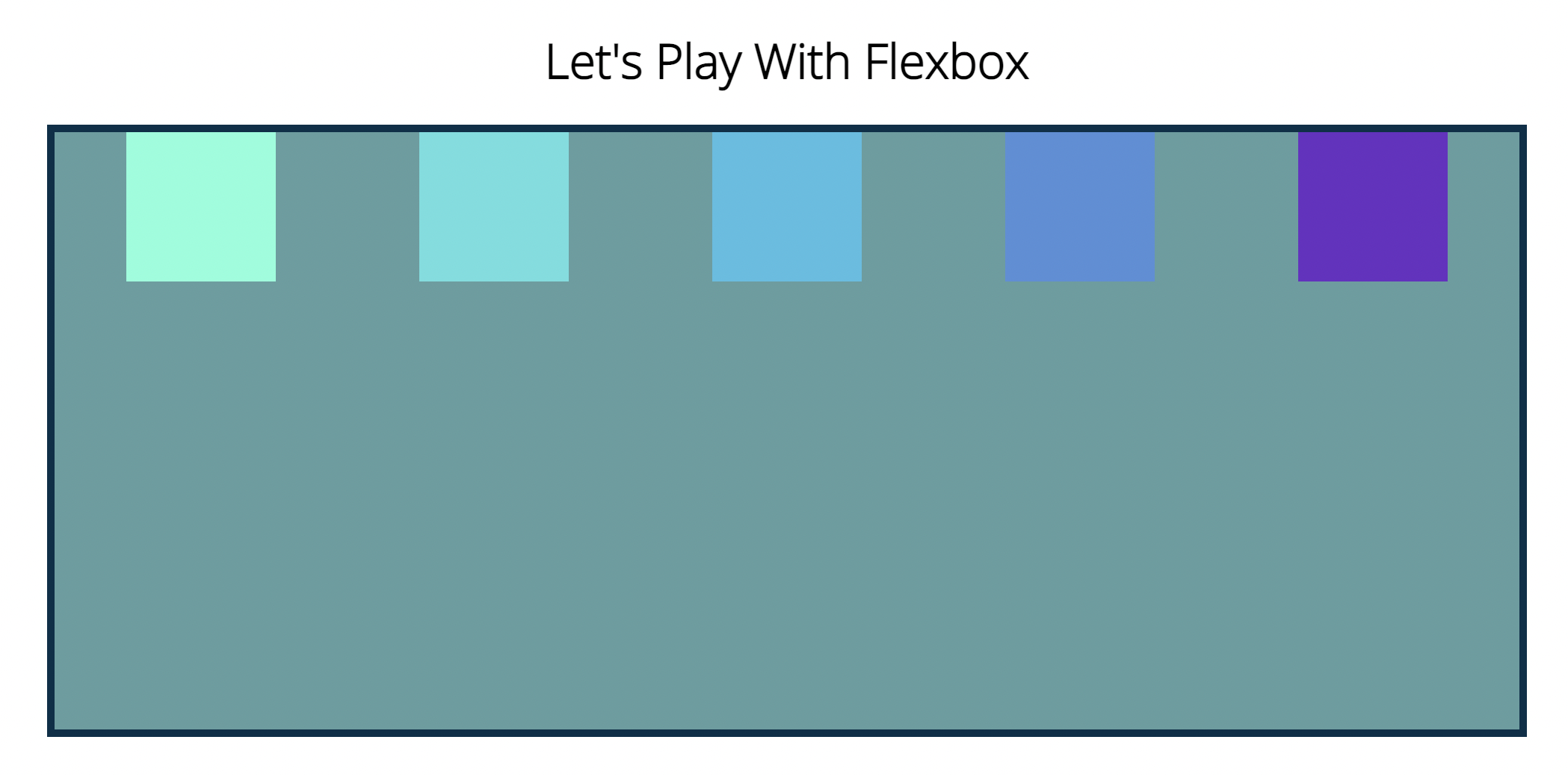
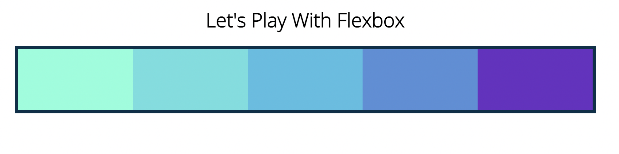
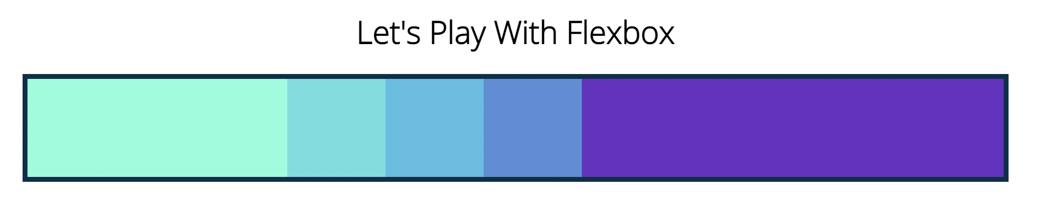
}display:flex 적용 전

적용 후
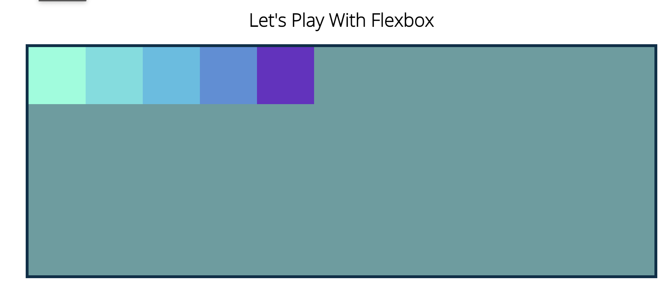
- display를 만든 컨테이나 박스의 본축의 방향은 왼->오른쪽 순.
flex-direction: row-reverse; 
flex-direction: column; 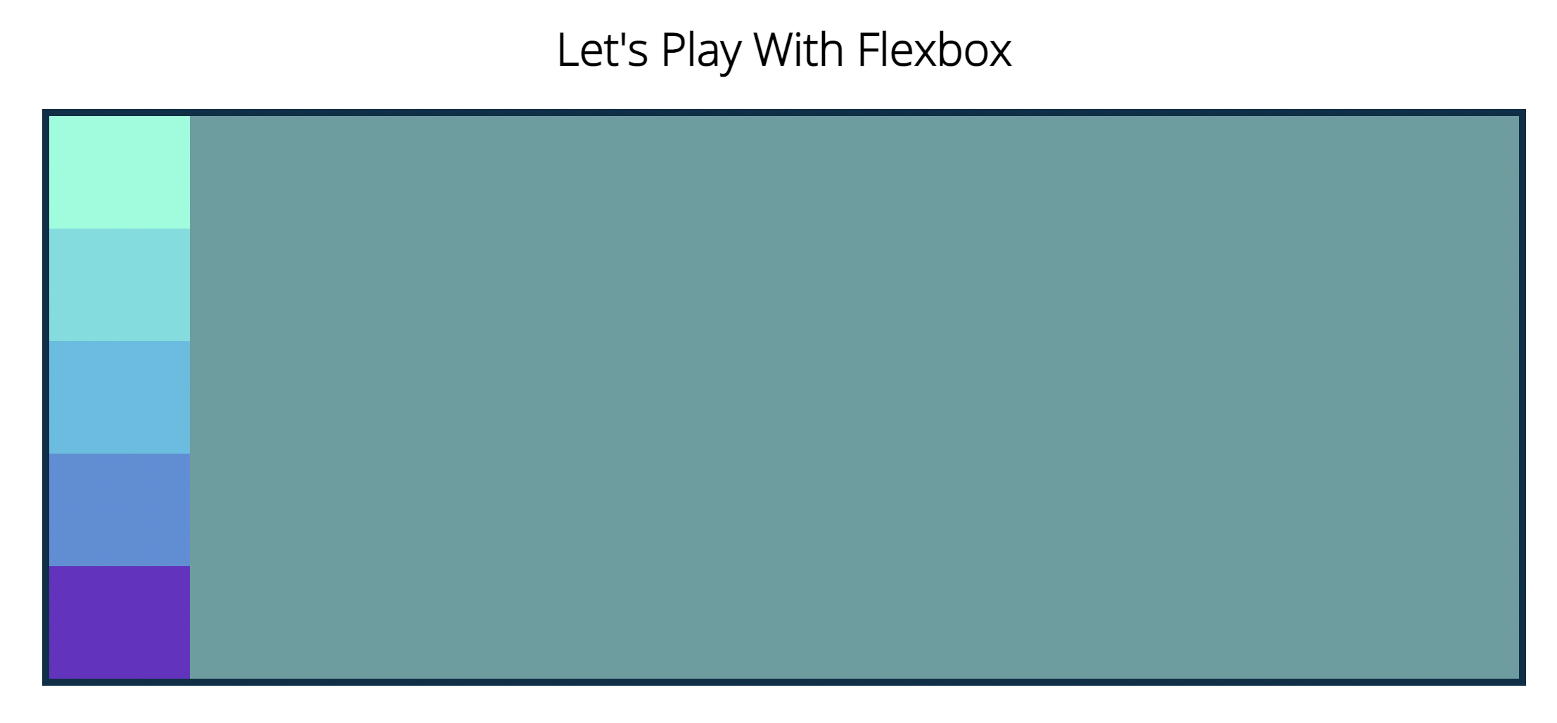
- 컨테이너 크기에 맞춰서 크기변경됨. (flexbox)
flex-direction: column-reverse;
3) Justify-content
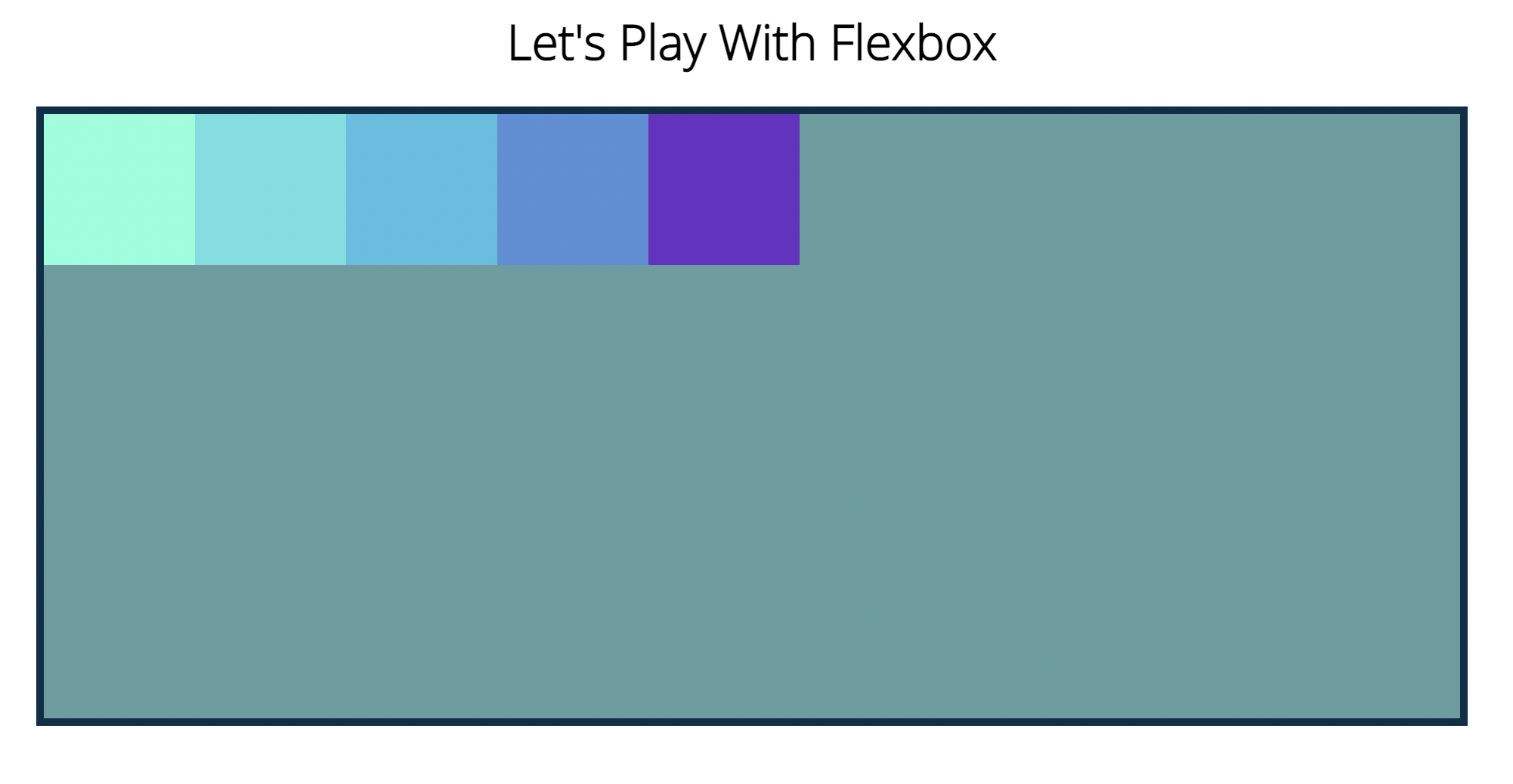
- 주축을 기준으로 요소와 컨텐츠를 어떻게 배칠할지 결정하는 속성. (defalut는 flex-start)
  display: flex;
  flex-direction: row;
justify-content: flex-start;- 주축이 왼->오른쪽 이므로 justify-content의 방향도 왼->오른쪽으로 유지.
  display: flex;
  flex-direction: row;
  justify-content: flex-end;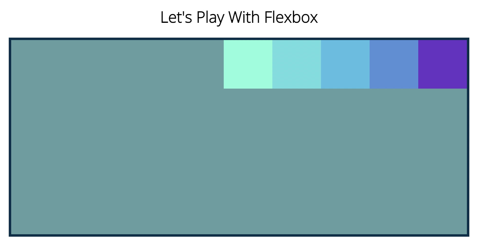
  display: flex;
  flex-direction: row;
  justify-content: center;
  display: flex;
  flex-direction: row;
  justify-content: space-between;
  display: flex;
  flex-direction: row;
justify-content: space-around;- 요소의 '둘레' 에 똑같은 면적을 부여.
  display: flex;
  flex-direction: row;
justify-content: space-evenly;- 양 끝 사이드 포함해서 모두 여백이 같음.

- justify-content 는 특정한 수평,수직이 아니다.
flex-direction에 따라 방향과 주축이 달라진다.
(상->하 , 하->상 , 좌->우 , 우->좌)
6) Flex-wrap
  flex-direction: column;
  justify-content: space-evenly;
  flex-wrap: wrap;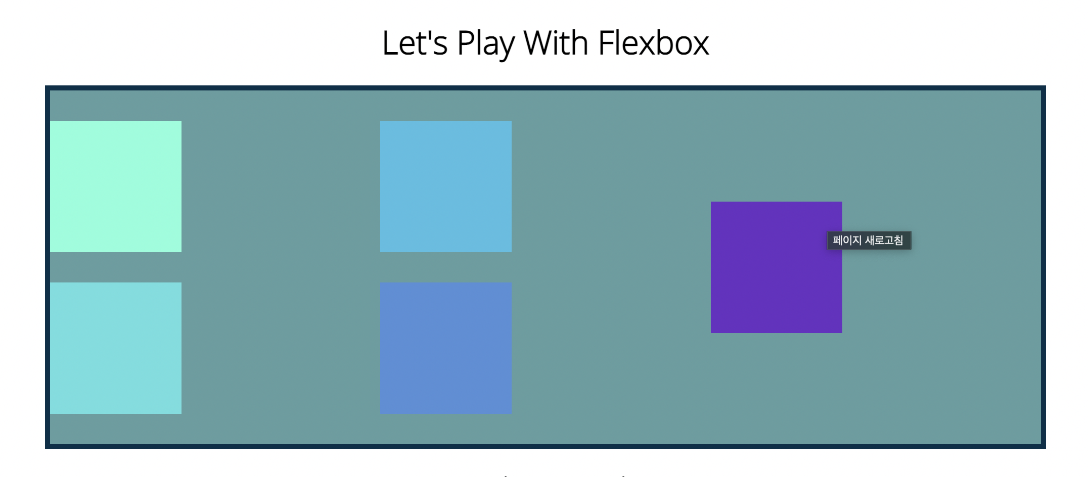
  flex-direction: column;
  justify-content: space-evenly;
  flex-wrap: wrap-reverse;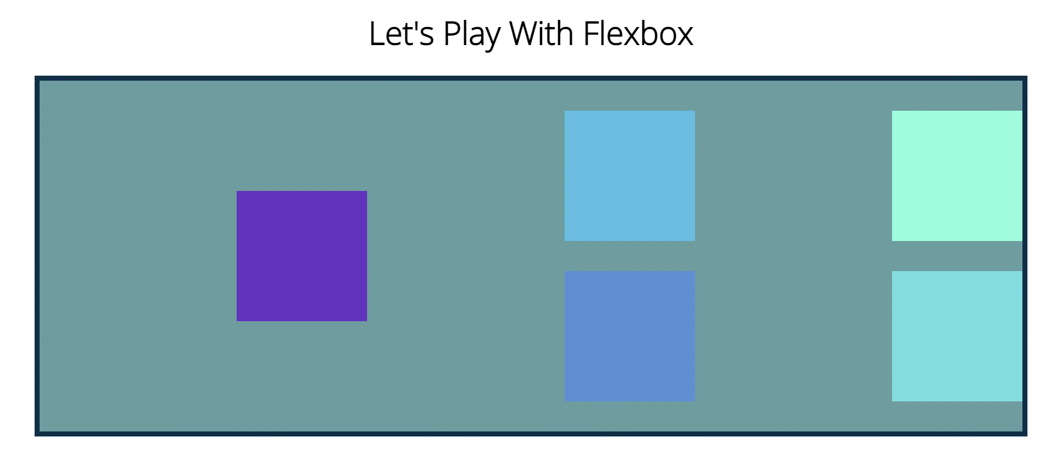
7) Align-items
- justify-content 가 main-axis 축을 중심으로 정렬했다면 Align-items는 cross-axis를 주축으로 정렬함 (단순히 세로,가로축이 아니고 박스들의 배열이 어떤식으로 배열되느냐에 따라 축의 방향이 매번 달라짐).
<html code>
<body>
    <h1>Let's Play With Flexbox</h1>

    <section id="container">
      <div style="background-color: #80ffdb">H</div>
      <div style="background-color: #64dfdf">E</div>
      <div style="background-color: #48bfe3; height: 200px">L</div>
      <div style="background-color: #5390d9">L</div>
      <div style="background-color: #6930c3; height: 50px">O</div>
    </section>
</body>


<css code>

#container {
  background-color: cadetblue;
  width: 90%;
  height: 200px;
  margin: 0 auto;
  border: 5px solid #003049;
  display: flex;
  flex-direction: row;
  justify-content: center;
  align-items: baseline;
}

#container div {
  width: 100px;
  height: 100px;
  font-size: 2em;
}
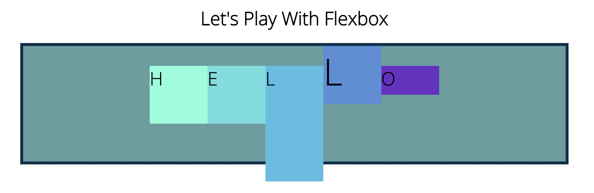
- 밑에 처럼 'L' 알파벳을 크게만들어주니 다른 박스가 align-items의 성질이 baseline임에도 불구하고 밑으로 내려갔다. 따라서 baseline의 기준은 글자들의 밑단을 일자로 그었을때 연결해주는 느낌으로 생각해주며 쉽다.
#container {
  background-color: cadetblue;
  width: 90%;
  height: 350px;
  margin: 0 auto;
  border: 5px solid #003049;
  display: flex;
  flex-direction: column;
  justify-content: center;
  align-items: center;
  flex-wrap: wrap;
}

#container div {
  width: 140px;
  height: 140px;
  text-align: center;
}
8. Align-content & Align-self
  display: flex;
  flex-direction: column;
  justify-content: center;
  align-items: flex-end;
  flex-wrap: wrap;
  align-content: center;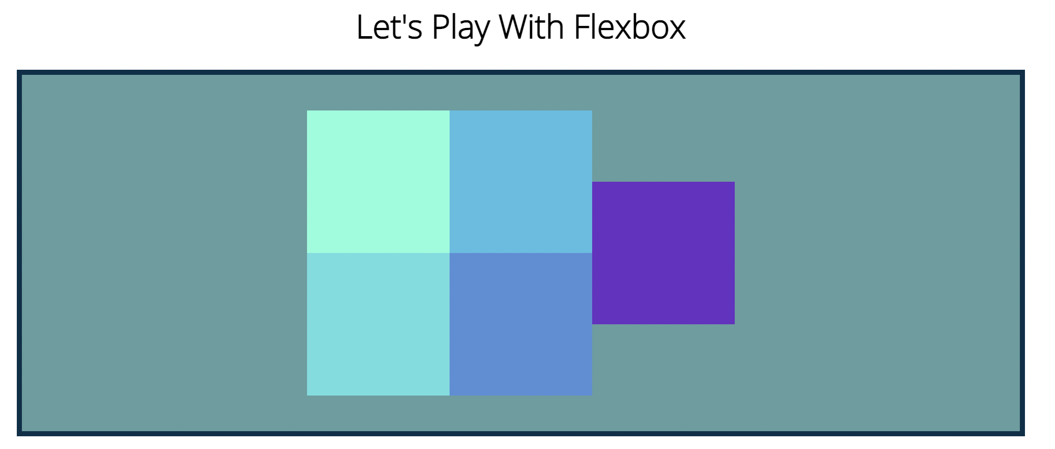
  display: flex;
  flex-direction: column;
  justify-content: center;
  align-items: flex-start;
  flex-wrap: wrap;
  align-content: space-between;
- align-content는 여러개의 블록이 단위를 줄바꿈이 생길때만 적용이 가능. 단순열,행의 일렬의 박스들은 적용 X
9. Align-self
- 개별 박스에만 적용시키기
#container {
  display: flex;
  flex-direction: row;
  justify-content: center;
  align-items: flex-start;
  flex-wrap: wrap;
}

div:nth-of-type(3) {
  align-self: flex-end;
}
div:nth-of-type(2) {
  align-self: center;
}
div:nth-of-type(3) {
  align-self: flex-end;
}
10. Flex-Basis, Grow & Shrink
1) flex-basis
#container {
  background-color: cadetblue;
  width: 90%;
  /*height: 200px; */
  margin: 0 auto;
  border: 5px solid #003049;
  display: flex;
  flex-direction: row;
  justify-content: center;
}

#container div {
  width: 100px;
  height: 100px;
  text-align: center;
  flex-basis: 400px;
}- 너비가 100px 임에도불구하고 flex-basis 기준으로 블럭들이 채워짐.
- 요소가 배치될때의 최초 크기.

#container div {
  width: 100px;
  height: 50px;
  flex-basis: 100px;
}- height가 50px임에도 불구하고 flex-basis의 크기로 설정됨.
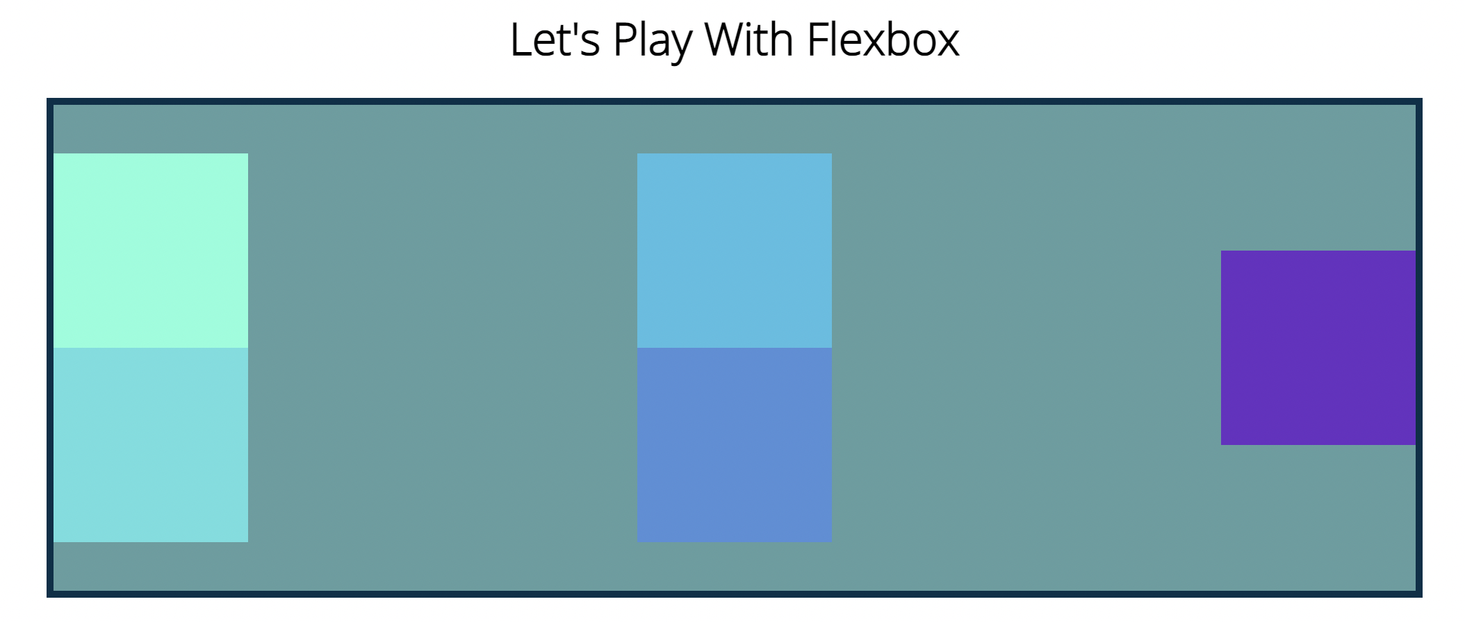
2) flex-grow
#container {
  background-color: cadetblue;
  width: 90%;
  /*height: 200px; */
  margin: 0 auto;
  border: 5px solid #003049;
  display: flex;
  flex-direction: row;
  justify-content: center;
}

#container div {
  width: 100px;
  height: 100px;
  text-align: center;
  flex-basis: 100px;
}

div:nth-of-type(1) {
  flex-grow: 1;
}

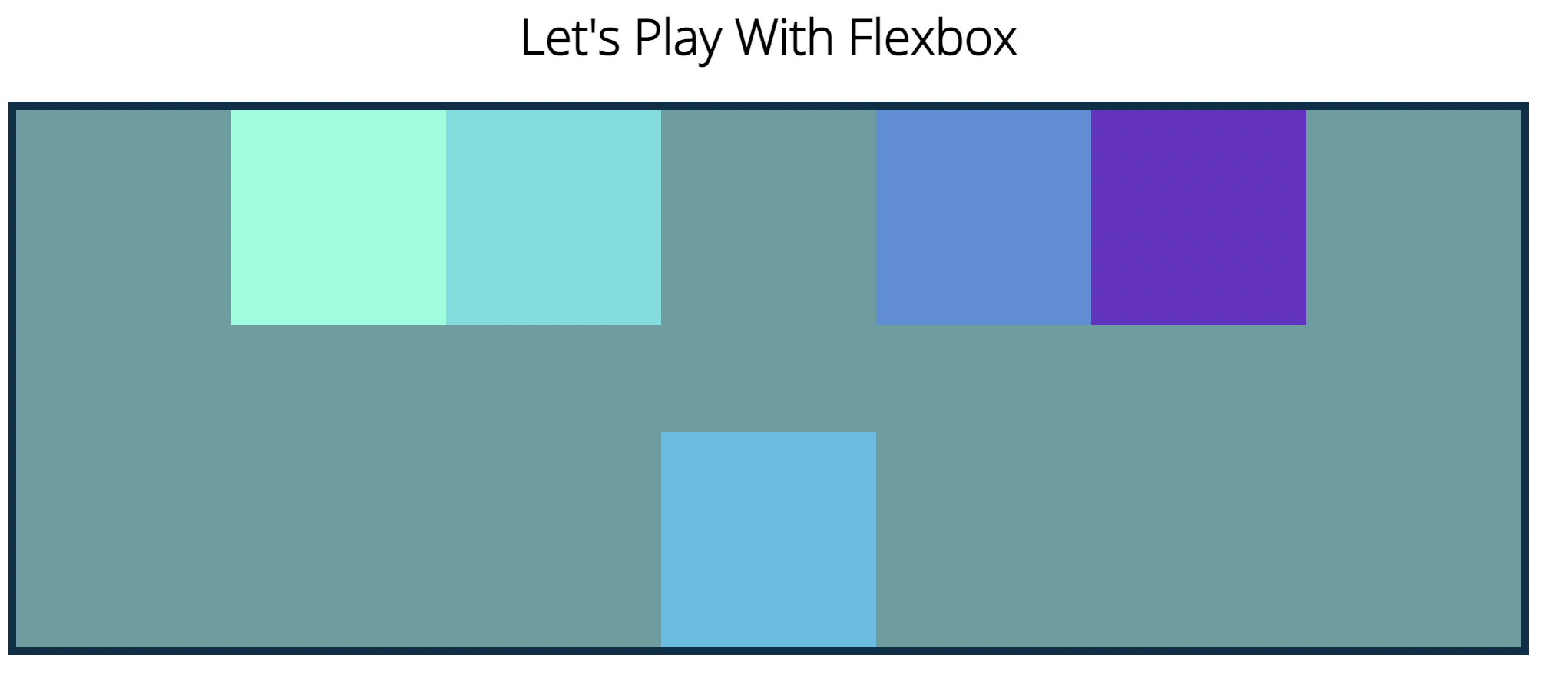
3) flex-shrink
#container {
  background-color: cadetblue;
  width: 90%;
  /*height: 200px; */
  margin: 0 auto;
  border: 5px solid #003049;
  display: flex;
  flex-direction: row;
  justify-content: center;
}

#container div {
  width: 100px;
  height: 100px;
  text-align: center;
  flex-basis: 100px;
}

div:nth-of-type(1) {
  flex-grow: 1;
  flex-shrink: 2;
}

div:nth-of-type(5) {
  flex-grow: 2;
}
- 다른블럭에비해 상대적으로 줄어듬.
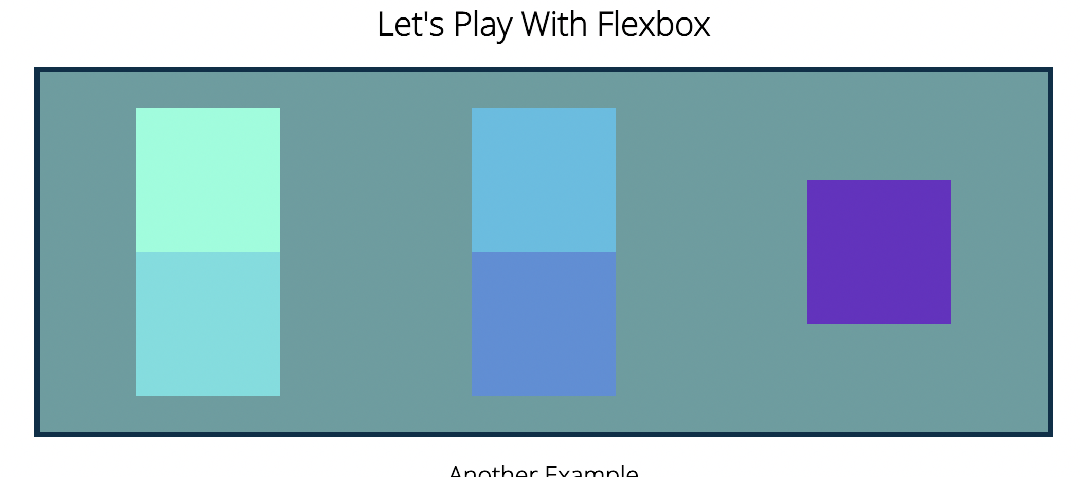
11) Flex shorthand
flex : (flex-grow | flex-shrink | flex-basis) ->가장많이씀.
flex : (flex-grow | flex-shrink)
if flex's one of the elements is px or em
flex : (flex-grow | flex-basis)
<html code>
 <body>
    <h1>Let's Play With Flexbox</h1>

    <section id="container">
      <div style="background-color: #80ffdb"></div>
      <div style="background-color: #64dfdf"></div>
      <div style="background-color: #48bfe3"></div>
      <div style="background-color: #5390d9"></div>
      <div style="background-color: #6930c3"></div>
    </section>

    <h2>Another Exmaple</h2>
    <main>
      <section class="sidebar"></section>
      <section class="maincontent"></section>
      <section class="sidebar"></section>
    </main>
  </body>

<css code>

main {
  width: 80%;
  margin: 0 auto;
  border: 5px solid black;
  height: 300px;
  display: flex;
}

main .sidebar {
  background-color: purple;
  border: 2px solid white;
  flex: 1 2;
}

main .maincontent {
  background-color: green;
  flex: 2 1 400px;
}
11) 미디어 쿼리의 능력
<html code>
 <body>
    <nav>
      <a href="#home">Home</a>
      <ul>
        <li>
          <a href="#Home">Learn More</a>
        </li>
        <li>
          <a href="#Home">About</a>
        </li>
        <li>
          <a href="#Home">Contact</a>
        </li>
      </ul>
      <a href="#signup">Sign Up</a>
    </nav>
    <h1>Media Queries</h1>
  </body>

<css code>

body {
  font-family: "Open Sans", sans-serif;
}

h1 {
  font-size: 6em;
  text-align: center;
}
nav {
  font-size: 1.5em;
  display: flex;
  justify-content: space-between;
}

ul,
li {
  display: inline;
  margin: 0;
  padding: 0;
}
ul {
  flex: 1;
  max-width: 50%;
  display: flex;
  justify-content: space-evenly;
}


h1 {
  color: red;
}

@media (min-width: 500px) {
  h1 {
    color: orange;
  }
}
@media (min-width: 1000px) {
  h1 {
    color: yellow;
  }
}
@media (min-width: 1500px) {
  h1 {
    color: green;
  }
}
12) 반응형 네비게이션 바 제작
@media (max-width: 768px) {
  h1 {
    font-size: 4em;
  }
  nav,
  nav ul {
    flex-direction: column;
    align-items: center;
  }
}
@media (max-width: 576px) {
  h1 {
    font-size: 3em;
  }
}
WILL is ALL