Logistic Regression
- 로지스틱 회귀는 독립 변수들을 사용해 사건이 발생할 확률을 예측하는, 분류용 통계·머신러닝 모델이다.
1. Linear Regression 다시 살펴보기
비용함수와 경사하강법
비용함수
- 모델이 얼마나 잘 예측하고 있는지를 수치로 표현하는 기준
- 데이터 전체를 보고, 예측값과 실제값의 차이를 하나의 숫자로 요약한 것
가설함수 (Hypothesis)를 아래로 설정한다. (원점을 지나는 직선 그래프)
비용함수는 다음과 같이 정의된다.
3개의 관측 데이터가 (2, 1), (3,5), (5, 6)을 지난다고 할 때
가설함수를 대입하면
J(theta)는 오차항들의 분포 전체를 하나의 수치로 요약한 함수이며 theta는 회귀선 x의 기울기. 즉 회귀선의 기울기가 theta일 때 가지는 오차제곱평균 값들의 모음
import numpy as np
import matplotlib.pyplot as plt

# 다항식 구하기
poly = np.poly1d([2,-1])**2 + np.poly1d([3,-5])**2 + np.poly1d([5, -6])**2

theta = np.linspace(-3,5.5,200) # theta(x축 범위)
cost = poly(theta) # theta를 대입하여 출력값 구하기

plt.plot(theta, cost, label = "Cost Function J(theta)")
plt.legend()
plt.show()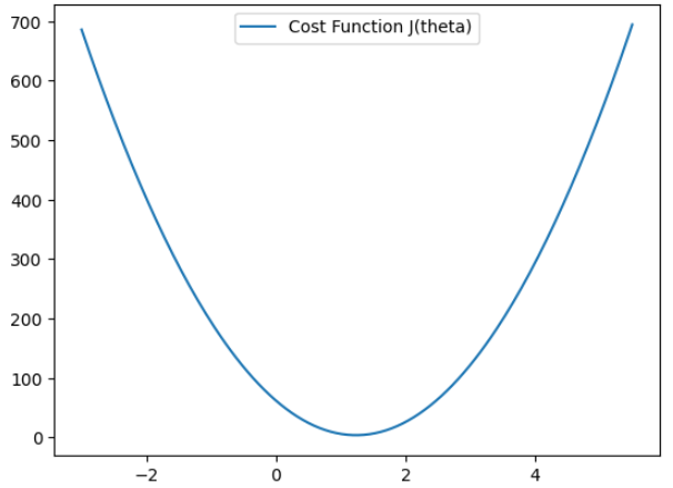
위의 비용함수에서 그래프가 만나는 점에 대해 미분했을 때 기울기가 0인 지점을 극값 (회귀선의 기울기) 후보로 선정할 수 있다.
경사하강법
- 임의의 값을 정한 후 순차적으로 내려가며 극값 후보를 찾는 과정이다.
방법
- 위의 비용함수에서 임의의 점에 대해 미분(혹은 편미분)하여 값을 업데이트한다.
그 값(기울기가) 0보다 크면 - {Positive Value}, 0보다 작다면 - {Negative Value}를 해준다.
학습률 (Learning Rate)
- 위 식에서 alpha는 얼마만큼 theata를 갱신할 것인지를 설정하는 값. theta값을 얼마나 크게 이동할지 정하는 하이퍼파라미터 정도로 이해하면 된다.
- 학습률이 작다면, 여러 번 갱신하지만 안전하게 극값을 찾을 것이며 학습률이 크다면 그 반대일 것이다.

2. Logistic Regression
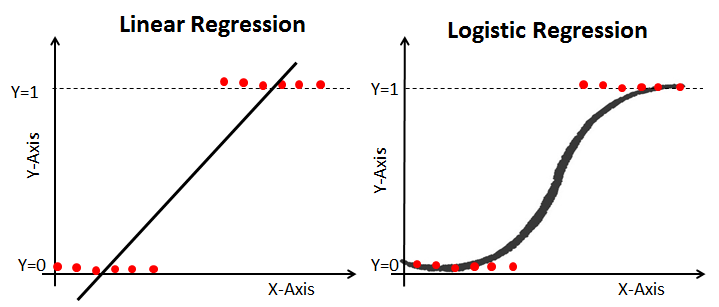
주어진 종양의 크기로 악성 종양을 찾는 문제는 회귀일까 분류일까? 결과는 악성(1)과 양성(0) 두 가지만 존재하는데, 무한대 값을 가지는 Linear Regression을 이용하는 것은 적용하기에는 어려움이 있다.
이처럼 문제를 0또는 1로 예측해야할 때 항상 0과 1사이의 값을 가지도록 Hypothesis 함수를 수정한다. 이를 시그모이드 함수라고 한다.
Logistic Function 그리기
import numpy as np
import matplotlib.pyplot as plt

z = np.arange (-10,10,0.01)
g = 1 / (1+np.exp(-z))

plt.plot(z,g)
plt.show()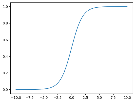
H_theta(x) Hypothesis는 다음과 같은 식을 가지고 있다.
Cost Function
실제 데이터와 예측 데이터의 오차 관게를 타나낸 비용함수를 도출할 때, 로지스틱회귀에서 선형회귀와 동일하게 MSE를 사용하게 되면 비볼록되어 최적화가 까다롭다. 대신 Log Loss를 사용하며 볼록(convex)이어서 경사 하강법 적용이 잘 된다.
y = 1일 때,
예측값이 0으로 갈 수록, 즉 실제 데이터와 멀어질 수록 Cost function의 값은 점점 커지게 된다.
반대로 실제 데이터가 0일 때,
값이 1로 갈수록 Cost function 값은 점점 커지게 된다.
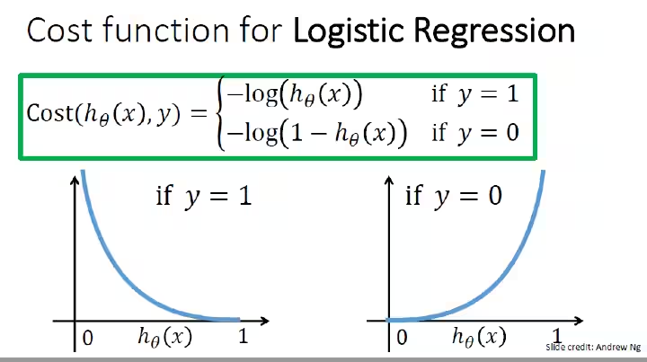
이제 두 선을 하나로 결합하여 통합된 비용함수를 만들 수 있다.
Learning 알고리즘은 선형과 동일하게 학습률과 미분을 이용한다.
h = np.arange(0.01, 1, 0.01)
c0 = -np.log(1 - h)
c1 = -np.log(h)

plt.figure(figsize = (12,8))
plt.plot(h, c0, label = 'y = 0')
plt.plot(h, c1, label = 'y = 1')
plt.legend()

plt.show()
3. Python 실습하기
# 데이터 load
import pandas as pd

df = pd.read_csv("/kaggle/input/wine-quality-data-set-red-white-wine/wine-quality-white-and-red.csv")
df['taste'] = [1 if q > 5 else 0 for q in df['quality']]
df['type'] = df['type'].replace({'red':'0', 'white':'1'})
df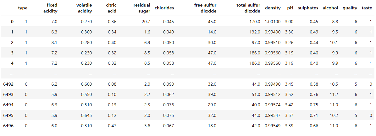
from sklearn.model_selection import train_test_split

X = df.drop(['taste', 'quality'], axis = 1)
y = df['taste']

X_train, X_test, y_train, y_test = train_test_split(X, y, test_size = 0.2, random_state = 23)
from sklearn.linear_model import LogisticRegression
from sklearn.metrics import accuracy_score
clf = LogisticRegression(solver = 'liblinear', random_state = 23)
clf.fit(X_train, y_train)
y_pred_tr = clf.predict(X_train)
y_pred_ts = clf.predict(X_test)

accuracy_score(y_train,y_pred_tr), accuracy_score(y_test,y_pred_ts)
# 파이프라인 구축
from sklearn.pipeline import Pipeline
from sklearn.preprocessing import StandardScaler
estimator = [('scaler', StandardScaler()),
('clf', LogisticRegression(solver = 'liblinear', random_state = 23))]
pipe = Pipeline(estimator)
pipe.fit(X_train, y_train)y_pred_tr = clf.predict(X_train)
y_pred_ts = clf.predict(X_test)
accuracy_score(y_train,y_pred_tr), accuracy_score(y_test,y_pred_ts)# Decison Tree와 비교
from sklearn.tree import DecisionTreeClassifier
clf_tree = DecisionTreeClassifier(max_depth = 2, random_state = 23)
clf_tree.fit(X_train, y_train)
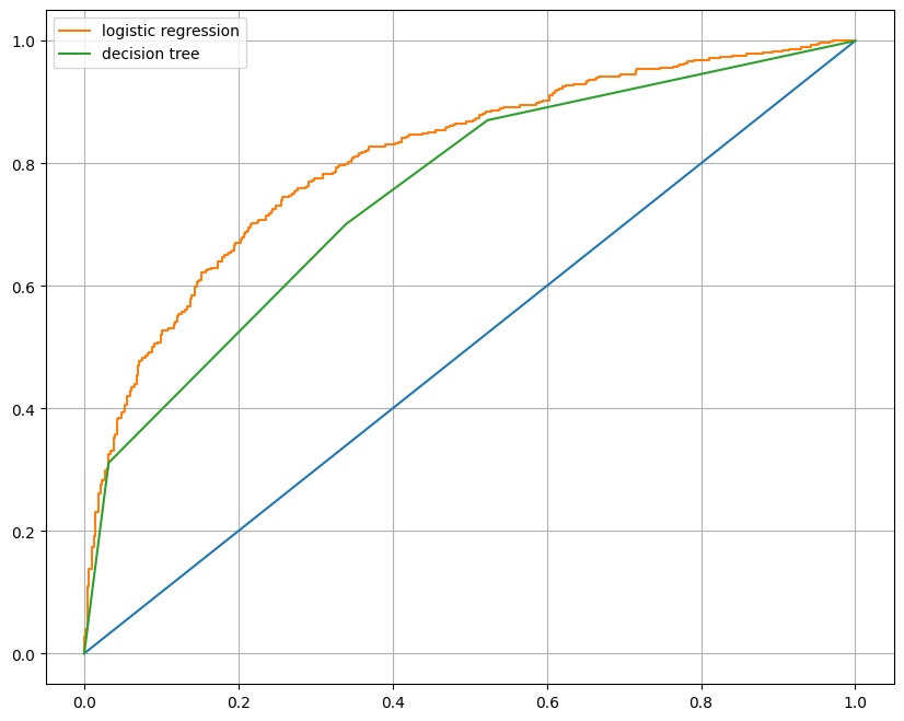
models = {'logistic regression': clf, 'decision tree': clf_tree}# AUC 그래프를 이용한 모델간 비교
from sklearn.metrics import roc_curve
plt.figure(figsize = (10, 8))
plt.plot([0,1],[0,1])
for model_name, model in models.items():
pred = model.predict_proba(X_test)[:, 1] # 1일 확률값의 배열만 사용
fpr, tpr, thresholds = roc_curve(y_test, pred)
plt.plot(fpr,tpr, label = model_name)
plt.grid()
plt.legend()
plt.show()