해당 내용은 Udemy 강의 'Pandas 및 Python을 이용한 데이터 분석:마스터 클래스'를 수강 후 정리한 내용입니다.
Section1
SEABORN SCATTERPLOT & COUNTPLOT
# Seaborn is a visualization library that sits on top of matplotlib
# Seaborn offers enhanced features compared to matplotlib
Example gallery — seaborn 0.13.2 documentation
# import libraries
import pandas as pd # Import Pandas for data manipulation using dataframes
import numpy as np # Import Numpy for data statistical analysis
import matplotlib.pyplot as plt # Import matplotlib for data visualisation
import seaborn as sns # Statistical data visualization
# Import Cancer data
cancer_df = pd.read_csv('cancer.csv')
# Plot scatter plot between mean area and mean smoothness
sns.scatterplot(x='mean area', y='mean smoothness', hue='target', data=cancer_df)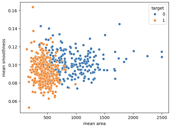
# Let's print out countplot to know how many samples belong to class #0 and #1

sns.countplot(x='target', data=cancer_df, palette='Set1')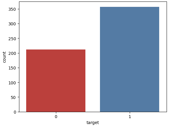
MINI CHALLENGE #1:
- Plot the scatterplot between the mean radius and mean area. Comment on the plot
sns.scatterplot(x='mean radius', y='mean area', hue='target', data=cancer_df)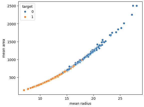
Section2
SEABORN PAIRPLOT, DISPLOT, AND HEATMAPS/CORRELATIONS
# Plot the pairplot

sns.pairplot(cancer_df, hue='target',
             vars=['mean radius', 'mean texture', 'mean area', 'mean perimeter', 'mean smoothness'])
vars=[''] 에 들어있는 변수에 대해 pairplot을 그려준다.
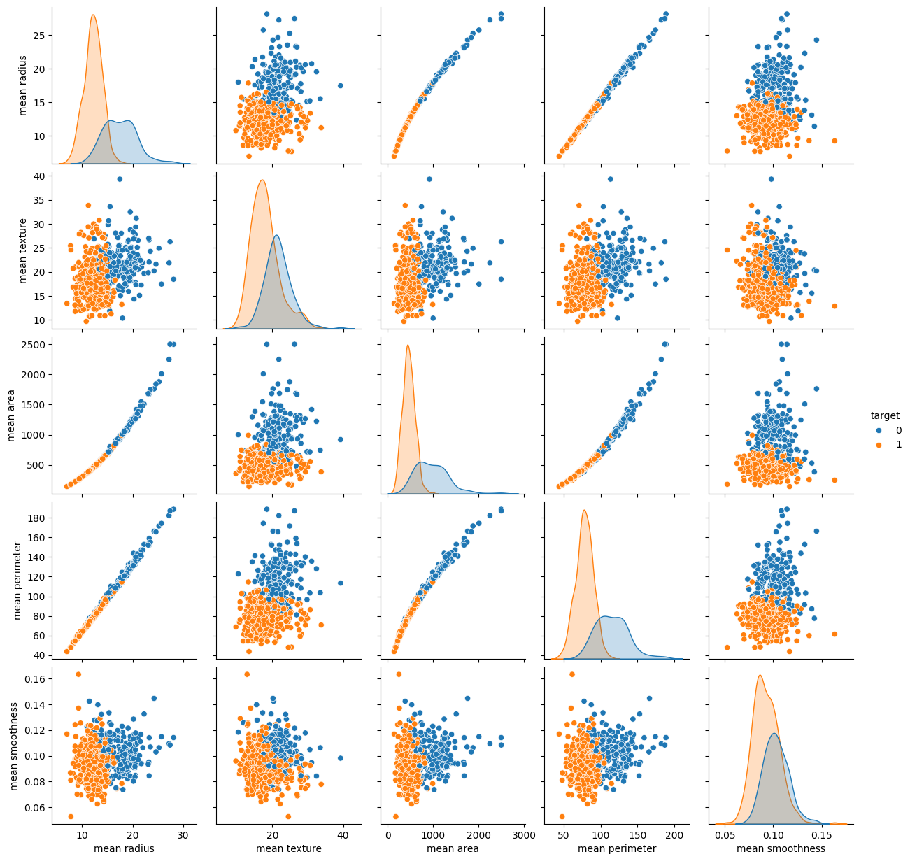
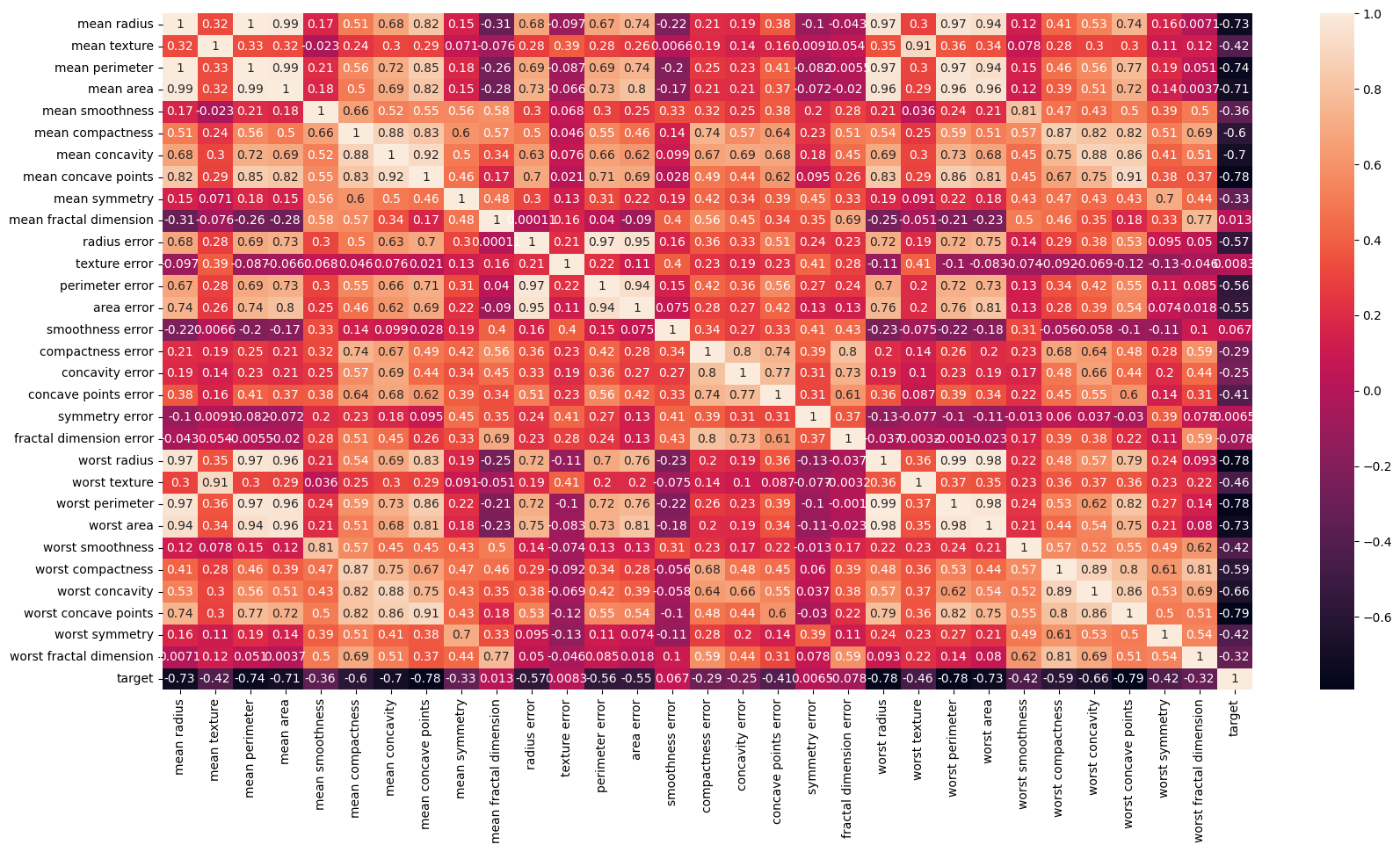
# Strong correlation between the mean radius and mean perimeter, mean area and mean primeter

sns.heatmap(cancer_df.corr())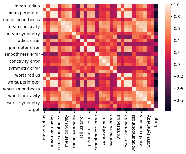
plt.figure(figsize=(20, 10))

sns.heatmap(cancer_df.corr(), annot=True)
annot=True를 지정해줌으로써 상관계수 값을 표기할 수 있다.
# plot the distplot
# Displot combines matplotlib histogram function with kdeplot() (Kernel density estimate)
# KDE is used to plot the Probability Density of a continuous variable.

sns.distplot(cancer_df['mean radius'], bins=5, color='blue')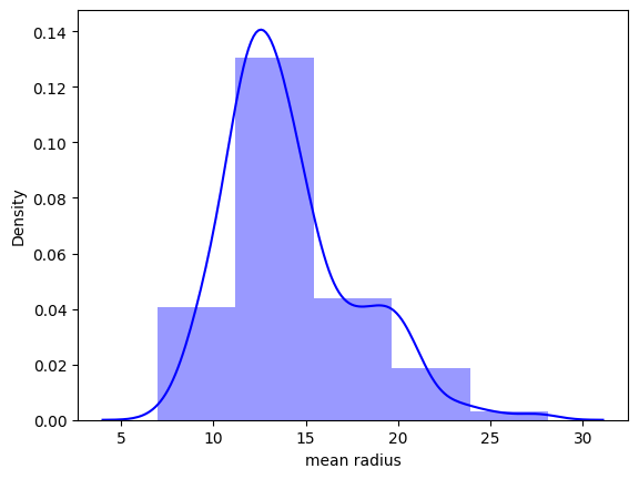
MINI CHALLENGE #2:
- Plot two separate distplot for each target class #0 and target class #1
class_0_df = cancer_df[cancer_df['target']==0]
class_0_df
class_1_df = cancer_df[cancer_df['target']==1]
class_1_df# Plot the distplot for both classes
plt.figure(figsize=(10, 7))
sns.distplot(class_0_df['mean radius'], bins = 25, color = 'blue')
sns.distplot(class_1_df['mean radius'], bins = 25, color = 'red')
plt.grid()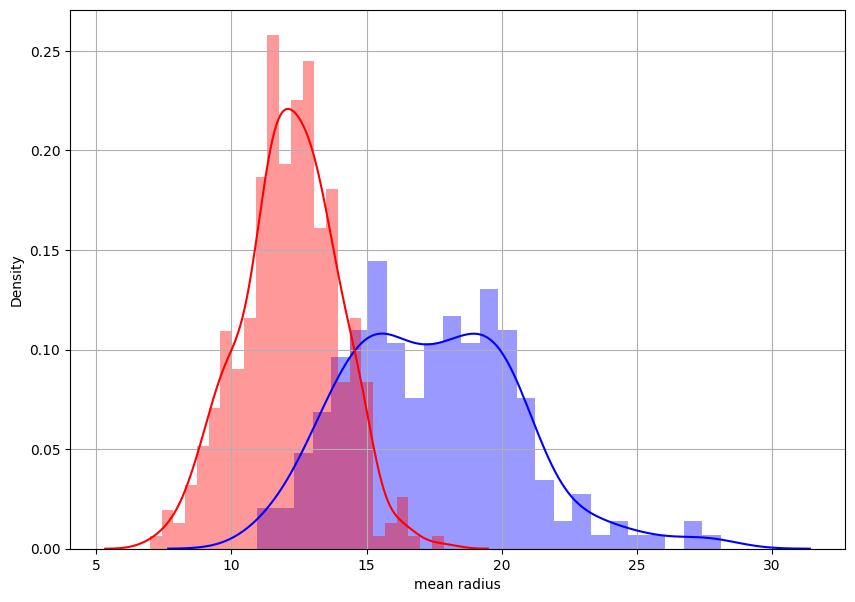

데이터를 향해, 한 걸음씩 천천히.