판다스 프로파일링(Pandas-Profiling)
전체적인 시각화 데이터를 쉽게 그려보기 좋다.
pandas profiling 공식
pandas profiling github
pandas profiling 참고자료
import pandas as pd
import numpy as np
import seaborn as sns
# 최근 버전으로 upgrade 필요
!pip install seaborn --upgrade
# pandas profiling 설치
!pip install pandas-profiling==3.1.0
# pandas profiling 설정하기
from pandas_profiling import ProfileReport

# 펭귄 데이터셋 불러오기
df = sns.load_dataset("penguins")
# pandas profiling 하기. title 은 생략 가능하다.
profile = ProfileReport(df, title="penguins_profile")
# html파일이 생성
profile.to_file("penguins_profile_report.html")
ProfileReport 의 사용법은 아래와 같다.
profile = ProfileReport(df,)
profile.to_file("penguins_profile_report.html")
(df: DataFrame | None = None, minimal: bool = False, explorative: bool = False, sensitive: bool = False,
dark_mode: bool = False, orange_mode: bool = False, sample: dict | None = None, config_file: Path | str = None,
lazy: bool = True, typeset: VisionsTypeset | None = None, summarizer: BaseSummarizer | None = None,
config: Settings | None = None, **kwargs: Any) -> None
Generate a ProfileReport based on a pandas DataFrame

Args:
    df: the pandas DataFrame
    minimal: minimal mode is a default configuration with minimal computation
    config_file: a config file (.yml), mutually exclusive with minimal
    lazy: compute when needed
    sample: optional dict(name="Sample title", caption="Caption", data=pd.DataFrame())
    typeset: optional user typeset to use for type inference
    summarizer: optional user summarizer to generate custom summary output
**kwargs: other arguments, for valid arguments, check the default configuration filePandas-Profiling 상세
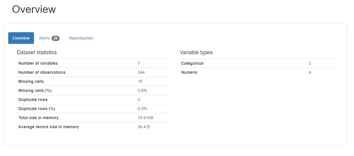
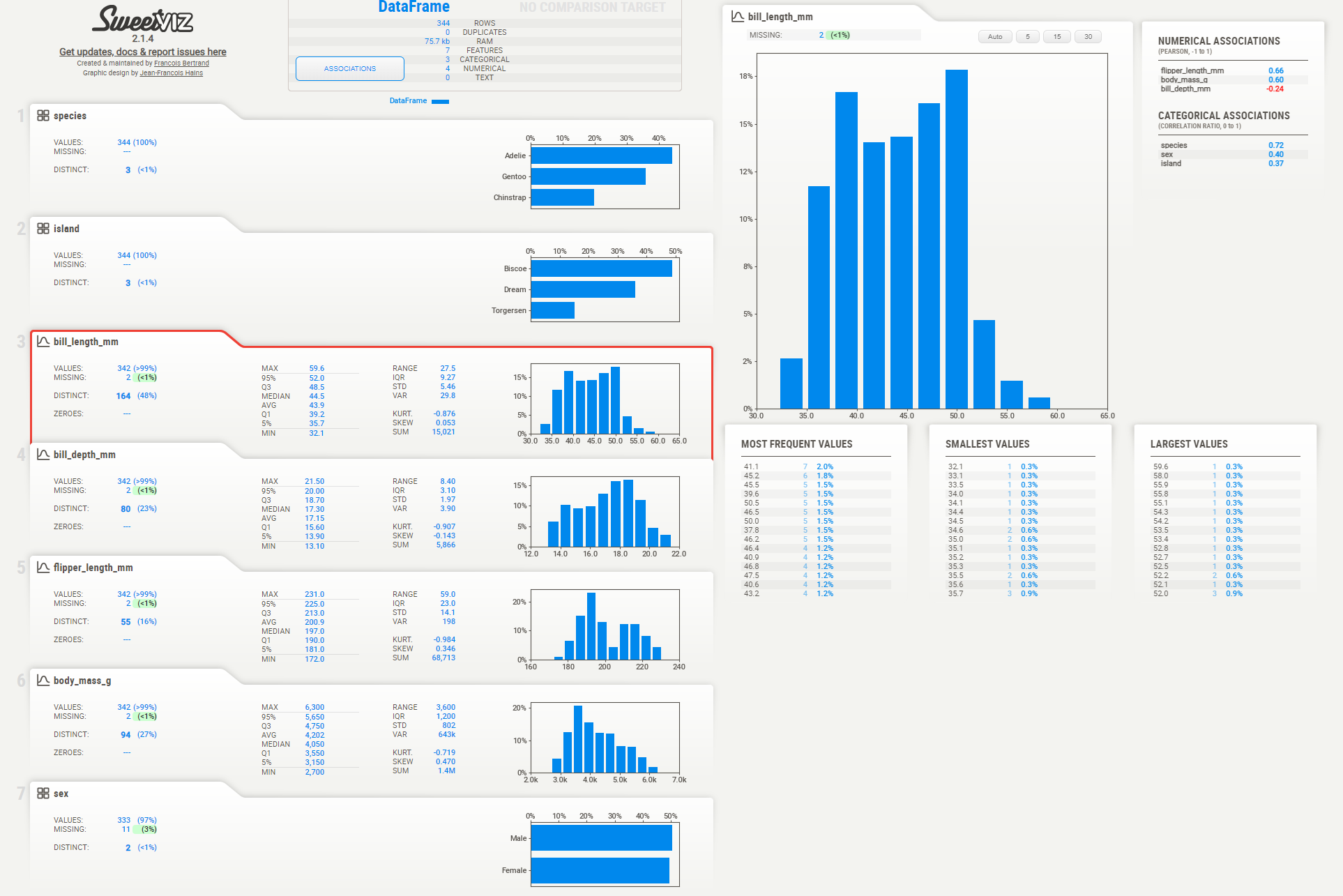
Overview 를 통해, dataFrame.info() 와 같은 내용을 개력적으로 볼 수 있다.
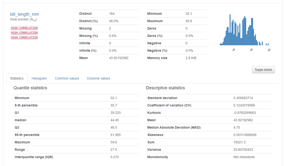
각 변수 별로도 통계를 보여준다.
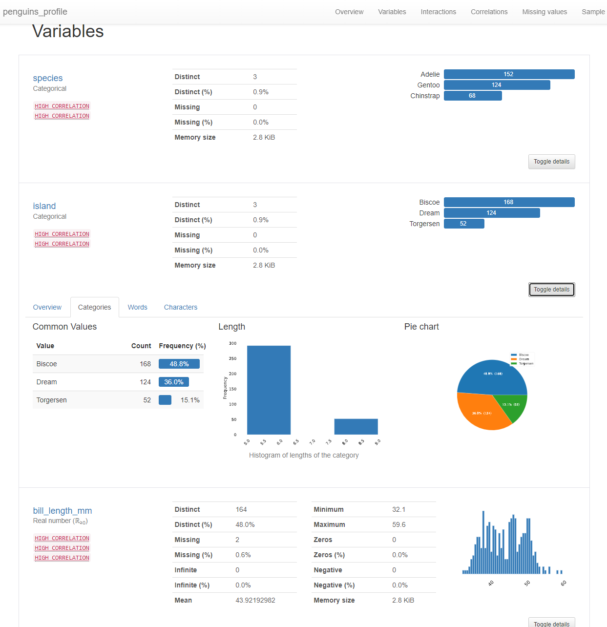
수치형변수와 범주형 변수 일때
통계에 사용하는 그래프가 다른 걸 확인 해 볼 수 있다.
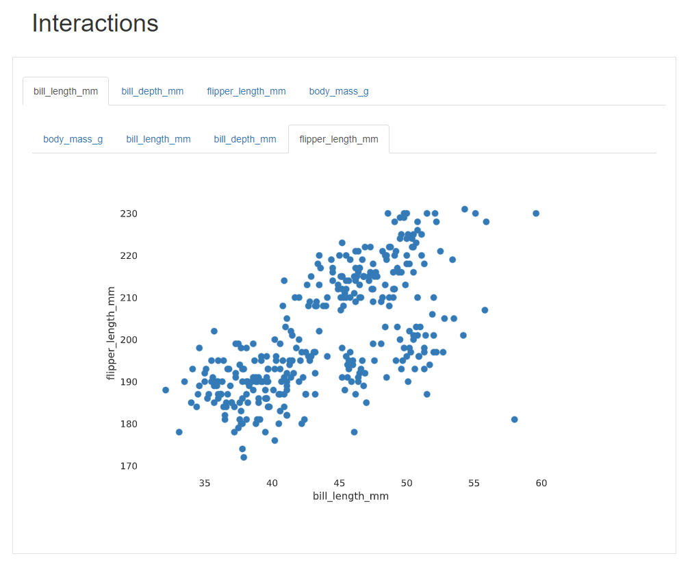
Interactions 에는 범주형 자료는 나타내지 못한다.
Interactions 수치형 자료끼리 짝을 지어서 보여주는 역할을 한다.
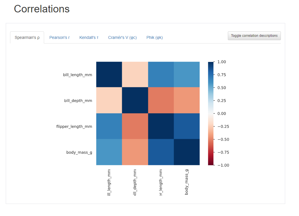
Correlations에서는 데이터 마다의 상관계수를 알 수 있다.
빨간 값은 -1에 가깝다. 파란색은 1에 가깝다.
- 판다스에서 corr 에서 나오는 값은 피어슨상관계수이다.
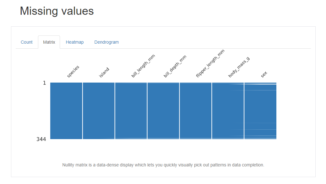
Missing value 에서는 어떤 컬럼에서 얼마나 데이터가 빠졌는데 여러 시각적인 방법으로 보여준다. 개인적으로는 matrix 방식이 효과가 좋게 느껴진다.
왜도(Skewness) 첨도(Kurtosis)
수치형 데이터 분석을 보면 Skewness, Kurtosis 이런 값이 있다. 도수 분포 모양을 나타내는 수치들이다.
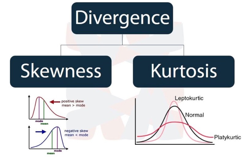
왜도(Skewness) : Skew 는 영어로 비스듬 하다는 뜻으로, Skewness는 분포가 정규분포에 비해서 얼마나 비태칭인지 나타내는 척도이다. Skewness 가 0이면 완전한 대칭이다.
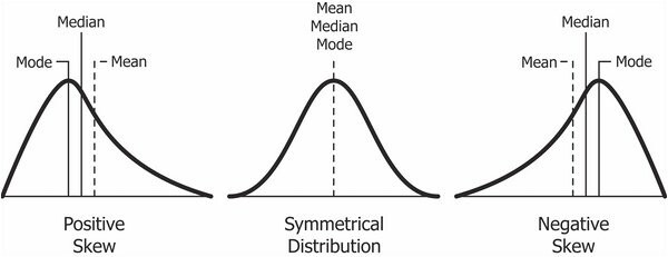
+ 값을 가지면 왼쪽으로 치우쳐져 있다.
- 값을 가지면 오른쪽으로 치우쳐져 있다.
첨도(Kurtosis) : 양쪽 꼬리의 두터움 정도를 나타내는 값이다.
큰 편차, 이상치(outlier)가 많을수록 큰 값을 나타낸다.
론적으로 정규분포의 첨도 값은 3이다.
첨도가 3보다 작으면 정규분포 보다 꼬리가 얇고 뾰족한 분포이고,
첨도가 3보다 크면 정규분포보다 꼬리가 두꺼운 분포입니다.
첨도가 크면 분포에 존재하는 이상치(outlier)가 많다는 의미이므로 이상치를 조사해 볼 필요가 있다.
왜도,첨도 참고자료:
https://dining-developer.tistory.com/17
https://hyunhp.tistory.com/184
https://m.blog.naver.com/PostView.naver?isHttpsRedirect=true&blogId=s2ak74&logNo=220616766539
sweetviz
sweetviz도 pandas profiling 과 마찬가지로, 기본적으로 봐야하는 기술 통계 값을 한번에 시각화 해주는게 장점이다.
기술 통계 값이 전면에 드러나 있어서 확인이 쉽고,
페이지가 가로형이다.
# sweetviz 설치
!pip install sweetviz
# sweetviz 설정
import sweetviz as sv

# dataFrame 으로 sweetviz 만들기
my_report = sv.analyze(df)
my_report.show_html()
sv.analyze 사용법을 아래와 같다.
(source: DataFrame | Tuple[DataFrame, str], target_feat: str = None, feat_cfg: FeatureConfig = None, pairwise_analysis: str = 'auto') -> Any- 타겟변수 없이 그릴 수도 있고 타겟변수를 지정할 수도 있습니다.
- 타겟변수는 범주형이 아닌 수치, bool 값만 가능합니다.
- 데이터에 따라 수치형으로 되어있지만 동작하지 않을 수도 있습니다.
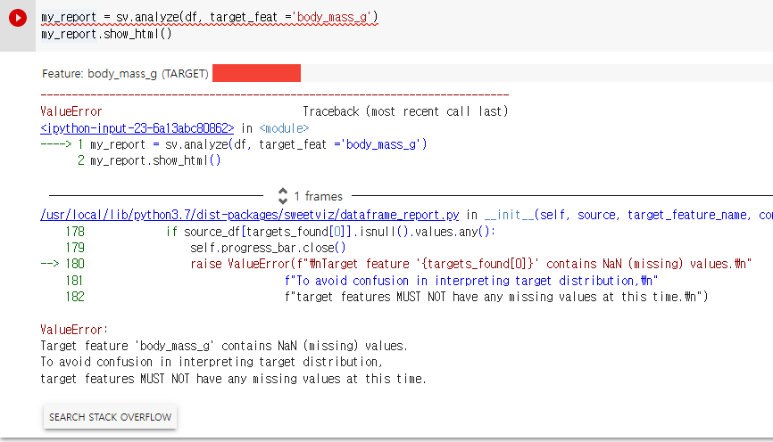
target 을 지정해여 진행해보려고 했는데, target feature 가 되려면 결측값이 하나도 없어야 한다는 오류 메세지가 나왔다.
# 결측치 제거
df = df.dropna()
# 타겟지정
my_report = sv.analyze(df, target_feat ='body_mass_g')
my_report.show_html()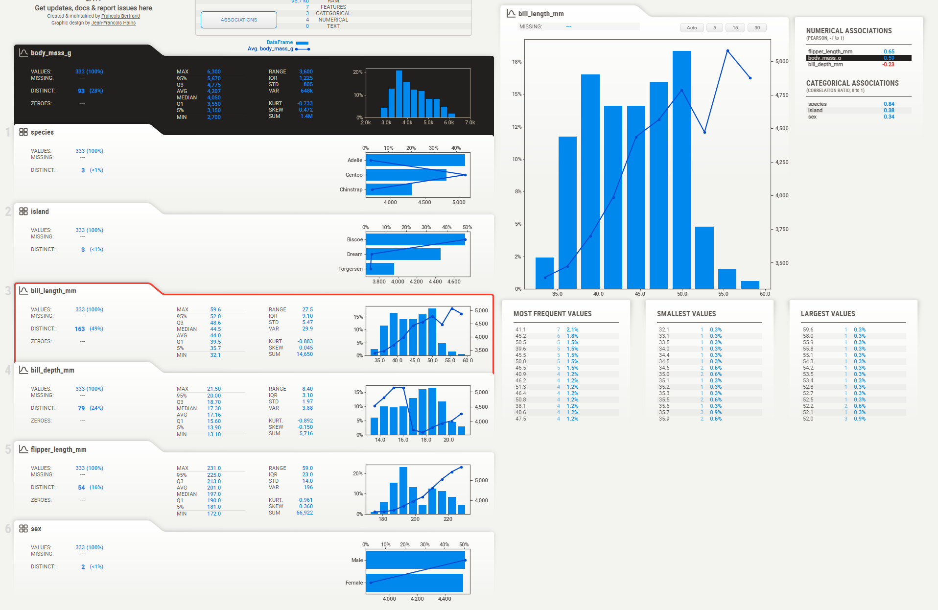
모든 그래프에서 직선은 body_mass_g 값을 의미한다.
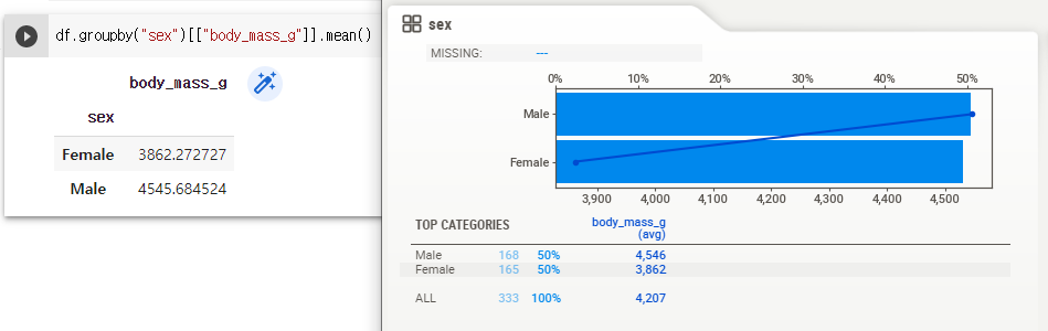
sex 그래프의 경우 x 축 때문에 혼란했지만, x 축을 잘 확인하면 맞는 그래프라는 것을 알 수 있다.
pandas 에서 실시한 groupby 결과와도 일치한다.
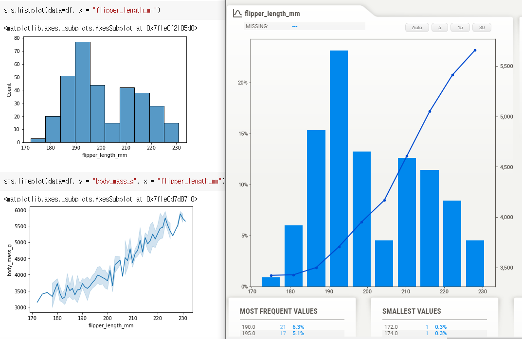
body_mass_g 와 flipper_length_mm 의 관계도 한눈에 확인 할 수 있다.