복습 문제
1. csv_exam.csv 파일을 읽어오세요
[답변] csv_exam <- read.csv("csv_exam.csv")

2. 1반이 아니면서 영어 혹은 과학이 90점 이상인 값만 추출하시오
[답변] csv_exam %>% filter(class != 1 & (english >= 90 | science >= 90))

3. 별도의 패키지 없이 read_excel()함수는 사용이 가능하다?(ox)
[답변] x

4. 갯수를 세는 n() 함수는 summarise 함수가 아닌 어느 함수에서나 사용이 가능하다(ox)
[답변] x

5. test1 <- data.frame(mid = c(80, 90, 100, 95))
	test1 %>% rename(mid = test)
    위 코드가 원하는대로 작동하지 않는 이유는?
[답변] rename(새로운 변수명 = 기존 변수명) 이여야 한다.

6. 세과목의 합을 구하시오
[답변] csv_exam %>% mutate(totle = math + science + english)

7. 세과목의 합이 200이 넘으면 pass, 넘지못하면 fail로 표기하는 '통과여부' 컬럼을 추가하시오
[답변] exam %>% mutate(total = math + english + science,
                통과여부 = ifelse(total >= 200, "pass", "fail"))

8. dplyr로 가공시 집단별로 나누는 함수는
[답변] group_by()

9. 현재 지정된 작업 폴더의 경로를 출력하고 싶다면
[답변] getwd()

10. 컬럼명을 알고싶다면
[답변] colnames(), names()

11. 아래 데이터를 합치세요
class1 <- data.frame(name = c("kim", "lee", "park", "ang", "min"),
                     score = c(93, 84, 87, 98, 77))

class2 <- data.frame(name = c("kang", "yun", "cho", "yang", "jung"),
                     score = c(90, 95, 75, 79, 90))
[답변]	full_join(class1, class2)
		bind_rows(class1, class2)

12. 새로운 컬럼을 추가하는 함수는 무엇인가
[답변] mutate()

13. 점수합산 1등을 알고싶다면
[답변] 	exam <- exam %>% mutate(total = math + english + science)

        exam %>% summarise("1등" = max(total))
		->컬럼명 처음에 숫자가 나와서 ""로 묶어준것이고
        숫자로 시작하는게 아니라면 안묶어도 ok

        exam %>%  arrange(desc(total)) %>%  head(1) %>%  select("1등" = total)
		-> 이런식으로 사용도 가능
🌱 결측치
자료가 누락되어있는 상태
출력시 NA라 표시된다
데이터 만들기
> df <- data.frame(sex = c("M","F", NA, "M", "F"),
+                  score = c(5,4,3,4,NA))
> df
   sex score
1    M     5
2    F     4
3 <NA>     3
4    M     4
5    F    NA
결측치는 반드시 제거해야
어떤 분석이나 통계 등을 할때 결측치가 많으면 결과를 신뢰하기 힘들어지기 때문에, 영향이 크다
결측치 확인
df 에 NA가 있는가?
is.na(df)

># NA 가 있는 자리만 TRUE 로 보여주기
> is.na(df)
       sex score
[1,] FALSE FALSE
[2,] FALSE FALSE
[3,]  TRUE FALSE
[4,] FALSE FALSE
[5,] FALSE  TRUE


># summary로 확인할 수도 있다. NA's 에 해당칼럼에 NA가 몇개인지 보여줌
> summary(air)
     Ozone           Solar.R           Wind             Temp
 Min.   :  1.00   Min.   :  7.0   Min.   : 1.700   Min.   :56.00
 1st Qu.: 18.00   1st Qu.:115.8   1st Qu.: 7.400   1st Qu.:72.00
 Median : 31.50   Median :205.0   Median : 9.700   Median :79.00
 Mean   : 42.13   Mean   :185.9   Mean   : 9.958   Mean   :77.88
 3rd Qu.: 63.25   3rd Qu.:258.8   3rd Qu.:11.500   3rd Qu.:85.00
 Max.   :168.00   Max.   :334.0   Max.   :20.700   Max.   :97.00
 NA's   :37       NA's   :7
     Month            Day
 Min.   :5.000   Min.   : 1.0
 1st Qu.:6.000   1st Qu.: 8.0
 Median :7.000   Median :16.0
 Mean   :6.993   Mean   :15.8
 3rd Qu.:8.000   3rd Qu.:23.0
 Max.   :9.000   Max.   :31.0
빈도 출력
table(is.na(df))

> table(is.na(df))
FALSE  TRUE
    8     2
># NA가 아닌 8개값과 NA값 2개
결측치 제외하고 산출하기
> #NA가 있는 것을 아니까 NA는 지우고 계산해라
> mean(df$score, na.rm = T)
[1] 4
> sum(df$score, na.rm = T)
[1] 16
> mean(air$Ozone, na.rm = T)
[1] 42.12931

># 스코어가 NA인 것만 골라서 보여주기
> df %>% filter(is.na(score))
  sex score
1   F    NA


> df %>% filter(!is.na(score) & !is.na(sex))
  sex score
1   M     5
2   F     4
3   M     4
제외하지 않고?
- 결측치를 제외하여 평균을 구해놓고
이 값을 NA에 넣기 - 바로 위 컬럼의 값과 같은 값 넣기
(ex. 키 순서대로 정렬되어있는 상태)
🌱 이상치
outlier
정상범주에서 크게 튀어나간 값
결측치와 마찬가지로 분석 결과가 왜곡될 수 있기 때문에 분석에 앞서 이상치를 제거하는 과정이 필요
데이터 만들기
> outlier <- data.frame(sex = c(1, 2, 1, 3, 2, 1),
+                       score = c(5, 4, 3, 4, 2, 6))
> outlier
  sex score
1   1     5
2   2     4
3   1     3
4   3     4
5   2     2
6   1     6
값 정제하기
># 만약 outlier 속 sex값이 3인게 있다면 NA로 바꿔라
> outlier$sex <-  ifelse(outlier$sex == 3, NA, outlier$sex)
> outlier
  sex score
1   1     5
2   2     4
3   1     3
4  NA     4
5   2     2
6   1     6

> # 만약 score 값중 5보다 큰게 있다면 NA로 바꿔주자
> outlier$score <- ifelse(outlier$score > 5, NA, outlier$score)
> outlier
  sex score
1   1    NA
2   2     4
3   1     3
4  NA     4
5   2     2
6   1    NA


># 성별 평균을 구하고 싶어요
># outlier 속 NA가 있는 행들을 모두 삭제해버리고 값내기
> na.omit(outlier) %>% group_by(sex) %>% summarise(평균 = mean(score))
# A tibble: 2 × 2
    sex  평균
  <dbl> <dbl>
1     1     3
2     2     3
># 성이 비어있지 않은 것만 필터링해서 평균내주기
outlier %>% filter(!is.na(sex)) %>%
  group_by(sex) %>% summarise(평균 = mean(score, na.rm = T))
drv 별로 hwy의 평균값을 알고싶다(단, 이상치는 제외)
># library(ggplot2)
#1. 박스플롯으로 이상치 파악
boxplot(mpg$hwy)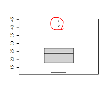
> # 줄 세워서 튀는 값 확인
> mpg %>% select(hwy) %>% arrange(desc(hwy))
# A tibble: 234 × 1
     hwy
   <int>
 1    44
 2    44
 3    41
 4    37
 ...


># 사용할 drv, hwy의 값을 선택한 후
># 이상치 제거하는 필터 걸어주기
># drv로 묶고 hwy를 요약한 통계량 보여주기

> mpg %>% select(drv, hwy) %>% filter(hwy < 41) %>%
+   group_by(drv) %>% summarise(mean(hwy))
# A tibble: 3 × 2
  drv   `mean(hwy)`
  <chr>       <dbl>
1 4            19.2
2 f            27.9
3 r            21
🌱 ggplot2 그래픽
# 사용할 라이브러리 불러오기
library(ggplot2)


# ggplot(data = 어떤 데이터 셋을 그릴것인가, aes(x= 어떤걸 x축으로 사용할 것인가))
ggplot(data = mpg, aes(x=hwy)) + geom_boxplot(color = 'blue')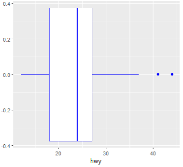
ggplot(data = mpg, mapping=(aes(x=class, y=hwy, fill=class))) + geom_boxplot()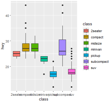
단계별로 해보기
# 축 설정
# 생략 가능(data =, mapping=)
ggplot(mpg, aes(x=displ, y=hwy))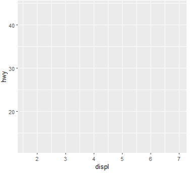
# 산점도
ggplot(mpg, aes(x=displ, y=hwy)) + geom_point()
# 색 변경
ggplot(mpg, aes(x=displ, y=hwy)) + geom_point(color="skyblue")
# 범위 지정(x축 3~6, Y축 10~30)
ggplot(mpg, aes(x=displ, y=hwy)) + geom_point(color="skyblue") +
  xlim(3,6) + ylim(10,30)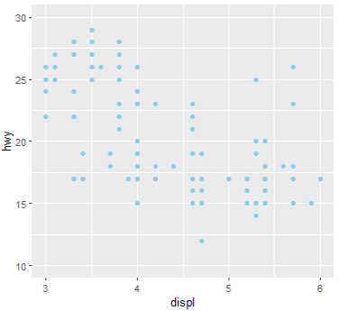
# 색에 컬럼명을 주면?
# 해당 컬럼을 기준으로 그룹지어 색 배치
ggplot(mpg, aes(x=displ, y=hwy, color=drv)) + geom_point()
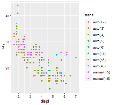
ggplot(mpg, aes(x=displ, y=hwy, color=trans)) + geom_point()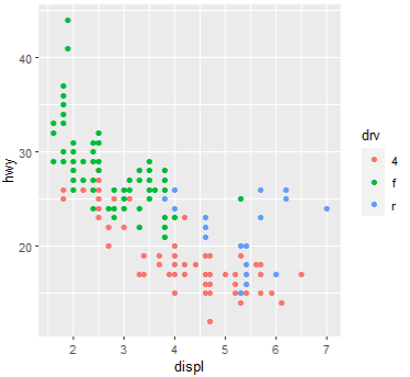
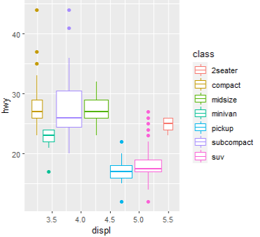
# class로 그룹지어서 박스플롯에 색을 배치하세요
ggplot(mpg, aes(x=displ, y=hwy, color=class)) + geom_boxplot()