
import numpy as np
import pandas as pd
import seaborn as sns
🛻 displot
‣ data penguins
'penguins' 데이터는 seaborn 안에 내장되어 있는 데이터이다.
sns.load_dataset 함수로 불러온다.
pd_pen = sns.load_dataset('penguins')
pd_pen.head()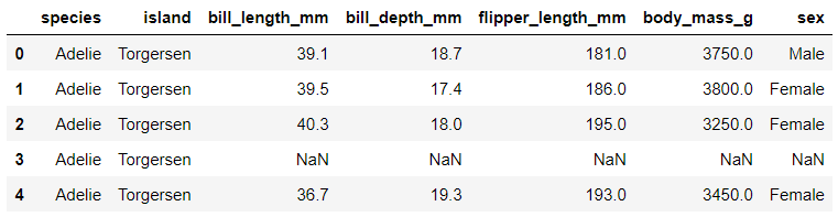
⌨️ hisplot : default plot
sns.displot(pd_pen, x='bill_length_mm', bins=10)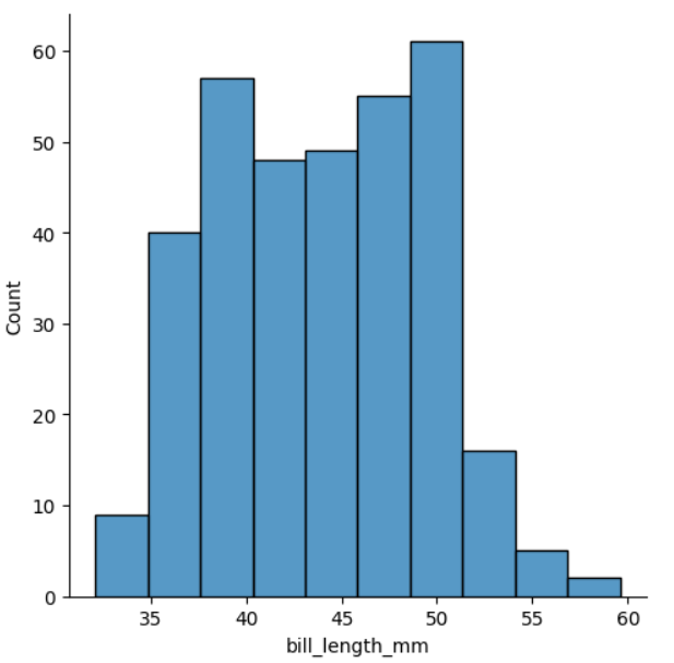
- x축 변수가 continuous var 이기 때문에, histplot에서는 bill_length_mm 의 min-max를 몇 개의 구간 (bins)으로 나누어서 해당 구간에 속하는 값을 count한다.
(bins 옵션으로 구간의 갯수를 정할 수 있다.) - y축 변수는 따로 잡지 않고, y축은 count 값을 나타낸다.
따라서, 위와 같은 histplot은 x의 "분포"를 보여준다고 볼 수 있다.
‖ hue
sns.displot(pd_pen, x='bill_length_mm', bins=10, hue = 'species')
sns.displot(pd_pen, x='bill_length_mm', bins=10, hue = 'species', multiple = 'dodge')
sns.displot(pd_pen, x='bill_length_mm', bins=10, hue = 'species', multiple = 'stack')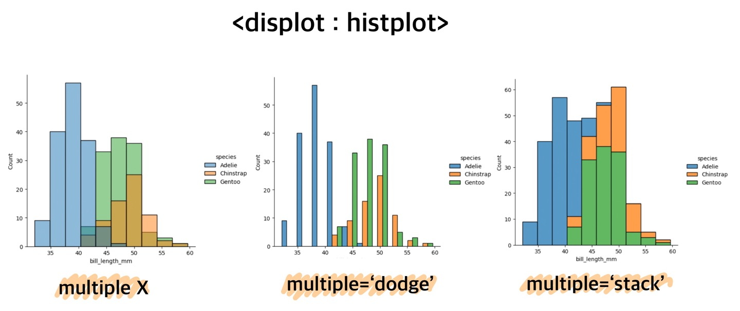 .
.
.
.
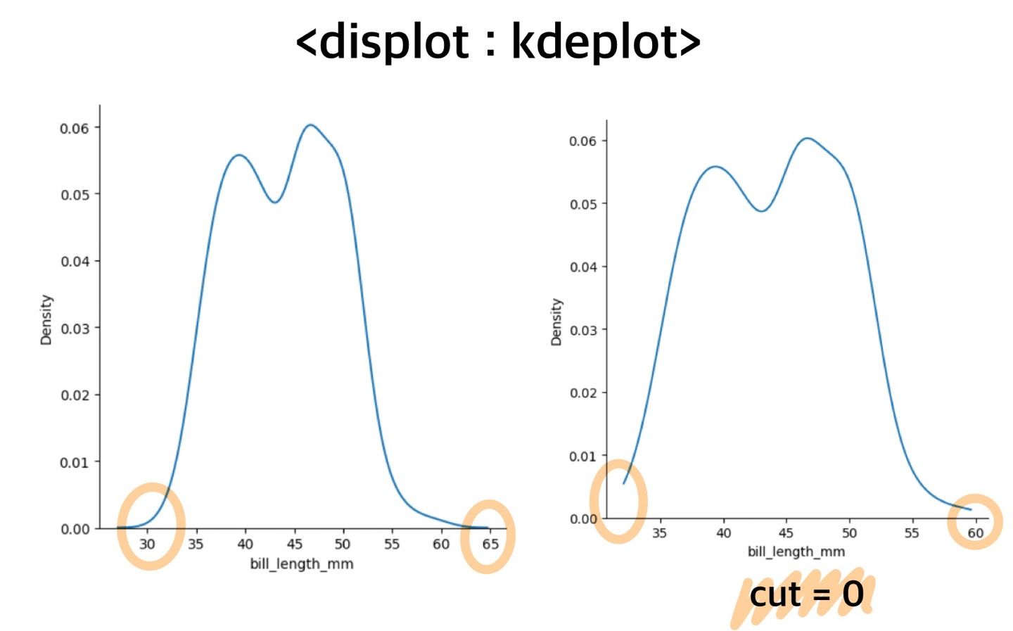
⌨️ kdeplot
kind = kde
정확한 구간을 나눠 해당 구간에 속하는 데이터의 개수를 count 하는 hisplot과는 달리,
kdeplot 은 구간을 나누지 않고, "분포곡선 추정치" 를 그려준다.
따라서 정확한 데이터값이 아닌, 예측값을 출력한다.
sns.displot(pd_pen, x='bill_length_mm', kind= 'kde')
sns.displot(pd_pen, x='bill_length_mm', kind= 'kde', cut=0)
cut = 0옵션을 넣어주면, 데이터가 없는 부분은 예측하지 않으므로, 분포곡선에서 실제 데이터가 없는 부분은 사라진다.
.
.
⌨️ ecdplot
kind = ecd
ecdplot 은 kde 에서 아래면적의 누적값에 대한 분포값을 그려준다.
sns.displot(pd_pen, x='bill_length_mm', kind = 'ecdplot')sns.displot(pd_pen, x='bill_length_mm', kind = 'ecdplot' , hue = 'species')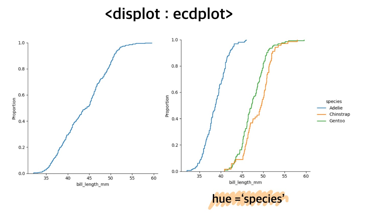
주로 "누적분포의 기울기를 비교" 할 때, ecdplot을 사용한다.

데이터 분석 / 데이터 사이언티스트 / AI 딥러닝