transition은 CSS 스타일 변경을 부드럽게 표현하기 위해 지속시간을 부여하여 속도를 조절하고, animation은 하나의 스토리를 구성하여 스토리 내에서 세부 움직임을 시간 흐름 단위로 제어하여 element의 변화를 표현한다.
Transform?
transform은 element에 이동, 회전, 스케일링, 비틀기 효과를 부여하기 위한 함수를 제공한다. 단, animation 효과를 제공하지는 않기 때문에 정의된 property가 바로 적용되어 화면에 표시된다.
transform은 animation 효과를 위해 사용해야하는 것은 아니지만 animation 효과를 부여할 필요가 있다면 transition이나 animation과 함께 사용한다.
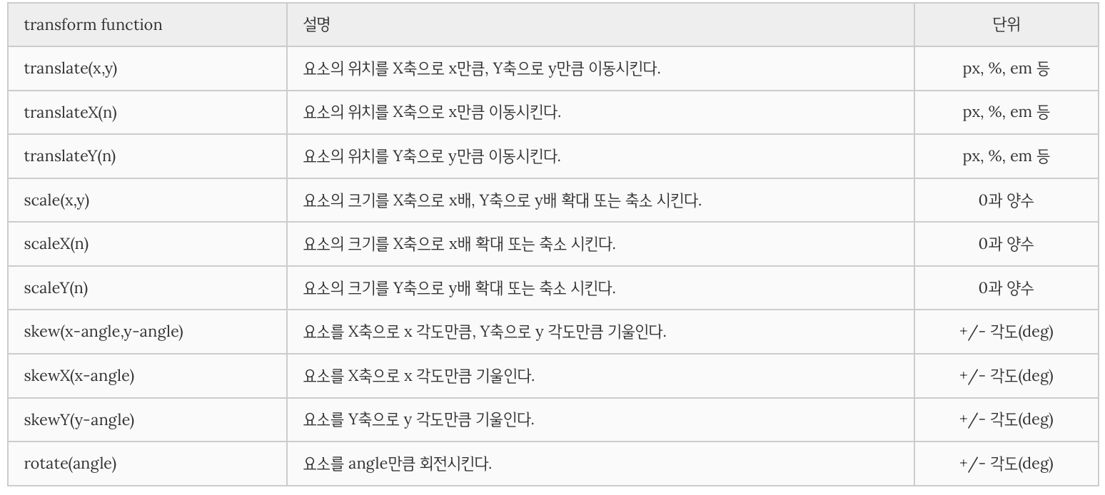
2D Transform
property 값으로 transform function을 사용한다.
사용할 수 있는 함수는 다음과 같다.
transform property
transform function을 property 값으로 쉼표없이 나열한다. 나열 순서에 따라 차례대로 효과가 적용된다.
<!DOCTYPE html>
<html>
<head>
  <style>
  .box {
    width: 95px;
    height: 95px;
    line-height: 95px;
    color: white;
    text-align: center;
    border-radius: 6px;
  }
  .original {
    margin: 30px;
    border: 1px dashed #cecfd5;
    background: #eaeaed;
    float: left;
  }
  .child {
    background: #2db34a;
    cursor: pointer;
  }
  .translate {
    transform: translate(10px, 50px);
  }
  .scale {
    transform: scale(.75);
  }
  .skew {
    transform: skew(5deg, -20deg);
  }
  .rotate {
    transform: rotate(70deg);
  }
  .complex {
    transform: scale(.5) rotate(20deg);
  }

  /* Animation Effect */
  .translate:hover {
    transition: transform 1s linear;
    transform: translate(0px, 0px);
  }
  /* .translate:hover {
    animation: translate 1s linear forwards;
  }
  @keyframes translate {
    100% {
      transform: translate(0px, 0px);
    }
  } */
  .scale:hover {
    transition: transform 1s linear;
    transform: scale(1);
  }
  .skew:hover {
    transition: transform 1s linear;
    transform: skew(0, 0);
  }
  .rotate:hover {
    transition: transform 1s linear;
    transform: rotate(0);
  }
  .complex:hover {
    transition: transform 1s linear;
    transform: scale(1) rotate(0);
  }
  </style>
</head>
<body>
  <div class="original box">
    <div class="child box translate">translate</div>
  </div>
  <div class="original box">
    <div class="child box scale">scale</div>
  </div>
  <div class="original box">
    <div class="child box skew">skew</div>
  </div>
  <div class="original box">
    <div class="child box rotate">rotate</div>
  </div>
  <div class="original box">
    <div class="child box complex">complex</div>
  </div>
</body>
</html>
transform-origin property
transform 효과가 실행되기전에 element의 기준점을 설정할 때 사용된다. 기본 기준점은 element의 정중앙이다.(50%, 50%)
설정값으로 %, px, top, left, bottom, right을 사용할 수 있다.
0 0은 top left, 100% 100%은 bottom right과 같은 값이다.
참고로, 이동(translate)은 기준점을 변경해도 일정 거리만큼 이동하므로 의미가 없다.
<!DOCTYPE html>
<html>
<head>
<style>
.box {
width: 150px;
height: 150px;
line-height: 150px;
color: white;
text-align: center;
border-radius: 6px;
}
.original {
margin: 20px;
border: 1px dashed #cecfd5;
background: #eaeaed;
float: left;
}
.child {
background: #2db34a;
cursor: pointer;
}
.scale1:hover {
transition: transform 1s linear;
transform-origin: 0 0;
transform: scale(.5);
}
.scale2:hover {
transition: transform 1s linear;
transform-origin: 50% 50%;
transform: scale(.5);
}
.scale3:hover {
transition: transform 1s linear;
transform-origin: 100% 100%;
transform: scale(.5);
}
.translate:hover {
transition: transform 1s linear;
/*transform-origin: 100% 100%;*/
transform: translate(10px, 10px);
}
</style>
</head>
<body>
<div class="original box">
<div class="child box scale1">scale1</div>
</div>
<div class="original box">
<div class="child box scale2">scale2</div>
</div>
<div class="original box">
<div class="child box scale3">scale3</div>
</div>
<div class="original box">
<div class="child box translate">translate</div>
</div>
</body>
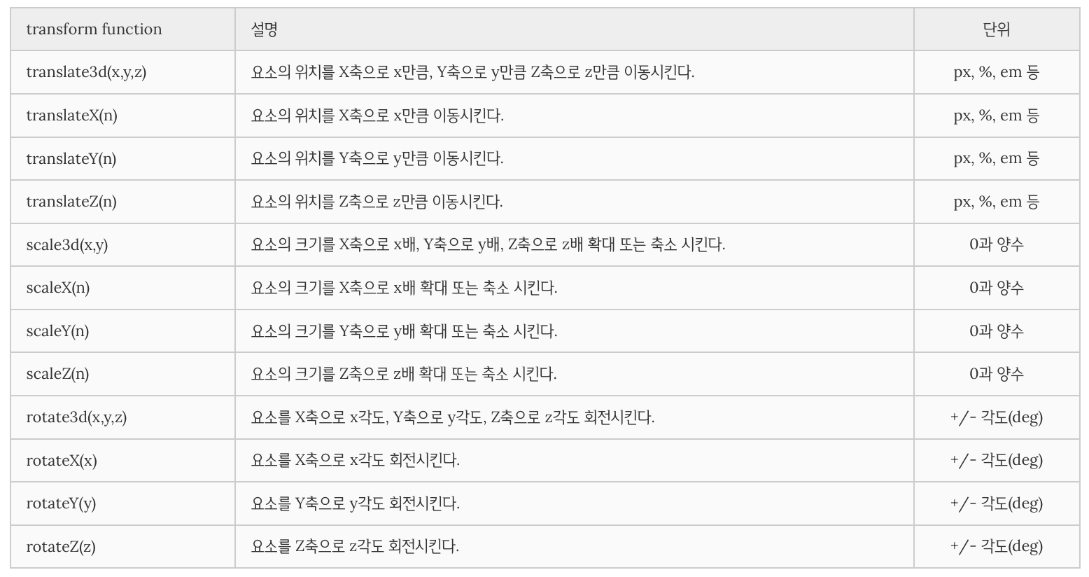
</html>3D Transform
property 값으로 transform function을 사용한다.
사용할 수 있는 transform function은 다음과 같다.
참고문헌
