float property
주로 레이아웃을 구성할 때, block level element를 가로 정렬하기 위해 사용되는 중요한 property이다.
flexbox 레이아웃을 사용한다면 더욱 간단하게 정렬을 구현할 수도 있지만, 이를 지원하지 않는 IE를 고려해야 한다면 float property를 사용해야 한다.
float property는 본래 아래 예제와 같이 이미지와 텍스트가 있을 때, 이미지의 주위를 텍스트로 감싸기 위해 만들어진 것이다.
<!DOCTYPE html>
<html>
<head>
  <style>
    img {
      float: left;
      margin-right: 10px;
    }
  </style>
</head>
<body>
  <img src="https://poiemaweb.com/img/doug.jpg">
  <div>Lorem ipsum dolor sit amet, consectetur adipisicing elit, sed do eiusmod tempor incididunt ut labore et dolore magna aliqua. Ut enim ad minim veniam, quis nostrud exercitation ullamco laboris nisi ut aliquip ex ea commodo consequat. Duis aute irure dolor in reprehenderit in voluptate velit esse cillum dolore eu fugiat nulla pariatur. Excepteur sint occaecat cupidatat non proident, sunt in culpa qui officia deserunt mollit anim id est laborum.Lorem ipsum dolor sit amet, consectetur adipisicing elit, sed do eiusmod tempor incididunt ut labore et dolore magna aliqua. Ut enim ad minim veniam, quis nostrud exercitation ullamco laboris nisi ut aliquip ex ea commodo consequat. Duis aute irure dolor in reprehenderit in voluptate velit esse cillum dolore eu fugiat nulla pariatur. Excepteur sint occaecat cupidatat non proident, sunt in culpa qui officia deserunt mollit anim id est laborum.</div>
</body>
</html>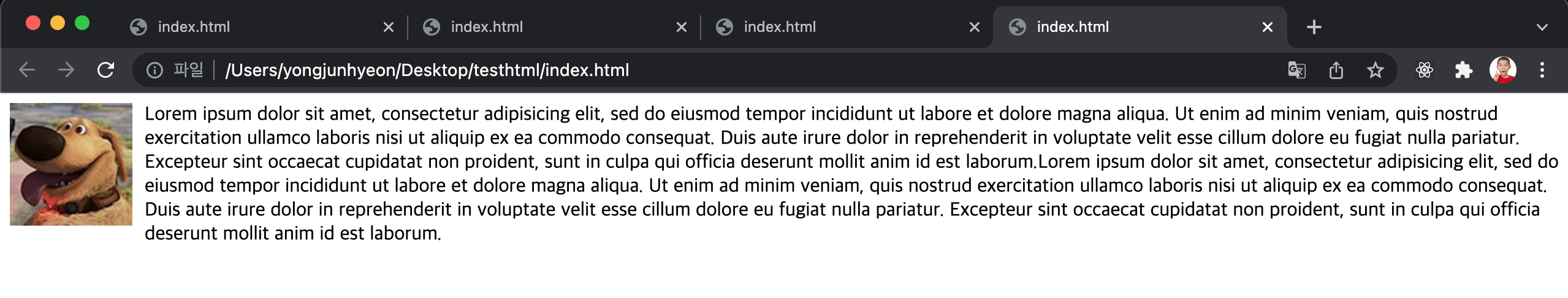
float property는 해당 element를 다음 element 위에 떠 있게한다. 여기서 떠 있다는 의미는 element가 기본 레이아웃 흐름에서 벗어나 페이지의 왼쪽이나 오른쪽에 이동하는 것이다.
property value에 따라 다음의 기능을 한다.
none: element를 떠 있게 하지 않는다. 기본값right: element를 오른쪽으로 이동시킨다.left: element를 왼쪽으로 이동시킨다.
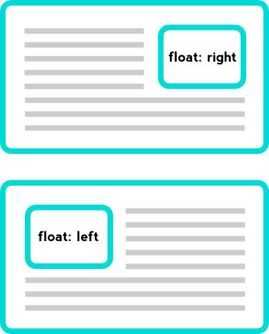
정렬
float property를 사용하지 않은 block level element들은 수직으로 정렬된다.
float:left; 를 지정하면 왼쪽부터 가로 정렬되고, float:right; 를 지정하면 오른쪽부터 가로 정렬된다.
예를 들어 오른쪽 가로 정렬의 경우, 먼저 기술된 element가 가장 오른쪽에 출력된다.
<!DOCTYPE html>
<html>
<head>
  <style>
    .box {
      color: white;
      font-weight: bold;
      font-size: 50px;
      border-radius: 6px;
      width: 100px;
      height: 100px;
      margin: 10px;
      padding: 10px;
    }
    .d1, .d2 {
      float: left;
    }
    .d1 {
      background: red;
    }
    .d2 {
      background: orange;
    }
    .d3, .d4 {
      float: right;
    }
    .d3 {
      background: red;
    }
    .d4 {
      background: orange;
    }
  </style>
</head>
<body>
  <div class="container">
    <div class="box d1"> 1 </div>
    <div class="box d2"> 2 </div>
    <div class="box d3"> 3 </div>
    <div class="box d4"> 4 </div>
  </div>
</body>
</html>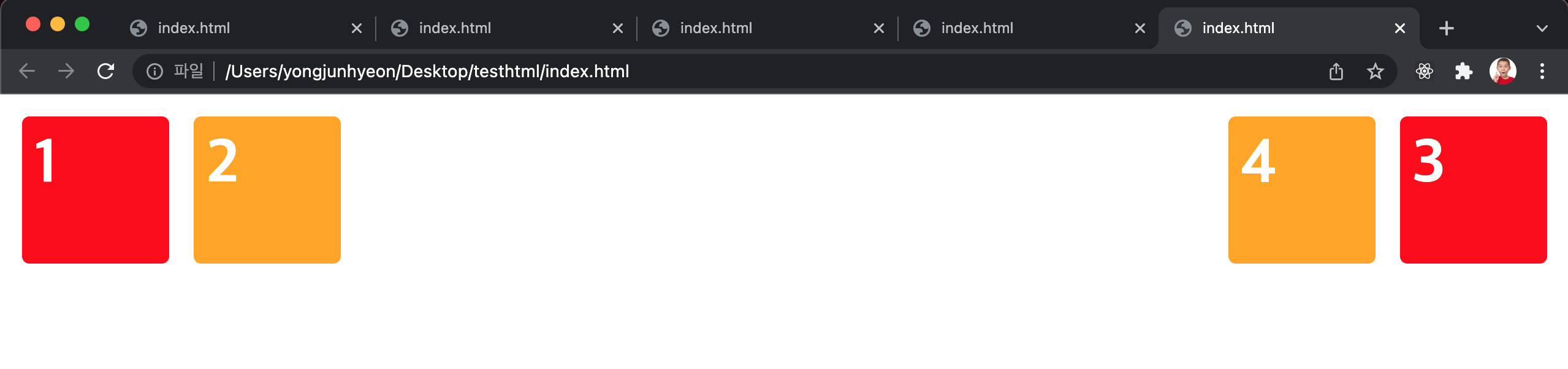
width
width property의 기본값은 100%이므로, 따로 값을 지정하지 않은 block level element는 부모 element의 가로폭을 가득 채운다.
<!DOCTYPE html>
<html>
<head>
  <style>
    .box {
      color: white;
      font-weight: bold;
      font-size: 30px;
      line-height: 50px;
      height: 50px;
      margin: 0 10px;
      padding: 10px;
    }
    .d1 {
      background: red;
    }
    .d2 {
      background: orange;
    }
  </style>
</head>
<body>
  <div class="box d1"> div </div>
  <div class="box d2"> div </div>
</body>
</html>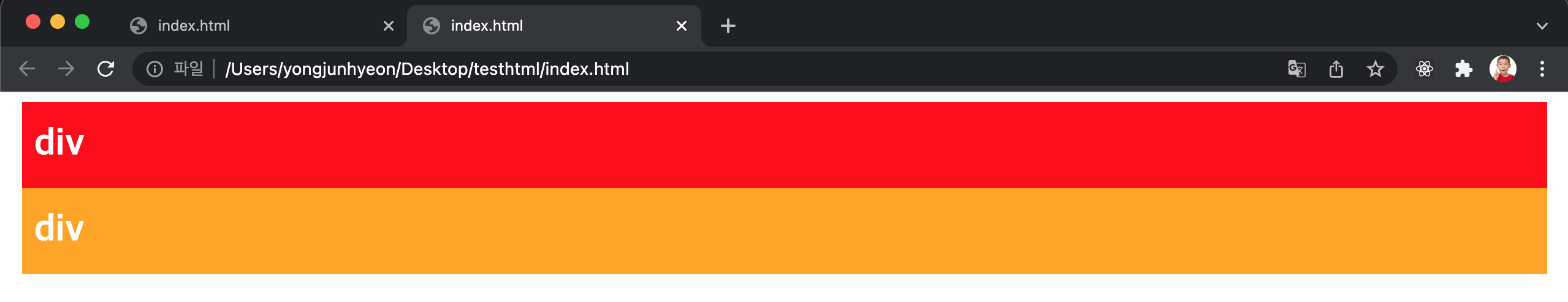
width property를 선언하지 않은 block level element에 float property가 선언되면, width가 inline level element와 같이 content에 맞게 최소화되고 다음 element 위에 떠있게 된다.
<!DOCTYPE html>
<html>
<head>
  <style>
    .box {
      color: white;
      font-weight: bold;
      font-size: 30px;
      line-height: 50px;
      height: 50px;
      margin: 0 10px;
      padding: 10px;
    }
    .d1 {
      float: left;
      background: red;
    }
    .d2 {
      background: orange;
    }
  </style>
</head>
<body>
  <div class="box d1"> float: left; </div>
  <div class="box d2"> div </div>
</body>
</html>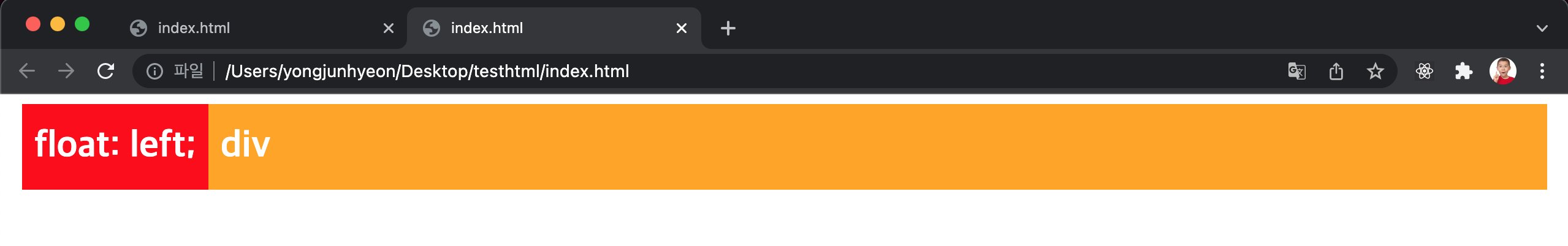
위 예제를 살펴보면 d1 class element에는 float: left;를 선언하였고, d2 class element에는 float property를 선언하지 않았다.
이 때, d1 class element는 width가 inline level element와 같이 content에 맞게 최소화되고, d2 class element 위에 떠 있게 된다.
주의할 것은 d1 class element가 d2 class element 위에 떠있게 되어도 d2 class element의 width는 d1 class element가 차지한 width만큼 줄어들지 않고 100%를 유지한다는 것이다.
이는 d2 class element에 float property를 선언하지 않았기에 본래의 width를 유지하기 때문이다. 따라서, d2 class element는 본래의 width(100%)를 유지한 상태에서 d1 class element가 그 위에 위치한다.
float property 관련 문제 해결 방법
float property가 선언된 element와 float property가 선언되지 않은 element간에 matgin이 사라지는 문제
바로 앞서서 살펴본 예제를 보면 두 element는 차례대로 정렬된 것처럼 보이지만 사실은 float property가 선언된 element가 다음 element 위에 떠 있는 상태이다. 따라서 두 element간의 margin은 제대로 표현되지 않는다.
이것은 두 번째 element에 float property를 선언하지 않았기 때문에 발생하는 box model상의 문제이다.
이 문제를 해결하는 가장 쉬운 방법은 float property를 선언하지 않은 element에 overflow: hidden property를 선언하는 것이다.
overflow: hidden property는 자식 element가 부모 element보다 클 경우에 넘치는 부분을 안보이게 해주는 역할을 하는데, 여기서는 float property가 없어서 제대로 표현되지 못하는 element를 제대로 출력해준다.
<!DOCTYPE html>
<html>
<head>
  <style>
    .box {
      color: white;
      font-weight: bold;
      font-size: 30px;
      line-height: 50px;
      height: 50px;
      margin: 0 10px;
      padding: 10px;
    }
    .d1 {
      float: left;
      background: red;
    }
    .d2 {
      overflow: hidden;
      background: orange;
    }
  </style>
</head>
<body>
  <div class="box d1"> float: left; </div>
  <div class="box d2"> div </div>
</body>
</html>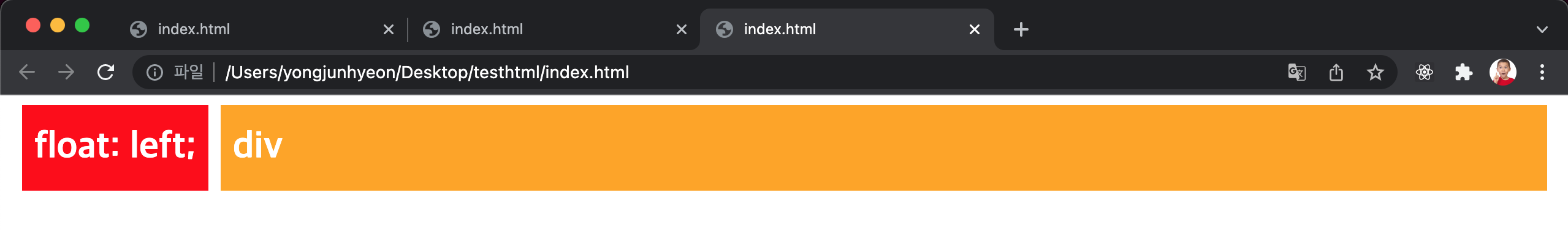
두 번째 element에도 float property를 선언하면 해결되지 않을까 싶지만, 너비가 최소화되는 문제가 있다.
float property가 선언된 자식 element를 포함하는 부모 element의 높이가 정상적으로 반영되지 않는 문제
아래 예시를 보면 float property가 선언된 두 개의 자식 element를 포함하는 부모 element의 높이가 정상적인 값을 가지지 못하는 문제가 발생했다.
float가 선언된 element는 일반적인 흐름상에서 존재하지 않기 때문에 float가 선언된 element의 높이를 알 수 없기 때문인데, 이 문제는 부모 element 이후에 위치하는 element의 정렬에 문제를 발생시킨다.
<!DOCTYPE html>
<html>
<head>
  <style>
    .container {
      color: white;
      text-align: center;
      padding: 10px;
      background-color: #def0c2;
    }
    .d1, .d2 {
      float: left;
      width: 50%;
      padding: 20px 0;
    }
    .d1 {
      background-color: #59b1f6;
    }
    .d2 {
      background-color: #ffb5b4;
    }
  </style>
</head>
<body>
  <div class="container">
    <div class="d1">1</div>
    <div class="d2">2</div>
  </div>
  <div style="background:red;padding:10px;color:white;">3</div>
</body>
</html>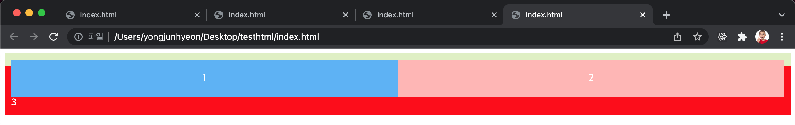
이 문제를 해결하는 가장 쉬운 방법은 float property가 선언된 자식 element의 부모 element에 overflow: hidden; property를 선언하는 것이다.
<!DOCTYPE html>
<html>
<head>
  <style>
    .container {
      color: white;
      text-align: center;
      padding: 10px;
      background-color: #def0c2;
      overflow: hidden;
    }
    .d1, .d2 {
      float: left;
      width: 50%;
      padding: 20px 0;
    }
    .d1 {
      background-color: #59b1f6;
    }
    .d2 {
      background-color: #ffb5b4;
    }
  </style>
</head>
<body>
  <div class="container">
    <div class="d1">1</div>
    <div class="d2">2</div>
  </div>
  <div style="background:red;padding:10px;color:white;">3</div>
</body>
</html>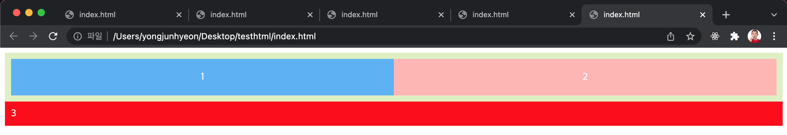
다음으로 많이 사용되는 방법은 :after 혹은 ::after pseudo class selector를 이용하는 것이다.
부모 element에 사전에 작성한 clearfix class만 추가하거나, 해당 element를 selector로 선택하여 clear 문법을 선언하면 되기 때문에 가장 깔끔하고 간편한 방법이다.
<!DOCTYPE html>
<html>
<head>
  <style>
    .container {
      color: white;
      text-align: center;
      padding: 10px;
      background-color: #def0c2;
    }
    .clearfix:after {
      content: "";
      display: block;
      clear: both;
    }
    .d1, .d2 {
      float: left;
      width: 50%;
      padding: 20px 0;
    }
    .d1 {
      background-color: #59b1f6;
    }
    .d2 {
      background-color: #ffb5b4;
    }
  </style>
</head>
<body>
  <div class="container clearfix">
    <div class="d1">1</div>
    <div class="d2">2</div>
  </div>
  <div style="background:red;padding:10px;color:white;">3</div>
</body>
</html>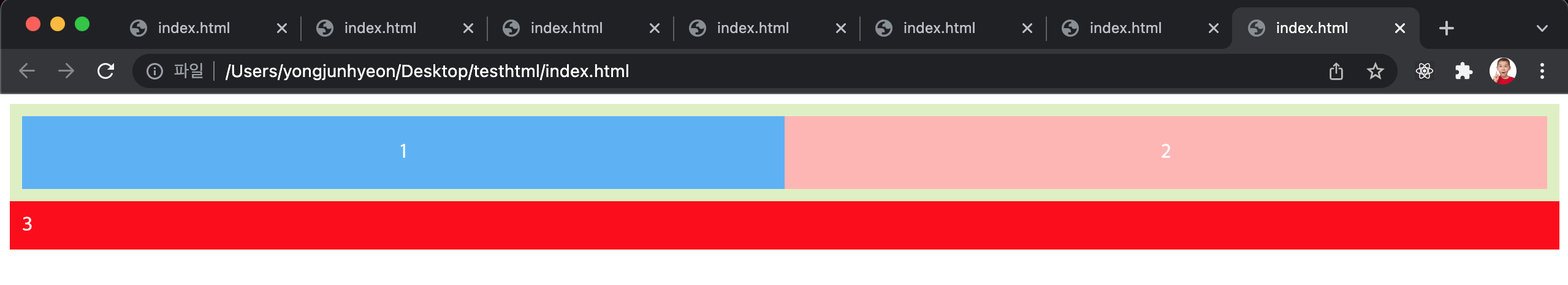
참고문헌
