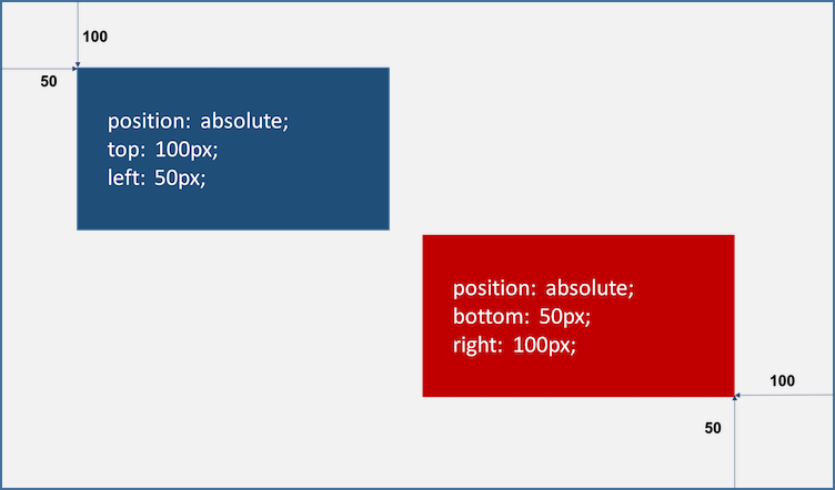
position property
top, bottom, left, right property와 함께 사용하여 element의 위치를 지정한다.
static
position property를 지정하지 않았을 때, 설정되어 있는 기본값이다.
기본적인 element의 순서에 따라 위에서 아래로, 왼쪽에서 오른쪽으로 순서에 따라 배치된다. 만약 부모 element 내에 자식 element로서 존재할 때는 부모 element의 위치를 기준으로 배치된다.
기본적으로 이 값을 지정할 일을 없지만, 이미 설정된 position을 무력화하기 위해 사용될 수 있다.
좌표 property(top, bottom, left, right)를 같이 사용할 수 없으며, 사용할 경우에는 무시된다.
<!DOCTYPE html>
<html>
<head>
  <style>
    body { margin: 0; }
    .parent {
      width: 150px;
      height: 150px;
      background: #bcbcbc;
      border: 5px solid #bcbcbc;
    }
    .static-box {
      position: static;
      background: #2E303D;
      color: #e55c3c;
      font-weight: bold;
      text-align: center;
      line-height: 150px;
    }
  </style>
</head>
<body>
  <div class="parent">
    <div class="static-box">static box</div>
  </div>
</body>
</html>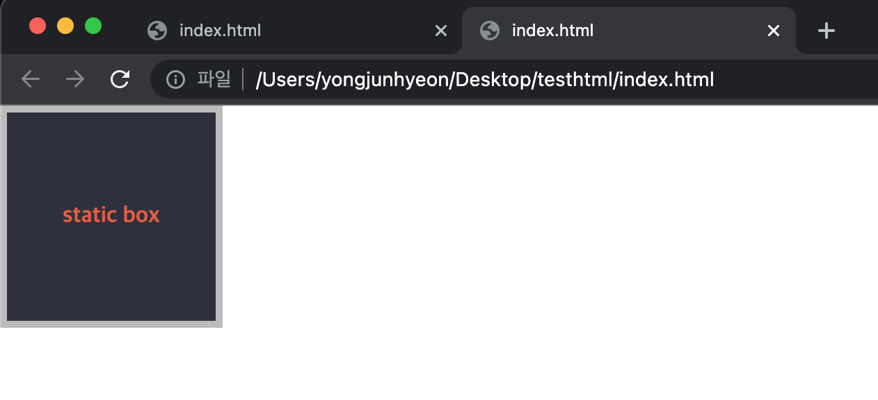
relative
기본 위치(static)를 기준으로 좌표 property(top, bottom, left, right)를 사용하여 위치를 이동시킨다.
<!DOCTYPE html>
<html>
<head>
  <style>
    body { margin: 0; }
    .parent {
      width: 150px;
      height: 150px;
      background: #bcbcbc;
      border: 1px solid #bcbcbc;
      margin: 50px;
    }
    .relative-box {
      position: relative;
      top: 50px; left: 50px;
      background: #2E303D;
      color: #e55c3c;
      font-weight: bold;
      text-align: center;
      line-height: 150px;
    }
  </style>
</head>
<body>
  <div class="parent">
    <div class="relative-box">relative box</div>
  </div>
</body>
</html>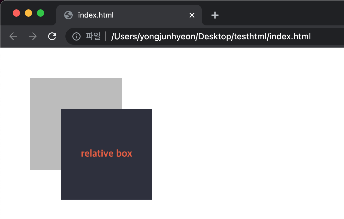
absolute
static을 제외하고 relative, absolute, fixed property가 선언되어 있는 부모 또는 조상 element를 기준으로 좌표 property(top, bottom, left, right)만큼 이동하여 위치가 결정된다.
만일 부모 또는 조상 element가 static인 경우, body element를 기준으로 하여 좌표 property대로 위치하게 된다.
따라서, 부모 element를 기준으로 삼기 위해서는 부모 element에 relative를 정의하여야 한다.
이때 다른 element가 먼저 위치를 점유하고 있어도, 뒤로 밀리지 않고 덮어 쓰게된다. 이런 특성을 부유 객체라 한다.
absolute 선언시, block level element의 width는 inline level element와 같이 content에 맞게 변화되므로 적절한 width를 지정해야 한다.
<!DOCTYPE html>
<html>
<head>
  <style>
    body { margin: 0; }
    .parent {
      width: 200px;
      height: 200px;
      background: #bcbcbc;
      border: 1px solid #bcbcbc;
      margin: 50px 0 0 300px;
      position: relative;
    }
    .absolute-box {
      position: absolute;
      height: 200px; width: 200px;
      top: 50px; left: 50px;
      color: #e55c3c;
      font-weight: bold;
      text-align: center;
      background: #2E303D;
      line-height: 200px;
    }
  </style>
</head>
<body>
  <div class="parent">
    <div class="absolute-box">absolute box (in parent)</div>
  </div>
  <div class="absolute-box">absolute box (no parent)</div></body>
</html>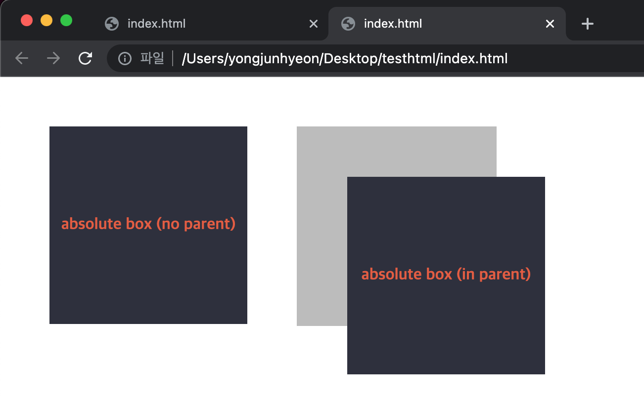
relative와 absolute의 차이점은 아래와 같다.
- relative는 static을 기준으로 좌표 property를 사용하여 위치를 이동시킨다. 따라서, 무조건 부모를 기준으로 위치하게 된다.
- absolute는 부모에 static 이외의 값이 지정되어 있을 경우에만 부모를 기준으로 위치하게 된다. 만약에 부모, 조상이 모두 static인 경우에는 body element를 기준으로 위치하게 된다.
- 따라서, absolute는 부모 element의 영역을 벗어나 자유롭게 어디든지 위치할 수 있다.
<!DOCTYPE html>
<html>
<head>
  <style>
    body { margin: 0;}
    .parent {
      width: 150px;
      height: 150px;
      background: #bcbcbc;
      border: 1px solid #bcbcbc;
      margin: 50px;
      float: left;
      /*position: relative; 현재 값은 static*/
    }
    .relative-box {
      position: relative;
      top: 10px; left: 10px;
      width: 150px;
      height: 150px;
      background: #2E303D;
      color: #e55c3c;
      font-weight: bold;
      text-align: center;
      line-height: 150px;
    }
    .absolute-box {
      position: absolute;
      top: 10px; left: 10px;
      width: 150px;
      height: 150px;
      background: #2E303D;
      color: #e55c3c;
      font-weight: bold;
      text-align: center;
      line-height: 150px;
    }
  </style>
</head>
<body>
  <div class="parent">
    <div class="absolute-box">absolute box</div>
  </div>
  <div class="parent">
    <div class="relative-box">relative box</div>
  </div>
</body>
</html>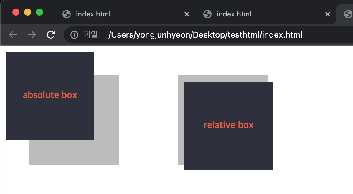
fixed
부모 element와 관계없이 브라우저의 viewport를 기준으로 좌표 property(top, bottom, left, right)를 사용하여 위치를 이동시킨다.
스크롤이 되더라도 화면에서 사라지지 않고, 항상 같은 곳에 위치한다.
fixed 선언 시, block level element의 width는 inline level element와 같이 content에 맞게 변화되므로, 적절한 width를 지정해야 한다.
<!DOCTYPE html>
<html>
<head>
  <style>
    body { margin: 0; }
    .fixed-box {
      position: fixed;
      color: #e55c3c;
      font-weight: bold;
      text-align: center;
      background: #2E303D;
    }
    .sidebar {
      width: 50px;
      height: 100%;
      top: 0;
      right: 0;
      padding-top: 100px;
    }
    .footer {
      width: 200px;
      width: 100%;
      height: 50px;
      bottom: 0;
      left: 0;
      line-height: 50px;
    }
  </style>
</head>
<body>
  <div class="fixed-box sidebar">fixed box (side-bar)</div>
  <div class="fixed-box footer">fixed box (footer)</div>
</body>
</html>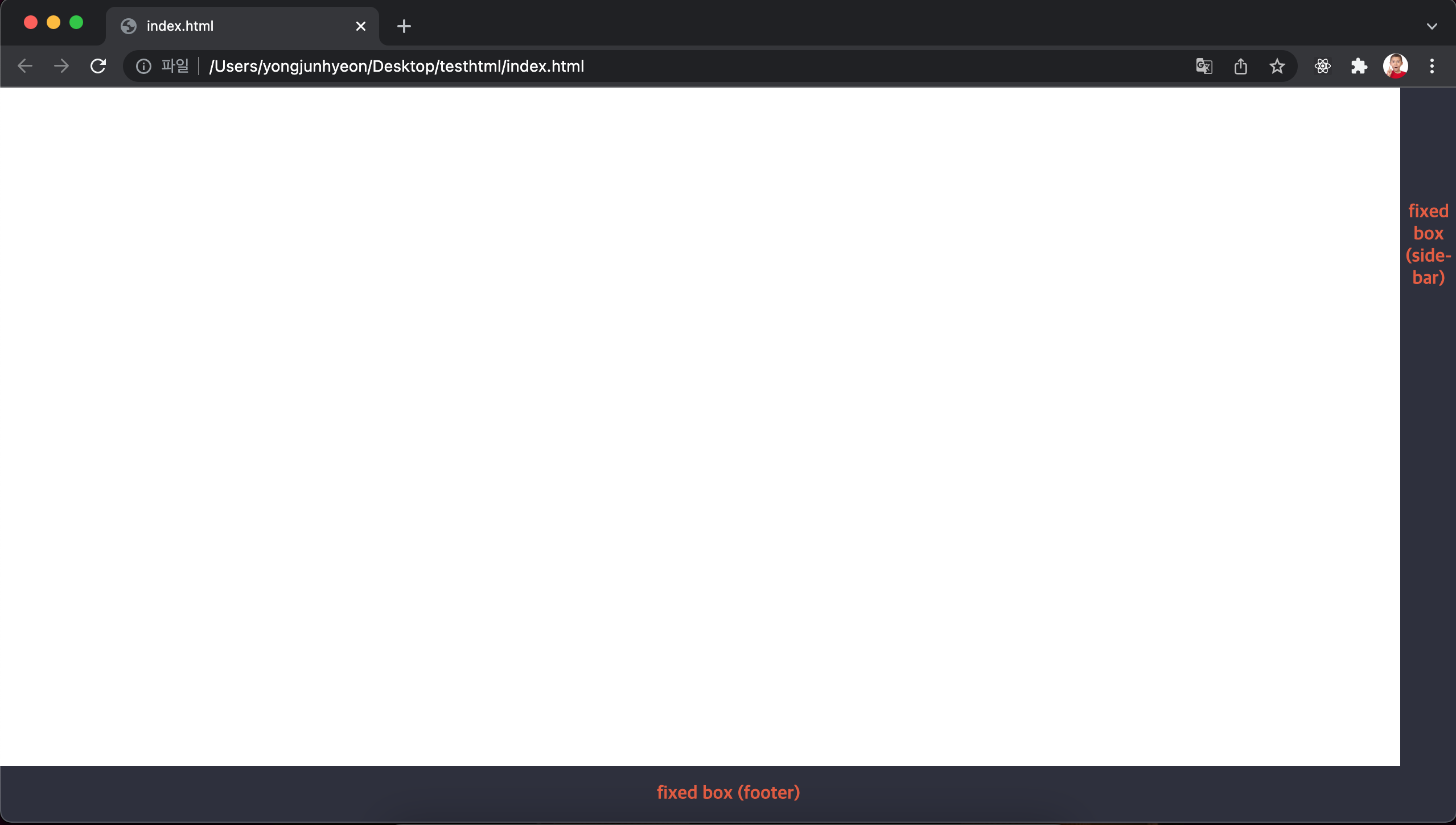
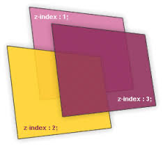
z-index property
큰 숫자를 값으로 지정할수록 화면 전면에 출력된다.
position property의 값이 static 이외인 element에만 적용된다.
<!DOCTYPE html>
<html>
<head>
  <style>
    .normal-box {
      width: 100px; height: 100px;
    }
    .absolute-box {
      width: 100px; height: 100px;
      position: absolute;
    }
    /* z-index는 positon 프로퍼티가 static 이외인 요소에만 적용된다. */
    .orange {
      background-color: orange;
      z-index: 1000;
    }
    .red {
      background-color: red;
      left: 50px; top: 50px;
      z-index: 100;
    }
    .green {
      background-color: green;
      left: 100px; top: 100px;
      z-index: 10;
    }
    .blue {
      background-color: blue;
      left: 150px; top: 150px;
      z-index: 1;
    }
  </style>
</head>
<body>
  <div class="normal-box orange"></div>
  <div class="absolute-box red"></div>
  <div class="absolute-box green"></div>
  <div class="absolute-box blue"></div>
</body>
</html>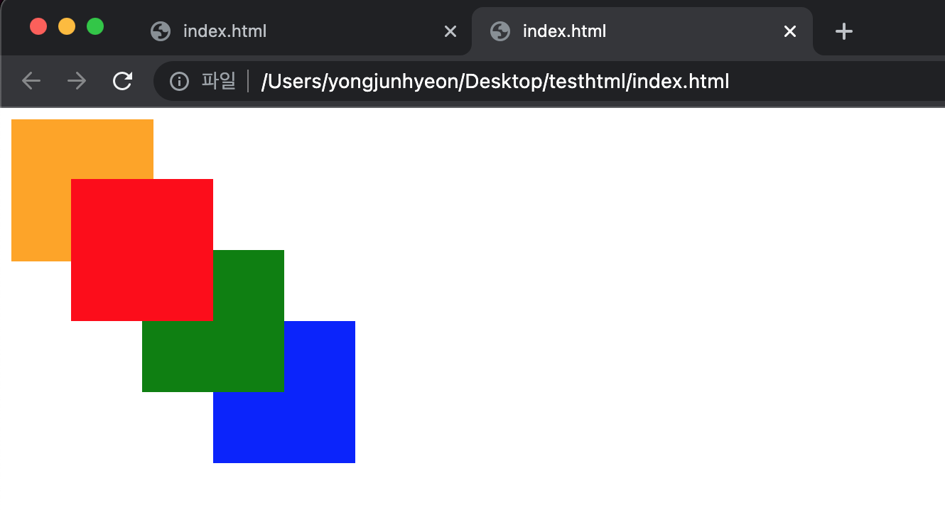
overflow property
자식 element가 부모 element를 벗어났을 때의 처리 방법을 정의한다.
property value에 따라 다음 기능을 한다.
visible: 영역을 벗어난 부분을 표시한다. 기본값hidden: 영역을 벗어난 부분을 잘라내, 보이지 않게 한다.auto: 영역을 벗어난 부분이 있을때만 스크롤 표시한다.scroll: 영역을 벗어난 부분이 없어도 스크롤 표시한다. 현재 대부분 브라우저는 auto와 동일하게 작동한다.
<!DOCTYPE html>
<html>
<head>
  <style>
    div {
      width: 150px;
      height: 150px;
      padding: 10px;
      margin: 30px;
      font-size: 1.2em;
      border-radius: 6px;
      border-color: gray;
      border-style: dotted;
      float: left;
    }
    .visible { overflow: visible; }
    .hidden  { overflow: hidden; }
    .scroll  { overflow: scroll; }
    .auto    { overflow: auto; }
  </style>
</head>
<body>
  <h1>overflow</h1>
  <div class="visible"><h3>visible</h3>Lorem ipsum dolor sit amet, consectetur adipisicing elit, sed do eiusmod tempor incididunt ut labore et dolore magna aliqua.</div>
  <div class="hidden"><h3>hidden</h3>Lorem ipsum dolor sit amet, consectetur adipisicing elit, sed do eiusmod tempor incididunt ut labore et dolore magna aliqua.</div>
  <div class="scroll"><h3>scroll</h3>Lorem ipsum dolor sit amet, consectetur adipisicing elit, sed do eiusmod tempor incididunt ut labore et dolore magna aliqua.</div>
  <div class="auto"><h3>auto</h3>Lorem ipsum dolor sit amet, consectetur adipisicing elit, sed do eiusmod tempor incididunt ut labore et dolore magna aliqua.</div>
</body>
</html>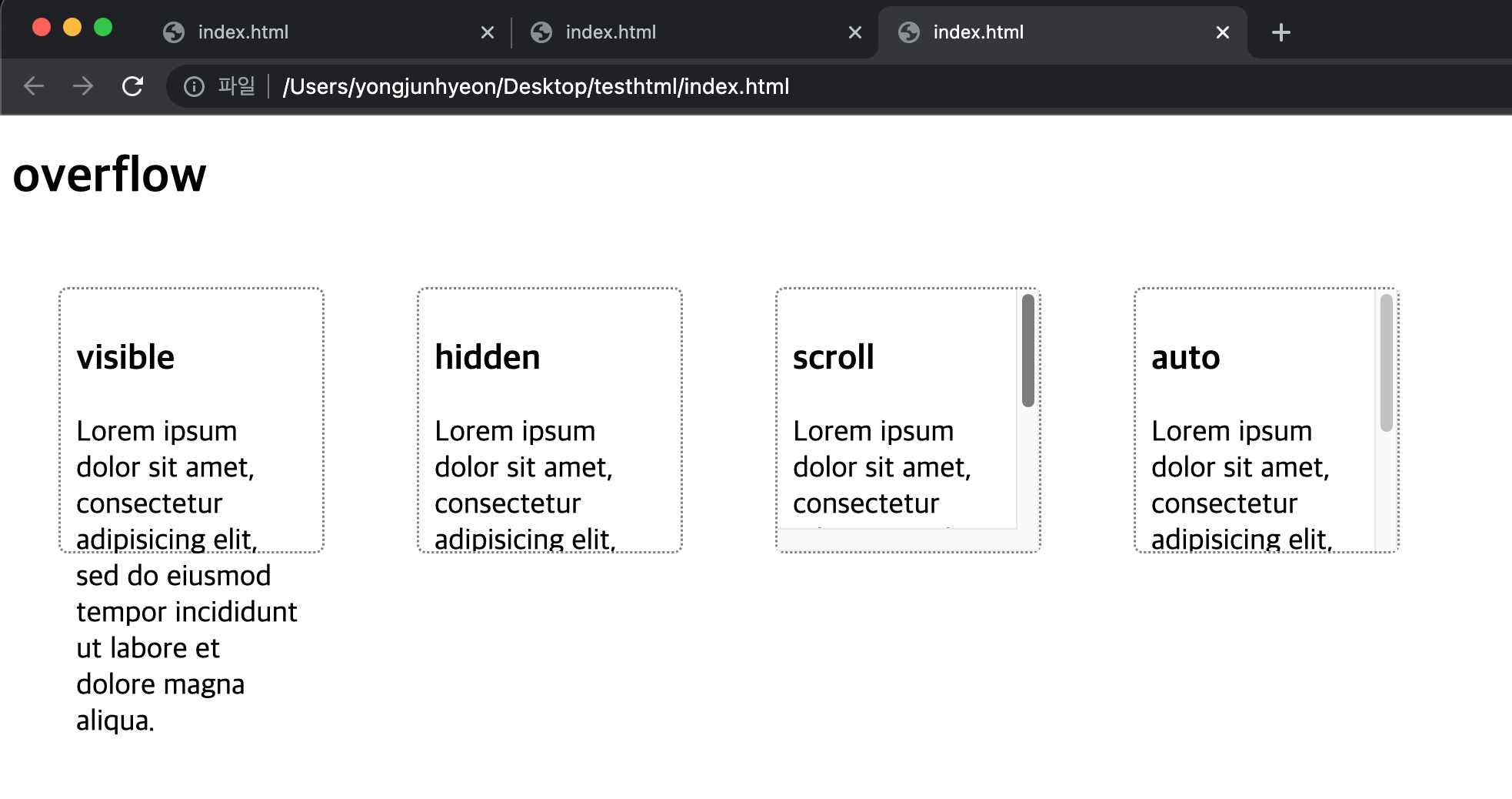
특정 방향으로만 스크롤을 표시하고자 할 때는, overflow-x 또는 overflow-y property를 사용한다.
div { overflow-y: auto; }참고문헌
