
이전 포스팅에 이어...
만들었던 반응형 여행 웹사이트에, 자바스크립트를 활용하여 기능적인 부분을 구현한 것을 리뷰해보고자 한다.
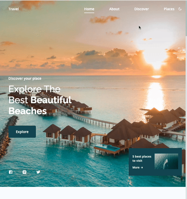
1. navbar 숨겨두었다가 클릭 시 보여주기
특정 아이콘 클릭 시 클래스 속성을 add/remove함으써 메뉴바를 조절하였다.
상세 코드는 아래와 같다.
const navMenu = document.getElementById('nav-menu'),
      navToggle = document.getElementById('nav-toggle'),
      navClose = document.getElementById('nav-close')

/*===== 아이콘 클릭 시 메뉴바 보여주기 =====*/
if(navToggle){
    navToggle.addEventListener('click', () =>{
        navMenu.classList.add('show-menu')
    })
}

/*===== 아이콘 클릭 시 메뉴바 사라지게 하기 =====*/
if(navClose){
  navClose.addEventListener('click', () =>{
      navMenu.classList.remove('show-menu')
  })
}

/*===== 4개의 메뉴 중 어떤 걸 클릭하더라도 메뉴바 사라지게 하기 =====*/
const navLink = document.querySelectorAll('.nav__link')

function linkAction(){
    const navMenu = document.getElementById('nav-menu')
    navMenu.classList.remove('show-menu')
}
navLink.forEach(n => n.addEventListener('click', linkAction))
show-menu클래스의 속성값은 아래와 같다. 이미 .nav__menu 속성을 모두 갖춰놓은 다음 position:fixed 이기 때문에
- 초기값:
right: -100% - 버튼 클릭 시:
right: 0
이렇게right속성값으로 조절하였다
@media screen and (max-width: 767px) {
  .nav__menu {
    position: fixed;
    background-color: var(--body-color);
    top: 0;
    right: -100%;
    width: 70%;
    height: 100%;
    box-shadow: -1px 0 4px rgba(14, 55, 63, 0.15);
    padding: 3rem;
    transition: 0.4s;
  }
}

.show-menu {
  right: 0;
}
2. 스크롤할 때 특정포인트에서 navbar 배경을 변경하기
스크롤이 height: 100vh 이상이 되었을 때, 클래스를 header부분에 추가였다.
쏘 심플 !
function scrollHeader(){
  const header = document.getElementById('header')
  // When the scroll is greater than 100 viewport height, add the scroll-header class to the header tag
  if(this.scrollY >= 100){
    header.classList.add('scroll-header');
   } else {
     header.classList.remove('scroll-header')
   }
}
window.addEventListener('scroll', scrollHeader)
scroll-header 속성엔 간단히 배경색깔과 텍스트 색깔만 바꿔주었다.
.scroll-header {
  background-color: var(--body-color);
  box-shadow: 0 0 4px rgba(14, 55, 63, 0.15);
}

.scroll-header .nav__logo,
.scroll-header .nav__toggle {
  color: var(--title-color);
}
3. 여러 사진 카드처럼 옆으로 넘기기
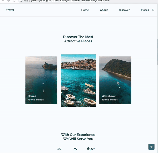
swiper라는 라이브러리를 사용해주었다(부트스트랩과 비슷함)
그 중에서 coverflow effect를 선택해서 여러 사진을 옆으로 넘기는 것을 동적으로 보여주는 것을 구현해보았다.
- 아래와 같이 swiper에서 지정한 특정 클래스를 부여해야 한다.(
swiper-container, swiper-wrapper, swipper-slide)
<section class="discover section" id="discover">
              <h2 class="section__title">Discover The Most <br> Attractive Places</h2>
              <div class="discover__container container swiper-container">
                <div class="swiper-wrapper">
                  <!--==================== DISCOVER 1 ====================-->
                  <div class="discover__card swiper-slide">
                    <img src="assets/img/discover1.jpg" alt="" class="discover__img">
                    <div class="discover__data">
                      <h2 class="discover__title">Bali</h2>
                      <span class="discover__description">24 tours available</span>
                    </div>
                  </div>
               <!-- ...-->

                </div>
              </div>

</section>- swiper에서 제공하는 js 소스코드는 아래와 같다.
rotate속성이나spaceBetween은 조절할 수 있다.
var swiper = new Swiper(".discover__container", {
  effect: "coverflow",
  grabCursor: true,
  centeredSlides: true,
  slidesPerView: "auto",
  loop: true,
  spaceBetween: 32,
  coverflowEffect: {
    rotate: 0
  }
});- swiper-bundle.min.js파일과 swiper-bundle.min.css 파일을 긁어와서 추가로 html에 연결시킨다.
4. 스크롤했을 때 홈 섹션으로 돌아가는 버튼 생성
스크롤했을 때 navbar 변경시키는 것과 다를 것 없다!
스크롤이 height: 200vh 이상이 되었을 때, 버튼속성에 추가였다.
function scrollUp(){
  const scrollUp = document.getElementById('scroll-up');
  if(this.scrollY >= 200){
    scrollUp.classList.add('show-scroll');
  } else{
    scrollUp.classList.remove('show-scroll')
  }
}
window.addEventListener('scroll', scrollUp)
튀어나오게 되는 버튼은 평상시에 bottom 속성이 -20% 였다가, show-scroll이라는 속성이 추가되면 1.5rem으로 화면에 보이게 된다.
.scrollup {
  position: fixed;
  right: 1rem;
  bottom: -20%;
  background-color: var(--first-color);
  padding: 0.5rem;
  border-radius: 5px;
  display: flex;
  opacity: 0.8;
  z-index: var(--z-tooltip);
  transition: 0.4s;
}

.scrollup__icon {
  color: var(--white-color);
  font-size: 1.2rem;
}

.scrollup:hover {
  background-color: var(--first-color-alt);
  opacity: 1;
}

.show-scroll {
  bottom: 1.5rem;
}
5. 현재 위치한 section에 맞게 nav메뉴에서 및줄 표시 처리
스크롤이 섹션별로 왔다갔다 할 때, 맞는 섹션의 <a> 요소에 active-link라는 클래스을 부여하였다.
const sections = document.querySelectorAll('section[id]')

function scrollActive(){
    const scrollY = window.pageYOffset

    sections.forEach(current =>{
        const sectionHeight = current.offsetHeight
        const sectionTop = current.offsetTop - 50;
        sectionId = current.getAttribute('id')

        if(scrollY > sectionTop && scrollY <= sectionTop + sectionHeight){
            document.querySelector('.nav__menu a[href*=' + sectionId + ']').classList.add('active-link')
        }else{
            document.querySelector('.nav__menu a[href*=' + sectionId + ']').classList.remove('active-link')
        }
    })
}
window.addEventListener('scroll', scrollActive)active-link요소를 부모요소로 둔 가상요소 before는 position: absolute로 독립적으로 위치하며, 가상요소 before를 사용하여 나타내어 주었다.(가느다란 네모박스와도 같은 것)
.active-link {
  position: relative;
  color: var(--title-color);
}

.active-link::before {
  /* 가상요소 before */
  content: "";
  position: absolute;
  bottom: -0.5rem;
  left: 0;
  background-color: var(--title-color);
  width: 100%;
  height: 2px;
}
6. 다크모드
다크모드일 때의 배경컬러, 텍스트 컬러를 변수로 따로 지정해주었다.
다크모드 아이콘을 클릭하였을 때 아래 두 가지 변화가 일어나는데
body에dark-theme속성을 부여하고 바뀐 컬러 변수가 사용되게끔 하였다.- 다크모드 아이콘이 다시 라이트코드 아이콘으로 변경되게 하였다.
/*==================== DARK LIGHT THEME ====================*/
const themeButton = document.getElementById('theme-button')
const darkTheme = 'dark-theme'
const iconTheme = 'ri-sun-line'

// Previously selected topic (if user selected)
const selectedTheme = localStorage.getItem('selected-theme')
const selectedIcon = localStorage.getItem('selected-icon')

// We obtain the current theme that the interface has by validating the dark-theme class
const getCurrentTheme = () => document.body.classList.contains(darkTheme) ? 'dark' : 'light'
const getCurrentIcon = () => themeButton.classList.contains(iconTheme) ? 'ri-moon-line' : 'ri-sun-line'

// We validate if the user previously chose a topic
if (selectedTheme) {
  // If the validation is fulfilled, we ask what the issue was to know if we activated or deactivated the dark
  document.body.classList[selectedTheme === 'dark' ? 'add' : 'remove'](darkTheme)
  themeButton.classList[selectedIcon === 'ri-moon-line' ? 'add' : 'remove'](iconTheme)
}

// Activate / deactivate the theme manually with the button
themeButton.addEventListener('click', () => {
    // Add or remove the dark / icon theme
    document.body.classList.toggle(darkTheme)
    themeButton.classList.toggle(iconTheme)
    // We save the theme and the current icon that the user chose
    localStorage.setItem('selected-theme', getCurrentTheme())
    localStorage.setItem('selected-icon', getCurrentIcon())
})
7. 스크롤 시 각 요소들이 스무스하게 나타나는 에니메이션
scrollReveal이라는 라이브러리를 사용했다.
scrollreveal.min.js 파일을 연결시키고 메인 js파일에 아래 코드를 추가해주었다.
distance, duration속성 등을 조절해주면 된다.
const sr = ScrollReveal({
  distance: '60px',
  duration: 2000,
  // reset: true,
})


sr.reveal(`.home__data, .home__social-link, .home__info,
         .section__title,
         .discover__container,
         .experience__data, .experience__overlay,
         .place__card,
         .sponsor__content,
         .footer__data, .footer__rights`,{
  origin: 'top',
  // interval: 100,
})

sr.reveal(`.about__description,
         .video__description,
         .subscribe__description`,{
  origin: 'left',
  interval: 100,
})

sr.reveal(`.about__img-overlay,
         .video__content,
         .subscribe__form`,{
  origin: 'right',
  interval: 100,
})

이거 전체
코드좀 주실수있으시나요 ?