가시성 높이기
정렬
데이터를 정확히 전달하기 위해서는 정렬이 필수
sort_values(), sort_index()와 같이 미리 정렬을 하고 plot을 하면 좋다.여백 및 공간 활용
여백과 공간, 그리고 두께와 같은 것들을 적절히 조절해야 가독성이 더 높아진다.
복잡함과 단순함
필요없는 복잡함은 X, 예를 들어 무의미한 3D는 오히려 좋지 않다. 무엇을 보고 싶은지, 대상이 누군지 고려하고 하자.
ETC
오차 막대를 추가해 Uncertainty에 대한 정보를 추가하거나 Gap을 줄여서 bar chart를 히스토그램으로 custom할 수도 있다.
bar & barh
axes는 리스트로 안에 ax 객체가 들어있다.
fig, axes = plt.subplots(1,2, figsize= (12,7))
x = list('abcde')
y = np.arange(1,6)
axes[0].bar(x,y)
axes[1].barh(x,y)
Examples
Data 확인하기
head와 비슷한 기능이나 랜덤하게 추출해준다.
student.sample(5)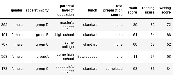
각 컬럼별 데이터 타입, null값 여부 등을 간략히
student.info()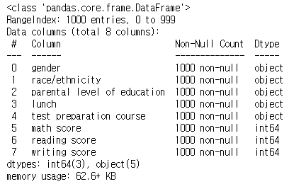
데이터의 통계치를 보여준다.
student.describe()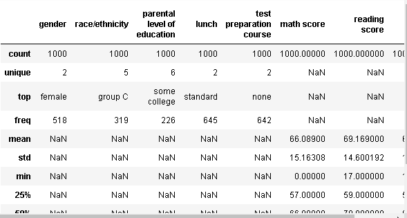
Multiple Bar plot
이 데이터에서 각 성별 별 인종 분포를 보고 싶다고 하자. 그러면 일단 성별로 group을 나누고 인종을 count해야한다.
student.groupby('gender')['race/ethnicity'].value_counts().sort_index()성별로 묶고, 묶인 데이터들 중에서 인종만 가져온 후에 각 인종 별 수를 count를 하는 코드이다. 그리고 index를 기준으로 정렬
fig, axes = plt.subplots(1,2, figsize = (15,7))
axes[0].bar(group['male'].index, group['male'], color = 'royalblue')
axes[1].bar(group['female'].index, group['female'], color = 'tomato')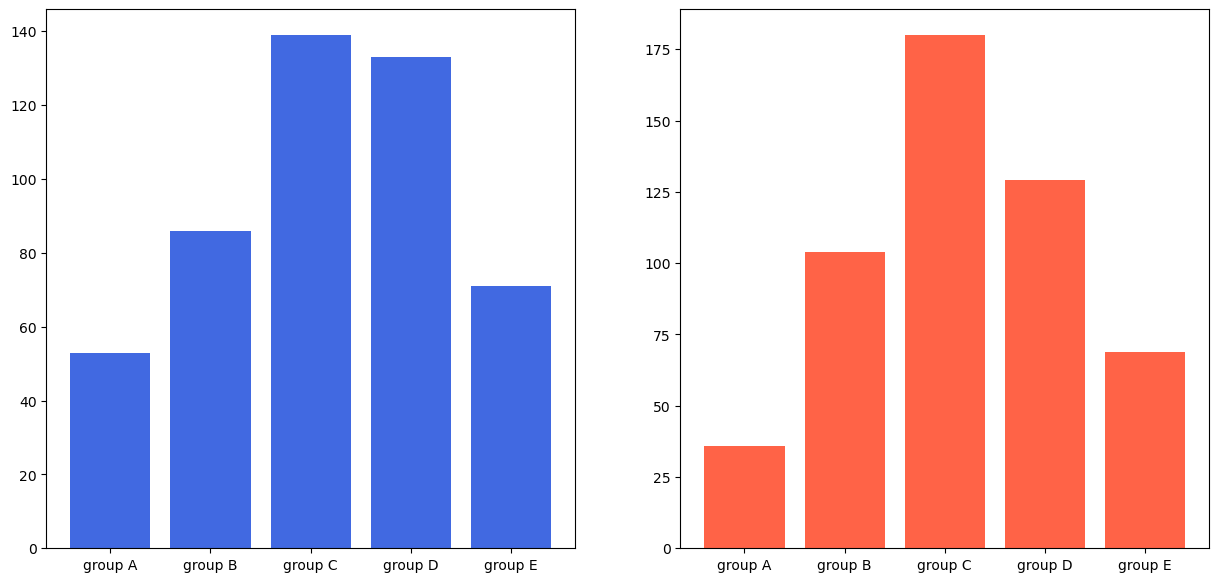
두 그래프를 보면 스케일이 다르다. 이럴 경우 sharey를 사용해서 조정을 해주면된다.
fig, axes = plt.subplots(1,2, figsize = (15,7), sharey = True)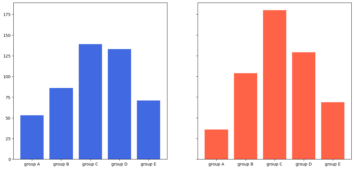
다만 그룹 별 두 성별이 차지하는 비율은 조금 알아보기 힘들다. 이럴 때 stacked bar plot을 사용해주면 좋다.
stacked bar plot
bottom = 이라는 코드를 사용해주면 밑을 비워놓고 그린다. 다만 위에서 이미 male을 그렸기 때문에 하얀색이 아닌 파란색이 채워져서 그려진다. 만약 3번째 줄의 코드가 없으면 파란색은 안보인다.
fig, axes = plt.subplots(1,2, figsize = (15,7))
axes[0].bar(group['male'].index, group['male'] + group['female'], color = 'darkgray')
axes[1].bar(group['male'].index, group['male'], color = 'royalblue')
axes[1].bar(group['female'].index, group['female'],bottom = group['male'], color = 'tomato')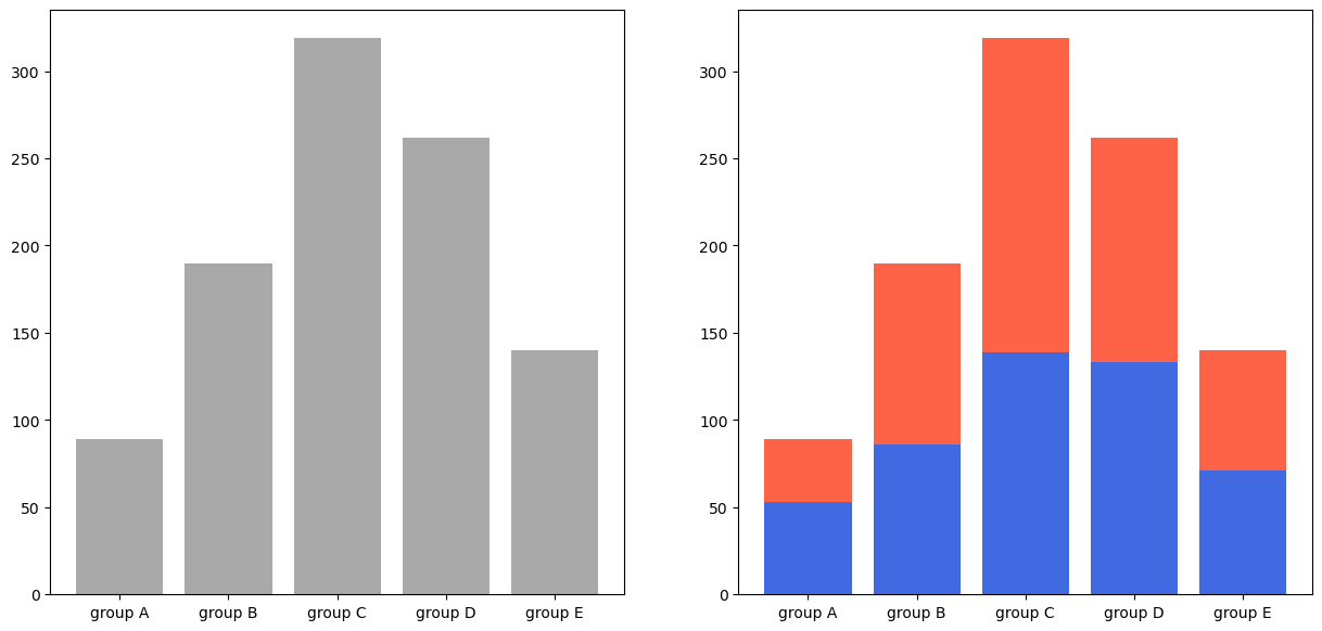
Percentage Stacked Bar plot
다만 얼마나 각 성별이 차지하고 있는지는 알아보기 힘들다. 이럴 경우 비율을 시각화해주면 더욱 보기 쉽다. 비율을 위해서 전체 수를 구한다. 그리고 bottom을 사용했던 것처럼 left를 해주면 left는 해당 값만큼 비워진다.
group = group.sort_index(ascending = False)
fig, ax = plt.subplots(1,1, figsize = (12,7))
total = group['male'] + group['female']
ax.barh(group['male'].index, group['male']/total, color = 'royalblue')
ax.barh(group['female'].index, group['female']/total, left =group['male']/total,
        color = 'tomato')

ax.set_xlim(0,1)
for s in ['top','bottom','left','right']:
ax.spines[s].set_visible(False) 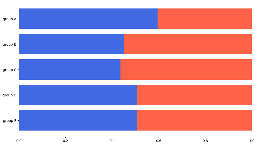
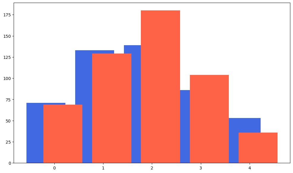
Overlapped Plot
alpha를 이용해서 불투명도를 조정할 수 있다.
fig, axes = plt.subplots(1,1, figsize = (15,7), sharey = True)
axes.bar(group['male'].index, group['male'], color = 'royalblue')
axes.bar(group['female'].index, group['female'], color = 'tomato',alpha = 0.5)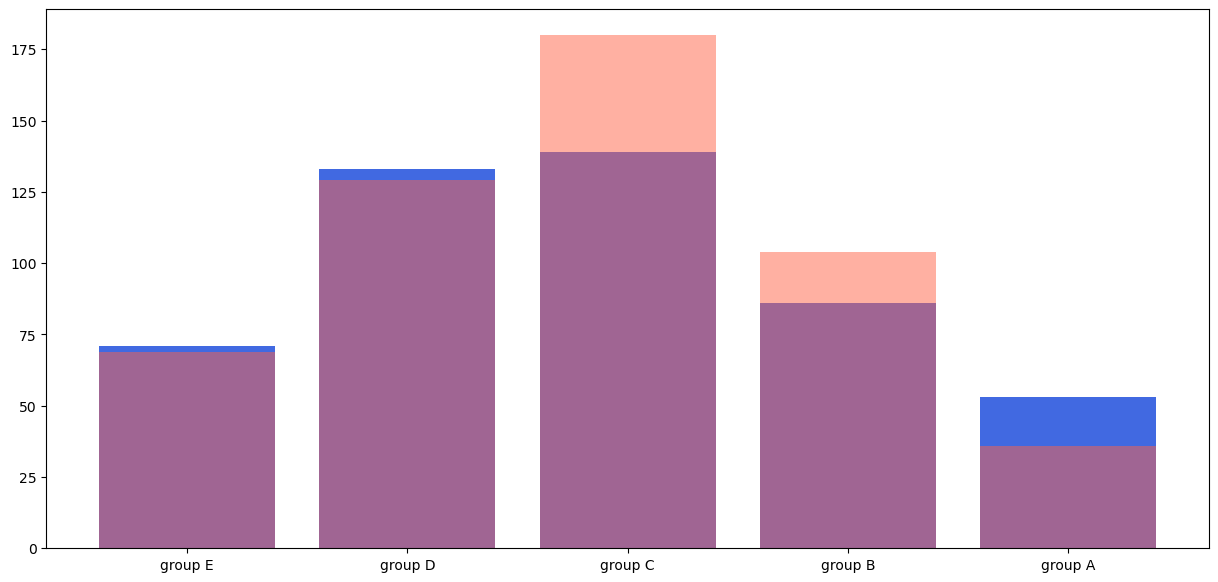
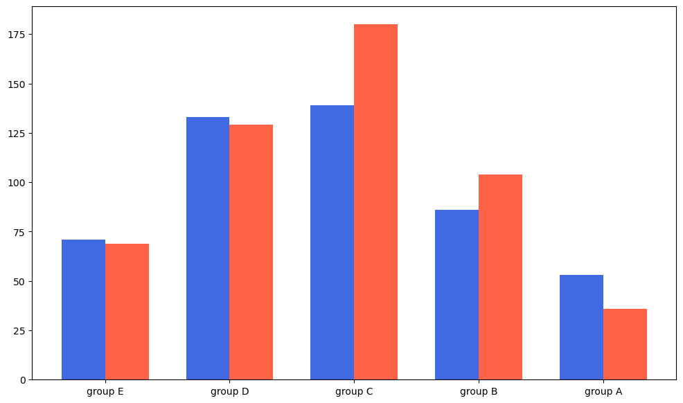
Grouped Bar plot
그래프를 그리는 위치는 정수만 할 수 있는 것이 아니다. 다음과 같이 0.3, 0,7에도 가능
이거를 이용해서 bar chart를 그룹화할 수 있는데 width를 이용하면 된다. 다만 이러면 라벨이 초기화되니 다시 설정해줘야한다.
fig, axes = plt.subplots(1,1, figsize = (12,7))
idx = np.arange(len(group['male'].index))
width = 0.35
axes.bar(idx - width/2, group['male'], color = 'royalblue', width = width)
axes.bar(idx + width/2, group['female'], color = 'tomato',width = width)
axes.set_xticks(idx)
axes.set_xticklabels(group['male'].index)