1. 데이터 개요
- 데이터셋: Football Data from Transfermarkt
- 배경 설명
- 선수 연령/포지션별 몸값 변화, 연도별 평균 및 최대 몸값 추이 확인 등을 통해 축구선수 이적시장이 어떻게 변화하는지 확인하고 유의미한 인사이트를 도출한다.
2. 데이터 불러오기
- players.csv, player_valuations.csv 로드, 구조 확인 및 결측치 제거
# 필요 라이브러리 import
import pandas as pd
import numpy as np
import os
base_path = "/content/drive/MyDrive/부트캠프/football"

# 데이터 로드
players = pd.read_csv(os.path.join(base_path, "players.csv"))
players_value = pd.read_csv(os.path.join(base_path, "player_valuations.csv"))

# 구조 확인
players.info()
players_value.info()

# players 데이터의 컬럼이 지나치게 많아 필요 컬럼만 추출
col_list = ["player_id", "first_name", "last_name", "name", "last_season",
            "current_club_id", "player_code", "country_of_birth", "city_of_birth",
            "country_of_citizenship", "date_of_birth", "sub_position", "position"]
players = players[col_list]

# 결측치 확인
players.isna().sum()
players_value.isna().sum()

# 결측치 확인 결과, players 데이터에만 결측치 존재
# 결측치의 수량이 많지 않아 간단히 drop
players.dropna(inplace=True)- 요약정보 확인
# players_value의 describe 정보
players_value.describe().round()

## 출력 정보
#        player_id  market_value_in_eur  current_club_id
# count   488573.0             488573.0         488573.0
# mean    219583.0            2401273.0           4402.0
# std     202045.0            6806894.0          10831.0
# min         10.0                  0.0              3.0
# 25%      58427.0             200000.0            369.0
# 50%     162029.0             500000.0           1025.0
# 75%     326363.0            1600000.0           2995.0
# max    1306851.0          200000000.0         110302.0

# market_value_in_eur 컬럼 평균이 중위수 대비 상당히 높은 편
# 평균의 백분위수 확인 결과 약 80 백분위수에 해당함을 확인
# 분포가 상당히 왜곡되어 있음을 짐작할 수 있음
import scipy.stats
scipy.stats.percentileofscore(players_value["market_value_in_eur"], players_value["market_value_in_eur"].mean())

## 출력 정보
# 80.2389816874858- clubs.csv, competitions.csv 로드, 구조 확인, 결측치 점검
clubs = pd.read_csv(os.path.join(base_path, "clubs.csv"))
competitions = pd.read_csv(os.path.join(base_path, "competitions.csv"))

clubs.info()
competitions.info()

# 결측치 점검 결과 일부 컬럼 내 결측치 존재하나, 그대로 활용
clubs.isna().sum()
competitions.insa().sum()
3. 데이터 정제하기
- players & players_value 병합
# 두 데이터프레임을 player_id 컬럼을 기준으로 병합
players_with_val = players.merge(players_value, on="player_id")- players_with_val 데이터 내 age컬럼 생성
# 기준일 데이터 내 기준연도 추출
players_with_val["date_year"] = players_with_val["date"].apply(lambda x: int(x[:4]))

# 기준연도에서 생년월일 차감하여 age 추출
players_with_val["age"] = players_with_val["date_year"] - players_with_val["date_of_birth"].apply(lambda x: int(x[:4]))

# age가 비정상적으로 작은 경우 존재, 15세 이상으로 필터링
players_with_val = players_with_val[players_with_val["age"] >= 15]- players_with_val 데이터 내 연도별 하나의 몸값 데이터만 남도록 중복컬럼 제거
players_with_val.drop_duplicates(["player_id", "date_year"], keep="last", inplace=True)- players_with_val 데이터 내 컬럼명 재정리
# 필요 컬럼만 정의
col_list = ['player_id', 'current_club_id_x', 'first_name', 'last_name', 'name',
            'last_season', 'country_of_citizenship', 'city_of_birth', 'position',
            'sub_position', 'date_year', 'age', 'market_value_in_eur']

# 필요 컬럼만 추출
players_with_val = players_with_val[col_list]

# 컬럼명 정제
players_with_val.rename(
    columns={"current_club_id_x": "current_club_id",},
    inplace=True
)- players_with_val 데이터 중 2024년도 정보 추출 및 순위 컬럼 추가
# 2024년 데이터만 추출
players_with_val_2024 = players_with_val[(players_with_val["date_year"] == 2024) & (players_with_val["last_season"] == 2024)]

# 순위 정보 추가 (몸값이 가장 큰사람이 1순위)
players_with_val_2024["market_value_rank"] = players_with_val_2024["market_value_in_eur"].rank(method="min", ascending=False)- clubs 데이터 중 2024년도 정보 추출 및 클럽별 선수가치 총합 계산
# 2024년도 클럽 정보만 추출
clubs_2024 = clubs[clubs["last_season"] == 2024]

# 클럽별 선수가치 총합 계산
tot_market_values = players_with_val_2024.groupby("current_club_id")["market_value_in_eur"].sum()
clubs_2024["tot_market_value"] = clubs_2024["club_id"].apply(lambda x: tot_market_values[x])- competitions 데이터 중 필요 컬럼만 추출
competitions = competitions[["competition_id", "name", "country_name"]]
competitions.rename(
    columns={"competition_id": "domestic_competition_id"},
    inplace=True
)- clubs-competitions 데이터 간 조인 후 필요 컬럼만 추출
clubs_2024 = pd.merge(clubs_2024, competitions, on="domestic_competition_id")
clubs_2024 = clubs_2024[
	["club_id", "club_code", "name_x", "total_market_value",
     "squad_size", "average_age", "foreigners_number",
     "foreigners_percentage", "name_y", "country_name"]
]
4. 시각화
- market_value_in_eur의 Box Plot
# 시각화 모듈 import
import matplotlib.pyplot as plt
import seaborn as sns

# market_value_in_eur의 Box Plot
fig, ax = plt.subplots(figsize=(3, 5))
sns.boxplot(players_with_val_2024["market_value_in_eur"], ax=ax)
ax.set_title("Boxplot of Makret Value (EUR)")
ax.set_ylabel(None)
plt.show()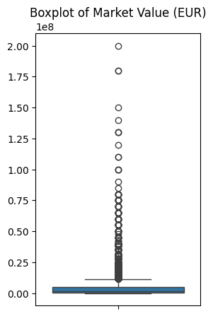
- market_value_in_eur의 Histogram
# market_value_in_eur의 Histogram
fig, ax = plt.subplots(figsize=(5, 3))
sns.histplot(players_with_val_2024["market_value_in_eur"], ax=ax)
ax.set_title("Histogram of Makret Value (EUR)")
ax.set_ylabel(None)
plt.show()

# 선수의 몸값은 대부분 0~0.25*10e8 유로 사이에 위치하고 있음
# 극단적으로 비싼 몸값을 가진 선수들이 존재함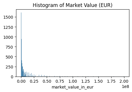
- 시간의 흐름에 따른 몸값의 합 변화 Line Graph
plot_data = players_with_val.groupby("date_year")["market_value_in_eur"].sum().reset_index()
fig, ax = plt.subplots(figsize=(7, 3))
sns.lineplot(data=plot_data, x="date_year", y="market_value_in_eur", ax=ax)
ax.set_title("Sum of Market Value (EUR)")
ax.set_ylabel(None)
plt.show()

# 20년간 물가가 상승함에 따라 몸값의 합도 4배 이상 증가함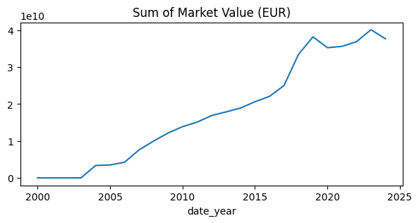
- 시간의 흐름에 따른 최대 몸값 변화 Line Graph
plot_data = players_with_val.groupby("date_year")["market_value_in_eur"].max().reset_index()
fig, ax = plt.subplots(figsize=(7, 3))
sns.lineplot(data=plot_data, x="date_year", y="market_value_in_eur", ax=ax)
ax.set_title("Max Market Value (EUR)")
ax.set_ylabel(None)
plt.show()

# 시간의 흐름에 따라 최대 몸값도 증가하는 추세임을 확인
# 단, 2020년대 초반에 잠시 최대 몸값이 감소한 적이 있음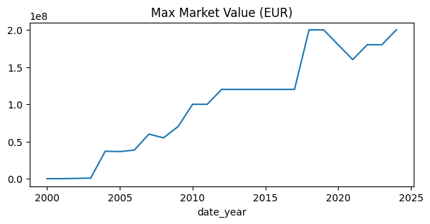
- 시간의 흐름에 따른 평균 몸값 변화 Line Graph
plot_data = players_with_val.groupby("date_year")["market_value_in_eur"].mean().reset_index()
fig, ax = plt.subplots(figsize=(7, 3))
sns.lineplot(data=plot_data, x="date_year", y="market_value_in_eur", ax=ax)
ax.set_title("Mean Market Value (EUR)")
ax.set_ylabel(None)
plt.show()

# 평균 몸값의 경우, 2005년이 2015년보다 높았음을 확인 가능 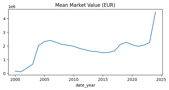
- 연도별 몸값 데이터 건수 Count Plot
plot_data = players_with_val.groupby("date_year")["market_value_in_eur"].count().reset_index()
plot_data["date_year"] = plot_data["date_year"].apply(lambda x: str(x)[2:])
fig, ax = plt.subplots(figsize=(7, 3))
sns.barplot(x=plot_data.date_year, y=plot_data.market_value_in_eur, ax=ax)
ax.set_title("Count of Market Value (EUR)")
ax.set_ylabel(None)
plt.show()

# 2000년도의 경우 데이터 수가 현저히 적어, 평균이 높게 나왔을 가능성 존재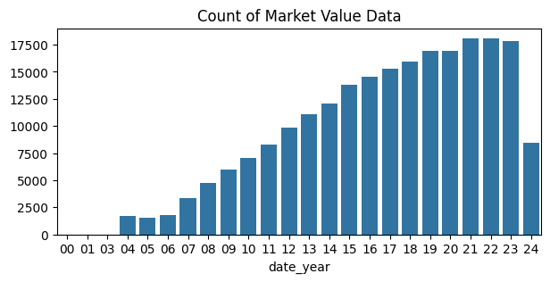
- 2018-2023 연도별 몸값 Boxplot
plot_data = players_with_val[["date_year", "market_value_in_eur"]]
year_list = [2018, 2019, 2020, 2021, 2022, 2023]

fig, axes = plt.subplots(2, 3, figsize=(7, 7))
fig.suptitle("Boxplot of Market Value Data (EUR, 2018-2023)")
axes = axes.ravel()
idx = 0

for yr in year_list:
  sns.boxplot(plot_data[plot_data["date_year"] == yr]["market_value_in_eur"], ax=axes[idx])
  axes[idx].set_title(yr)
  idx += 1

plt.tight_layout()
plt.show()

# 항상 초고가의 몸값을 지닌 선수는 여러 존재하고 있으며,
# '21년의 최대 몸값이 가장 작았음을 확인할 수 있음
# 이는 코로나로 인한 관객 감소, 수익 악화 등의 영향으로 추정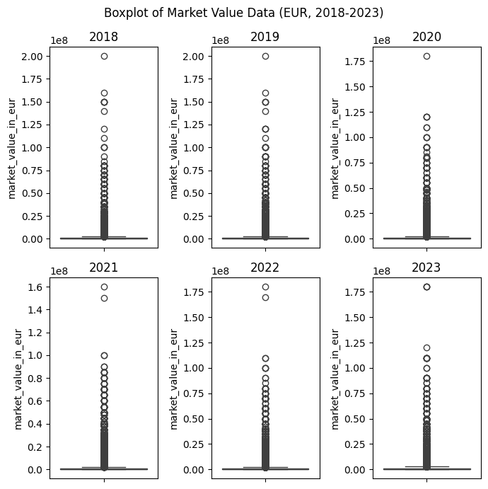
- Age별 평균 몸값 Bar Graph
plot_data = players_with_val.groupby("age")["market_value_in_eur"].mean().reset_index()
high_value_interval = plot_data.sort_values(by="market_value_in_eur", ascending=False)["age"].head().tolist()
colors = ["salmon" if age in high_value_interval else "royalblue" for age in plot_data["age"]]
fig, ax = plt.subplots(figsize=(8, 3))
plot_data.plot(kind="bar", x="age", y="market_value_in_eur", color=colors, ax=ax)
ax.set_title("Mean Market Value of Age (EUR)")
ax.set_ylabel(None)
ax.set_xlabel(None)
ax.get_legend().remove()
plt.show()

# 선수의 평균 몸값은 20대 후반이 가장 높음을 알 수 있음
# 예상외로 40 중반의 선수의 몸값이 다시 상승하는 경향도 확인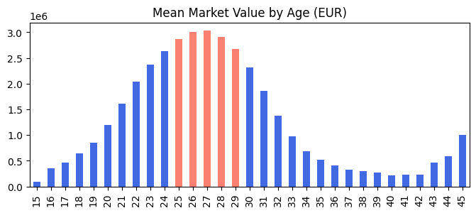
- Position과 몸값 Bar Graph
plot_data = players_with_val.groupby("position")["market_value_in_eur"].mean().reset_index()
fig, ax = plt.subplots(figsize=(5, 3))
sns.barplot(data=plot_data, x="position", y="market_value_in_eur", hue="position", width=.5)
ax.set_title("Mean Market Value by Position (EUR)")
ax.set_ylabel(None)
ax.set_xlabel(None)
plt.show()

# 공격수의 몸값이 가장 높으며, 골키퍼의 몸값이 가장 낮음을 알 수 있음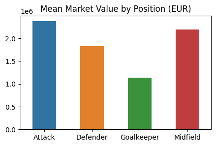
- 연도별 Position과 몸값 Line Graph
plot_data = players_with_val.groupby(["date_year", "position"])["market_value_in_eur"].mean().reset_index()
fig, ax = plt.subplots(figsize=(10, 5))
sns.lineplot(data=plot_data, x="date_year", y="market_value_in_eur", hue="position")
ax.set_title("Mean Market Value by Position (EUR)")
ax.set_ylabel(None)
ax.set_xlabel(None)
plt.show()

# 포지션과 몸값 간의 순위는 연도별로 큰 차이가 없는 것으로 확인
# 단, 2022-2023년에는 공격수와 미드필더 간 평균 금액의 차이가 미미했음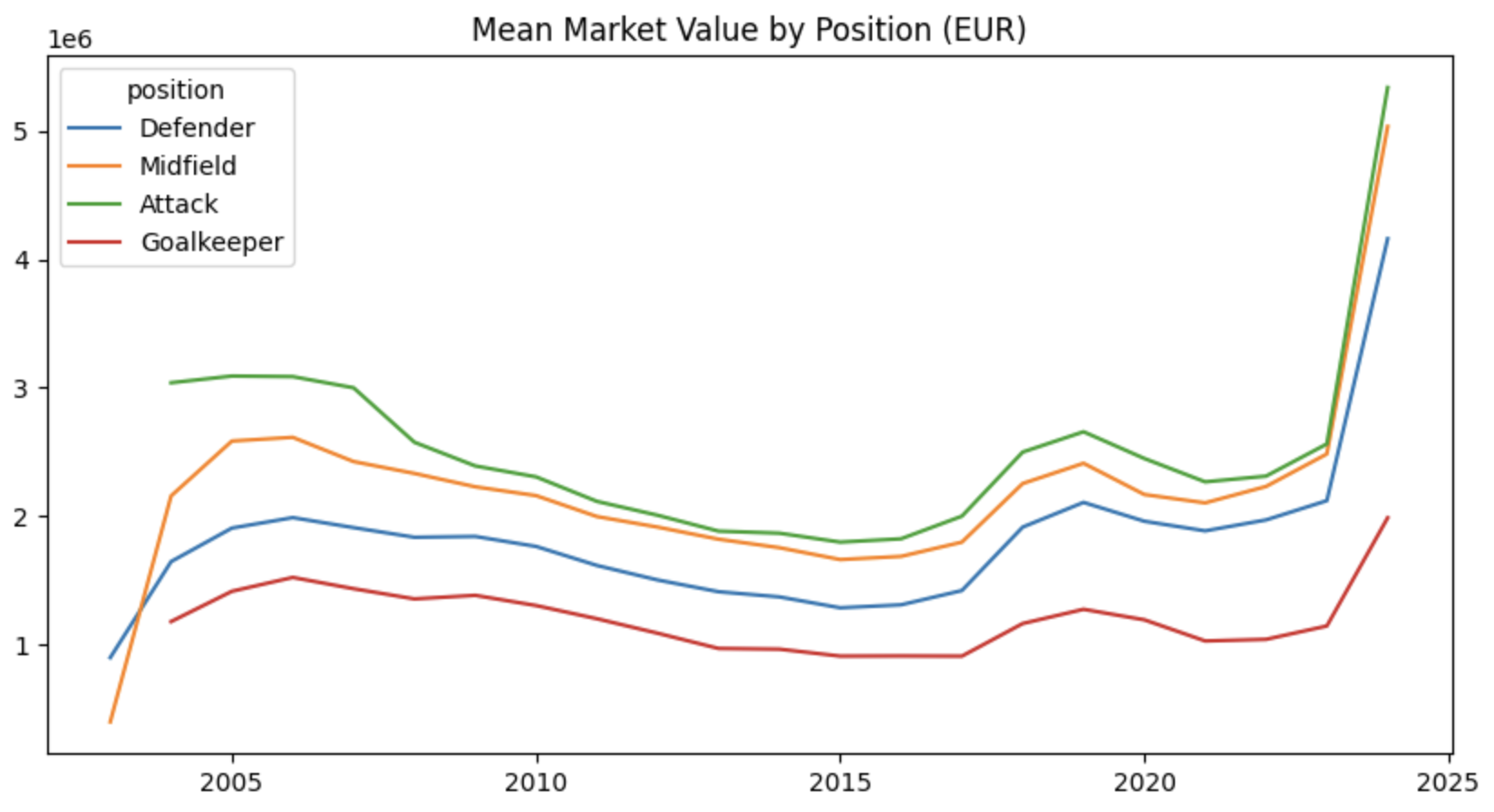
- 선수 배출 수 상위 10개국 Bar Plot
plot_data = players_with_val.drop_duplicates("player_id")["country_of_citizenship"].value_counts().reset_index().head(10)
fig, ax = plt.subplots(figsize=(10, 5))
sns.barplot(data=plot_data, x="country_of_citizenship", y="count", hue="country_of_citizenship")
ax.set_title("Top 10 countries with the largest number of players")
for pos in ax.patches:
  ax.text(pos.get_x() + pos.get_width()/2,
          pos.get_y() + pos.get_height()-50,
          f"{pos.get_height():,.0f}",
          ha="center", va="top", color="white", weight="bold")
ax.set_ylabel(None)
ax.set_xlabel(None)
plt.show()

# 이탈리아와 스페인에서 가장 많은 선수를 배출 중에 있음
# 우크라이나의 경우에도 상위 10개국 안에 드는 것이 인상적임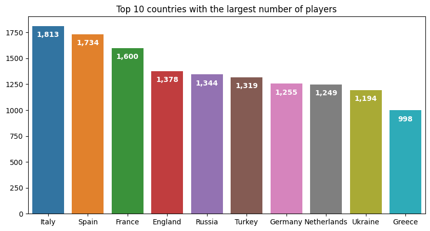
- 국가별 선수 배출 수 Map
# 지리 시각화를 위한 라이브러리 import
from geopy.geocoders import Nominatim
import time

# 국가별 위도, 경도 추출
locations, errors = [], []
geolocator = Nominatim(user_agent="my-app")
target_data = players_with_val.drop_duplicates("player_id")["country_of_citizenship"].value_counts().reset_index()
countries = target_data.country_of_citizenship

for country in countries: # 국가명 인식 에러 발생 대비
  try:
    location = geolocator.geocode(country)

  except Exception as e:
    print(f"!!! Error in converting country name: {country} ({e})")
    errors.append(country)
    continue

  time.sleep(0.3)
  latitude = location.latitude
  longitude = location.longitude

  locations.append((country, latitude, longitude))
  print(f"{country} -> {latitude}, {longitude}, conversion succesfull")

# locations 데이터프레임 생성
loc_df = pd.DataFrame(locations)
loc_df.columns = ["country", "latitude", "longitude"]
loc_df["count"] = loc_df.country.apply(lambda x: target_data[target_data["country_of_citizenship"] == x]["count"].values[0])
loc_df

# 지리 시각화
import plotly.express as px

fig = px.density_mapbox(
    loc_df, lat="latitude", lon="longitude", z="count",
    radius=20, center=dict(lat=40, lon=90), zoom=0.4, mapbox_style ="carto-positron",
    color_continuous_scale=[[0.0, "yellow"], [0.2, "orange"], [1.0, "blue"]],
    labels=dict(count="Count")
)

fig.update_layout(
    title="<b>Density Map of Players Count</b>",
    title_x = 0.025,
    title_y = 0.97,
    title_font_color = "black",
    title_font_family = "Sparrows",
    margin=dict(b=20, t=40, l=20, r=20),
    font_color = "black",
    font_family = "Sparrows",
)

fig.show()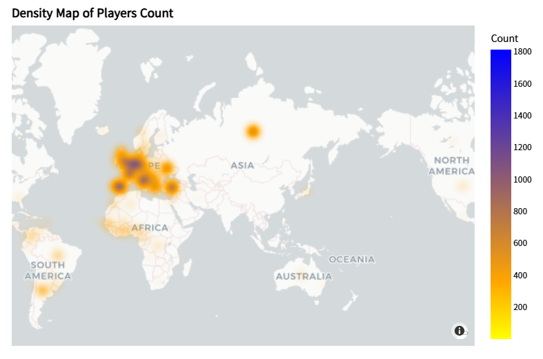
- 영국 도시별 선수 배출 수 Map
# 영국 도시별 위도, 경도 추출
locations, errors = [], []
geolocator = Nominatim(user_agent="my-app")
cities_in_england = players_with_val[players_with_val["country_of_citizenship"] == "England"].\
  drop_duplicates("player_id")["city_of_birth"].value_counts().reset_index()
cities = cities_in_england.city_of_birth

for city in cities: # 도시명 인식 에러 발생 대비
  try:
    location = geolocator.geocode(city)

  except Exception as e:
    print(f"!!! Error in converting city name: {city} ({e})")
    errors.append(city)
    continue

  time.sleep(0.1)
  latitude = location.latitude
  longitude = location.longitude

  locations.append((city, latitude, longitude))
  print(f"{city} -> {latitude}, {longitude}, conversion succesfull")

# loc_df 생성
loc_df = pd.DataFrame(locations)
loc_df.columns = ["city", "latitude", "longitude"]
loc_df["count"] = loc_df.city.apply(lambda x: cities_in_england[cities_in_england["city_of_birth"] == x]["count"].values[0])
loc_df

# 시각화
import folium

england_location = [54.8670, -4.2621]
england_map = folium.Map(location=england_location, zoom_start=5)

for idx, row in loc_df.iterrows():
  city = row["city"]
  count = row["count"]
  latitude = row["latitude"]
  longitude = row["longitude"]

  radius = count / 10
  color = "red" if count > 200 else "orange" if count > 50 else "darked"

  folium.CircleMarker(
      location=[latitude, longitude],
      radius=radius,
      color=color,
      fill=True,
      fill_color=color,
      fill_opacity=0.7,
      tooltip=f"{city}<b><br>Count: {count}</b>"
  ).add_to(england_map)

england_map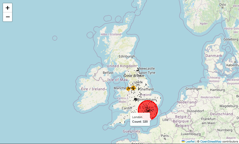
- 영국 도시별 선수 배출 수 Map (연도별 반응형)
# 연도, 도시별 선수 수 계산
year_city_count = pd.DataFrame(
    players_with_val[players_with_val["country_of_citizenship"]=="England"].\
      groupby(["date_year", "city_of_birth"])["player_id"].\
      count()
).reset_index()

year_city_count.rename(columns={
    "date_year": "year",
    "city_of_birth": "city",
    "player_id": "count"
}, inplace=True)

year_city_count = pd.merge(
    year_city_count,
    loc_df[["city", "latitude", "longitude"]],
    on="city",
    how="left"
)

# 시각화
fig = px.scatter_geo(
    year_city_count, lat="latitude", lon="longitude",
    hover_name="city", size="count", color="count",
    animation_frame="year", projection="natural earth",
    color_continuous_scale=[[0.0, "yellow"], [0.2, "orange"], [1.0, "blue"]],
    labels=dict(count="Count")
)

fig.update_geos(
    projection_scale=3.5,
    scope="europe",
    center=dict(lat=55.8679, lon=-4.2621),
)

fig.update_layout(
    title="<b>Players count by UK cities</b>",
    title_x = 0.025,
    title_y = 0.97,
    title_font_color = "black",
    title_font_family = "Sparrows",
    margin=dict(b=20, t=40, l=20, r=20),
    font_color = "black",
    font_family = "Sparrows",
)

fig.show()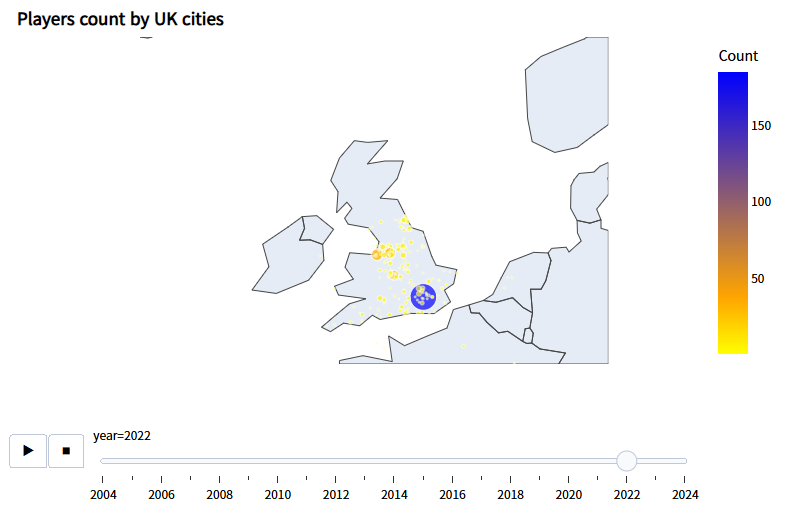
- 국가별 축구클럽 총 몸값 Tree Map
plot_data = clubs_2024.sort_values("tot_market_value", ascending=False)

fig = px.treemap(
    plot_data,
    path=["country_name", "club_code"],
    values="tot_market_value",
    labels={"club_code": "Club Name",
            "tot_market_value": "Total Market Value"}
)

fig.update_layout(
    title="<b>Treemap of Total Market Value by Clubs</b>",
    title_x = 0.025,
    title_y = 0.97,
    title_font_color = "black",
    title_font_family = "Sparrows",
    margin=dict(b=20, t=40, l=20, r=20),
    font_color = "black",
    font_family = "Sparrows",
)

fig.show()

# 영국 축구 클럽 소속 선수의 몸값 합이 가장 큼을 확인할 수 있음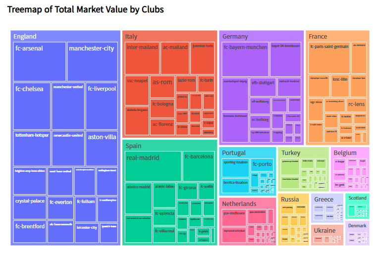
- 국가별 축구클럽 총 몸값 Bar Plot
fig = px.bar(
    plot_data,
    x="club_code",
    y="tot_market_value",
    color="country_name",
    labels={"club_code": "Club Name",
            "tot_market_value": "Total Market Value"}
)

fig.update_layout(
    title="<b>Bar Plot of Total Market Value by Clubs</b>",
    title_x = 0.025,
    title_y = 0.97,
    title_font_color = "black",
    title_font_family = "Sparrows",
    margin=dict(b=20, t=40, l=20, r=20),
    font_color = "black",
    font_family = "Sparrows",
)

fig.show()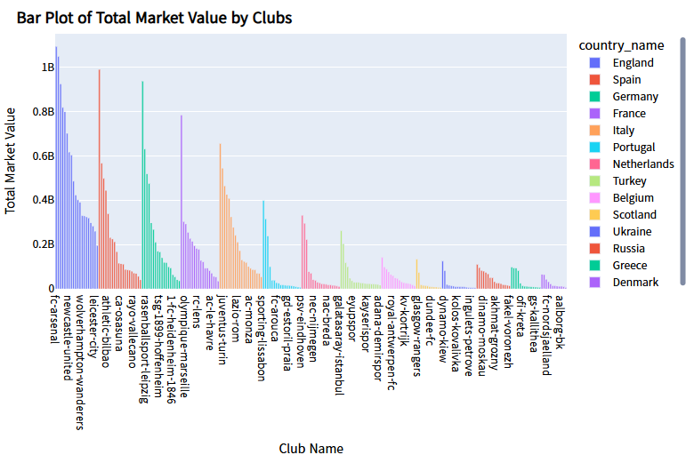
- 리그별 총 몸값 Box Plot
fig = px.box(
    plot_data,
    x="name_y",
    y="tot_market_value",
    color="name_y",
    labels={"name_y": "Competition",
            "tot_market_value": "Total Market Value"}
)

fig.update_layout(
    title="<b>Box Plot of Total Market Value by Competitions</b>",
    title_x = 0.025,
    title_y = 0.97,
    title_font_color = "black",
    title_font_family = "Sparrows",
    margin=dict(b=20, t=40, l=20, r=20),
    font_color = "black",
    font_family = "Sparrows",
    showlegend = False,
)

fig.show()

# 프리미어 리가 소속 선수의 몸값이 가장 편차가 크다는 점을 확인할 수 있음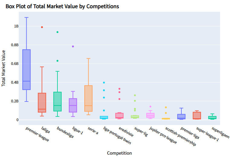
*이 글은 제로베이스 데이터 취업 스쿨의 강의 자료 일부를 발췌하여 작성되었습니다.

데이터 분석, 데이터 사이언스 학습 저장소