import numpy as np
import matplotlib.pyplot as plt
import pandas as pd
import seaborn as sns
%matplotlib inline

plt.style.use('seaborn')
sns.set(font_scale=2.5)
import missingno as msno

import plotly.offline as py
py.init_notebook_mode(connected=True)
import plotly.graph_objs as go
import plotly.tools as tls

#ignore warnings
import warnings
warnings.filterwarnings('ignore')
plt.style.use('seaborn')
sns.set(font_scale=2.5)
matplotlib의 기본 scheme 말고 seaborn scheme을 세팅하고, graph의 폰트사이즈를 일일이 지정하는 것이 아니라 seaborn의 font_scale을 사용해서 편하다.
kaggle을 진행하면서 해야할 프로세스:
- 데이터셋 확인 - null data가 있는지 확인하고 수정한다.
- 데이터 분석 - 여러 feature들을 개별적으로 분석하고 상관관계를 확인한다.
- feature Engineering - 모델의 성능을 높이기위해 진행하며, one-hot encoding, class로 나누기, 구간으로 나누기, 텍스트 데이터 처리 등을 한다.
- model 만들기 - sklearn, tensorflow, pytorch 등을 사용해 모델을 만든다.
- 모델 학습 및 예측 - train_set으로 학습시킨 후, test_set으로 예측을 한다.
- 모델 평가 - 예측 성능이 원하는 수준인지 판단한다.
1. 데이터셋 확인
df_train = pd.read_csv('train.csv')
df_test = pd.read_csv('test.csv')
df_train.head()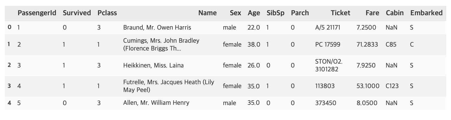
titanic 문제에서 feature은 Pclass, Name, Sex, Age, SibSp, Parch, Ticket, Fare, Cabin, Embarked이며 예측하려는 target label은 Survived이다.
df_train.describe()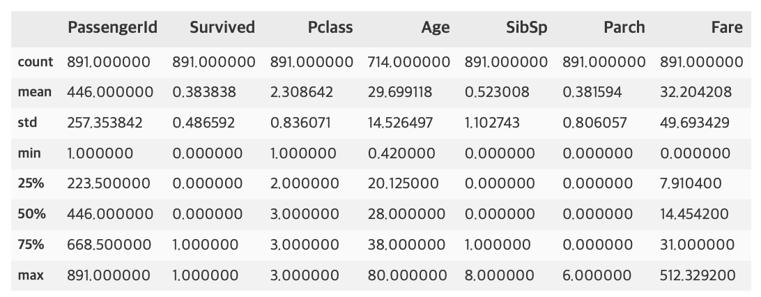
df_test.describe()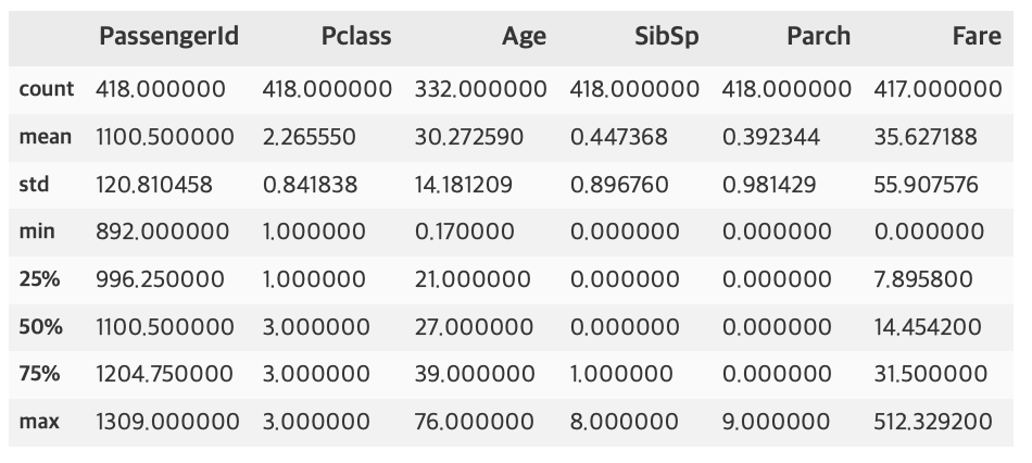
1.1 Null data 확인
train 셋에서의 Age, test 셋에서의 Age, Fare등 Null 값이 존재하는 것으로 보인다. 이를 더 눈에 띄게 확인하기위해 아래 과정을 진행한다.
for col in df_train.columns:
    msg = 'column: {:>10}\t percent of NaN value: {:.2f}%'.format(col, 100 * (df_train[col].isnull().sum() / df_train[col].shape[0]))
    print(msg)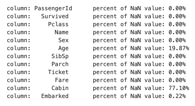
for col in df_test.columns:
    msg = 'column: {:>10}\t percent of NaN value: {:.2f}%'.format(col, 100 * (df_test[col].isnull().sum() / df_test[col].shape[0]))
    print(msg)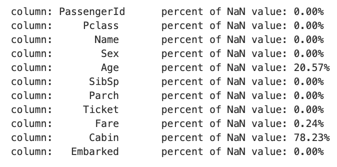
train 셋에서 Age, Cabin, Embarked가 각각 19.87%, 77.10%, 0.22%의 Null 값이 존재하고, test 셋에서 Age, Fare, Cabin이 각각 20.57%, 0.24%, 78.23%가 존재하는 것을 알 수 있다.
위에서 사용한 코드 중 {:>10}의 의미는 10칸 공간에 오른쪽 정렬을 의미한다. 왼쪽 정렬은 {:<10}, 가운데 정렬은 {:^10}으로 할 수 있으며, :앞에 어떠한 문자를 넣으면 정렬을 하고 남은 공간에 그 문자로 채워넣을 수 있고, 10이라는 숫자도 바꿔서 n칸 공간으로 설정 할 수 있다.
MSNO 라이브러리로 null data의 존재를 더 쉽게 확인 할 수 있다.
msno.bar(df=df_train.iloc[:, :], figsize=(8, 8), color=(0.8, 0.5, 0.2))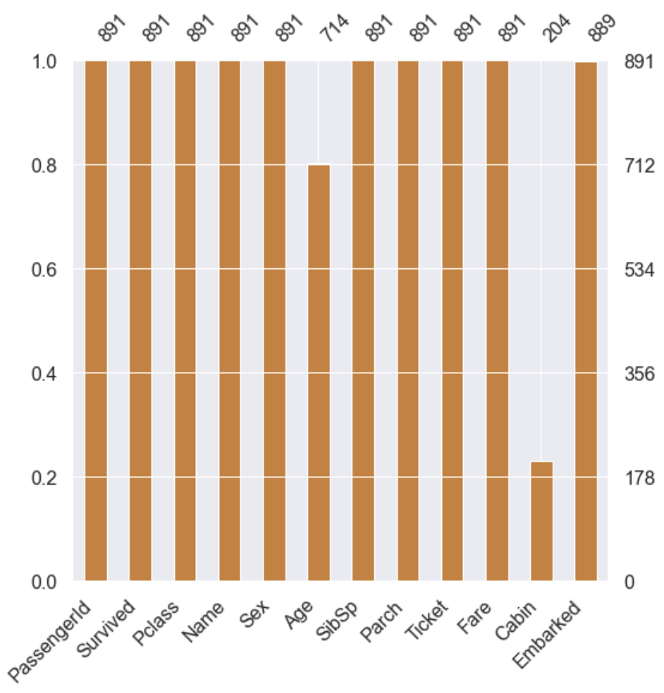
msno.bar(df=df_test.iloc[:, :], figsize=(8, 8), color=(0.1, 0.5, 0.2))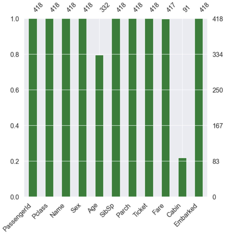
1.2 target label 확인
f, ax = plt.subplots(1, 2, figsize=(18, 8))

df_train['Survived'].value_counts().plot.pie(explode=[0, 0.1], autopct='%1.1f%%', ax=ax[0], shadow=True)
ax[0].set_title('Pie plot - Survived')
ax[0].set_ylabel('')
sns.countplot('Survived', data=df_train, ax=ax[1])
ax[1].set_title('Count plot - Survived')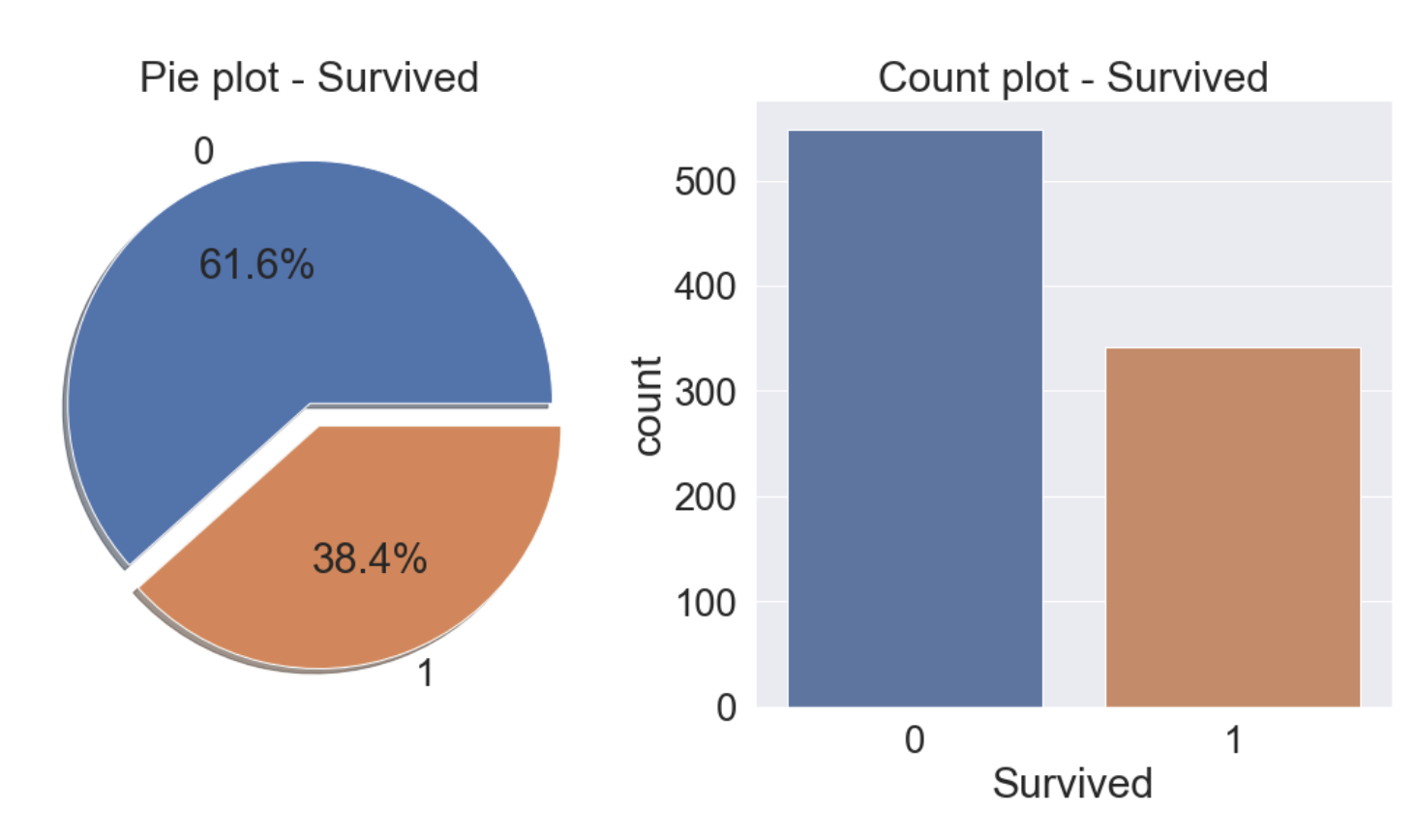
38.4%가 생존한 것을 알 수 있다.
2. 데이터 분석
2.1 Pclass
- Pclass는 서수형 데이터이고 카테고리이면서 순서가 있는 데이터 타입이다.
- Pclass와 Survived로 각 클래스별 생존률을 알 수 있다.
df_train[['Pclass', 'Survived']].groupby(['Pclass'], as_index=True).count()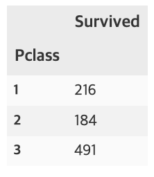
df_train[['Pclass', 'Survived']].groupby(['Pclass'], as_index=True).sum()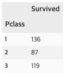
pandas의 crosstab을 사용하면 보다 수월하게 확인 할 수 있다. margins=True는 행, 열의 합(All)을 나타낸다.
pd.crosstab(df_train['Pclass'], df_train['Survived'], margins=True).style.background_gradient(cmap='summer_r')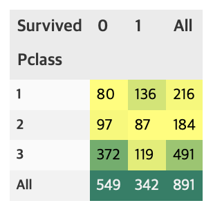
groupby에 mean()을 하게 되면, 각 클래스별 생존률을 얻을 수 있다.
df_train[['Pclass', 'Survived']].groupby(['Pclass'], as_index=True).mean().sort_values(by='Survived', ascending=False).plot.bar()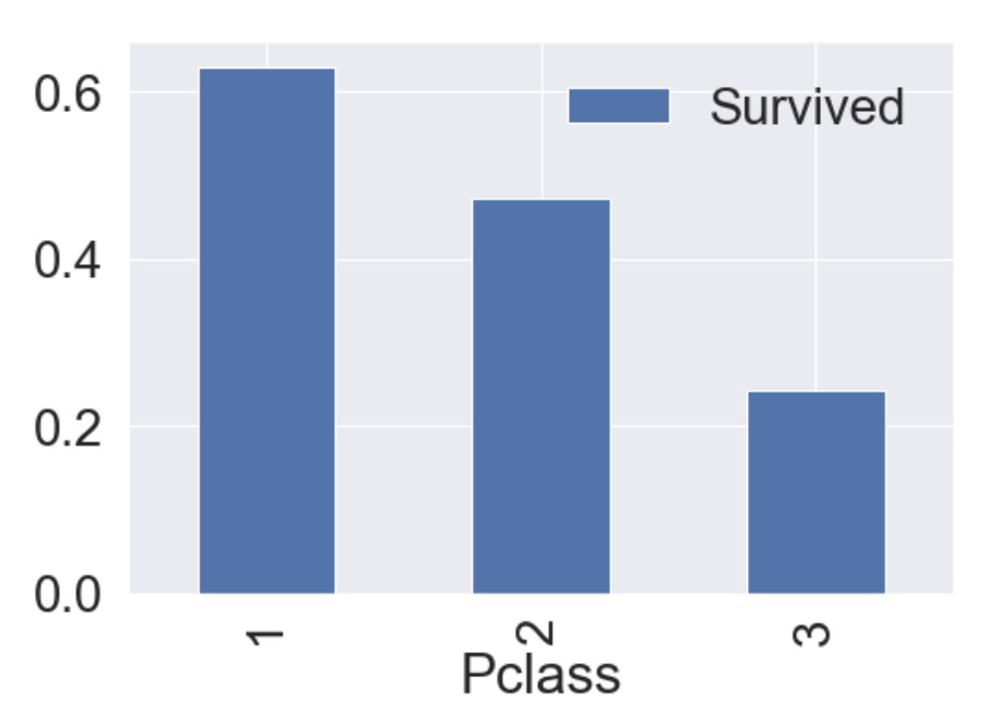
가시화 결과 Pclass가 좋을수록 생존률이 높은 것을 알 수 있다.
이번엔 seaborn의 countplot으로 특정 label에 따른 갯수를 확인해보자.
y_position = 1.02
f, ax = plt.subplots(1, 2, figsize=(18, 8))
df_train['Pclass'].value_counts().plot.bar(color=['#CD7F32','#FFDF00','#D3D3D3'], ax=ax[0])
ax[0].set_title('Number of Passengers by Pclass', y=y_position)
ax[0].set_ylabel('Count')
sns.countplot('Pclass', hue='Survived', data=df_train, ax=ax[1])
ax[1].set_title('Pclass: Survived vs Dead', y=y_position)
plt.show()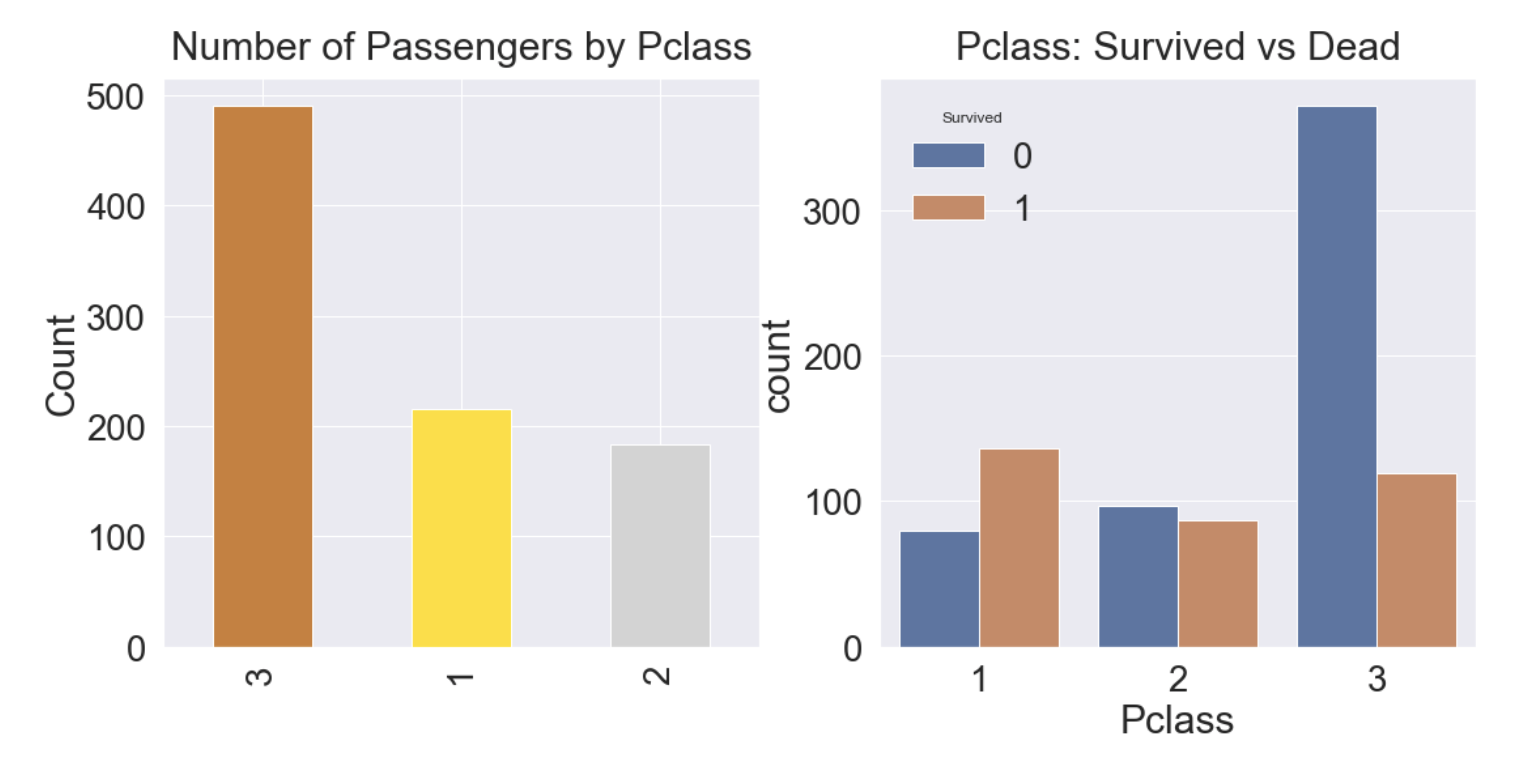
- 클래스가 높을수록 생존률이 높고, 생존률은 각각 63%, 48%, 25%이다.
- 생존에 Pclass가 큰 영향을 미친다고 생각할 수 있으며, 나중에 모델을 세울때 이 feature를 사용하는 것이 좋을 것이라고 판단할 수 있다.
2.2 Sex
- 이번에는 성별에 따른 생존률에 대해 알아보자.
f, ax = plt.subplots(1, 2, figsize=(18, 8))
df_train[['Sex', 'Survived']].groupby(['Sex'], as_index=True).mean().plot.bar(ax=ax[0])
ax[0].set_title('Survived vs Sex')
sns.countplot('Sex', hue='Survived', data=df_train, ax=ax[1])
ax[1].set_title('Sex: Survived vs Dead')
plt.show()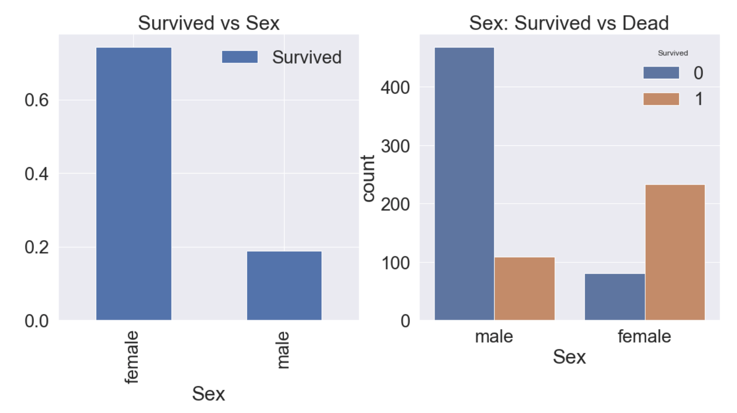
여자의 생존률이 남자보다 높다는 것을 알 수 있다.
df_train[['Sex', 'Survived']].groupby(['Sex'], as_index=False).mean().sort_values(by='Survived', ascending=False)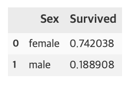
여자의 생존률은 74.2%, 남자의 생존률은 18.9%이다.
pd.crosstab(df_train['Sex'], df_train['Survived'], margins=True).style.background_gradient(cmap='summer_r')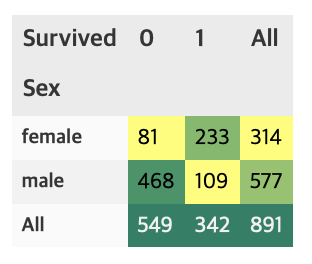
이것으로 Sex도 Pclass처럼 중요한 feature임을 알 수 있다.
2.3 Sex and Pclass
이번에는 Sex, Pclass 두가지 feature에 관해 생존률이 어떻게 달라지는지 확인해보자.
seaborn의 factorplot을 이용하면 3개의 차원으로 이루어진 그래프를 그릴 수 있다.
sns.factorplot('Pclass', 'Survived', hue='Sex', data=df_train, size=6, aspect=1.5)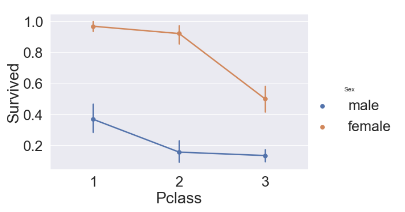
- 모든 클래스에서 여성의 생존률이 남성보다 높다.
- 남, 여 상관없이 클래스가 높을수록 생존률이 높다.
위의 그래프에서 hue대신 column 파라미터를 사용하면 아래와 같이 그릴 수 있다.
sns.factorplot('Sex', 'Survived', col='Pclass', data=df_train, size=9, aspect=1)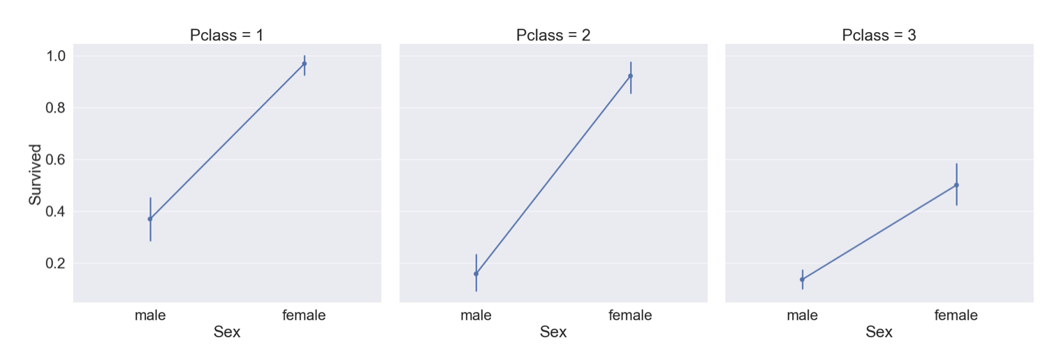
2.4 Age
이번에는 Age Feature에 대해 알아보자.
print('제일 나이가 많은 탑승객 : {:.1f} Years'.format(df_train['Age'].max()))
print('제일 나이가 어린 탑승객 : {:.1f} Years'.format(df_train['Age'].min()))
print('탑승객 평균 나이 : {:.1f} Years'.format(df_train['Age'].mean()))
나이에 따른 생존률의 히스토그램을 그리면 아래와 같다.
fig, ax = plt.subplots(1, 1, figsize=(9, 5))
sns.kdeplot(df_train[df_train['Survived'] == 1]['Age'], ax=ax)
sns.kdeplot(df_train[df_train['Survived'] == 0]['Age'], ax=ax)
plt.legend(['Survived == 1', 'Survived == 0'])
plt.show()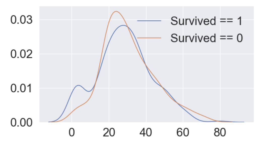
0에서 10세 사이의 생존률이 높은 것을 알 수 있다.
# Age distribution within classes
plt.figure(figsize=[8, 6])
df_train['Age'][df_train['Pclass'] == 1].plot(kind='kde')
df_train['Age'][df_train['Pclass'] == 2].plot(kind='kde')
df_train['Age'][df_train['Pclass'] == 3].plot(kind='kde')

plt.xlabel('Age')
plt.title('Age Distribution within Classes')
plt.legend(['1st class', '2nd class', '3rd class'])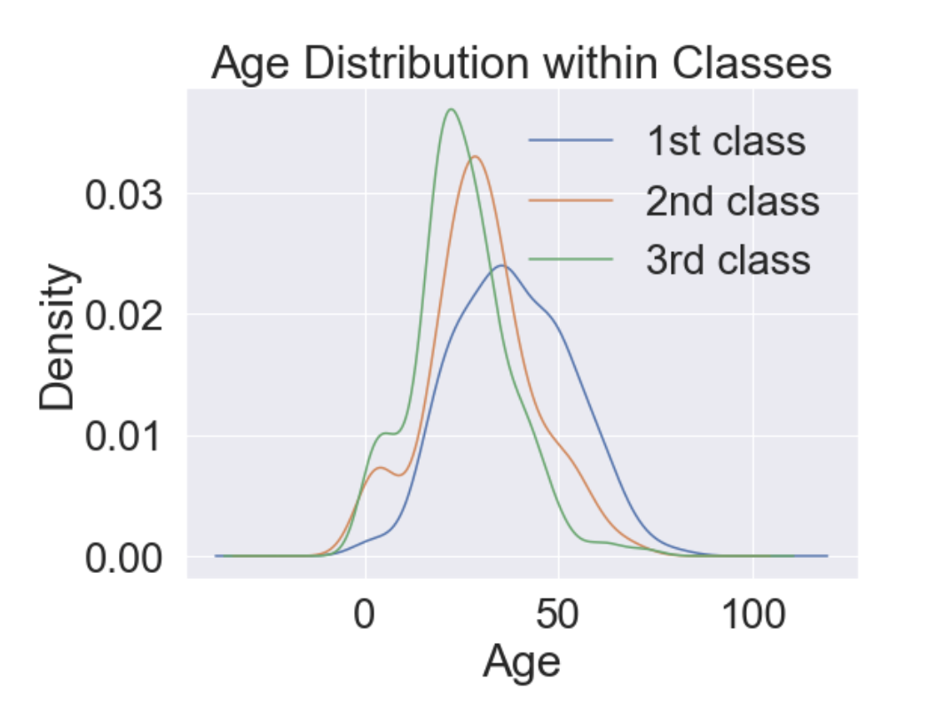
- Pclass가 높아짐에 따라 나이 많은 사람의 비중이 커진다.
이번엔 나이대에 따른 생존률에 대해 알아보자.
cummulate_survival_ratio = []
for i in range(80):
    cummulate_survival_ratio.append(df_train[df_train['Age'] < i]['Survived'].sum() / len(df_train[df_train['Age'] < i]['Survived']))

plt.figure(figsize=(7, 7))
plt.plot(cummulate_survival_ratio)
plt.title('Survival rate change depending on range of Age', y=1.02)
plt.ylabel('Survival rate')
plt.xlabel('Range of Age(0~x)')
plt.show()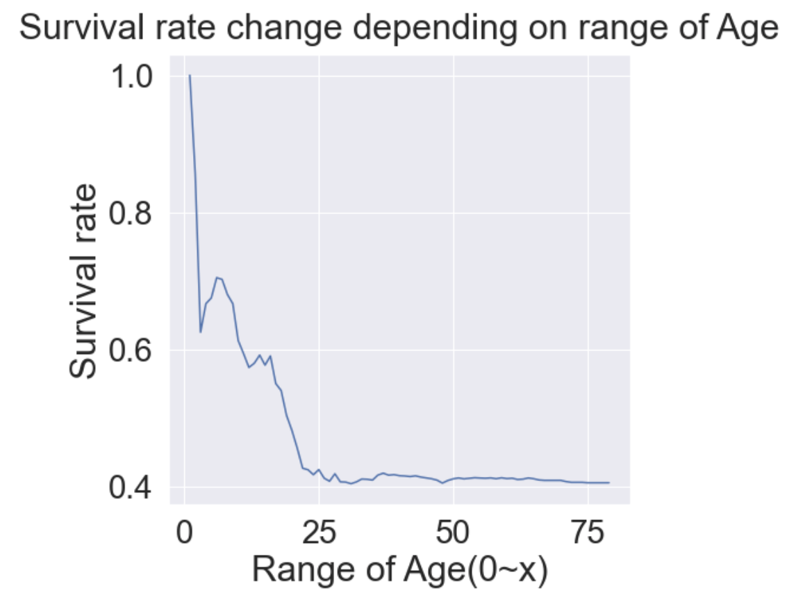
- 확실히 나이가 어릴수록 생존률이 높은 것을 알 수 있다.
- Age도 중요한 Feature로 쓰일 수 있음을 확인 할 수 있다.
2.5 Pclass, Sex, Age
지금까지 확인해본 세 가지 Feature(Pclass, Sex, Age)를 모두 사용해 가시화해보려한다.
이때 seaborn의 violinplot을 사용할 수 있다.
f, ax = plt.subplots(1, 2, figsize=(18, 8))
sns.violinplot('Pclass', 'Age', hue='Survived', data=df_train, scale='count', split=True, ax=ax[0])
ax[0].set_title('Pclass and Age vs Survived')
ax[0].set_yticks(range(0, 110, 10))
sns.violinplot('Sex', 'Age', hue='Survived', data=df_train, scale='count', split=True, ax=ax[1])
ax[1].set_title('Sex and age vs Survived')
ax[1].set_yticks(range(0, 110, 10))
plt.show()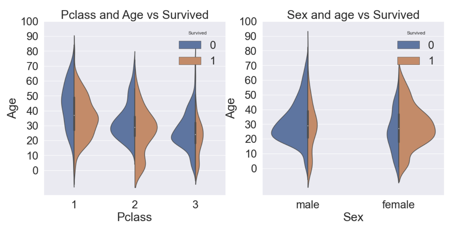
- 왼쪽 그림은 Pclass 별로 Age의 분포가 어떻게 되는지 그에 따른 생존률을 그린 그래프이다.
- 오른쪽 그림은 Sex 별로 Age의 분포가 어떻게 되고 그에 따른 생존률을 그린 그래프이다.
- 모든 클래스에서 나이가 어릴수록 생존률이 높은 것을 알 수 있다.
- 여성의 생존률이 높은 것을 알 수 있다.
2.6 Embarked
Embarked는 어떤 항구에서 탑승했는가를 나타낸다. string 타입으로 C = Cherbourg, Q = Queenstown, S = Southampton이다.
f, ax = plt.subplots(1, 1, figsize=(7, 7))
df_train[['Embarked', 'Survived']].groupby(['Embarked'], as_index=True).mean().sort_values(by='Survived', ascending=False).plot.bar(ax=ax)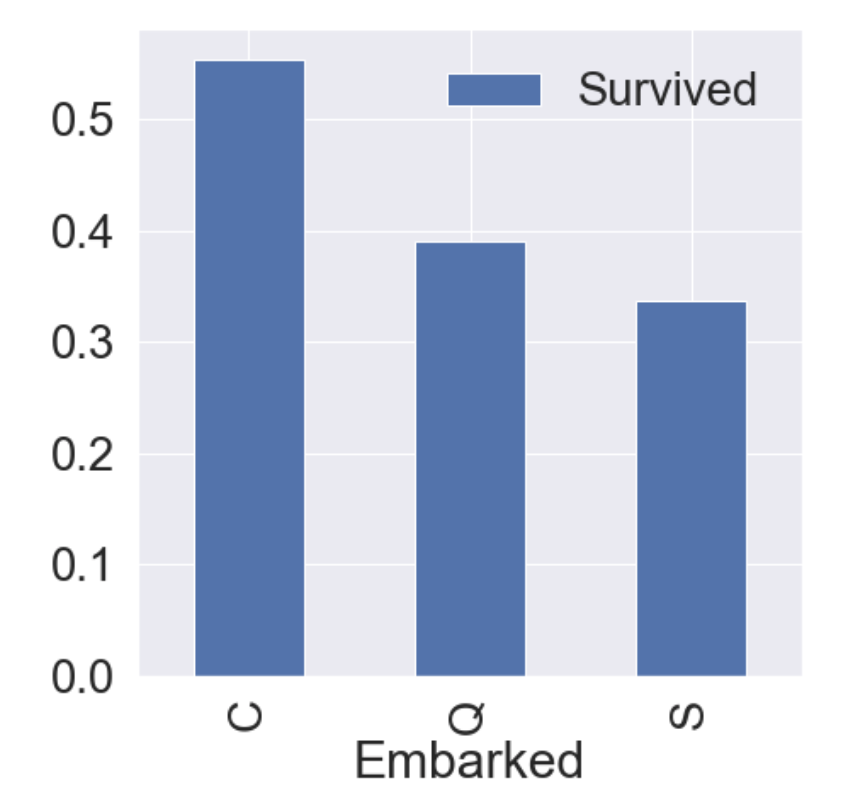
다른 항구보다 C(Cherbourg)에서 탑승한 승객의 생존률이 다른 항구보다 높은 것을 알 수 있다.
f, ax = plt.subplots(2, 2, figsize=(20, 15))
sns.countplot('Embarked', data=df_train, ax=ax[0, 0])
ax[0, 0].set_title('(1) No. of Passengers Boarded')
sns.countplot('Embarked', hue='Sex', data=df_train, ax=ax[0, 1])
ax[0, 1].set_title('(2) Male-Female Split for Embarked')
sns.countplot('Embarked', hue='Survived', data=df_train, ax=ax[1, 0])
ax[1, 0].set_title('(3) Embarked vs Survived')
sns.countplot('Embarked', hue='Pclass', data=df_train, ax=ax[1, 1])
ax[1, 1].set_title('(4) Embarked vs Pclass')
plt.subplots_adjust(wspace=0.2, hspace=0.5)
plt.show()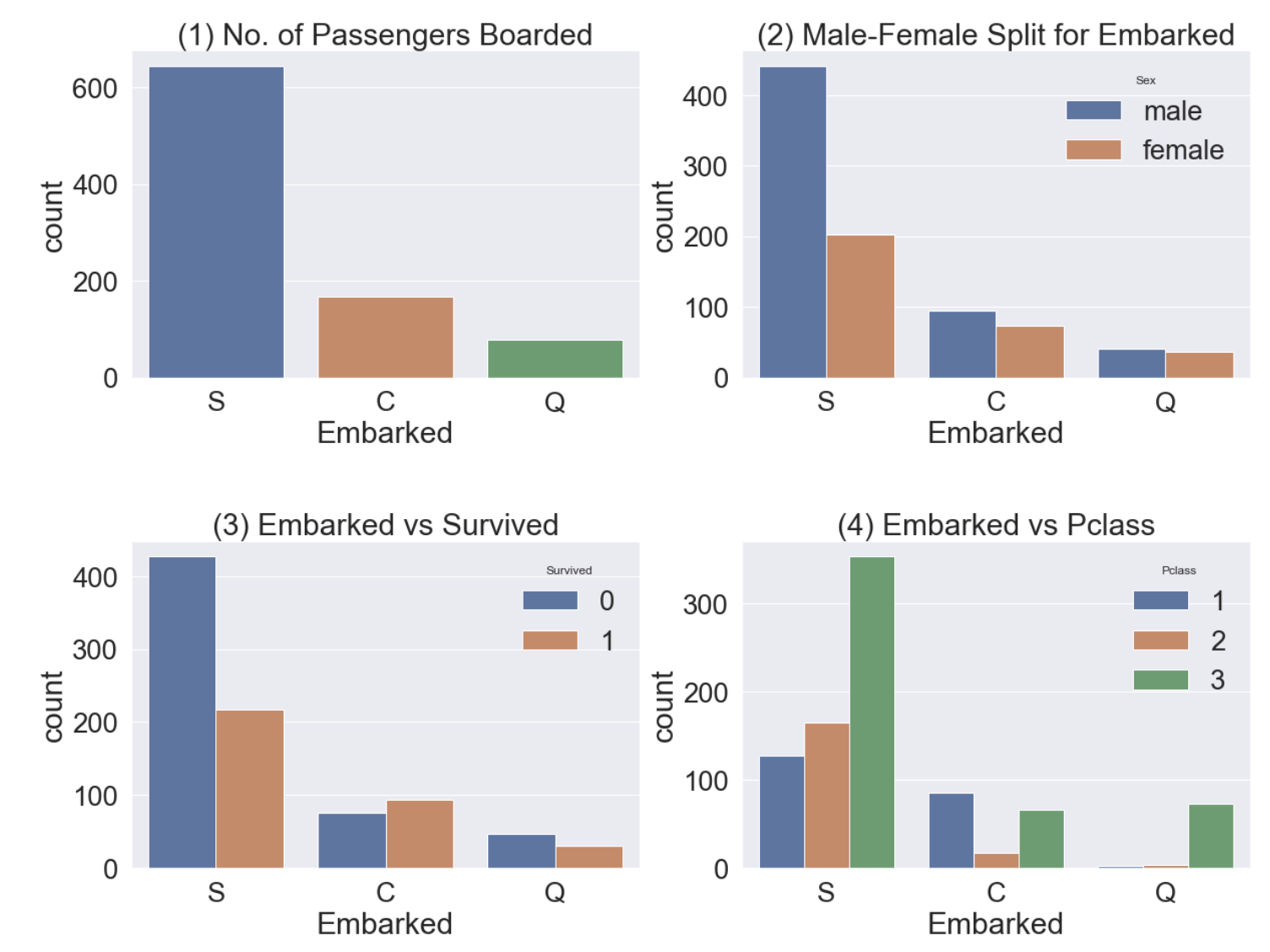
- graph(1) - S 항구에서 가장 많은 승객이 탑승했다.
- graph(2) - C, Q 항구 탑승객의 성비는 비슷하고, S는 남자가 더 많다.
- graph(3) - 탑승객의 생존률이 많이 낮다.
- graph(4) - C 항구 탑승객의 생존률이 높은 이유는 아마 클래스가 높은 사람이 많아서 일 것이다. 반대로 S 항구 탑승객은 3rd class가 많아서 생존률이 낮을 것이다.
2.7 Family
- SibSp는 형제, 자매를 의미하고, Parch는 부모, 자녀를 의미한다.
- 그럼 우린 여기서 FamilySize라는 feature를 SibSp + Parch + 1(자신)으로 합쳐서 분석을 해 볼 수 있다.
df_train['FamilySize'] = df_train['SibSp'] + df_train['Parch'] + 1
df_test['FamilySize'] = df_test['SibSp'] + df_test['Parch'] + 1
print('Maximum size of Family: ', df_train['FamilySize'].max())
print('Minimum size of Family: ', df_train['FamilySize'].min())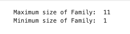
Familysize별 생존률을 가시화시켜보자.
f, ax = plt.subplots(1, 3, figsize=(40, 10))
sns.countplot('FamilySize', data=df_train, ax=ax[0])
ax[0].set_title('(1) No. of Passengers Boarded', y=1.02)

sns.countplot('FamilySize', hue='Survived', data=df_train, ax=ax[1])
ax[1].set_title('(2) Survived countplot depending on FamilySize', y=1.02)

df_train[['FamilySize', 'Survived']].groupby(['FamilySize'], as_index=True).mean().sort_values(by='Survived', ascending=False).plot.bar(ax=ax[2])
ax[2].set_title('(3) Survived rate depending on FamilySize', y=1.02)

plt.subplots_adjust(wspace=0.2, hspace=0.5)
plt.show()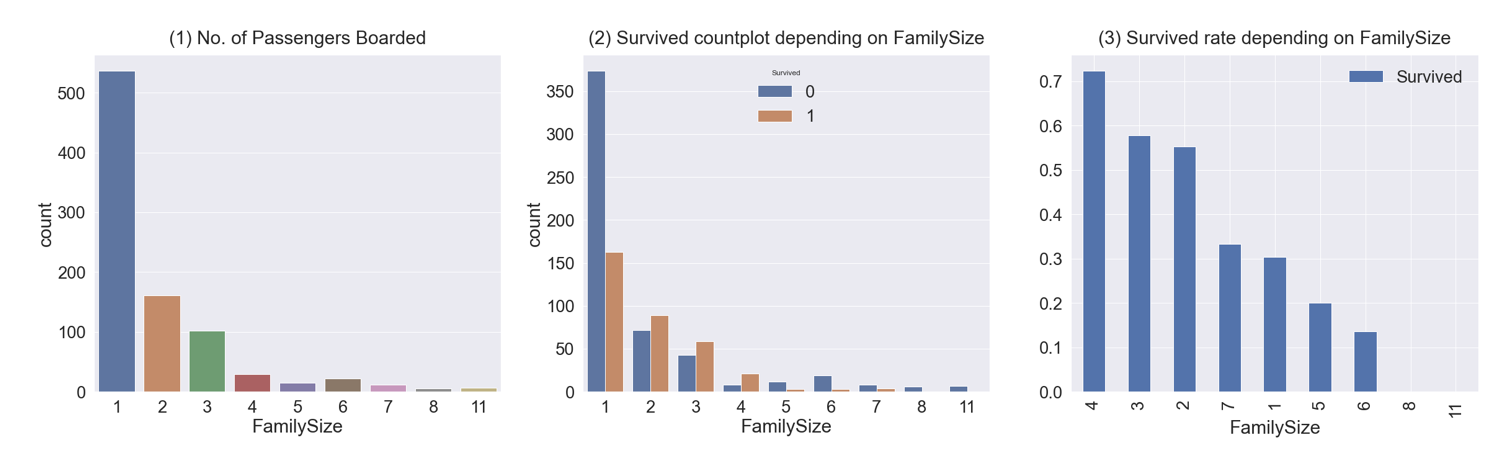
- graph(1) - 가족 크기가 1~11까지 있고, 대부분 1명이다.
- graph(2), (3) - 가족 크기에 따른 생존률이다. 가족이 4명인 경우가 생존률이 가장 높고, 가족이 많아지거나(5, 6, 8, 11) 작아질수록(1) 생존률이 낮아진다.
2.8 Fare
Fare는 탑승요금으로 연속형 데이터이다.
fig, ax = plt.subplots(1, 1, figsize=(8, 8))
g = sns.distplot(df_train['Fare'], color='b', label='Skewness : {:.2f}'.format(df_train['Fare'].skew()), ax=ax)
g = g.legend(loc='best') # 자동으로 최적의 위치에 범례를 표시함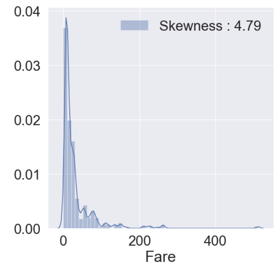
- 히스토그램을 그려본 결과 분포가 매우 비대칭인 것을 알 수 있다. 이대로 모델에 사용한다면 모델이 잘못 학습할 가능성이 있다.
- outlier(이상치)의 영향을 줄이기 위해 Fare에 log를 취한다.
df_test.loc[df_test.Fare.isnull(), 'Fare'] = df_test['Fare'].mean()
df_train['Fare'] = df_train['Fare'].map(lambda i : np.log(i) if i > 0 else 0)
df_test['Fare'] = df_test['Fare'].map(lambda i : np.log(i) if i > 0 else 0)
그리고 다시 히스토그램을 그려본다.
fig, ax = plt.subplots(1, 1, figsize=(8, 8))
g = sns.distplot(df_train['Fare'], color='b', label='Skewness : {:.2f}'.format(df_train['Fare'].skew()), ax=ax)
g = g.legend(loc='best')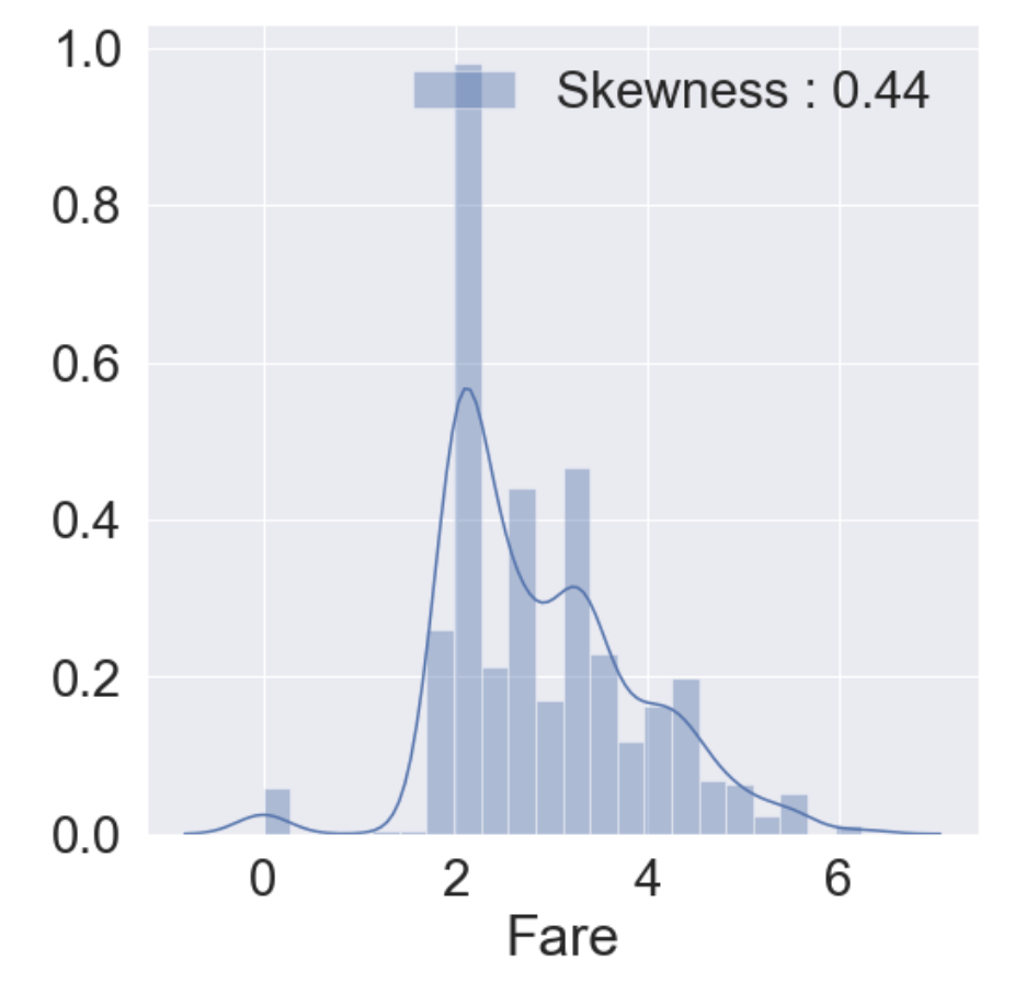
2.9 Cabin
이 feature는 80%가 NaN이라 생존에 영향을 미칠 중요한 정보를 얻기가 쉽지 않다. 그래서 이 튜토리얼에선 포함시키지 않는다.
2.10 Ticket
Ticket은 NaN이 없지만 String형이기에 작업을 해줘야 모델에서 사용이 가능하다.
df_train['Ticket'].value_counts()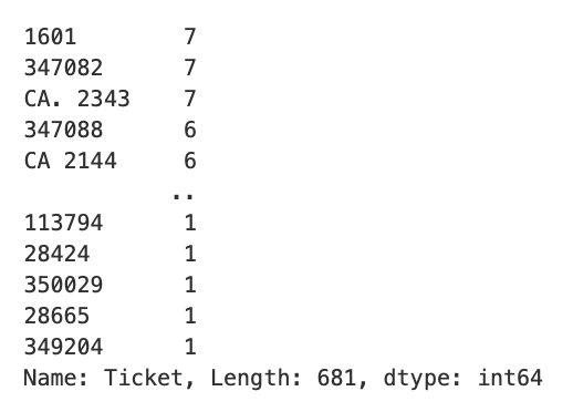
이 부분도 튜토리얼이라서 패스한다. Cabin과 Ticket에 관련해선 다음에 올릴 게시물을 참고하면 좋을 것 같다.
3. Feature Engineering
- 여기서부터 null 값을 채운다.
- 통계학적 개념을 이용해서 채우거나 다른 아이디어로 채울 수 있다.
- 어떻게 채우느냐에 따라 모델의 성능이 달라지므로 신경써서 채워야한다.
- train 셋과 test 셋 모두에 적용해줘야 한다.
3.1 Fill Null
3.1.1 Fill Null in Age using Title
- Age에는 177개의 null 값이 있다. 여기선 title + statistics를 사용한다.
- Title은 "Miss", Mrs", "Mr"등이 해당된다.
df_train['Initial'] = df_train.Name.str.extract('([A-Za-z]+)\.')
df_test['Initial'] = df_test.Name.str.extract('([A-Za-z]+)\.')
추출한 Initial과 Sex간의 count를 살펴보자.
pd.crosstab(df_train['Initial'], df_train['Sex']).T.style.background_gradient(cmap='summer_r')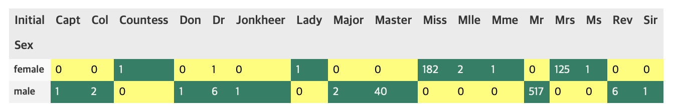
위의 crosstab을 이용하여 initial을 구분해보자. 여기선 replace 메소드를 사용한다.
df_train['Initial'].replace(['Mlle', 'Mme', 'Ms', 'Dr', 'Major', 'Lady', 'Countess', 'Jonkheer', 'Col', 'Rev', 'Capt', 'Sir', 'Don', 'Dona'], ['Miss', 'Miss', 'Miss', 'Mr', 'Mr', 'Mrs', 'Mrs', 'Other', 'Other', 'Other', 'Mr', 'Mr', 'Mr', 'Mr'], inplace=True)
df_test['Initial'].replace(['Mlle', 'Mme', 'Ms', 'Dr', 'Major', 'Lady', 'Countess', 'Jonkheer', 'Col', 'Rev', 'Capt', 'Sir', 'Don', 'Dona'], ['Miss', 'Miss', 'Miss', 'Mr', 'Mr', 'Mrs', 'Mrs', 'Other', 'Other', 'Other', 'Mr', 'Mr', 'Mr', 'Mr'], inplace=True)df_train.groupby('Initial').mean()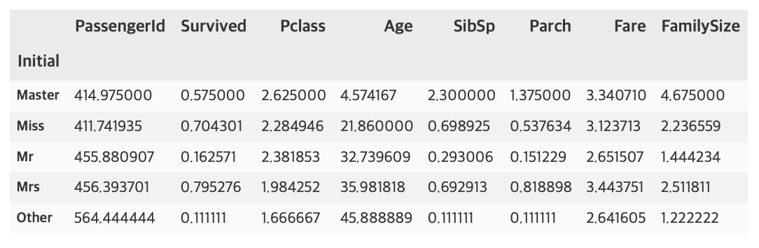
여성과 관계있는 Miss, Mrs의 생존률이 높은 것을 알 수 있다.
df_train.groupby('Initial')['Survived'].mean().plot.bar()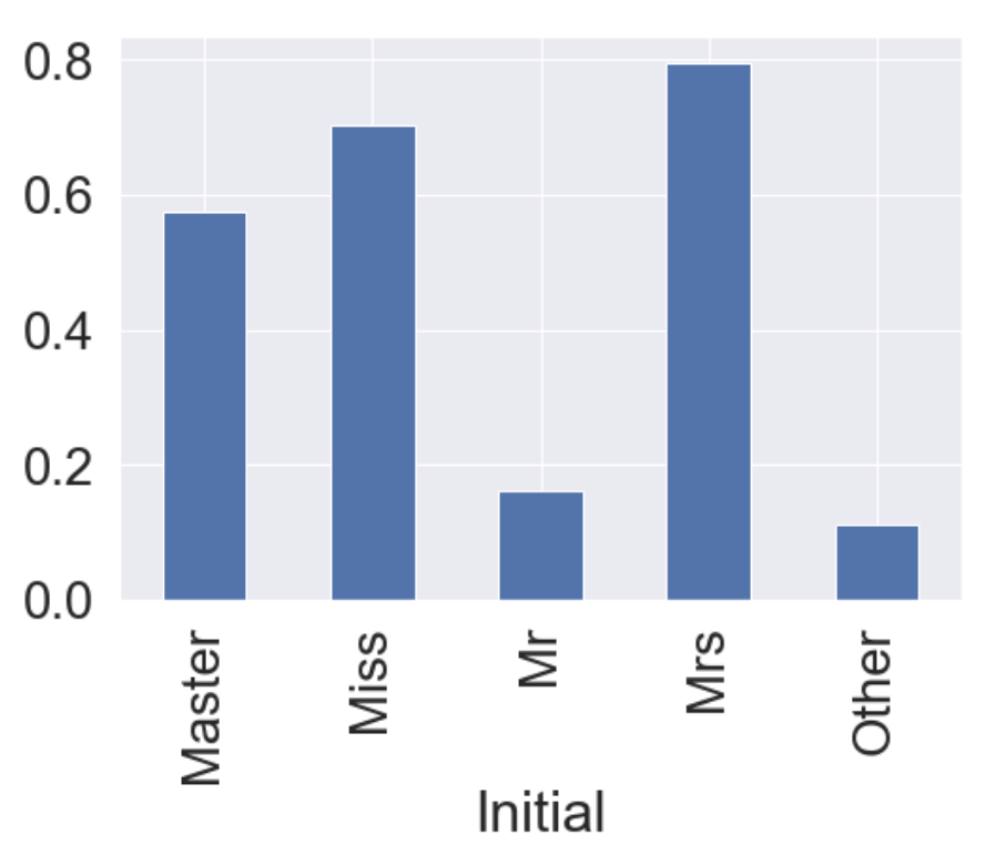
위에 df_train.groupby('Initial').mean()결과 중 Age의 평균을 이용해 null 값을 채운다.
df_train.loc[(df_train.Age.isnull()) & (df_train.Initial == "Mr"), 'Age'] = 33
df_train.loc[(df_train.Age.isnull()) & (df_train.Initial == "Mrs"), 'Age'] = 36
df_train.loc[(df_train.Age.isnull()) & (df_train.Initial == "Master"), 'Age'] = 5
df_train.loc[(df_train.Age.isnull()) & (df_train.Initial == "Miss"), 'Age'] = 22
df_train.loc[(df_train.Age.isnull()) & (df_train.Initial == "Other"), 'Age'] = 46

df_test.loc[(df_train.Age.isnull()) & (df_test.Initial == "Mr"), 'Age'] = 33
df_test.loc[(df_train.Age.isnull()) & (df_test.Initial == "Mrs"), 'Age'] = 36
df_test.loc[(df_train.Age.isnull()) & (df_test.Initial == "Master"), 'Age'] = 5
df_test.loc[(df_train.Age.isnull()) & (df_test.Initial == "Miss"), 'Age'] = 22
df_test.loc[(df_train.Age.isnull()) & (df_test.Initial == "Other"), 'Age'] = 46
이 부분에선 저번에 포스팅한적 있는 pandas의 불린인덱싱을 사용해서 채웠다. 나중에 업로드할 다른 코드들에선 다른 방식으로 채우므로 이들을 비교해보는 것도 재밌을거같다.
3.1.2 Fill Null in Embarked
print('Embarked has ', sum(df_train['Embarked'].isnull()), ' Null values')Embarked has 2 Null values
Embarked의 Null 값은 2개이고, S에서 가장 많은 탑승객이 탑승하므로 대부분 코드에서 "S"로 간단하게 채운다.
df_train['Embarked'].fillna('S', inplace=True)3.2 Change Age type
- 현재 Age는 continuous, 즉 연속형 데이터이다. 이를 몇 개의 group으로 나누어 category화 해줄 수 있다.
- 함수를 만들어 apply 메소드로 넣어주는 방식으로 작성하였다.
def category_age(x):
    if x < 10:
        return 0
    elif x < 20:
        return 1
    elif x < 30:
        return 2
    elif x < 40:
        return 3
    elif x < 50:
        return 4
    elif x < 60:
        return 5
    elif x < 70:
        return 6
    else:
        return 7

df_train['Age_cat'] = df_train['Age'].apply(category_age)
df_test['Age_cat'] = df_test['Age'].apply(category_age)
원래 컬럼 Age를 제거해준다.
df_train.drop(['Age'], axis=1, inplace=True)
df_test.drop(['Age'], axis=1, inplace=True)
3.3 Change Initial, Embarked and Sex
Initial, Embarked, Sex는 현재 String형 데이터이다. 그러므로 컴퓨터가 인식할 수 있도록 수치화시켜야 한다.
먼저 Initial에 대해 사전 순서대로 mapping을 해보자.
df_train['Initial'] = df_train['Initial'].map({'Master': 0, 'Miss': 1, 'Mr': 2, 'Mrs': 3, 'Other': 4})
df_test['Initial'] = df_test['Initial'].map({'Master': 0, 'Miss': 1, 'Mr': 2, 'Mrs': 3, 'Other': 4})
Embarked도 C, Q, S로 이루어져 있으므로 사전 순서대로 mapping을 한다.
df_train['Embarked'] = df_train['Embarked'].map({'C': 0, 'Q': 1, 'S': 2})
df_test['Embarked'] = df_test['Embarked'].map({'C': 0, 'Q': 1, 'S': 2})
Sex도 male, female로 이루어져 있으므로 사전 순서대로 mapping을 한다.
df_train['Sex'] = df_train['Sex'].map({'female': 0, 'male': 1})
df_test['Sex'] = df_test['Sex'].map({'female': 0, 'male': 1})
이제 지금까지 처리한 feature들로 상관관계를 확인해보자.
heatmap_data = df_train[['Survived', 'Pclass', 'Sex', 'Fare', 'Embarked', 'FamilySize', 'Initial', 'Age_cat']]

colormap = plt.cm.RdBu
plt.figure(figsize=(14, 12))
plt.title('Pearson Correlation of Features', y=1.05, size=15)
sns.heatmap(heatmap_data.astype(float).corr(), linewidths=0.1, vmax=1.0, square=True, cmap=colormap, linecolor='white', annot=True, annot_kws={"size": 16})

del heatmap_data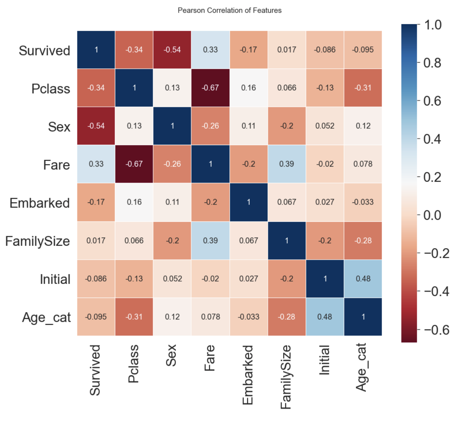
- Sex와 Pclass가 Survived와 상관관계가 있다.
- Fare와 Embarked도 Survived와 어느정도 상관관계가 있다.
3.4 One-Hot Encoding
- 수치화시킨 카테고리 데이터를 그대로 넣어도 되지만, 모델의 성능을 높이기위해 One-Hot Encoding을 해줄 수 있다.
- 이는 pandas의 get_dummies를 사용해서 해줄 수 있다.
- prefix 파라미터를 통해 구분이 쉽게 만들 수 있다.
- Initial과 Embarked에 대해서 One-Hot Encoding을 진행한다.
3.4.1 Initial
df_train = pd.get_dummies(df_train, columns=['Initial'], prefix='Initial')
df_test = pd.get_dummies(df_test, columns=['Initial'], prefix='Initial')
df_train.head()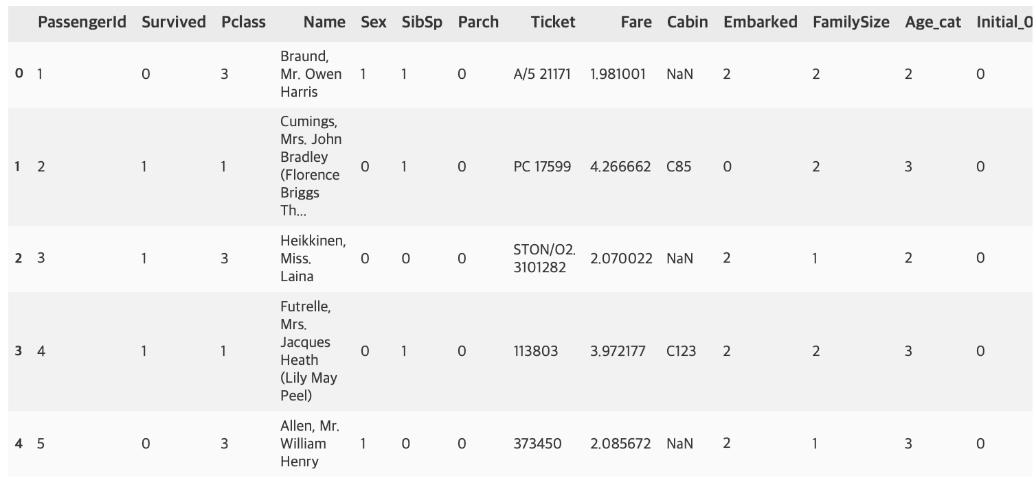
3.4.2 Embarked
df_train = pd.get_dummies(df_train, columns=['Embarked'], prefix='Embarked')
df_test = pd.get_dummies(df_test, columns=['Embarked'], prefix='Embarked')
3.5 Drop Columns
이제 원래 있던 칼럼 중 필요없는 칼럼들을 삭제한다.
df_train.drop(['PassengerId', 'Name', 'SibSp', 'Parch', 'Ticket', 'Cabin'], axis=1, inplace=True)
df_test.drop(['PassengerId', 'Name', 'SibSp', 'Parch', 'Ticket', 'Cabin'], axis=1, inplace=True)
df_train.head()
df_test.head()
4. Building ML Model and Prediction
이제 sklearn으로 머신러닝 모델을 만들어보자
from sklearn.ensemble import RandomForestClassifier
from sklearn import metrics
from sklearn.model_selection import train_test_split
4.1 Preparation
학습에 쓰일 데이터와 target label을 분리한다.
x_train = df_train.drop('Survived', axis=1).values
target_label = df_train['Survived'].values
x_test = df_test.valuestrain_test_split을 사용해서 train 셋을 쉽게 분리할 수 있다.
x_tr, x_val, y_tr, y_val = train_test_split(x_train, target_label, test_size=0.3, random_state=2018)4.2 Model Generation and Prediction
model = RandomForestClassifier()
model.fit(x_tr, y_tr)
prediction = model.predict(x_val)
이제 모델의 성능을 테스트해보자.
print('총 {}명 중 {:.2f}% 정확도로 생존을 맞춤'.format(y_val.shape[0], 100 * metrics.accuracy_score(prediction, y_val)))총 268명 중 82.46% 정확도로 생존을 맞춤
튜토리얼이여서 간단하게 진행했는데도 82.46%의 정확도가 나왔다.
4.3 Feature Importance
- 학습한 모델이 가지고 있는 feature importance를 통해, 어떤 feature의 영향을 많이 받았는지 확인할 수 있다.
- pandas의 Series를 이용하면 쉽게 Sorting하여 그래프를 그릴 수 있다.
from pandas import Series

feature_importance = model.feature_importances_
Series_feat_imp = Series(feature_importance, index=df_test.columns)plt.figure(figsize=(8, 8))
Series_feat_imp.sort_values(ascending=True).plot.barh()
plt.xlabel('Feature importance')
plt.ylabel('Feature')
plt.show()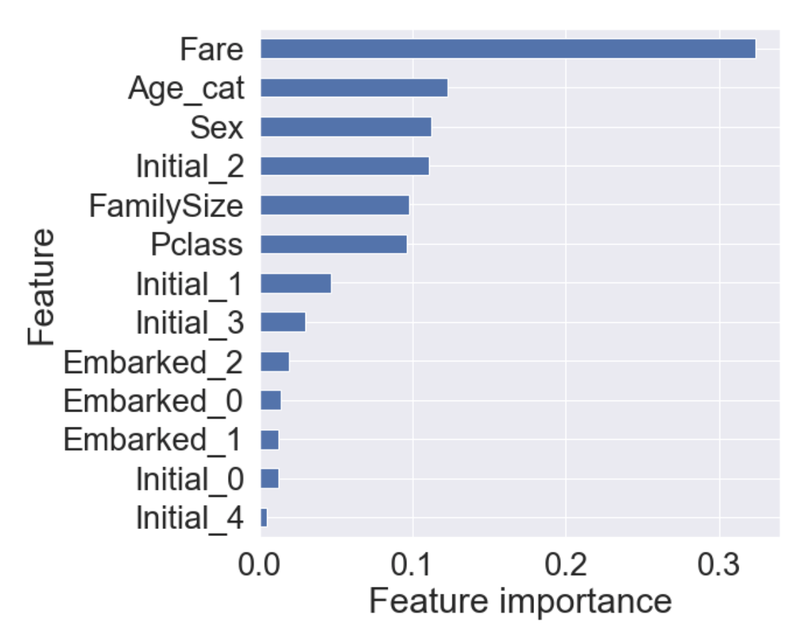
이 튜토리얼을 진행하면서 얻은 모델에서 Fare가 가장 큰 영향력을 가지며, 그 뒤로 Age_cat, Sex, Initial_2가 차례로 중요도를 가진다.
4.4 Prediction on Test Set
- 이제 모델이 본적없는 테스트 셋을 모델에 주어서, 생존여부를 예측해보자.
- kaggle에서 제공한 gender_submission.csv 파일을 읽어서 제출 준비를 하자.
submission = pd.read_csv('gender_submission.csv')
prediction = model.predict(x_test)
submission['Survived'] = prediction
submission.to_csv('./my_first_submission.csv', index=False)
이후 kaggle에 제출하면 된다.
현재 계획으로 이유한님의 스터디 커리큘럼에 따라 공부하면서 늦어도 2021년 2월초까지는 나만의 프로젝트를 진행해서 kaggle에 제출해보고싶다. 그때까지 코드 공부도 열심히 포스팅도 열심히 하면 좋겠다.
source:
https://kaggle-kr.tistory.com/17?category=868316
https://kaggle-kr.tistory.com/18?category=868316