군집화 개요
Clustering
- 데이터 포인트들을 별개의 군집으로 그룹화 하는 것을 의미
- 유사성이 높은 데이터들을 동일한 그룹으로 분류하고 서로 다른 군집들이 상이하게 그룹화
군집화 활용 분야
- 고객, 마켓, 브랜드, 사회 경제 활동 세분화
- 이미지 검출, 세분화, 트랙킹
- 이상 검출
군집화 알고리즘 종류
- K-Means
- Mean Shift
- Gaussian Mixture Model
- DBSCAN
K-Means Clustering 개요
군집 중심점 (Centroid) 기반 클러스터링
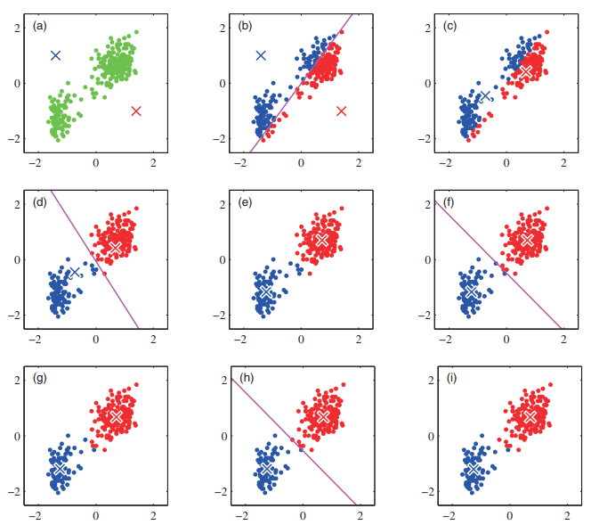
(a) 2개의 군집 중심점을 설정
(b) 각 데이터를 가장 가까운 중심점에 소속
(c) 중심점에 할당된 데이터들의 평균 중심으로 중심점 이동
(d) 각 데이터들은 이동된 중심점 기준으로 가장 가까운 중심점에 소속
(e) 다시 중심점에 할당된 데이터들의 평균 중심으로 중심점 이동
(f), (g), (h), (i) 반복
-> 중심점을 이동하였지만 데이터들의 중심점 소속 변경이 없으면 군집화 완료!
K-Means 장점
- 일반적인 군집화에서 가장 많이 활용되는 알고리즘
- 알고리즘이 쉽고 간결
- 대용량 데이터에도 활용 가능
K-Means 단점
- 거리 기반 알고리즘으로 속성의 개수가 매우 많을 경우 군집화 정확도가 떨어짐
-> 이를 위해 PCA로 차원 축소를 할 수 있음 - 반복 횟수가 많을수록 수행 시간 증가
- 이상치에 취약함
K-Means Clustering 실습
scikit-learn에서 sklearn.cluster.KMeans 클래스 제공
주요 파라미터
- n_cluster: 군집화할 개수 (군집 중심점의 개수)
- max_iter: 최대 반복 횟수
-> 이 횟수 전에 모든 데이터의 중심점 이동이 없으면 종료
주요 속성
- labels_: 각 데이터 포인트가 속한 군집 중심점 레이블
- cluster_centers_: 각 군집 중심점 좌표 (군집 개수, Feature 수)
iris 데이터를 이용해서 실습 진행
우선 데이터프레임으로 만들자
from sklearn.preprocessing import scale
from sklearn.datasets import load_iris
from sklearn.cluster import KMeans
import matplotlib.pyplot as plt
import numpy as np
import pandas as pd

iris = load_iris()
print('target name:', iris.target_names)
irisDF = pd.DataFrame(data=iris.data, columns=['sepal_length','sepal_width','petal_length','petal_width'])
irisDF.head(3)
K-Means Clustering 진행
군집 개수는 3개로 설정
init='k-means++은 centroid 초기화를 k-means++ 기법을 사용하겠다는 뜻 (자세한 설명은 생략)
kmeans = KMeans(n_clusters=3, init='k-means++', max_iter=300,random_state=0)
kmeans.fit(irisDF)
군집화 결과를 확인해보자
kmeans.fit_predict(irisDF)array([1, 1, 1, 1, 1, 1, 1, 1, 1, 1, 1, 1, 1, 1, 1, 1, 1, 1, 1, 1, 1, 1,
1, 1, 1, 1, 1, 1, 1, 1, 1, 1, 1, 1, 1, 1, 1, 1, 1, 1, 1, 1, 1, 1,
1, 1, 1, 1, 1, 1, 0, 0, 2, 0, 0, 0, 0, 0, 0, 0, 0, 0, 0, 0, 0, 0,
0, 0, 0, 0, 0, 0, 0, 0, 0, 0, 0, 2, 0, 0, 0, 0, 0, 0, 0, 0, 0, 0,
0, 0, 0, 0, 0, 0, 0, 0, 0, 0, 0, 0, 2, 0, 2, 2, 2, 2, 0, 2, 2, 2,
2, 2, 2, 0, 0, 2, 2, 2, 2, 0, 2, 0, 2, 0, 2, 2, 0, 0, 2, 2, 2, 2,
2, 0, 2, 2, 2, 2, 0, 2, 2, 2, 0, 2, 2, 2, 0, 2, 2, 0])
fit_transform()을 하면 변형이라기 보다는
각 데이터의 좌표값을 반환함
kmeans.fit_transform(irisDF)array([[3.41925061, 0.14135063, 5.0595416 ],
[3.39857426, 0.44763825, 5.11494335],
[3.56935666, 0.4171091 , 5.27935534],
[3.42240962, 0.52533799, 5.15358977],
[3.46726403, 0.18862662, 5.10433388],
[3.14673162, 0.67703767, 4.68148797],
...
[1.94554509, 5.09187392, 0.50939919],
[1.44957743, 4.60916261, 0.61173881],
[0.89747884, 4.21767471, 1.10072376],
[1.17993324, 4.41184542, 0.65334214],
[1.50889317, 4.59925864, 0.83572418],
[0.83452741, 4.0782815 , 1.1805499 ]])군집화 결과를
cluster칼럼으로 추가해서 원래의 traget과 비교해보자
irisDF['target'] = iris.target
irisDF['cluster']=kmeans.labels_
irisDF.head(10)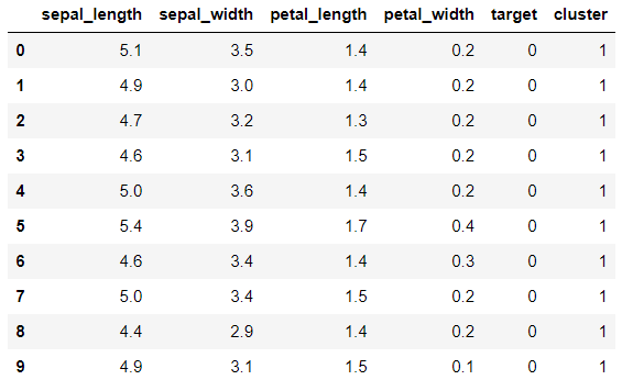
아마
target=0이cluster=1에 대응되는 것 같다.
groupby로 좀 더 구체적으로 확인하자
irisDF['target'] = iris.target
irisDF['cluster']=kmeans.labels_

irisDF.groupby(['target','cluster']).count()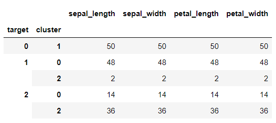
첫번째 군집은 완벽하고, 두 번째도 거의 완벽하다, 세 번째는 조금 헷갈린 듯
왜 저런 결과가 나왔는지, PCA로 2차원으로 축소한 다음 데이터의 분포를 살펴보자
from sklearn.decomposition import PCA

pca = PCA(n_components=2)
pca_transformed = pca.fit_transform(iris.data)

irisDF['pca_x'] = pca_transformed[:,0]
irisDF['pca_y'] = pca_transformed[:,1]
PCA 두 축으로 시각화 진행
# cluster 값이 0, 1, 2 인 경우마다 별도의 Index로 추출
marker0_ind = irisDF[irisDF['cluster']==0].index
marker1_ind = irisDF[irisDF['cluster']==1].index
marker2_ind = irisDF[irisDF['cluster']==2].index

# cluster값 0, 1, 2에 해당하는 Index로 각 cluster 레벨의 pca_x, pca_y 값 추출. o, s, ^ 로 marker 표시
plt.scatter(x=irisDF.loc[marker0_ind,'pca_x'], y=irisDF.loc[marker0_ind,'pca_y'], marker='o')
plt.scatter(x=irisDF.loc[marker1_ind,'pca_x'], y=irisDF.loc[marker1_ind,'pca_y'], marker='s')
plt.scatter(x=irisDF.loc[marker2_ind,'pca_x'], y=irisDF.loc[marker2_ind,'pca_y'], marker='^')

plt.xlabel('PCA 1')
plt.ylabel('PCA 2')
plt.title('3 Clusters Visualization by 2 PCA Components')
plt.show()
아무래도 파란색과 초록색 군집이 서로 붙어있어서 조금의 오차가 있던 것으로 추정됨
이 시각화는 한 줄로도 표현 가능
plt.scatter(x=irisDF.loc[:, 'pca_x'], y=irisDF.loc[:, 'pca_y'], c=irisDF['cluster']) # c: color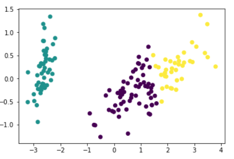
iris 데이터는 그만하고, 랜덤 데이터를 생성해서 진행해보자
scikit-learn의make_blobs를 이용하면 군집화를 위한 랜덤 데이터 샘플링이 된다.
n_samples: 샘플의 개수
n_features: 데이터의 feature의 개수 (시각화하려면 2로 설정 )
centers: 군집의 개수 (ndarray로 넣으면 개별 군집 중심점의 좌표)
cluser_std: 생성될 군집 내 데이터의 표준편차 (리스트로 군집별 설정 가능)
import numpy as np
import matplotlib.pyplot as plt
from sklearn.cluster import KMeans
from sklearn.datasets import make_blobs

X, y = make_blobs(n_samples=200, n_features=2, centers=3, cluster_std=0.8, random_state=0)
print(X.shape, y.shape)

# y target 값의 분포를 확인
unique, counts = np.unique(y, return_counts=True)
print(unique,counts)
(200, 2) (200,)
[0 1 2] [67 67 66]데이터프레임으로 만들고 진행하자
import pandas as pd

clusterDF = pd.DataFrame(data=X, columns=['ftr1', 'ftr2'])
clusterDF['target'] = y
clusterDF.head(10)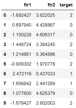
Clustering 수행 전에 어떻게 데이터가 생성됐는지 각 군집별로 구분해서 시각화해보자 (랜덤 데이터지만 어느정도 군집 특성을 고려해서 생성된 것임!)
target_list = np.unique(y)
# 각 target별 scatter plot 의 marker 값
markers=['o', 's', '^', 'P','D','H','x']
# 3개의 cluster 영역으로 구분한 데이터 셋을 생성했으므로 target_list는 [0,1,2]
# target==0, target==1, target==2 로 scatter plot을 marker별로 생성
for target in target_list:
    target_cluster = clusterDF[clusterDF['target']==target]
    plt.scatter(x=target_cluster['ftr1'], y=target_cluster['ftr2'], edgecolor='k', marker=markers[target] )
plt.show()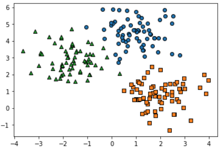
K-Means Clustering을 수행하고 각 데이터와 centroid까지 시각화
# KMeans 객체를 이용하여 X 데이터를 K-Means 클러스터링 수행
kmeans = KMeans(n_clusters=3, init='k-means++', max_iter=200, random_state=0)
cluster_labels = kmeans.fit_predict(X)
clusterDF['kmeans_label']  = cluster_labels

#cluster_centers_ 는 개별 클러스터의 중심 위치 좌표 시각화를 위해 추출
centers = kmeans.cluster_centers_
unique_labels = np.unique(cluster_labels)
markers=['o', 's', '^', 'P','D','H','x']

# 군집된 label 유형별로 iteration 하면서 marker 별로 scatter plot 수행.
for label in unique_labels:
    label_cluster = clusterDF[clusterDF['kmeans_label']==label]
    plt.scatter(x=label_cluster['ftr1'], y=label_cluster['ftr2'], edgecolor='k',
                marker=markers[label] )

    center_x_y = centers[label]

    # 군집별 중심 위치 좌표 시각화

    plt.scatter(x=center_x_y[0], y=center_x_y[1], s=220, color='white', # centroid 배경
                alpha=0.9, edgecolor='k', marker=markers[label])
    plt.scatter(x=center_x_y[0], y=center_x_y[1], s=80, color='k', edgecolor='k', # centroid 숫자
                marker='$%d$' % label)

plt.show()
위에 그래프와 각각 비교해보자
거의 동일하게 잘 군집화 됨
groupby로 어느정도 맞았나 확인하고 마무리하자
print(clusterDF.groupby('target')['kmeans_label'].value_counts())target kmeans_label
0 0 66
1 1
1 2 67
2 1 65
2 1
Name: kmeans_label, dtype: int642개만 빼면 랜덤 샘플링이 의도한 군집과 동일하다.
이건 make_blobs가 군집화를 가정하고 초기 군집을 저장해놓은 거라 비교가 가능한 것
-> 군집화는 원래 비지도학습이라 Label(Target)이 없는 게 정상임!