타이타닉에 나왔던 레오나르도 디카프리오와 케이트윈슬렛은 생존확률이 얼마나 됐을지, ML을 통해 알아보자!
1. 데이터 탐색
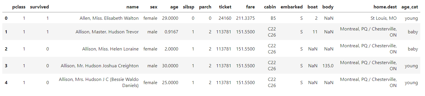
(1) 데이터 불러오기 (캐글)
import pandas as pd
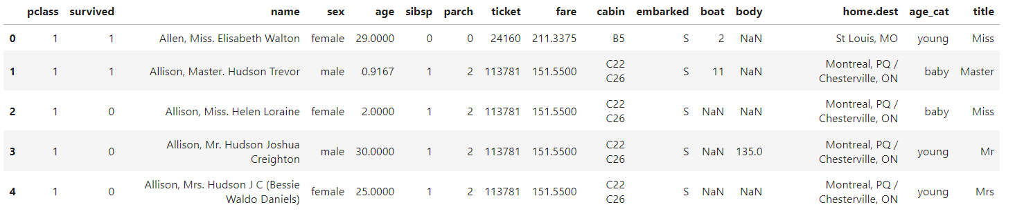
titanic = pd.read_excel("../data/titanic.xls")
titanic.head()
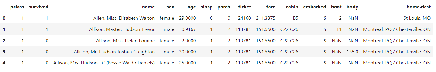
<컬럼의 의미>
- pclass : 객실등급
- survived : 생존유무(0: 사망 / 1: 생존)
- sex : 성별
- age : 나이
- sibsp : 형제 혹은 부부의 수
- parch : 부모 혹은 자녀의 수
- fare : 지불한 요금
- boat : 탈출했다면 탑승한 보트 번호
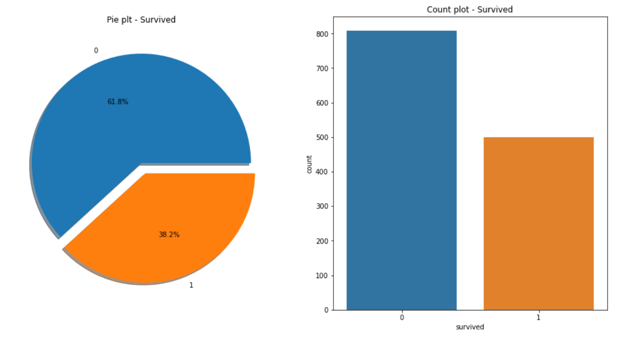
(2) 시각화1_생존 현황
import matplotlib.pyplot as plt
import seaborn as sns
%matplotlib inline
f, ax = plt.subplots(1, 2, figsize=(16, 8))

titanic['survived'].value_counts().plot.pie(explode=[0, 0.1], autopct="%1.1f%%", ax=ax[0], shadow=True)

ax[0].set_title("Pie plt - Survived")
ax[0].set_ylabel("")
sns.countplot(x="survived", data=titanic, ax=ax[1])
ax[1].set_title("Count plot - Survived")

plt.show()
f, ax = plt.subplots(1, 2, figsize=(16, 8)
- f, ax = plt.subplots(1, 2, figsize=(18, 8)) : 그래프를 1행 2열로 그릴 예정.
- f, ax는 subplots가 반환하는 값. ax는 각 그래프의 속성을 의미한다.
titanic['survived'].value_counts().plot.pie(explode=[0, 0.1], autopct="%1.1f%%", ax=ax[0], shadow=True
- value_counts( ): 값의 개수를 세주는 함수
- explode : 조각 간 거리
- autopct : 숫자를 입력하는 옵션, (1.1f : 소숫점 첫째자리까지)
- shdow : 파이차트를 3D 처럼 보이게 하는 그림자가 생김 (아주 작게 생긴다)
38.2%의 생존률...약 500명의 사람만 살아남았다...
(3) 시각화2_성별에 따른 생존 현황
f, ax = plt.subplots(1, 2, figsize=(16, 8))

sns.countplot(x="sex", data=titanic, ax=ax[0])
ax[0].set_title("Count of Passengers of Sex")
ax[0].set_ylabel("")

sns.countplot(x="sex", hue='survived', data=titanic, ax=ax[1])
ax[1].set_title("Sex : Survived and Unsurvived")

plt.show()
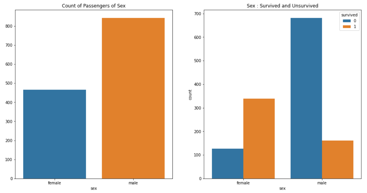
여성 승객은 약 450명, 생존자는 약 350명인 반면,
남성 승객은 약 800명, 생존자는 약 200명이다.
남성의 생존 가능성이 더 낮다고 볼수 있다.
(4) 시각화3_등실별&연령별 생존률 (pd.crosstab)
pd.crosstab(titanic['pclass'], titanic['survived'], margins=True)
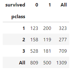
1등실의 생존률이 높다. 그리고 여성의 생존률도 높다.
그렇다면, 1등실에는 여성이 많이 타고 있었을까?
히스토그램으로 객실별&성별별 나이 분포를 알아보자!
grid = sns.FacetGrid(titanic, row='pclass', col='sex', height=4, aspect=2)
grid.map(plt.hist, 'age', alpha=0.8, bins=20)
grid.add_legend()
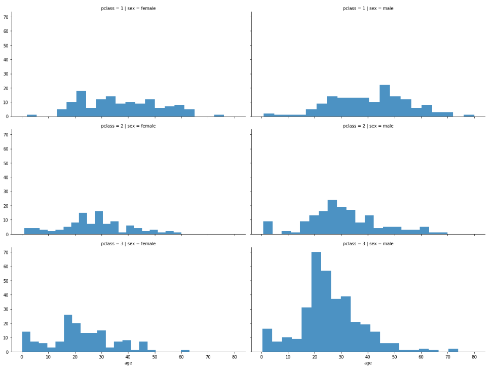
1, 2등실은 남,여 모두 나이 분포가 고르다.
다만 3등실에는 20대 남성이 많았다는 것을 알수 있다.
승객의 나이 분포를 plotly.express를 사용해 시각화 해보자!
없다면 !pip install plotly_express 로 설치하면 된다.
import plotly.express as px

fig = px.histogram(titanic, x="age")
fig.show()
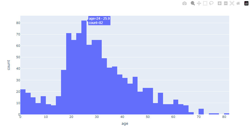
plotly 는 그래프에 커서를 올리면 관련 정보가 뜬다.
우측 상단 툴바를 활용해 그래프를 확대/축소 할 수도 있다.
당시 타이타닉 호에는 아이들과 20,30대 청년층이 많았다.
위에 그렸던 히스토그램을 사용해서 이번에는 등실별 생존자의 연령 분포를 알아보자!
grid = sns.FacetGrid(titanic, col="survived", row="pclass", height=3, aspect=2)
grid.map(plt.hist, "age", alpha=0.5, bins=20)
grid.add_legend();
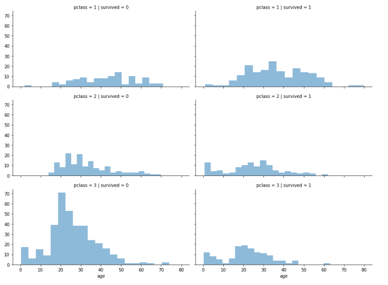
선실 등급이 높을수록 생존자가 많다.
특히 20-30대 3등실 승객이 많이 사망했다.
(5) 시각화4_나이, 성별, 등실 별 생존율
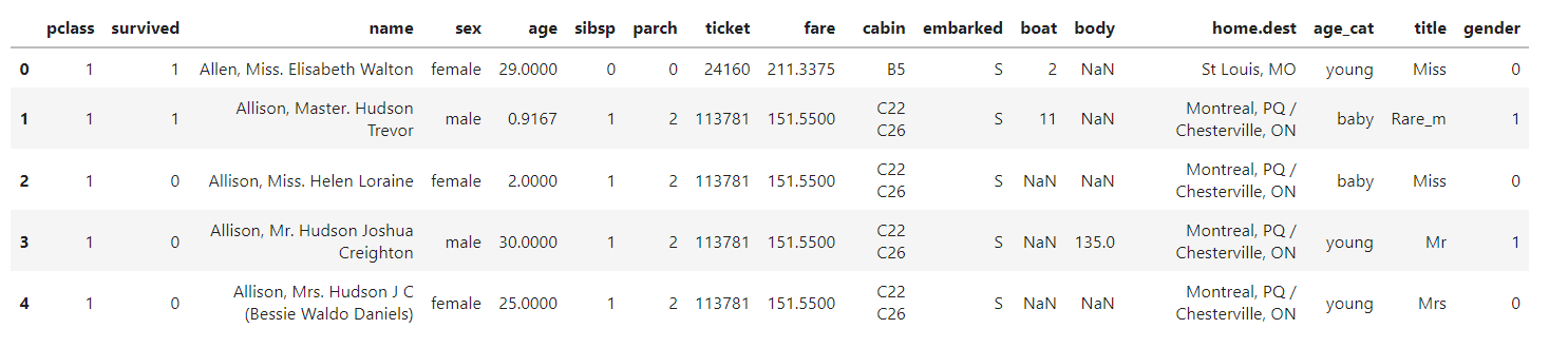
titanic["age_cat"] = pd.cut(titanic['age'],
							bins=[0, 7, 15, 30, 60, 100],
                            include_lowest=True,
                            labels=["baby", "teen", "young", "adult", "old"])

titanic.head()
pd.cut을 이용해 나이를 ["baby", "teen", "young", "adult", "old"]로 분리했다.
bins=[0, 7, 15, 30, 60, 100] bin으로 구간을 설정한다.
plt.figure(figsize=(12, 6))

plt.subplot(131)  # 1행 3열 중 첫번째
sns.barplot(x='pclass', y='survived', data=titanic)

plt.subplot(132)  # 1행 3열 중 두번째
sns.barplot(x='age_cat', y='survived', data=titanic)

plt.subplot(133)  # 1행 3열 중 세번째
sns.barplot(x='sex', y='survived', data=titanic)

plt.subplots_adjust(top=1, bottom=0.1, left=0.1, right=1, hspace=0.5, wspace=0.5)
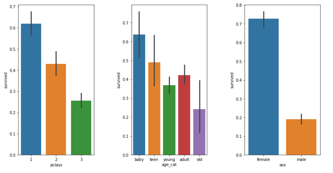
1등실 > 2등실 > 3등실 순으로 생존율이 높다.
어릴수록, 여자인 경우, 생존율이 높다.
(6) 시각화5_남/여 나이별 생존 현황
fig, axes = plt.subplots(nrows=1, ncols=2, figsize=(14, 6))

w = titanic[titanic['sex'] == 'female']
m = titanic[titanic['sex'] == 'male']

ax = sns.distplot(w[w['survived']==1]['age'], bins=20, label='survived', ax=axes[0], kde=False)
ax = sns.distplot(w[w['survived']==0]['age'], bins=40, label='not_survived', ax=axes[0], kde=False)
ax.legend();
ax.set_title("Female")

ax = sns.distplot(m[m['survived']==1]['age'], bins=18, label='survived', ax=axes[1], kde=False)
ax = sns.distplot(m[m['survived']==0]['age'], bins=40, label='not_survived', ax=axes[1], kde=False)
ax.legend();
ax.set_title("Male")
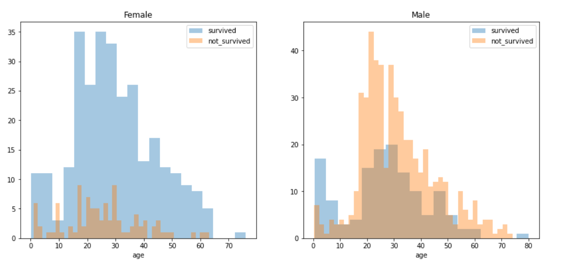
kde=False : 밀도함수 제거
bins: 값이 클수록 잘게 나눈다
확실히 여성의 생존율이 모든 연령대에서 높다.
(7) 신분에 따른 생존율
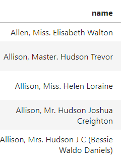
이름을 보면 Miss, Master, Mr, Mrs, Miss등 신분을 유추할 수 있는 단어가 있다.
이 단어들을 사용해 신분을 유추하고, 생존율을 알아보자!!
import re

title = []

for i, da in titanic.iterrows():
    tmp = da["name"]
    title.append(re.search('\,\s\w+(\s\w+)?\.', tmp).group()[2:-1])
re.search('\,\s\w+(\s\w+)?\.', tmp): 콤마(,)로 시작 + 단어 여러개 + 단어 여러개 (개수 미정) + 마침표(.)로 끝나는 단어를 tmp에서 찾아라!
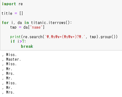
re.search('\,\s\w+(\s\w+)?\.', tmp).group()의 결과는 위와 같아서,
[2:-1] 로 슬라이싱 하여 title에 저장하는 것이다.
titanic["title"] = title
titanic.head()
만든 title 리스트를 타이타닉 데이터셋에 넣어준다.
titanic['title'].unique()
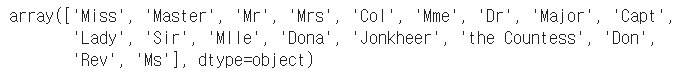
이름 목록에서
"Mlle", "Mme", "Ms"는 과거에 사용했던 단어로, "Miss"와 동일한 의미라고 한다.
pd.crosstab(titanic['title'], titanic['sex'])
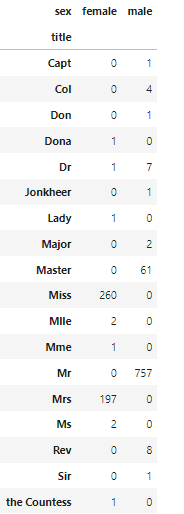
이름이 어떤 성별에 쓰이는지 감이 안와서 crosstab으로 성별 별 이름 사용 빈도를 알아보았다.
titanic['title'] = titanic['title'].replace("Mlle", "Miss")
titanic['title'] = titanic['title'].replace("Mme", "Miss")
titanic['title'] = titanic['title'].replace("Ms", "Miss")
동의어들을 모두 Miss로 바꿔줬다..
rare_f = ['Dona', 'Lady', 'the Countess']
rare_m = ['Capt', 'Col', 'Don', 'Major', 'Sir', 'Rev', 'Dr', 'Master', 'Jonkheer']
crosstab() 표를 참고해서 여성 귀족 이름은 rare_f, 남성 귀족 이름은 rare_m 으로 정리한 다음,
for i in rare_f:
    titanic['title'] = titanic['title'].replace(i, 'Rare_f')

for i in rare_m:
    titanic['title'] = titanic['title'].replace(i, 'Rare_m')
귀족 이름을 가진 사람의 "title"을 "Rare_f" 또는 "Rare_m" 으로 변경했다.
이는 귀족인 사람과 귀족이 아닌 사람의 생존율을 알아보기 위해서 하는 작업이다!
titanic['title'].unique()

이름 목록이 깔끔해졌다..!
titanic[['title', 'survived']].groupby(['title'], as_index=False).mean()
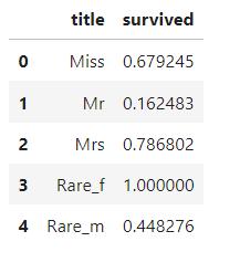
group() 를 사용해 각 이름별 생존율을 간단하게 알아봤다.
귀족 여성은 생존율이 1인 반면, 귀족 남성은 0.45 수준이다.
이는 평민 여성의 생존율인 0.68 보다도 훨씬 낮다.
2. ML을 이용한 생존자 예측
지금까지 타이타니 데이터를 요리조리 탐색해봤다!
이제는 ML 모델을 만들어 디카프리오와 케이트 윈슬렛의 생존 확률을 예측해보자!
(1) 데이터 전처리1_데이터 타입 변경
titanic.info()
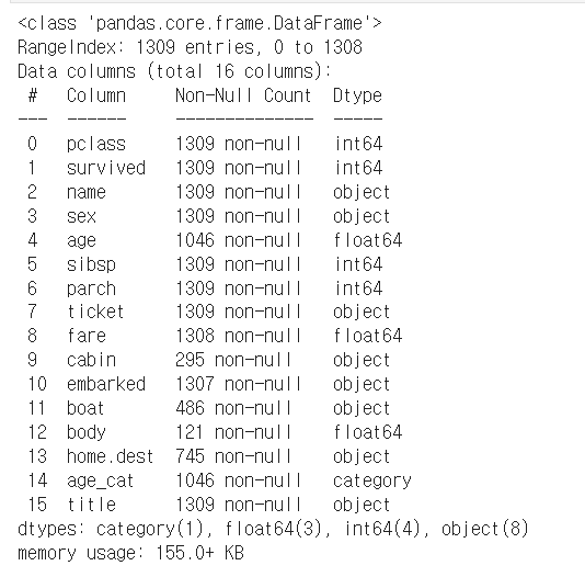
머신러닝에 feature 값으로 사용하려면 dtype이 숫자여야 한다.
현재 sex가 문자 이므로, 숫자로 바꿔준다.
from sklearn.preprocessing import LabelEncoder

le = LabelEncoder()
le.fit(titanic['sex'])

titanic['gender'] = le.transform(titanic['sex'])
titanic.head()
LabelEncoder 는 문자를 숫자로 변환해준다.
.fit 을 먼저 해준뒤에, transform을 사용하면 된다.
그렇게 변환한 값은 "gender"컬럼으로 입력한다.
0이 여자, 1이 남자를 의미한다.
(2) 데이터 전처리2_결측치 삭제
titanic = titanic[titanic['age'].notnull()]
titanic = titanic[titanic['fare'].notnull()]
feature로 사용할 컬럼에 결측치가 있다면, 쿨하게 삭제해버렸다.
내가 임의로 값을 입력할 수 없기 때문이다..!
(3) 상관관계 확인
survived 컬럼과 상관관계가 큰 컬럼이 무엇인지 알아보자!
cor = titanic.corr().round(1)
sns.heatmap(data=cor, annot=True, cmap='bwr')
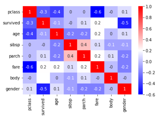
큰 상관관계를 보이는 컬럼은 없네...!
(4) 데이터 분할
from sklearn.model_selection import train_test_split
X = titanic[['pclass', 'age', 'sibsp', 'parch', 'fare', 'gender']]
y = titanic['survived']

X_train, X_test, y_train, y_test = train_test_split(X, y, test_size=0.2, random_state=13)
X는 feature, y는 예측할 대상의 값을 넣어주면 된다.
8:2의 비율로 train, test 로 나눠봤다.
(5) Decision Tree
from sklearn.tree import DecisionTreeClassifier
from sklearn.metrics import accuracy_score
dt = DecisionTreeClassifier(max_depth=4, random_state=13)
dt.fit(X_train, y_train)

pred = dt.predict(X_test)
print(accuracy_score(y_test, pred))
max_depth는 4로 정하고 Decision Tree를 train 데이터로 학습시켰다.
그 모델로 test 데이터를 예측해본 결과, 76%의 정확도가 나왔다..!
이게 좋은건지 아닌지는 잘..모르겠다..
하지만 나에겐 다른 방법이 없으니, 이 모델로 디카프리오와 케이트윈슬렛의 생존확률을 알아보자..!
(6) 디카프리오와 케이트윈슬렛의 생존확률
import numpy as np
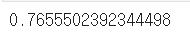
dica = np.array([[3, 18, 0, 0, 5, 1]])
print("Decaprio : ", dt.predict_proba(dica)[0,1])

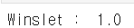
win = np.array([[1, 16, 1, 1, 100, 0]])
print("Winslet : ", dt.predict_proba(win)[0,1])
입력한 값은 feature의 값으로, 순서대로 ['pclass', 'age', 'sibsp', 'parch', 'fare', 'gender'] 를 의미한다.
디카프리오의 생존 확률은 겨우 17%, 윈슬렛의 생존 확률은 100%로 모델은 예측했다...!
So Sad...
