Data Analysis
Exercise
1) Find the most common date and time for taking classes
-> What day and time do they usually take the classes?
1-1) identify the necessary fields - access_date, user_id
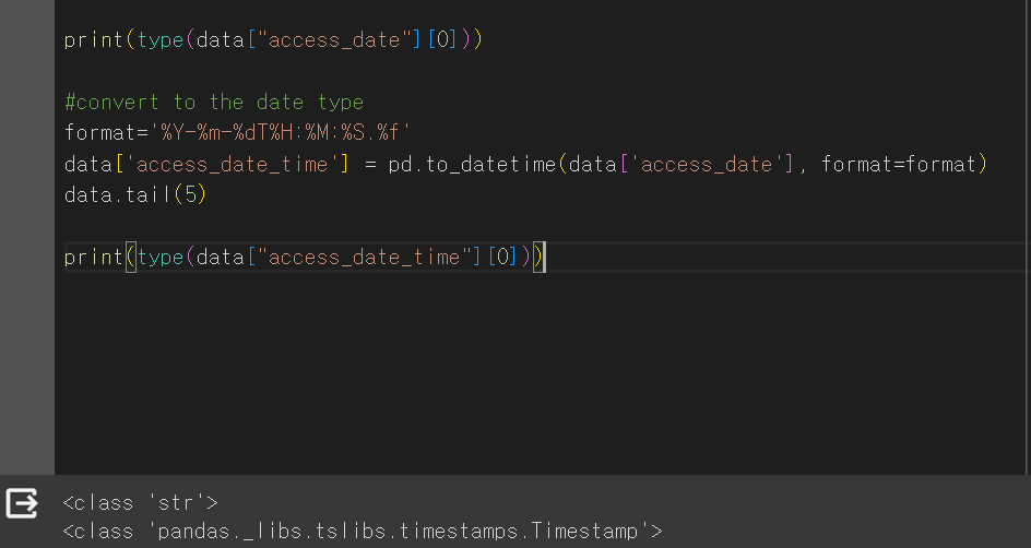
1-2) convert from str to timestamp type
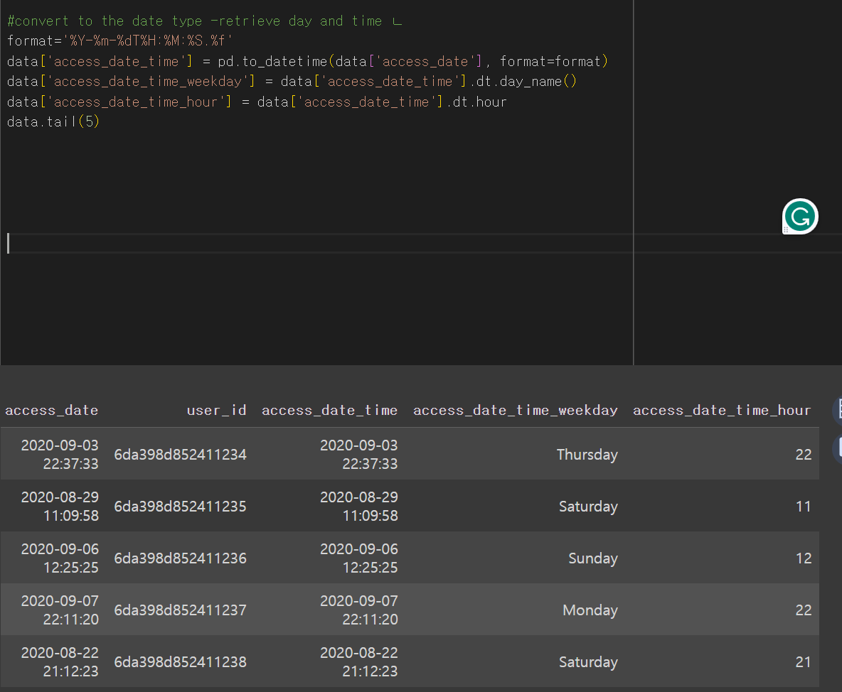
1-3) retrieve day and time
since we convert the type, we can easily retrieve only day and time from date time.
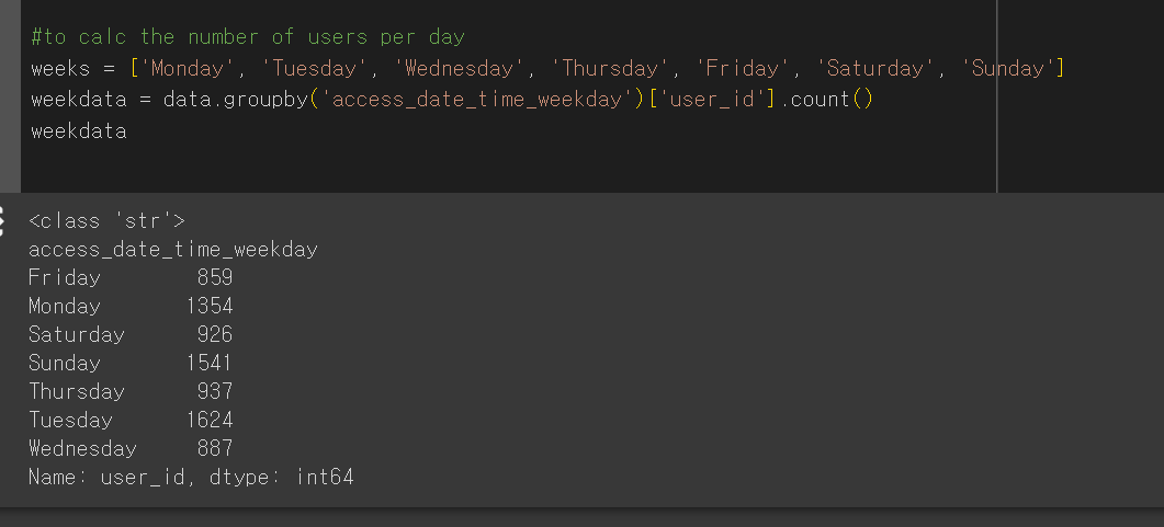
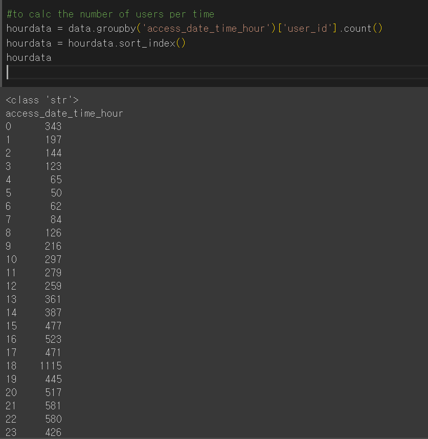
if we want to retrieve the number of users per day or hour?
use 'groupby'and count function
type() - to display the data type
sort_index() - ascending order
sort_index(ascending=False) -descending order
hourdata = hourdata.reset_index().sort_values(by=['user_id'], ascending=False) -  to order the data by the number of users in descending order
1-4)
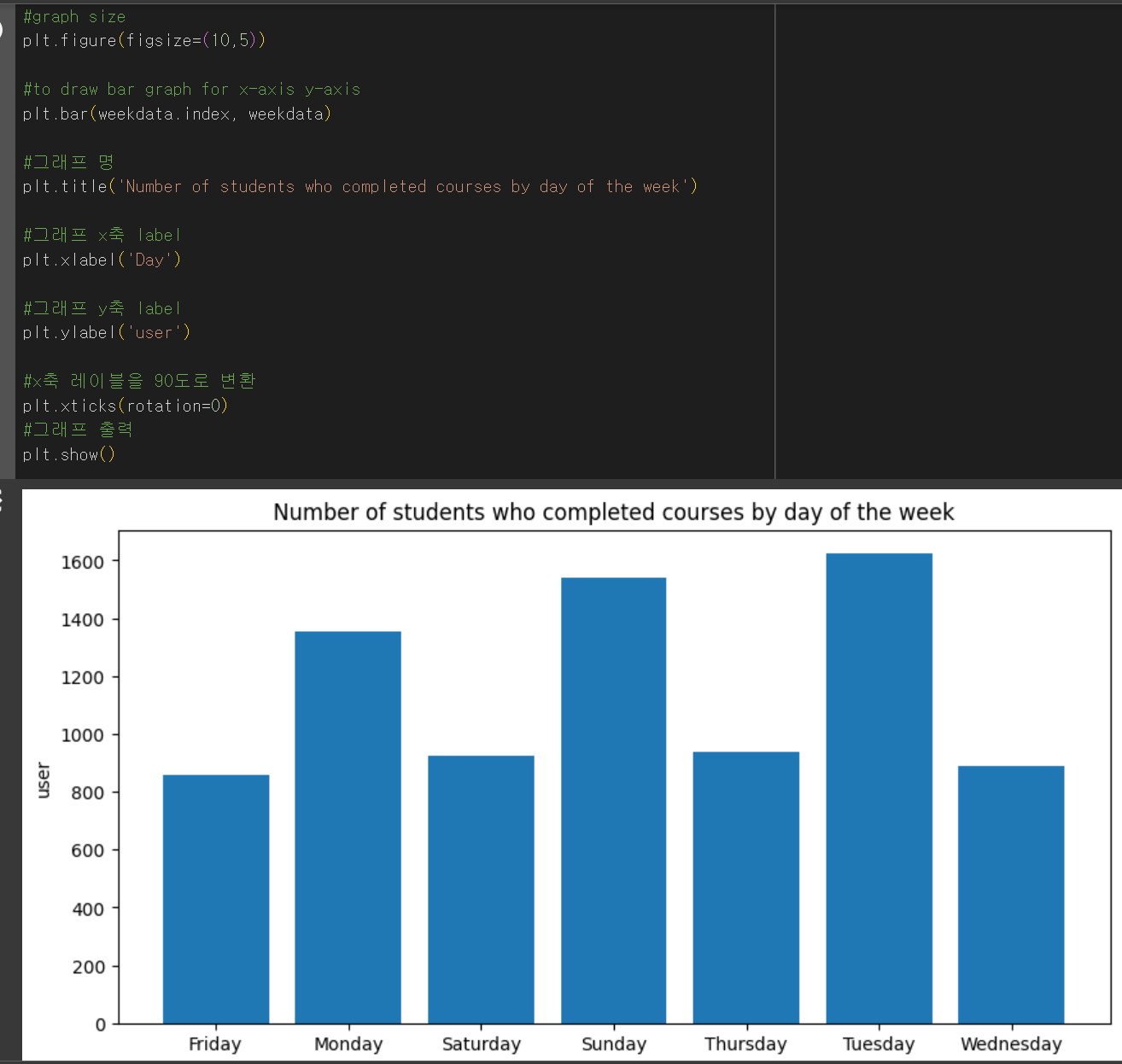
visualize the data per day of the week
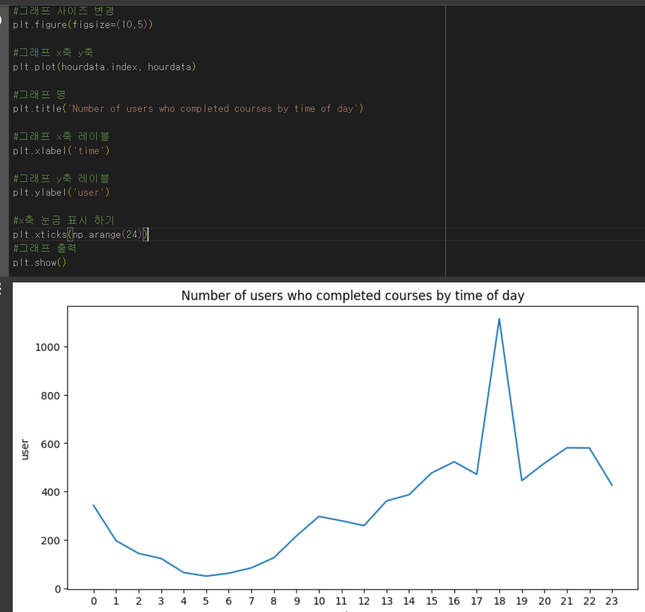
visualize the data per time of day
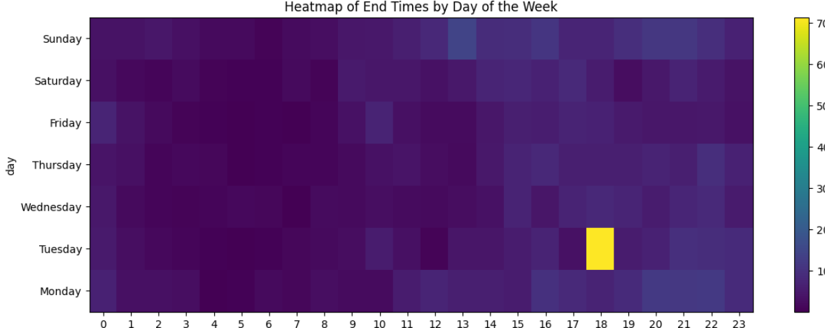
- Heatmap
A graphical representation of data that uses a system of color coding to represent different values
=> the most number of users : 6pm on Tuesday
2) Find the regions with high demand for courses
->what region has the most number of users?
set() - returns an object of the set class from the specified iterable and its elements (contain unique value)
len() - length
ex) print(category_range, len(category_range))drop_duplicate - drop duplicate values
ex) area_info = area_info.drop_duplicates(['area'])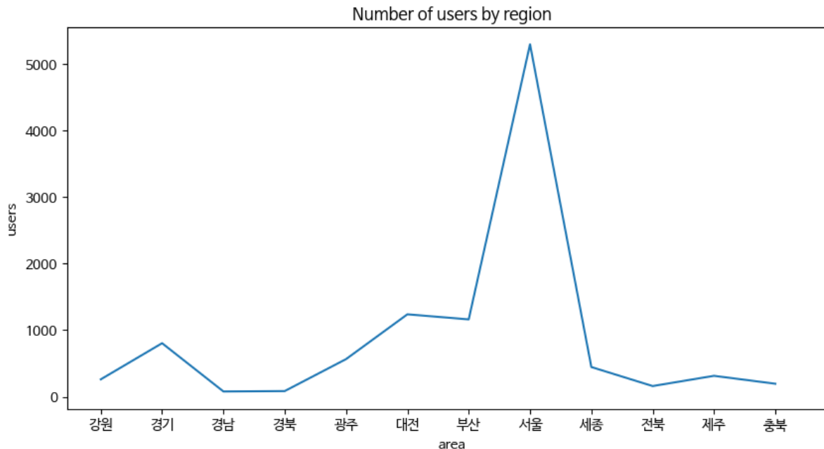
+use plot() to draw plot graph
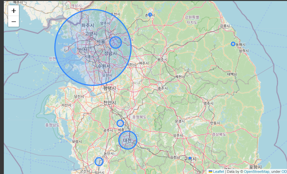
3) Marking the results on a map with Folium
->Display the distribution of students on a map using latitude and longitude
Folium - the library to draw the results of the analyzed data on a map
Today I learned
- the concept of the heatmap to visually represent numeric values in a way that makes it easy to view and interpret
- some function in Python ( set(), len() ..)
- the process to display the distribution on a map