https://www.kaggle.com/code/yoontaeklee/credit-card-fraud-detection
import time, psutil, os, gc

import math

import numpy as np
import pandas as pd

import matplotlib.pyplot as plt
import matplotlib.patches as mpatches
import seaborn as sns
sns.set_theme()
import plotly.express as px
import plotly.graph_objects as go
from plotly.subplots import make_subplots
from plotly.offline import init_notebook_mode, iplot
init_notebook_mode(connected=True)


from sklearn.model_selection import train_test_split

from tqdm.contrib import itertools
# Recording the starting time, complemented with a stopping time check in the end to compute process runtime
start = time.time()
# Class representing the OS process and having memory_info() method to compute process memory usage
process = psutil.Process(os.getpid())이상 탐지
통계나 데이터 분석에서, outlier는 대다수의 데이터에서 벗어난 데이터를 말한다. 이는 해당 데이터가 다른 데이터와는 다른 메커니즘으로 생성되었거나 다른 데이터셋과는 달리 일관성 없이 생성되었기 때문이다. 최근에는 머신러닝을 이용하여 이상 탐지를 하는 경우가 많아졌다. 이상 탐지는 다음과 같은 경우에 적합하다
- 데이터셋에서 비정상 데이터가 거의 없다
- 비정상 데이터가 다른 정상 데이터들과는 차이가 많이 나는 특징을 가지고 있다
- 비정상 데이터가 각기 다른 이유들로 생성될 수 있다
1. 데이터셋
df = pd.read_csv('../input/creditcardfraud/creditcard.csv')
df.head()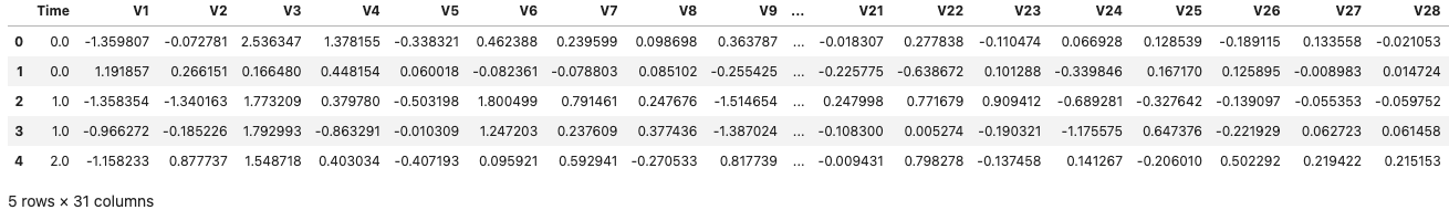
1.1 Null data 확인
for column in df.columns:
	msg = 'column: {:>11}\t Percent of NaN value: {:.2f}%'.format(column,
    				100 * (df[column].isnull().sum() / df[column].shape[0]))
- 다행히 해당 커널에서 제공하는 데이터에는 Null data는 없는 것으로 확인된다
1.2 Target value 확인
f, ax = plt.subplots(1, 2, figsize = (18, 8))

df['Class'].value_counts().plot.pie(explode = [0, 0.1], autopct = '%1.1f%%', ax = ax[0], shadow = True)
ax[0].set_title('Pie plot - Fraud')
sns.countplot('Class', data = df, ax = ax[1])
ax[1].set_title('Count plot - Fraud')

plt.show()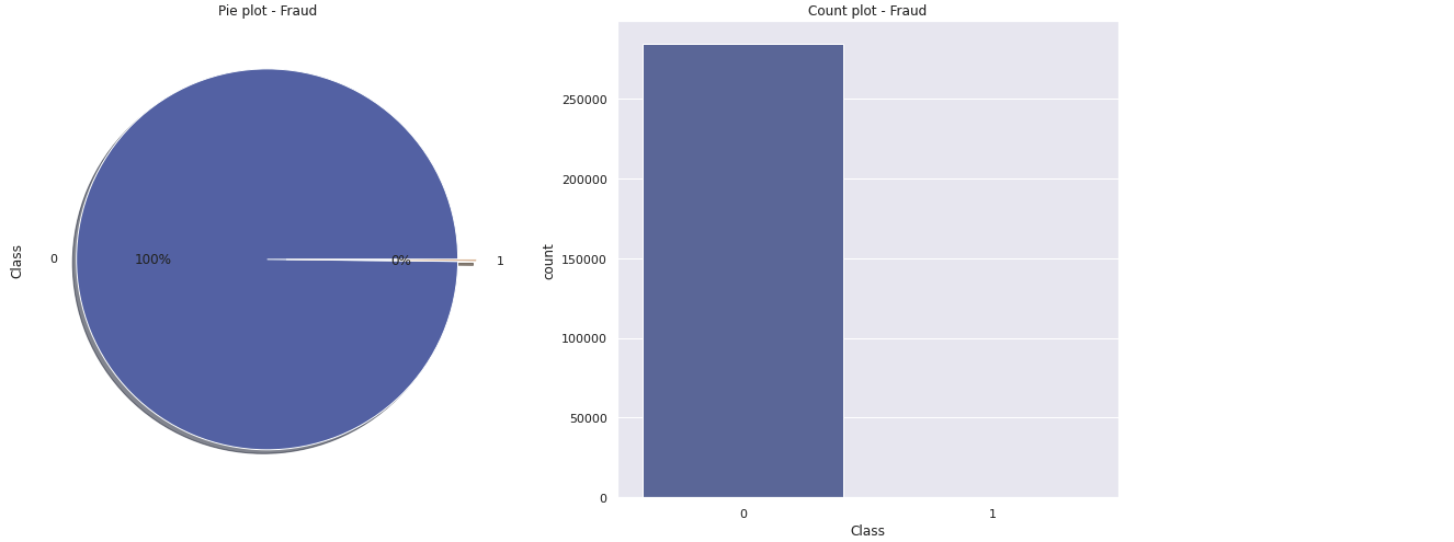
- 사기거래와 정상거래의 분포가 지극히 언밸런스하다
- 이러한 언밸런스한 데이터를 다루는 데에는 다음과 같은 솔루션들이 있다
- 더 많은 데이터를 수집한다
- 데이터를 다른 방식으로 분석한다(시각화 변경)
- Confusio nmatrix 사용
- F1score
- Kappa
- ROC curves
- 데이터셋을 리샘플링
- 갖고있는 데이터를 50:50 정도의 비율로 맞추기 위한 방법
- 오버샘플링을 통해 수행 -> 비율이 적은 데이터의 카피를 추가
- 언더샘플링을 통해 수행 -> 비율이 많은 데이터의 일부 제거
그 전에, 타겟값이 0 혹은 1 등의 두가지로 나뉘는 경우의 예측은 다음 네 가지 카테고리로 나뉜다
- True Positive: 실제 True인 정답을 True라고 예측 (정답)
- True Negative: 실제 False인 정답을 False라고 예측 (정답)
- False Positive: 실제 False인 정답을 True라고 예측 (오답)
- False Negative: 실제 True인 정답을 False라고 예측 (오답)

1.3 Train - Test Dataset Split
- 현 커널에서의 데이터는 트레이닝 데이터와 테스트 데이터가 나뉘지 않아 직접 나눠야한다
# data_0 : 정상거래, data_1 : 이상거래
data_0, data_1 = df[df['Class'] == 0], df[df['Class'] == 1]

# X_0, y_0 : 정상거래 데이터 중 Class를 제외한 값, 정상거래 데이터 중 Class만
# X_1, y_1 : 이상거래 데이터 중 Class를 제외한 값, 이상거래 데이터 중 Class만
X_0, y_0 = data_0.drop('Class', axis = 1), data_0['Class']
X_1, y_1 = data_1.drop('Class', axis = 1), data_1['Class']

# data_val_1 : Class가 0인 테스트 데이터셋을 스플릿 했을 때의 반(Class 포함)
# data_val_2 : Class가 1인 테스트 데이터셋을 스플릿 했을 때의 반(Class 포함)
X_train, X_test, y_train, y_test = train_test_split(X_0, y_0, test_size = 0.2, random_state = 40)
X_val, X_test, y_val, y_test = train_test_split(X_test, y_test, test_size = 0.5, random_state = 40)
data_val_1, data_test_1 = pd.concat([X_val, y_val], axis = 1), pd.concat([X_test, y_test], axis = 1)

X_val, X_test, y_val, y_test = train_test_split(X_1, y_1, test_size = 0.5, random_state = 40)
data_val_2, data_test_2 = pd.concat([X_val, y_val], axis = 1), pd.concat([X_test, y_test], axis = 1)

# data_val : Class가 0인 데이터셋(val) + Class가 1인 데이터셋(val)
data_val, data_test = pd.concat([data_val_1, data_val_2], axis = 0),
					  pd.concat([data_test_1, data_test_2], axis = 0)
X_val, y_val = data_val.drop('Class', axis = 1), data_val['Class']
X_test, y_test = data_test.drop('Class', axis = 1), data_test['Class']
labels = ['Train', 'Validation', 'Test']
values_0 = [len(y_train[y_train == 0]), len(y_val[y_val == 0]), len(y_test[y_test == 0])]
values_1 = [len(y_train[y_train == 1]), len(y_val[y_val == 1]), len(y_test[y_test == 1])]
fig = make_subplots(rows = 1, cols = 2, specs = [[{'type': 'domain}, {'type': 'domain'}]])
fig.add_trace(go.Pie(values = values_0, labels = labels, hole = 0.5, textinfo = 'percent', title = "Authentic"),
row = 1, col = 1)
fig.add_trace(go.Pie(values = values_1, labels = labels, hole = 0.5, textinfo = 'percent', title = "Fraudulent"),
row = 1, col = 2)
text_title = "Distribution of authentic and fraudulent transactions over training, validation and test set"
fig.update_layout(height = 500, width = 800, showlegend = True, title = dict(text = text_title, x = 0.5, y = 0.95))
fig.show()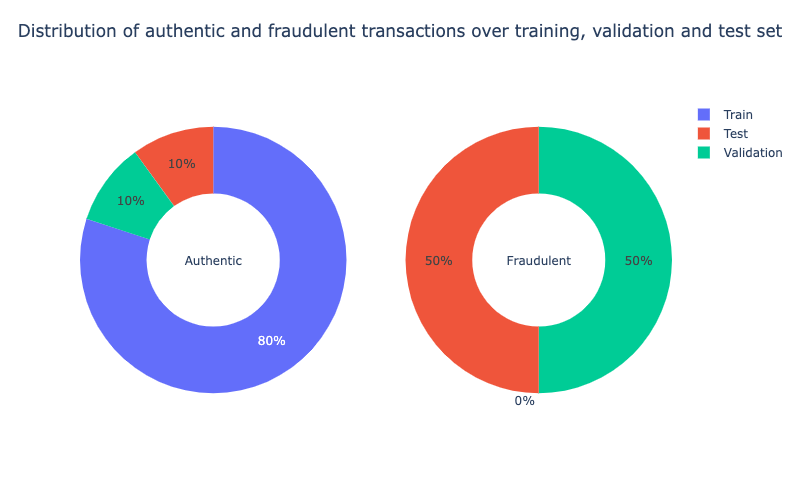
bins_train = math.floor(len(X_train) ** (1/3))2. Feature Engineering
2.1 Time
- 첫번째로, 초 단위의
Time을 일, 시, 분, 초 단위로 나눠준다
for df in [X_train, X_val, X_test]:
	df['Day'], temp = df['Time'] // (24*60*60), df['Time'] % (24*60*60)
    df['Hour'], temp = temp // (60*60), temp % (60*60)
    df['Minute'], df['Second'] = temp // 60, temp % 60

X_train[['Time','Day','Hour','Minute','Second']].head()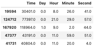
fig, ax = plt.subplots(1, 2, figsize = (15, 6), sharey = False)
sns.histplot(data = X_train, x = 'Time', bins = bins_train, ax = ax[0])
sns.histplot(data = X_train, x = 'Hour', bins = 24, ax = ax[1])
ax[1].set_ylabel(" ")
plt.suptitle("Histograms of Time and Hour", size = 14)
plt.tight_layout()
plt.show()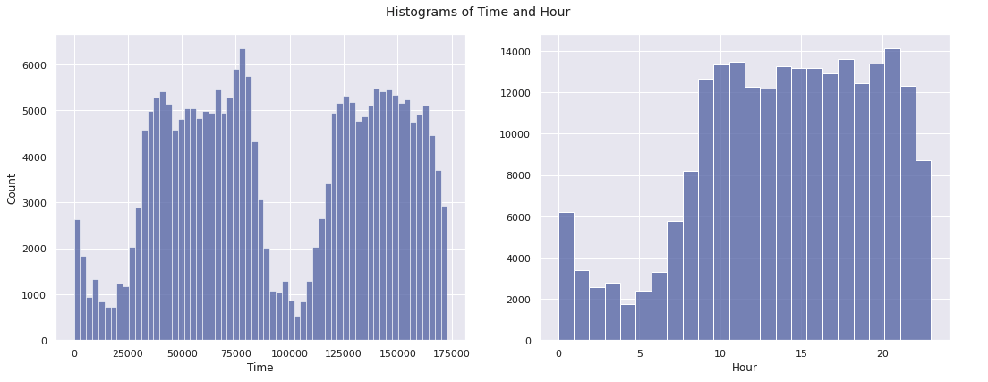
2.2 Amount
Amount또한 데이터마다 편차가 크다.Amount컬럼에 로그를 씌워 데이터를 확인해본다Amount가 0인 경우를 대비하여 0.001을 더하여 계산한다 :
for df in [X_train, X_val, X_test]:
df['Amount_transformed'] = np.log10(df['Amount'] + 0.001)fig, ax = plt.subplots(1, 2, figsize = (15, 6), sharey = False)
sns.histplot(data = X_train, x = 'Amount', bins = bins_train, ax = ax[0])
sns.histplot(data = X_train, x = 'Amount_transformed', bins = bins_train, ax = ax[1])
ax[1].set_ylabel(" ")
plt.suptitle("Histograms of Amount and Amount_transformed", size = 14)
plt.tight_layout()
plt.show()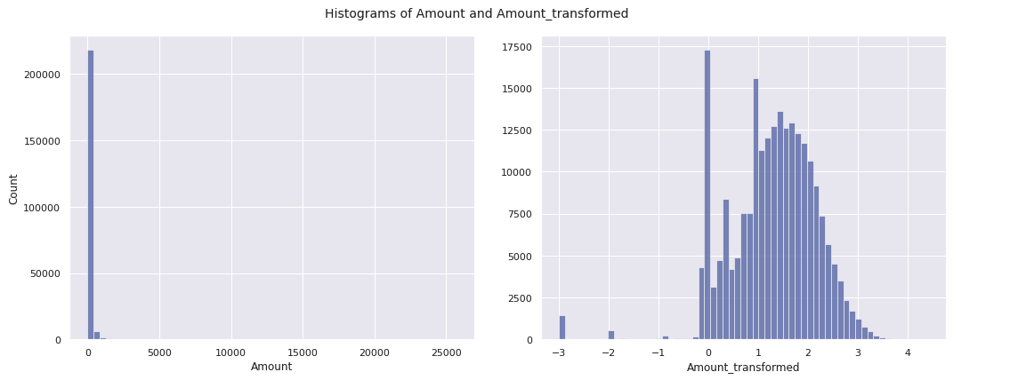
- Feature Engineering을 진행하며,
Amount_transformed,Hour제외하고 Drop
for df in [X_train, X_val, X_test]:
	df.drop(['Time','Day','Minute','Second','Amount'], axis = 1, inplace = True)
3. Feature Selection
Hour와Amount_transformed를 포함한 30개의 컬럼이 있다. 이 중에서Class의 값과 연관이 있어 보이는 컬럼들만 사용할 수 있도록 비교한다
data_val = pd.concat([X_val, y_val], axis = 1)
data_val_0, data_val_1 = data_val[data_val['Class'] == 0], data_val[data_val['Class'] == 1]
cols, ncols = list(X_val.columns), 3
nrows = math.ceil(len(cols) / ncols)
fig, ax = plt.subplots(nrows, ncols, figsize = (4.5 * ncols, 4 * nrows))

for i in range(len(cols)):
	sns.kdeplot(data_val_0[cols[i]], ax = ax[i // ncols, i % ncols])
    sns.kdeplot(data_val_1[cols[i]], ax = ax[i // ncols, i % ncols])
    if i % ncols != 0:
    	ax[i // ncols, i % ncols].set_ylabel(" ")
plt.tight_layout()
plt.show()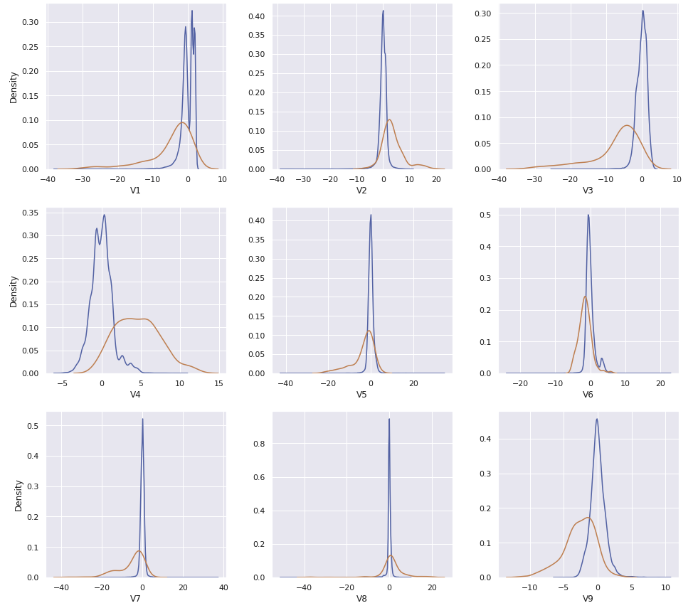
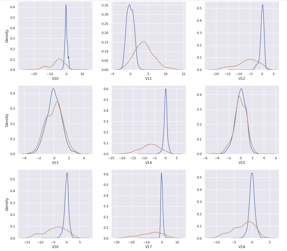
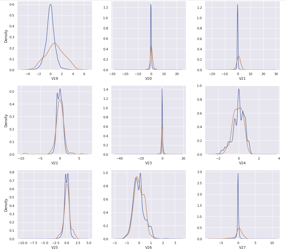
cols = ['V4','V11','V12','V14','V16','V17','V18','V19','Hour']
X_train_fs, X_val_fs, X-test_fs = X_train[cols], X_val[cols], X_test[cols]
X_train_fs.head()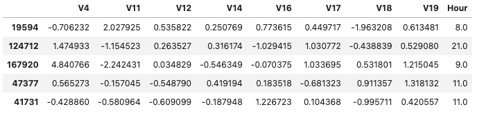
4. Implementing Anomaly Detection
확률 밀도 함수 ( : 평균 , : 표준분포):
# 위의 확률 밀도 함수를 코드로 구현
def normal_density(x, mu, sigma):
	assert sigma > 0
    f = (1 / (sigma * np.sqrt(2 * np.pi))) * np.exp(- (1 / 2) * ((x - mu) / sigma) ** 2)
    return f
def normal_product(x_vec, mu_vec, sigma_vec):
assert min(sigma_vec) > 0
assert len(mu_vec) == len(x_vec)
assert len(sigma_vec) == len(x_vec)
f = 1
for i in range(len(x_vec)):
f = f * normal_density(x_vec[i], mu_vec[i], sigma_vec[i])
return fmu_train, sigma_train = X_train_fs.mean(), X_train_fs.std()def model_normal(X, epsilon):
y = []
for i in X.index:
prob_density = normal_product(X.loc[i].tolist(), mu_train, sigma_train)
y.append((Prob_density < epsilon).astype(int))
return y5. Threshold Tuning on Validation Set
def conf_mat(y_test, y_pred):
	y_test, y_pred = list(y_test), list(y_pred)
    count, labels, confusion_mat = len(y_test), [0, 1], np.zeros(shape = (2, 2), dtype = int)
    for i in range(2):
    	for j in range(2):
        	confusion_mat[i][j] = len([k for k in range(count)
            							if y_test[k] == labels[i] and y_pred[k] == labels[j]])
	return confusion_mat
def conf_mat_heatmap(y_test, y_pred):
confusion_mat = conf_mat(y_test, y_pred)
labels, confusion_mat_df = [0, 1], pd.DataFrame(confusion_mat, range(2), range(2))
plt.figure(figsize = (6, 4.75))
sns.heatmap(confusion_mat_df, annot = True, annot_kws = {"size": 16}, fmt = 'd')
plt.xticks([0.5, 1.5], labels, rotation = 'horizontal')
plt.yticks([0.5, 1.5], labels, rotation = 'horizontal')
plt.xlabel("Predicted label", fontsize = 14)
plt.ylabel("True label", fontsize = 14)
plt.title("Confusion Matrix", fontsize = 14)
plt.grid(False)
plt.show()def f2_score(y_test, y_pred):
# 정확도 계산
confusion_mat = conf_mat(y_test, y_pred)
tn, fp, fn, tp = confusion_mat[0, 0], confusion_mat[0, 1], confusion_mat[1, 0], confusion_mat[1, 1]
f2 = (5 * tp) / ((5 * tp) + (4 * fn) + fp)
return f2alpha_list, f2_list, f2_max, alpha_opt, y_val_pred_opt = [], [], 0.0, 0.0, np.zeros(len(y_val))
for alpha, j in itertools.product(np.arange(0.001, 0.051, 0.001), range(1)):
y_val_pred = model_normal(X_val_fs, epsilon = alpha**X_val_fs.shape[1])
f2 = f2_score(y_val, y_val_pred)
alpha_list.append(alpha)
f2_list.append(f2)
if f2 > f2_max:
alpha_opt = alpha
y_val_pred_opt = y_val_pred
f2_max = f2plt.figure(figsize = (9, 6))
plt.plot(alpha_list, f2_list)
plt.xlabel("alpha", fontsize = 14)
plt.ylabel("F2-score", fontsize = 14)
plt.title("F2-score vs alpha", fontsize = 14)
plt.tight_layout()
plt.show()
print(pd.Series({
    "Optimal alpha" : alpha_opt,
    "Optimal F2-score" : f2_score(y_val, y_val_pred_opt)
}).to_string())
conf_mat_heatmap(y_val, y_val_pred_opt)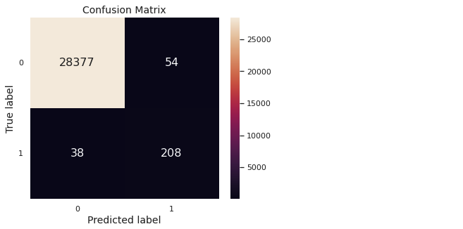
6. Prediction & Evaluation
def evaluation(y_test, y_pred):
    confusion_mat = conf_mat(y_test, y_pred)
    tn, fp, fn, tp = confusion_mat[0, 0], confusion_mat[0, 1], confusion_mat[1, 0], confusion_mat[1, 1]
    print(pd.Series({
        "Accuracy": (tp + tn) / (tn + fp + fn + tp),
        "Precision": tp / (tp + fp),
        "Recall": tp / (tp + fn),
        "F1-score": (2 * tp) / ((2 * tp) + fn + fp),
        "F2-score": (5 * tp) / ((5 * tp) + (4 * fn) + fp),
        "MCC": ((tp * tn) - (fp * fn)) / np.sqrt((tp + fp) * (tp + fn) * (tn + fp) * (tn + fn))
    }).to_string())
y_test_normal = model_normal(X_test_fs, epsilon = alpha_opt**X_test_fs.shape[1])
evaluation(y_test, y_test_normal)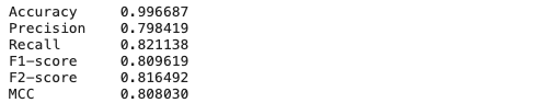
conf_mat_heatmap(y_test, y_test_normal)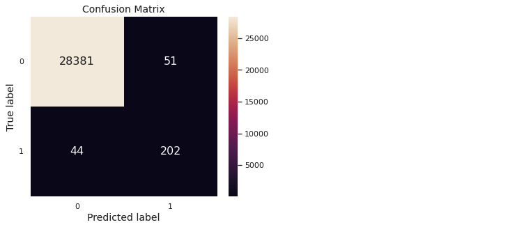
7. 결론
- 타겟값의 분포가 굉장히 치우쳐져 있는 케이스이다. 따라서 정상거래의 케이스를 토대로, 해당 케이스에서 벗어나면 비정상 거래로 간주하게끔 설계해야한다
- Feature Engineering을 거쳐 총 30개의 feature 중, 필요한 feature를 확인하기 위해 kdeplot으로 확인한다
- Training Dataset을 통해 다변량 정규분포(Multivariate normal distribution)을 구하고, 새로운 데이터가 들어왔을 때 이미 구한 분포를 통해 사기거래를 탐지한다

데이터 엔지니어로 전향중인 백엔드 개발자입니다