HTML&CSS 강의
navigation 스타일링
navigation.scss
@use './../utils' as *;
@use './../components' as *;
.appNavigation {
}
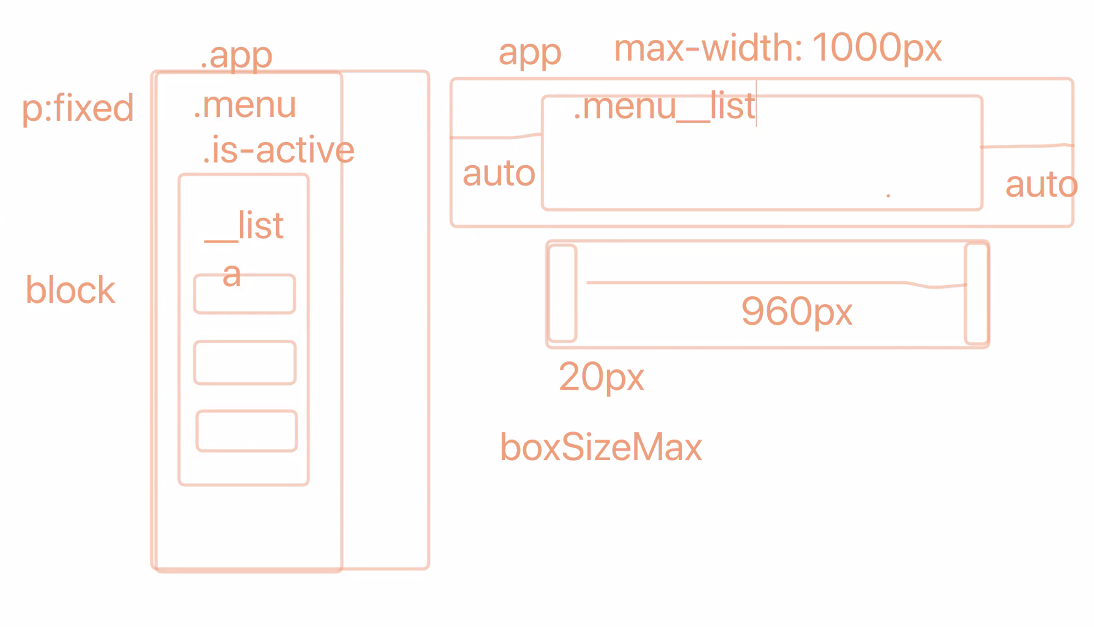
.menu {
@include desktop {
background-color: $brown;
padding: rem(16px) 0;
}
&__list {
@include mobile {
position: fixed;
top: 0;
left: 0;
// (reflow) 성능을 위해 left를 움직이는 것이 아닌 transform 속성 사용!
transform: translateX(-100%);
width: 70%;
height: 100vh;
background: rgba($darkbrown, 0.95);
padding: rem(32px);
transition: all 200ms ease;
}
@include desktop {
@include boxSizeMax($paddingX: 20px);
@include flexbox(row, space-between, center, nowrap);
font-size: rem(18px);
}
}
&__item {
@include mobile {
// 사용자 관점에서 여백을 넣어주는 것이 중요!
margin-bottom: rem(16px);
}
}
&__link {
display: block;
padding: rem(8px);
font-weight: 500;
color: $white;
}
}
.menu.is-active {
.menu__list {
transform: none;
}
}reflow를 위해 left를 바로 옮기기 보다 transform속성을 사용!
사용자 관점에서 여백을 넣어주는 것이 중요(알기 쉽게하기 위해)
main 페이지 레이아웃
@use './../utils' as *;
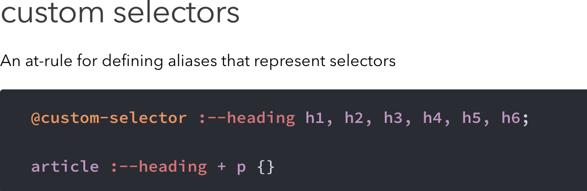
// @custom-selector :--home-section-title .book__title, .news__title, .board__title, .favorite__title, .twitter__title;
.homeMain {
// 섹션 공통 여백
.book, .news, .board, .favorite, .twitter {
margin: rem(24px) 0;
}
// 섹션 공통 제목 스타일
[class*="__title"] {
@include flexbox(column, center);
font-size: rem(20px);
font-weight: 500;
margin-bottom: rem(16px);
}
// 섹션 영문 제목 공통 스타일
[class*="__enTitle"] {
font-size: rem(14px);
margin-top: rem(4px);
}
// 섹션 본문 공통 스타일
[class*="__summary"] {
line-height: 1.5;
}
// 아이콘 공통
.far, .fas {
margin-right: rem(8px);
}
// 추천 서적
.book {
&__cover {
width: 50%;
@include autoMargin;
text-align: center;
}
&__coverImage {
@include responsive;
}
&__coverCaption {
margin: rem(16px) 0;
}
&__info {
text-align: center;
* {
display: inline-block;
}
.ratingStar {
display: block;
color: $green;
font-size: rem(24px);
margin: rem(8px) 0 rem(16px);
}
}
}
// 새소식
.news {
&__videoContainer {
margin-bottom: rem(16px);
}
&__video {
@include responsive(width);
}
&__iframeContainer {
@include responsiveIframe(16, 9);
}
&__date {
display: block;
text-align: right;
margin-top: rem(8px);
}
}
// 게시판
.board {
position: relative;
&__item {
@include flexbox(row, space-between);
margin: rem(8px) 0;
}
&__link {
display: block;
padding: rem(8px) 0;
@include ellipsis;
margin-right: rem(8px);
}
&__date {
white-space: nowrap;
padding: rem(8px) 0;
vertical-align: baseline;
}
&__more {
position: absolute;
top: rem(4px);
right: 0;
padding: rem(8px) 0;
}
}
// 인기 사이트
.favorite {
&__item {
margin: rem(8px) 0;
}
&__link {
display: block;
padding: rem(8px) 0;
@include mobile {
&::after {
position: relative;
top: rem(4px);
content: attr(data-tooltip);
margin-left: rem(8px);
display: inline-block;
color: $orange;
// 최소 픽셀, 최대 픽셀 설정 clamp함수 글자를 Flexible하게 만듦
font-size: clamp(0.75rem, 4vw, 1.125rem);
@include ellipsis;
}
}
}
}
@include mobile {
padding: 0 rem(20px);
}
// @include desktop {
// @include boxSizeMax($paddingX: 20px);
// display: grid;
// grid-template-columns: repeat(12, 1fr);
// grid-template-areas:
// "news news news news news news news news news news news news"
// "book book book book favorite favorite favorite twitter twitter twitter twitter twitter"
// "book book book book . board board board board board board board";
// .book {
// grid-area: book;
// }
// .news {
// grid-area: news;
// }
// .board {
// grid-area: board;
// }
// .favorite {
// grid-area: favorite;
// }
// .twitter {
// grid-area: twitter;
// }
// }
}속성 선택자(class*=)를 사용하여 그 부분만 들어있는 클래스를 모두 선택할 수 있음.
맨 위에 커스텀 셀렉터가 존재하는데 이는 postcss-preset의 custom selector이며@custome-selecotr : {이름} ~클래스명과 같이 이름에 정의하여 클래스나 요소들을 모아서 사용할 수 있다.
iframe은 video와 달리 div로 감싸진 container가 필요
_mixin.scss
// 반응형 iframe ----------------------------------------------------------- /
@mixin responsiveIframe($ratio-width, $ratio-height) {
  position: relative;
  width: 100%;
  height: 0 !important;
  padding-top: math.div($ratio-height, $ratio-width) * 100%;


  iframe {
    position: absolute;
    top: 0;
    left: 0;
    width: 100%;
    height: 100%;
  }
}
믹스인에도 보면 iframe의 부모가 되는 요소에 height를 0으로 만들고 padding-top을 주는 패딩 트릭을 사용하고 있는데 부모 height에 바로 값을주게되면 깨지기 때문에 패딩 트릭을 사용! (믹스인으로 매개변수를 받아 그 비율만큼 패딩 값을 줌)
font-size: clamp()
clamp() CSS의 기능은 상부 및 하한 사이의 값을 클램프. clamp() 사용하면 정의 된 최소값과 최대 값 사이의 값 범위 내에서 중간 값을 선택할 수 있다. 최소값, 선호 값 및 최대 허용 값의 세 가지 매개 변수가 필요하다.
conetnt: attr(data-tooltip)
CSS - attr() 함수
-
attr() 는 요소의 속성 값을 문자열로 반환하는 함수이다.
-
attr() CSS 함수는 선택한 요소의 속성 값을 검색하여 스타일시트에서 사용하는 데 사용된다. 의사 요소에도 사용할 수 있으며, 이 경우 의사 요소의 원래 요소에 있는 특성 값이 반환된다.
main 페이지 작업 하면서 수정한 부분 & 코드 알아본 부분
_header.scss
@include mobile {
    position: relative;
    @include flexbox(column);
    background: $darkbrown;
    padding: 0 rem(20px);
    // 음수 마진을 통해 전체에 padding: 0 rem(20)px을 준 것을 보완하여 화면이 꽉차게 해줌
    // margin: 0 rem(-20px);
  }
(헤더에)음수 마진을 통해 전체에 padding: 0 rem(20)px을 준 것을 보완하여 화면이 꽉차게 만드는 방법으로 마진의 좌우 값을 패딩을 준 만큼 값을 준다.
_sprites.scss
@use './color' as var;
@use './unit' as *;

// 색상 테마
$colors: (
    'Green': var.$green,
    'Yellow': var.$yellow,
    'Brown': var.$brown,
    'Orange': var.$orange,
    'Blue': var.$blue,
);

@each $color, $color-value in $colors {
    .theme#{$color} {
      color: $color-value;
    }
}

// 스프라이트 배경이미지
.sprite{
    min-height: rem(60px);
    padding-left: rem(64px);
    background-image: url(./../assets/images/sprite_main.png);
    background-repeat: no-repeat;

    $sprites: Book, Board, News, Favorite, Twitter;
    $x: 0;
    $y: 0;

    @each $sprite in $sprites {
        $i: index($sprites, $sprite);
        &#{$sprite}{
            background-position: $x $y;
        }
        $y: $y - 115px;
    }
}
sprite.scss부분에선
@each를 사용하여 key와 value값으로 접근하여 속성 이름에 문자보간을 같이 사용할 수도 있다.
스프라이트 배경 이미지의 경우 index함수로 접근을 하여 인덱스의 값을 저장할 수 있고, 백그라운드 포지션의 값 $y를 한번 돌 때마다 줄여나가서 background-position을 변경시켜 스프라이트 이미지를 만들어 낼 수 있다.
강의시간에 나온 사이트 & 찾아볼 것들
웹 바이탈 읽어보기(CLS, FID, LCP)
Web Vital 소개
Web Vital
포커스 비저블 믹스인 만들어보기