이전 글 에 이어서 data에 대한 분석과,
보다 상세한 data 전처리를 적용하여 Titanic문제를 다시 풀어보았다.
다음의 코드들을 참고해 학습하는 방식으로 진행했으며,
특히 첫번째 링크의 코드를 클론코딩하는 방식으로 학습했다.
EDA To Prediction(DieTanic)
Titanic Survivor Predict(EDA+LightGBM)_Kor+Eng
1. Exploratory Data Analysis(EDA)
1.1. 모듈 및 데이터 불러오기
우선 필요한 모듈을 import하고,
data를 pandas의 read_csv를 통해 가져온다.
import numpy as np
import pandas as pd
import matplotlib.pyplot as plt
import seaborn as sns
plt.style.use('fivethirtyeight')
import warnings
warnings.filterwarnings('ignore')
%matplotlib inline


df_train = pd.read_csv('/kaggle/input/titanic/train.csv')
df_test = pd.read_csv('/kaggle/input/titanic/test.csv')
1.1.1. 데이터 보기
- head 메소드로 data를 확인한다.
df_train.head()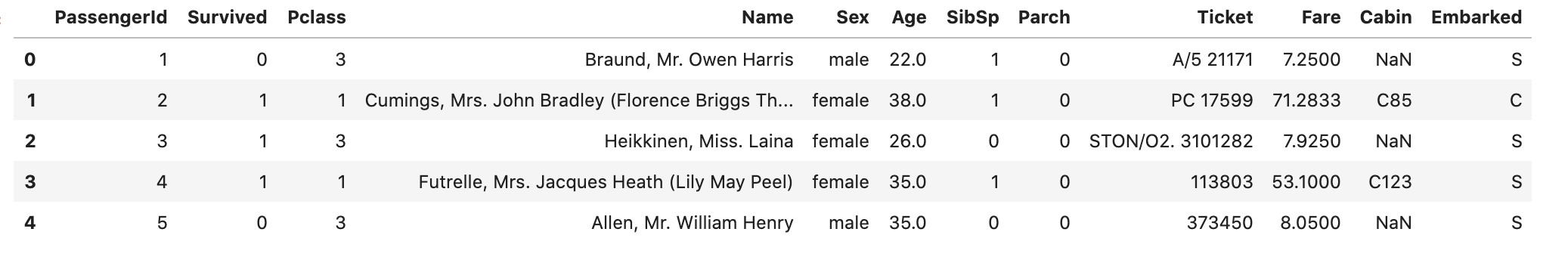
- Nan값을 확인한다.
df_train.isnull().sum()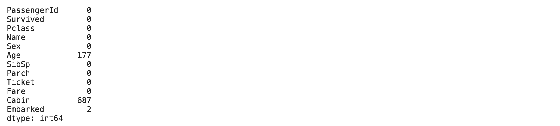
확인 결과 아래의 각 column에서
Age: 177
Cabin : 687
Embarked : 2
개의 Nan값을 갖고있으니 뒤에서 처리해 주어야한다.
1.1.2. 얼마나 생존했을까?
- 다음의 그래프를 통해 생존 비율을 확인한다.
f, ax = plt.subplots(1, 2, figsize=(18,8))
df_train['Survived'].value_counts().plot.pie(explode=[0,0.1], autopct='%1.1f%%', ax=ax[0], shadow=True)
ax[0].set_title('Survived')
ax[0].set_ylabel('')
sns.countplot('Survived', data=df_train, ax=ax[1])
ax[1].set_title('Survived')
plt.show()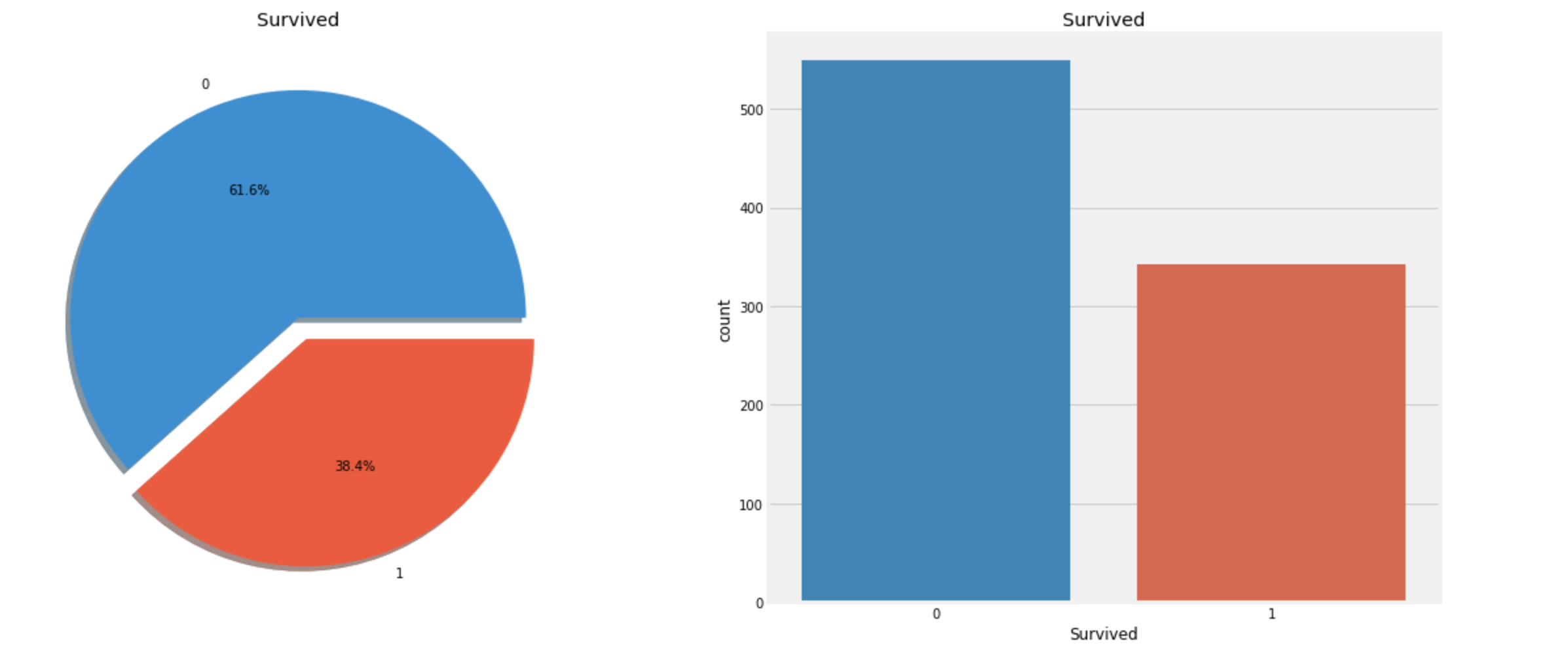
위의 그래프를 보면
살아남은 승객의 비율이 사망한 승객보다 작음을 알 수 있다.
(생존자는 전체 891명 중 342명)
이제 dataset의 살아남은 승객과 그렇지 못한 승객의 data를 각 feature마다 좀 더 깊게 관찰해보자.
1.1.3. feature 유형
- Categorical data(범주형 자료)
- 범주형 자료는 몇개의 범주 또는 항목의 형태로 나타나는 자료를 말한다.
이때, 이 항목들간에 순서가 있는지에 따라 다음 두 type으로 나뉜다.
- Ordinal data(순위형 자료)
- 순서가 있는 범주형 자료.
ex) 1등급, 2등급, 3등급. - 현재 dataset에서의 순위형 자료 :
Pclass
- 순서가 있는 범주형 자료.
- Nominal data(명목형 자료)
- 순서가 없는 범주형 자료.
ex) 서울, 대전, 대구, 부산. - 현재 dataset에서의 명목형 자료 :
Sex,Embarked
- 순서가 없는 범주형 자료.
- 범주형 자료는 몇개의 범주 또는 항목의 형태로 나타나는 자료를 말한다.
- Numerical data(수치형 자료)
- 수치형 자료는 수치로서 측정되는 자료를 말한다.
이때, 성질에 따라 다음 두 type으로 나뉜다.
- Continuous data(연속형 자료)
- 값이 연속적인 자료.
ex) 키, 몸무게. - 현재 dataset에서의 연속형 자료 :
Age,Fare
- 값이 연속적인 자료.
- Discrete data(이산형 자료)
- 셀 수 있는 자료.
ex) 불량품 수. - 현재 dataset에서의 이산형 자료 :
SibSp,Parch
- 셀 수 있는 자료.
- 수치형 자료는 수치로서 측정되는 자료를 말한다.
1.2. 탐색적 데이터 분석(EDA)
1.2.1. Sex
Sexcolumn에 대한 분석을 해보자.- 우선 groupby로
Sex,Survivedcolumn에서Survived를 집계해본다.
data.groupby(['Sex','Survived'])['Survived'].count()Sex Survived
female 0 81
1 233
male 0 468
1 109
Name: Survived, dtype: int64- 성별에 따른
Survived비율과,
각 성별Survived여부를 확인해본다.
f, ax=plt.subplots(1, 2, figsize=(18,8))
df_train[['Sex', 'Survived']].groupby(['Sex']).mean().plot.bar(ax=ax[0])
ax[0].set_title('Survived vs Sex')
sns.countplot('Sex', hue='Survived', data=df_train, ax=ax[1])
ax[1].set_title('Sex: Survived vs Dead')
plt.show()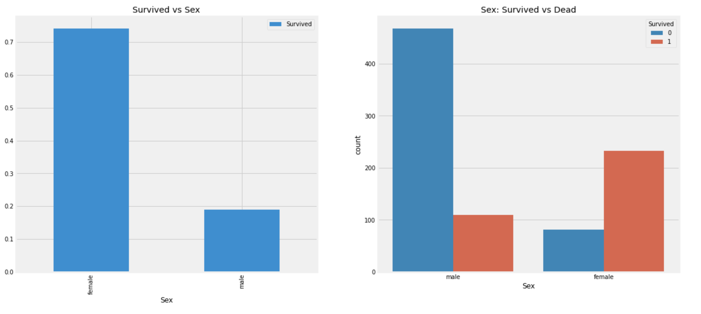
- 배에 탑승한 전체 비율은
male이 많지만 살아남은 사람은female이male의 약 2배임을 알 수 있다. - 또한
female중 생존 비율은 약 233/(81+233)=74% 이고,
male중 생존 비율은 약 109/(468+109)=19% 이다.
1.2.2. Pclass
Pclasscolumn에 대한 분석.
pd.crosstab(df_train.Pclass, df_train.Survived, margins=True).style.background_gradient(cmap='summer_r')
(값이 클 수록 색이 진함.)
Pclass:1의 Survived:1,
Pclass:3의 Survived:0의 값이 크다.
f, ax=plt.subplots(1, 2, figsize=(18,8))
df_train[['Pclass']].value_counts().sort_index().plot.bar(ax=ax[0])
ax[0].set_title('Number of Passengers By Pclass')
ax[0].set_ylabel('Count')
ax[0].set_xticklabels([1,2,3], rotation=0)
sns.countplot('Pclass', hue='Survived', data=df_train, ax=ax[1])
ax[1].set_title('Pclass: Survived vs Dead')
plt.show()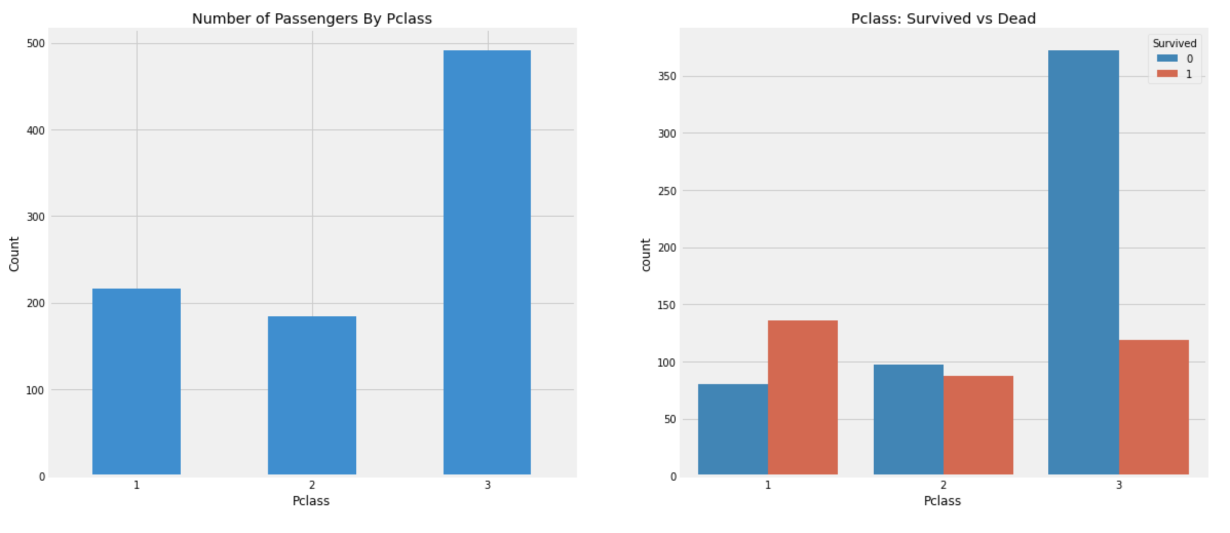
위의 그래프를 보면 Pclass:1의 사람들이 높은 구조순위를 가졌음을 알 수 있다.
Pclass:3의 사람들이 Pclass:1보다 훨씬 많이 탔음에도 불구하고, Pclass:1의 사람들이 더 많이 살아남았다.
df_train[['Pclass','Survived']].groupby('Pclass').mean()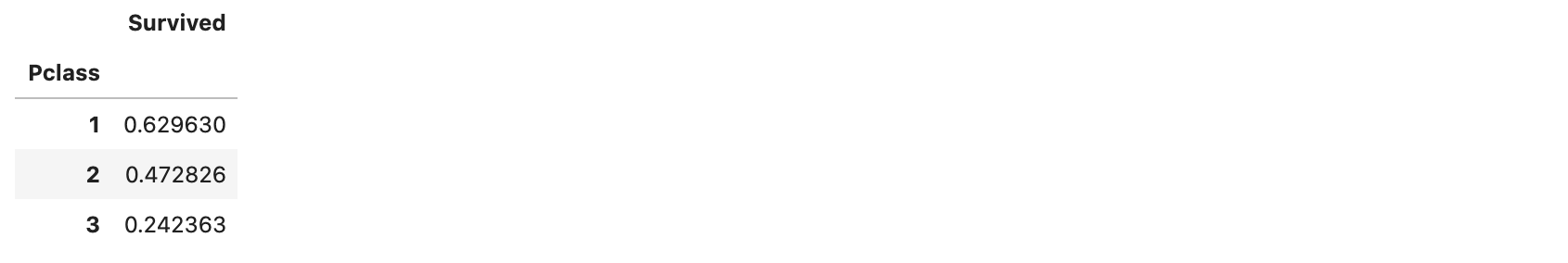
Pclass:1의 사람들은 절반이 넘는 약 63%가 살아남았고,
Pclass:3의 사람들은 약 25%밖에 살아남지 못했다.
- 추가로 위에서 분석했던
Sex도 결합해서 관찰해보자.
pd.crosstab([df_train.Pclass, df_train.Sex], df_train.Survived, margins=True).style.background_gradient(cmap='summer_r')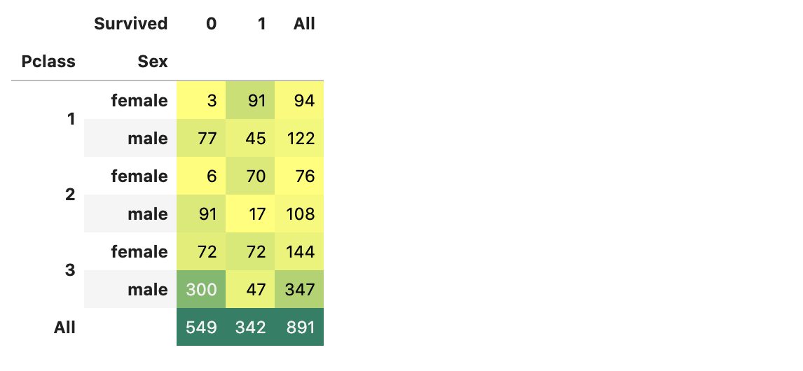
Pclass:1, female 이 가장 많이 살아남았고,
Pclass:3, male 이 가장 많이 사망했다.
sns.factorplot('Pclass', 'Survived', hue='Sex', data=df_train)
plt.show()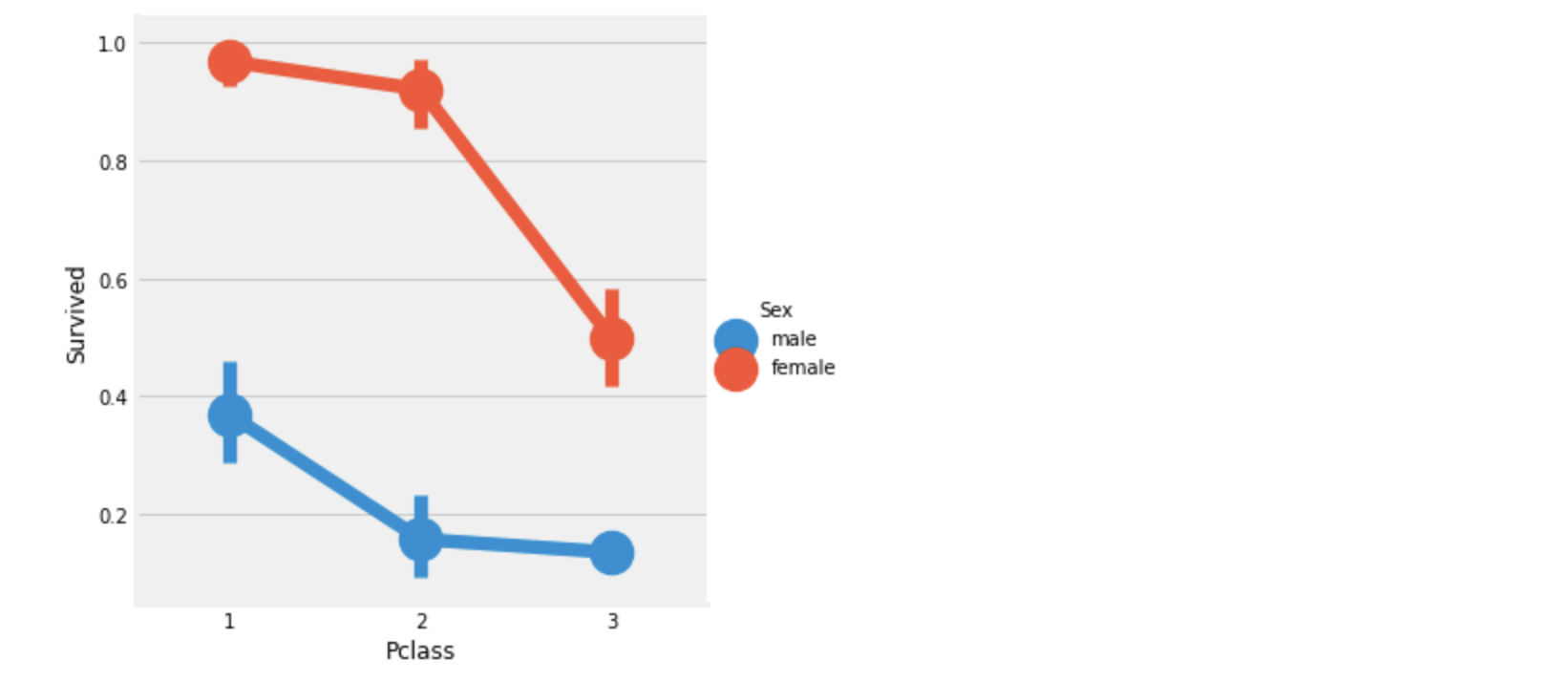
위의 그래프로 보아 Pclass:1, female 이 가장 우선적인 구조를 받았음을 알 수 있고,
Pclass 등급이 낮아질수록 생존률이 낮아짐을 볼 수 있다.
따라서 Pclass도 아주 중요한 feature임을 알 수 있었다.
1.2.3. Age
Agecolumn에 대한 분석.
print('Oldest Passenger\'s age :', df_train['Age'].max())
print('Youngest Passenger\'s age :', df_train['Age'].min())
print('Average Age on the ship :', df_train['Age'].mean())
Oldest Passenger's age : 80.0
Youngest Passenger's age : 0.42
Average Age on the ship : 29.69911764705882f, ax=plt.subplots(1, 2, figsize=(18,8))
sns.violinplot('Sex', 'Age', hue='Survived', data=df_train, split=True, ax=ax[0])
ax[0].set_title('Sex and Age vs Survived')
ax[0].set_yticks(range(0,110,10))
sns.violinplot('Pclass', 'Age', hue='Survived', data=df_train, split=True, ax=ax[1])
ax[1].set_title('Pclass and Age vs Survived')
ax[1].set_yticks(range(0,110,10))
plt.show()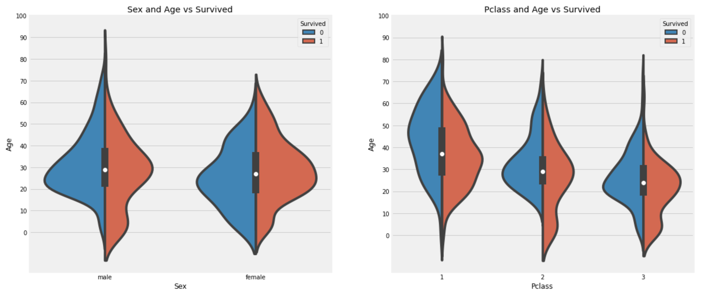
관찰:
- 10세 이하의 어린이들의 수는
Pclass: 1 < 2 < 3으로 증가하고,Pclass에 관계없이 아이들의 생존률은 좋다고 볼 수 있다. - 20~50세의
Pclass:1여성이 우선 구조되었음을 볼 수 있다. male의 경우 나이가 많을 수록 생존률이 많이 떨어짐을 볼 수 있다.
1.2.3.1. FillNan
위에서 보았듯이 우리 dataset의 Age에는 177개의 Nan 값이 있다.
이 값을 채우기 위해 Age column의 평균값으로 넣을 수 있지만, 바로 위의 그래프가 말해주듯 Age는 중요한 feature이다.
또한 [0.42, 80] 구간의 값을 그냥 평균인 29로 대체하는것은 좋은 방법이 아닐 수 있다.
따라서 이 글에서는 Name feature를 이용해 Age의 Nan 값을 채워넣는다.
Name 을 잘 보면 Mr., Mrs. 등으로 시작하는 것을 알 수 있다.
각 대응되는 그룹들의 평균값으로 Age를 대체하면 전체 평균으로 대체하는 것보다 좋은 방법일 것이다.
모든 row의 Name에서 Initial역할을 하는 문자열을 추출해낸다.
df_train['Initial']=0
for i in df_train:
    df_train['Initial']=df_train.Name.str.extract('([A-Za-z]+)\.')

pd.crosstab(df_train.Sex, df_train.Initial).style.background_gradient(cmap='summer_r')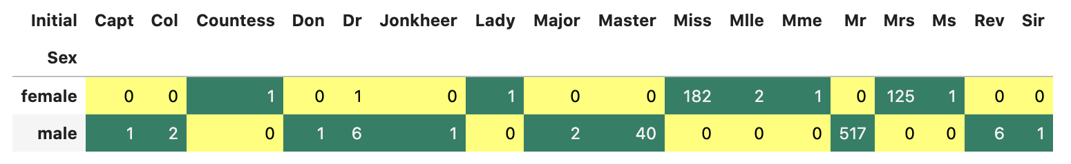
이상치들을 변경 후 각 그룹 별 평균 나이를 구한다.
df_train['Initial'].replace(['Mlle','Mme','Ms','Dr','Major','Lady','Countess','Jonkheer','Col','Rev','Capt','Sir','Don'],['Miss','Miss','Miss','Mr','Mr','Mrs','Mrs','Other','Other','Other','Mr','Mr','Mr'],inplace=True)
df_train.groupby('Initial')['Age'].mean()
Initial
Master 4.574167
Miss 21.860000
Mr 32.739609
Mrs 35.981818
Other 45.888889
Name: Age, dtype: float64각 그룹 별 평균 나이로 Nan값을 채워준다.
df_train.loc[(df_train.Age.isnull())&(df_train.Initial=='Master'),'Age']=5
df_train.loc[(df_train.Age.isnull())&(df_train.Initial=='Miss'),'Age']=22
df_train.loc[(df_train.Age.isnull())&(df_train.Initial=='Mr'),'Age']=33
df_train.loc[(df_train.Age.isnull())&(df_train.Initial=='Mrs'),'Age']=36
df_train.loc[(df_train.Age.isnull())&(df_train.Initial=='Other'),'Age']=46

df_train['Age'].isnull().any()FalseAge에는 더이상 Nan값이 없다.
data를 관찰하기 위해 히스토그램으로 그려보자.
f, ax=plt.subplots(1, 2, figsize=(18, 8))
df_train[df_train['Survived']==0].Age.plot.hist(ax=ax[0], edgecolor='black', bins=20)
ax[0].set_title('Survived = 0')
x_range = list(range(0,85,5))
ax[0].set_xticks(x_range)
df_train[df_train['Survived']==1].Age.plot.hist(ax=ax[1], edgecolor='black', bins=20)
ax[1].set_title('Survived = 1')
ax[1].set_xticks(x_range)
plt.show()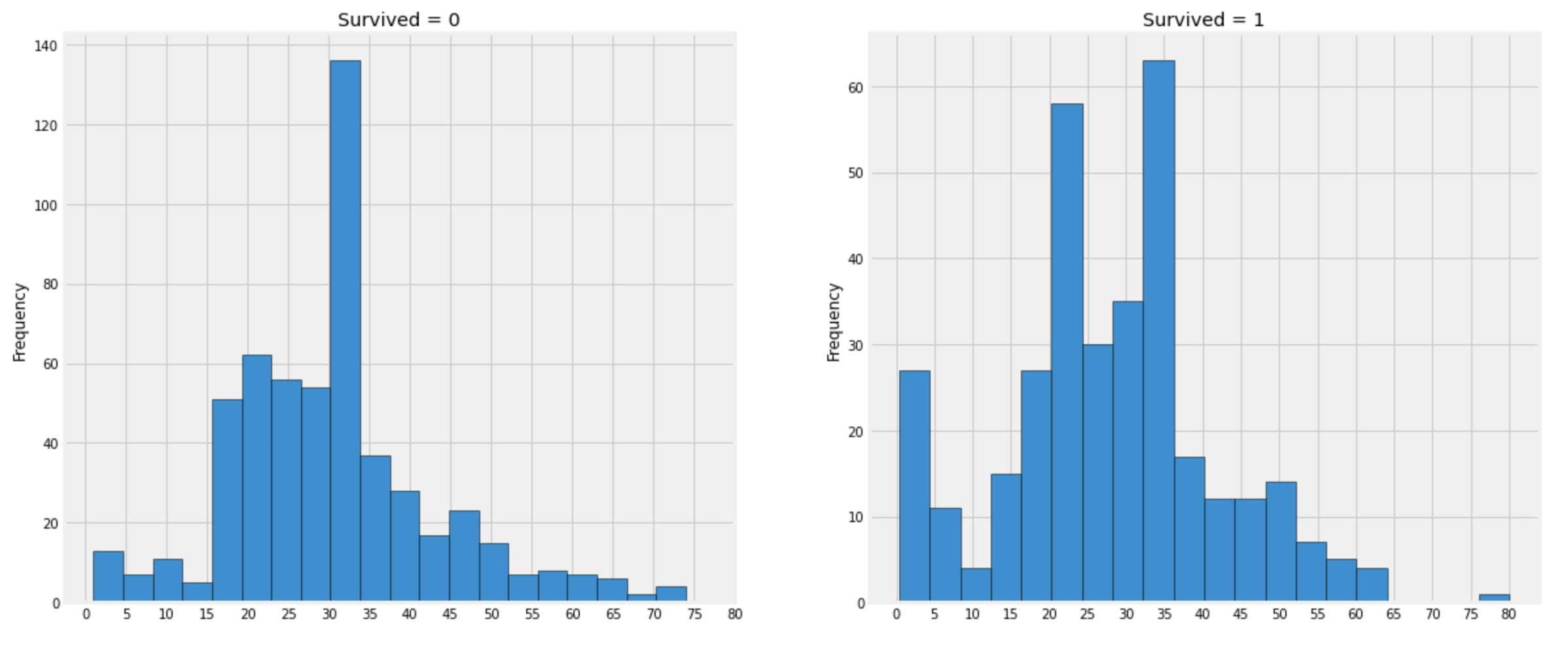
관찰:
- 5세 이하의 유아는 대부분이 생존했다.
- 최고령이었던 80세 승객은 생존했다.
- 30-35세의 그룹이 가장 많이 사망했다.
sns.factorplot('Pclass', 'Survived', col='Initial', data=df_train)
plt.show()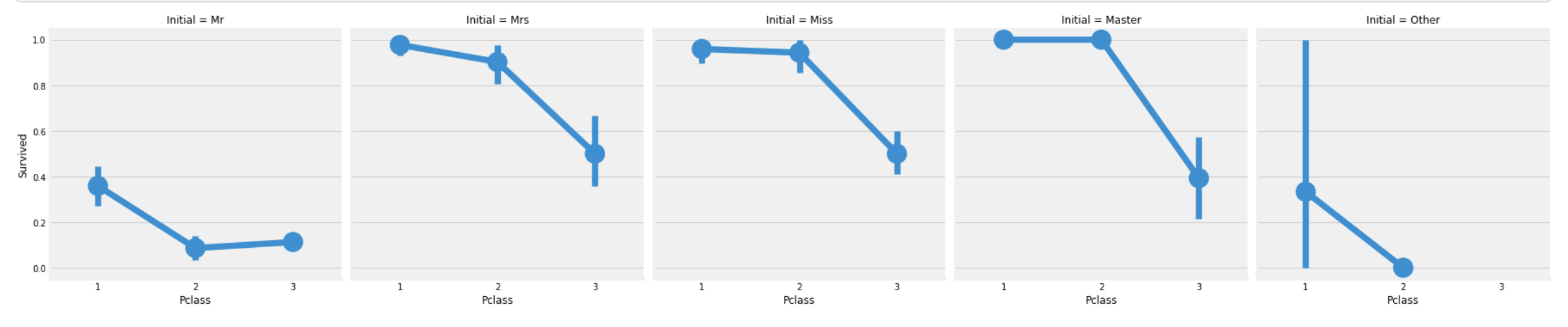
여성그룹인 Mrs, Miss 그룹과
평균 연령 5세인 Master 그룹이 가장 많이 생존했고,
그 수는 Pclass에도 관련이 있다.
1.2.4. Embarked
Embarkedcolumn에 대한 분석
pd.crosstab([df_train.Embarked, df_train.Pclass], [df_train.Sex, df_train.Survived], margins=True).style.background_gradient(cmap='summer_r')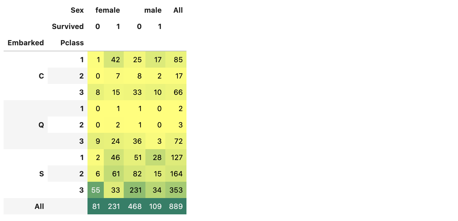
sns.factorplot('Embarked', 'Survived', data=df_train)
fig=plt.gcf()
fig.set_size_inches(5,3)
plt.show()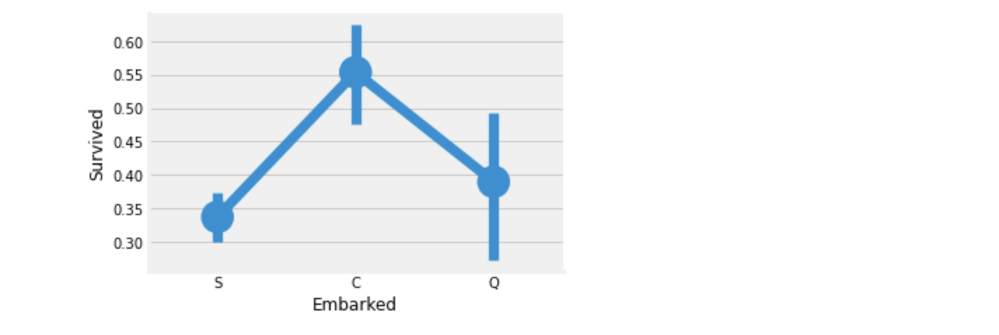
위 두 그래프를 보면 Port C 에서 승선한 승객들의 생존비율이 가장 높다.
f, ax=plt.subplots(2, 2, figsize=(20,15))
sns.countplot('Embarked', data=df_train, ax=ax[0,0])
ax[0,0].set_title('Number of Passengers Boarded')
sns.countplot('Embarked', hue='Sex', data=df_train, ax=ax[0,1])
ax[0,1].set_title('Male-Female Split for Embarked')
sns.countplot('Embarked', hue='Survived', data=df_train, ax=ax[1,0])
ax[1,0].set_title('Embarked vs Survived')
sns.countplot('Embarked', hue='Pclass', data=df_train, ax=ax[1,1])
ax[1,1].set_title('Embarked vs Pclass')
plt.subplots_adjust(wspace=0.2, hspace=0.5)
plt.show()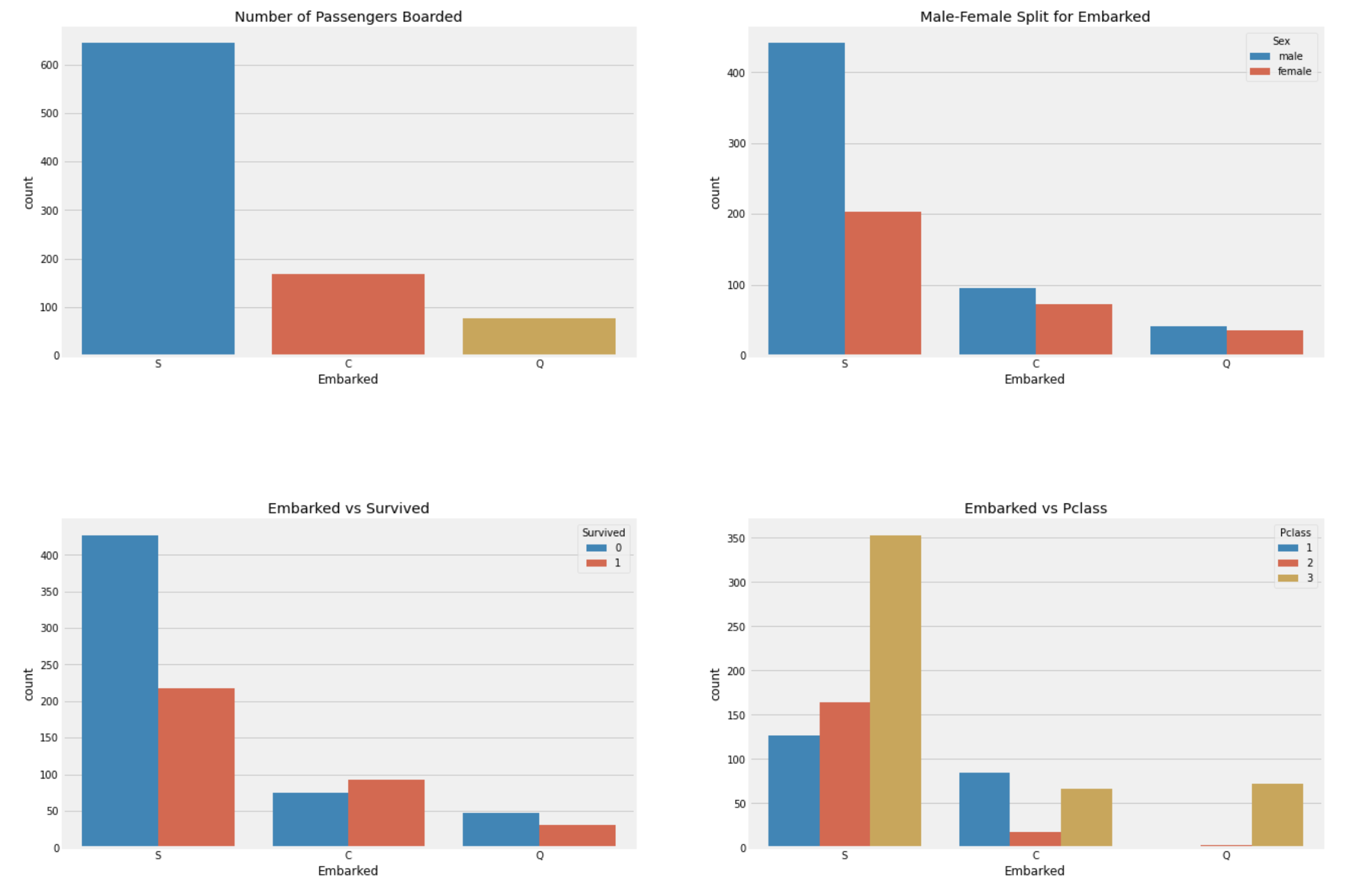
관찰:
- 승객들이 가장 많이 탑승한 Port는 S이고, 그 중 대다수는
Pclass:3이다. - C에서 승선한 승객들은 생존자의 비율이 더 높다. 이유는
Pclass:1승객들이 많기 때문이다. - S에서는
Pclass:1승객이 가장 많이 승선했지만,Pclass:3승객도 많이 승선했기 때문에, 사망자의 비율이 높다. - Q의 승객중 95%이상은
Pclass:3이다.
sns.factorplot('Pclass', 'Survived', hue='Sex', col='Embarked', data=df_train)
plt.show()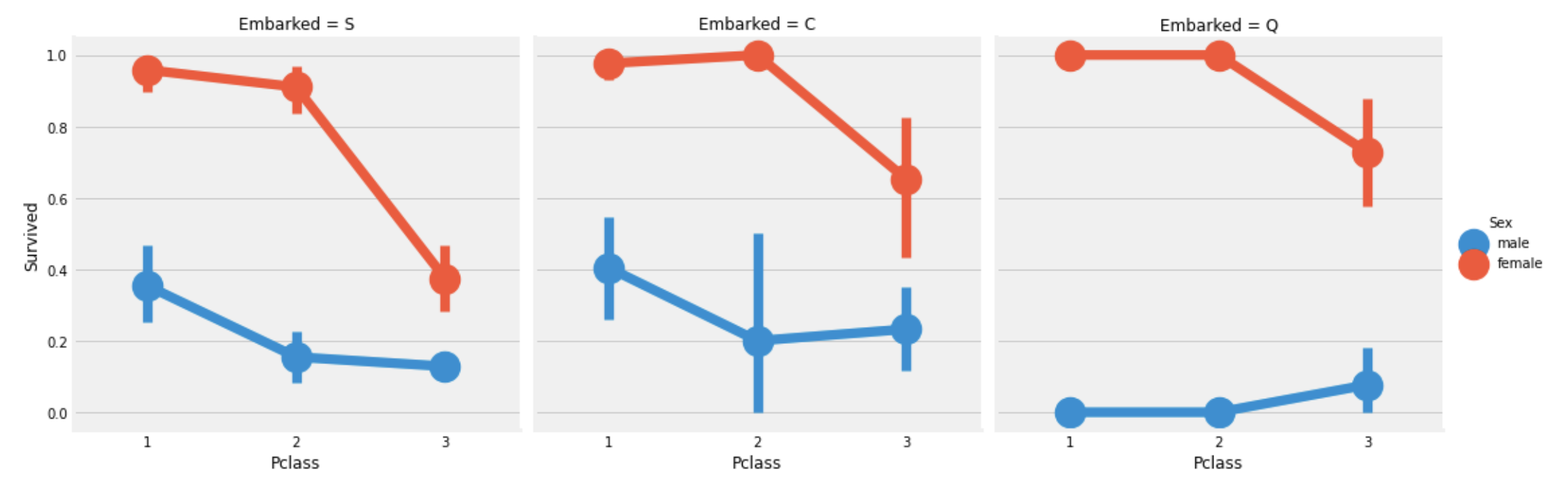
관찰:
Pclass:1,Pclass:2의 여성은Embarked에 관계없이 1에 가까운 생존확률을 보인다.- Port S의 경우
Pclass:3은 남녀구분없이 작은 생존 확률을 보인다. - Port Q의 남자는 가장 운이 없다.(Q에서의 승객은 대부분
Pclass:3이었음)
1.2.4.1. FillNan
Embarked column은 2개의 Nan값을 갖고 있다.
위에서 관찰한 대로 대부분의 승객은 S에서 탑승했으므로,
이 2개의 Nan값은 S로 채워줘도 무방할것으로 보인다.
df_train['Embarked'].fillna('S', inplace=True)
df_train['Embarked'].isnull().any()False1.2.5. SibSp
SibSpcolumn에 대한 분석SibSp는 혼자인지 또는 가족 구성원들과 같이 탑승했는지를 나타내는 feature이다.- Sibling = brother, sister, stepbrother, stepsister
- Spouse = husband, wife
pd.crosstab([df_train.SibSp], df_train.Survived).style.background_gradient(cmap='summer_r')
f, ax=plt.subplots(1, 2, figsize=(20,8))
sns.barplot('SibSp',  'Survived', data=df_train, ax=ax[0])
ax[0].set_title('SibSp vs Survived')
sns.pointplot('SibSp', 'Survived', data=df_train, ax=ax[1])
ax[1].set_title('SibSp vs Survived')
plt.show()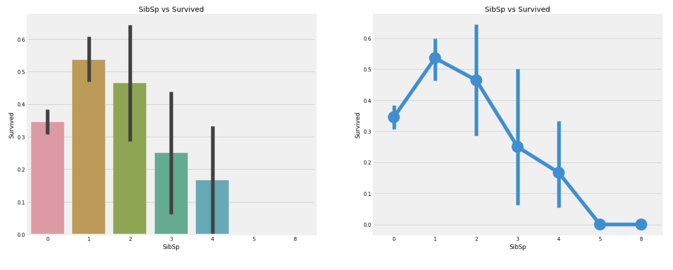
pd.crosstab(df_train.SibSp, df_train.Pclass).style.background_gradient(cmap='summer_r')
관찰:
- 각
Pclass에는 혼자 탄 승객이 제일 많다. - 혼자 탄 승객의 경우, 약 34%의 생존 확률을 보인다.
- 같이 탄 가족의 수가 1보다 많아지면 점점 생존률이 떨어진다.
- 이는 예상 가능하다. 내가 사는것보다 가족들을 구하려고 할 것이기 때문이다.
- 5~8명의 가족과 함께 탑승한 승객의 생존확률은 0이다. 마지막 표를 보면
Pclass의 영향이 큰 것을 알 수 있다.
1.2.6. Parch
Parchcolumn에 대한 분석Parch는 다음의 관계로 가족을 정의한다.- Parent = mother, father
- Child = daughter, son, stepdaughter, stepson
pd.crosstab(df_train.Parch, df_train.Pclass).style.background_gradient(cmap='summer_r')
위의 crosstab은 Pcalss:3에 가족이 제일 많음을 보인다.
f, ax=plt.subplots(1, 2, figsize=(20, 8))
sns.barplot('Parch', 'Survived', data=df_train, ax=ax[0])
ax[0].set_title('Parch vs Survived')
sns.pointplot('Parch', 'Survived', data=df_train, ax=ax[1])
ax[1].set_title('Parch vs Survived')
plt.show()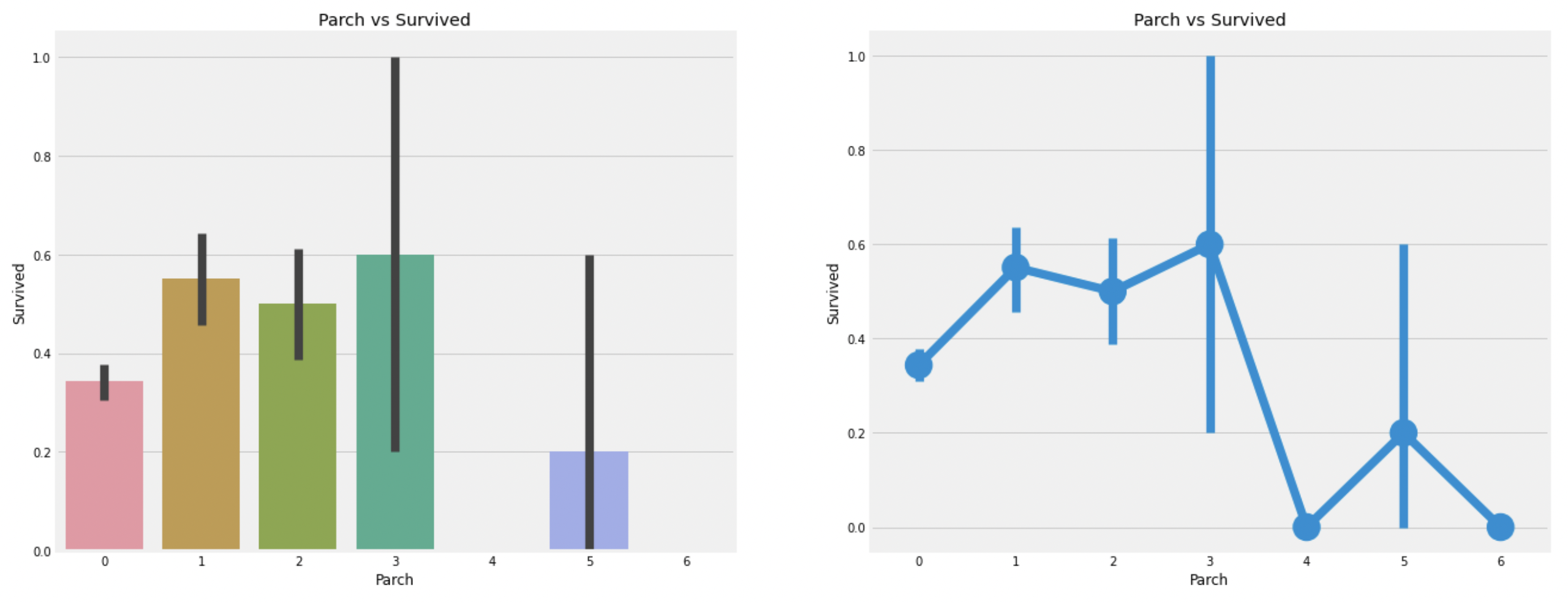
관찰:
Parch의 모습은SibSp의 결과와 비슷하다.- 부모와 같이 탄 승객은 생존확률이 높고(1~3), 수가 많아지면 감소한다.
1.2.7. Fare
Farecolumn에 대한 분석.
print('Highest Fare was :',df_train['Fare'].max())
print('Lowest Fare was :',df_train['Fare'].min())
print('Average Fare was :', df_train['Fare'].mean())
Highest Fare was : 512.3292
Lowest Fare was : 0.0
Average Fare was : 32.2042079685746(최소 0원을 지불한 승객도 있다)
f, ax=plt.subplots(1, 3, figsize=(20, 8))
sns.distplot(df_train[df_train['Pclass']==1].Fare, ax=ax[0])
ax[0].set_title('Fares in Pclass 1')
sns.distplot(df_train[df_train['Pclass']==2].Fare, ax=ax[1])
ax[1].set_title('Fares in Pclass 2')
sns.distplot(df_train[df_train['Pclass']==3].Fare, ax=ax[2])
ax[2].set_title('Fares in Pclass 3')
plt.show()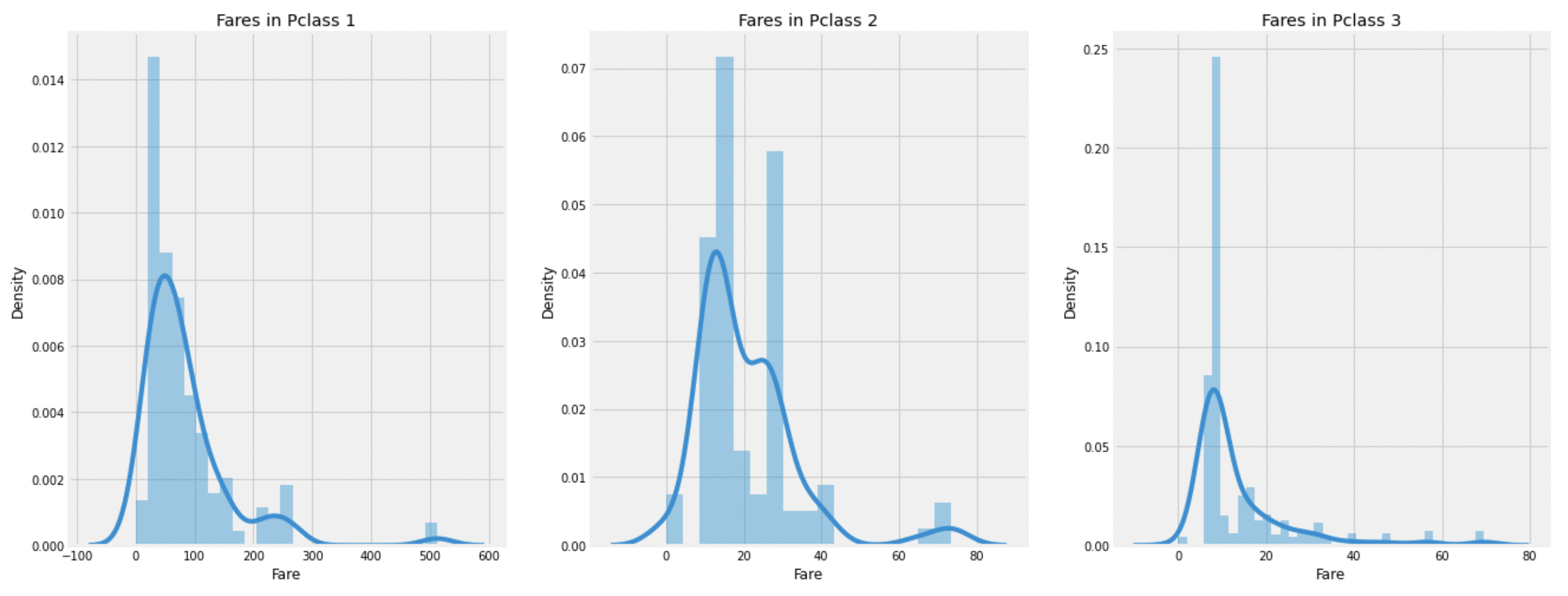
비교적 Pclass:1의 승객들이 많은 요금을 지불했고,
나름의 정규분포와 유사한 모습을 보인다.
이 Fare 값들은 연속형자료이기 때문에 뒤에서 이산형 자료로 바꿔줄것이다.
1.3. EDA 요약
- 각 feature에 대한 요약.
Sex : 여성이 더 높은 생존률을 보인다.
Pclass : Pclass:1의 승객들이 높은 생존률을 보이며, Pclass:3의 승객들의 생존률은 매우 낮다. 특히 Pclass:1,2의 여성들은 생존률의 거의 1에 가깝다.
Age : 5~10세 어린이들의 생존률은 높고, 15~35세의 사람들의 사망률이 가장 높다.
Embarked : Pclass:1의 승객은 S에서 가장 많이 탑승했지만, Pclass:3승객도 많이 탑승했기때문에, C에서 탑승한 승객의 생존률이 가장 높다. Q에서 탑승한 대부분의 승객은 Pclass:3이다.
SibSp + Parch : 1~2의 SibSp 또는 1~3의 Parch 값을 보이는 승객들의 생존률이 혼자이거나 많은 가족과 탑승한 승객보다 생존률이 높다.
1.3.1. Feature끼리의 상관관계
- heatmap을 이용해 feature들끼리의 관계를 보인다.
sns.heatmap(df_train.corr(), annot=True, cmap='RdYlGn', linewidth=0.2)
fig=plt.gcf()
fig.set_size_inches(10, 8)
plt.show()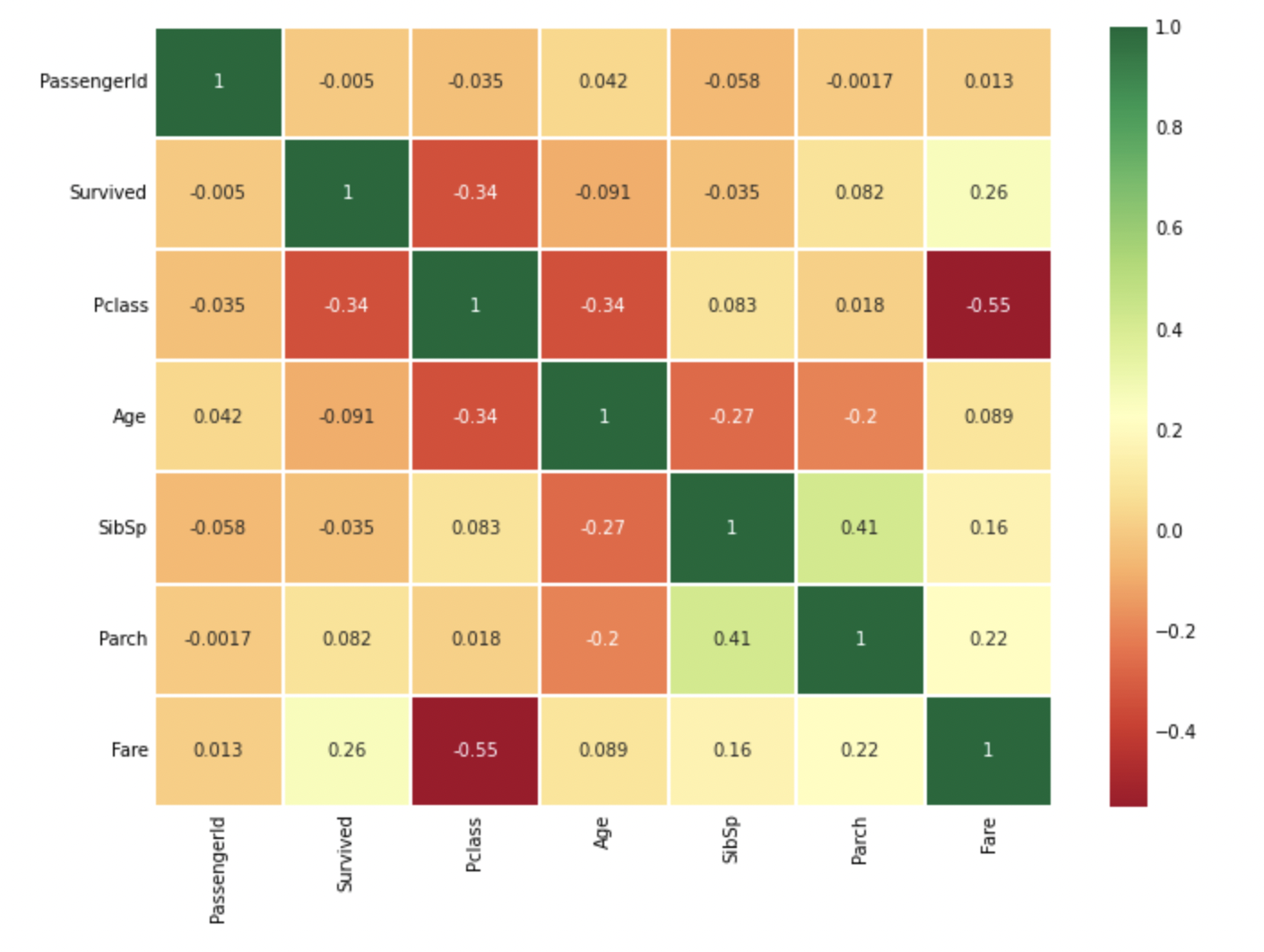
(heatmap은 numeric한 특성만 비교 가능하다.)
히트맵 분석:
- 양의 값이면 두 변수가 같은 방향으로 움직인다.
- 음의 값이면 두 변수가 반대 방향으로 움직이다.
만약 어떤 두 feature가 매우 높은 상관관계를 갖는다면,
그 두 feature는 정보의 차이가 거의 없다고 볼 수 있다.
이러한 경우 두 feature는 중복되기 때문에 모두 사용할 필요가 없다.
training시 시간을 단축하고, 계산량을 줄일 수 있다.
위의 heatmap에서는 높은 상관관계를 갖지는 않음을 알 수 있다.
가장 큰 값이 0.41이므로, 둘 다 사용할 수 있을 것으로 보인다.
2. Feature Engineering and Data Cleaning
Feature Engineering
- 어떤 dataset이 주어진 경우, 모든 feature가 다 중요하진 않다.
즉, 제거해야 할 불필요한 feature가 있을 수 있고,
또한 서로 다른 feature들끼리 조합하여 새로운 feature를 만들어 낼 수도 있다.- 예로 우리는 Name을 가지고 Initial이라는 새로운 feature를 만들었다.
2.1. Age_band
- 머신러닝 모델에서 continuous data인
Age를 그대로 사용하는 것은 좋지 않을 수 있다.
따라서 이 continuous value들을 categorical value로 변환하여 사용 할 것이다.
가장 많은 나이의 승객은 80세 이므로,
5개의 그룹으로 나누기 위해 80/5=16으로 각 그룹을 나눈다.
df_train['Age_band']=0
df_train.loc[df_train['Age']<=16, 'Age_band']=0
df_train.loc[(df_train['Age']>16)&(df_train['Age']<=32), 'Age_band']=1
df_train.loc[(df_train['Age']>32)&(df_train['Age']<=48), 'Age_band']=2
df_train.loc[(df_train['Age']>48)&(df_train['Age']<=64), 'Age_band']=3
df_train.loc[df_train['Age']>64, 'Age_band']=4
df_train.head()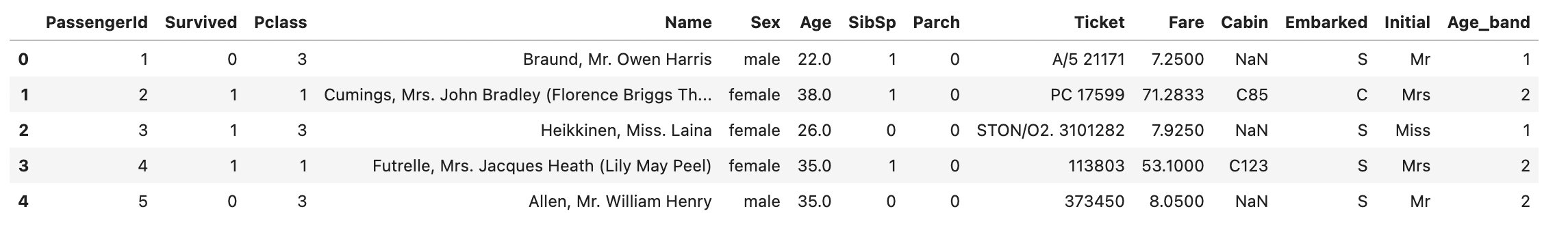
df_train['Age_band'].value_counts().sort_index().to_frame().style.background_gradient(cmap='summer_r')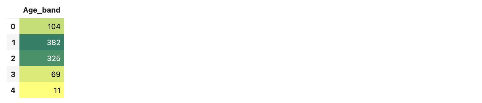
Age_band:1,2에 속하는 승객이 가장 많다.
sns.factorplot('Age_band', 'Survived', data=df_train, col='Pclass')
plt.show()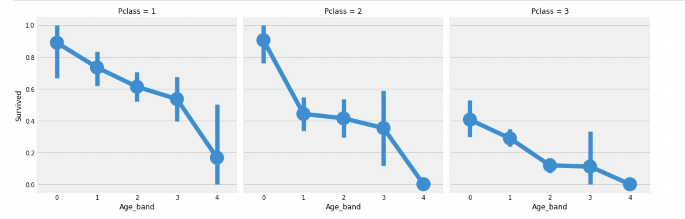
알고있는대로 Pclass와 상관없이 Age_band에 따라 생존률이 감소함을 볼 수 있다.
2.2. Family_Size and Alone
여기서는 Family_Size, Alone feature를 새로 만든다.
Family_Size는 SibSp와 Parch를 더해서 만들고,
이 중 Family_Size가 0인 경우 Alone은 True이다.
df_train['Family_Size']=0
df_train['Family_Size']=df_train['SibSp']+df_train['Parch']
df_train['Alone']=0
df_train.loc[df_train.Family_Size==0, 'Alone']=1

f, ax=plt.subplots(1, 2, figsize=(18, 6))
sns.pointplot('Family_Size', 'Survived', data=df_train, ax=ax[0])
ax[0].set_title('Family_Size vs Survived')
sns.pointplot('Alone', 'Survived', data=df_train, ax=ax[1])
ax[1].set_title('Alone vs Survived')
plt.show()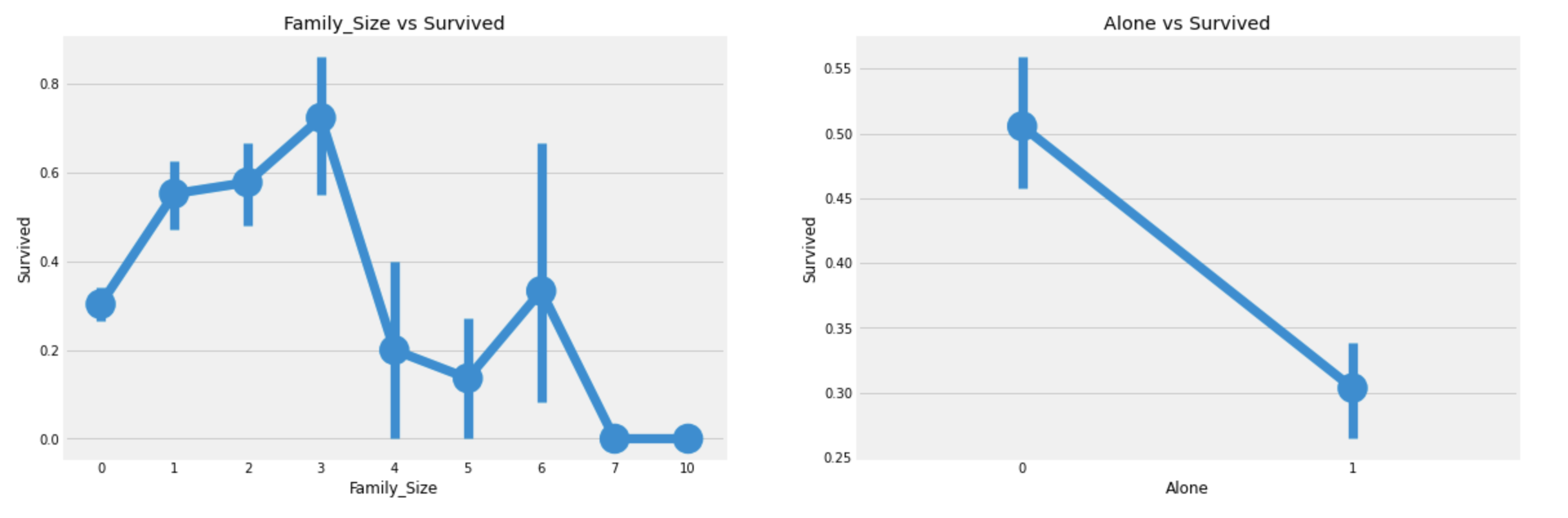
혼자인 승객은 생존률이 낮고,
Family_Size도 3보다 크면 생존률이 감소한다.
sns.factorplot('Alone', 'Survived', data=df_train, hue='Sex', col='Pclass')
plt.show()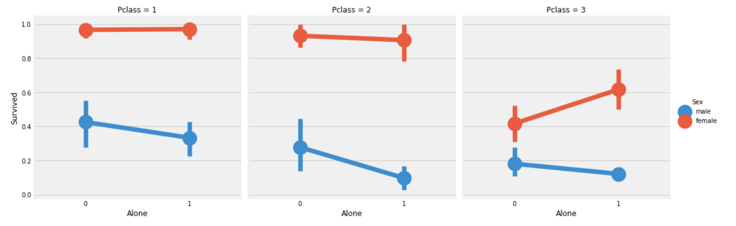
Pclass:3의 혼자인 여성만 제외하고,
혼자인 승객의 생존률은 감소한다.
2.3. Fare_Range
Fare도 연속형 자료이므로 순위형 자료로 변환해준다.
이때, Fare은 편차가 크기 때문에,
동일한 길이가 아닌, 동일한 갯수로 나누어준다.
이때 사용하는것이 pandas의 qcut이다.
df_train['Fare_Range']=pd.qcut(df_train['Fare'], 4)
df_train.groupby(['Fare_Range'])['Survived'].count().to_frame()
df_train.groupby(['Fare_Range'])['Survived'].mean().to_frame().style.background_gradient(cmap='summer_r')
위를 보면 Fare_Range가 높아질수록 생존확률이 높아짐을 볼 수 있다.
이제 이 Fare_Range를 그냥 사용할 수 없으니, integer encoding을 해준다.
df_train['Fare_cat']=0
df_train.loc[df_train['Fare']<=7.91, 'Fare_cat']=0
df_train.loc[(df_train['Fare']>7.91)&(df_train['Fare']<=14.454), 'Fare_cat']=1
df_train.loc[(df_train['Fare']>14.454)&(df_train['Fare']<=31.0), 'Fare_cat']=2
df_train.loc[df_train['Fare']>31.0, 'Fare_cat']=3

sns.factorplot('Fare_cat', 'Survived', data=df_train, hue='Sex')
plt.show()
Fare_cat이 증가함에따라 생존률이 올라간다.
2.4. Convert String to Numeric
- 머신러닝 모델이 인자로 받아들일 수 있도록 string type의 feature를 numeric한 type으로 변환한다.
one-hot encoding으로 관계성을 갖지 않도록 바꿔주었다.
sex = pd.get_dummies(df_train['Sex'], drop_first=True)
embark = pd.get_dummies(df_train['Embarked'], drop_first=True)
initial = pd.get_dummies(df_train['Initial'], drop_first=True)
df_train = pd.concat([df_train, sex, embark, initial], axis=1)
2.5. Dropping UnNeeded Features
이제 training에 필요없는 data를 삭제한다.
df_train.drop(['Name','Sex','Age','Ticket','Fare','Embarked','Initial','Cabin','Fare_Range','PassengerId'], axis=1, inplace=True)

sns.heatmap(df_train.corr(), annot=True, cmap='RdYlGn', linewidths=0.2, annot_kws={'size':12})
fig=plt.gcf()
fig.set_size_inches(13,10)
plt.xticks(fontsize=14)
plt.yticks(fontsize=14)
plt.show()
3. Modeling
EDA를 통해 많은 통찰을 얻을 수 있었지만,
그것만으로는 새로운 승객 data의 생존여부를 파악하기 힘들다.
다음의 알고리즘들을 이용해 생존여부 분류 모델을 얻을 예정이다.
1) Logistic Regression
2) Support Vector Machines(Linear and radial)
3) Decision Tree
4) Random Forest
5) Naive Bayes
6) K-Nearest Neighbors
3.1. Setting data
3.1.1. Import module
from sklearn.linear_model import LogisticRegression
from sklearn import svm
from sklearn.ensemble import RandomForestClassifier
from sklearn.neighbors import KNeighborsClassifier
from sklearn.naive_bayes import GaussianNB
from sklearn.tree import DecisionTreeClassifier
from sklearn.model_selection import train_test_split
from sklearn import metrics
from sklearn.metrics import confusion_matrix
3.1.2. Split train, test data
- sklearn의
train_test_split을 이용해
train_data와validation_data를 나눈다.
data = df_train[df_train.columns[1:]]
target = df_train['Survived'].values
x_train, x_test, y_train, y_test = train_test_split(data, target, test_size=0.3, random_state=0, stratify=target)
X = df_train[df_train.columns[1:]]
Y = df_train['Survived']
3.2. Predict
각 모델을 정의하고, train data로 훈련(fit)한다.
이후 test set으로 predict하여 accuracy를 얻는다.
3.2.1. Logistic Regression
model = LogisticRegression()
model.fit(x_train, y_train)
prediction1 = model.predict(x_test)
print('Accuracy of Logistic Regression is',metrics.accuracy_score(prediction1, y_test))
The accuracy of Logistic Regression is 0.82835820895522383.2.2. Linear SVM
model=svm.SVC(kernel='linear', C=0.1, gamma=0.1)
model.fit(x_train, y_train)
prediction2=model.predict(x_test)
print('Accuracy of linear SVM is',metrics.accuracy_score(prediction2, y_test))
Accuracy of linear SVM is 0.81343283582089553.2.3. rbf SVM
model=svm.SVC(kernel='rbf', C=0.1, gamma=0.1)
model.fit(x_train, y_train)
prediction3=model.predict(x_test)
print('Accuracy of rbf SVM is',metrics.accuracy_score(prediction3, y_test))
Accuracy of rbf SVM is 0.82462686567164183.2.4. Decision Tree
model=DecisionTreeClassifier()
model.fit(x_train, y_train)
prediction4=model.predict(x_test)
print('Accuracy of Decision Tree is',metrics.accuracy_score(prediction4, y_test))
Accuracy of Decision Tree is 0.79850746268656713.2.5. Random Forest
model=RandomForestClassifier(n_estimators=100)
model.fit(x_train, y_train)
prediction5=model.predict(x_test)
print('Accuracy of Random Forests is',metrics.accuracy_score(prediction5, y_test))
Accuracy of Random Forests is 0.81343283582089553.2.6. Naive Bayes
model=GaussianNB()
model.fit(x_train, y_train)
prediction6=model.predict(x_test)
print('Accuracy of Naive Bayes is',metrics.accuracy_score(prediction6, y_test))
Accuracy of Naive Bayes is 0.41417910447761193.2.7. K-Nearest Neighbors
model=KNeighborsClassifier()
model.fit(x_train, y_train)
prediction7=model.predict(x_test)
print('Accuracy of KNN is',metrics.accuracy_score(prediction7, y_test))
Accuracy of KNN is 0.80970149253731343.2.7.1. Various values of n_neighbors
a_index=list(range(1,11))
accuracies=[]

for i in a_index:
    model=KNeighborsClassifier(n_neighbors=i)
    model.fit(x_train, y_train)
    prediction=model.predict(x_test)
    accuracies.append(metrics.accuracy_score(prediction, y_test))

plt.plot(a_index, accuracies)
plt.xticks(a_index)
fig=plt.gcf()
fig.set_size_inches(12,6)
plt.show()
print('Accuracies for different values of n are:',accuracies,'with the max value as ',max(accuracies))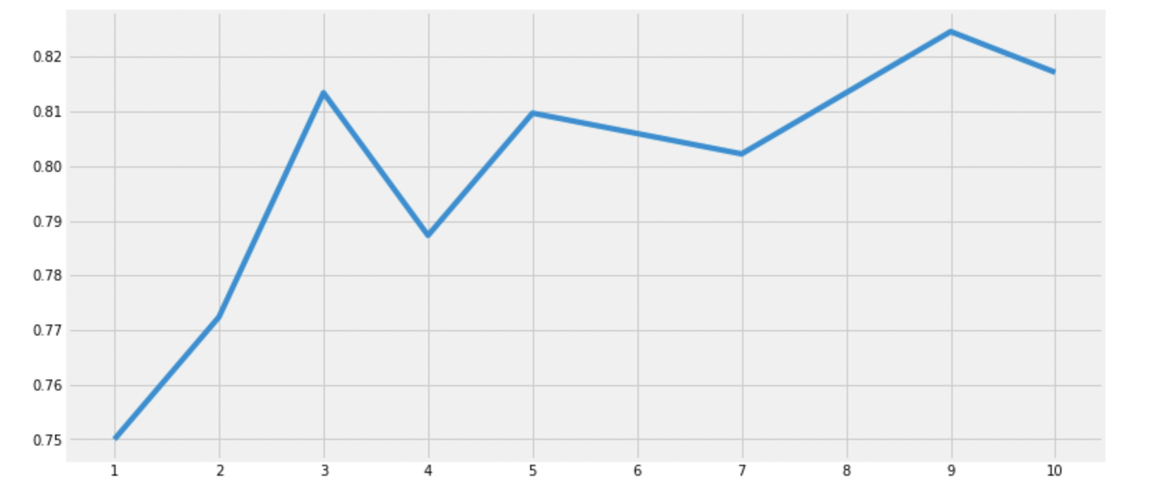
Accuracies for different values of n are: [0.75, 0.7723880597014925, 0.8134328358208955, 0.7873134328358209, 0.8097014925373134, 0.8059701492537313, 0.8022388059701493, 0.8134328358208955, 0.8246268656716418, 0.8171641791044776] with the max value as 0.8246268656716418다양한 알고리즘을 이용해 성능 평가를 진행했다.
하지만 여기서 나온 정확도가 실제 data에 대해 같은 정확도를 보인다고는 보장할 수 없다.
train에 쓰인 data가 아닌 실제 data에서는 정확도가 감소하거나, 증가할 수 있는데, 이를 variance라고 한다.
이 variance를 줄이기 위해 Cross Validation기법을 사용한다.
4. Cross Validation
대부분의 경우 data는 불균형하다.
때문에, train, test dataset에 들어있는 인스턴스들은 불균형하게 분포하고,
이는 train과 test결과가 다를 수 있음을 뜻한다.
따라서 데이터의 모든 부분을 사용하여 모델을 검증하고,
그 중 최적의 효과를 내는 모델을 선택한다.
즉, 모델 자체의 성늘을 개선하는 것이 아니고, 일반화를 위한 과정이다.
K-Fold Cross Validation 순서
1. dataset을 k개의 subset으로 나눈다.
(이때, 최종 제출에 사용하는 test set은 애초에 별개의 dataset임을 주의하자.)
2. 위에서 나눈 subset중 하나를 test로 사용, 나머지는 train data로 사용한다.
3. test로 사용하는 data를 변경하며 동일하게 진행한다.
4. k개의 지표를 평균(경우에 따라 다를 수 있음)내어 최종적으로 모델 성능을 평가한다.
from sklearn.model_selection import KFold
from sklearn.model_selection import cross_val_score
from sklearn.model_selection import cross_val_predict

kfold = KFold(n_splits=10, shuffle=True, random_state=0)
xyz=[]
accuracy=[]
std=[]
classifiers=['Logistic Regression', 'Linear SVM', 'Radial SVM', 'Decision Tree', 'Random Forest', 'KNN']
models=[LogisticRegression(), svm.SVC(kernel='linear'), svm.SVC(kernel='rbf'), DecisionTreeClassifier(), RandomForestClassifier(n_estimators=100), KNeighborsClassifier(n_neighbors=9)]
for model in models:
    cv_result = cross_val_score(model,X,Y, cv=kfold, scoring='accuracy')
    xyz.append(cv_result.mean())
    std.append(cv_result.std())
    accuracy.append(cv_result)

new_models_dataframe2=pd.DataFrame({'CV Mean':xyz, 'Std':std}, index=classifiers)
new_models_dataframe2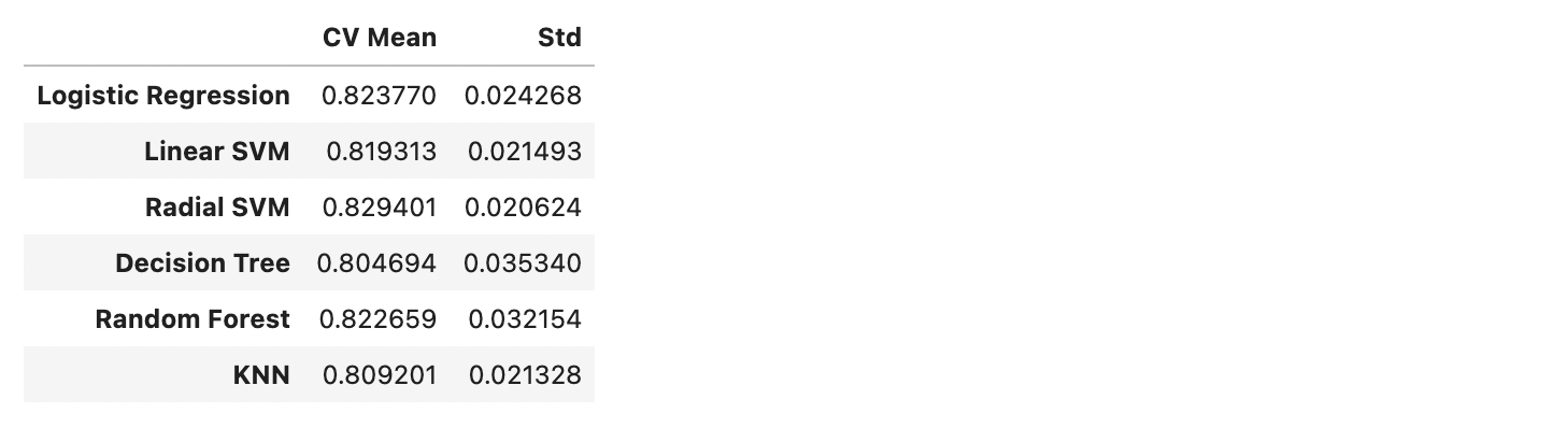
plt.subplots(figsize=(12,6))
box=pd.DataFrame(accuracy, index=[classifiers])
box.T.boxplot()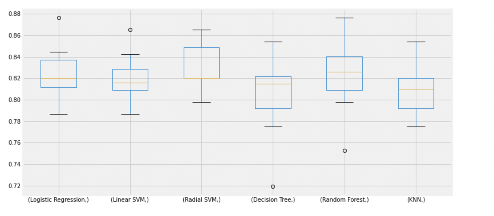
new_models_dataframe2['CV Mean'].plot.barh(width=0.8)
plt.title('Average CV Mean Accuracy')
fig=plt.gcf()
fig.set_size_inches(8,5)
plt.show()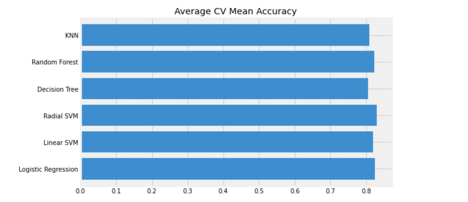
accuracy는 단적으로 숫자만 보여주기때문에, 오해가 생길 수 있다.
confusion Matrix를 이용해 모델이 어디서 잘못 예측하는지 확인해보자.
4.1. Confusion Matrix
f,ax=plt.subplots(2,3,figsize=(15,10))
y_pred = cross_val_predict(LogisticRegression(),X,Y,cv=10)
sns.heatmap(confusion_matrix(Y,y_pred),ax=ax[0,0],annot=True,fmt='2.0f')
ax[0,0].set_title('Matrix for Logistic Regression')
y_pred = cross_val_predict(svm.SVC(kernel='linear'),X,Y,cv=10)
sns.heatmap(confusion_matrix(Y,y_pred),ax=ax[0,1],annot=True,fmt='2.0f')
ax[0,1].set_title('Matrix for Linear-SVM')
y_pred = cross_val_predict(svm.SVC(kernel='rbf'),X,Y,cv=10)
sns.heatmap(confusion_matrix(Y,y_pred),ax=ax[0,2],annot=True,fmt='2.0f')
ax[0,2].set_title('Matrix for rbf-SVM')
y_pred = cross_val_predict(DecisionTreeClassifier(),X,Y,cv=10)
sns.heatmap(confusion_matrix(Y,y_pred),ax=ax[1,0],annot=True,fmt='2.0f')
ax[1,0].set_title('Matrix for Decision Tree')
y_pred = cross_val_predict(RandomForestClassifier(n_estimators=100),X,Y,cv=10)
sns.heatmap(confusion_matrix(Y,y_pred),ax=ax[1,1],annot=True,fmt='2.0f')
ax[1,1].set_title('Matrix for Random-Forests')
y_pred = cross_val_predict(KNeighborsClassifier(n_neighbors=9),X,Y,cv=10)
sns.heatmap(confusion_matrix(Y,y_pred),ax=ax[1,2],annot=True,fmt='2.0f')
ax[1,2].set_title('Matrix for KNN')
plt.subplots_adjust(hspace=0.2,wspace=0.2)
plt.show()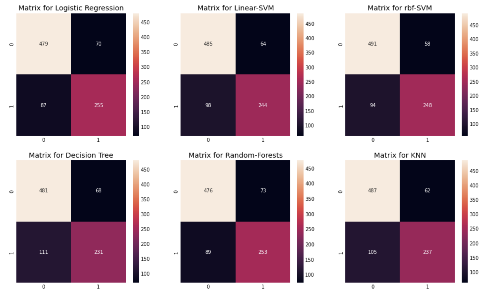
confusion matrix 관찰:
- confusion matrix의 행은 실제 값, 열을 예측값을 의미한다.
위에서 왼쪽위->오른쪽아래 대각선은 올바르게 예측한 경우,
(actual-0, predict-0 or actual-1, predict-1)
왼쪽아래->오른쪽위 대각선은 예측이 틀린 경우를 나타낸다.
(actual-0, predict-1 or actual-1, predict-0) - 3번째 rbf-SVM을 예를 들면, 이 모델은 491+248개의 옳은 예측을 했고, 이에 대한 정확도는 (491+248)/891 = 82.94%로 위에서 구한 CV mean과 같은 값을 보임을 알 수 있다.
- 또한 에러로는 58명의 사망자를 생존자로 분류했고, 94명의 생존자를 사망했다고 분류했음을 볼 수 있다. 이 모델은 생존자를 사망했다고 잘못 예측하는 경우가 더 많다.
5. Hyper Parameter Tuning
input data의 각 feature들의 가중치들이 training 과정에서 더 나은 방향으로 변하게 된다.
이 과정은 내부적으로 기계처럼 동작하지만 사람이 보기에 블랙박스와 같이 느껴질 수 있다.
이때 우리는 사람이 직접 수정할 수 있는 hyperparameter를 바꿔가며 더 나은 학습 속도와 accuracy를 얻을 수 있다.
위에서 가장 높은 accuracy를 보인 rbf-SVM 모델의
hyper-parameter를 튜닝해보자.
from sklearn.model_selection import GridSearchCV
C=[0.05,0.1,0.2,0.3,0.25,0.4,0.5,0.6,0.7,0.8,0.9,1]
gamma=[0.1,0.2,0.3,0.4,0.5,0.6,0.7,0.8,0.9,1.0]
kernel=['rbf']
hyper={'kernel':kernel,'C':C,'gamma':gamma}
gd=GridSearchCV(estimator=svm.SVC(),param_grid=hyper,verbose=True)
gd.fit(X,Y)
print(gd.best_score_)
print(gd.best_estimator_)
Fitting 5 folds for each of 120 candidates, totalling 600 fits
0.8305065595380077
SVC(C=0.5, gamma=0.2) C=0.5, gamma=0.2에서 가장 높은 accuracy를 얻을 수 있다.
6. 정리.
처음으로 데이터를 하나하나 살펴가며 각 feature의 특성과,
서로 다른 feature간의 상관관계등을 살펴보며 전체 데이터의 유형을 알 수 있었다.
하나하나 눈으로 '잘' 볼 수 있도록 만드는것이 고통이지만 좋은 모델을 만들기 위해 데이터를 완벽히 이해하는것은 필수적임을 이해했다.
다양한 데이터를 만나보고, 그 데이터 특성에 가장 잘 맞는 모델을 찾아내기 위해
많은 경험과 노력이 필요할듯!
kaggle에 좋은 예시들이 많아서 배우기 너무 좋다!!!