4강 ( 처음 ~ 01:33:42 )
학습내용
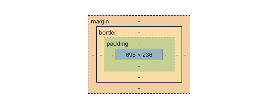
box-model
- margin
- padding
- border
- content
html
<!DOCTYPE html>
<html>
<head>
<meta charset="utf-8">
<link rel="stylesheet" type="text/css" href="css/style.css">
</head>
<body>
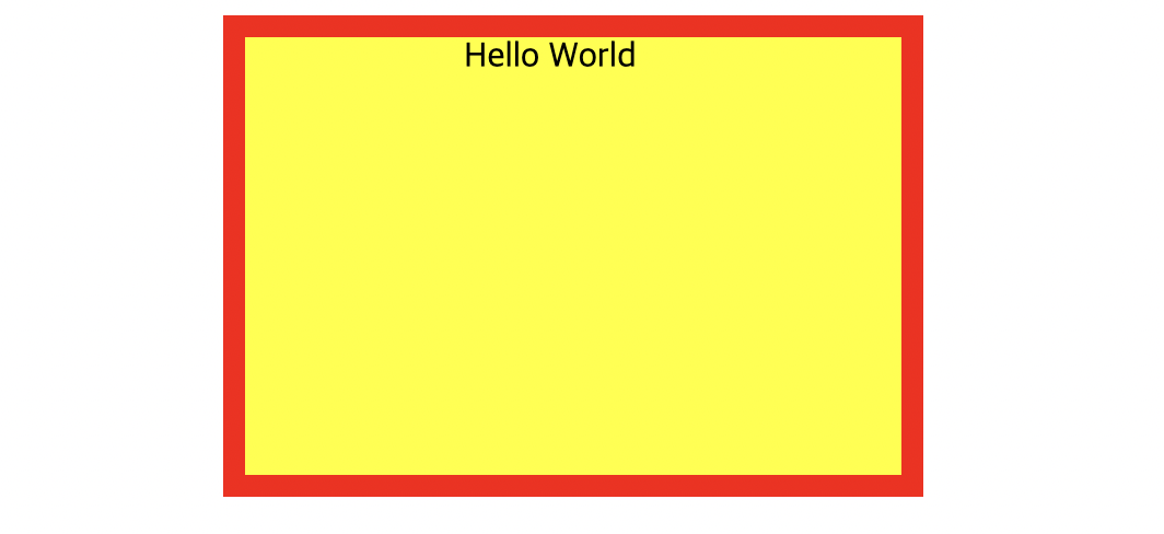
<div class="box-model">
Hello World
</div>
</body>
</html>css
.box-model {
	width: 200px;
	height: 200px;
	background-color: yellow;
	border: solid 10px red;

	margin-left: 100px;
	padding-left: 100px;
}
같은 의미
1
	margin-left: 100px;
	margin-top: 100px;
	margin-right: ;
	margin-bottom: ;

	padding-left: 100px;
	padding-top: 100px;
	padding-bottom: ;
	padding-right: ;
2
	margin: 100px 0px 0 100px;
	padding: 100px 0 0 100px;
->시계 방향으로 생각. top right bottom left
css - default로 넣어주기. 모든 방향 0이라는 의미
html, body {
margin: 0;
padding: 0;
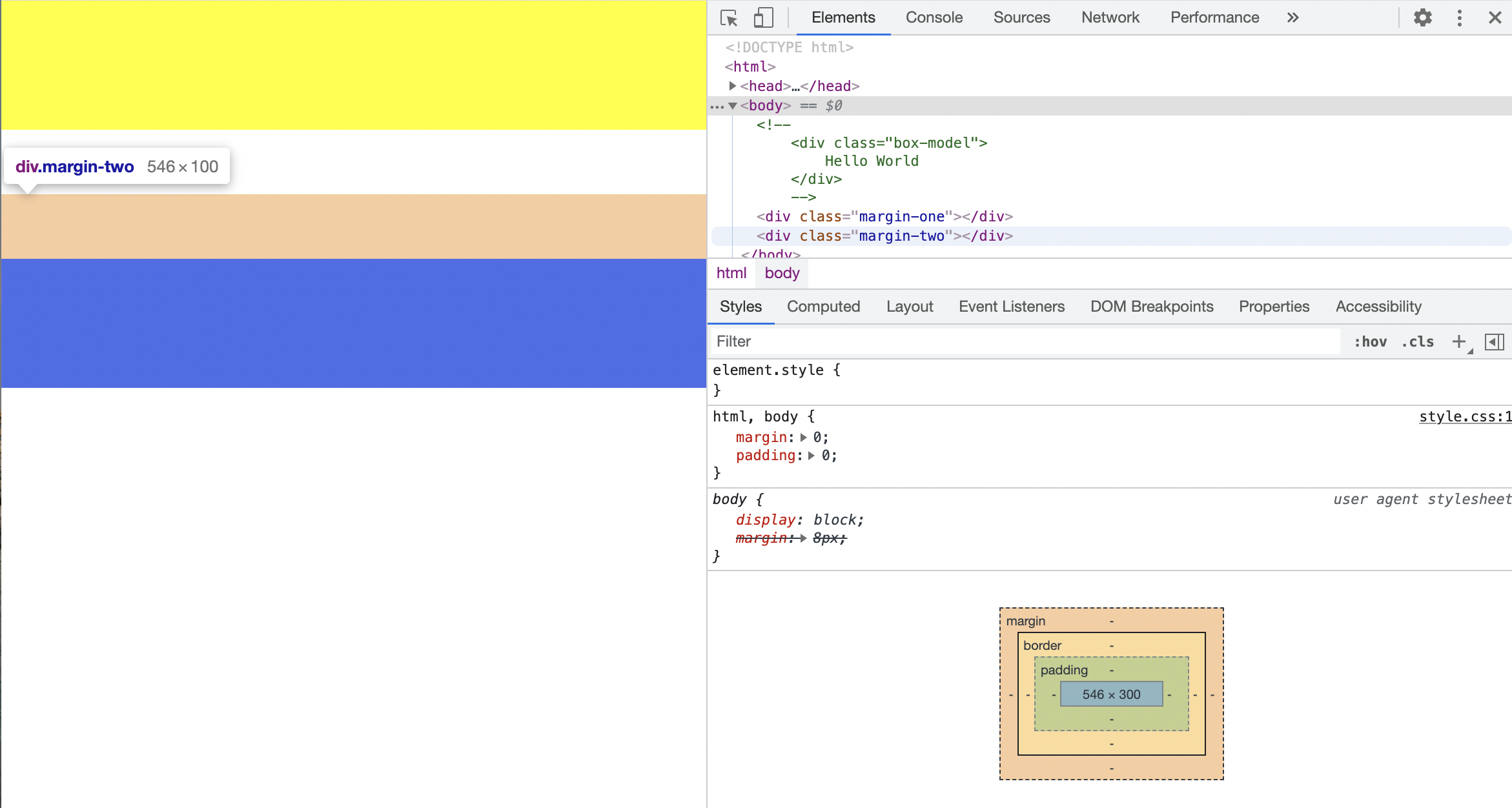
}box-sizing: border-box;
만든 공간 유지하면서 padding으로 위치 변경하고 싶을 때
- margin 공백 공유하는 경우
큰 숫자의 우선순위가 높음(큰 값이 작은 값을 병합)
html
	<div class="margin-one"></div>
 	<div class="margin-two"></div>
css
.margin-one {
	width: 100%;
	height: 100px;
	background-color: yellow;

	margin-bottom: 100px;
}

.margin-two {
	width: 100%;
	height: 100px;
	background-color: blue;

	margin-top: 50px;
}
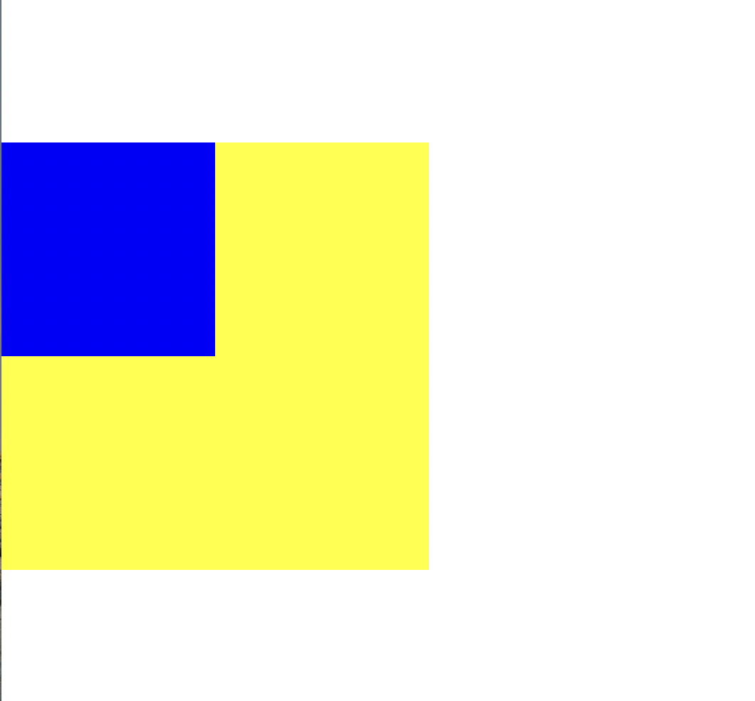
html
<div class="margin-parent">

 	 	<div class="margin-child"></div>

 	 </div>
css
.margin-parent {
	width: 300px;
	height: 300px;
	background-color: yellow;
}

.margin-child {
	width: 150px;
	height: 150px;
	background-color: blue;
}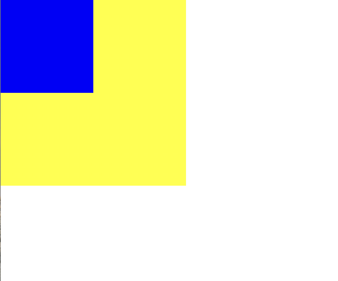
css (margin-child에)
margin-top: 100px;파란색 부분만 내려가는 줄 알았는데 같이 내려감
자식 부모 병합되어서
css (margin-child)
position: absolute;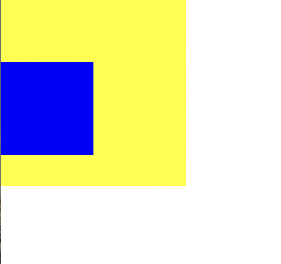
position:absolute; 넣고
병합없이 파란 부분만 내려감
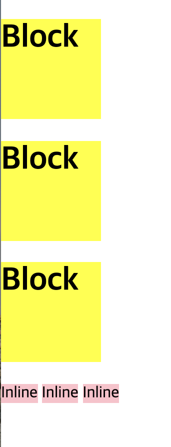
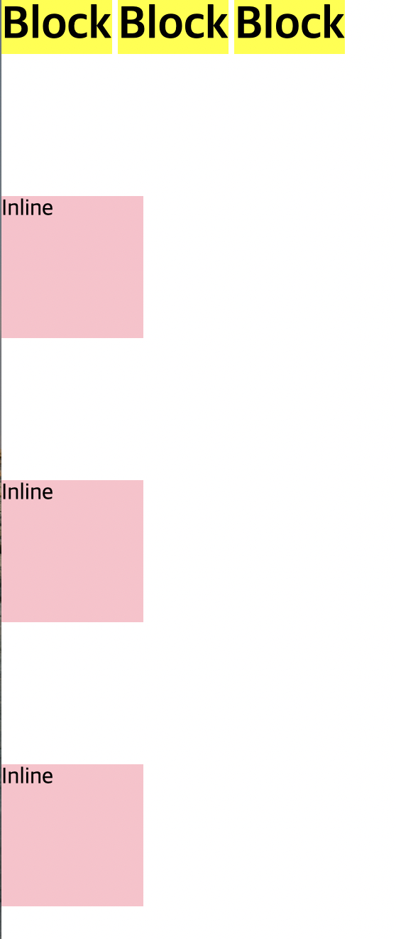
html
 	<h1>Block</h1>
 	<h1>Block</h1>
 	<h1>Block</h1>

 	<span>Inline</span>
 	<span>Inline</span>
 	<span>Inline</span>
css
h1 {
	width: 100px;
	height: 100px;
	background-color: yellow;
}

span {
	width: 100px;
	height: 100px;
	background-color: pink;
}
각각
css
margin-top: 100px;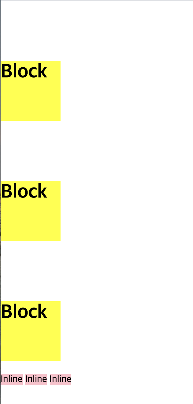
서로 특성을 바꿔서 적용하고 싶을 때
h1 {
	display: inline;

	width: 100px;
	height: 100px;
	background-color: yellow;

	margin-top: 100px;
}

span {
	display: block;

	width: 100px;
	height: 100px;
	background-color: pink;

	margin-top: 100px;
}
display 태그 이용
vertical-align
메뉴 만들 때 자주 사용 display: inline-block;
html
	<span class="inline">Inline</span>
 	<span class="inline-block">Inline-Block</span>
 	<img src="https://via.placeholder.com/200">
css
.inline-block {
	display:  inline-block;

	width: 100px;
	height: 100px;
	background-color: yellow;
}
짜잔
뒤죽박죽
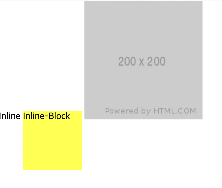
정렬을 하기 위해서
.inline, .inline-block, img {
	vertical-align: top;
}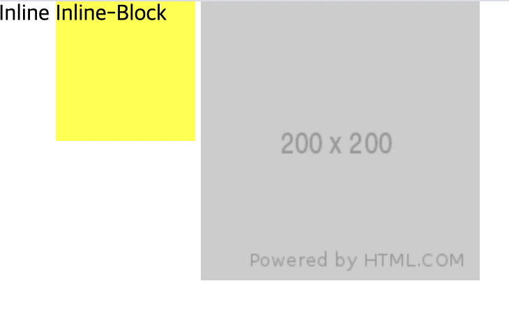
참고) vertical-align: ;
top; middle; bottom;
은 inline에서만 먹힘
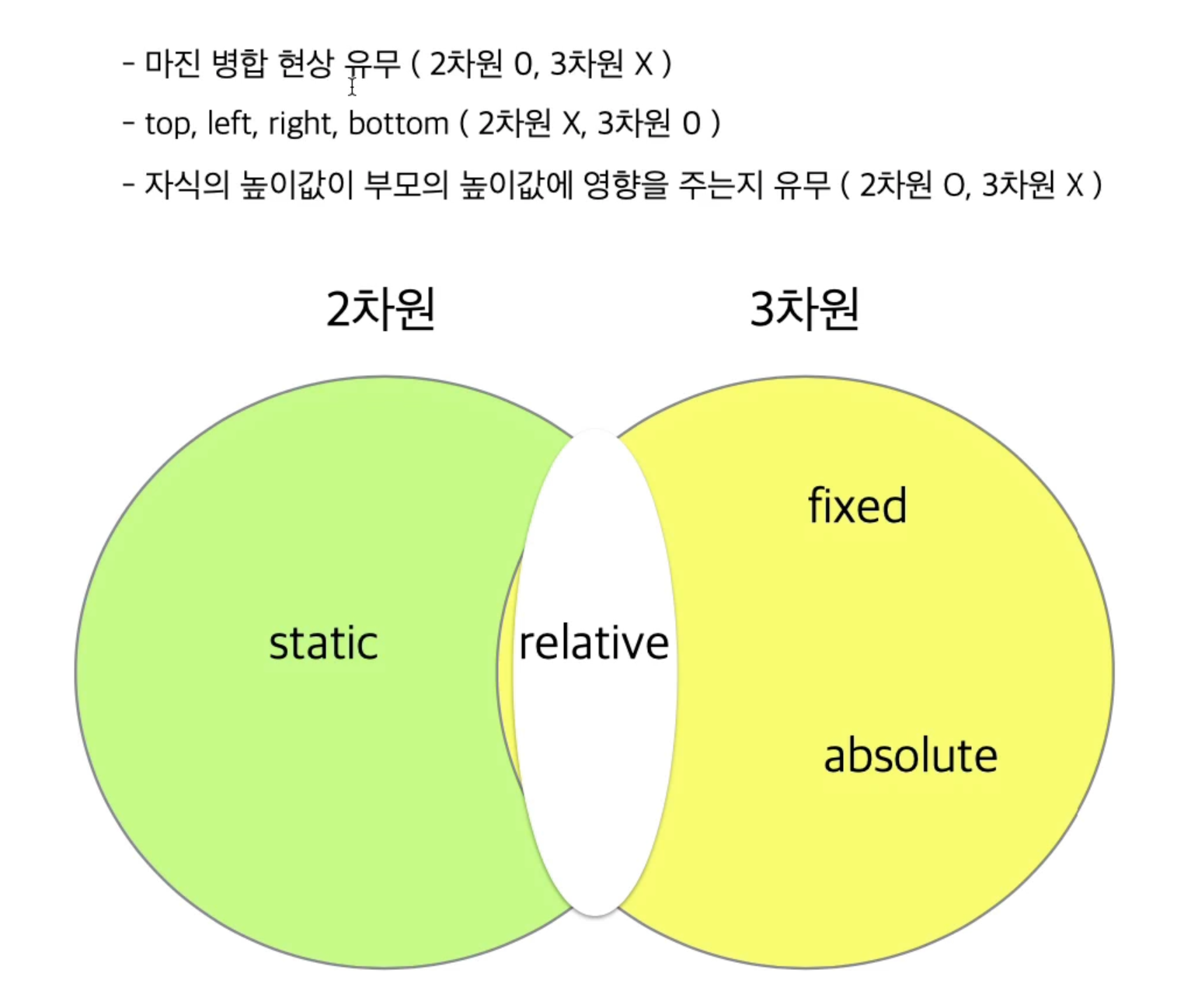
position 속성
-
margin-top 사용시 부모 자식 지간에 발생하는 마진 병합 현상이 일어나는지...
-
top, right, bottom, left 속성을 사용할 수 있는지
-
자식의 높이 값이 부모에게 영향을 주는지
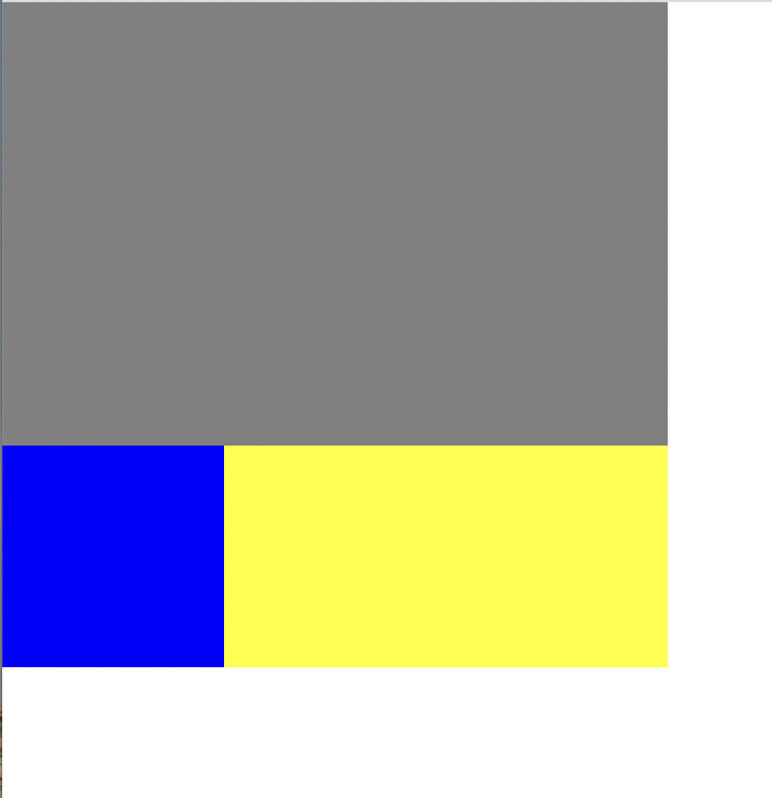
html
 	<div class="static-parent">
 		<div class="static-child"></div>

 	</div>
css
.static-parent {
	width: 300px;
	/*height: 300px;*/
	background-color: yellow;
}

.static-child {
	position:  static;

	width: 150px;
	height: 150px;
	background-color: blue;

	/*margin-top: 100px;*/
	/*top:  100px;*/

}
부모 높이값 없을 때 자식 높이값이 적용(2차원)
노란색 부분은 300이 아니라 150이 되는 것임
position: static; 없애도 똑같이 적용된다. 모든 html 태그는 기본적으로 position: static; 상태. 2차원으로 시작
html
 	<div class="box1"></div>
 	<div class="fixed-parent">
 		<div class="fixed-child"></div>
 	</div>

 	<div class="box2"></div>
css
.box1 {
	width: 300px;
	height: 200px;
	background-color: gray;
}

.fixed-parent {
	width: 300px;
	height: 300px;
	background-color: yellow;
}


.fixed-child {
	width: 100px;
	height: 100px;
	background-color: blue;
}

.box2 {
	width: 300px;
	height: 2000px;
	background-color: green;
}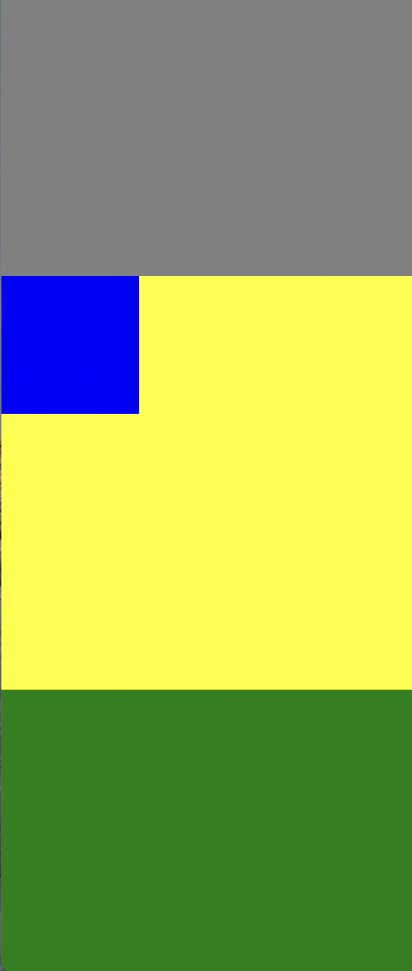
브라우저 왼쪽 상단을 기준으로 움직인다.
자식의 높이값이 부모에게 영향 x (3차원)
html과 css 모두
아까했던 fixed를 relative로만 바꿔줌
css
margin-top: 100px;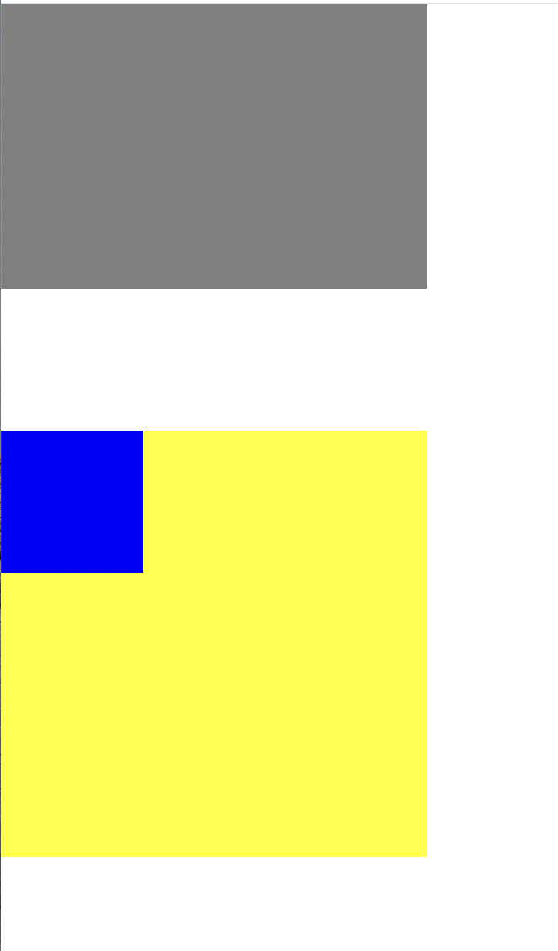
css
	/*margin-top: 100px;*/
	top: 100px;
fixed는 브라우저 기준으로 움직이지만
relative는 최초 파란색 있었던 위치 기준으로 움직임
.relative-parent {
	width: 300px;
	/*height: 300px;*/
	background-color: yellow;
}
부모 높이값 제거
자식의 높이값이 부모에게 영향을 주고 있음
-
position relative는 margin top을 사용했을 때 margin 병합 현상 일어남. top left right bottom 사용 가능. 최초 있었던 위치 기준으로 좌표 형성.
부모가 높이값 가지고 있지 않을 때 자식의 높이값이 부모에게 영향 o -
position absolute는 margin 병합 현상 일어나지 x. top left right bottom 사용 가능. 자식의 높이값이 부모에게 영향x(fixed와 동일). 3차원 특징
어려웠던 점
margin border padding content
static relative fixed absolute
용어들도 생소하고 어떤 말인지 강의를 들어도 잘 모르겠고 헷갈렸다.
해결방법
구글링을 해보았다
static 기본값, relative 자기 자신 기준, absolute 부모 기준, fixed 기준
학습소감
fixed를 빼면 27가지의 경우의 수가 나오는데 오늘은 이것을 다 해보고 이해를 해야겠다. 하나씩 배우는 건 이해하기 쉽지만 나중에 잘 써먹으려면 계속 해보는 방법 밖에 없는 것 같다.
0개의 댓글
관련 채용 정보


