4강(01:33:42 - 02:47:54)
z-index
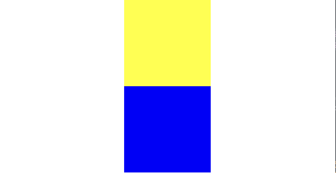
html
<div class="z-one"></div>
	<div class="z-two"></div>
css
.z-one {
	width: 200px;
	height: 200px;
	background-color: yellow;
}

.z-two {
	width: 200px;
	height: 200px;
	background-color: blue;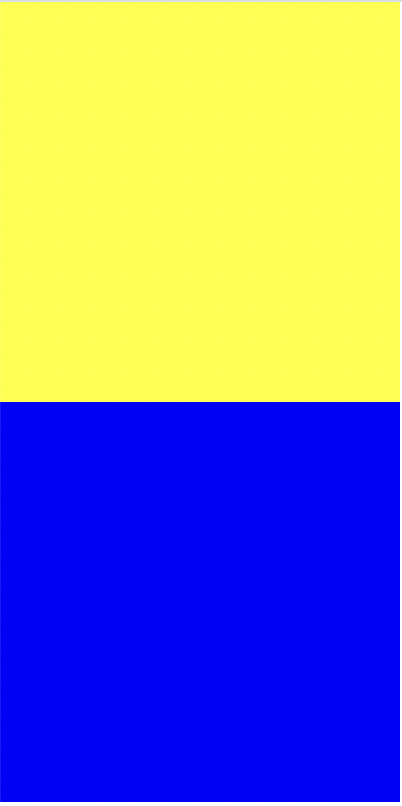
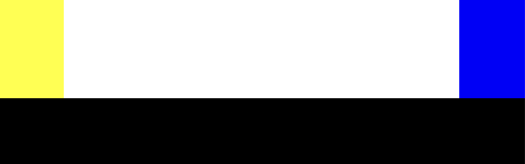
z-one 에 position: absolute; 하면 노란색 박스만 보이게 되는데
z-two 크기를 크게 하면 보이게 된다. 레이어가 겹쳐서 안 보이는 것 뿐!
높이값을 조정해주면 다음과 같은 그림
z-index : z축의 높이에 영향을 미치는 속성, 속성값은 숫자만 입력(단위 생략)
z축이 있는 3차원 영역에서만 사용 가능
3차원적인 특징이 있는 position 속성값(absolute, fixed, relative)에서만 사용 가능, static은 불가능
첫 번째 나오는 형제의 position이 2차원인지 3차원인지에 따라서 layer 겹침 유무 결정
3차원일 경우 겹침
layer 겹치는 것을 방지하기 위해 큰 공간을 만들 때 주로 2차원 사용
(9가지 경우의 수 check!)
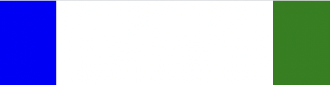
x축 정렬로 바꾸기
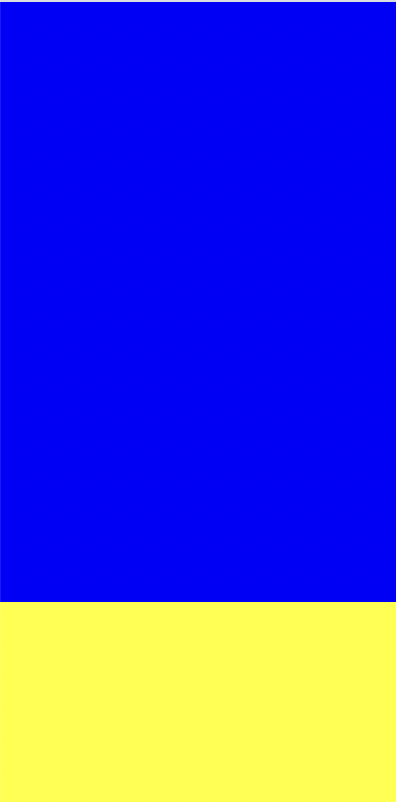
html
 	<div class="left-1"></div>
 	<div class="right-1"></div>
css
.left-1 {
	width: 100px;
	height: 150px;
	background-color: blue;
}

.right-1 {
	width: 100px;
	height: 150px;
	background-color: green;
}
y축 정렬로 출력
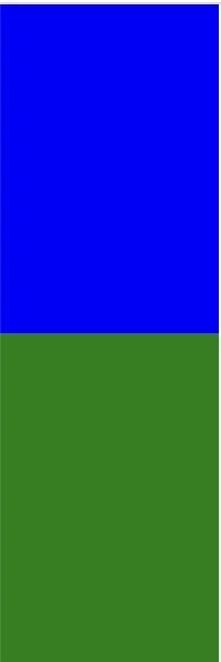
css
.left-1 {
	float: left;

	width: 100px;
	height: 150px;
	background-color: blue;
}

.right-1 {
	float: right;

	width: 100px;
	height: 150px;
	background-color: green;
}
x축 정렬로 출력
html
 	<header></header>
 	<div class="left"></div>
 	<div class="center"></div>
 	<div class="centerright"></div>
 	<div class="right"></div>
 	<footer></footer>
css
header {
	width: 100%;
	height: 100px;
	background-color: yellow;
}

.left {
	width: 100px;
	height: 200px;
	background-color: pink;
}

.center {
	width: 300px;
	height: 200px;
	background-color: blue;
}

.right {
	width: 100px;
	height: 200px;
	background-color: green;
}

footer {
	width: 100%;
	height: 100px;
	background-color: black;
}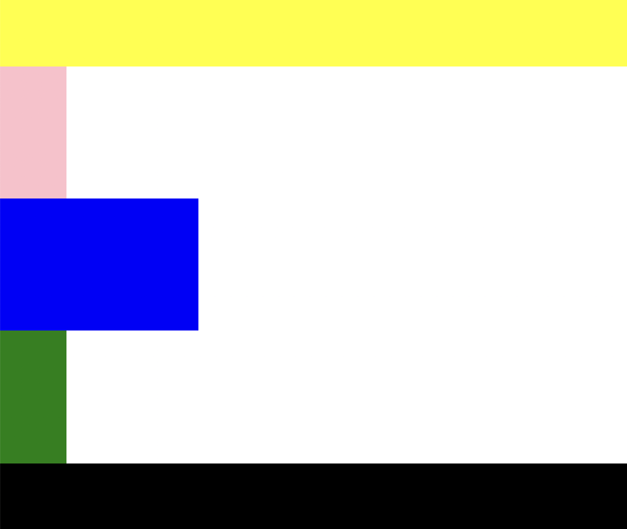
left, center, right를 일직선상에 위치하고 싶을 때
float을 써준다.
.left {
	float: left;

	width: 100px;
	height: 200px;
	background-color: pink;
}

.center {
	float: left;

	width: 300px;
	height: 200px;
	background-color: blue;
}

.right {
	float: right;

	width: 100px;
	height: 200px;
	background-color: green;
}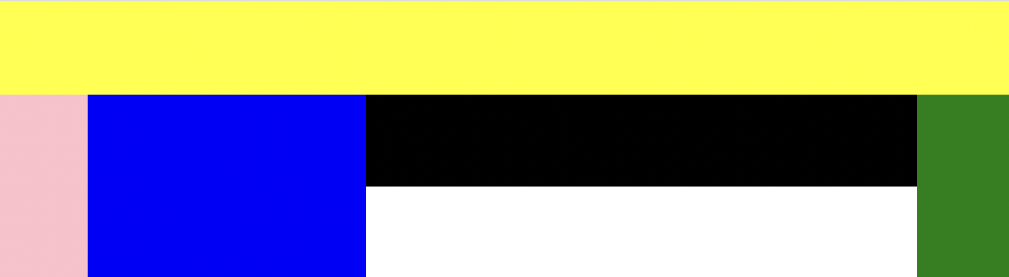
검은색 부분인 footer가 겹치게 되는데 이 때 clear 함수를 써줘야 한다.
footer {
	clear: both;

	width: 100%;
	height: 100px;
	background-color: black;
}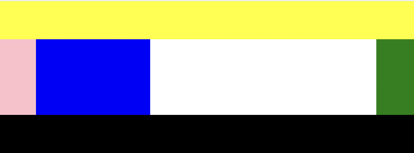
float은 같은 선상에 박스를 배치시키고 싶을 때 기능을 켜는 의미로 쓰는 속성
clear는 그 기능을 끌 때 쓰는 속성
float을 마지막으로 쓰는 태그 다음 태그 안에 clear 넣어준다.
float 사용할 때는 clear가 따라온다
Q)clear 속성을 사용할 때 both를 쓰지 않고 left나 right를 쓰면 어떻게 될지 궁금해서 적용을 해보았다.
A)같은 픽셀에서는 눈으로 볼 때 비교가 되지 않았다.
right의 height값을 300px로 바꾸고 확인해보았다.
clear: left; 일 때 초록박스가 검은박스쪽으로 내려와있었고, right일 때는 초록박스의 마지막부분부터 검은박스가 정렬되었다.
float을 사용할 때 주의점
고정값을 가지고 있는 영역(section) 안에서 float을 사용해야 layer가 틀어지는 현상을 방지할 수 있다.
단, float을 사용한 영역이 가변값(%)이라면 부모가 고정값이 아니어도 괜찮다.
부모의 width 값은 float을 지정한 영역의 width값의 합보다 크거나 같아야 한다.
그렇지 않으면 layer 틀어진다.
float을 사용한 영역은 그 영역의 높이값이 부모에게 영향을 주지 않는다.
float을 사용할 때는 position이 static 이거나 relative를 사용해야 한다.
absolute와 fixed는 float과 사용할 수 없다.
(float이 3차원이기 때문에 3차원끼리 상쇄되었다~ 라고 이해하면 쉽다.)
- tip1 ! 다른 방법으로 clear 사용
clearfix를 사용해서 어떤 지점에서 float이 사용이 되고 중단되었는지 확인 가능
html
	<div class="left-2"></div>
 	<div class="right-2"></div>

 	<div class="clearfix"></div>

 	<footer></footer>
css
.left-2 {
	float: left;

	width: 100px;
	height: 150px;
	background-color: yellow;
}

.right-2 {
	float: right;

	width: 100px;
	height: 150px;
	background-color: blue;
}

footer {
	width: 100%;
	height: 100px;
	background-color: black;
}

.clearfix {
	clear: both;
}
-
tip2 ! overflow hidden 값을 사용하여 자식의 높이값이 부모에게 영향을 줄 수 있음
-
over-box
overflow: hidden;
박스 영역을 벗어난 부분을 가리고 싶을 때
css
.over-box {
	overflow: hidden;
	width: 200px;
	height: 200px;
	background-color: yellow;
}
overflow-y: scroll; (overflow-축)
박스 영역의 크기는 유지한 채로 스크롤 하여 모든 내용을 볼 수 있다.
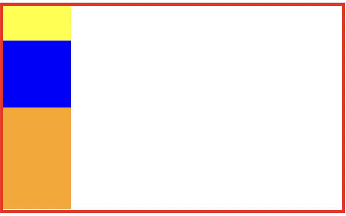
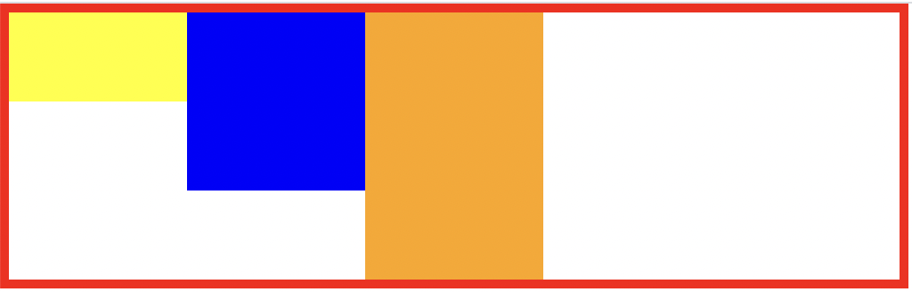
html
	<div class="container">
 		<div class="item one"></div>
 		<div class="item two"></div>
 		<div class="item three"></div>
 	</div>
css
.container {

	width: 1000px;
	border: solid 10px red;
}

.item {
	width: 200px;
	height: 300px;
}

.one {
	height: 100px;
	background-color: yellow;
}

.two {
	height: 200px;
	background-color: blue;
}

.three {
	height: 300px;
	background-color: orange;
}
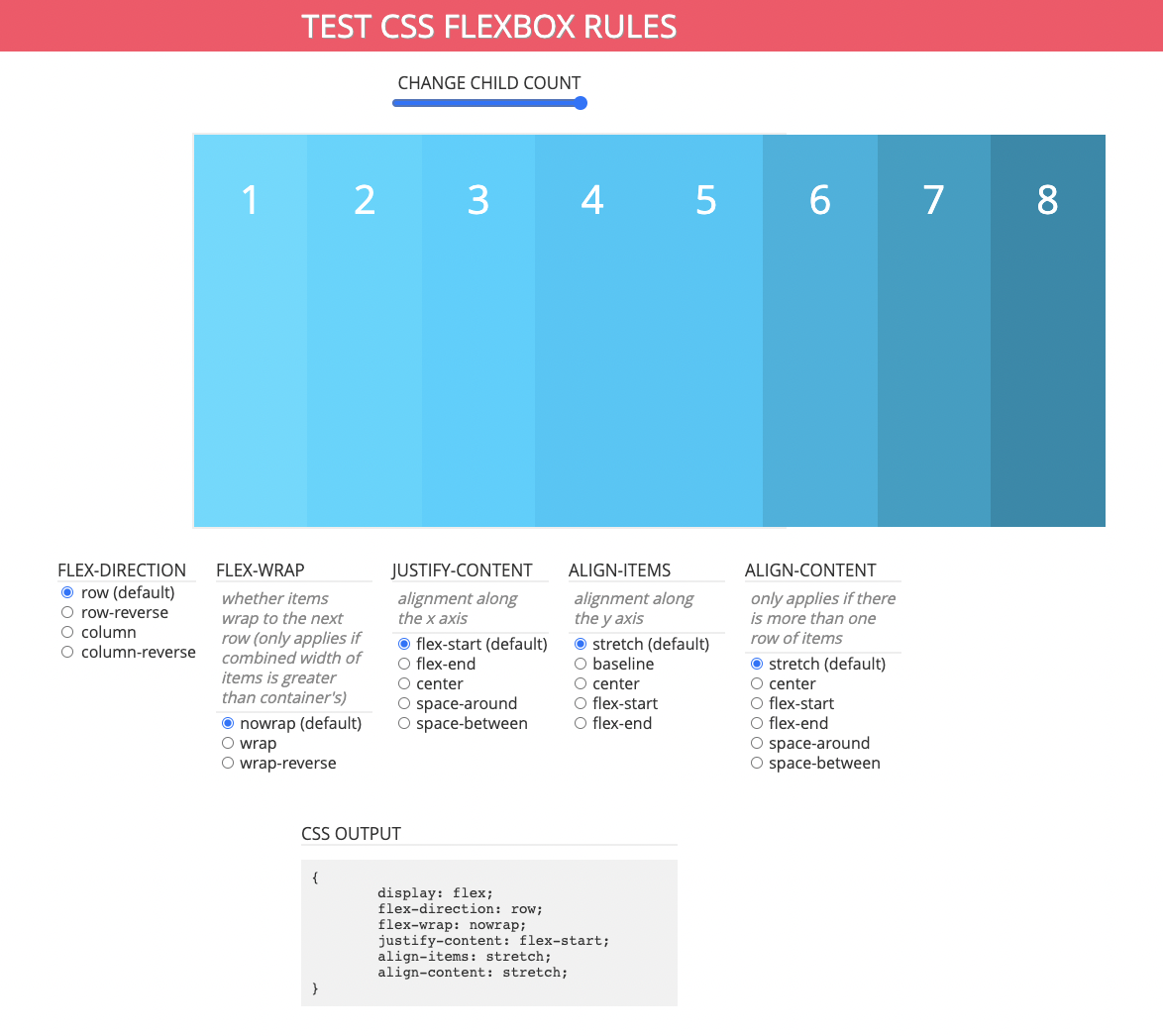
display 은 html 의 성격을 바꿀 때 사용하는 속성
inline 요소 <-> block
flex로 변경도 가능
css
.container {
	display: flex;

	width: 1000px;
	border: solid 10px red;
}
flex-direction 정렬 방법
row, row-reverse
column, column-reverse
css 변경
.three {
	width: 900px;
	height: 300px;
	background-color: orange;
}
추가
container 에
flex-wrap: nowrap;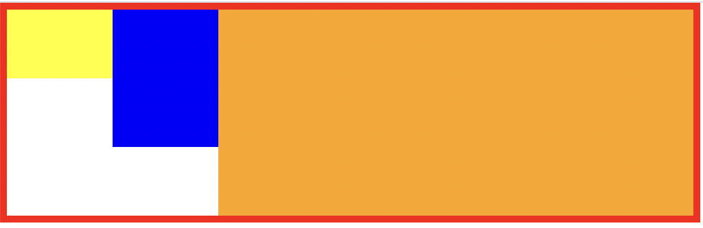
부모의 값보다 자식의 합이 더 크다.
자식들의 원래 값이 유지되지 않고 부모의 값 안에서 서로 소수점을 가지고 나눠진다.
nowrap을 wrap으로 바꾸면
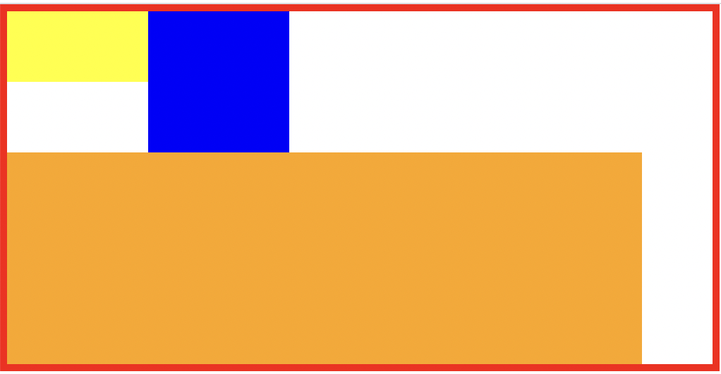
자동으로 줄바꿈 현상
-
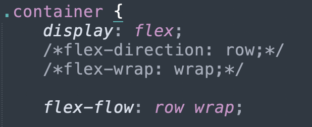
flex flow
direction과 wrap을 한번에 지정
-
x축 정렬작업 justify-content, y축 정렬작업 align-items
start;
center;
end;
space-between;
space-around;
https://flexbox.help/
flexbox help 검색하면 여러 경우의 flex 속성값 확인 가능
- 가운데 정렬
html
 	<div class="center-1"></div>
	<div class="center-2"></div>
css
.center-1 {
	width: 300px;
	height: 300px;
	background-color: yellow;

	margin: 0 auto;
}

.center-2 {
	position: relative;

	width: 300px;
	height: 300px;
	background-color: blue;

	left: 50%;
	margin-left: -150px;
}
2번째 경우 width 값에 따라 margin-left 값을 설정해 주어야 하는 번거로움 있다.
참고사이트
https://css-tricks.com/centering-css-complete-guide/
어려웠던 점
은 크게 없었지만 강의를 들으면서 궁금한 부분을 직접 해보면서 궁금증을 풀어갔다. 태그에 따른 속성이 다양해서 강사님께서 직접 다 보여주시지 못하는 부분은 참고사이트를 알려주셔서 도움을 많이 받았다. 강의를 들을 때는 쉽게 넘어갔던 부분도 일지를 쓰면서 헷갈리기도 했다.
해결방법
강사님께서 직접 해보라고 하셨던 다양한 경우의 수에 대해서 직접 따라해보았고 잘 모르거나 막히는 부분은 참고사이트에 들어가서 시도하려는 경우를 누르고 코드를 직접 보면서 하나씩 해결했다.
소감
일지를 남기는 게 한번 더 공부하는 계기도 되고 강의 들을 때와는 다르게 내가 몰랐던 부분을 새롭게 알게 되어서 좋은 것 같다. 하루하루 듣는 강의는 큰 무리없이 따라가고는 있지만 어느정도 쌓이다보니 예전에 배운 내용에 대해 가물가물 하기도 했다. 강의를 들으면서 이전 내용을 적용시킬 때 바로 기억이 나도록 복습을 더 열심히 해야겠다!