Set up the notebook
import pandas as pd
pd.plotting.register_matplotlib_converters()
import matplotlib.pyplot as plt
%matplotlib inline
import seaborn as sns
print("Setup Complete")
Select a dataset
Dataset from the US Department of Transportation that tracks flight delays. (in minutes)
- Row for each month in 2015
- Column for each airline code.
Load the data
# Path of the file to read
flight_filepath = "../input/flight_delays.csv"

# Read the file into a variable flight_data
flight_data = pd.read_csv(flight_filepath, index_col="Month")
The row labels (from the 'Month' column) don't correspond to dates, we don't add parse_dates=True in the parentheses.
Examine the data
Since the dataset is small, we can easily print all of its contents.
# Print the data
flight_data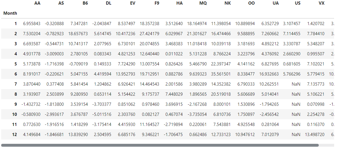
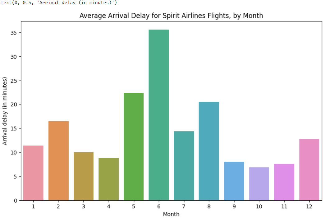
Bar chart
Create a bar chart showing the average arrival delay for Spirit airlines (airline code: NK) flights, by month.
# Set the width and height of the figure
plt.figure(figsize=(10,6))

# Add title
plt.title("Average Arrival Delay for Spirit airlines Flights, by Month")

# Bar chart showing average arrival delay for Spirit airlines flights by month
sns.barplot(x=flight_data.index, y=flight_data['NK'])

# Add label for vertical axis
plt.ylabel("Arrival delay (in minutes)")- sns.barplot - This tells the notebook that we want to create a bar chart.
- x=flight_data.index - This determines what to use on the horizontal axis.
- y=flight_data['NK'] - This sets the column in the data that will be used to determine the height of each bar.
- x축에 표시되는 인덱스명이나 컬럼명이 길어서 서로 겹칠 경우, y축에 두면 좋다.
- You must select the indexing column with flight_data.index, and it is not possible to use flight_data['Month'] (which will return an error). This is because when we loaded the dataset, the "Month" column was used to index the rows.
Heatmap
Create a heatmap to quickly visualize patterns in data. Each cell is color-coded according to its corresponding value.
# Set the width and height of the figure
plt.figure(figsize=(14,7))

# Add title
plt.title("Average Arrival Delay for Each Airline, by Month")

# Heatmap showing average arrival delay for each airline by month
sns.heatmap(data=flight_data, annot=True)

# Add label for horizontal axis
plt.xlabel("Airline")- sns.heatmap - This tells the notebook that we want to create a heatmap.
- annot=True - The values for each cell appear on the chart. (Leaving this out removes the numbers from each of the cells!)
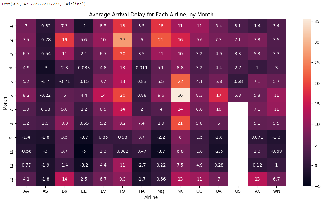
What patterns can you detect in the table? The months toward the end of the year (especially months 9-11) appear relatively dark for all airlines. This suggests that airlines are better (on average) at keeping schedule during these months.

Let's take the lead