Line charts
Set up the notebook
import pandas as pd
pd.plotting.register_matplotlib_converters()
import matplotlib.pyplot as plt
%matplotlib inline
import seaborn as sns
print("Setup Complete")
Select a dataset
the music streaming service 'Spotify' 에서 2017~2018년도의 five popular songs 의 스트림 횟수 데이터
Load the data
# Path of the file to read
spotify_filepath = "../input/spotify.csv"

# Read the file into a variable spotify_data
spotify_data = pd.read_csv(spotify_filepath, index_col="Date", parse_dates=True)
Examine the data
# Print the first 5 rows of the data
spotify_data.head()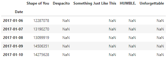
# Print the last five rows of the data
spotify_data.tail()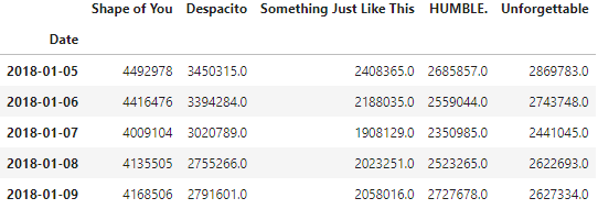
Plot the data
# Line chart showing daily global streams of each song
sns.lineplot(data=spotify_data)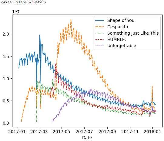
# Set the width and height of the figure
plt.figure(figsize=(14,6))

# Add title
plt.title("Daily Global Streams of Popular Songs in 2017-2018")

# Line chart showing daily global streams of each song
sns.lineplot(data=spotify_data)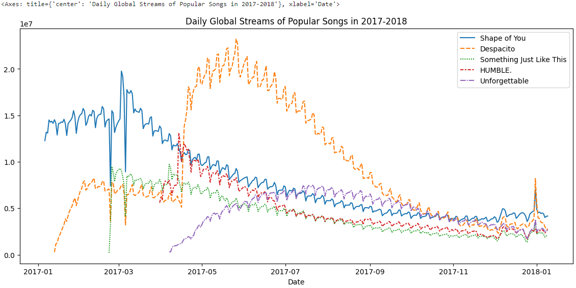
Plot a subset of the data
list(spotify_data.columns)
# Set the width and height of the figure
plt.figure(figsize=(14,6))

# Add title
plt.title("Daily Global Streams of Popular Songs in 2017-2018")

# Line chart showing daily global streams of 'Shape of You'
sns.lineplot(data=spotify_data['Shape of You'], label="Shape of You")

# Line chart showing daily global streams of 'Despacito'
sns.lineplot(data=spotify_data['Despacito'], label="Despacito")

# Add label for horizontal axis
plt.xlabel("Date")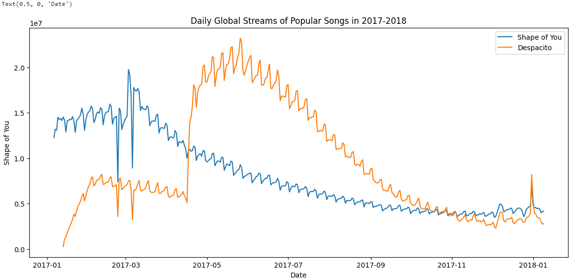
label="Shape of You" 를 추가함으로 legend(범례)에 line과 그에 상응하는 label을 나타냅니다.


Let's take the lead