Set up the notebook
import pandas as pd
pd.plotting.register_matplotlib_converters()
import matplotlib.pyplot as plt
%matplotlib inline
import seaborn as sns
print("Setup Complete")
Load and examine the data
insurance_filepath = "../input/insurance/insurance.csv"
insurance_data = pd.read_csv(insurance_filepath)
insurance_data.head()
Scatter plots
To create a simple scatter plot, we use the sns.scatterplot command.
sns.scatterplot(x=insurance_data['bmi'], y=insurance_data['charges'])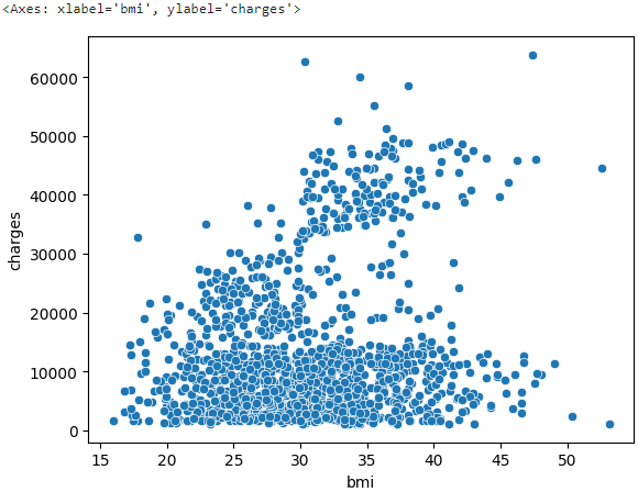
BMI and insurance charges are positively correlated, where customers with higher BMI typically also tend to pay more in insurance costs. (High BMI is typically associated with higher risk of chronic disease.)
Regplot
To check the strength of this relationship, you might like to add a regression line. We do this by changing the command to sns.regplot.
sns.regplot(x=insurance_data['bmi'], y=insurance_data['charges'])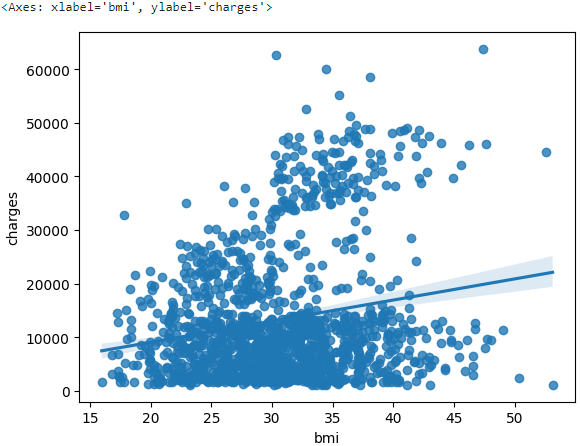
Color-coded scatter plots
We can use scatter plots to display the relationships between (not two, but...) three variables. One way of doing this is by color-coding the points.
To understand how smoking affects the relationship between BMI and insurance costs, we can color-code the points by 'smoker', and plot the other two columns ('bmi', 'charges') on the axes.
sns.scatterplot(x=insurance_data['bmi'], y=insurance_data['charges'], hue=insurance_data['smoker'])# Hue means color tone.
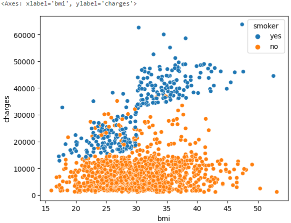
This scatter plot shows that while nonsmokers to tend to pay slightly more with increasing BMI, smokers pay MUCH more.
Lmplot
We can use the sns.lmplot command to add two regression lines, corresponding to smokers and nonsmokers.
sns.lmplot(x="bmi", y="charges", hue="smoker", data=insurance_data)
Swarmplot
We'll refer to this plot type as a categorical scatter plot, and we build it with the sns.swarmplot command.
Usually, we use scatter plots to highlight the relationship between two continuous variables (like "bmi" and "charges"). However, we can adapt the design of the scatter plot to feature a categorical variable (like "smoker") on one of the main axes.
# 'smoker'는 yes, no 범주로 분류되어 있다.
sns.swarmplot(x=insurance_data['smoker'], y=insurance_data['charges'])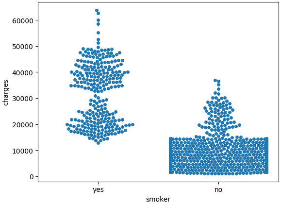
On average, non-smokers are charged less than smokers, and the customers who pay the most are smokers; whereas the customers who pay the least are non-smokers.