학습한 내용
CSS 애니메이션
- 웹사이트의 다양한 인터렉션한 효과를 줄 때 사용 (움직이는 효과나 이미지)
- 예전엔 자바스크립트로만 제작했지만, 지금은 CSS로도 간단한 애니메이션 제작 가능
CSS 애니메이션 속성 - 1 (transform)
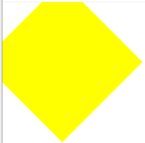
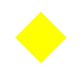
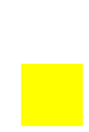
transform- 선택한 오브젝트의 크기를 축소, 확대 및 각도와 위치를 변경transform: rotate- 각도 변경, 음수로 설정시 반대로 각도 조절
HTML 문서
<body>
	<div class="transform"></div>
</body>
CSS 문서
.transform {
	width: 300px;
	height: 300px;
	background-color: yellow;

	transform: rotate(45deg);
}
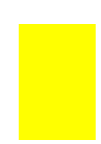
transform: scale- 크기 배수 변경(앞 숫자는 가로, 뒷 숫자는 세로, 소수점 설정 시 크기 줄어듬)
CSS 문서
.transform {
	width: 300px;
	height: 300px;
	background-color: yellow;

	transform: scale(2, 3);

	margin-left: 300px;
	margin-top: 500px;
}
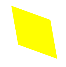
transform: skew- 3차원 속성으로 각도 변경 (앞 숫자는 x축, 뒷 숫자는 y축, 음수 설정 시 반대 각도)
CSS 문서
.transform {
	width: 300px;
	height: 300px;
	background-color: yellow;

	transform: skew(10deg, 20deg);

	margin-left: 300px;
	margin-top: 500px;
}
transform: translate- 선택한 오브젝트 위치 이동(앞 숫자는 x축, 뒷 숫자는 y축)
CSS 문서
.transform {
	width: 300px;
	height: 300px;
	background-color: yellow;

	transform: translate(100px, 300px);
}
- 하위 버전 브라우저에서도 작동하게 하기 위해서는 접두사를 붙여야 함(프리싱크)
-webkit-(Chrome, Safari, iOS Safari, Android),
-moz-(Firefox),-ms-(IE/Edge),-o-(Opera)
CSS 문서
-webkit-transform: rotate(10deg);
-moz-transform: rotate(10deg);
-ms-transform: rotate(10deg);
-o-transform: rotate(10deg);
transform: rotate(10deg)
CSS 애니메이션 속성 - 2 (transition)
-
transition- 애니메이션의 변화 과정을 보여주는 속성 -
transition-property- 변화를 주고자 하는 영역 -
transition-duration- 애니메이션이 진행되는 시간 -
transition-timing-function- 애니메이션 속도 유형 (linear = 일정 속도 유지) -
transition-delay- 애니메이션이 시작되는 시간 -
transition: property duration timing-function delay;으로 요약 가능 (순서는 상관없으나, 앞 숫자가duration, 뒷 숫자가delay)
HTML 문서
<body>
	<div class="transition"></div>
</body>
CSS 문서
.transition {
	width: 300px;
	height: 300px;
	background-color: yellow;

	/*
	transition-property: width;
	transition-duration: 2s;
	transition-timing-function: linear;
	*/

	transition: width 2s linear 1s;
}

.transition:hover {
	width: 600px;
}.gif)
-
다른 영역의 애니메이션을 설정할 때는, 첫 속성 다음에 쉼표와 함께 이으면 됨
CSS 문서
.transition {
	width: 300px;
	height: 300px;
	background-color: yellow;

	transition: width 2s linear, height 2s linear;
}

.transition:hover {
	width: 600px;
	height: 600px
}.gif)
CSS 애니메이션 속성 - 3 (animation)
-
animation- 움직이는 이미지, 애니메이션을 만들 때 사용하는 속성 -
animation-name- 애니메이션 이름 설정 -
animation-property- 변화를 주고자 하는 영역 -
animation-duration- 애니메이션이 진행되는 시간 -
animation-timing-function- 애니메이션 속도 유형 (linear = 일정 속도 유지) -
animation-delay- 애니메이션이 시작되는 시간 -
animation-iteration-count- 애니메이션 반복 횟수 (infinite = 무한) -
animation-direction- 애니메이션 진행 방향 (normal = 정방향, alternate = 왕복) -
@keyframes-animation과 같이 연동해서 사용하는 CSS (from,to를 사용해서 시작과 끝을 정함)
HTML 문서
<body>
	<div class="animation"></div>
</body>
CSS 문서
.animation {
	width: 300px;
	height: 300px;
	background-color: yellow;

	animation-name: changeWidth;
	animation-duration: 3s;
	animation-timing-function: linear;
	animation-delay: 1s;

	animation-iteration-count: 6;
	animation-direction: normal;
}

@keyframes changeWidth {
	from {
		width: 300px;
	}

	to {
		width: 600px;
	}
}.gif)
alternate,infinite, CSS 문법 설정
CSS 문서
.animation {
	width: 300px;
	height: 300px;
	background-color: yellow;

	animation-name: changeWidth;
	animation-duration: 3s;
	animation-timing-function: linear;
	animation-delay: 1s;

	animation-iteration-count: infinite;
	animation-direction: alternate;
}

@keyframes changeWidth {
	from {
		width: 300px;
		height: 300px;
        background-color: yellow;
	}

	to {
		width: 600px;
		height: 600px;
        background-color: red;
	}
}.gif)
to,from은%로도 가능, 중간 과정을 따로 설정 가능
CSS 문서
.animation {
	width: 300px;
	height: 300px;
	background-color: yellow;

	animation-name: changeWidth;
	animation-duration: 3s;
	animation-timing-function: linear;
	animation-delay: 1s;

	animation-iteration-count: infinite;
	animation-direction: alternate;
}

@keyframes changeWidth {
	0% {
		width: 300px;
		height: 300px;
		background-color: yellow;
	}

	50% {
		background-color: blue;
	}

	100% {
		width: 600px;
		height: 600px;
		background-color: red;
	}
}.gif)
animation속성도 한 줄로 요약 가능 (앞 숫자duration, 뒷 숫자delay)
HTML 문서
<body>
	<div class="spin-lion"></div>
</body>
CSS 문서
.spin-lion {
	width: 150px;
	height: 150px;
	background-color: blue;

	/*animation-name: spinLion;
	animation-duration: 1.5s;
	animation-timing-function: linear;
	animation-iteration-count: infinite;
	animation-direction: alternate;*/

	animation: spinLion 1.5s linear infinite alternate;
}

@keyframes spinLion {
	from {
		transform: rotate(-10deg);
	}

	to {
		transform: rotate(10deg);
	}
}.gif)
animation또한 하위 브라우저를 위한 프리싱크 필요,@keyframes를 따로 설정해야 함
CSS 문서
.spin-lion {
	width: 150px;
	height: 150px;
	background-color: blue;

	-webkit-animation: spinLion 1.5s linear infinite alternate;
	animation: spinLion 1.5s linear infinite alternate;

@keyframes spinLion {
	from {
		transform: rotate(-10deg);
	}

	to {
		transform: rotate(10deg);
	}
}

@-webkit-keyframes spinLion{
	from {
		transform: rotate(-10deg);
	}

	to {
		transform: rotate(10deg);
	}
}-
stylie 사이트를 통해 CSS 애니메이션 제작 가능
.gif)
CSS 애니메이션 실습 - 1
opacity는 글을 포함한 영역의 전체 투명도를 조정, 글 색상의 투명도를 고정하기 위해서는rgba속성을 이용하여 설정
HTML 문서
<body>
	<nav class="mouse-animation">
		<ul>
			<li><a href="#">메뉴1</a></li>
			<li><a href="#">메뉴2</a></li>
			<li><a href="#">메뉴3</a></li>
			<li><a href="#">메뉴4</a></li>
		</ul>
	</nav>
</body>
CSS 문서
html, body {
	margin: 0;
	padding: 0;
}

ul {
	list-style: none;
}

a {
	text-decoration: none;
	color: #000000;
}

.mouse-animation li {
	width: 250px;
	background-color: rgba(0, 0, 0, 1);
	padding: 20px;

	border-top: solid 5px #dfdfdf;
	transition: opacity 0.5s, margin-left 0.5s;
}

.mouse-animation li:hover {
	background-color: rgba(0, 0, 0, 0.5);
	margin-left: 10px;
}

.mouse-animation li a {
	color: red;
	font-size: 20px;
}.gif)
CSS 애니메이션 실습 - 2
animation-play-state-running은 페이지 실행 시 애니메이션 시작,paused는 페이지 실행 시 애니메이션 정지animation-fill-mode-backwards는 0%로 설정 된 색상으로 최초 이미지 변경
HTML 문서
<body>
	<div class="move-box"></div>
</body>
CSS 문서
html, body {
	margin: 0;
	padding: 0;
}

ul {
	list-style: none;
}

a {
	text-decoration: none;
	color: #000000;
}

.move-box {
	position: relative;
	width: 200px;
	height: 200px;
	background-color: red;

	animation-name: moveBox;
	animation-duration: 4s;
	animation-timing-function: linear;
	animation-delay: 1s;
	animation-iteration-count: infinite;
	animation-direction: alternate;
	animation-play-state: running;
	animation-fill-mode: backwards;
}

@keyframes moveBox {
	0% {
		background-color: green;
		left: 0;
		top: 0;
	}

	25% {
		background-color: yellow;
		left: 500px;
		top: 0;
	}

	50% {
		background-color: gray;
		left: 500px;
		top: 500px;
		border-radius: 50%;
	}

	75% {
		background-color: blue;
		left: 0;
		top: 500px;
	}

	100% {
		background-color: red;
		left: 0;
		top: 0;
	}
}.gif)
CSS 애니메이션 실습 - 3
scale은 자식에게도 영향을 줌box-sizing: border-box을 통해, 지정했던 사이즈로 애니메이션 크기 조정 가능
HTML 문서
<body>
	<div class="outer-border">
		<div class="inner-border"></div>
	</div>
</body>
CSS 문서
html, body {
	margin: 0;
	padding: 0;
}

ul {
	list-style: none;
}

a {
	text-decoration: none;
	color: #000000;
}

.outer-border {
	display: flex;
	justify-content: center;
	align-items: center;

	width: 200px;
	height: 200px;
	border: solid 15px red;
	border-radius: 50%;

	margin: 0 auto;
	margin-top: 200px;

	animation: outerBorder 2s infinite;
}

@keyframes outerBorder {
	0% { border-color: red; transform: scale(1);}
	25% { border-color: yellow; transform: scale(1.2);}
	50% { border-color: blue; transform: scale(1.3);}
	75% { border-color: green; transform: scale(1.2);}
	100% { border-color: pink; transform: scale(1);}
}

.inner-border {
	box-sizing: border-box;
	width: 75px;
	height: 75px;
	border: solid 5px purple;

	animation: innerBorder 2s infinite alternate;
}

@keyframes innerBorder {
	0% { transform: rotate(0deg); }
	25% { border-color: blue; border-width: 10px; }
	50% { border-color: yellow; border-width: 20px; }
	75% { border-color: green; border-width: 40px; }
	100% { border-color: gray; border-width: 5px; transform: rotate(360deg); }
}.gif)
CSS 애니메이션 실습 - 4 (마리오 동전)
- x축 말고, y축만 변경 시, 문법 뒤에 Y를 추가하면 됨
- 동시에 여러가지 애니메이션을 설정하려면, 첫 애니메이션 다음에 쉼표 없이 이으면 됨
HTML 문서
<body>
	<div class="mario-container">
		<div class="mario-coin"></div>
		<div class="mario-box"></div>
	</div>
</body>
CSS 문서
html, body {
	margin: 0;
	padding: 0;
}

ul {
	list-style: none;
}

a {
	text-decoration: none;
	color: #000000;
}

.mario-container {
	position: relative;
	width: 500px;
	height: 500px;
	border: solid 10px black;

	margin: 0 auto;
	margin-top: 200px;
}

.mario-container .mario-coin {
	position: relative;
	width: 70px;
	height: 70px;
	background-color: yellow;
	border-radius: 50%;

	margin: 0 auto;
	margin-top: 100px;

	animation: jumpCoin 0.8s linear infinite;
}

@keyframes jumpCoin {
	0% {
		transform: translateY(0);
		opacity: 1;
	}
	50% {
		transform: translateY(-100px) rotateY(180deg);
		opacity: 0;
	}
	100% {
		transform: translateY(-100px) rotateY(360deg);
		opacity: 0;
	}
}

.mario-container .mario-box {
	width: 100px;
	height: 100px;
	background-color: blue;

	margin: 0 auto;

	animation: jumpBox 0.5s linear infinite alternate;
}

@keyframes jumpBox {
	0% { transform: translateY(0px); }
	50% { transform: translateY(-10px); }
	100% { transform: translateY(0px); }
}.gif)
CSS 애니메이션 실습 - 5 (이미지 확대)
-
vertical-align: middle을 사용하면,img가 선천적으로 가지고 있는 하단의 공백을 없앨 수 있음 (대부분 표준으로 사용) -
같은 3차원 속성 설정 시, 자식이 길이를 100%로 설정하면, 부모의 길이를 따라감
-
cursor: pointer를 사용하여, 커서를 손가락 모양으로 변경 가능 -
같은 3차원 속성 및 부모 태그
overflow: hidden설정 시, 자식 태그 범위 영역 밖으로 설정하면 보이지 않게 됨
HTML 문서
<body>
	<div class="hover-image">
		<img src="https://images.template.net/wp-content/uploads/2015/08/Extraordinary-Beach-Background-Free-Download.png">

		<div class="image-info">
			<h2>Title</h2>
			<p>Parapraph</p>
		</div>
	</div>
</body>
CSS 문서
html, body {
	margin: 0;
	padding: 0;
}

ul {
	list-style: none;
}

a {
	text-decoration: none;
	color: #000000;
}

.hover-image {
	cursor: pointer;
	overflow: hidden;
	position: relative;
	width: 400px;
	border: solid 10px #000000;
}

.hover-image img {
	width: 100%;
	vertical-align: middle;
	transition: transform 0.3s linear;
}

.hover-image:hover img {
	transform: scale(1.3);
}

.hover-image .image-info {
	box-sizing: border-box;
	position: absolute;
	width: 100%;

	background-color: rgba(0, 0, 0, 0.5);
	padding: 20px;

	left: 0;
	bottom: -85px;

	transition: bottom 0.3s linear;
}

.hover-image:hover .image-info {
	bottom: 0;
}

.hover-image .image-info h2,
.hover-image .image-info p {
	margin: 0;
	padding: 0;
	color: #ffffff;
}

.hover-image .image-info h2 {
	font-size: 20px;
}

.hover-image .image-info p {
	font-size: 15px;
}.gif)
학습한 내용 중 어려웠던 점 또는 해결못한 것들
transform: skew에 대한 이해도 부족.box-sizing: border-box활용.- 이전에 학습되었던 속성들의 다양한 활용에 대해 이해도 부족.
해결방법
transform: skew는 인터넷 검색을 통해, 양수는 시계 반대 방향으로 기울고, 음수는 시계 방향으로 기운다는 것을 참고하게 됨.box-sizing: border-box는 이전에 정리하며 적었던 내용을 바탕으로 복습을 통해 다시 이해하도록 노력함.- 기존에 배웠던 속성들이 다양한 환경에서 활용된다는 것을 잘 기억하고, 특정한 상황에서 이용되는 속성들을 따로 복습하여 기억하도록 노력함.
학습 소감
- 오늘은 CSS 애니메이션 속성들을 배우며, 실습을 통해 학습을 진행하였음. 새로운 속성들을 배우며 애니메이션을 만드는 행위 자체는 즐거웠으나, 기존에 배웠던 개념들이 특정 상황에서 이용되는 것이 생각보다 기억하기 힘들어서 스스로 정리하여 기억하도록 노력해야겠음.