[zerobase_데이터취업스쿨] 머신러닝_CH4-01~4-09[다항함수, 로그함수, 자연상수, 지수함수, meshgrid, 벡터, 혼동행렬, ROC-AUC Curve]
머신러닝
CH4-01~CH4-02: 분류 모델 평가 지표
1. 혼동행렬(confusion matrix)지표
1-1. Precision(정밀도)와 Recall(재현율)
Precision(FPR: False Positive Rate = TP/(TP+FP))
Recall(TPR: True Positive Rate = TP/(TP+FN))
1. 스팸 이메일 필터링
- 목적: 이메일을 스팸과 비스팸(정상 이메일)으로 분류
- Precision: 스팸으로 분류된 이메일 중 실제 스팸 이메일의 비율. 스팸 필터가 정상 이메일을 스팸으로 오분류하는 것을 최소화하고자 할 때 중요.
- Recall: 실제 스팸 이메일 중 스팸으로 올바르게 분류된 이메일의 비율. 모든 스팸 이메일을 잡아내고자 할 때 중요.
2. 질병 진단 시스템
- 목적: 환자가 특정 질병을 가지고 있는지 없는지를 판단
- Precision: 질병이 있다고 진단된 환자들 중 실제로 질병이 있는 환자의 비율. 오진으로 인한 불필요한 치료나 불안을 최소화하고자 할 때 중요.
- Recall: 실제 질병이 있는 환자 중 진단 시스템이 질병이 있다고 올바르게 진단한 환자의 비율. 질병을 놓치지 않고 모두 진단하고자 할 때 중요.
3. 이미지 분류 시스템
- 목적: 이미지에 특정 객체(예: 고양이)가 포함되어 있는지를 판단
- Precision: 고양이가 있다고 분류된 이미지 중 실제로 고양이가 있는 이미지의 비율. 오분류를 줄이고자 할 때 중요.
- Recall: 실제 고양이가 있는 이미지 중 시스템이 고양이가 있다고 올바르게 분류한 이미지의 비율. 모든 고양이가 포함된 이미지를 찾고자 할 때 중요.
4. 검색 엔진
- 목적: 사용자 쿼리와 관련된 문서를 검색
- Precision: 검색 결과로 반환된 문서 중 사용자가 유용하다고 판단하는 문서의 비율. 사용자에게 관련 없는 정보를 최소화하고자 할 때 중요.
- Recall: 관련된 모든 문서 중 검색 엔진이 실제로 찾아낸 문서의 비율. 사용자가 필요로 하는 모든 정보를 제공하고자 할 때 중요.
각 예시에서, Precision은 정확도를 높이는 것에 중점을 두고, Recall은 관련된 모든 사례를 놓치지 않으려는 목표에 중점을 둡니다. 실제 응용에서는 이 두 지표 사이의 균형을 찾는 것이 중요하며, 이를 위해 F1 Score와 같은 다른 지표들도 함께 사용됩니다.
1-2. 정확도, 정밀도, 재현율, 특이도, FPR(False Positive Rate: 거짓양성비율)
1. 정확도 (Accuracy)
- 모든 예측 중 올바른 예측의 비율입니다.
- 공식:
- 모든 클래스의 예측을 동등하게 취급합니다. 클래스 불균형이 심할 때는 이 지표만으로 모델의 성능을 완전히 평가하기 어려울 수 있습니다.
2. 정밀도 (Precision)
- 긍정으로 예측된 경우 중 실제로 긍정인 비율입니다.
- 공식:
- 모델이 제시하는 긍정 예측의 정확성을 측정합니다.
3. 재현율 (Recall) 또는 민감도 (Sensitivity)
- 실제 긍정 중 모델이 긍정으로 올바르게 예측한 비율입니다.
- 공식:
- 모델이 실제 긍정 케이스를 얼마나 잘 잡아내는지를 평가합니다.
4. F1 점수 (F1 Score)
- 정밀도와 재현율의 조화 평균입니다.
- 공식:
- 정밀도와 재현율이 모두 중요할 때 유용합니다.
- 의료 진단 시스템에서는 잘못된 진단으로 인한 부정적인 결과를 최소화하기 위해 높은 정밀도와 재현율이 모두 중요
- F1 스코어는 0에서 1 사이의 값을 가지며, 값이 1에 가까울수록 모델의 성능이 좋다고 평가합니다. 정밀도 또는 재현율 중 하나가 매우 낮은 경우 F1 스코어도 낮아집니다. 예를 들어, 모델이 매우 높은 재현율을 가지고 있지만 정밀도가 낮다면, 많은 양성 예측이 실제로는 음성인 경우를 포함할 수 있습니다. 반대로, 정밀도는 높지만 재현율이 낮다면, 모델이 많은 실제 양성 사례를 놓치고 있음을 의미합니다. 따라서 F1 스코어는 이러한 두 지표의 균형을 평가하는 데 매우 유용한 지표입니다.
5. 특이도 (Specificity)
- 실제 음성 중 음성으로 올바르게 예측된 비율입니다.
- 공식:
- 모델이 음성 케이스를 얼마나 잘 식별하는지를 평가합니다.
6. ROC 곡선 (Receiver Operating Characteristic Curve) 및 AUC (Area Under the Curve)
- ROC 곡선은 진짜 긍정 비율(재현율) 대 거짓 긍정 비율(FP / (FP + TN))을 그린 그래프입니다.
- AUC는 ROC 곡선 아래의 면적으로, 모델이 무작위 선택보다 얼마나 더 잘 예측하는지를 나타냅니다. AUC 값이 1에 가까울수록 모델의 성능이 좋다고 평가합니다.
7. 정밀도-재현율 곡선 (Precision-Recall Curve)
- 정밀도 대 재현율을 그린 그래프입니다.
- 주로 긍정 클래스의 샘플이 드물거나 불균형이 심한 데이터셋에서 유용합니다. 각 지표는 특정 상황에서 모델의 성능을 더 잘 이해하고 평가하기 위해 사용됩니다. 모델을 평가할 때는 한 가지 지표만을 고려하기보다는 여러 지표를 함께 고려하는 것이 좋습니다
from sklearn.metrics import roc_auc_score, roc_curve, RocCurveDisplay, f1_score, accuracy_score, recall_score, precision_score
from sklearn.ensemble import RandomForestClassifier
import pandas as pd
import numpy as np

url_w = 'https://archive.ics.uci.edu/ml/machine-learning-databases/wine-quality/winequality-white.csv'
url_r = 'https://archive.ics.uci.edu/ml/machine-learning-databases/wine-quality/winequality-red.csv'
white_df = pd.read_csv(url_w,sep=';')
red_df = pd.read_csv(url_r,sep=';')white_df.head()| fixed acidity | volatile acidity | citric acid | residual sugar | chlorides | free sulfur dioxide | total sulfur dioxide | density | pH | sulphates | alcohol | quality | |
|---|---|---|---|---|---|---|---|---|---|---|---|---|
| 0 | 7.0 | 0.27 | 0.36 | 20.7 | 0.045 | 45.0 | 170.0 | 1.0010 | 3.00 | 0.45 | 8.8 | 6 |
| 1 | 6.3 | 0.30 | 0.34 | 1.6 | 0.049 | 14.0 | 132.0 | 0.9940 | 3.30 | 0.49 | 9.5 | 6 |
| 2 | 8.1 | 0.28 | 0.40 | 6.9 | 0.050 | 30.0 | 97.0 | 0.9951 | 3.26 | 0.44 | 10.1 | 6 |
| 3 | 7.2 | 0.23 | 0.32 | 8.5 | 0.058 | 47.0 | 186.0 | 0.9956 | 3.19 | 0.40 | 9.9 | 6 |
| 4 | 7.2 | 0.23 | 0.32 | 8.5 | 0.058 | 47.0 | 186.0 | 0.9956 | 3.19 | 0.40 | 9.9 | 6 |
red_df.head()| fixed acidity | volatile acidity | citric acid | residual sugar | chlorides | free sulfur dioxide | total sulfur dioxide | density | pH | sulphates | alcohol | quality | |
|---|---|---|---|---|---|---|---|---|---|---|---|---|
| 0 | 7.4 | 0.70 | 0.00 | 1.9 | 0.076 | 11.0 | 34.0 | 0.9978 | 3.51 | 0.56 | 9.4 | 5 |
| 1 | 7.8 | 0.88 | 0.00 | 2.6 | 0.098 | 25.0 | 67.0 | 0.9968 | 3.20 | 0.68 | 9.8 | 5 |
| 2 | 7.8 | 0.76 | 0.04 | 2.3 | 0.092 | 15.0 | 54.0 | 0.9970 | 3.26 | 0.65 | 9.8 | 5 |
| 3 | 11.2 | 0.28 | 0.56 | 1.9 | 0.075 | 17.0 | 60.0 | 0.9980 | 3.16 | 0.58 | 9.8 | 6 |
| 4 | 7.4 | 0.70 | 0.00 | 1.9 | 0.076 | 11.0 | 34.0 | 0.9978 | 3.51 | 0.56 | 9.4 | 5 |
white_df['color'] = 0
red_df['color'] = 1
wine_df = pd.concat([white_df,red_df],axis=0)
wine_df.head()| fixed acidity | volatile acidity | citric acid | residual sugar | chlorides | free sulfur dioxide | total sulfur dioxide | density | pH | sulphates | alcohol | quality | color | |
|---|---|---|---|---|---|---|---|---|---|---|---|---|---|
| 0 | 7.0 | 0.27 | 0.36 | 20.7 | 0.045 | 45.0 | 170.0 | 1.0010 | 3.00 | 0.45 | 8.8 | 6 | 0 |
| 1 | 6.3 | 0.30 | 0.34 | 1.6 | 0.049 | 14.0 | 132.0 | 0.9940 | 3.30 | 0.49 | 9.5 | 6 | 0 |
| 2 | 8.1 | 0.28 | 0.40 | 6.9 | 0.050 | 30.0 | 97.0 | 0.9951 | 3.26 | 0.44 | 10.1 | 6 | 0 |
| 3 | 7.2 | 0.23 | 0.32 | 8.5 | 0.058 | 47.0 | 186.0 | 0.9956 | 3.19 | 0.40 | 9.9 | 6 | 0 |
| 4 | 7.2 | 0.23 | 0.32 | 8.5 | 0.058 | 47.0 | 186.0 | 0.9956 | 3.19 | 0.40 | 9.9 | 6 | 0 |
wine_df.info()<class 'pandas.core.frame.DataFrame'>
Index: 6497 entries, 0 to 1598
Data columns (total 13 columns):
# Column Non-Null Count Dtype
--- ------ -------------- -----
0 fixed acidity 6497 non-null float64
1 volatile acidity 6497 non-null float64
2 citric acid 6497 non-null float64
3 residual sugar 6497 non-null float64
4 chlorides 6497 non-null float64
5 free sulfur dioxide 6497 non-null float64
6 total sulfur dioxide 6497 non-null float64
7 density 6497 non-null float64
8 pH 6497 non-null float64
9 sulphates 6497 non-null float64
10 alcohol 6497 non-null float64
11 quality 6497 non-null int64
12 color 6497 non-null int64
dtypes: float64(11), int64(2)
memory usage: 710.6 KBwine_df.describe()| fixed acidity | volatile acidity | citric acid | residual sugar | chlorides | free sulfur dioxide | total sulfur dioxide | density | pH | sulphates | alcohol | quality | color | |
|---|---|---|---|---|---|---|---|---|---|---|---|---|---|
| count | 6497.000000 | 6497.000000 | 6497.000000 | 6497.000000 | 6497.000000 | 6497.000000 | 6497.000000 | 6497.000000 | 6497.000000 | 6497.000000 | 6497.000000 | 6497.000000 | 6497.000000 |
| mean | 7.215307 | 0.339666 | 0.318633 | 5.443235 | 0.056034 | 30.525319 | 115.744574 | 0.994697 | 3.218501 | 0.531268 | 10.491801 | 5.818378 | 0.246114 |
| std | 1.296434 | 0.164636 | 0.145318 | 4.757804 | 0.035034 | 17.749400 | 56.521855 | 0.002999 | 0.160787 | 0.148806 | 1.192712 | 0.873255 | 0.430779 |
| min | 3.800000 | 0.080000 | 0.000000 | 0.600000 | 0.009000 | 1.000000 | 6.000000 | 0.987110 | 2.720000 | 0.220000 | 8.000000 | 3.000000 | 0.000000 |
| 25% | 6.400000 | 0.230000 | 0.250000 | 1.800000 | 0.038000 | 17.000000 | 77.000000 | 0.992340 | 3.110000 | 0.430000 | 9.500000 | 5.000000 | 0.000000 |
| 50% | 7.000000 | 0.290000 | 0.310000 | 3.000000 | 0.047000 | 29.000000 | 118.000000 | 0.994890 | 3.210000 | 0.510000 | 10.300000 | 6.000000 | 0.000000 |
| 75% | 7.700000 | 0.400000 | 0.390000 | 8.100000 | 0.065000 | 41.000000 | 156.000000 | 0.996990 | 3.320000 | 0.600000 | 11.300000 | 6.000000 | 0.000000 |
| max | 15.900000 | 1.580000 | 1.660000 | 65.800000 | 0.611000 | 289.000000 | 440.000000 | 1.038980 | 4.010000 | 2.000000 | 14.900000 | 9.000000 | 1.000000 |
X = wine_df.drop(columns = 'color',axis = 1)
y = wine_df['color']
from sklearn.model_selection import train_test_split
X_train, X_test, y_train, y_test = train_test_split(X, y, test_size = 0.2, random_state = 2024)랜덤포레스트 분류모델의 파라미터를 내가 임의로 정했는데 각 트리들의 깊이를 1로 하였고, 총 약분류기의 갯수를 10개로 함
rf = RandomForestClassifier(max_depth = 1, n_estimators = 10, n_jobs = -1, random_state = 2024)
rf.fit(X_train, y_train)
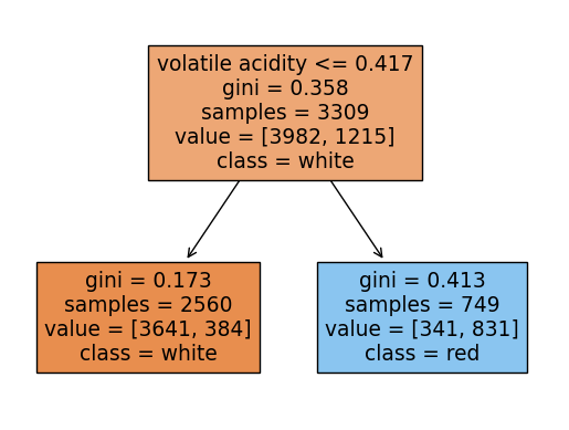
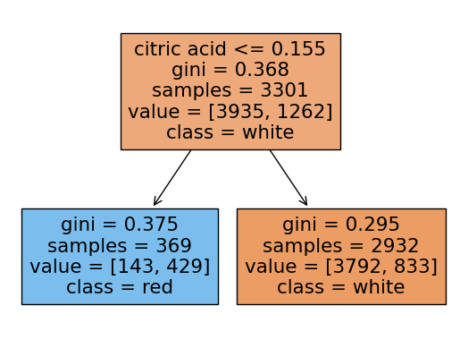
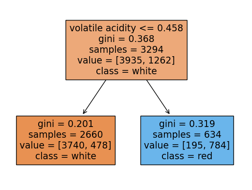
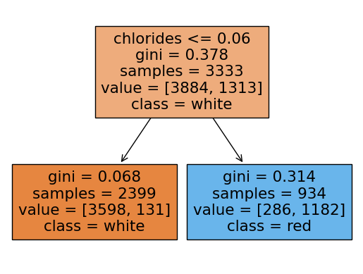
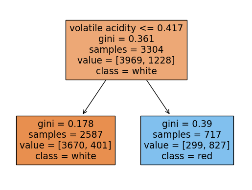
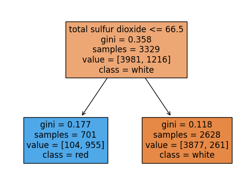
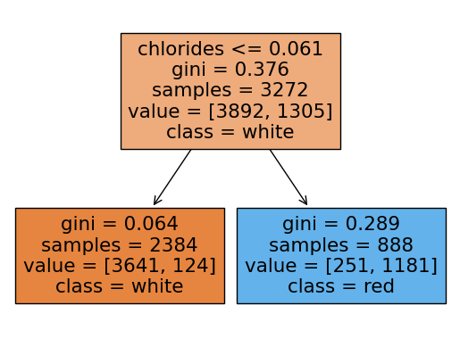
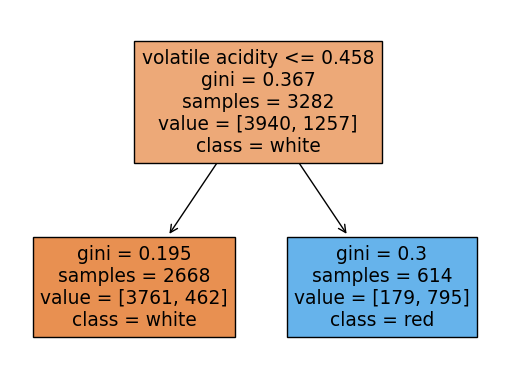
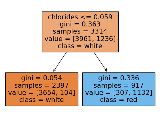
rf.score(X_test, y_test)0.9053846153846153랜덤포레스트에 쓰인 각 트리들을 시각화해보기
여기서 각 트리의 노드에서 value의 합과 samples과 다른이유:
랜덤포레스트의 각 트리는 부트스트랩 샘플링을 하는데 부트스트랩 샘플링은
중복을 허용하여 샘플링을 함.
samples는 unique(고유한)값들을 표시하고 value는 중복된 데이터포인트까지 count되어서 value의 각 클래스의 합과 samples가 일치하지 않는 것임
from sklearn.tree import plot_tree
import matplotlib.pyplot as plt
import seaborn as sns
for i in range(10):

    plot_tree(rf.estimators_[i],filled=True,feature_names = X.columns.tolist(), class_names=['white','red'],precision = 3)
    plt.show()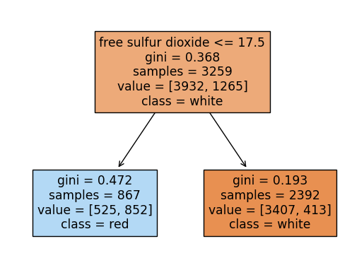
y_pred = rf.predict(X_test)
y_pred_proba = rf.predict_proba(X_test)
print('Accuracy Score:', accuracy_score(y_test, y_pred))
print('f1_score:', f1_score(y_test, y_pred))
print('recall:', recall_score(y_test, y_pred))
print('precision:', precision_score(y_test, y_pred))
print('roc-auc-score:',roc_auc_score(y_test, y_pred_proba[:,1]))
Accuracy Score: 0.9053846153846153
f1_score: 0.7823008849557522
recall: 0.6636636636636637
precision: 0.9525862068965517
roc-auc-score: 0.9773454944085762Roc-Auc 커브 시각화
fpr, tpr, threshold = roc_curve(y_test, y_pred_proba[:,1])
print(fpr)
print(tpr)
print(threshold)
[0. 0. 0. 0. 0.00206825 0.00206825
0.00310238 0.00310238 0.00310238 0.00310238 0.01034126 0.01034126
0.01137539 0.01137539 0.01240951 0.01240951 0.01447777 0.01551189
0.01551189 0.0196484 0.0196484 0.0196484 0.02998966 0.02998966
0.03102378 0.03826267 0.04136505 0.04136505 0.0475698 0.07859359
0.07962771 0.08169597 0.13547053 0.13960703 0.14064116 0.14684592
0.15201655 0.15201655 0.17166494 0.1737332 0.19648397 0.19855222
0.20268873 0.20889349 0.22026887 0.30713547 1. ]
[0. 0.18618619 0.24324324 0.38138138 0.4024024 0.44144144
0.47147147 0.47747748 0.50750751 0.51051051 0.57357357 0.60660661
0.63963964 0.66366366 0.66366366 0.66966967 0.68168168 0.68168168
0.68468468 0.69369369 0.84384384 0.86486486 0.86786787 0.87087087
0.91591592 0.91591592 0.91591592 0.91891892 0.91891892 0.92192192
0.92192192 0.92192192 0.96396396 0.96396396 0.96396396 0.96396396
0.96696697 0.96996997 0.98198198 0.98198198 0.98198198 0.98198198
0.98798799 0.98798799 0.98798799 0.99099099 1. ]
[ inf 0.77476273 0.72370061 0.71777354 0.69089071 0.66671142
0.63982859 0.63533131 0.63390152 0.61857945 0.5828394 0.57834212
0.54268114 0.51037158 0.4944701 0.49161902 0.48569195 0.48364531
0.45930946 0.45880912 0.45338239 0.44340798 0.407747 0.40324972
0.40232027 0.40181993 0.37543744 0.37109672 0.36951037 0.35075781
0.33828682 0.3193777 0.31844825 0.27828999 0.26831558 0.26238851
0.23926968 0.22722787 0.2213008 0.21332709 0.21132639 0.19441797
0.17023868 0.16226497 0.14335585 0.13742878 0.08636666]plt.figure(figsize=(7,7))
plt.plot(fpr,tpr, color = 'hotpink')
plt.plot([0,1],[0,1], color = 'r',ls = '--')
plt.xlabel('FPR(1-specificity)')
plt.ylabel('TPR(recall)')
plt.title('ROC-AUC Curve')
plt.grid()
plt.show()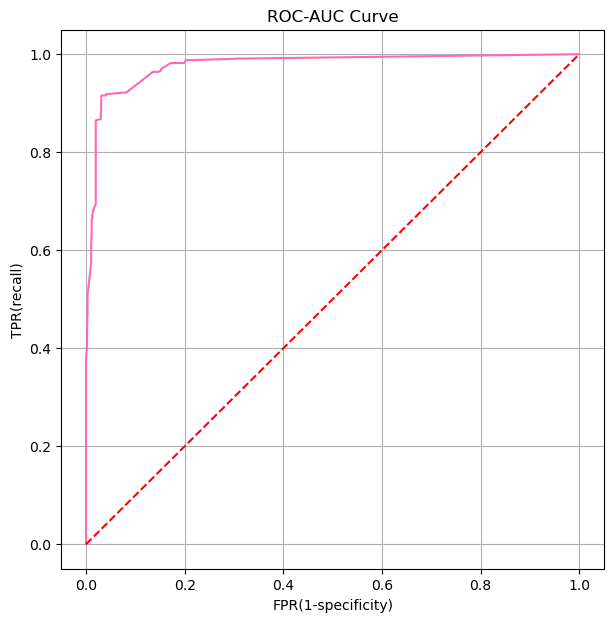
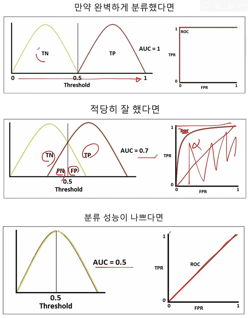
CH4-03: ROC-AUC와 Threshold의 관계
1. ROC-AUC
ROC-AUC 곡선은 분류 모델의 성능을 평가하는 데 사용되는 도구 중 하나입니다. ROC(Receiver Operating Characteristic) 곡선은 모델의 임계값을 다양하게 변화시킬 때 진짜 양성 비율(True Positive Rate, TPR) 대 거짓 양성 비율(False Positive Rate, FPR)을 그래프에 나타낸 것입니다. AUC(Area Under the Curve)는 이 ROC 곡선 아래의 면적을 의미하며, 모델의 성능을 하나의 숫자로 요약해 줍니다.
- TPR(재현율, 민감도): 실제 양성 중 양성으로 올바르게 예측된 비율입니다.
- FPR(위양성률): 실제 음성 중 잘못하여 양성으로 예측된 비율입니다.
ROC 곡선은 다음과 같은 특성을 가집니다:
- 완벽한 분류기: AUC가 1인 경우, 모델은 완벽하게 양성과 음성을 구분합니다.
- 무작위 추측: AUC가 0.5인 경우, 모델의 예측 성능은 무작위 추측과 같습니다.
- 모델의 성능: AUC 값이 0.5보다 크면 클수록 모델의 성능이 좋다고 할 수 있습니다.
CH4-05 함수(1): 다항함수, 지수함수
mpl.style.available['Solarize_Light2',
'_classic_test_patch',
'_mpl-gallery',
'_mpl-gallery-nogrid',
'bmh',
'classic',
'dark_background',
'fast',
'fivethirtyeight',
'ggplot',
'grayscale',
'seaborn-v0_8',
'seaborn-v0_8-bright',
'seaborn-v0_8-colorblind',
'seaborn-v0_8-dark',
'seaborn-v0_8-dark-palette',
'seaborn-v0_8-darkgrid',
'seaborn-v0_8-deep',
'seaborn-v0_8-muted',
'seaborn-v0_8-notebook',
'seaborn-v0_8-paper',
'seaborn-v0_8-pastel',
'seaborn-v0_8-poster',
'seaborn-v0_8-talk',
'seaborn-v0_8-ticks',
'seaborn-v0_8-white',
'seaborn-v0_8-whitegrid',
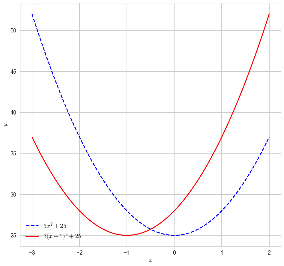
'tableau-colorblind10']1-1. 다항함수 ''의 x축 이동 시각화해보기
import matplotlib as mpl
import seaborn as sns
# mpl.style.available 사용가능한 스타일 리스트 출력
mpl.style.use('seaborn-v0_8-whitegrid')
x = np.linspace(-3,2,100)
y1 = 3*x**2 + 25
y2 = 3*(x+1)**2 + 25
plt.figure(figsize=(10,10))
plt.plot(x,y1,label = '$3x^2 + 25$', color = 'blue',ls = 'dashed')
plt.plot(x,y2,label = '$3(x+1)^2 + 25$', color = 'red')
plt.legend(fontsize = 15)
plt.xlabel('$x$')
plt.ylabel('$y$')
plt.show()
1-2. 지수함수의 y축 대칭 시각화
x = np.linspace(-2,2,100)
a11, a12, a13 = 2, 3, 4
y11, y12, y13 = a11**x, a12**x, a13**x
a21, a22, a23 = 1/2, 1/3, 1/4
y21, y22, y23 = a21**x, a22**x, a23**xfig, axes = plt.subplots(1,2,figsize=(10,10))
axes[0].plot(x, y11, label = '$2^x$', color = 'green', ls = ':')
axes[0].plot(x, y12, label = '$3^x$', color = 'hotpink', ls = 'dashed')
axes[0].plot(x, y13, label = '$4^x$', color = 'blue')
axes[1].plot(x, y21, label = '$1/2^x$', color = 'green', ls = ':')
axes[1].plot(x, y22, label = '$1/3^x$', color = 'hotpink', ls = 'dashed')
axes[1].plot(x, y23, label = '$1/4^x$', color = 'blue')
axes[0].legend(fontsize = 15)
axes[1].legend(fontsize = 15)
plt.show()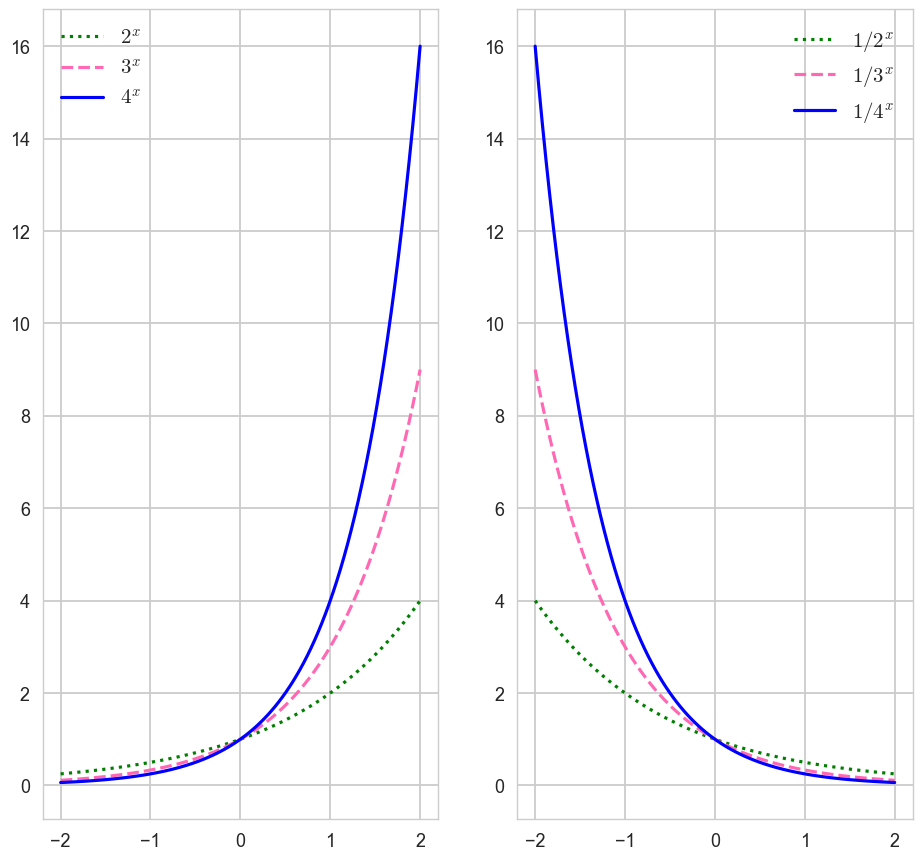
CH4-06 함수(2): 자연상수 '' = 2.718......

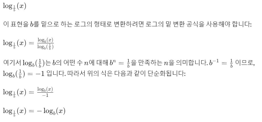
1-1. 로그함수의 밑변환 공식
x1 = np.linspace(0.0001, 5, 1000)
x2 = np.linspace(0.01, 5, 100)

y11, y12 = np.log10(x1), np.log(x2)
y21, y22 = -np.log10(x1), -np.log(x2)

fig, axes = plt.subplots(1,2,figsize=(10,10))
axes[0].plot(x1, y11, ls = ':', label = '$\log_{10} x$')
axes[0].plot(x2, y12, label = '$\log_{e} x$')
axes[0].legend()
axes[0].set_xlabel('$x$')
axes[0].set_ylabel('$y$')
axes[1].plot(x1, y21, ls = ':', label = '$\log_{1/10} x$')
axes[1].plot(x2, y22, label = '$\log_{1/e} x$')
axes[1].legend()
axes[1].set_xlabel('$x$')
axes[1].set_ylabel('$y$')
plt.show()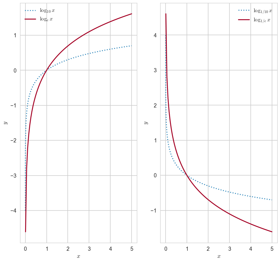
1-2. 시그모이드 함수(이진 로지스틱 회귀에서 확률을 구할 때 사용됨, 주로 0.5를 기준으로 클래스를 분류함)
- 아무리 발악해도 0과 1사이의 값을 가짐
- x =0, y=0.5임
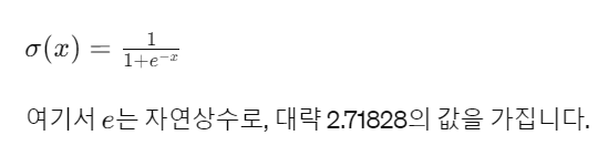
z = np.linspace(-10,10,100)
y = 1/(1+np.exp(-z))

plt.figure(figsize=(7,7))
plt.plot(z,y,color = 'blue',lw = 1)
plt.title('sigmoid function')
plt.xlabel('$x$')
plt.ylabel('$y$')
plt.legend()
plt.show()
CH4-07: 함수(변량, 벡터와 함수의 관계)
1. 벡터의 표현
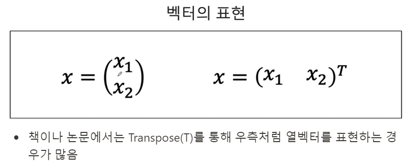
- 책이나 논문에서는 Transpose(T)를 통해 우측처럼 열벡터를 표현하는 경우가 많음
2. 변수와 함수
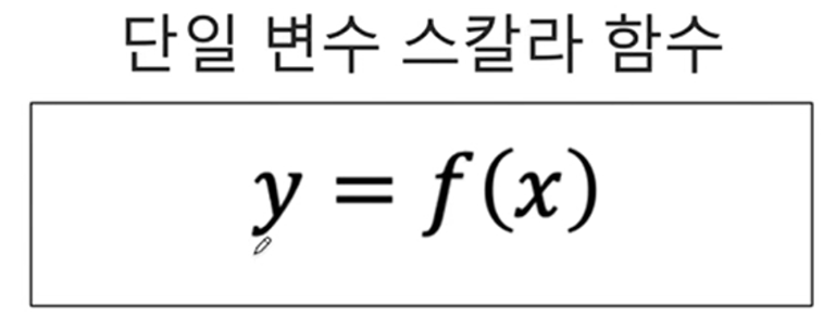
2-1. 단일변수 스칼라함수(변수가 하나, 결과가 하나)
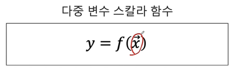
2-2. 다중변수 스칼라함수(변수가 여러개, 출력이 하나): 변수에 벡터기호가 있음(다중변수)
2-3. 다변수 벡터함수
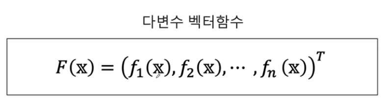
다변수 벡터함수는 여러 개의 독립변수를 가지고 있으며, 결과로 벡터 값을 반환하는 함수입니다. 간단히 말해, 다변수 벡터함수는 입력변수 에 대해 여러 개의 함수의 결과를 벡터 형태로 묶어서 반환합니다.
예를 들어, 입력변수가 이고, 이 의 각 요소에 대한 함수일 때, 다변수 벡터함수 는 다음과 같이 정의됩니다:
여기서 는 n차원 벡터를 반환하며, 각 요소는 입력변수 에 대한 각각의 함수 의 값입니다.
모든 함수들이 같은 독립변수 벡터 를 공유하지만, 각 함수는 를 다르게 해석하거나 다른 계산을 수행하여 각각 다른 결과를 반환할 수 있습니다. 예를 들어, 한 함수는 의 첫 번째 요소에 더 많은 가중치를 둘 수 있고, 다른 함수는 의 두 번째 요소에 더 많은 가중치를 둘 수 있습니다.
결과적으로, 는 에 대한 각 함수 의 출력을 요소로 가지는 벡터를 생성합니다. 이렇게 함으로써, 는 입력 벡터 를 고차원 공간에서의 하나의 점으로 매핑하는 변환을 수행합니다.
다변수 벡터함수 가 하나의 점으로 매핑된다는 표현은, 함수 가 입력 벡터 를 새로운 공간에서의 단일 벡터로 변환한다는 의미입니다. 구체적으로 설명하면:
- 입력 벡터 : 이는 m차원 공간의 점을 나타낼 수 있습니다. 여기서 m은 의 요소 개수입니다.
- 각 함수 : 이 함수들은 의 각 독립변수들을 받아서 하나의 스칼라 값을 출력합니다. 여기서 는 1부터 까지의 인덱스입니다.
- 출력 벡터 : 이 벡터는 차원 공간의 점으로 표현됩니다. 여기서 각 의 결과는 벡터의 번째 요소가 됩니다.
이렇게 F를 통해 입력 벡터 는 n차원 벡터 로 변환되며, 이 변환된 벡터는 n차원 공간에서의 단일 점으로 해석될 수 있습니다. 이 변환은 공학, 물리학, 컴퓨터 그래픽스 등 다양한 분야에서 차원 변환, 상태 변화, 물리적 변형 등을 설명하는 데 사용됩니다.
예를 들어, 물리학에서 시간에 따른 입자의 위치를 나타내는 다변수 벡터함수는 3차원 공간에서의 입자의 경로를 하나의 곡선으로 매핑할 수 있습니다. 컴퓨터 그래픽스에서는 3D 객체의 모양을 2D 화면 상의 이미지로 변환하는 데 사용됩니다. 이러한 변환을 통해 다차원 공간에서의 복잡한 관계나 동작을 이해하고 시각화할 수 있습니다.
3. numpy 라이브러리에서 벡터 x,y에 대해 모든 (x,y)쌍을 표시할 수 있는 meshgrid함수
np.meshgrid 함수는 NumPy 라이브러리에서 제공하는 함수로, 두 벡터를 입력으로 받아서 2차원 격자(grid)를 형성합니다. 이 함수는 주로 2차원 공간에 대한 평가 지점들을 생성하는 데 사용되며, 3차원 공간으로 확장해서 사용할 수도 있습니다. 격자를 형성하는 원리는 각 입력 벡터의 모든 요소들 간의 조합을 만들어내는 것입니다.
원리
예를 들어, 두 벡터 x = [x1, x2, x3]과 y = [y1, y2, y3, y4]가 있다고 가정해 보겠습니다. np.meshgrid(x, y)는 다음과 같이 작동합니다:
x벡터는 각y요소에 대해 반복됩니다. 이것은 2차원 배열에서 각 행이x벡터의 복사본이 되도록 합니다.y벡터는 각x요소에 대해 반복됩니다. 이것은 2차원 배열에서 각 열이y벡터의 복사본이 되도록 합니다.- 결과적으로, 두 개의 2차원 배열이 생성됩니다. 하나는
x좌표를 위한 것이고, 다른 하나는y좌표를 위한 것입니다.
이 두 배열을 함께 사용하여 2차원 공간에서 모든 (x, y) 쌍을 나타낼 수 있습니다.
np.meshgrid의 결과는 입력된 배열의 길이에 기반하여 생성되는데, 각각의 출력 배열의 차원은 입력 배열들의 길이에 의해 결정됩니다. 즉, x와 y 배열이 주어질 때, x의 길이가 n이고 y의 길이가 m이라면, np.meshgrid(x, y)를 통해 생성되는 두 개의 2차원 배열 X, Y는 각각 m x n 차원을 가집니다.
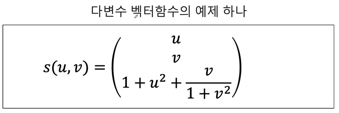
1-1. 시각화해보기(3차원 벡터가 결과로 나옴)
u = np.linspace(0,1,30)
v = np.linspace(0,1,30)
U, V = np.meshgrid(u, v)
Z = ( 1+ U ** 2) + V/(1 + V ** 2)fig = plt.figure(figsize=(7,7))
axes = plt.axes(projection = '3d')
axes.xaxis.set_tick_params(labelsize=15)
axes.yaxis.set_tick_params(labelsize=15)
axes.zaxis.set_tick_params(labelsize=15)
axes.set_xlabel(r'$x$', fontsize=20)
axes.set_ylabel(r'$y$',fontsize=20)
axes.set_zlabel(r'$z$',fontsize=20)
axes.scatter3D(U, V, Z)
plt.show()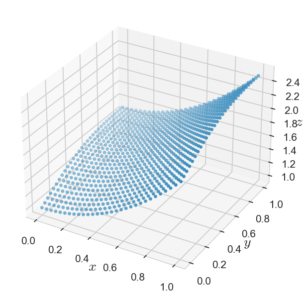
CH4-08: 함수(삼차함수와 로그함수의 합성함수를 시각화해보자)
1-1. 삼차함수, 로그함수 따로 시각화해보기
x = np.linspace(-4,4,100)
y = x**3 - 15*x + 30
z = np.log(y)fig, axes = plt.subplots(1,2,figsize=(10,5))
axes[0].plot(x, y, ls = ':', color = 'blue', label = '$x^3 - 15x + 30$')
axes[1].plot(y, z, label = '$\log(y)$')
axes[0].legend()
axes[1].legend()
plt.show()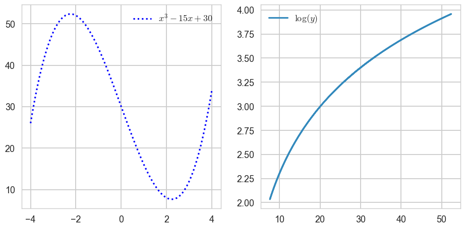
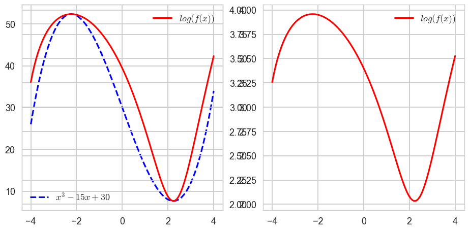
1-2. 삼차함수와 로그함수의 합성함수 시각화해보기
fig, axes = plt.subplots(1,2,figsize=(10,5))
axes[0].plot(x, y, ls = 'dashed', color = 'blue', label = '$x^3 - 15x + 30$') # f(x)
axes[1].plot(x, z, color = 'red', label = '$log(f(x))$') # g(f(x))
axes[1].legend()
ax_tmp = axes[0].twinx()
ax_tmp.plot(x,z,color = 'red',label = '$log(f(x))$')
ax_tmp.legend()
axes[0].legend(loc = 'lower left')
plt.show()