Front-End 과제
오늘은 수업 도중에 Figma 주소를 받게 되었다. 실제 기업에서 Front-End들에게 과제로 주어지는 문제와 유사하다고 한다.
( 별점 3/5 정도의 난이도.. )
물론 javascript를 요구사항 명세에 맞게 설계해야한다.
JS는 나중에 하고, 오늘은 HTML/CSS을 설계해보자.
HTML
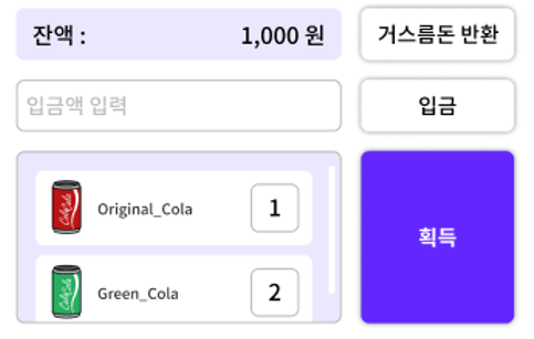
<section id="app">
<h1 class="tit-app ir">cola cola</h1>
<section class="vending-machine">
</section>
<section class="my-info">
</section>
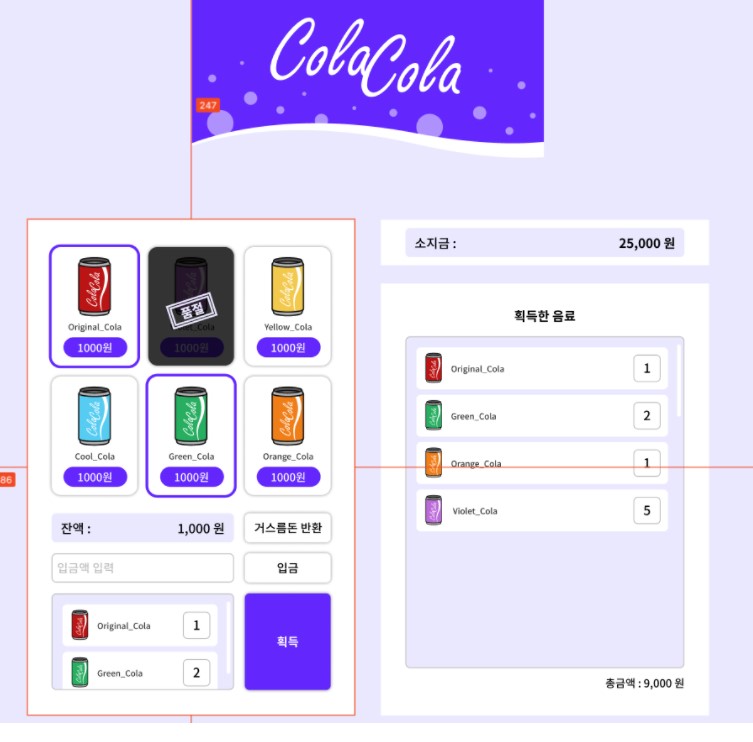
</section>전체적인 구조는 이와 같다. 모든 부분은 <section id="app">으로 감싸져 있다.
h1은 위의 사진을 불러올 것이다. <section class="vending-machine">은 자판기 부분을 담을 것이고, <section class="my-info">는 소지금과 획득한 음료 부분이다.
<h2 class="ir">자판기 화면</h2>
<ul class="list-item">
  <li>
    <button
            class="btn-item"
            data-item="Original Cola"
            data-count=""
            data-price=""
            data-image=""
            >
      <img class="img-item" src="img/Original_Cola.png" alt="">
      <strong class="tit-item">Original_Cola</strong>
      <span class="txt-item">1000원</span>
    </button>
  </li>
음료수 캔 부분에서 하나의 <li>이다. 버튼 안에 img와 strong, span을 넣어주어 아무곳이나 클릭해도 동작하도록 되어있다.
자바스크립트에서 데이터를 주기 편하게 HTML에서 작업할 수 있다. data-item="Original Cola" 와 같이 미리 정보를 넣어주는 것이다. data-item은 명시되어있는 속성은 아니다. 이름을 마음대로 지어준 것이다. 이와 같은 설계는 자바스크립트 최적화 하기 좋다.
아직 멋쟁이사자처럼 프론트엔드스쿨에서 JS를 배운것이 아니기때문에 값을 비워놓고 나중에 다시 설명하겠다.
<div class="cont-return">
  <div class="info-balance">
    잔액 :
    <span class="txt-balance">1,000원</span>
  </div>
  <button type="button" class="btn-return">거스름돈 반환</button>
</div>

<div class="cont-put">
  <input class="inp-put" type="number" placeholder="입금액 입력">
  <button class="btn-put">입금</button>
</div>

<div class="cont-get">
  <strong class="ir">선택한 음료</strong>
  <ul class="list-item-staged">
    <li class="item-stage">
      <img class="img-item" src="img/Original_Cola.svg" alt="">
      <strong class="txt-item">Original_Cola</strong>
      <span class="num-counter">1</span>
    </li>
    <li class="item-stage">
      <img class="img-item" src="img/Green_Cola.svg" alt="">
      <strong class="txt-item">Green_Cola</strong>
      <span class="num-counter">2</span>
    </li>
  </ul>
  <button class="btn-get" type="button">획득</button>
</div>
음료수 캔 진열대의 밑 부분이다. 나중에 입금, 잔액, 거스름돈 반환 버튼 등의 기능이 js로 처리될 것이다.
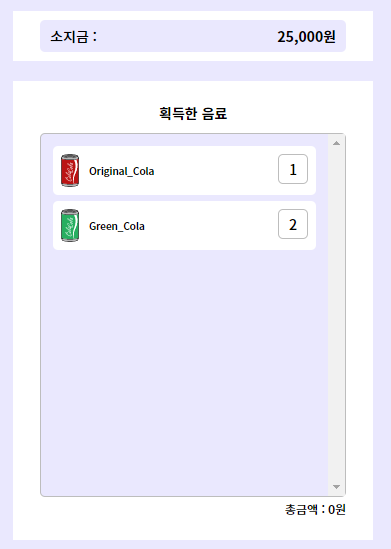
<h2 class="ir">나의 정보 화면</h2>

<div class="cont-mymoney">
  <div class="info-money">
    소지금 :
    <span class="txt-mymoney">25,000원</span>
  </div>
</div>

<div class="cont-myitems">
  <strong class="tit-myitems>획득한 음료</strong>
  <ul cass="list-item-staged">
    <li class="item-stage">
      <img class="img-item" src="" alt="">
      <strong class="txt-item">Original_Cola</strong>
      <span class="num-counter">1</span>
    </li>
  </ul>
  <strong class="txt-total">총금액 :
    <span class="txt-total-money">0원</span>
  </strong>
</div>
이제 <section class="my-info"> 부분이다. 입금하면 나의 소지금이 빠지고, 거스름돈을 누르면 추가되는 기능이나, 획득한 음료 부분이 나중에 js로 처리 될 것이다.
CSS
/* util */
.ir {
  display: block;
  overflow: hidden;
  position: absolute;
  text-indent: -9999px;
  line-height: 0;
  font-size: 1px;
  color: transparent;
}
이제 CSS작업을 시작하자. ir class는 스크린 리더를 위한 태그였다. 숨김처리를 해주자.
body {
  background-color: #eae8fe;
}

#app {
  display: flex;
  flex-wrap: wrap;
  justify-content: center;
  align-items: flex-start;
  gap: 0px 28px;
  padding-top: 247px;
  font-family: "Noto Sans KR", sans-serif;
}

#app .vending-machine,
#app .my-info {
  width: 360px;
  background-color: #fff;
  box-sizing: border-box;
}
화면을 줄였을 때, <section class="my-info"> 부분이 아래로 내려가게끔 flex-wrap를 주었다.
/* title */
.tit-app {
top: 0;
width: 100%;
max-width: 386px;
height: 180px;
background: no-repeat center / 100% 100% url("../img/Logo_img.png");
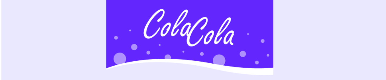
}h1태그의 텍스트는 ir class를 이용하여 숨겨줬었다. tit-app class를 이용하여 background에 이미지만 가져온 것이다.
/* 자판기 */
#app .vending-machine {
  position: relative;
  padding: 31px 27px 28px;
}

/* 자판기 아이템 리스트 */
.vending-machine .list-item {
  display: flex;
  flex-wrap: wrap;
  justify-content: space-between;
}
자판기 아이템 리스트에 flex를 주어 6개의 음료수캔이 한줄에 표시된다. flex-wrap로 공간 넘어가면 아랫줄로 가게 하자.
.vending-machine .list-item li {
  position: relative;
  width: 30%;
  height: 130px;
  border-radius: 10px;
  box-shadow: 0px 0px 4px rgba(0, 0, 0, 0.5);
}

.vending-machine .list-item li:active::before {
  display: block;
  position: absolute;
  content: "";
  width: 100%;
  height: 100%;
  top: 0;
  left: 0;
  border: 3px solid #6327ef;
  border-radius: 10px;
  box-sizing: border-box;
}

.vending-machine .list-item li.sold-out::before {
  display: block;
  position: absolute;
  content: "";
  width: 100%;
  height: 100%;
  top: 0;
  left: 0;
  z-index: 1;
  border-radius: 10px;
  background: no-repeat center / 58px 45px url(../img/Sold-out.png)
    rgba(0, 0, 0, 0.8);
}

.vending-machine .list-item li.sold-out {
  pointer-events: none;
}

.vending-machine .list-item li:nth-child(3) ~ li {
  margin-top: 12px;
}

.vending-machine .btn-item {
  display: block;
  width: 100%;
  height: 100%;
  border-radius: 10px;
}
.vending-machine .list-item .img-item {
  width: 36px;
  height: 65px;
  margin: 0px auto;
}
.vending-machine .tit-item {
  display: block;
  font-size: 9px;
  margin: 5px auto;
}
.vending-machine .list-item .txt-item {
  display: inline-block;
  padding: 5px 15px;
  font-size: 12px;
  color: white;
  background: #6327fe;
  border-radius: 50px;
}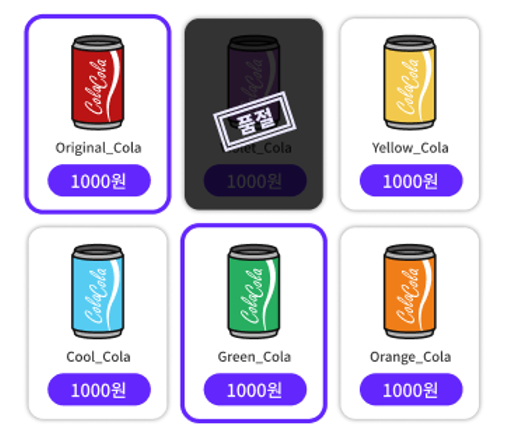
.vending-machine .list-item li 에 relative를 주었다. 그 이유는 음료수 캔을 클릭했을 경우 선택되었다는 표시로 보라색 테두리를 가상요소로 넣기 위해서이다.(가상요소를 absolute로..) 그리고 품절일 경우에도 가상요소로 absolute를 할 것이기 때문이다.
별다른 속성을 주지 않았지만 음료수 사진이 top에서 떨어져있는 것이 보인다. 버튼은 자동으로 가운데 정렬된다는 것을 잊지말자.
.vending-machine .list-item li:active::before 에서 box-sizing: board-box;를 준 것은 active했을경우 범위가 넘쳐서 처리해준 것이다.
pointer-events: none;은 다 팔린 제품은 클릭하지 못하게 미리 설정해준 것이다.
.vending-machine .cont-return,
.vending-machine .cont-put,
.vending-machine .cont-get {
  display: flex;
  justify-content: space-between;
  margin-top: 12px;
}

.cont-return .info-balance,
.cont-put .inp-put,
.cont-get .list-item-staged {
  width: 65%;
  padding: 6px 10px;
  box-sizing: border-box;
  border-radius: 5px;
}

.cont-return .btn-return,
.cont-put .btn-put,
.cont-get .btn-get {
  width: 30%;
  font-size: 13px;
  padding: 6px 0px;
  border-radius: 5px;
  box-shadow: 0px 0px 4px rgba(0, 0, 0, 0.5);
}

.vending-machine .cont-return {
  margin-top: 20px;
}
이제 이부분이다. 크게 보면 왼쪽부분과 오른쪽부분으로 나누어진다. 부모에 flex 해준 후 space-between으로 정렬해준 것이다.
그리고 왼쪽 부분이 더 크게 width를 65% 주었다.
.cont-return .info-balance {
  overflow: hidden;
  font-size: 14px;
  line-height: 20px;
  background-color: #eae8fe;
}

.info-balance .txt-balance {
  float: right;
}

.cont-put .inp-put {
  border: 1px solid #bdbdbd;
  box-sizing: border-box;
  line-height: 18px;
}

.cont-get .list-item-staged {
  height: 106px;
  overflow-y: scroll;
  border: 1px solid #bdbdbd;
  background-color: #eae8fe;
  padding: 12px;
}
잔액 : 1000원 에서 1000원을 float로 해주었다. 이것은 info-balance의 자식인데, float가 자식을 인식할 수 있도록 overflow: hidden;을 주었다.
입금액을 입력하는 부분도 스타일링 해주고, 음료를 담는 부분도 CSS를 적용해주었다.
.list-item-staged li {
  overflow: hidden;
  padding: 8px;
  border-radius: 5px;
  background-color: #fff;
  box-sizing: border-box;
}
.list-item-staged li + li {
  margin-top: 6px;
}
.list-item-staged .img-item {
  width: 18px;
  height: 33px;
}
.list-item-staged .img-item,
.list-item-staged .txt-item {
  float: left;
}
.list-item-staged .txt-item {
  margin-left: 10px;
  line-height: 33px;
  font-size: 9px;
}
.list-item-staged .num-counter {
  float: right;
  display: flex;
  width: 30px;
  height: 30px;
  font-size: 14px;
  border: 1px solid #bdbdbd;
  box-sizing: border-box;
  border-radius: 5px;
  justify-content: center;
  align-items: center;
}

.cont-get .btn-get {
  font-weight: 700;
  background-color: #6327fe;
  color: #fff;
}
여기의 overflow: hidden;도 위에서와 마찬가지로 float가 자식을 인식할 수 있도록 사용해준 것이다.
.list-item-staged li + li는 list-item-staged에서 li의 다음에 오는 li부터 margin-top값을 갖도록 하고있는 것이다.
#app .my-info {
  background-color: #eae8fe;
}

.my-info .cont-mymoney {
  background-color: #fff;
  padding: 9px 27px;
}

.cont-mymoney .info-mymoney {
  background-color: #eae8fe;
  padding: 6px 10px;
  font-size: 14px;
  line-height: 20px;
  border-radius: 5px;
}

.cont-mymoney .txt-mymoney {
  float: right;
  font-weight: 700;
}
이제 거의 다왔다. 먼저 소지금부분이다. 위에서와 마찬가지로 25,000원 부분은 float로 처리해주고 있다.
.my-info .cont-myitems {
  margin-top: 20px;
  padding: 25px 27px;
  background-color: #fff;
}

.cont-myitems .tit-myitems {
  display: block;
  text-align: center;
  margin-bottom: 13px;
  font-size: 14px;
  font-weight: 700;
}

.cont-myitems .list-item-staged {
  height: 364px;
  overflow-y: scroll;
  border: 1px solid #bdbdbd;
  background-color: #eae8fe;
  padding: 12px;
  box-sizing: border-box;
  border-radius: 5px;
}

.cont-myitems .txt-total {
  display: block;
  text-align: right;
  font-size: 12px;
  margin-top: 6px;
}
획득한 음료 부분도 간단하게 마무리 지어주었다.
미디어쿼리
PC에서의 UI는 모두 설계했다. 이제 모바일을 고려하여 미디어쿼리를 작성해자주자.
대박 벌써 올리시다니.. 완전 성실하세요!