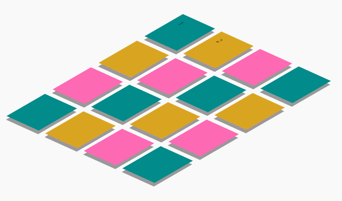
위와같이 동작하는 타일을 grid, flex를 이용하여 설계해보았다.
    <header>
        <h1>codepen 실습</h1>
    </header>
    <section class="section-board">
        <div class="board-item">
            <input id="radio-1" type="radio" name="checkbox">
            <label for="radio-1">1</label>
        </div>
        <div class="board-item">
            <input id="radio-2" type="radio" name="checkbox">
            <label for="radio-2">2</label>
        </div>
        <div class="board-item"></div>
        <div class="board-item"></div>
        <div class="board-item"></div>
        <div class="board-item"></div>
        <div class="board-item"></div>
        <div class="board-item"></div>
        <div class="board-item"></div>
        <div class="board-item"></div>
        <div class="board-item"></div>
        <div class="board-item"></div>
        <div class="board-item"></div>
        <div class="board-item"></div>
        <div class="board-item"></div>
        <div class="board-item"></div>
    </section>
    <footer></footer>
먼저 크게 header, section, footer으로 나누어져 있다.
타일의 각각의 모양을 나타내기 위해 div를 16개 만들어주었다.
        body{
            display: flex;
        }
        header{
            flex: 1;
        }
        footer{
            flex: 1;
        }
        .section-board{
            flex: 1;
            display: grid;
            grid-template-columns: repeat(4, 1fr);
            gap: 20px;
            transform: rotateX(60deg) rotateY(-10deg) rotateZ(50deg);
        }
header, section, footer에 flex:1;을 주어 화면에서 각각 같은 비율의 공간을 차지하도록 하였다. (flex-direction은 row인 상태)
section에 grid를 주고, 모양을 잡아주었다.
        .board-item:nth-child(3n){
            background-color: hotpink;
        }
        .board-item:nth-child(3n-2){
            background-color: darkcyan;
        }
        .board-item:nth-child(3n-1){
            background-color: goldenrod;
        }
        .board-item {
            position: relative;
            top: 0;
            left: 0;
            width: 100px;
            height: 100px;
            transition: all .3s;
        }
        .board-item:hover{
            cursor: pointer;
            /* transform: translate(-10px, -10px); */
            top: -15px;
            left: -15px;
        }
        .board-item::after {
            z-index: -1;
            content: '';
            position: absolute;
            top: 10px;
            left: 10px;
            background-color: #999;
            width: 100px;
            height: 100px;
            transition: all 0.3s;
        }
        .board-item:hover::after{
            top: 25px;
            left: 25px;

        }
board-item에 각각 가상요소를 넣어주기 위해 position을 relative로 설정해주었다.
.board-item:hover, boarder-item, .board-item::after에 top과 left값을 이와같이 설정한 이유가 있다. hover했을경우 그림자처럼 보이는 가상요소는 board-item과 같이 올라가지 않도록 내려가는것처럼 보이게 한 것이다. (board-item만 올라가는것 처럼 보임)
        .board-item input{
            /* position: absolute;
               left: -9999px; */

            /* opacity: 0; */

            display: none;
        }
        .board-item label{
            display: flex;
            align-items: center;
            justify-content: center;
            width: 50%;
            height: 50%;
        }
        .board-item input:checked + label{
            color: white;
            background-color: black;
        }
이 부분은 타일을 클릭했을 경우 색칠되도록 실습해 본 것이다.
마무리
        /* Keyword values */
        flex: auto;
        flex: initial;
        flex: none;

        /* One value, unitless number: flex-grow */
        flex: 2;

        /* One value, length or percentage: flex-basis */
        flex: 10em;
        flex: 30%;

        /* Two values: flex-grow | flex-basis */
        flex: 1 30px;

        /* Two values: flex-grow | flex-shrink */
        flex: 2 2;

        /* Three values: flex-grow | flex-shrink | flex-basis */
        flex: 2 2 10%;

        /* Global values */
        flex: inherit;
        flex: initial;
        flex: unset;
flex: 1 을 주어 자식 요소들에게 화면에서 차지하는 공간을 설정할 수 있다는 사실을 알게 되었다. (flex-grow 값을 주게 된 것)
            grid-template-areas: 'header header header'
                                 'section section aside'
                                 'footer footer footer';
평소에 grid-row: 2/3; , grid-column: 1/3;와 같이 grid를 사용했는데, 위와 같이 설계할 수 있었다.
함께 일하고 싶은 개발자가 되기 위해 달려나가고 있습니다.

와!! 대단합니다!!