1. 배경관련 CSS 속성들
.main-background {
  background-image : url(../img/shoes.jpg);
  // 배경으로 꽉 채워주세요
  // contain은 배경이 짤리지 않게 꽉 채워주세요
  background-size : cover;
  // 모자란 부분 반복 no
  background-repeat : no-repeat;
  // 가운데부터 채워넣기
  background-position : center;
  // 웹사이트가 스크롤될 때 배경이 신기하게 동작하게 만들고 싶을때
  background-attachment : fixed;
}
2. 배경 두개 겹치기
.main-background {
  background-image : url(../img/shoes.jpg), url(person.jpg);
}
3. background-attachment
.layout2-container {
    width: 100%;
    height: 1000px;
    background-image: url(../images/shoes.jpeg);
    background-position: center;
    background-repeat: no-repeat;
    background-size: cover;
    // 스크롤시 배경위치 조정
    background-attachment: fixed;
}
background-attachment 참조
4. margin bug (margin collapse effect)
<div class="배경">
  <p>안에 글씨</p>
</div>
- div 박스안에 p를 사용했는데 이때 p에 상단 margin을 margin-top을 주게 되면 div와 p가 동시에 margin-top이 생겨서 움직이게 됨
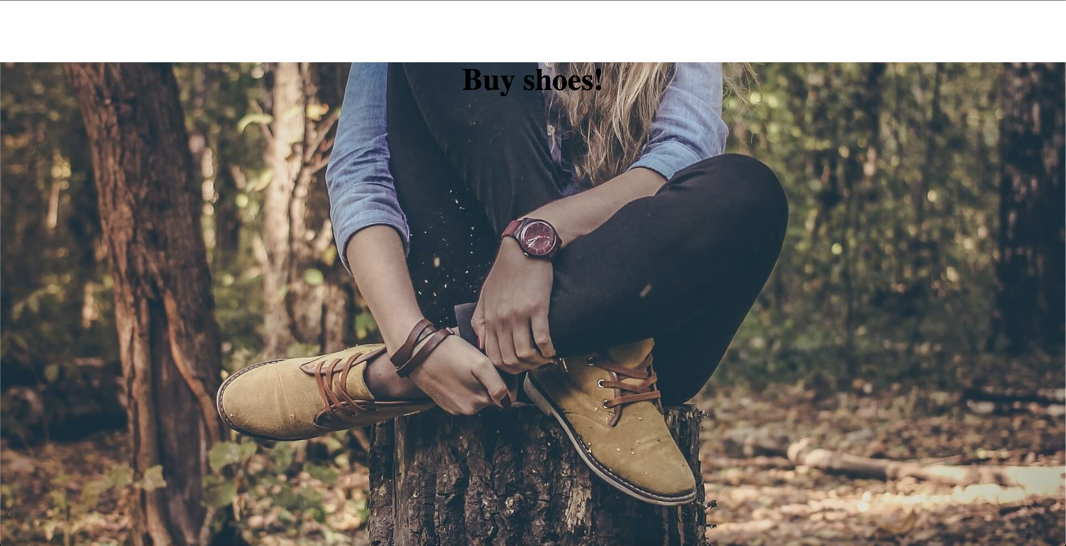
<div class="layout2-container" style="padding: 1px;">
  <h1 class="layout2-header">Buy shoes!</h1>
</div>
- 위에처럼 container에 padding 1px를 주게 되면
5. 박스에 보정입히기
.layout2-container {
    width: 100%;
    height: 1000px;
    background-image: url(../images/shoes.jpeg);
    background-position: center;
    background-repeat: no-repeat;
    background-size: cover;
    background-attachment: fixed;
    // 박스에 보정입히기 (
    filter: brightness(70%);
}
6. 배경에 검은색 틴트 주기
.main-background {
background-image: linear-gradient( rgba(0,0,0,0.5), rgba(0,0,0,0.5) ), url();
}
- linear-gradient 이건 색이 점진적으로 변하는 gradient를 줄 수 있는 키워드인데 여기에 투명도 0.5의 검은색을 입힌 후에 배경겹치기 스킬을 사용.