[React 심화 팀프로젝트] Outsourcing 프로젝트_display 속성(Grid), 조건부 css(props) , hover 시 커서 url 커스텀(Styled-component)
내배캠React3기-프로젝트
목록 보기
13/27
display 속성 - Grid
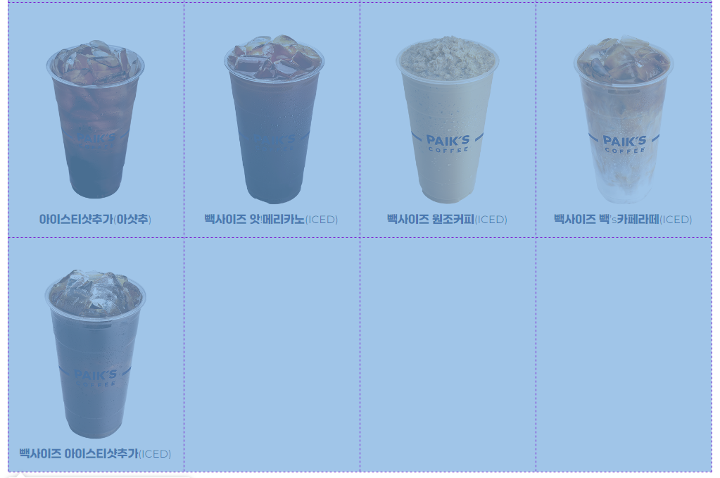
완성 모습
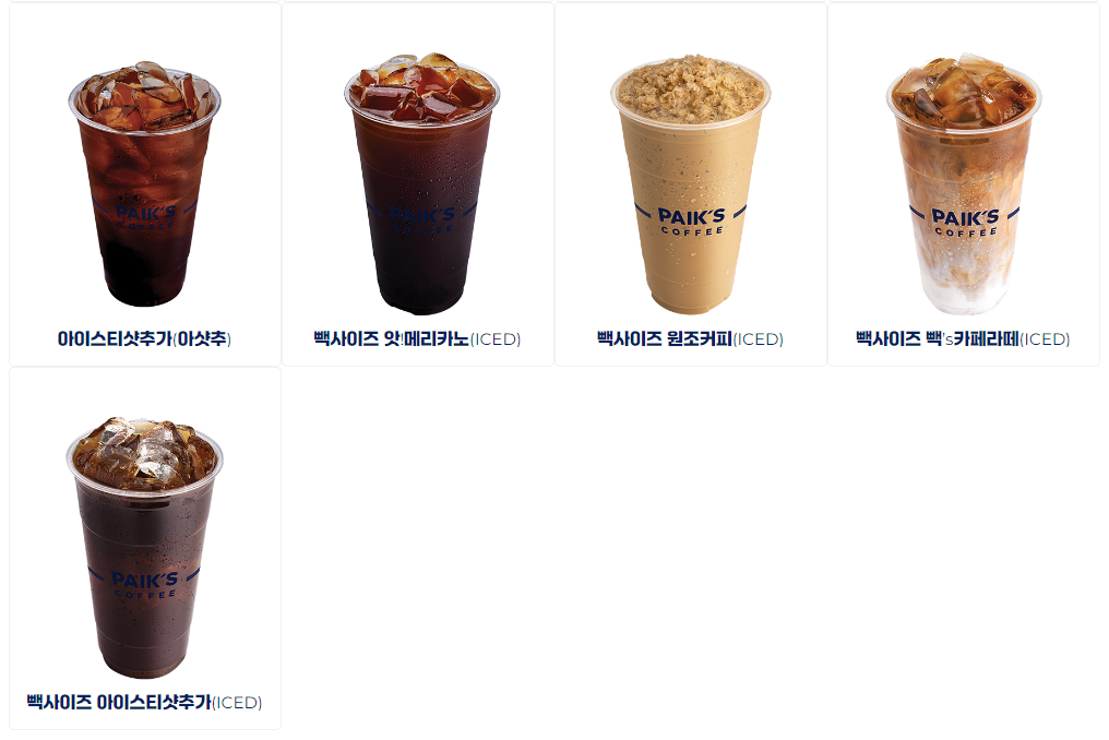
- 항상 flex만 쓰던 나에게 큰 시련이 찾아왔다. 메뉴 카드를 쭉 나열하는데 마지막 한장이 자꾸 중앙에 오는 것이다..(그 당시엔 아주 큰 시련)
- 지금은 justify-content: center 속성만 빼면 내가 원하는 결과물을 얻을 수 있다는 것을 알지만..... 그때는 구글링에서 적당한 답을 찾지 못해 결국 속성을 grid로 바꾸게 되었다.
완성 코드
Product.jsx
* return 부분
import styled, { css } from 'styled-components';

<StProductListContainer>
  {/*메뉴 map으로 뿌려주기*/}
  {products &&
    selectedCategory &&
    products[selectedCategory]?.map(
  ({ name, imgSrc, subName, description }) => {
    return (
      <StProductBox key={name}>
        <StProductImg src={imgSrc} alt="productID" />
        <StProductName>{name}</StProductName>
        <StProductOverlay>
          <h1>{name}</h1>
          <h3>{subName}</h3>
          <hr />
          <p>{description}</p>
        </StProductOverlay>
      </StProductBox>
    );
  }
   )}
</StProductListContainer>
* styled-component
// 제품 카드 전체 리스트를 감싸는 컨테이너
const StProductListContainer = styled.div`
  max-width: 100rem;
  margin: auto;
  display: grid;
  align-items: center;
  grid-template-columns: repeat(4, 1fr);
  transition: all 0.3s;
  overflow: hidden;
  @media screen and (max-width: 60rem) {
    grid-template-columns: repeat(3, 1fr);
  }
  @media screen and (max-width: 37.5rem) {
    grid-template-columns: repeat(2, 1fr);
  }
`;
------------------------------------------------------------------------------
1. 제품 카드 리스트 전체를 감싸주는 컨테이너에 display: grid를 먹여준다.
2. grid-template-columns 속성을 넣어 grid의 열(columns)에서의 배치 형태를 정의해준다.
-> 1fr 1fr 1fr 1fr = repeat(4, 1fr): 1:1:1:1 비율인 4개의 column을 만든다.
------------------------------------------------------------------------------

// 제품 사진과 이름이 들어갈 박스
const StProductBox = styled.li`
  list-style-type: none;
  width: 100%;
  aspect-ratio: 3/4;
  border: 0.1rem solid #f1f1f1;
  border-radius: 0.5rem;
  position: relative;
  overflow: hidden;
  @media screen and (max-width: 60rem) {
    min-width: 13rem;
    width: 100%;
  }
  @media screen and (max-width: 37.5rem) {
    min-width: 13rem;
    width: 100%;
  }
`;
----------------------------------------------------------------
3. width는 100%로 맞춰 grid의 칸 하나마다 채워질 카드의 크기를 정해준다.
----------------------------------------------------------------

// 상품 카드 안에 들어갈 이미지
const StProductImg = styled.img`
  width: 100%;
  height: 100%;
  display: block;
`;
// 상품 카드 안에 들어갈 이름
const StProductName = styled.h1`
  width: 100%;
  padding: 0 1rem;
  font-size: 1.5rem;
  display: block;
  position: absolute;
  text-align: center;
  color: #071f60;
  bottom: 5%;
  max-width: 100%;
  white-space: nowrap;
  overflow: hidden;
  text-overflow: ellipsis;
`;
※ flex와 grid의 차이점
- flex는 1차원으로 수평, 수직 영역 중 하나의 방향으로만 레이아웃을 나눌 수 있고, grid는 2차원으로 수평, 수직 영역을 동시에 나눌 수 있다. (grid는 신문 같은 느낌)
- 개발자 도구로 본다면 flex와 grid의 차이가 좀 더 명확히 보인다.
-> 들어가는 요소가 없으면 flex는 모두 비어 있지만, grid는 칸이 이미 지정되어 있다.
조건부 css(props)
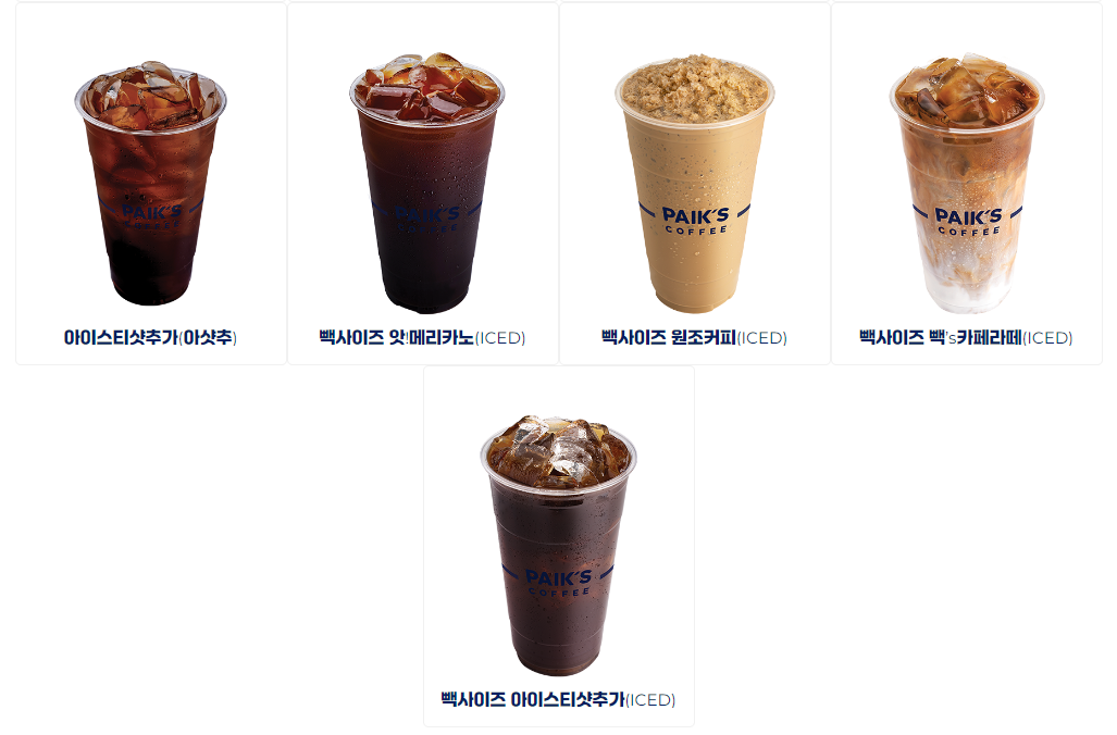
완성 모습
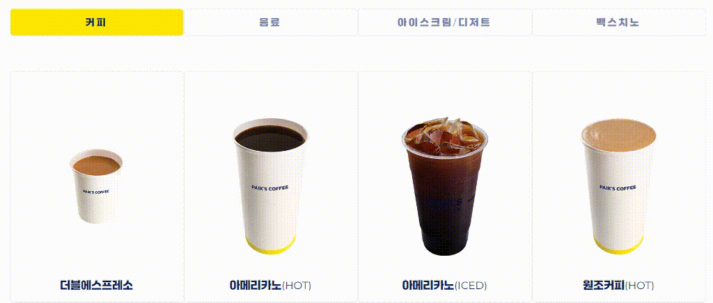
- 카테고리를 선택하면 선택한 버튼만 색이 바뀌도록 css를 만들어줘야했는데, props를 내려서 조건부 css를 거는 것이 가능했다.
완성 코드
Product.jsx
* return 부분
import styled, { css } from 'styled-components';

<StSelectCategoryContainer>
  {categories.map((category) => {
    return (
      <StCategoryButton
        to={`/products?category=${category}`}
        $selectCategory={selectedCategory}
        key={category}
        value={category}
        >
        {category}
      </StCategoryButton>
    );
  })}
</StSelectCategoryContainer>- 먼저 버튼 태그에 selectCategory를 props로 내려준다.
-> react에서 카멜케이스로 이름을 적을 때는 앞에 달러표시($)를 넣어준다. - styled-components의 {css}를 꼭 import 해줄 것!
* styled-component
// 카테고리 탭 전체 컨테이너
const StSelectCategoryContainer = styled.ul`
  display: flex;
  justify-content: center;
  padding: 2rem;
  margin-bottom: 3rem;
  @media screen and (max-width: 37.5rem) {
    display: flex;
    flex-direction: column;
    align-items: center;
    padding: 0;
  }
`;
// 카테고리 버튼
const StCategoryButton = styled(Link)`
  width: 25rem;
  min-height: 4rem;
  padding: 0.5rem 2rem;
  border: 0.1rem solid #f1f1f1;
  border-radius: 0.5rem;
  display: flex;
  justify-content: center;
  align-items: center;
  text-align: center;
  font-size: 1.3rem;
  transition: 0.3s;
  letter-spacing: 3px;
  &:hover {
    background-color: #ffe800;
    color: #071f60;
    cursor: pointer;
  }
  @media screen and (max-width: 37.5rem) {
    min-width: 13rem;
    width: 80%;
  }
  /* 눌러지는 카테고리마다 조건부 css */
  ${(props) => {
    if (props.$selectCategory === props.children) {
      return css`
        background-color: #ffe800;
        color: #071f60;
      `;
    }
    return css`
      background-color: white;
      color: #7483aa;
    `;
    /* 내려준 props를 ${ }로 가져와서 if문으로 조건을 걸어준다.
       props로 내려준 selectCategory와 선택된 요소가 같다면
       return css``(백틱)로 배경색과 글자색을 바꿔준다. */
  }}
`;- 내려준 props를 ${ }로 가져와서 if문으로 조건을 걸어준다.
-> props로 내려준 selectCategory와 선택된 요소가 같다면 return css``(백틱)으로 배경색과 글자색을 바꿔준다. - +소소한 팁! Link 태그는 styled-component로 빼낼 때 styled.Link 가 아닌 styled(Link) 처럼 소괄호 안에 넣어준다. 별거 아니지만 모르면 또 찾아봐야 아니까..
hover 시 커서 url 커스텀
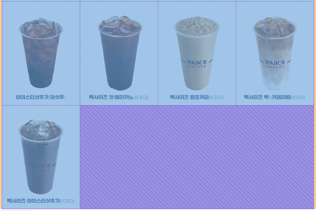
완성 모습
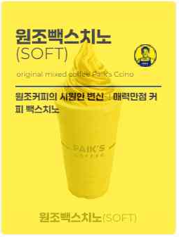
- 캡처 단계에서 화질이 떨어졌지만... 저기 보이는 로고 모양이 커서다. 제품 카드에 호버하면 로고가 뜨도록 하였다.
- 커스텀 cursor는 cursor: url( )을 사용하면 생각보다 쉽게 구현할 수 있다.
완성 코드
Product.jsx
* styled-component (return 부분은 grid 완성 코드의 return과 같다)
// 이미지 import 필수!
import small_logo from '../../assets/img/small_Logo.png';

// 호버 시 올라오는 상품 설명 박스
const StProductOverlay = styled.div`
  width: 100%;
  height: 100%;
  border-radius: 0.5rem;
  top: 0;
  left: 0;
  position: absolute;
  background: #ffe800;
  padding: 2rem;
  display: flex;
  flex-direction: column;
  opacity: 0;
  transition: all 0.5s;
  transform: translateY(2.5rem);
  & h1 {
    font-size: 2.3rem;
    margin: 2rem 0 1.3rem 0;
  }
  & h3 {
    margin: 0 0 0.6rem 0.2rem;
  }
  & hr {
    border-color: #071f60;
    width: 100%;
  }
  & p {
    font-size: 1.2rem;
    line-height: 1.5;
  }
  &:hover {
    opacity: 0.7;
    transform: translateY(0rem);
    cursor: url(${small_logo}) 5 5, default;
  }
  @media screen and (max-width: 37.5rem) {
    padding-top: 0.5rem;
    h1 {
      font-size: 1.5rem;
      margin-bottom: 0.25rem;
    }
    h3 {
      font-size: 0.8rem;
    }
    p {
      font-size: 1rem;
    }
  }
`;- 경로에 따라 이미지를 import 해준다.
- styled-component에 hover {cursor: url( )} 속성을 넣어 커스텀 커서를 만들어준다.
- url의 소괄호에 넣어줄 때는 ${small_logo}를 사용하여 넣어준다.
- cursor: url(${small_logo}) 5 5, default
- 5 5 가 의미하는 것은 각각 이미지의 x좌표, y좌표를 의미하는데, 마우스의 어느 부분에 이미지를 위치 시키고 싶은지에 따라 값이 달라진다.
- 좌표값을 입력해주지 않아도 사용이 가능하지만 입력해주지 않을 경우 마우스 포인터의 우측 하단에 이미지가 표시되어 부자연스럽게 보일 수 있다.
- x좌표에 입력한 값 만큼 왼쪽으로 이동, y좌표에 입력한 값 만큼 위로 이동한다.
-> 만약 이미지 사이즈가 40px * 60px 일 때 마우스 포인터 정중앙으로 이미지를 위치시키고 싶을 때는 이미지 사이즈의 절반인 20 30을 입력하면 된다. - 마지막 default는 이미지를 표시할 수 없을 때 보여줄 커서 모양이다.
-> default 외의 다른 기본 속성이 궁금하다면 여기에서 확인 가능하다.
느낀 점
사실 flex 속성으로도 웬만한 구현은 다 할 수 있어서 grid는 한 번도 써본 적이 없었는데, 이번 기회에 grid 속성도 사용하고 견문이 넓어졌다. props의 폭넓은 사용법과 커스텀 커서를 이용하여 좋은 결과물을 낼 수 있어 뿌듯했다.
참고자료
Grid 속성: https://studiomeal.com/archives/533
props css: https://devbirdfeet.tistory.com/177
커스텀 커서: https://blog.webi.kr/34