hover 시 카드에 설명 띄우기
완성작
완성 코드
Product.jsx
import 뱅쇼hot from '../../assets/img/뱅쇼hot.png'
import styled from 'styled-components';
// return 부분(UI)
<StProductsContainer>
<StProductBox>
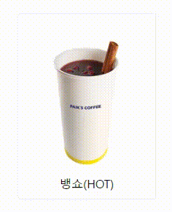
<StProductImg src={뱅쇼hot} alt='productID' />
<StProductName>뱅쇼(HOT)</StProductName>
<StProductOverlay>
<h1>뱅쇼(HOT)</h1>
<h3>VIN CHAUD</h3>
<hr />
<p>상큼한 과일향과 풍부한 시나몬향이 매력적인 메뉴</p>
</StProductOverlay>
</StProductBox>
</StProductsContainer>
// styled-component(css)
const StProductsContainer = styled.div`
max-width: 100rem;
display: flex;
justify-content: center;
align-items: center;
transition: all 0.3s;
margin: auto;
flex-wrap: wrap;
overflow: hidden;
`;
const StProductBox = styled.div`
width: 20rem;
aspect-ratio: 3/4;
border: 0.1rem solid #f1f1f1;
border-radius: 0.5rem;
position: relative;
display: flex;
justify-content: center;
@media screen and (max-width: 60rem) {
min-width: 13rem;
width: 40%;
}
@media screen and (max-width: 37.5rem) {
min-width: 13rem;
width: 80%;
}
`;
const StProductImg = styled.img`
width: 100%;
height: 100%;
display: block;
`;
const StProductName = styled.h1`
font-size: 1.7rem;
position: absolute;
bottom: 5%;
`
const StProductOverlay = styled.div`
width: 100%;
height: 100%;
border-radius: 0.5rem;
top: 0;
left: 0;
position: absolute;
background: #FFE800;
padding: 2rem;
display: flex;
flex-direction: column;
opacity: 0;
transition: all .5s;
transform: translateY(2.5rem);
& h1 {
font-size: 2.3rem;
margin: 2rem 0 1.3rem 0;
}
& h3 {
margin: 0 0 0.6rem 0.2rem;
}
& hr {
border-color: #071F60;
width: 100%;
}
& p {
font-size: 1.2rem;
line-height: 1.5;
}
&:hover {
opacity: 0.7;
transform: translateY(0rem);
}
`코드 설명
import / return 부분(UI)
// assets/img/에 있는 이미지 import(각자 경로에 있는 이미지 import 해오면 됨)
import 뱅쇼hot from '../../assets/img/뱅쇼hot.png'
// styled-components를 사용하기 위해 import
import styled from 'styled-components';

// return 부분(UI)
<StProductsContainer>
  <StProductBox>
    {/* import한 이미지를 넣을 때는 내가 지정한 이미지 이름을 중괄호에 넣어주면 된다. */}
    <StProductImg src={뱅쇼hot} alt='productID' />
    <StProductName>뱅쇼(HOT)</StProductName>
    <StProductOverlay>
      <h1>뱅쇼(HOT)</h1>
      <h3>VIN CHAUD</h3>
      <hr /> {/*구분선 태그*/}
      <p>상큼한 과일향과 풍부한 시나몬향이 매력적인 메뉴</p>
    </StProductOverlay>
  </StProductBox>
</StProductsContainer>
*- 사실 나는 이 부분에서 참 헷갈렸는데, 특히 3번 위치를 잘못잡아서 css에 반나절이 걸렸다😥
- 같은 카드들(카드 리스트)을 담아 줄 가장 최상위 컨테이너를 하나 만들고
- 그 아래에 제품 사진과 이름이 들어갈 카드 박스를 자식으로 넣어준다.
- 그 아래 자식으로 사진과 이름을 넣고 여기에 hover 시 보여질 태그를 넣어준다.
- hover 시 보여질 태그의 하위요소로 그 안에 들어갈 내용들을 구분하여 넣어준다.
styled-component 부분(css)
// 제품 카드 전체를 감싸는 컨테이너
const StProductsContainer = styled.div`
  max-width: 100rem;
  display: flex;
  justify-content: center;
  align-items: center;
  transition: all 0.3s;
  margin: auto;
  flex-wrap: wrap;
  overflow: hidden;
`;
-------------------------------------------------------------------------------
* transition - 호버 시 부드러운 효과를 주기 위해 넣음 (all 0.3초 동안 천천히)
* overflow: hidden - 호버 시 전체 박스를 넘어가는 경우 전체 틀에 맞춰 보이지 않도록 해줌
-------------------------------------------------------------------------------

// 제품 사진과 이름이 들어갈 박스
const StProductBox = styled.div`
  width: 20rem;
  aspect-ratio: 3/4;
  border: 0.1rem solid #f1f1f1;
  border-radius: 0.5rem;
  position: relative;
  display: flex;
  justify-content: center;
  @media screen and (max-width: 60rem) {
    min-width: 13rem;
    width: 40%;
  }
  @media screen and (max-width: 37.5rem) {
    min-width: 13rem;
    width: 80%;
  }
`;
--------------------------------------------------------------------------------
* position: relative - 자기 자신을 기준으로 이동하는 포지션(absolute와 주로 함께 쓰인다.)
* @media screen and (max-width: 60rem)
  - 반응형 웹을 구현할 때 주로 쓰며, 해당 넓이보다 작아지면 중괄호에 든 내용으로 UI 변경
  	-> min이 아니라 max를 써야한다.
      (최대 60rem까지만 전 UI를 쓰고 더 작아지면 바뀐 UI를 나타낸다.)
--------------------------------------------------------------------------------

// 상품 카드 안에 들어갈 이미지
const StProductImg = styled.img`
  width: 100%;
  height: 100%;
  display: block;
`;
--------------------------------------------------------------------------------
* display: block - display 속성은 요소를 어떻게 보여줄지를 결정한다.
 -> block은 기본적으로 가로 영역을 모두 채워서 block 요소 다음에 등장하는 태그는 줄바꿈 됨
 --------------------------------------------------------------------------------

// 상품 카드 안에 들어갈 이름
const StProductName = styled.h1`
  font-size: 1.7rem;
  position: absolute;
  bottom: 5%;
`
--------------------------------------------------------------------------------
* position: absolute - 자주 함께 쓰는 relative의 자식
  -> 부모를 기준으로 절대적으로 움직이므로, 부모 요소를 벗어날 수 없다.
* bottom: 5% - 부모를 기준으로 아래에서 5%만 띄운다.
--------------------------------------------------------------------------------

// 호버 시 올라오는 상품 설명 박스
const StProductOverlay = styled.div`
  width: 100%;
  height: 100%;
  border-radius: 0.5rem;
  top: 0;
  left: 0;
  position: absolute;
  background: #FFE800;
  padding: 2rem;
  display: flex;
  flex-direction: column;
  opacity: 0;
  transition: all .5s;
  transform: translateY(2.5rem);
  & h1 {
    font-size: 2.3rem;
    margin: 2rem 0 1.3rem 0;
  }
  & h3 {
    margin: 0 0 0.6rem 0.2rem;
  }
  & hr {
    border-color: #071F60;
    width: 100%;
  }
  & p {
    font-size: 1.2rem;
    line-height: 1.5;
  }
  &:hover {
    opacity: 0.7;
    transform: translateY(0rem);
  }
  `
--------------------------------------------------------------------------------
* opacity: 0 - 투명도를 나타낸다. 숫자가 작을수록 점점 옅어짐(1이 기본 값)
* transform: translateY - translate는 현재위치를 기준으로 이동하는데 Y는 세로로 이동
  -> transform: translateY(2.5rem)는 아래(세로로) 2.5rem 만큼 내려준다.
    (처음에는 살짝 아래에서(2.5rem) 시작하다가 hover 시 올라가게(0rem) 지정해준다.)
* styled-components에서 &는 자기 자신을 가리킨다.
  -> &h1 이란 부모 컨포넌트 본인이 품고 있는 자식 h1을 가리키며 css를 변경시켜준다.
* &:hover - 본인을 hover했을 때 opacity(투명도) 0.7 만큼만 줘서 뒤가 비치게 해준다.
--------------------------------------------------------------------------------
느낀 점
Styled-component로 hover 시 카드 위에 설명 띄우는 방법이 잘 나와있지 않아서(내가 이해를 못해서😂) 그렇게 어렵지 않은 걸 5시간이나 헤매고 쓰는 TIL...
반응형 웹을 처음으로 제대로 구현해보려고 하는데, 생각보다 신경써야할 것들이 많고 css가 시간을 엄청 잡아먹는다.. ㅠㅠ
참고 자료
호버 애니메이션: https://www.youtube.com/watch?v=hr4JiDr7Aec
position 속성: https://velog.io/@remon/position-%EC%9D%B4%EB%9E%80
display 속성: https://ofcourse.kr/css-course/display-%EC%86%8D%EC%84%B1
transform: traslate 속성: (1) https://gahyun-web-diary.tistory.com/79
(2) https://velog.io/@jamie7dev/CSS-transform