1. 미루고 미루던 반응형 UI
드디어 반응형 UI를 잡았다.
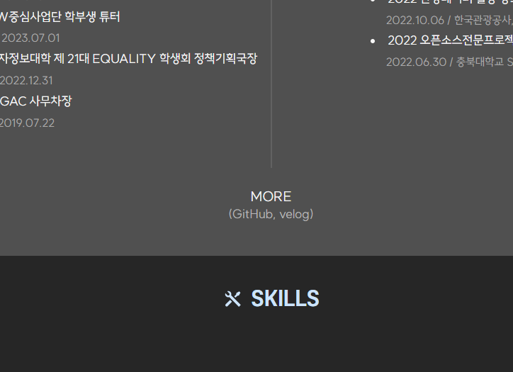
기존의 <About> 부분이
이렇게 가로로 진행되어 가로축이 좁혀질 때 컴포넌트가 겹쳤었는데,
이렇게 1100px기준 display속성을 변경했다.
const GridContainer = styled.div`
  position: relative;
  display: grid;
  grid-template-columns: repeat(2, 1fr);
  column-gap: 2vw;
  margin-top: 2vh;

  &::after {
    content: "";
    position: absolute;
    right: 50%;
    transform: translateX(50%);
    top: 0;
    bottom: 0;
    width: 1px;
    background-color: #757575;
  }

  @media (max-width: 1100px) {
    display: flex;
    flex-flow: column nowrap;

    &::after {
      content: none;
    }
  }
`;
외에도
<Skills> 컴포넌트 배치를 가로폭 기준에 맞게 반응형으로 변경했다.
const ParentDiv = styled.div`
  display: grid;
  grid-template-columns: repeat(4, 1fr);
  grid-template-rows: repeat(5, 1fr);
  width: 100%;
  max-width: 1100px;
  gap: 2rem;
  justify-content: center;
  padding: 2vh 2vw;

  @media (max-width: 1100px) {
    display: flex;
    flex-flow: column nowrap;
    gap: 2vh;
    width: 85%;
  }
...
나머지도 부분 부분 확인해 수정했다.
2. Footer 직행 핸들러 추가
- 내 포트폴리오를 들어오면서 Footer까지 가지 않는 이상 GitHub이나 velog등 외부 링크를 접할 수 없는게 아쉬웠다.
- 그래서
<About>에 핸들러를 추가했다.
- 그래서
const scrollToFooter = () => {
  const footerElement = document.getElementById("footer");
  if (footerElement) {
    footerElement.scrollIntoView({ behavior: "smooth" });
  }
};<p id="more" onClick={scrollToFooter}>
MORE
<br />
<span>(GitHub, velog)</span>
</p>4차 추가 변경 사항 (예정)
<Project>란 프로젝트 소개 형식을 변경할 예정이다.- 현재 :
주요기능→경험 사항 - 변경 :
주요기능→Struggle→HOW Solve→What I Learned
- 현재 :
- 한번에 다 보여주긴 세로축이 길어져
Accordian을 도입할 계획이다.

Being a Modern Project Manager