kaggle 노트북을 필사해보면서 공부하기로 마음먹고 바로 시작했다. Kaggle Korea의 이유한님께서 올려주신 Kaggle 커리큘럼을 보고 순차대로 진행해볼 예정이다.
import numpy as np
import pandas as pd
import matplotlib.pyplot as plt
import seaborn as sns
plt.style.use('fivethirtyeight')
import warnings
warnings.filterwarnings('ignore')
%matplotlib inline
일단 import할게 너어무 많다. 기본적으로 Numpy랑 Pandas는 깔고 간다 치고, 시각화는 plotly가 아니라 matplotlib랑 seaborn을 사용.
이번에 처음 알았는데 plt.style.use로 시각화 테마를 바꿀 수 있다!
print(plt.style.available)를 실행하면
['bmh', 'classic', 'dark_background', 'fast', 'fivethirtyeight', 'ggplot', 'grayscale', 'seaborn-bright', 'seaborn-colorblind', 'seaborn-dark-palette', 'seaborn-dark', 'seaborn-darkgrid', 'seaborn-deep', 'seaborn-muted', 'seaborn-notebook', 'seaborn-paper', 'seaborn-pastel', 'seaborn-poster', 'seaborn-talk', 'seaborn-ticks', 'seaborn-white', 'seaborn-whitegrid', 'seaborn', 'Solarize_Light2', 'tableau-colorblind10', '_classic_test']
뭐 요런 가능한 테마 스타일이 쭉 나온다~~. 한번씩 사용해보면 질리지 않고 좋을듯??
warnings은 알고는 있었는데 이번에 처음 사용해봐서 어떤건지 살펴봤다.
간략히 말하면 경고 메시지를 무시하거나 다시 보이게 하거나 할 수 있는 기능인듯?
warnings.filterwarnings('ignore') # 경고메시지를 무시하고 숨긴다.

warnings.filterwarnings('default') # 경고메시지를 다시 보이게.
%matplotlib inline은 또 무엇인고 하니~~ notebook을 실행한 브라우저에서 그림(시각화 그래프)를 바로 볼 수 있게 하는것이렸다!
이제 모듈에 대해서 알아 보았으니 Titanic 데이터를 가져오고
df = pd.read_csv('C:/Users/gasak/OneDrive/바탕 화면/big data/파이썬 머신러닝/pandas/titanic/train.csv')분석을 시작해 봅시당!!
💻분석 시작~~!
타이타닉 데이터가 어떤 데이터인진 대충 분석했을 때 알아보았었으니 넘어가고자 한다.
일단 가장 기본적인 결측값의 유무를 파악하자
df.isnull().sum()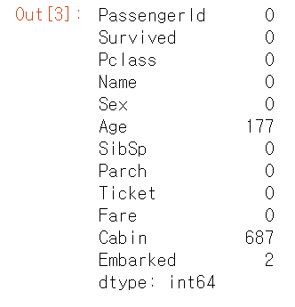
df.isna().sum()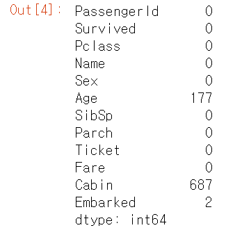
결측값의 유무를 확인할 때 isna()도 되고 isnull()도 된다. 뭔차이인지는 모르겠다
-> 찾아보니 차이는 없고 isna()를 추천하는듯 하다.(stackoverflow 참고)
😥생존자는 얼마나 될까..
타이타닉 영화를 본 사람은 알듯이 매우 절망적인 사고 현장이었다. 많은 사람이 사망한 사건이었는데... 실제로 생존자와 사망자의 비율을 확인해보자.
fig, ax = plt.subplots(1, 2, figsize=(18,8))
df['Survived'].value_counts().plot.pie(explode=[0,0.1], autopct='%1.1f%%', ax=ax[0], shadow=True)
# explode : 파이 조각이 돌출되는 크기(0이면 돌출x) - 2번째 파이조각을 돌출
# autopct : 파이 조각의 전체 대비 백분율 - 소수점 1자리까지 %로 표기
ax[0].set_title('Survived')
ax[0].set_ylabel('')
sns.countplot('Survived',data=df,ax=ax[1])
ax[1].set_title('Survived')
plt.show()
df.Survived의 값들을 count에서 pie 그래프로 시각화를 해봤고, countplot을 통해 생존자의 수를 막대 그래프로도 나타내어 보았다. countplot은 자동적으로 value_count를 해주는듯 하다.
두 그래프를 확인하듯이 생존자(1)은 사망자에 비해 적다. 대략 61%의 승객이 사망한 것으로 보인다.
💻Feature Analysis
이번엔 데이터 Feature에 대해서 분석을 해보자. 기본적으로 Feature의 타입은 네가지가 있다.
Categorical(범주형) - 질적 변수
명목형(Norminal) 변수라고도 한다. 타이타닉 데이터에선 Sex, Embarked에 해당하는 데이터. 순서와는 무관하여 정렬을 할 수 없다. 그냥 분류만 한 것!
Ordinay(순서형) - 질적 변수
명목형 변수, 예를 들어 성별은 순서의 의미가 없다고 했다. 남자가 1, 여자가 2라고 해서 1에 가중치를 더 둘 수 없는것은 상식!
그에 반해 순서형 변수는 이름답게 순서에 따라 의미를 둘 수 있다. 이 데이터에서는 Pclass데이터가 해당된다. Pclass는 1, 2, 3으로 나눠져 있는데 이는 의미를 둘 수 있다. 다른 예로서, 설문조사에서 만족, 불만족의 단계도 또한 순서형 데이터라고 할 수 있다.
Continous(연속형) - 양적 변수
말 그대로 연속적인 값. 키, 몸무게 등이 이에 해당한다. 이 데이터에서는 Age가 해당한다.(사실 나이가 연속형이라고도 할 수 있고, 이산형이라고도 할 수 있다.)
Discrete(이산형) - 양적 변수
이산형 변수는 연속형 변수와 다르게 셀 수 있는 변수이다.
네 종류의 변수에 대해 학습해 보았으니 이제는 Titanic 데이터를 가지고 Feature마다 자세히 뜯어보자.
1. Sex Analysis
df.groupby(['Sex','Survived'])['Survived'].count()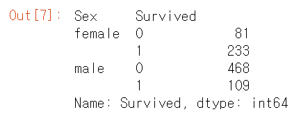
Groupby를 통해 성별과 생존 유무에 따라 묶고난 다음, 생존자 및 사망자의 수를 세보았다.
일단 남녀의 전체 수는 치워두고, 사망자와 생존자의 수만 비교하면 여자의 생존자가 더 많다.
fig, ax = plt.subplots(1, 2, figsize=(18,8))
df[['Sex','Survived']].groupby(['Sex']).mean().plot.bar(ax=ax[0])
ax[0].set_title('Survived vs Sex')
sns.countplot('Sex', hue='Survived', data=df, ax=ax[1])
# hue인자에 카테고리컬 변수를 지정하면 카테고리값에 따라 색을 변화
ax[1].set_title('Sex:Survived vs Dead')
plt.show()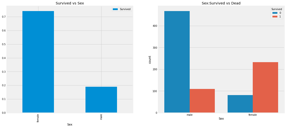
시각화 그래프로 확인해본 결과, 여성의 생존자 비율이 훨씬 높다. 이는 생존자 예측 시에 중요한 변수중 하나라고 생각된다.
2. Pclass Analysis
Pclass는 객실 클래스에 대한 변수이다. 3 -> 2 -> 1순으로 등급이 나눠진다.
pd.crosstab(df.Pclass,df.Survived,margins=True).style.background_gradient(cmap='summer_r')
# background_gradient로 heatmpas를 만들 수 있다.(matplotlib 모듈), 값의 크기에 따라 gradient 변화
# margins 파라미터로 행, 열 합 추가 가능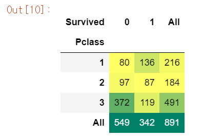
crosstab으로 변수 케이스 별 value_count가 가능하다. 이 함수를 통해 데이터를 재구조화가 가능하다. 이 crosstab은 범주형 변수로 되어있는 요인별로 교차분석을 하여, 행 및 열 요인 기준별로 빈도를 세어서 도수분포표, 교차표를 만들어준다.
Pclass별 Survived의 교차분석을 시행한 결과 생존자가 가장 만은 class는 1, 사망자가 많은 클래스는 3이다.
- margins = false로 한 결과
pd.crosstab(df.Pclass,df.Survived,margins=False).style.background_gradient(cmap='summer_r')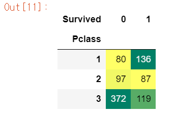
이번엔 보기 좋게 시각화를 통해 Pclass별 승객의 수를 보자.
fig, ax = plt.subplots(1, 2, figsize=(18,8))
df['Pclass'].value_counts().plot.bar(color=['#CD7F32','#FFDF00','#D3D3D3'], ax=ax[0])
ax[0].set_title('Number Of Passengers By Pclass')
ax[0].set_ylabel('Count')
sns.countplot('Pclass', hue='Survived', data=df, ax=ax[1])
ax[1].set_title('Pclass:Survived vs Dead')
plt.show()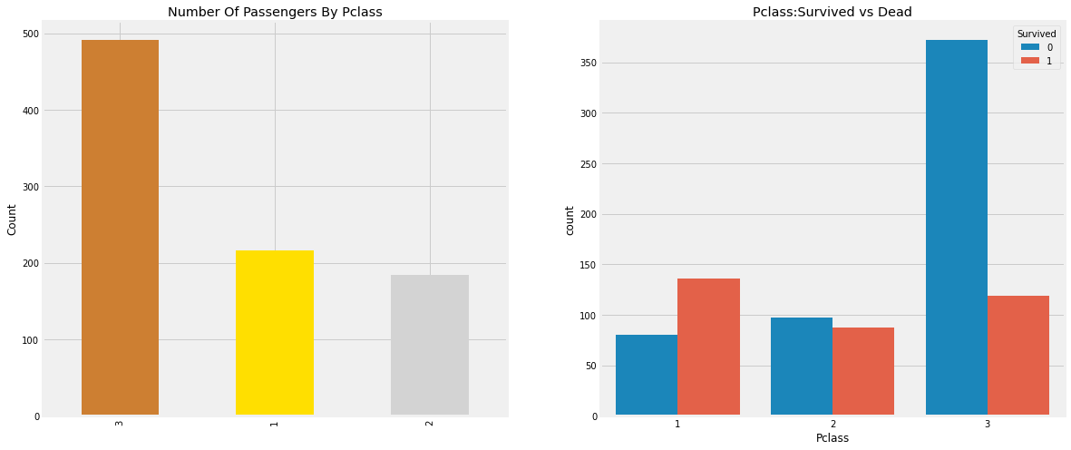
위 그래프를 통해 각 Pclass마다 승객의 수를 비교하기가 쉬워졌고, 사망자와 생존자의 비율도 확인이 가능하다.
각 Pclass의 생존율을 계산해보면
df[['Pclass', 'Survived']].groupby('Pclass').mean()
# Pclass 3의 생존율이 가장 낮다.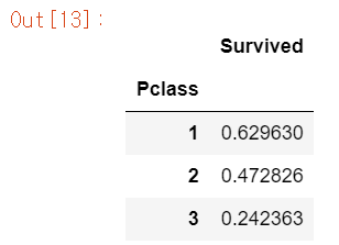
3번이 압도적으로 적다... 타이타닉의 구조가 어떻게 생겼는지는 모르겠지만 부자는 살고, 일반인은 비극적인 참변을 겪었다.
이번엔 Sex와 Pclass별 생존자를 파악해보자.
pd.crosstab([df.Sex, df.Survived], df.Pclass, margins=True).style.background_gradient(cmap='summer_r')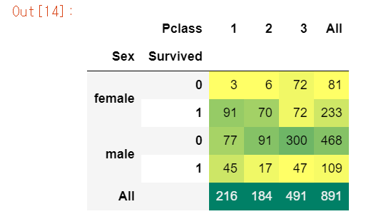
pd.crosstab([df.Sex, df.Pclass], df.Survived, margins=True).style.background_gradient(cmap='summer_r')
# Pclass별 성별에 따른 생존자, 사망자 확인은 위에가 낫다.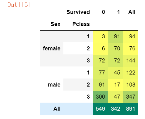
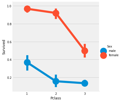
Factorplot은 카테고리컬 변수에 따른 시각화가 용이한 그래프이다. y축은 평균값을 나타낸다.
sns.factorplot('Pclass', 'Survived', hue='Sex', data=df)Pclass와는 무관하게 여성이 우선시 구조, PClass1의 남자는 아무리 Class 1의 승객이더라도 생존율이 낮다.
df[['Sex','Pclass','Survived']].groupby(['Sex', 'Pclass']).mean()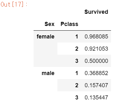
df.groupby(['Sex', 'Pclass'])['Survived'].mean()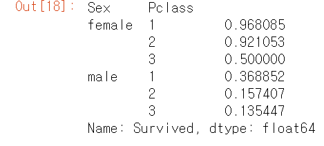
생존율을 계산하면 여성의 first 클래스는 생존율이 무려 96%를 넘기지만 남자는 37%밖에 되지 않는다. third 클래스의 남자는 생존율이 13%밖에 되지 않는다.
3. Age Analysis
print('Oldereest Passenger was of : ', df['Age'].max(), 'Years')
print('Younged Passenger was of : ', df['Age'].min(), 'Years')
print('Average Passenger was of : ', df['Age'].mean(), 'Years')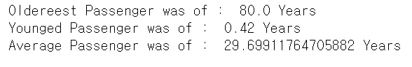
승객들의 나이 분포를 보면 0 ~ 80살정도이고, 평균은 대략 30살이다.
Pclass별 나이에 따른 승객들의 생존율을 보자. (Violin plot 사용, 이 그래프는 boxplot처럼 분포도를 볼 수 있다.)
fig, ax = plt.subplots(1, 2, figsize=(18, 8))
sns.violinplot('Pclass', 'Age', hue='Survived', data=df, split=True, ax=ax[0])
ax[0].set_title('Pclass and Age vs Survived')
ax[0].set_yticks(range(0, 110, 10))
sns.violinplot('Sex', 'Age', hue='Survived', data=df, split=True, ax=ax[1])
ax[1].set_title('Sex and Age vs Survived')
ax[1].set_yticks(range(0, 110, 10))
plt.show()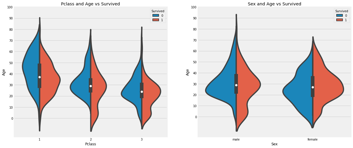
사망자의 나이대를 보면 20 ~ 50대의 승객이 많이 분포하고 있다. 0 ~ 10살의 어린아이들은 대부분이 생존자에 속하고, 나이 많은 대략 65세 이상의 노인은 사망자가 더 많다.
이번엔 결측값이 존재하던 Age 피쳐에 값을 넣어보자. 전에는 그냥 평균값을 넣었지만 이번에는 다르게 해보려고 한다. 각 이니셜마다 나이의 평균치를 구해 대입해보려고 한다.
# 이름중에 Mr, Mrs들어가는 사람의 나이중 결측값에 평균을 대입
df['Initial'] = 0
for i in df:
    df['Initial']=df.Name.str.extract('([A-Za-z]+)\.')
    #위 extraxt의 의미는 A-Z와 a-z의 문자중 다음 문자로 .이 따라오는 것을 추출
pd.crosstab(df.Initial, df.Sex, margins=True).T.style.background_gradient(cmap='summer_r')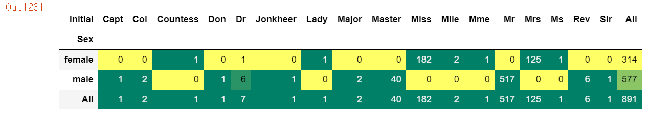
Mlle 또는 Mme와 같이 Miss를 나타내는 잘못된 이니셜이 있다. 오타라고 생각되는 이니셜들을 수정해보자.
df['Initial'].replace(['Mlle','Mme','Ms','Dr','Major','Lady','Countess','Jonkheer','Col','Rev','Capt','Sir','Don'],['Miss','Miss','Miss','Mr','Mr','Mrs','Mrs','Other','Other','Other','Mr','Mr','Mr'],inplace=True)그 후에 이니셜별 나이의 평균을 구해서 이니셜을 가진 승객이 결측치라면 구한 평균값을 넣어주자.
df.groupby('Initial')['Age'].mean()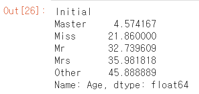
df.loc[(df.Age.isnull()) & (df.Initial=='Mr'),'Age']=33
df.loc[(df.Age.isnull()) & (df.Initial=='Mrs'),'Age']=36
df.loc[(df.Age.isnull()) & (df.Initial=='Master'),'Age']=5
df.loc[(df.Age.isnull()) & (df.Initial=='Miss'),'Age']=22
df.loc[(df.Age.isnull()) & (df.Initial=='Other'),'Age']=46
df.Age.isnull().any() # NuLL값이 있는지 확인False
fig, ax = plt.subplots(1, 2, figsize=(18, 8))
df[df.Survived == 0].Age.plot.hist(ax=ax[0], bins=20, edgecolor='black', color='red')
ax[0].set_title('Not Survived')
x1=list(range(0, 85, 5))
ax[0].set_xticks(x1)
df[df.Survived==1].Age.plot.hist(ax=ax[1], bins=20, color='green', edgecolor='black')
ax[1].set_title('Survived')
ax[1].set_xticks(range(0, 85, 5))
plt.show()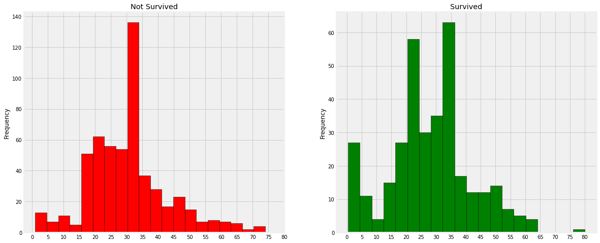
- 30 ~ 40대의 사람의 사망율이 높다.
- 아이들의 생존도 우선시
- 80대의 노인은 살았다.
sns.factorplot('Pclass', 'Survived', col='Initial', data=df)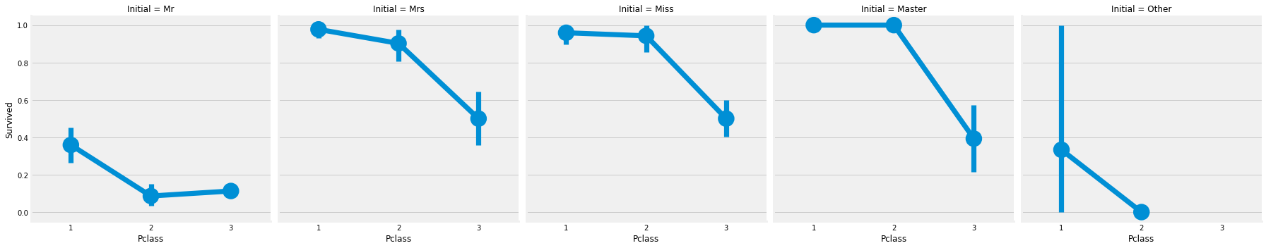
이번엔 Initial에 따른 Pclass별 생존율을 파악해보았다.
4. Embarked Analysis (Embarked : 승선함 항구명)
pd.crosstab([df.Embarked,df.Pclass],[df.Sex,df.Survived],margins=True).style.background_gradient(cmap='summer_r')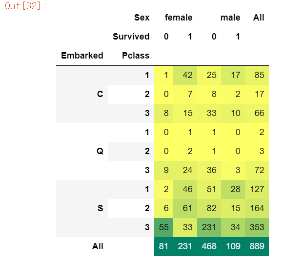
S의 승객이 가장 많은 것도 있지만 남자의 사망자 인원이 엄청 많다.
sns.factorplot('Embarked', 'Survived', data=df)
fig=plt.gcf()
fig.set_size_inches(5, 3)
plt.show()
# figure에 접근해야할 땐, plt.gcf()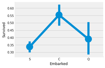
factorplot으로 확인한 결과 S 승객의 생존율이 35%도 안된다.
fig, ax = plt.subplots(2, 2, figsize=(20, 15))
sns.countplot('Embarked', data=df, ax=ax[0,0])
ax[0, 0].set_title('No. Of Passengers Boadrded')
sns.countplot('Embarked', hue='Sex', data=df, ax=ax[0,1])
ax[0,1].set_title('Male-Female Split for Embarked')
sns.countplot('Embarked', hue='Survived', data=df, ax=ax[1,0])
ax[1,0].set_title('Embarked vs Survived')
sns.countplot('Embarked', hue='Pclass', data=df, ax=ax[1,1])
ax[1,1].set_title('Embarked vs Pclass')
plt.subplots_adjust(wspace=0.2,hspace=0.5)
plt.show()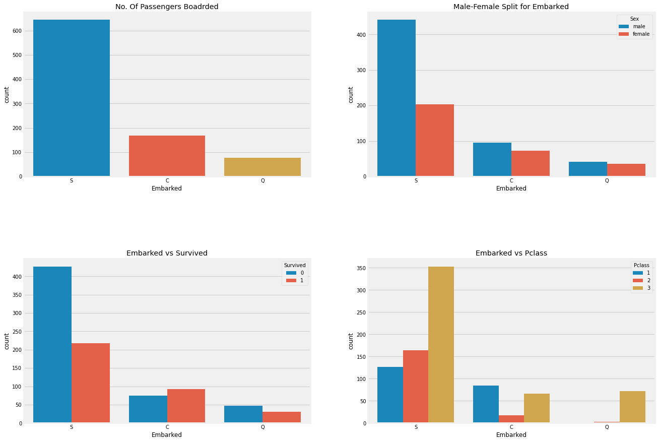
df.groupby(['Embarked', 'Pclass'])['Survived'].mean()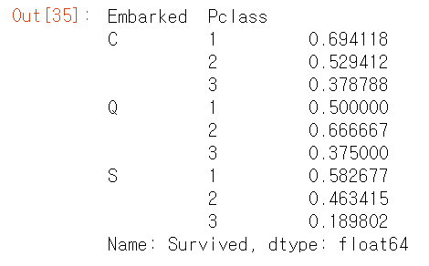
Embarked S의 생존율이 낮은 이유는 Pclass3 의 대략 81% 사람이 사망했기 때문이다.
sns.factorplot('Pclass', 'Survived', hue='Sex', col='Embarked', data=df)
plt.show()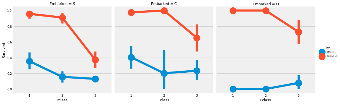
Embarked의 결측치는 최빈값으로 채워준다. 따라서 S로 대체했다.
# NULL value of Embakred
# Maximum passenger boarded from pors S, so replace Null with 'S'
df['Embarked'].fillna('S', inplace=True)df.Embarked.isna().any()False
5. SibSp Analysis
pd.crosstab(df.SibSp, df.Survived, margins=True).style.background_gradient(cmap='summer_r')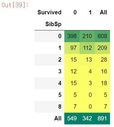
sns.barplot('SibSp', 'Survived', data=df).set_title('SibSp vs Survived')
plt.show()
# barplot에서 가는선은 추정치이다. 이는 신뢰구간과 유사
# 이 범위는 기본적으로 부트 스트랩 신뢰구간이라는 것을 사용한다.
# 이 데이터를 기반으로 유사한 상황의 95%가 이 범위 내에서 결과를 얻을 것이라는 의미
# 신뢰구간이 아니라 표준편차를 표현하고 싶으면 파라미터로 ci="sd" 저장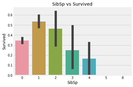
SibSp 데이터 분석해보니 1 ~ 2에 해당하는 승객의 생존율은 높은 편이지만, 혼자이거나 3 이상은 낮아진다.
factor = sns.factorplot('SibSp', 'Survived', data=df, ax=ax[1])
factor.fig.suptitle('SibSp vs Survived')
plt.show()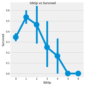
pd.crosstab(df.SibSp, df.Pclass).style.background_gradient(cmap='summer_r')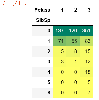
6. Parch Analysis
pd.crosstab(df.Parch, df.Survived).style.background_gradient(cmap='summer_r')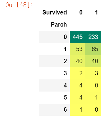
pd.crosstab(df.Parch, df.Pclass).style.background_gradient(cmap='summer_r')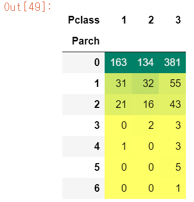
sns.barplot('Parch', 'Survived', data=df).set_title('Parch vs Survived')
plt.show()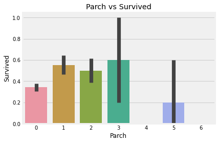
fac = sns.factorplot('Parch', 'Survived', data=df)
fac.fig.suptitle('Parch vs Survived')
plt.show()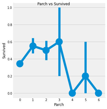
Parch데이터는 1 ~ 3에 해당하는 승객은 생존율이 높고, 나머지는 낮다.
7. Fare(continous) Analysis
print('Highest Fare was : ', df['Fare'].max())
print('Lowest Fare was : ', df['Fare'].min())
print('Average Fare was : ', df['Fare'].mean())
Highest Fare was : 512.3292
Lowest Fare was : 0.0
Average Fare was : 32.2042079685746
fig, ax = plt.subplots(1, 3, figsize=(20, 8))
sns.distplot(df[df['Pclass']==1].Fare, ax=ax[0])
ax[0].set_title('Fares in Pclass 1')
sns.distplot(df[df['Pclass']==2].Fare,ax=ax[1])
ax[1].set_title('Fares in Pclass 2')
sns.distplot(df[df['Pclass']==3].Fare, ax=ax[2])
ax[2].set_title('Fares in Pclass 3')
plt.show()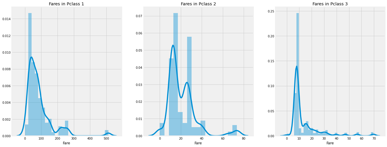
정리
- Sex : 남성보다 여성의 생존율이 높다. 이는 구조가 여성이 우선한다
- Pclass : Pclass 1의 승객의 생존율이 높다. 반면에 3은 낮다. 여성에게는 Pclass 1이 거의 1등이고, 2등도 높다.
- Age : 5~10살의 아이들의 생존율이 높고 15~35살의 성인들이 많이 사망했다.
- Embarked : Q의 사람들은 대다수가 Pclass 3. Embarked중에서 C만 생존율이 사망률보다 높다.
- Parch + SibSp : 1~2 SibSP, Spouse on board or 1~3 Parents의 생존율이 높다. 혼자오거나 대가족은 상대적으로 낮다.
상관계수(Correlation)
sns.heatmap(df.corr(), annot=True, cmap='RdYlGn', linewidths=0.2)
# annot=True : 각 셀에 숫자를 입력
fig=plt.gcf()
fig.set_size_inches(10, 8)
plt.show()
# 알파벳이나 문자열 사이에 상관관계는 없기 때문에 수치형 변수에만 적용
# 만약 상관계수가 높다면 다중공산성 문제 발생
# 이는 ML 모델을 학습시킬 때 성능 약화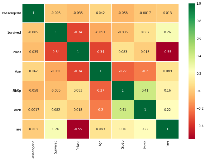
heat맵을 통해 각 변수끼리의 상관계수를 구했다. Pclass와 Fare의 상관계수는 상대적으로 높은 편에 속한다. 주의해서 봐야할 변수라고 생각.
데이터 정제
Age
- Age는 연속형 변수 -> ML모델에 문제가 발생할 가능성 있다.
- 연속형 변수를 범주형 변수로 변환하자(Binning or 표준화)
- 나이(0 ~ 80)을 5단위로 binning하자
df['Age_band'] = 0
df.loc[df['Age'] <= 16, 'Age_band'] = 0
df.loc[(df['Age'] > 16) & (df.Age <= 32), 'Age_band'] = 1
df.loc[(df.Age > 32) & (df.Age <= 48), 'Age_band'] = 2
df.loc[(df.Age > 48) & (df.Age <= 64), 'Age_band'] = 3
df.loc[df.Age > 64, 'Age_band'] = 4
df.Age_band.value_counts().to_frame().style.background_gradient(cmap='summer')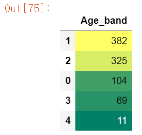
loc를 통해 각 나이 범주에 해당하는 Age_band 피쳐를 재생성했다.
sns.factorplot('Age_band', 'Survived', hue='Pclass', data=df)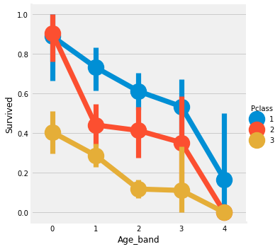
sns.factorplot('Age_band', 'Survived', col='Pclass', data=df)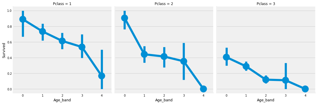
factorplot로 확인한 결과 확실히 나이가 많아질 수록 생존율이 급감한다. 이는 PClass와 무관하다.
Family_Size
SibSp와 Parch 피쳐를 통해 가족의 size를 재생성하고 혼자 유무를 파악하는 피쳐도 만들자.
df['Family_Size'] = 0
df['Family_Size']=df['Parch']+df['SibSp']
df['Alone'] = 0
df.loc[df.Family_Size == 0, 'Alone'] = 1
f1 = sns.factorplot('Family_Size', 'Survived', data=df)
f1.fig.suptitle('Family_Size vs Survived')
f2 = sns.factorplot('Alone', 'Survived', data=df)
f2.fig.suptitle('Alone vs Survived')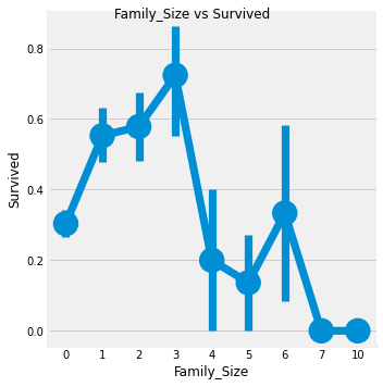
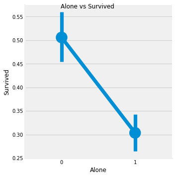
위 그래프를 보면 혼자이거나 가족이 4명 이상인 경우 생존율 급락한다. 가족의 크기는 1 ~ 3명일 때가 생존율이 높다.
sns.factorplot('Alone', 'Survived', hue='Sex', data=df, col='Pclass')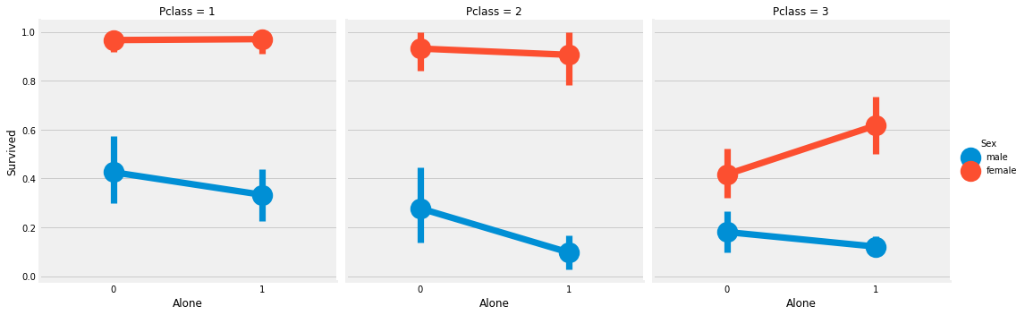
Fare_Range
Fare 또한 연속형 변수이기 때문에 이산형 변수로 전환해야 한다. pd.qcut 사용. qcut는 설정한 bin에 따라 분리하고 정렬해준다.
df['Fare_Range'] = pd.qcut(df['Fare'], 4)
df.groupby('Fare_Range')['Survived'].mean().to_frame().style.background_gradient(cmap='summer_r')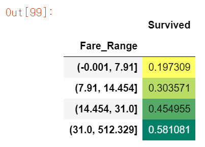
Fare이 높을수록 생존율도 높아지는 것을 확인할 수 있다.
df['Fare_cat'] = 0
df.loc[df.Fare <= 7.91, 'Fare_cat'] = 0
df.loc[(df.Fare > 7.91) & (df.Fare <= 14.454), 'Fare_cat'] = 1
df.loc[(df.Fare > 14.454) & (df.Fare <= 31.0), 'Fare_cat'] = 2
df.loc[(df.Fare > 31.0) & (df.Fare < 513), 'Fare_cat'] = 3
sns.factorplot('Fare_cat', 'Survived', hue='Sex', data=df)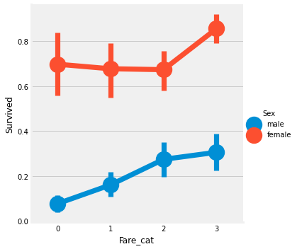
Fare은 Pcalss와 상관관계가 있을 것이고, PClass가 높을 수록 생존율이 높았었는데 Fare도 마찬가진 것을 보니 생각이 맞을 듯 싶다.
인코딩
from sklearn.preprocessing import LabelEncoder

le = LabelEncoder()
le.fit(df.Sex)
df['Sex'] = le.transform(df['Sex'])

le.fit(df.Embarked)
df.Embarked = le.transform(df.Embarked)

le.fit(df.Initial)
df.Initial = le.transform(df.Initial)

df.head()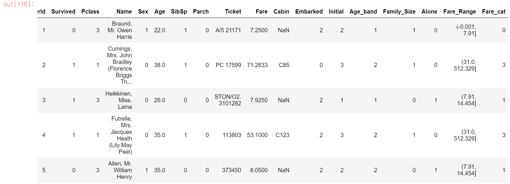
ML 알고리즘을 학습시길 경우에 테스트 데이터에 문자열이 들어있으면 학습율이 떨어지므로 인코딩 작업을 실시한다. Sex, Embarked, Initial은 카테고리컬 함수이므로 LabelEncoder을 실행해 주었다. 그러나 회귀에서는 OneHot이 성능이 좋으므로 나중에 한번 OneHot Encoder도 실행해봐야 겠다.
이번엔 필요없는 Feature을 drop 시켜보자.
# Name : 딱 봐도 노필요
# Age : Age_band가 있다.
# Ticket : 딱봐도 노필요
# Fare : Fare_cat 있다
# Cabin : 객실번호가 왜 필요하겠나
# Fare_Range ; Fare_cat 있다.
# PassengerId : index가 있는데 왜 필요?

#df.drop(['Name', 'Age', 'Ticket', 'Fare', 'Cabin', 'Fare_Range', 'PassengerId'], inplace=True, axis=1)
sns.heatmap(df.corr(), annot=True, cmap='RdYlGn', linewidth=0.2, annot_kws={'size':20})
#annot_kws : 글자 크기 조절 가능, fmt="f" : 데이터 표시 데이터타입
fig=plt.gcf()
fig.set_size_inches(18, 15)
plt.xticks(fontsize=14)
plt.yticks(fontsize=14)
plt.show()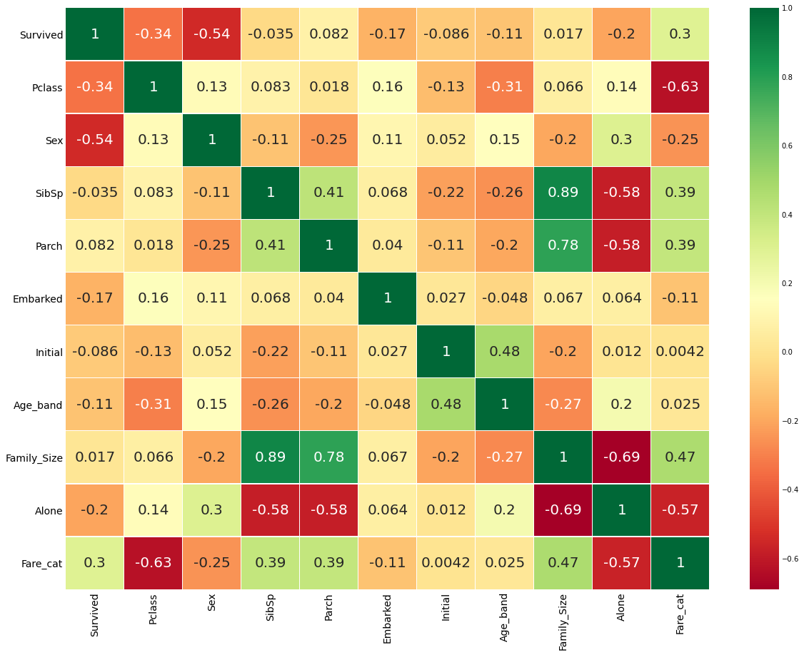
필요없는 변수들을 지우고 상관관계를 확인해본 결과,
Family Size는SibSp,Parch를 통해 만든 요약변수(파생변수보단 요약에 가깝다고 생각)다 보니 상관관계가 높다.Fare_Cat도PClass와 상관관가 높은 편에 속한다.Alone또한Family_Size를 통한 요약변수라 관계성이 짙은 편이다.- 상관관계가 높은 변수는 다중공산성을 조심해야 한다.
💻예측 시작
from sklearn.linear_model import LogisticRegression		# 로지스틱 회귀
from sklearn import svm						# 서포트 벡터 머신
from sklearn.ensemble import RandomForestClassifier		# 랜덤포레스트
from sklearn.neighbors import KNeighborsClassifier		# KNeighbor 분류
from sklearn.naive_bayes import GaussianNB			# 가우시안 나이브
from sklearn.tree import DecisionTreeClassifier			# 의사결정 나무
from sklearn.model_selection import train_test_split
from sklearn import metrics
from sklearn.metrics import confusion_matrix
이번 데이터 예측을 위한 모듈들을 import 해준다.
train,test=train_test_split(df,test_size=0.3,random_state=0,stratify=df['Survived'])
train_X=train[train.columns[1:]]	# 설명변수들
train_Y=train[train.columns[:1]]  # Survived(목표 변수)
test_X=test[test.columns[1:]]
test_Y=test[test.columns[:1]]
X=df[df.columns[1:]]
Y=df['Survived']- stratify : Stratified K Fold 역할과 비슷. Stratify를 Target 변수로 지정해주면 비율에 맞게 나눠준다
타이타닉 데이터를 train, test 데이터로 분류해준다.
Radial Support Vector Machines
model=svm.SVC(kernel='rbf',C=1,gamma=0.1)
model.fit(train_X,train_Y)
prediction1=model.predict(test_X)
print('Accuracy for rbf SVM is ',metrics.accuracy_score(prediction1,test_Y))
Accuracy for rbf SVM is 0.835820895522388
선형 SVM에선 사용할 수 없는 상황에서 사용하는 커널이다.
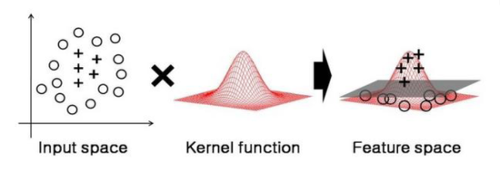
2차원 상에서 선형으로 분류할 수 없던 데이터들이 고차원으로 확장하자 가능해졌다. 이렇게 커널은 주어진 데이터를 보다 고차원으로 확장시켜 준다.
커널의 종류는 다양하다.
- Polynomal
- Sigmoid
- 가우시안 rbf
이 중에 가우시안 rbf의 성능이 뛰어나다. rbf의 하이퍼 파라미터는 gamma, C가 있다.
- gamma : gamma가 클수록 데이터 포인터들이 영향력을 행사하는 거리가 짧아진다. 즉, gamma가 커지면 작은 표준편차를 갖는다.
- C : C가 커질수록 이상치의 존재를 무시하기가 힘들어진다.
- 이 두 파라미터가 낮으면 underfitting, 높으면 overfitting의 위험이 있다.
Linear Support Vector Machines
model = svm.SVC(kernel='linear', C=0.1, gamma=0.1)
model.fit(train_X, train_Y)
pred2 = model.predict(test_X)
print('Accuracy for linear SVC is ', metrics.accuracy_score(pred2, test_Y))
Accuracy for linear SVC is 0.8171641791044776
LogisticRegression
model = LogisticRegression()
model.fit(train_X, train_Y)
pred3 = model.predict(test_X)
print('Accuracy of the Logistic Regression is ', metrics.accuracy_score(pred3, test_Y))
Accuracy of the Logistic Regression is 0.8134328358208955
DecisionTreeClassifier
model = DecisionTreeClassifier()
model.fit(train_X, train_Y)
pred4 = model.predict(test_X)
print("Accuracy of the DecisionTreeClassifier is ", metrics.accuracy_score(pred4, test_Y))
Accuracy of the DecisionTreeClassifier is 0.8097014925373134
KNeighborClassifier
mdoel = KNeighborsClassifier()
model.fit(train_X, train_Y)
pred5 = model.predict(test_X)
print('Accuracy of the KNeighborClassifier is ', metrics.accuracy_score(pred5, test_Y))
Accuracy of the KNeighborClassifier is 0.8097014925373134
a_index = list(range(1, 11))
a = pd.Series()
x=[0,1,2,3,4,5,6,7,8,9,10]
for i in list(range(1, 11)):
    model=KNeighborsClassifier(n_neighbors=i)
    model.fit(train_X, train_Y)
    pred = model.predict(test_X)
    a = a.append(pd.Series(metrics.accuracy_score(pred, test_Y)))
    # Series의 append는 Series로 받는다.
plt.plot(a_index, a)
plt.xticks(x)
fig=plt.gcf()
fig.set_size_inches(12, 6)
plt.show()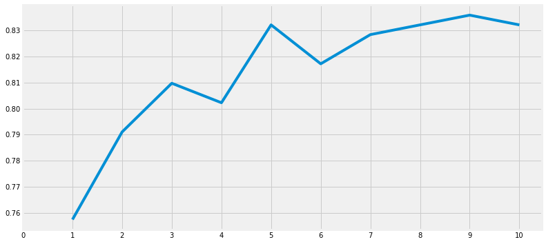
print('Accuracies for different values of n are : ', a.values, 'with the max values as ' , a.values.max())Accuracies for different values of n are : [0.75746269 0.79104478 0.80970149 0.80223881 0.83208955 0.81716418
0.82835821 0.83208955 0.8358209 0.83208955] with the max values as 0.835820895522388
GauissianNB
model=GaussianNB()
model.fit(train_X, train_Y)
pred6 = model.predict(test_X)
print('Accuract of the NaiveBayes is ', metrics.accuracy_score(pred6, test_Y))
Accuract of the NaiveBayes is 0.8134328358208955
RandomForestClassifier
model = RandomForestClassifier(n_estimators=100)
model.fit(train_X, train_Y)
pred7 = model.predict(test_X)
print('Accuracy of the Random Forests is ', metrics.accuracy_score(pred7, test_Y))
Accuracy of the Random Forests is 0.8246268656716418
예측이 끝나고 의아했던 점
데이터 분석 공부를 했을 때 정확도가 못해도 95%는 넘어야 한다고 생각했다. 그런데 필사하면서 노트북에 적혔던 내용중 하나가
모델의 정확성이 분류의 성능을 꼭 결정하는 것은 아니다. 정확도가 90% 넘는다고 다른 테스트 또는 학습용 데이터를 학습시켜서 90%의 정확성이 나온다고 보장할 수 없다. 높아질 수도 떨어질 수도 있다. 이것을 model variance라고 한다. 이를 극복하기 위해 교차검증을 한다.
라는 내용을 봤다. 전에 학원에서 공부했을 때는 90%가 넘었던 것으로 기억하는데... 그래도 일단 성능을 좋게 만들기 위해 교차검증도 해보자.
Cross Validation
from sklearn.model_selection import KFold, cross_val_score, cross_val_predict

kfold = KFold(n_splits=10, random_state=22)
xyz = []
accuracy = []
std = []
classifiers = ['Linear Svm', 'Radial Svm', 'Logistic Regression','KNN','Decision Tree','Naive Bayes', 'Random Forest']
models = [svm.SVC(kernel='linear'),svm.SVC(kernel='rbf'),LogisticRegression(),KNeighborsClassifier(n_neighbors=9), DecisionTreeClassifier(),
         GaussianNB(),RandomForestClassifier(n_estimators=100)]

for i in models:
    model = i
    cv_result = cross_val_score(model,X,Y, cv = kfold,scoring = "accuracy")
    cv_result=cv_result
    xyz.append(cv_result.mean())
    std.append(cv_result.std())
    accuracy.append(cv_result)
new_models_dataframe2=pd.DataFrame({'CV Mean':xyz,'Std':std},index=classifiers)
new_models_dataframe2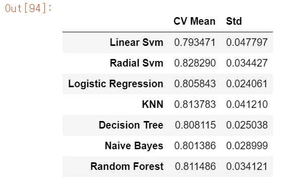
model별 cross validation을 해본 결과이다.
plt.subplots(figsize=(20, 6))
box = pd.DataFrame(accuracy, index=[classifiers])
box.T.boxplot() # df.T는 transpose(col과 row를 서로 바꿔준다.)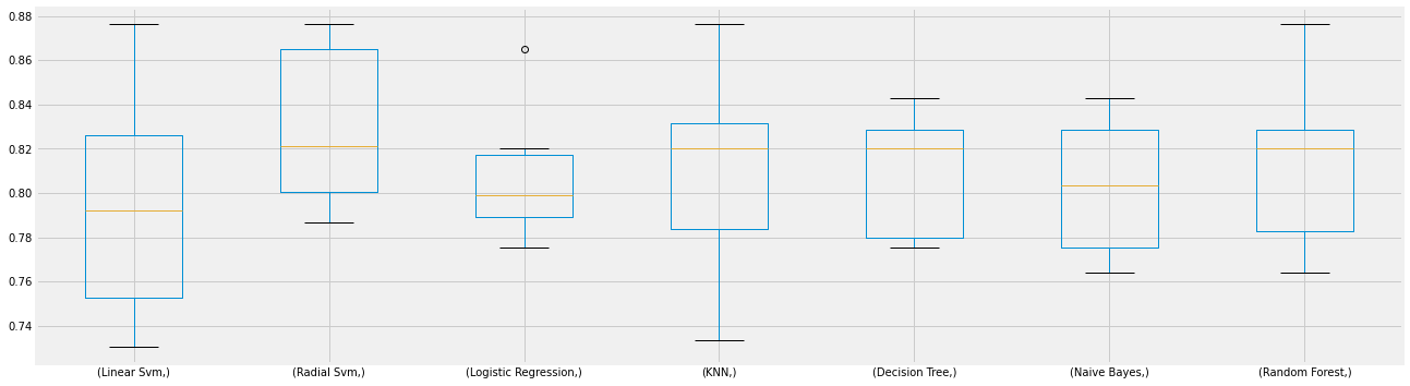
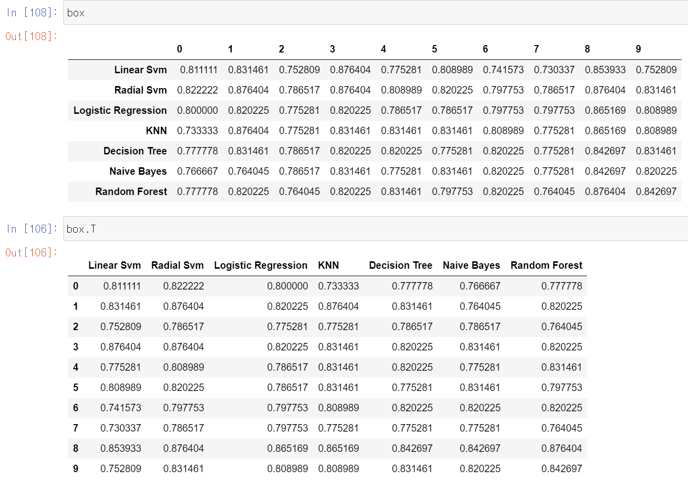
boxplot을 나타내기 위해 box 데이터프레임을 transpose 해주었다.
new_models_dataframe2['CV Mean'].plot.barh(width=0.8)
plt.title('Average CV Mean Accuracy')
fig = plt.gcf()
fig.set_size_inches(8, 5)
plt.show()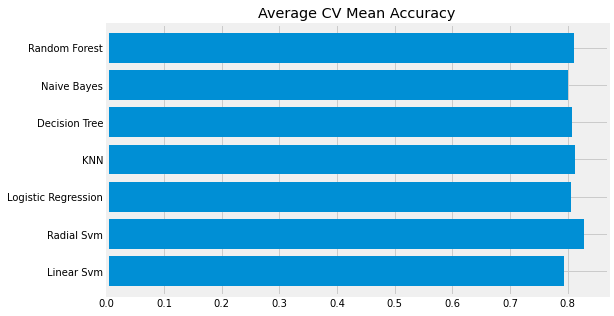
모든 예측 모델 중 Radial SVM이 가장 성능이 좋은것으로 나타났다.
Confusion Metrix
Confunion Metrix가 뭔지 몰랐는데 찾아보니 ADsP에서 공부했던 내용중 성과분석이었다. 정분류율, 특이도, 민감도 등등을 포함한 성과분석이다.
fig, ax = plt.subplots(3, 3, figsize=(12, 10))
y_pred = cross_val_predict(svm.SVC(kernel='rbf'), X, Y, cv=10)
sns.heatmap(confusion_matrix(Y,y_pred), ax=ax[0,0], annot=True, fmt='2.0f')
ax[0,0].set_title('Matrix for rbf_SVM')
y_pred = cross_val_predict(svm.SVC(kernel='linear'), X, Y, cv=10)
sns.heatmap(confusion_matrix(Y, y_pred), ax=ax[0,1], annot=True, fmt='2.0f')
ax[0,1].set_title('Matrix for Linear_SVM')
y_pred = cross_val_predict(KNeighborsClassifier(n_neighbors=9), X, Y, cv=10)
sns.heatmap(confusion_matrix(Y, y_pred), ax=ax[0,2], annot=True, fmt='2.0f')
ax[0,2].set_title('Matrix for KNN')
y_pred = cross_val_predict(RandomForestClassifier(n_estimators=100),X,Y,cv=10)
sns.heatmap(confusion_matrix(Y,y_pred), ax=ax[1,0], annot=True, fmt='2.0f')
ax[1,0].set_title("Matrix for Random_Forest")
y_pred = cross_val_predict(LogisticRegression(), X,Y,cv=10)
sns.heatmap(confusion_matrix(Y,y_pred), ax=ax[1,1], annot=True,fmt='2.0f')
ax[1,1].set_title('Matrix for LogisticRegression')
y_pred = cross_val_predict(DecisionTreeClassifier(), X, Y, cv=10)
sns.heatmap(confusion_matrix(Y, y_pred), ax=ax[1,2], annot=Trueㅃㅇ, fmt='2.0f')
ax[1,2].set_title('Matrix for Decision Tree')
y_pred = cross_val_predict(GaussianNB(), X, Y, cv=10)
sns.heatmap(confusion_matrix(Y, y_pred), ax=ax[2,0], annot=True, fmt='2.0f')
ax[2,0].set_title('Matrix for Naive Bayes')
plt.subplots_adjust(hspace=0.2, wspace=0.2) # subplots 사이에 예약된 공간
plt.show()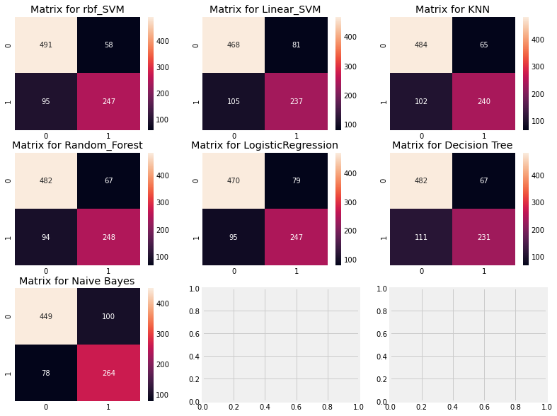
- rbf_SVM에서 옳은 예측은 491 + 247 -> accuracy = (491+247)/891
- error은 58 + 95, 문제점은 생존자를 사망자로 예측한 것이 더 많다.
- rbf_SVM은 사망자를 정확하게 예측할 확률이 높고, 네이비안은 생존자를 정확하게 예측할 확률이 높다.
Hyper Parameters 튜닝
머신러닝에서 사용자가 직접 튜닝함으로서 모델의 성능을 조절할 수 있다.
from sklearn.model_selection import GridSearchCV
C=[0.05,0.1,0.2,0.3,0.25,0.4,0.5,0.6,0.7,0.8,0.9,1]
gamma=[0.1,0.2,0.3,0.4,0.5,0.6,0.7,0.8,0.9,1.0]
kernel=['rbf','linear']
hyper={'kernel':kernel,'C':C,'gamma':gamma}
gd=GridSearchCV(estimator=svm.SVC(),param_grid=hyper,verbose=True)
# verbose : iteration시마다 수행결과 메시지 출력 여부
# 0 : 메시지 출력 ㄴ(default)
# 1 : 간단한 메세지 출력
# 2 : 하이퍼 파라미터별 메시지 출력
gd.fit(X,Y)
print(gd.best_score_)
print(gd.best_estimator_)
SVC 머신러닝 모델의 하이퍼 파라미터는 대표적으로 C, gamma, kernel이 있다. 이를 딕셔너리 자료구조로 만들어 놓고 GridSearchCV로 돌린 코드이다.
n_estimators=range(100,1000,100)
hyper={'n_estimators':n_estimators}
gd=GridSearchCV(estimator=RandomForestClassifier(random_state=0),param_grid=hyper,verbose=True)
gd.fit(X,Y)
print(gd.best_score_)
print(gd.best_estimator_)
이 코드는 RandomForestClassifier의 하이퍼 파라미터 중 n_estimators로 성능 조절을 했다.
Ensambling
Voting
Voting Classifier은 여러 다른 ML 모델의 예측을 결합한 가장 간단한 방법이다.
Voting은 여러 모형에서 산출된 결과를 다수결에 의해 최종 결과를 선정하는 과정이다.
from sklearn.ensemble import VotingClassifier

ensemble_lin_rbf=VotingClassifier(estimators=[('KNN', KNeighborsClassifier(n_neighbors=10)),
                                             ('RBF', svm.SVC(probability=True, kernel='rbf',C=0.5, gamma=0.1)),
                                             ('RFor',RandomForestClassifier(n_estimators=500, random_state=0)),
                                             ('LR', LogisticRegression(C=0.05)),
                                             ('DT',DecisionTreeClassifier(random_state=0)),
                                             ('NB',GaussianNB()),
                                             ('svm',svm.SVC(kernel='linear', probability=True))],
                                  voting='soft').fit(train_X,train_Y)
print('Accuracy for ensembled model is : ', ensemble_lin_rbf.score(test_X, test_Y))
cross = cross_val_score(ensemble_lin_rbf, X, Y, cv=10, scoring='accuracy')
print('The cross validated score is' , cross.mean())
Accuracy for ensembled model is : 0.8208955223880597
The cross validated score is 0.8249188514357053
Voting을 통해 KNN, RBF, RFor, LR, DT, NB, SVM의 모델을 결합한 분류 예측을 시도했다.
Bagging
Bagging은 분산이 높은 모델에서 잘 작동되는 모델이라 한다. 배깅은 주어진 자료에서 여러개의 붓스트랩 자료를 생성하고 각 붓스트랩 자료에서 예측모형을 만든 후 결합하여 최종 예측 모델을 만든다.
붓스트랩 : 주어진 자료에서 동일한 크기의 표본을 랜덤 복원추출로 뽑은 자료를 의미
# Bagging KNN
from sklearn.ensemble import BaggingClassifier
model = BaggingClassifier(base_estimator=KNeighborsClassifier(n_neighbors=3), random_state=0, n_estimators=700)
model.fit(train_X, train_Y)
pred = model.predict(test_X)
print('Accuracy for bagged KNN is ', metrics.accuracy_score(pred, test_Y))
result = cross_val_score(model, X,Y, cv=10, scoring='accuracy')
print('The cross validated score for bagged KNN is ', result.mean())
Accuracy for bagged KNN is 0.835820895522388
The cross validated score for bagged KNN is 0.8160424469413232
# Bagging DecisionTreeClassifier
model = BaggingClassifier(base_estimator=DecisionTreeClassifier(), random_state=0, n_estimators=100)
model.fit(train_X, train_Y)
pred = model.predict(test_X)
print('Accuracy for bagged Decision Tree is ', metrics.accuracy_score(pred, test_Y))
result = cross_val_score(model, X,Y,cv=10, scoring='accuracy')
print('The Cross validated score for bagged Decision Tree is ', result.mean())
Accuracy for bagged Decision Tree is 0.8208955223880597
The Cross validated score for bagged Decision Tree is 0.8171410736579275
Boosting
Boosting하면 가장 먼저 생각나는 것은 XGBoost인데, 이 외에도 여러가지가 있었다. AdaBoost, GridientBoost가 있지만 XGBoost가 가장 좋은 모델이라고 한다.
# Adaboost (Decision Tree)
from sklearn.ensemble import AdaBoostClassifier
ada = AdaBoostClassifier(n_estimators=200, random_state=0, learning_rate=0.1)
result = cross_val_score(ada, X, Y, cv=10, scoring='accuracy')
print('The Cross validated score for Adaboost is ', result.mean())
The Cross validated score for Adaboost is 0.8249188514357055
# Stochastic Gradient Boosting
from sklearn.ensemble import GradientBoostingClassifier
grad = GradientBoostingClassifier(n_estimators=500, random_state=0, learning_rate=0.1)
result = cross_val_score(grad, X, Y, cv=10, scoring='accuracy')
print('The Cross validated score is ', result.mean())
The Cross validated score is 0.8115230961298376
import xgboost as xg
xgboost = xg.XGBClassifier(n_estimators=900, learning_rate=0.1)
result = cross_val_score(xgboost, X, Y, cv=10, scoring='accuracy')
print('The Cross validated score is ', result.mean())
The Cross validated score is 0.8160299625468165
이번엔 하이퍼 파라미터를 튜닝해보자
n_estimators = list(range(100, 1100, 100))
learn_rate = list(np.arange(0.05, 1, 0.05))
hyper = {'n_estimators':n_estimators, 'learning_rate':learn_rate}
gd = GridSearchCV(estimator=AdaBoostClassifier(), param_grid=hyper, verbose=True)
gd.fit(X, Y)
print(gd.best_score_)
print(gd.best_estimator_)

ada = AdaBoostClassifier(n_estimators=100, learning_rate=0.1, random_state=0)
result=cross_val_predict(ada,X,Y,cv=100)
sns.heatmap(confusion_matrix(Y,result), cmap='winter', annot=True, fmt='2.0f')
plt.show()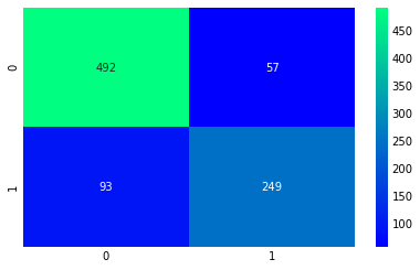
주성분 분석
f,ax = plt.subplots(2, 2, figsize=(15, 12))
model=RandomForestClassifier(n_estimators=500, random_state=0)
model.fit(X,Y)
pd.Series(model.feature_importances_, X.columns).sort_values(ascending=True).plot.barh(width=0.8, ax=ax[0,0])
ax[0,0].set_title('Feature Importance in Random Forests')
model = AdaBoostClassifier(n_estimators=100, learning_rate=0.1, random_state=0)
model.fit(X,Y)
pd.Series(model.feature_importances_, X.columns).sort_values(ascending=True).plot.barh(width=0.8, ax=ax[0,1], color='#ddff11')
ax[0,1].set_title('Feature Importance in AdaBoost')
model = GradientBoostingClassifier(n_estimators=500, learning_rate=0.1, random_state=0)
model.fit(X,Y)
pd.Series(model.feature_importances_, X.columns).sort_values(ascending=True).plot.barh(width=0.8, ax=ax[1,0], cmap='RdYlGn_r')
ax[1,0].set_title('Feature Importance in Gradient Boosting')
model = xg.XGBClassifier(n_estimators=900, learning_rate=0.1)
model.fit(X,Y)
pd.Series(model.feature_importances_, X.columns).sort_values(ascending=True).plot.barh(width=0.8, ax=ax[1,1], color='#FD0F00')
ax[1,1].set_title('Feature Importance in XgBoost')
plt.show()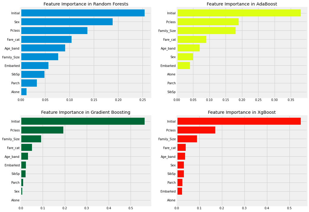

상세하고, 명쾌한 설명 감사히 읽었습니다.